10,000 search results
(0.021 seconds)
- TT Supermolot Neue by TypeType,
$35.00 Useful links: TT Supermolot Neue PDF Type Specimen TT Supermolot Neue graphic presentation at Behance Looking for a custom version of TT Supermolot Neue? TT Supermolot Neue is a redesigned, extended and greatly enhanced reincarnation of the popular TT Supermolot and TT Supermolot Condensed font families. During its existence, the hammers (‘molot’ in Russian) managed to get into the spotlight in a huge number of projects, for example, in popular video games, films, and branding. Despite its popularity, the limited composition of old families put boundaries their development, which prompted us to release a completely redesigned and greatly extended version. And while the old families could offer designers only a limited number of tools, in the new version you can already find 54 fonts, and each individual font now consists of more than 620 glyphs. First, we have added a completely new subfamily, TT Supermolot Neue Extended. But this is only the tip of the iceberg—in order to achieve visual harmony between the three subfamilies, we completely revised the distribution of widths among them. As a result of this work, the width of the TT Supermolot Neue Basic subfamily became a bit narrower, and the width of the TT Supermolot Neue Condensed subfamily became even narrower than it was in the old version. Secondly, we’ve increased the number of weights. While in the old versions there were only 5 weights, in the new ones there are 9 in each of the subfamilies. In addition, we gave a facelift to the lowercase and uppercase letters. In TT Supermolot Neue, the design of all controversial grapheme forms was soothed and now the family can also be used in the text set. We have completely redrawn italics. It took us half a year to compensate for all the circles, to transform italic strokes, to work out the position of the diacritics, to make right the spacing, and to finish kerning. Following a good tradition, in the TT Supermolot Neue extensive support for useful OpenType features was added, and hinting was also improved. If we talk about visual features, we recommend paying closer attention to two stylistic sets: the first set (ss01) is designed to make the typeface more humanist, and when you turn on the second set (ss02), the typeface becomes even more technological. In addition, the typeface has more than 26 items of standard and discretionary ligatures. We also have not forgotten about the figures and we added a set of old-style figures to the standard version. In addition, the typeface has case, ordn, frac, sups, sinf, numr, dnom, onum, tnum, lnum, pnum, calt, liga, dlig, salt, ss01, ss02.
 - Deco Metro by Greater Albion Typefounders,
$20.00 Deco Metro is a 1920s and 30s inspired display family, ideal for posters, banners, book covers and other promotional work. Two weights, regular (with an incised centre line) and bold (without the centre line) are offered. The family has an extensive range of features including discretionary ligatures, old-style numerals, Swash Letter and numeral forms, small capitals, Roman numerals and fractions.
 - Kudos Kaps NF by Nick's Fonts,
$10.00Introducing a series of decorative initials with a twist: each font contains two complete alphabets, A-Z, and numerous border elements in the numeral and shift-numeral positions. Classic, ornate, quaint and exotic, these fonts are essential tools for adding style and charm to your next project. Kudos Kaps Five features Jakob Erbar’s eponymous Initials in the uppercase slots, and Aldo Novarese’s Fontasi in the lowercase AND numeral slots. The font also includes three complete eight-piece borders, a two-piece accent set, two single border elements and an elegant penman dingbat. - Sancoale Slab by insigne,
$32.00 The contemporary feel of the Sancoale superfamily takes a bolder turn with this futuristic slab. Built from Sancoale's successfully simple geometry, Slab's serif elements and tall x-height give the face an energetic, yet clean figure that easily complements its cousins: Sancoale Softened--a sans with blunted terminals; Sancoale Narrow; and, of course, the original Sancoale itself. The weights of each member have been balanced carefully to ensure compatibility with the others, and when used together, the combination creates a powerful design that is easy to identify. With weights ranging from the classier Thin to the authoritative Black, Slab opens the door to a range of applications. Used in different text sizes, its tech image is legible and neutral enough for longer bodies of copy--both in print and on the web. Have a more prominent need? The web font also stands out well in a headline or even as a display face. Slabís great personality puts a strong foot forward without giving its reader a kick in the teeth. Whatever the task, this font's one to capture the Zeitgeist into your work. All Insigne fonts are fully loaded with OpenType features. Sancoale Slab is also equipped for complex professional typography, including alternates with stems, small caps and plenty of alts, including "normalized" capitals and lowercase letters. The face includes a number of numeral sets, including fractions, old-style and lining figures with superiors and inferiors. OpenType-capable applications such as Quark or the Adobe suite can take full advantage of automatically replacing ligatures and alternates. You can find these features demonstrated in the .pdf brochure. Included are small caps, fractions, old-style and lining numbers, scientific superior/inferior figures, complete ordinal and inferior alphabet, and a set of symbols and arrows. The Sancoale family also includes the glyphs to support a wide range of languages, including Central, Eastern and Western European languages. In all, Sancoale Slab supports over 40 languages that use the extended Latin script, making the new addition a great choice for multi-lingual publications and packaging.
 - Kebo by DLetters Studio,
$12.00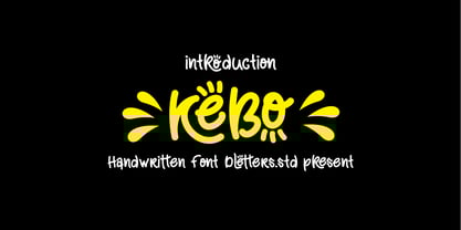 Introduction Kebo handwritten font, funny style, and playful hand draw display typeface and perfect for many design projects! Kebo font includes uppercase, lowercase, numbers, punctuations, ligatures, swash, and has multilingual support.
 - Print Illustrations JNL by Jeff Levine,
$29.00 Print Illustrations JNL gathers a number of charming and functional designs redrawn from vintage sources. There are attention getters, spot illustrations, catch words and decorative embellishments all in one digital file.
 - Cross Stitch Monogram by Gerald Gallo,
$20.00 Cross Stitch Monogram is based on upper case characters 15 stitches tall and contains the upper case characters A-Z, numbers 0-9, ampersand, and a selection of various simple ornaments.
 - Caustin Bolar by madeDeduk,
$16.00 Really excited to introduce Caustin Bolar is a bold brush script and will be perfect for all your designs project. Uppercase Lowercase Number & Symbol International Glyphs Ligature Hope you enjoy it.
 - Burning Chiller by Letterhend,
$17.00 Introducing Burning Chiller, a playful typeface that captures the essence of the 90s era. Immerse yourself in its retro charm. Features : Uppercase & lowercase Numbers and punctuation Alternates & Ligatures Multilingual PUA encoded
 - Techla by Mevstory Studio,
$30.00 Techla is a futuristic/science fiction typeface in several weights and styles. Techla also comes with stylistic alternatives on several letters. Included: Techla Regular Techla includes multilingual support , numbers and punctuation.
 - Rahere Esoteric by ULGA Type,
$25.00 Rahere Esoteric is a gothic-flavoured, quasi-Roman display font with an eccentric persona and more quirks than a Tim Burton film. A member of the extended Rahere typeface family, it’s the enigmatic cousin of Rahere Roman Display & Rahere Sans. This is a niche display font that doesn’t try to please everyone. Rahere Esoteric revels in its mystical aura, using a bewildering array of ligatures to magically transmute itself as characters loop, curl, jerk and strut, randomly connecting and disconnecting into words like a retro-futuristic steam train clattering along a disused railway track, challenging and delighting the reader at the same time. To add more sparkle, there are alternatives, inferior and superior caps plus a [Wicca] basketful of symbols, ornaments, weird faces and even a snake-infused ampersand. Whilst Rahere Esoteric has been designed primarily as an all-caps font, the lowercase slots contain small caps with corresponding numerals. However, because this is an arcane, unpredictable font, order and regularity are frowned upon, which means there are no tabular numerals – so company reports or accounts are a solid no! Unless they’re for the Golden Circle of Alchemists PLC or Gothic Blackstar Corporation. It is ideal for all things pagan, esoteric, alchemy, other-worldly or magic-related projects and particularly useful for music genres across the Gothic / Darkwave / Ethereal spectrum. What about legibility? Hey, look into my eyes: Esoteric is all about the mystique. If a secondary font is needed for the important stuff, I recommend its cousin, Rahere Sans, which pairs beautifully with this display font and is perfect for long passages or small text. The initial idea for Rahere Esoteric came about during a visit to Whitby, a small coastal town in Yorkshire, UK and famous for its inclusion in Bram Stoker’s novel, Dracula. A Steampunk festival was in full swing and the narrow streets of the town centre were teeming with people adorned in a glorious fusion of clothing and accessories influenced by a love of 19th-century life, science fiction, horror, fashion and art. I was fascinated by the juxtapositions of colour, patterns, material and style – archaic mechanical Sci-fi, gothic, the American Wild West and romantic Victorian. But what intrigued me the most, somehow, all the disparate elements worked as a whole. Thus, like Frankenstein, this font jolted into existence. Supported languages include Western Europe, Vietnamese, Central/Eastern Europe, Baltic, Turkish and Romanian.
 - Sweet Frosting by Danielle Eneh,
$18.00 Sweet Frosting is a cute script font designed to be reminiscent of a script from a handwritten menu or sign. It will add a quirky, fun but still elegant touch to your designs. The smooth edges create a clean look for your modern design projects. It’s perfect for branding projects, social media posts, product packaging, product designs, labels, and invitations. Sweet Frosting comes with 297 glyphs- including 2 uppercase sets, lowercase, numerals, punctuation and includes 16 ligatures for a more natural handwritten feel. OPENTYPE: Sweet Frosting is an opentype font and recommended for programs that support opentype features such as Adobe Illustrator, Adobe Photoshop, Adobe Indesign, Pages, Word. Please make sure you know how to access these features before purchasing. ➤ What’s Included ❤ 297 glyphs — 2 Uppercase sets, lowercase, numbers, symbols, punctuation, 16 styled ligatures ❤ Multilingual Support : AÀÁÂÃÄÅCÇDÐEÈÉÊËIÌÍÎÏNÑOØÒÓÔÕÖUÙÜÚÛWYÝŸỲŸÆŒßÞþ
 - PF DIN Text Universal by Parachute,
$165.00 DIN Text Universal is the most advanced DIN superfamily ever. It combines the powerful DIN Text Pro with DIN Text Arabic bringing the number of glyphs to 3320 per font. In fact, this set of fonts contains the most complete and powerful array of arabic features commercially available. It supports all variations of the Arabic script such as Persian, Urdu and Pashto. It is also enhanced with 30 advanced opentype features and kerning for all languages. The four major scripts Latin, Arabic, Cyrillic and Greek are now matched across the design of the whole family, respecting at the same time each one's modern cultural identity. With its vast array of weights, the extended support for numerous languages, its careful and detailed design, it will prove to be extremely valuable for many complex corporate projects and corporations which operate internationally.
 - Judger by Twinletter,
$15.00 Judger is a graffiti typeface that we created with the purpose of producing unique works that can be applied to a number of your projects, prioritizing high flexibility in order to make it easier for you to respond to your diverse needs. This typeface is not only versatile, but it will also make your project look appealing, attractive, and cool. When you use this font, viewers will perceive your project as high quality, professional, and well-designed, and your project will be highly rated. This graffiti font is great for product logos, poster titles, headlines, packaging, film titles, logotypes, gorgeous writing, and trendy graffiti designs, among other things. Of course, if you utilize this font in your numerous creative projects, they will be perfect and outstanding. Use this typeface right away for your one-of-a-kind and remarkable projects.
 - Punk Rotten by Prioritype,
$19.00 Street art style is endless. Here comes a font with a cool and fun graffiti tagging style. Coupled with ornaments that make it more attractive. You can access the ornament by typing underscore + underscore + number (1-14). Example: __14. The program must support the opentype feature or contain a glyph panel. Suitable for merchandise designs, posters, stickers or album covers. Features: Uppercase, Lowercase, Numeral, Punctuation, Multilingual & Ornament. Multilingual contained: Afrikaans, Albanian, Asu, Basque, Bemba, Bena, Breton, Catalan, Chiga, Cornish, Danish, Dutch, English, Estonian, Filipino, Finnish, French, Friulian, Galician, German, Gusii, Indonesian, Irish, Italian, Kabuverdianu, Kalenjin, Kinyarwanda, Luo, Luxembourgish, Luyia, Machame, Makhuwa-Meetto, Makonde, Malagasy, Manx, Morisyen, North Ndebele, Norwegian Bokmål, Norwegian Nynorsk, Nyankole, Oromo, Portuguese, Quechua, Romansh, Rombo, Rundi, Rwa, Samburu, Sango, Sangu, Scottish Gaelic, Sena, Shambala, Shona, Soga, Somali, Spanish, Swahili, Swedish, Swiss German, Taita, Teso, Uzbek (Latin), Volapük, Vunjo, Zulu. Thanks!
 - Kabrio by Zetafonts,
$39.00 Designed by Cosimo Lorenzo Pancini and Andrea Tartarelli, Kabrio is a sans serif typeface for the lovers of minimal design, and great curves. Kabrio features four different corner treatments to offer variation in display and logo use: the "alternate" variant features slightly rounded corners, that become even more round in the "soft" variant. "Abarth" features cut corner for a more mechanical, cold look. Each variant comes in seven weights with matching italics, for a grand total of 56 weights to add to your typographic palettes. All Kabrio weights feature an extended character set with accents to cover over forty European languages as well as Russian and Bulgarian Cyrillc. OpenType features include stylistic alternates and a wide arrange of numerals (oldstyle, tabular, tabular oldstyle, superior, inferior, fractions) to allow you maximum flexibility to use Kabrio in number-heavy documents: spreadsheets, tables, timetables.
 - Binggo Wood Display by Genesislab,
$20.00 Bingo Wood Display in totality and elegance. One of my newest first releases, hand drawn with pinpoint accuracy. Bingo Wood has the perfect amount of simplicity and subtlety for your next project. It perfectly represents retro and vintage aesthetics. I recommend this font for logos, invitations, and your next home decor project that requires a touch of compact alternative combinations! Include Format: - Bingo Wood Display. otf Bingo Wood appears with a total of 593 Glyph characters available: Basic Latin, Extended Latin A, Punctuation, Open & Close Punctuation, Dashes & Quotes, Super Script & Sub Script, Currency, Numbers, Math Symbol, Designer Favorites Case Sensitive Forms, Discretionary Ligature, Denominators, Standard Ligature, Numerators Stylistic Alternates Set, 1, 2, 3, Sup Script, Super Script, Swash Get inspired by the images above and feel free to share with me what you get using this font.
 - Dear Gray by Redy Studio,
$17.00 Dear Gray – Modern Wedding Fonts Dear Gray is a beautiful, feminine, and modern calligraphy script for your wedding designs. Dear Gray includes a full set of uppercase and lowercase letters, numerals, punctuation, and common ligatures for a more harmonious look. With Opentype features and stylistic alternatives, Dear Gray gives you a lot of possibilities to make your design even more special. Following the trend of modern hand-drawn typography, Dear Gray is a friendly choice to convey your loving words. Dear Gray features: A full set of upper & lowercase characters Numbers & punctuation Ligatures Lowercase beginning swashes Lowercase ending swashes A ton of stylistic alternatives PUA Encoded Characters – Fully accessible without additional design software. Feel free to give me a message if you have a problem or question. Thank you so much for taking the time to look at one of our products.
 - Sapphire Script by Design by Laney,
$32.00 Sapphire Script is a hand-lettered modern calligraphy font based on the signature script of Design by Laney. Made with wedding invitations in mind, this font with over 500 playful, romantic characters is perfect for branding, stationery, packaging, social media templates, magazine layouts, artist prints, and more! With 3 or more characters for each uppercase letter and 35 stunning standard ligatures, you'll be able to create that perfectly imperfect calligraphy style. Sapphire Script contains over 500 unique, coded features for a realistic, handwritten look: 35 standard ligatures, full Western European language support, over 100 stylistic alternates, ordinals (1st, 2nd, 3rd, etc.), 2 alternate number sets including 1-10 Roman Numerals, and a few word glyphs (for, to, from, and). Sapphire Script was named for the street where Design by Laney began, and where I moved in downstairs from my future husband!
 - Waite Park JNL by Jeff Levine,
$29.00Waite Park JNL is based on the smallest of the die-cut letters and numbers contained in the Webway Sign Cabinet - once manufactured by the Holes-Webway Company of Minneapolis, Minnesota. The largest of the set's sizes (2 inch) was the model for Sign Kit JNL, the medium size (1-1/8 inch) was used to make Sign Production JNL and this font is a version from the 3/4 inch size. Each size of alphabet and numerals have their own unique characteristics, although they all follow the same basic font style, which is reminiscent of classic Art Deco-era sanserif typefaces. The name Waite Park JNL was derived from a division of Holes-Webway that (for some reason lost to time) distributed their sign kits under the name Waite Park Sign Company, located in the Minnesota city of the same name. - Brinar by Hackberry Font Foundry,
$24.95 I've been working on a usable sans serif for body copy since the mid-1990s (though I certainly did not know it at the time). This one works well. It started life back in the mists of time as a scan of an old German font by Carl Fahrenwaldt. It was developed fully as a synergized serif with strong traditional roots and released as Bergsland Pro. Now it finally makes it to where I was headed all along as a sans text font. This is a well modulated humanist, sans serif font family with many OpenType features and over 600 characters: Caps, lower case, small caps, ligatures, swashes, small cap figures, old style figures, numerators, denominators, accents characters, ordinal numbers, and so on. It is designed for text use in body copy. But it also works very well for elegantly stylized display.
 - The Northland & Southland Combinations by Almeera Studio,
$10.00 Introducing The Northland Combinations. is a pair of Northland script and Southland sans font that perfectly. The classic feel is really perfect for you who needs a typeface for especially logotype, apparel, invitation, branding, packaging, advertising etc. This typeface is comes in uppercase, lowercase, punctuations, symbols & numerals,swashes, 05 stylistic set alternate, ligatures,underlines and also support multilingual and already PUA encoded. to access the underlines you simply press numbers 1-5 followed by an underscore after the last letter. For example: 1_ 2_ 3_ 4_ 5_ We highly recommend using a program that supports OpenType features and Glyphs panels like many of Adobe apps and Corel Draw, so you can see and access all Glyph variations. HOW TO ACCESS ALTERNATE CHARACTERS Open glyphs panel: -In Adobe Photoshop go to Window - glyphs -In Adobe Illustrator go to Type - glyphs
 - Hokaplay by Afkari Studio,
$13.00 Hokaplay - Playful Display Font Hokaplay is a playful display font that creates with a very good concept and adjusted well to keep the legibility. Hokaplay Playful Display Font Comes with upper and lowercase Standard Characters, Punctuation, Numerals And other Glyphs variation of the OpenType features/ Ligatures. Hokaplay Playful Display Font is suitable for logos, posters, school flyers, university banners, modern advertising design, product labels, cartoons, kid books, custom mugs, pillows, t-shirts, youtube thumbnail/cover, poster quote, editorial design, book/cover Title, website/blog, social media post, packaging designs,, and other designs. Features; - 2 Styles; Regular and Rounded - Standart and special ligatures - Uppercase, Lowercase, Number, and Punctuation - Works on PC & Mac - Simple installations - Accessible in Adobe Illustrator, Adobe Photoshop, Adobe InDesign, even work on Microsoft Word - Fully accessible without additional design software. - Mültîlíñgúãl Sùppört for; ä ö ü Ä Ö Ü ß ¿ ¡
 - Mizwinki Display by Tondi Republk,
$31.00 Mizwinki Display is an all caps sans serif font family that seamlessly blends organic elegance with ornate industrial precission reminiscent of the Art Deco period. The typeface has organic forms that give it a clean decorative and somewhat oriental appeal. This trendsetting trio consists of three font styles, all denoted as MD (Mizwinki Display): MD-Base: This style forms the foundation of the font family, featuring smooth stems and geometric terminals. It blends organic and industrial designs, with letterforms like E, F, W, N, and M crafted from continuous flowing geometry. MD-Ink: Building upon MD-Base, this style introduces spurs and slits, evoking the ornate look synonymous with classic tattoo art letterforms. MD-InkLine: A unique offshoot of MD-Ink, this style features an inline aesthetic that enhances the ornate appeal. Tighter spacing between letterforms allows the glyphs to blend into each other while maintaining legibility within the inline letter silhouettes. Ideal for logos, headlines, packaging, digital ephemera, and apparel, Mizwinki Display is versatile. Despite being a display font, it works well at smaller sizes and is suitable for low-count body copy. Technical Specs: _____________________________________________________ 3 Font Styles / 12 Open Type Features / Extended Latin Character set (Basic Latin; Western, Central and South Eastern European Latin) / Currency Symbols / Punctuation and Parenthesis / Arrows / Basic Mathematical Symbols / Special Symbols / Basic Numerals / Circled Numerals / Numerators and Denominators / Table Figures / Inferiors and Superiors & Fractions Support for 112 Languages: _____________________________________________________ Afrikaans / Akan / Albanian / Asturian / Asu / Bafia / Basque / Bemba / Bena / Breton / Catalan / Chiga / Colognian / Cornish / Croatian / Czech / Danish / Duala / Dutch / Embu / English / Estonian / Ewe / Faroese / Filipino / Finnish / French / Friulian / Fulah / Galician / Ganda / German / Gusii / Hungarian / Icelandic / Igbo / Inari Sami / Indonesian / Irish / Italian / Jola-Fonyi / Kabuverdianu / Kalenjin / Kamba / Kikuyu / Kinyarwanda / Koyraboro Senni / Koyra Chiini / Langi / Latvian / Lingala / Lithuanian / Lower Sorbian / Luba-Katanga / Luo / Luxembourgish / Luyia / Machame / Makhuwa-Meetto / Makonde / Malagasy / Maltese / Manx / Masai / Meru / Metaʼ / Morisyen / Northern Sami / North Ndebele / Norwegian Bokmål / Norwegian Nynorsk / Nuer / Nyankole / Oromo / Polish / Portuguese / Quechua / Romanian / Romansh / Rombo / Rundi / Rwa / Samburu / Sango / Scottish Gaelic / Sena / Serbian / Shambala / Shona / Slovak / Soga / Somali / Spanish / Swahili / Swedish / Swiss German / Taita / Tasawaq / Teso / Turkish / Upper Sorbian / Uzbek (Latin) / Vai / Volapük / Vunjo / Walser / Welsh / Western Frisian / Yoruba / Zarma / Zulu
 - Aquacia by Coniglio Type,
$9.95A stencil font you won't find anywhere else. Part of Market LTD, a collection of limited faces, mostly alpha-numeric and some just plain numeric, used primarily in retail and display situations and titling. - Ultraxoid by PizzaDude.dk,
$20.00 Ultraxoid has got autoligatures for both double numbers, double letters, and a good handful of the most common letter combinations. You will need to use OpenType supporting applications to use the autoligatures.
 - Print Embellishments JNL by Jeff Levine,
$29.00 Print Embellishments JNL gathers together a number of vintage typographic enhancements that can be used as simple spot decorations, rule lines or borders, adding a bit of design elegance to any project.
 - Foda Klay by Fo Da,
$30.00 Foda Klay is a modern Arabic typeface that offers a large number of glyphs and ligatures. Foda Klay is a perfect choice for Logo designs, branding, Clothing , packaging, headings, advertising, and more...
 - Gorilas by DLetters Studio,
$10.00 GORILAS Handbrush Font is a font with an available brushstroke style with a set of uppercase all with number and punctuation support, and Ligatures making this font perfect for your awesome project.
 - Brogetta by Hanzel Space,
$25.00 BROGETTA will perfect for many project: fashion, magazines, logo, branding, photography, invitations, wedding invitation, quotes, blog header, poster, advertisements, postcard, book, websites, etc. What's Included? Uppercase & lowercase letters, numbers, punctuation Multilingual support
 - Display Robust by Gerald Gallo,
$20.00 Display Robust is a display font not intended for text use. It was designed specifically for display, headline, logotype, branding, and similar applications. Display Robust has an uppercase alphabet, numbers, and punctuation.
 - Zanoix by PizzaDude.dk,
$20.00 Zanoix is based on text from an old horror poster. Comes with ligatures for both double letters and numbers. You will need to use OpenType supporting applications to use the auto-ligatures
 - Beralissa by Jadatype,
$15.00 Beralissa is a script font with a calligraphy style. suitable for social media, logotype, products, advertisements, and so on. contains standard English letters, numbers, punctuation, alternates and several accents that support multilingualism.
 - Claaure by madeDeduk,
$16.00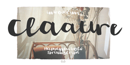 Really excited to introduce Claaure is a realistic brush script! Claaure will be perfect for all your designs project. Claaure Included: Uppercase Lowercase Number & Symbol International Glyphs - Ligature Hope you enjoy it.
 - Castles&Shields by Deniart Systems,
$15.00For all your royal invitations. The Castles & Shields Series contains over 85 unique and decorative characters depicting numbers and alphabets in castle and shield silhouettes to give your documents a medieval feel. - Display Brutal by Gerald Gallo,
$20.00 Display Brutal is a display font not intended for text use. It was designed specifically for display, headline, logotype, branding, and similar applications. Display Brutal has an uppercase alphabet, numbers, and punctuation.
 - Shanghai JNL by Jeff Levine,
$29.00 Shanghai JNL is loosely based on the title lettering from “Charlie Chan in Shanghai”, one of the long-running series of detective films featuring the Asian sleuth and his “number one son”.
 - Grah by Afkari Studio,
$10.00 Grah ia a friendly display handwritten font with unique dan natural style It will add a joyful touch to each of your projects. Featured: - Uppercase and Lowercase - Number and punctuation - Multilanguage Support
 - Jonze by KC Fonts,
$19.00 Jonze & Jonzing from KC Fonts is an all uppercase based font that resembles a rubber stamp; Jonze being more on the saturated side and Jonzing on the rather dry. Both fonts each have four glyphs for each letter & two per number, which are accessed by uppercase, lowercase & Contextual Alternates. The Jonze family takes the grungy look that you love one step further by creating a handmade look for you by randomly cycling through Contextual Alternates & Double Letter Ligatures for a unique and authentic look to your creative. When not using the Contextual Alternates feature, you can still alternate between uppercase and lowercase letters to change it up or by accessing the Stylistic Alternates feature. The Jonze family has an extended character set for multilingual support.
 - Teimer Std by Suitcase Type Foundry,
$75.00Typographer and graphic designer Pavel Teimer (1935-1970) designed a modern serif roman with italics in 1967. For the drawing of Teimer he found inspiration in the types of Walbaum and Didot, rather than Bodoni. He re-evaluated these archetypes in an individual way, adjusting both height and width proportions and modifying details in the strokes, thus effectively breaking away from the historical models he used as a starting point. Teimer's antiqua has less contrast; the overall construction of the characters is softer and more lively. The proportions of the italics are rather wide, making them stand out by their calm and measured rhythm. This was defined by the purpose of the typeface, as it was to be utilised for two-character matrices. The long serifs are a typical feature noticeable throughout the complete family of fonts. In 1967, a full set of basic glyphs, numerals and diacritics of Teimer's antiqua was submitted to the Czechoslovak Grafotechna type foundry. However, the face was never cast. At the beginning of 2005 we decided to rehabilitate this hidden gem of Czech typography. We used the booklet "Teimer's antiqua - a design of modern type roman and italics", written by Jan Solpera and Kl‡ra Kv’zov‡ in 1992, as a template for digitisation. The specimen contains an elementary set of roman and italics, including numerals and ampersands. After studying the specimen, we decided to make certain adjustments to the construction of the character shapes. We slightly corrected the proportions of the typeface, cut and broadened the serifs, and slightly strengthened the hair strokes. In the upper case we made some significant changes in the end serifs of round strokes in C, G and S, and the J was redrawn from the scratch. The top diagonal arm of the K was made to connect with the vertical stem, while the tail of Q has received a more expressive tail. The stronger hairlines are yet more apparent in the lower case, which is why we needed to further intervene in the construction of the actual character shapes. The drawing of the f is new, with more tension at the top of the character, and the overall shape of the g is better balanced. We also added an ear to the j, and curves in the r have become more fluent. To emphasise the compact character of the family, the lining numerals were thoroughly redrawn, with the finials being replaced by vertical serifs. The original character of the numerals was preserved in the new set of old-style figures. To make the uppercase italics as compact as possible, they were based on the roman cut rather than on the original design. The slope of lowercase italics needed to be harmonised. The actual letter forms are still broader than the characters in the original design, and the changes in construction are more noticeable. The lower case b gained a bottom serif, the f has a more traditional shape as it is no longer constricted by the demands of two-matrice casting, the g was redrawn and is a single storey design now. The serifs on one side of the descenders of the p and q were removed, the r is broader and more open. The construction of s, v, w, x, y, and z is now more compact and better balanced. Because Teimer was designed to make optimal use of the OpenType format, it was deemed necessary to add a significant amount of new glyphs. The present character set of one font comprisess over 780 glyphs, including accented characters for typesetting of common Latin script languages, small caps and a set of ligatures, tabular, proportional, old style and lining, superscript and fraction numerals. It also contains a number of special characters, such as arrows, circles, squares, boxed numerals, and ornaments. Because of its fine and light construction, the original digitised design remained the lightest of the family. Several heavier weights were added, with the family now comprising Light, Light Italic, Medium, Medium Italic, Semibold, Semibold Italic, Bold, and Bold Italic.