10,000 search results
(0.02 seconds)
- SK Irrationalist by Shriftovik,
$16.00 SK Irrationalist is a new experimental accidental font created by the SHRIFTOVIK font foundry and Tikhon Reztcov. This font is very unusual. It uses non-standard graphic techniques. Sloping non-parallel lines, sharp shapes and a combination of rectangles and circles all make the font special. The SK Irrationalist font was inspired by the works of constructivist artists of the early 20th century. The font contains both Latin, Latin Pro version for European countries and Cyrillic. This font delivered in 4 styles: Regular; Sharp; Outline; Rounded.
 - Berlinette NB by No Bodoni,
$39.00 These four typefaces, Berlinette NB, Lyonette NB, Marseillette NB and Parisette NB, were designed from the same basic shape, a fanciful geometric form that avoids strict horizontals and uses more offbeat triangular shapes. Berlinette is the medieval Gutenbergian version of the four. It’s like a weird black letter font from the 1930s. It would work well advertising an obscure brand of German beer on the side of a Zeppelin as it circles the soccer stadium during the last match. In a William Burroughs novel.
 - Cirkel Pro by Forte Type,
$4.90 Cirkel is a contemporary font family based on circles. Its geometrical and unusual forms gives us a nice feel of modernity and humor. Created by Jarbas Gomes, Cirkel family is composed by 3 weights (Light, Medium & Bold) and its respective ornamented fonts made of patterns (Stripes Light, Stripes Medium & Stripes Bold). The fonts also have a great set of ligatures and swashes that can be accessed in softwares with support to OpenType features. Cirkel is indicated for hype designs, on titles and short texts.
 - Impetus by Device,
$39.00 Impetus is a powerful capitals-only geometric sans in a solid and inline variant. Built around a framework of a circle and square, it echoes angular Deco or Italian Futurist "moderne” forms, and is about as heavy as it is possible for a font to be. Alternate forms are provided in the lower-case keystrokes for the S, G, J and W, and there is also an alternate 1. The two styles can be combined in one setting for effect. Use Impetus where maximum impact is required.
 - Riveta by JCFonts,
$30.00 Riveta is a sharp type family available in 18 styles, designed in 2021 by Joël Carrouché. Medium and medium italic styles are 100% free to use. The typeface features a simple and solid geometric construction, with straight terminals and a very discrete triangular serif that gives the font some extra spice in big size. Riveta is equipped for advanced typography, with features such as ligatures, tabular and proportional figures, arrows and icons, stylistic alternates, case-sensitive forms, fractions, scientific inferiors and superiors, and circled figures.
 - Gorva by Dasukreation,
$9.20 Gorva is a geometric sans serif typeface affected by other geometric sans like Product Sans and Avenir. There are more 400 glyphs with special characters with circles on a, g, and r. All special characters are PUA Encoded, which means that you can access all special characters through Windows and Mac and that you can load them into any application. This typeface is suitable for many projects, such as designing for print and digital media. Also supports multilingual languages from Western European to Eastern European.
 - Just Married by Gatype,
$12.00 Just Married Script is a feminine font and handwritten with fun characters. Good for greeting cards, wedding invitations, quotes, posters and many other projects. ♥ You just need to enable Contextual Alternates. Usually Adobe Photoshop and other programs enable it by default. It's your signature - unique and original. Ligatures Stylistics alternates PUA (personal use area) Compatible with Silhouette & Circut Languages currently supported: Albania, Netherlands, France, Indonesia, Hungary, Ireland, Romania, and Spain. Hope you like it! Any feedback is always welcome and very much appreciated :)
 - Criteria CF by Connary Fagen,
$35.00 Criteria CF is a geometric sans, efficiently built from lines and circles. Its strong, thoughtful construction allows for cleanly-stacked lowercase text and stunning headlines and logotypes. Criteria CF pairs nicely with any serif. Typefaces designed for body copy, such as Artifex CF and Addington CF, are a great match. It also looks great with bold display serifs like Wayfinder CF, or a humanist sans, like Artifex Hand CF. All typefaces from Connary Fagen include free updates, including new features, and free technical support.
 - Notes and Quotes by Ana's Fonts,
$14.00 Notes And Quotes is a font duo that includes a bold typewriter font and a casual script font. The contrast between the fonts makes it a striking pair, perfect for logotype design, modern branding and packaging, quotes and social media posts. Notes And Quotes includes 6 fonts: a handwritten script font with a slant alternative and a bonus set of handwritten doodles (underlines, circles, words and short sentences, etc) a bold typewriter font with a "jumpy" alternative and a set of bonus misprints and grungy elements
 - STP Stencil by Sete Std,
$30.00 Developed from the STP Display, the STP Stencil Typeface follows the same characteristic premise as its sister, in addition to composing the same number of Latin characters. What distinguishes them it’s that the STP Stencil can be applied more easily anytime, anywhere, increasing the possibility of being used in a more craft and artistic way. Since it has characteristics of a stencil font, it brings a more urban and contemporary look, which makes ideal to use it in public spaces with large circulation of people. In addition, wayfinding, architectural, advertising, packaging, posters, among others projects, are a good request for STP Stencil show its vigor and all its beauty. The STP Stencil is a modular feature source, perfect to use it in major event signaling projects or similar. It can also be useful in any demands that requires improvisation and quick solutions. The STP Stencil has very expressive forms and counterforms, but still counts with the practicality of a stencil source and its infinite possibilities of use. With a complete Latin alphabet, STP Stencil covers over 90% of the supported languages, covering the entire American continent, East and West Europe and most of the countries of Africa, Asia and Oceania.
 - Berryfield by Missy Meyer,
$12.00 Berryfield started as an experiment: making a font entirely out of geometric shapes. It started with a couple of circles and a couple of rectangles, and was constructed entirely from those parts, and parts made from those parts! For the uppercase, I took style inspiration from the heavy serif classics. But when it came time to create the lowercase set, I took a sharp turn and looked to fun unicase fonts, creating uppercase-height lowercase letters, in addition to uppercase alternates. When I finished Berryfield Regular, I liked it so much I made a lighter version (almost like a typewriter font), and a heavier version, to give you even more variety! Each font in the family contains over 520 characters, including over 300 extended Latin characters for language support. There are also a number of alternate letters to choose from, as well as superscript ordinals (ST, ND, RD, and TH), all of which are PUA-encoded for easy access no matter what design program you're using. Berryfield was a ton of fun to make, and I hope you have a ton of fun using it! It's smooth and easy for both print and crafting; the uppercase alone is straightforward enough for a magazine headline, but combining in the lowercase makes it quirky and fun.
 - Glance Slab by Identity Letters,
$29.00 Dynamic and sportive. A well-balanced experiment for sparkling headlines. Glance Slab is an experimental design that plays on the tension between connection and detachment. In this typeface, serifs may be detached and some strokes may not connect to their stems. This creates a dynamic impression of balance and movement. The elegance of an ice skater and the determination of a quarterback: Glance Sans has it all. Where a curve meets a stem and where serifs seem to “hover” near their respective letters, the nonjoining elements create an impression similar to a stencil typeface. But here, the function of the gaps differs from strictly stencil designs: while the gaps provide a “sparkling” effect in Glance Slab that’s clearly visible in large sizes, they take on the role of ink traps when set smaller, making for surprisingly legible body copy. With its strong visual character, this font family is quickly recognizable, making it perfectly suitable for branding and any large-scale application, such as posters, billboards, and event signage. Glance Slab consists of seven weights from Thin to Black. Each style has a character set of about 570 glyphs, which includes circled numbers and arrows (positive and negative versions), ligatures, extended language support, and many other features.
 - Axalp Grotesk by ROHH,
$39.00 Axalp Grotesk™ is a post-Swiss-Style modernist sans serif type family characterized by the play between elegant rounded shapes and sharp angular details. It is minimal, legible, well balanced and charismatic. Its heavy weights deliver powerful yet friendly impact. Thin ones emanate elegance, fine lines and precision. The family has very versatile proportions and generous x-height allowing a successful use for user interfaces, all sorts of display and branding scenarios, as well as a paragraph text typeface. Contemporary minimalistic approach makes Axalp Grotesk an outstanding design tool for creating modern visual identities and user interfaces. A truly universal sans serif family where beautiful forms and proportion work together with careful spacing, kerning and hand-hinting. Axalp Grotesk is an attractive contemporary alternative to the classics of Swiss Design School such as Akzidenz-Grotesk, Univers and Helvetica. It is bright, crisp, modern and friendly in character, and features an alternative stylistic set for more minimalistic and neutral look, simplifying such characters as “Q”, “J”, “a” and “y”. The family has extended latin language support, as well as broad number of OpenType features, such as stylistic alternates, case sensitive forms, ligatures, contextual alternates, lining, oldstyle, tabular and circled figures, slashed zero, fractions, superscript and subscript, ordinals, currencies and symbols.
 - Tin Stencil JNL by Jeff Levine,
$29.00 Tin Stencil JNL was modeled from examples of an antique metal stencil letter and number set.
 - Qurillian by insigne,
$19.99 A simplistic but usable sans-serif from DooleyType. Qurillian includes a number of advanced OpenType features.
 - Altemus Dingbats by Altemus Creative,
$11.00 A collection of 197 graphic, pointer, numbering, leaf sun and arrow illustrative and printer cut designs.
 - 112 Hours by Device,
$9.00 Rian Hughes’ 15th collection of fonts, “112 Hours”, is entirely dedicated to numbers. Culled from a myriad of sources – clock faces, tickets, watches house numbers – it is an eclectic and wide-ranging set. Each font contains only numerals and related punctuation – no letters. A new book has been designed by Hughes to show the collection, and includes sample settings, complete character sets, source material and an introduction. This is available print-to-order on Blurb in paperback and hardback: http://www.blurb.com/b/5539073-112-hours-hardback http://www.blurb.com/b/5539045-112-hours-paperback From the introduction: The idea for this, the fifteenth Device Fonts collection, began when I came across an online auction site dedicated to antique clocks. I was mesmerized by the inventive and bizarre numerals on their faces. Shorn of the need to extend the internal logic of a typeface through the entire alphabet, the designers of these treasures were free to explore interesting forms and shapes that would otherwise be denied them. Given this horological starting point, I decided to produce 12 fonts, each featuring just the numbers from 1 to 12 and, where appropriate, a small set of supporting characters — in most cases, the international currency symbols, a colon, full stop, hyphen, slash and the number sign. 10, 11 and 12 I opted to place in the capital A, B and C slots. Each font is shown in its entirety here. I soon passed 12, so the next logical finish line was 24. Like a typographic Jack Bauer, I soon passed that too -— the more I researched, the more I came across interesting and unique examples that insisted on digitization, or that inspired me to explore some new design direction. The sources broadened to include tickets, numbering machines, ecclesiastical brass plates and more. Though not derived from clock faces, I opted to keep the 1-12 conceit for consistency, which allowed me to design what are effectively numerical ligatures. I finally concluded one hundred fonts over my original estimate at 112. Even though it’s not strictly divisible by 12, the number has a certain symmetry, I reasoned, and was as good a place as any to round off the project. An overview reveals a broad range that nonetheless fall into several loose categories. There are fairly faithful revivals, only diverging from their source material to even out inconsistencies and regularize weighting or shape to make them more functional in a modern context; designs taken directly from the source material, preserving all the inky grit and character of the original; designs that are loosely based on a couple of numbers from the source material but diverge dramatically for reasons of improved aesthetics or mere whim; and entirely new designs with no historical precedent. As projects like this evolve (and, to be frank, get out of hand), they can take you in directions and to places you didn’t envisage when you first set out. Along the way, I corresponded with experts in railway livery, and now know about the history of cab side and smokebox plates; I travelled to the Musée de l’imprimerie in Nantes, France, to examine their numbering machines; I photographed house numbers in Paris, Florence, Venice, Amsterdam and here in the UK; I delved into my collection of tickets, passes and printed ephemera; I visited the Science Museum in London, the Royal Signals Museum in Dorset, and the Museum of London to source early adding machines, war-time telegraphs and post-war ration books. I photographed watches at Worthing Museum, weighing scales large enough to stand on in a Brick Lane pub, and digital station clocks at Baker Street tube station. I went to the London Under-ground archive at Acton Depot, where you can see all manner of vintage enamel signs and woodblock type; I photographed grocer’s stalls in East End street markets; I dug out old clocks I recalled from childhood at my parents’ place, examined old manual typewriters and cash tills, and crouched down with a torch to look at my electricity meter. I found out that Jane Fonda kicked a policeman, and unusually for someone with a lifelong aversion to sport, picked up some horse-racing jargon. I share some of that research here. In many cases I have not been slavish about staying close to the source material if I didn’t think it warranted it, so a close comparison will reveal differences. These changes could be made for aesthetic reasons, functional reasons (the originals didn’t need to be set in any combination, for example), or just reasons of personal taste. Where reference for the additional characters were not available — which was always the case with fonts derived from clock faces — I have endeavored to design them in a sympathetic style. I may even extend some of these to the full alphabet in the future. If I do, these number-only fonts could be considered as experimental design exercises: forays into form to probe interesting new graphic possibilities.
 - Vabi Dasabi by Chekart,
$20.00 Vabi Dasabi is a unique japanese hand drawn brush font. It comes with uppercase and lowercase characters, set of punctuation marks, numbers, alternative set of latin characters and numbers, Cyrillic characters, ligatures and multilingual support. Perfect for logos, quotes, posters, branding projects, product packaging, t-shirt, book cover, greeting cards and applicable for any graphic design.
 - OL Hebrew Cursive by Dennis Ortiz-Lopez,
$30.00 This font contains every variant found in the Hebrew Bible such as the “mutilated” Waw in Numbers 25: verse 12, the small Heh in Genesis 2: verse 4 and the Nun Inversum before Numbers 10: verse 35 and after verse 36 and elsewhere as well as oversized consonants and various double-wide consonants used in inscriptions.
 - OL Hebrew Formal Script by Dennis Ortiz-Lopez,
$30.00 This font contains every variant found in the Hebrew Bible such as the “mutilated” Waw in Numbers 25: verse 12, the small Heh in Genesis 2: verse 4 and the Nun Inversum before Numbers 10: verse 35 and after verse 36 and elsewhere as well as oversized consonants and various double-wide consonants used in inscriptions.
 - Rush Funky by HansCo,
$15.00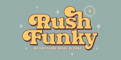 Rush Funky is a serif typeface with vintage and retro look!. Equipped with all complete characters ranging from uppercase letters, lowercase letters, numbers, punctuation marks and multi-lingual support, this font is ready to be used in any project. Uppercase & Lowercase Numbers & Punctuation Multilingual Alternate character & ornament How to access alternate / ornament ? : https://hanscostudio.com/tutorial/ Enjoy!
 - OL Hebrew Formal Script With Tagin by Dennis Ortiz-Lopez,
$30.00 This font contains every variant found in the Hebrew Bible such as the “mutilated” Waw in Numbers 25: verse 12, the small Heh in Genesis 2: verse 4 and the Nun Inversum before Numbers 10: verse 35 and after verse 36 and elsewhere as well as oversized consonants and various double-wide consonants used in inscriptions.
 - Pricing Labels JNL by Jeff Levine,
$29.00Pricing Labels JNL gives you a set of digital price gun labels in fifty-one of the most common store departments, plus an untitled title label on the lower case ‘z’ key. Additionally, numbers for creating prices are on the standard keystrokes (for dollar amounts), and smaller numbers/underscores (for cents amounts) are on the shift key groupings for the number keys. The dollar and cents sign are on the left and right brackets, the decimal point is on the period key and the words “each” and “for” [set sideways] are on the greater and lesser keys. - Graz by Mad Irishman Productions,
$12.00Graz is a decorative calligraphy font. The font includes both upper- and lowercase letters, numbers, and punctuation. - Carmay by Hoftype,
$49.00 Carmay was conceived as a charming, gently flowing member of the didonesque family. The roman weights present some hybrid characteristics, which results in an appearance of informality and adds a dash of brio. Carmay, nonetheless, remains restrained and committed to a classical ethos. All weights contain standard and optional ligatures, superior characters, proportional lining figures, tabular lining figures, proportional old style figures, lining old style figures, matching currency symbols, fraction- and scientific numerals, matching arrows.
 - Gracia Series 50 by astype,
$30.00 Gracia is a classic connected script design. OpenType features: - over 700 glyphs - central European faces - connection forms & stylistic alternates - proportional, mediaeval numerals & Roman numerals - numerators, denominators and fractions
 - Gracia Series 40 by astype,
$30.00 Gracia is a classic connected script design. OpenType features: - over 700 glyphs - central European faces - connection forms & stylistic alternates - proportional, mediaeval numerals & Roman numerals - numerators, denominators and fractions
 - Shark Snack by Comicraft,
$19.00 Dumm DUM. Dumm DUM. Duh dum duh dum duh dum DUMMMM... Just when you thought it was safe to get back in the water, this font surfaces to take one last bite out of your summer vacation skinnydip! Scream and scream again — it won’t do you any good, SHARKSNACK is rough and ready to EAT YOU ALIVE! It’s too late to close the beaches, Chief Brody, this particular set of saw tooth letters has already consumed Dracula, the Werewolf, the Frankenstein Monster and any number of 70s comic book characters foolish enough to dip a toe in its maw!
 - Snowflake by Jessica Hische,
$59.00 Snowflake is a new typeface by Jessica Hische, released in September of 2010. Inspired by cut paper snowflakes, this whimsical face is perfect for the holidays! It also resembles Mexican papel picado, so it is as at home in Summer designs as it is in wintery ones. The full typeface includes full alphabet, numbers, punctuation, accent characters as well as over a dozen snowflake ornaments which can be used to create amazing decorative borders or to just sprinkle about! You can also purchase just the snowflake ornaments separately, if it is just the ornaments you are after.
 - Bobbi Bee by Baseline Fonts,
$39.00 Bobbi Bee won't stop popping her bubblegum, even though that's not very ladylike. Bobbi Bee is very proud of all of her 361 numbers, letters and alternates - all of which are chock full of summer sunshine and life. The font comes in a single weight (because she's perfect just the way she is.) She's cut out for a very special book title, logotype, or love letter. Keep Bobbi's hand firmly in yours in shopping malls, as she tends to get distracted and wander, and though it's hard, always remember to tell her how smart she is, as well as how beautiful.
 - Laskey by Factory738,
$15.00 Laskey, a new retro serif, is now available! Laskey is a stylish font that is both retro and sophisticated. The serifs bring it back to tradition, while the smooth curves give it a 70s groovy vibe. Laskey is a perfect match for those vintage moodboards and logos. Numbers, punctuation, and multilingual letters are all included, as well as a distinct lower and uppercase. The ligature and italic fonts will come in handy for anything your imagination can think of! Laskey (Regular and Italic) Basic Latin A-Z and a-z Numerals & Punctuation Stylistic Alternates & Ligatures Multilingual Support for ä ö ü Ä Ö Ü ... Free updates and feature additions Thanks for looking, and I hope you enjoy it.
 - Toothpaste Two by Eclectotype,
$20.00 Toothpaste Two is a reworking of Toothpaste . The new font has all the features of the original Toothpaste, but is now even crazier, with the line twisting and turning over and under itself, making a tangled string of text bordering on the edge of legibility. As in Toothpaste, every letter and number connects and there are numerous contextual alternates and ligatures to keep it all running smoothly. This is a fun, decorative font. It would look good on kids' websites, scrapbooks, party invitations and the like. It works best in brighter colors on darker backgrounds, which give the characters a neon light quality. Also, try it with a stroke for a cool cartoony effect.
 - Askan by Hoftype,
$49.00 Askan is a new serif face which is suitable both for a pleasant experience in reading texts as well as for striking headlines and for subtext applications with the heavier weights. Askan shows that it was designed in 2019, generally avoiding any reference to historical models. The reduced number of formal elements results in a clear and contemporary look. The Askan family consists of 18 styles and is well equipped for advanced typography. It comes in OpenType format with extended language support. All weights contain small caps, ligatures, superior characters, proportional lining figures, tabular lining figures, proportional old style figures, lining old style figures, matching currency symbols, fraction- and scientific numerals, matching arrows and alternate characters.
 - Compote by Factory738,
$15.00 Compote is a fashionable sans serif font that is both retro and sophisticated. The sans serif font pays homage to tradition, while the smooth curves evoke a 70s groovy vibe. Compote is the ideal complement to vintage bringing it up and logos. There are numbers, punctuation, and multilingual letters, as well as a distinct lower and uppercase. The ligature and italic fonts will be useful for anything your imagination can dream up! 5 Weights (Light, Regular, Semibold, Bold and Black) 2 Styles (Regular and Italic) Basic Latin A-Z and a-z Numerals & Punctuation Stylistic Ligatures Multilingual Support for ä ö ü Ä Ö Ü ... Free updates and feature additions Thanks for looking, and I hope you enjoy it.
 - Nauman by The Northern Block,
$- A modern humanist sans serif made for the screen. Broad open letter forms are combined with precise geometry to create a functional and legible font that’s ideally suited to the web and on-screen applications. To reinforce readability and create more distinction at small point sizes serif like details have been drawn into uppercase ‘I’, ‘J’ and lowercase ‘i’ and ‘j’. Other characters of distinction include a serifed number 1 and a crossed out zero. Nauman is a highly legible font family aimed at large interface based projects. Details include over 800 characters with alternative lowercase a, e, I and M. 7 variations of numerals, true small caps with accents, manually edited kerning and Opentype features.
 - Mirtha Display by Nois,
$24.00 Mirtha Display is a modern display font with distinct Art Nouveau details. Its lighter weights are condensed and sophisticated, while the heavier weights have a more powerful effect, making it perfect for headlines, posters, branding, logos, packaging and more. With a set of over 450 glyphs, this font supports a wide range of languages. Key OpenType Features include numerators and denominators, Old Style and Lining numbers, standard ligatures and localized characters such as Uppercase and Lowercase Sharp S. Mirtha Display covers 5 weights, 10 styles and 2 Variable cuts (regular and italic) to give you more design flexibility. Any suggestion to continue improving Mirtha Display will be welcome, do not hesitate to contact us!
 - Falmera Pearson by Letterhend,
$19.00 Falmera Pearson is font a typeface which is inspired by vintage lettering sign and art. Very suitable for for headline, logotype, apparel, invitation, branding, packaging, advertising etc with old school / vintage as well as modern theme. It comes in uppercase, lowercase, punctuations, symbols & numerals, stylistic set alternate, ligatures, etc also support multilingual and already PUA encoded. Features : uppercase and lowercase numbers and punctuation multilingual alternates and ligatures PUA encoded We highly recommend using a program that supports OpenType features and Glyphs panels like many of Adobe apps and Corel Draw, so you can see and access all Glyph variations. How to access opentype feature : letterhend.com/tutorials/using-opentype-feature-in-any-software/
 - Abygaer by Sealoung,
$25.00 Abygaer - a stylish OpenType rich serif with letters that seem to dance and twist harmoniously together - to form unique & elegant typography designs. A large selection of interwoven Opentype ligatures and alternates, means ample selection and variety in your finished look. To access these OpenType features, you will need Opentype capable software such as : Word, Textedit, Photoshop, Sketch, Pages, Keynote, Numbers, iBooks Author, QuarkXPress, Indesign and Illustrator. A wide range of useful glyphs are included - see preview image of all glyphs. Abygaer is also included full set of: -uppercase and lowercase letters -multilingual symbols -numerals -punctuation -stylish alternates -ligature Wish you enjoy our font and if you have a question, don't hesitate to drop message & I'm happy to help :)
 - Paramour by Redy Studio,
$15.00 Paramour is a handwritten font that is the perfect way to add some flirty elegance to your design. Use it to create inked-style logos, wedding stationery & photographer watermarks, or to add a handwritten look to your website's typography. Paramour includes a full set of gorgeous uppercase and lowercase letters, numerals, a large range of punctuation, and 93 ligatures. This handcrafted typeface has been engineered to perfectly fit together. Paramour Features: A full set of upper & lowercase characters Numbers & punctuation 93 Gorgeous ligatures Multilingual symbols PUA Encoded Characters – Fully accessible without additional design software. Thank you for checking out Paramour! I hope you find it enjoyable, and feel free to give it a try below!
 - WriteHand by Scholtz Fonts,
$21.00 WriteHand is a light-hearted, fluid, freeform script font. It is one of Anton Scholtz's contemporary designs. Based on actual handwriting, the font contrasts a strong, artistic nature with a feminine sensitivity. WriteHand successfully combines exuberant capitals with devil-may-care swashes, and toned down lower case characters to make an extremely readable handwritten font. The font is most versatile and has a number of uses, among which are contemporary invitations, greeting cards, magazine pages, adverts, cosmetic packaging and promotions, clothing swing tags and promotions, and book covers. It has been carefully letterspaced and kerned. It contains a full character set: all upper and lower case characters, punctuation, numerals and accented characters are present.