10,000 search results
(0.02 seconds)
- Marcher by Horizon Type,
$30.00 Marcher is a modern display type family in 10 weights plus matching true italics. Designed for an impactful and stylish visual impression especially on logos and posters. Marcher has semi-humanist and semi-geometric details and extensive language support. Marcher has OpenType features like fractions, numerators, denominators, tabular numbers, stylistic alternates and 12 stylistic sets.
 - Nietos by Melvastype,
$22.00 Nietos is a geometric sans serif type family of 16 fonts. Nietos is a clean and classy font but still full of character and warmth. It has open apertures to improve the legibility at small sizes. Terminals are angled and the contrast is low. Nietos has double-storey lowercase a to enhance the legibility but there is also one-strorey lowercase a included as a Stylistic Alternate. Nietos OpenType features: Stylistic Alternates for lowercase a and uppercase I, Case Sensitive Forms, Arrows, Circled and Black Circled Figures, Proportional Old Style figures, Tabular Lining figures, Slashed Zero, Fractions, Superscript and Subscript figures.
 - Krong by Joelmaker,
$18.00 Krong is a set of font family, modern Geometric in which there are several combinations of unique style sets, so ready to help you to make your designs look elegant. Krong Each contains nine weights ranging from Thin to ExtraBold, all with companion italics. The font includes more than 819 glyphs, covering all European languages written in Latin script. Krong OpenType features: Stylistic Alternates, Sylistic Set, Standard Ligatures, Discretionary Ligatures for lowercase and uppercase, Case Sensitive Forms, Arrows, Circled and Black Circled Figures, Proportional Old Style figures, Tabular Lining figures, Slashed Zero, Fractions, Superscript and Subscript figures.
 - Strawberry Junkies by Yumna Type,
$15.00 Choosing the right display font can make your designs look more attractive and stunning, so that your designs gain more popularity. This is the Strawberry Junkies for you. It is a rather circled display font of which prone circled letters express soft, fun nuances in order that the company becomes more easily recognized by customers and audience. This font’s main characters are the consistent geometry, proportion, and line thickness on every letter to make it legible for big text sizes. In addition, Strawberry Junkies provides an extra clipart as a special bonus. Furthermore, you can enjoy the available features here. Features: Multilingual Supports PUA Encoded Numerals and Punctuations Strawberry Junkies fits best for various design projects, such as brandings, posters, banners, headings, magazine covers, quotes, printed products, merchandise, social media, etc. Find out more ways to use this font by taking a look at the font preview. Thanks for purchasing our fonts. Hopefully, you have a great time using our font. Feel free to contact us anytime for further information or when you have trouble with the font. Thanks a lot and happy designing.
 - Berolina by Solotype,
$19.95A circa 1900 type from the foundry of W. Grauneau, Berlin. A great utility face as it works well as the "plain" face with other decorative type of the same era. Reads well in paragraphs of copy. - Pickfair JNL by Jeff Levine,
$29.00Pickfair JNL is based on the vintage wood type Vandenburgh Tuscan (circa 1867), and gets its name from the mansion owned by Douglas Fairbanks and Mary Pickford—two of the founding partners of United Artists movie studios. - Evening Out JNL by Jeff Levine,
$29.00 Based on an example of [circa] 1950 Finnish embroidery lettering, Evening Out JNL is a classic Art Deco design with contrasting thick and thin lines. This elegant and stylish typeface is available in both regular and oblique versions.
 - Sonita by HansCo,
$15.00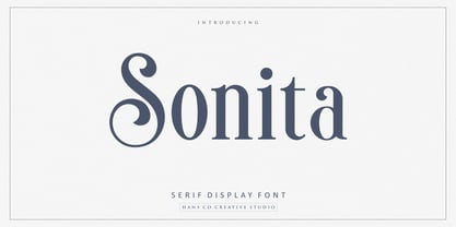 Sonita is an elegant serif display font designed with lovely circle tails to create a classy feeling. It perfectly represents a classic yet modern style. This font is perfect for elegant logo design, packaging or invitation cards. Enjoy!
 - Satisfaction Pro by E-phemera,
$20.00Satisfaction Pro is the vastly expanded and improved version of the popular font Satisfaction, inspired by cigarette ads from the 1930s. This new OpenType version has over 600 glyphs, including a full set of small caps, lining and oldstyle numbers, and numerous discretionary ligatures and contextual alternates to help create the look and feel of real handwriting. - Bandito Script by Muntab Art,
$20.00 Introducing of our new product the name Bandito fonts. Bandito includes uppercase and lowercase letters, numerals, a large range of punctuation and ligatures. All lowercase letters include ending swashes and alternative font. FEATURES : Uppercase Lowercase Number Punctuation Multilingual Swash Opentype Please contact us if you have any questions, we are happy to help you! Thank you!
 - VVE Giallo by vve.type,
$39.99 VVE Giallo brings simplicity, elegance and a certain warmth wherever a contemporary geometric typeface is needed. The balanced characteristics, clear and legible silhouette and simultaneously vivid appearance of VVE Giallo makes it perfect for any needs. VVE Giallo’s characteristic high x-height does not only give perfect legibility but also perfect matching for strong headlines, outstanding logos and also for long texts. By keeping the “o” and “a” perfect circles gives VVE Giallo the minimalist and modernist looking. VVE Giallo has six weights, thin to heavy, give it a full range of expression for branding; in print and on screen. Matching true italics, carefully slanted 10º, are perfectly designed one by one. The family totally consists of 16 styles. lt supports many OpenType features, such as tabular numerals, inferiors & superiors, numerators & denominators, fractions, discretionary ligatures, arrows and etc. It combined more than 500 glyphs.
 - Circularis by JAF 34,
$12.00 The Circularis family includes 8 styles and weights - eight uprights with eight italics. Circularis is characterized by the nice and smooth unordinary circle geometric contruction inspired at last century, nice readability, low price and finaly many variation of useful.
 - MB GEOMETRIXA by Ben Burford Fonts,
$25.00 Inspired from geometric curves and circles, an audacious lower case display face with some alternate characters in Upper and Lower case glyphs. Great for Logos and Logotypes, headlines and larger text. Works well with smaller strap lines as well.
 - Antikor by Taner Ardali,
$35.00 Antikor is "mono geometric sans" family consist of 3 styles, 55 fonts with real italics... All fonts of family contains 800+ glyphs, and equipped with many typographic features. (Styles: Mono, Text and Display) Antikor Text is designed for those who prefer to use monospaced fonts not only in coding but in many different media of graphic design. The idea came from creating a typeface with monospaced aesthetic without disturbing aspects of monospaced typefaces . Antikor text has proportional spacing and precise kerning to avoid poor rhythm and track in reading text. It also provides wide range of useful features with extended glyph sets and opentype features. Antikor Mono is geometric sans monospaced typeface with all typographic features except spacing and kerning. As other styles it has many opentype features and extended character set including SmallCaps, Stylistic Alternatives, Scientific Numbers, Fractions, Oldstyle Numbers, Case Sensitive Forms, Arrows, Circled numbers and etc... It is designed to meet all the needs of the monospaced text medias... As Antikor is a versatile family, Antikor Display is a very alternative typeface with playful calligraphic curves. It is designed with the idea of creating a contrast and eye catching touch in display use of typography. It creates tasty contrast against the serious and solid monospace look. Each style has 11 weights ranging from Hairline to ExtraBold + real italics, consist of 22 fonts.
 - Kunstler Grotesk by HiH,
$12.00 Künstler Grotesk ML is one of a number of typeface designs that attempts to reconcile Germany’s blackletter tradition with the international familiarity of roman letterforms in a simple, robust design suitable for meeting the demands of a modern industrial economy, while rejecting the extraneous ornamentation of the departing Victorian era. It is an all-cap design with a number of playful ligatures. It has an appealing boldness that reverses well. Künstler means ‘artist’ in German. I had always assumed it was a person’s name until I came across the translation. Lesson: conjecture is not fact. Grotesk refers to a sans serif letterform tradition. Kunstler Grotesk was originally released by Bauer'sche Giesserei of Frankfurt am Main circa 1900. Künstler Grotesk ML represents a major extension of the original release, with the following changes: 1. Added glyphs for the 1250 Central Europe, the 1252 Turkish and the 1257 Baltic Code Pages. Added glyphs to complete standard 1252 Western Europe Code Page. Special glyphs relocated and assigned Unicode codepoints, some in Private Use area. Total of 350 glyphs, 260 kerning pairs. 2. Added OpenType GSUB layout features: pnum, salt, dlig (19) and hist. 3. Revised vertical metrics for improved cross-platform line spacing. 4. Redesigned mathematical operators. 5. Included tabular (std) & proportional (opt) numbers. 6. Refined various glyph outlines. 7. Made CcNnOoSsZz-kreska available (salt). 8. Incorporated alternate glyphs in lower case.
 - Prinzess Gravur by RMU,
$35.00 In 1905 Berthold released an engraved blackletter font called Prinzess Kupferstichschrift. Based on an old printed remnant, I revived this beautiful open-face fraktur and enriched it with several OpenType features. As usual in my blackletter fonts, the round ‘s’ lies on the number sign key, and a traditional number sign can be accessed via the Discretionary Ligature feature and typing 'N-r-period'. In this font you have also the possibility to turn I, V, X, L, C, D, and M into Roman numerals by activating the Stylistic Alternates feature. And last but not least, various useful ligatures polish up this font.
 - Spitting Image by preussTYPE,
$25.00 SpittingImage is a font which speaks of mechanical exactness, cool and reserved. The SpittingImage font family is formed by two different weights (regular and bold), each one with uppercase and lowercase letters, numbers, punctuation marks and diacritic characters in regular and italic. The outline version included as a part of OpenType-Feature. There are in all styles numerous ligatures, alternate characters, small caps, and different sets of numbers that you can put both headlines and short texts without any problems. OpenType features: contains over 1.000 Glyhps Central European Glyhps Standard Ligatures Small Capitals Stylistic Alternates Discretionary Ligatures OldStyle Figures Ordinals Slashed Zero Feature
 - Oman by Par Défaut,
$35.00 With five weights and four contrasts, all grouped in three version : sans-serif, slab, serif and all this doubled by a true italic, Oman regroup 120 different styles declined in four variables. Perfect from headlines to text, Oman will meet your needs with a many languages to support (Latin pro, Cyrillic), 14 OpenType features (Fraction, Numerator, Denominator, Tabular figure, Oldstyle figure, Small capital, Small capital from capital, Ordinal, Stylistic set, Case sensitive, Discretionary ligature, Contextual alternate and All access alternate). • Numerator and Denominator includes numerals and currency • Tabular Figure includes : numerals, currency, OldStyle numerals, small capital numerals, small capital currency. • Small Capital features includes the Latin & Cyrillic alphabet with the accents. • Ordinal feature includes the Latin & Cyrillic alphabet. • Two Stylistic set for “a” & “g” includes accents. • Discretionary Ligature includes “AE”, “AÉ”, “IJ”,“OE”, available in lowercase, small capital and ordinal. • Contextual Alternate includes ligatures for arrows : <-->^|v|<->v^|. Add n, d or +, for numerator, denominator or case arrows. All Case sensitive characters become after the uppercase and number.
 - Europa Text by Solotype,
$19.95This circa 1910 European face was introduced into the United States by a German type foundry traveling salesman during the great depression of the 1930s. We have used it quite successfuly in sizes as small as 10 and 12 point. - P22 Royalist by IHOF,
$39.95 Royalist Pro is an expanded OpenType font based on "Secretary Hand" from the time of the English Civil War, circa 1632. This Pro version includes over 500 glyphs with alternate characters, ligatures and full Western and Central European Characters sets.
 - LTC Keystone Ornaments by Lanston Type Co.,
$24.95 LTC Keystone Ornaments is a set of over 100 glyphs based on "running border" ornaments from Keystone Type Foundry of Philadelphia, circa 1903. These geometric dingbats can be used individually for decorative emphasis, or combined in repetitive lines or complex patterns.
 - Circularis Alt by JAF 34,
$12.00 The Circularis Alt family includes 8 styles and weights - eight uprights with eight italics. Circularis Alt is characterized by the nice and smooth unordinary circle geometric contruction inspired at last century, nice readability, low price and finaly many variation of useful.
 - Herbie by The Infamous Foundry,
$49.00 Herbie is a uppercase display font with alternates on every character (upper/lowercase), based only on circles and geometric lines. Herbie is inspired by, as the name might indicate, Herb Lubalin’s work and the decorative style and kerning of his era.
 - P22 Elizabethan by IHOF,
$24.95 Elizabethan is part of the fonts designed by Ted Staunton for his historic novel centered around a family bible and the handwritten annotation through seven generations. The Elizabethan font is based on a style known as “secretary hand” circa 1610.
 - Polyspring by PintassilgoPrints,
$29.00 Polyspring is a handcrafted serif display font, with a cool flowery flair. It was hand-drawn based on Italia Condensed typeface from Keystone Foundry from circa 1906. Loaded with stylish ornaments and flourishing alternates for all its letters and numbers, this font is a terrific toolbox for display purposes. Yet, it has the superpower of changing the first and last letters in words to its germinated alternates at the click of a button, thanks to the smart OpenType programming. Please note that this feature will only work in OpenType savvy applications. Check it performing live on the sample text below: just click on the Advanced Typography option, located next to the sample colors options (look for an icon showing “ff”), and check the option “swash”. Very cool, isn't it? Happy blooming!
 - RF Tone by Russian Fonts,
$29.00 Tone was inspired by classic geometric sans-serif fonts but has a distinct modern day spirit. Contains 16 styles from ultralight to black: 8 regulars and 8 italics. Have a multilingual support and big amount of OpenType features. This typeface is comfortable to read in small sizes. Great for big pieces of text or as the main typeface in website design. Logotypes and branding, packaging, posters, editorial design, music covers, navigation systems, videos — these are just a few areas in which Tone can help you. Opentype features: old-style figures, tabular and tabular old-style, tabular currency symbols, ligatures, stylistic alternates, fractions and automatic frations, circled numbers, arrows and stylistic alternates for arrows, superscript and subscript, case sensitive forms. Multilingual support: Latin, latin extended, cyrillic and cyrillic extended (more than 70+ languages).
 - Use Your Words by Joanne Marie,
$10.00 Here’s a different kind of font for the hand lettered look! Use Your Words is a catchwords font family consisting of 3 fonts: 1.) Use Your Words Circles 2.) Use Your Words Arrows 3.) Use Your Words Banners It’s all hand drawn and hand lettered in a monoline script font with a shadow effect to boot. This font will be perfect to include on designs such as mugs, t-shirts, bags, notebooks, inspirational quotes for the home and office, and more. There are 215 words (no more than 4 letters per word) in both upper and lowercase, plus numbers, ampersand, question and exclamation marks in all three styles. There are 444 glyphs per font. I love using this font in my hand lettering designs and I hope you will too!
 - Geographica Hand by Three Islands Press,
$39.00 Geographica Hand replicates the neat hand-lettering typical of engraved British maps of the 18th century, including the work of cartographers Emanuel Bowen (circa 1694–1767), Geographer to King George II, and Thomas Jefferys (circa 1719–1771) Geographica ro King George III. A kindred font to our Geographica serif family, Geographica Hand exhibits long serifs, irregular edges, and a genuinely hand-made character. Use to simulate historical materials, vintage documents, or other time-worn text. The OpenType release of Geographica Hand comes with true small capitals, contextual and historical ligatures, a series of sketchy map ornaments (e.g., trees, churches, windmills, boats), and full Latin support.
 - Bouncer by Ingrimayne Type,
$6.95 The letters in Bouncer are round because they all begin as a ball and then have parts of the ball cut away. Bouncer was one of the earliest typefaces from Ingrimayne Type. Lower-case letters are smaller versions of the upper-case letters. BouncerTwo, designed twenty years after the original Bouncer, continues playing with the idea of making letters by cutting out parts of a circle, but in this case the circles are interlocking. All letters are upper-case but some of those on the lower-case keys differ from those on the upper-case keys. BouncerTwo is eye-catching but not highly legible.
 - Balance by Victory Type,
$12.00The three typefaces that make up the Balance font set are legible, funky and stylish. Every character has been spaced and designed on a uniform geometric grid to insure true typographic "balance." There are only two shapes that make up every character: a parallelogram and a quarter circle. This design renders Balance a distinct family of fonts which are appropriate for all documents. Balance Regular is legible, funky and stylish. Every character has been spaced and designed on a uniform geometric grid to insure true typographic "balance." There are only two shapes that make up every character: a parallelogram and a quarter circle. This design renders Balance Regular a distinct font that is appropriate for all documents. Balance Light is legible, funky and stylish. Every character has been spaced and designed on a uniform geometric grid to insure true typographic "balance." There are only two shapes that make up every character: a parallelogram and a quarter circle. This design renders Balance Light a distinct font that is appropriate for all documents. Balance Unicase is legible, funky and stylish. Every character has been spaced and designed on a uniform geometric grid to insure true typographic "balance." Each letter, in this unicase version of Balance uses a single character height. There are only two shapes that make up every character: a parallelogram and a quarter circle. This design renders Balance Unicase a distinct font that is appropriate for all documents. - Modesto by Parkinson,
$25.00 Modesto is a loose-knit family based on a signpainters lettering style popular in the late-19th and early-20th centuries. It evolved from the lettering I used for the Ringling Bros. and Barnum & Bailey Circus Logo. The Modesto family was not planned. It just happened, a few fonts at a time over about fifteen years. In 2014 four new Italic fonts were added. There is a downloadable MODESTO USER MANUAL PDF in the Gallery section for this family.
 - Cowboy Burt by Cool Fonts,
$25.00 Cowboy Burt was once a cowboy, but now he's a carnie at who runs the tilt-a -whirl. This hand drawn font was designed for use in a skate-punk layout, but will be quite at home in the old west, the circus, or underground cartoons. There are two versions Regular, and Extrude which work together or apart. There are even some goofy dingbats scatter throughout. You'll have hours of fun with Cowboy Burt...Where's my waitress?
 - Helsa Display by ParaType,
$39.00 Helsa is a slim and eccentric serif for headings and short texts. It’s a modern interpretation of the narrow Elseviers of the early 20th century. The letterforms are based on Dutch samples, and in the details there are references to both American type catalogs and letters from the foundries of Wolf and Herbeck. Due to the compact proportions of characters and the high contrast of strokes, Helsa doesn’t take up much space in the line and allows you to increase the type size freely, drawing the viewer's attention to the text. The typeface is suitable for branding museums and exhibitions, alternative music bands, independent clothing and perfume brands, and for any topic related to design or history. Helsa’s character set has more than 1600 characters. It supports hundreds of languages, including extended Cyrillic, Greek, and Vietnamese, as well as many OpenType features: fractions, ligatures, old style and tabular numerals, titular letter alternates, and more. There are variants of dashes and other punctuation marks specifically for uppercase typing. In addition to letters, the typeface contains arrows, numbers in circles (in fact, in ovals), symbols of various types of plastic, card suits and much more. Helsa typeface was made at Paratype in 2020-2022.
 - Komunikat FA by Fontarte,
$39.00 FA Komunikat is an experimental and geometrical typeface based on simple elements: a circle, it's parts and straight lines. The typeface communicate the spirit of future, dynamism and modernity. FA Komunikat design was based on the sketch of unique lettering from 1932 made by Władysław Strzemiński, Polish vanguard abstract painter, an artist and a typographer. Strzemiński claimed that modern economic letter forms should be standardized and based on lines and arches. He wrote that readability is a matter of habit and after a practice the new letter forms would be very well readable for everyone. In 2004 Artur Frankowski revived original design creating set of characters, widen up with numerals, punctuation marks and diactrics.
 - Cast Iron - Unknown license

- Chamber Of Commerce JNL by Jeff Levine,
$29.00Chamber of Commerce JNL is loosely based on a type style used for some rubber stamp letters and numbers from a vintage child's printing set. Originally a cast shadow design, Jeff Levine felt the lettering merited a direct treatment in both regular and oblique styles without the shadow effect. - Actium by Type Mafia,
$45.00 Actium is a contemporary multilingual sans serif typeface developed to help perfect typography automatically. Type Mafia has focussed on words with odd combinations of capital letters and numbers, such as product names and postal codes such as WD40 and H1N5, jump out of the text. They sit awkwardly together as the numerals have been designed to work with the lowercase, not the uppercase letters – affecting readability.To fix this Type Mafia invented Smart Capo™. Smart Capo™ Smart Capo is a feature that automatically activates once you type an uppercase letter together with a number. When a capital letter is sat next to a numeral, Smart Capo converts the letter to a mid-cap — a contemporary alternative to small caps — and the default old-style numeral to a lining numeral. Actium’s mid-caps and lining numerals have been designed with the same height (between cap and x-height) so they sit comfortably next to each other and fit more harmoniously into text. Smart Capo applies equal attention to capitalised words without any numbers, such as NAVO and USA, and are also automatically set into mid-capitals. Working on its own, Smart Capo saves time and money for the typographer — taking the pain out of text formatting — and makes it a more pleasurable experience for the reader. This feature is made possible by the use of ‘contextual alternates’, an OpenType feature used in modern font software, working with a set of characters specially designed at mid-cap height. By default these changes automatically take place so it doesn't need to be switched on, it will just work. Actium Actium’s design has an unusual diagonal contrast — much more common in a serifed face than in a sans serif — giving it more bite. The typeface looks elegant when set in large sizes and remains very legible when shown in small sizes. The family consists of six weights in two styles, making a dozen fonts. Weights range from light to black in roman and true italic. All fonts are fully loaded with functional elements. Actium boasts an extended Latin character set and with Greek. This means a wide range of Western languages are supported: perfect for use in bilingual publications and packaging. For numerals, each font includes old-style and lining figures in both proportional and tabular widths, with superiors and inferiors. These allow you to select the right set of numbers for the right task.
 - a picture alphabet - Unknown license

- Publication JNL by Jeff Levine,
$29.00If Publication JNL looks very familiar, this is no accident of design. It is Jeff Levine’s rendering of De Vinne, a classic typeface designed in honor of T.L. De Vinne (circa 1890-91) and given the gentle nuance of emulating hand-set type. - Flower Shop JNL by Jeff Levine,
$29.00 A piece of sheet music for “Broken Blossoms” circa the 1920s or early 1930s has its cover title hand lettered in a wide thick-and-thin Art Deco design. This is now available as Flower Shop JNL, in both regular and oblique versions.

