10,000 search results
(0.039 seconds)
- Peach Daisy (Duplicate) by Nathatype,
$29.00 Ready to make your branding spark? If you need to create a big, bold logo for your business, work on a poster for an event, or whatever your project may be-then this is the perfect font for you. Peach Daisy-A Sans Serif Font Peach Daisy is a new modern sans serif font. This font was carefully crafted and inspired by luxury fashion in the world. It creates a luxurious, rich, exclusive and elegant look in design. It’s thin brush strokes and imperfect baseline give it a fun and stylish. So beautiful on invitation like greeting cards, branding materials, business cards, quotes, posters, lettering and more. Features: Ligatures Alternates Swashes PUA Encoded Numerals and Punctuation Thank you for downloading premium fonts from Natha Studio
 - Peach Daisy by Nathatype,
$29.00Ready to make your branding spark? If you need to create a big, bold logo for your business, work on a poster for an event, or whatever your project may be-then this is the perfect font for you. Peach Daisy-A Sans Serif Font Peach Daisy is a new modern sans serif font. This font was carefully crafted and inspired by luxury fashion in the world. It creates a luxurious, rich, exclusive and elegant look in design. It’s thin brush strokes and imperfect baseline give it a fun and stylish. So beautiful on invitation like greeting cards, branding materials, business cards, quotes, posters, lettering and more. Features: Ligatures Alternates Swashes PUA Encoded Numerals and Punctuation Thank you for downloading premium fonts from Natha Studio - Moresign by Invasi Studio,
$19.00 Inspired by Urban Lifestyle, Moresign Font is bold, readable, and tailored to your street art designs. With alternate glyphs and multilingual Latin accents, Moresign Font adds dynamically to titles, logos, packaging, branding, and magazines. It adds impact to words above the background with precision: Moresign Font – the perfect font for making a statement.
 - Waialua by insigne,
$24.99 Aloha to Waialua! Put on your lei and grab a drink umbrella as you kick back and start designing with this island beauty of a font. Soak in the unprecedented potential of this new font. Waialua is one of insigne’s first variable fonts. Avoid the font limbo with a set number of options from Thin to Black. Go with the flow and see where you feel the innumerable amount of weights taking you as you slide your design options along a spectrum of stunning possibilities. There's more, too. Waialua’s auto-replacing terminators allow you never to need connectors at the end of your words. Or if you want, you can dial up your design with optional swash endings. So set your course for the islands and get ready for a fun time with the tropical beauty of Waialua. This is one font vacation your work--and your reader--will never want to end. Production assistance from Lucas Azevedo.
 - Sweet Boho by Sulthan Studio,
$12.00 Sweet boho is this amazing typeface handmade script font we created in freestyle for those of you who do work and crafts. It's perfect for any type of work you're working various purposes such as logos, wedding invitations, headings, t-shirts, letterheads, signage, labels, news, posters, badges etc.
 - Ring by Ochakov,
$9.00 First of all, Ring font has a little story. It was created as an example for Typography Exhibition in Moscow. And the font was immediately awarded! 10 years later, I decided to continue working on it and improve this font. Ring - really circular typeface. I felt inspired by Bauhaus. I've always wanted to design something similar. Ring is a cool and geometric-styled font. Expertly designed to make your creation look out of this world, this font will look gorgeous on a variety of ideas. This font is ideal for writing web designs, business cards, or pretty much anything else that requires a unique touch. Ring font comes in 8 weights and 16 styles and this is just the beginning. The beginning of a further big font family called Ring!
 - Amanet by Tour De Force,
$25.00 Amanet is original old fashion typeface that comes as Regular weight followed with stylistic compatibile Borders. It's pretty readable in small sizes which recommends it for use on packages, labels or specific corporate identities. "Amanet" is an archaic Serbian word for English word "legacy".
 - Concreto Mono by iframe,
$16.00 Concreto Mono is a monospaced san serif, built in regular style. The word concrete comes from the Latin word "concretus" meaning compact. Concreto Mono is released in OpenType format with support for most languages. Features: _ Multilanguage Support _ Letters Uppercase + Lowercase _ Glyphs _ Numbers design by iframe
 - CA Moskow has a plan by Cape Arcona Type Foundry,
$20.00 Inspired by an old Russian book about Moscow’s plan to take over the world, this font was designed to give digital prints the taste of hand lettering. It’s vivid outlines and slight differences in boldness between characters give it an accurate and realistic imperfect letterpress look. It works amazingly well as a text font in small sizes and shows it’s crippled outlines only at larger sizes. »CA Moskow has a plan« has got an extensive character-set including Russian Cyrillic, the Russian Rubel and the Turkish Lira sign. Although it includes kerning, for a full simulation of letterpress print and cold-war feeling we recommend to turn it off.
 - Askey by Craft Supply Co,
$20.00 Askey - The Funky Serif Font is a bold and expressive typeface that channels the spirit of funk and creativity. With its unique and unconventional serifs, Askey exudes a sense of artistic flair and individuality. This font is perfect for projects that seek to make a statement and stand out from the crowd. Whether you're working on posters, album covers, or any design that demands a touch of funkiness, Askey adds a distinctive and charismatic charm. Askey is like a burst of creativity in the world of typography, making it an ideal choice for projects that want to embrace a bold and unconventional style, exuding confidence and originality.
 - Bum Steer JNL by Jeff Levine,
$29.00 In older American slang, a "bum steer" is a bad tip, some bad advice or being sent in the wrong direction (to name a few examples). Bum Steer JNL was modeled from some playful hand lettering found on a piece of early 20th Century sheet music entitled "When Uncle Joe Plays a Rag on His Old Banjo". It's very possible that "Hobo" (a popular type design of the time) was a strong influence on the sheet music's style of title lettering. It seems that songwriters in those bygone days were prone to cramming as many words from a line of their song into the title itself. Another such example of a wordy song title which coincidently is in keeping with the theme of a "bum steer" (pun intended) is a novelty number from 1915: "Cows May Come and Cows May Go but the Bull Goes on Forever" (words by Vincent Bryan, music by Harry Von Tilzer). [It's kind of self-descriptive, don't you think?]
 - Kage Pro by Balibilly Design,
$25.00 Greetings: We are introducing an advanced version of the Kage font released and received great exposure from users and worldwide font enthusiasts. The massive development puts forward experimentation on the alternate letters. We redesign each shape to make it more functional and comfortable when text size escalation occurs. In addition to rejuvenating the letterform, we also apply an oblique style to provide diverse style choices. Learn more about Kage Pro here: Graphics presentation | Type Specimen | The Inspiration: The radical exploration world of fashion inspires us. It leads our minds to the Neo-classical type style created during the age of enlightenment in the 18th century. It has a reasonably extreme contrast from the previous serif style, making the impression that it is emitted more expensive and classy. Organically, this Neo-Classical typeface is closely related to the fashion world, especially in Europe, and even spread across the globe. Fashion and this typeface reflect each other. After, we boldly observed Japanese fashion designer Rei Kawakubo. Famous for radical & deconstructive fashion, which makes the world of fashion more flexible and dynamic. The Design: As well as the typeface that we made, we started it with a cultural foundation of the Didone typeface. We tried to deconstruct the appearance. The decoration that better reflected the dynamic of fashion implemented in the fashionable alternate and calligraphical stylistic set ended with ball terminals. The versatile impression created is like taking off a scarf on the model's hair during a fashion show. The deconstructive image is combined with a legibility structure like the appearance of the Neo-Classical style. Kage Pro is designed to visualize a costly and exclusive image of a thing, product, world clothing brand, famous fashion magazine, etc. The modern transitions of each letterform are softer, so when repositioning and escalating the size of this font, it will remain beautiful without injuring other elements. So, Kage Pro is a bold choice on headlines and more prominent media with a portion of 50% even more. The Feature: Kage Pro has 11 upright and 11 oblique styles from thin to black; all family-style consist of one variable font with 2 axes. The total number of glyphs is 1,665 in each style. She comes with tons of swirly ligatures and stylistic alternates in Advance OpenType features, including: Case-sensitive forms, small caps, standard and discretionary ligatures, stylistic alternates, ordinals, fractions, numerator, denominator, superscript, subscript, circled number, slashed zero, old-style figure, tabular and lining figure. Support multi-language including Western European, Central European, Southeastern European, South American, Oceanian, Vietnamese.
 - Sportune by Raditya Type,
$11.00 Sportune is made to support the work of designers who are used to making works with a sporty style. This font is great for various design styles, modern or old school.
 - Sonata Allegro by Tamar Fonts,
$35.00 “The Emperor Has Clothes” Like in music — the Allegro Sonata form consists of three main sections—the Exposition (section), the Development, and the Recapitulation — so in regard to this Allegro Sonata font family — there is an Exposition (font), a Development, and a Recapitulation—in which each theme is restated alongside its development material. While the Recapitulation font is perfect for titling and branding, the Exposition is perfect for branding {as demonstrated in the Inspiration Gallery pertaining this font} as well as being a comfortable read in long runs of text. The Exposition rounded, mono-line, with great x height, contemporary—A Synthesis Between Geometric & Hand-drawn—font, is at times geometric and at times hand drawn; in the end it all came down to finding the balance in a typeface between the robustness needed to function as a text face and enough refinement to look good as a display font. Following the Exposition, comes the Development (section), decorative, botanic-like, exuberant and playful font, signifying ABUNDANCE [of possibilities] & BENEVOLENCE—in regard to each theme/character, and to demonstrate—that 'structures' in music, are solid structures—like architecture {contrary to the words of J. W. von Goethe, who said: “Music is liquid architecture; Architecture is frozen music”}, just in some spiritual domain that is far beyond one's physical senses to grasp. Like in my art and music works in which I consider its 'Texture' element of vital importance, so is the case when it comes to type, as apparent in my previous Phone Pro/Polyphony font, as well as in this current Sonata Allegro/Development font. Each glyph has its own uniqueness, and when meeting with others, will provide dynamic and pleasing proximity. And due to the [individualistic] nature of this Development font, just a minimal amount of kerning/pairing were necessary... The development font is an extravagant design that looks best when used at large sizes—perfect for titling, logo, product packaging, branding project, wedding, or just used to express words against some [light or dark] background. Finally, “The (Exposition Font) Emperor Has (the Development Font) Clothes!” As said, there are three fonts/styles altogether in this Sonata Allegro type family, designed with the intention of harmonizing between Latin and Hebrew, which makes it an ideal font for the side-by-side use of Latin and Hebrew characters. However, they are being sold separately (kindly search for “Sonata Allegro Hebrew” on this MyFonts site), so they are economical for those interested just in either one of them. My aim is to shake up the type-design world with a range of distinctive fonts which break away from the generic letterforms, to make your design projects stand out—as a graphic designer, add this font to your most creative ideas for projects. This typeface has [lots of ligatures /] OpenType features, to enhance your designs even more — happy designing! Sonata Allegro Features: · 3 Weights/Styles · Multilingual Support · Proportional Figures & Ligatures While using this product, if you encounter any problem or spot something we may have missed, please don't hesitate to write to us; we would love to hear your feedback—in order to further fine-tune our products. Copyright Tamar Fonts/Hillel Glueck 2022 ALL RIGHTS RESERVED Any unauthorized distribution of my work is strictly prohibited, and will be prosecuted; do the right thing, and do not participate in the piracy of my typefaces; if you appreciate my work, then please pay for it and help me prosper — thank you!
 - Sonata Allegro Hebrew by Tamar Fonts,
$35.00 “The Emperor Has Clothes” Like in music — the Allegro Sonata form consists of three main sections—the Exposition (section), the Development, and the Recapitulation — so in regard to this Allegro Sonata font family — there is an Exposition (font), a Development, and a Recapitulation—in which each theme is restated alongside its development material. While the Recapitulation font is perfect for titling and branding, the Exposition is perfect for branding {as demonstrated in the Inspiration Gallery pertaining this font} as well as being a comfortable read in long runs of text. The Exposition rounded, mono-line, with great x height, contemporary—A Synthesis Between Geometric & Hand-drawn—font, is at times geometric and at times hand drawn; in the end it all came down to finding the balance in a typeface between the robustness needed to function as a text face and enough refinement to look good as a display font. Following the Exposition, comes the Development (section), decorative, botanic-like, exuberant and playful font, signifying ABUNDANCE [of possibilities] & BENEVOLENCE—in regard to each theme/character, and to demonstrate—that 'structures' in music, are solid structures—like architecture {contrary to the words of J. W. von Goethe, who said: “Music is liquid architecture; Architecture is frozen music”}, just in some spiritual domain that is far beyond one's physical senses to grasp. Like in my art and music works in which I consider its 'Texture' element of vital importance, so is the case when it comes to type, as apparent in my previous Phone Pro/Polyphony font, as well as in this current Sonata Allegro/Development font. Each glyph has its own uniqueness, and when meeting with others, will provide dynamic and pleasing proximity. And due to the [individualistic] nature of this Development font, just a minimal amount of kerning/pairing were necessary... The development font is an extravagant design that looks best when used at large sizes—perfect for titling, logo, product packaging, branding project, wedding, or just used to express words against some [light or dark] background. Finally, “The (Exposition Font) Emperor Has (the Development Font) Clothes!” As said, there are three fonts/styles altogether in this Sonata Allegro type family, designed with the intention of harmonizing between Latin and Hebrew, which makes it an ideal font for the side-by-side use of Latin and Hebrew characters. However, they are being sold separately (kindly search for “Sonata Allegro Hebrew” on this MyFonts site), so they are economical for those interested just in either one of them. My aim is to shake up the type-design world with a range of distinctive fonts which break away from the generic letterforms, to make your design projects stand out—as a graphic designer, add this font to your most creative ideas for projects. This typeface has [lots of ligatures /] OpenType features, to enhance your designs even more — happy designing! Sonata Allegro Features: · 3 Weights/Styles · Multilingual Support · Proportional Figures & Ligatures While using this product, if you encounter any problem or spot something we may have missed, please don't hesitate to write to us; we would love to hear your feedback—in order to further fine-tune our products. Copyright Tamar Fonts/Hillel Glueck 2022 ALL RIGHTS RESERVED Any unauthorized distribution of my work is strictly prohibited, and will be prosecuted; do the right thing, and do not participate in the piracy of my typefaces; if you appreciate my work, then please pay for it and help me prosper — thank you!
 - The British Telegraph by Vintage Voyage Design Supply,
$14.00 The British Telegraph font family was inspired by classic headers of Britain newspapers from the middle of XX century. Classic look with three width – Light, Regular and Bold. Great for headers, signs or logos. Also, working well for text blocks. - The British Telegraph Light: Use it for text blocks, or for gently light header typographic. Try to make more wide tracking with capitals, it looks good. - The British Telegraph Regular: Great for simple message, quotes, subheaders (If the header is Bold) or advert slogans. - The British Telegraph Bold: Is a killing title buddy. Massive, strong, bold and in the same time – very gentle. Perfectly for main words, headers, signs or logo's. The British Telegraph has full glyph set with standard and discretionary ligatures (Open Type Features).
 - Fabelo Kids by IbraCreative,
$37.00 Fabelo Kids is a delightful and playful children's typeface that sparks imagination and brings joy to any design. With its whimsical letterforms and charming details, Fabelo Kids captures the essence of childhood wonder and innocence. Each letter has a friendly and inviting nature, inviting young readers on a journey of discovery. Whether used in children's books, educational materials, or playful designs, Fabelo Kids adds a touch of magic and excitement to the visual experience. Its vibrant colors and energetic shapes make it a perfect choice for capturing the attention and imagination of young minds, creating a world where learning becomes an adventure. Fabelo Kids is a font that celebrates the joy and creativity of childhood, inspiring young readers to embrace the beauty of words and storytelling.
 - 1431 Humane Niccoli by GLC,
$38.00 Niccolo Niccoli (1364-1437) was a wealthy bibliophile and an acclaimed scribe, in Florence (Italy). He was one of the most important Italian calligrapher in this early time of rediscovering Roman script. Of rare accomplishment was his adaptation of the so called Italian humanistic minuscule script. We were inspired from his late work to create this present Font. We have added a lot of accented and other characters (U/V, I/J...) who was not existing in the original and replacing "long s" by a small "s" for a modern use. The OTF encoding was used for intelligent alternates, permitting to use different forms of the same lower case or capital in a single word, reproducing easily the charming variety of a real manual scripture.
 - Lando by Illunatic,
$13.99 Introducing Lando - a handmade uppercase type family with a natural character. Lando comes in two styles with two weights each. Its characters have been drawn by hand to give them a warm and authentic look. Lando's appearance is enhanced by two contextual alternates for each Latin character and all numbers. In addition, all fonts contain several open type functions such as swashes and initials, a selection of ligatures and support of open type fractions. It is rounded up by many handy extras, such as shapes and icons, catch words, bullets and much more. Lando is intended to work best in logos, posters, magazine headlines and on packaging and apparel. But it also feels comfortable with short texts, due to its support of many latin languages.
 - Ink Brush Arabic by NamelaType,
$29.00 This is the sibling font of Ink Brush, with the addition of Arabic glyphs; Arabic, Persian, Urdu, Kurdish, and Jawi (Pegon). The Ink Brush Font is a captivating addition to the world of typography. This versatile typeface offers two distinctive versions, adding a dynamic element to your creative projects. The textured version brings a sense of artistic spontaneity with its handmade appearance, while the solid version delivers clarity and precision. Whether you’re aiming for a rustic, handcrafted feel or a sleek, professional look, the Ink Brush Font has you covered. It’s perfect for a wide array of design applications, from branding and packaging to invitations and artistic endeavors, infusing your work with character and style
 - Lucid Fantasy by Hipfonts,
$17.00 Lucid Fantasy is an elegant and sophisticated script font that will transport your designs to a dreamlike world. With its flowing, fluid strokes and graceful curves, this font captures the beauty of calligraphy and handwriting in a digital format. Its unique style and attention to detail make it perfect for wedding invitations, greeting cards, and other high-end design projects. Lucid Fantasy's intricate and delicate design will add a touch of luxury and refinement to any project. Whether you're a designer, artist, or creative professional, Lucid Fantasy is the perfect font to elevate your work to new heights. Experience the magic of Lucid Fantasy today and create designs that are truly unforgettable.
 - P22 Posada by P22 Type Foundry,
$24.95 Mexican printmaker Jose Guadalupe Posada (1851-1913) created a massive variety of material—broadsheets, cards, advertisements, posters, etc.—which largely represented a defense of the common man and a manifestation of the horrible and gruesome events of the day. Posada often cut his own lettering that looked like more decorative versions of Gothic wood types. His most notable imagery comes from his Calaveras celebrating the Day of the Dead. Calaveras often represent effigies of living people depicted as skeletons going about their daily activities. These are often humorous and playful in a way that helps bridge this world with the beyond. This font family contains two small caps style fonts and one Extras font containing 60 images.
 - Mariogalo by Balpirick,
$15.00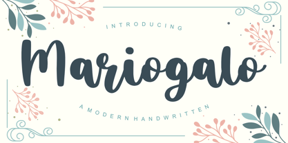 Proudly Present, Mariogalo Font. Mariogalo is a Modern Handwritten font. Mariogalo is perfect for product packaging, branding project, megazine, social media, wedding, or just used to express words above the background. Mariogalo also multilingual support. Enjoy the font, feel free to comment or feedback, send me PM or email. Thank you!
 - Bloomilife by Timurtype,
$14.00 Introducing by Timur type Proudly Present, Bloomilife Bloomilife A Handwritten Script Font Bloomilife is perfect for product packaging, branding project, megazine, social media, wedding, or just used to express words above the background. Bloomilife also multilingual support. Embelish your designs with our original fonts. Enjoy the font 😉 Thank you!
 - Whiteland by Balpirick,
$15.00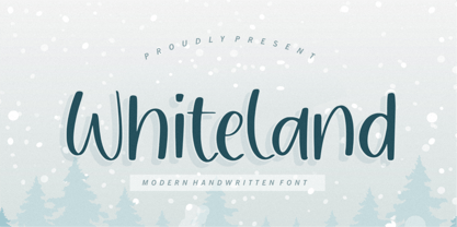 Proudly Present, Whiteland Font. Whiteland is a Modern Handwritten Font. Whiteland is perfect for product packaging, branding project, megazine, social media, wedding, or just used to express words above the background. Whiteland also multilingual support. Enjoy the font, feel free to comment or feedback, send me PM or email. Thank you!
 - HWT Roman Extended Fatface by Hamilton Wood Type Collection,
$24.95 The design of the first "Fat Face" is credited to Robert Thorne just after 1800 in England. It is considered to be the first type style designed specifically for display or jobbing, rather than for book work. The first instance of Fat Face in wood type is found in the first wood type specimen book ever produced: Darius Wells, Letter Cutter 1828. This style was produced by all early wood type manufacturers. The style is derived from the high contrast, thick and thin Modern style of Bodoni and Didot developed only decades previously. The extended variation makes the face even more of a display type and not at all suitable for text. This type of display type was used to compete with the new Lithographic process which allowed for the development of the poster as an artform unto itself. This new digitization by Jim Lyles most closely follows the Wm Page cut. The crisp outlines hold up at the largest point sizes you can imagine. This font contains a full CE character set.
 - Brush Hand Marker by TypoGraphicDesign,
$19.00 The typeface Brush Hand Marker is designed from 2020 for the font foundry Typo Graphic Design by Manuel Viergutz. The rough sans-serif display typeface with 4 font styles (Italic, Invert, Shadow, 3d) is inspired by handwriting. 348 glyphs incl. 100+ decorative extras like icons, arrows, dingbats, emojis, symbols, geometric shapes, catchwords, decorative ligatures (type the word #LOVE for ❤ or #SMILE for ☺ as OpenType-Feature dlig) and stylistic alternates (2 stylistic sets). For use in logos, magazines, posters, advertisement plus as webfont for decorative headlines. The font works best for display size. Have fun with this font & use the DEMO-Font (with reduced glyph-set) for FREE! Font Specifications ■ Font Name: Brush Hand Marker ■ Font Weights: Italic, Invert, Shadow, 3d + DEMO (with reduced glyph-set) ■ Font Category: Display for headline size ■ Font Format:.otf (Mac + Win, for Print) + .woff (for Web) ■ Glyph Set: 348 glyphs ■ Specials: Alternative letters, stylistic sets, automatic contextual alternates via OpenType Feature. Dingbats & Symbols, arrows, hearts, emojis/smileys, stars, further numbers, lines & geometric shapes ■ Design Date: 2020 ■ Type Designer: Manuel Viergutz
 - Klein Rough Gemein by TypoGraphicDesign,
$19.00 The typeface Klein Rough & Gemein(e) is designed from 2020 for the font foundry Typo Graphic Design by Inga Luft and Manuel Viergutz. The display font based on original old german rubber stamps and is inspired in the past and present. 4 font-styles (Rough, Rougher, Roughest, Rough Mix) + 1 icon-style with 432 glyphs (Adobe Latin 2) incl. 100+ decorative extras like icons, arrows, dingbats, emojis, symbols, geometric shapes, catchwords, decorative ligatures (type the word #LOVE for ❤ or #SMILE for ☺ as OpenType-Feature dlig) and stylistic alternates (7 stylistic sets). For use in logos, magazines, posters, advertisement plus as webfont for decorative headlines. The font works best for display size. Have fun with this font & use the DEMO-FONT (with reduced glyph-set) FOR FREE! ■ Font Name: Klein Rough & Gemein(e) ■ Font Weights: 4 + 1 (Icons) + DEMO (with reduced glyph-set) ■ Font Category: Display for headline size ■ Font Format:.otf (Mac + Win, for Print) + .woff (for Web) ■ Glyph Set: 432 glyphs (Adobe Latin 2) incl. 100+ decorative extras like dingbats ■ Design Date: 2020 ■ Type Designer: Manuel Viergutz und Inga Luft
 - LiebeDoris by LiebeFonts,
$29.00 Inspired by a workshop with iconic American sign painter Mike Meyer, Ulrike of LiebeFonts set out to create a versatile, lovely typeface for sign painting that looks not at all like a font but rather like the letters on a unique, hand-painted storefront sign. LiebeDoris combines the best of two worlds: the beauty of all-American sign painting and the meticulous craft of German engineering. Each and every letter in each of the four different styles in LiebeDoris was hand-painted on large sheets of paper with a brush and ink, then carefully transferred for digital typesetting. So rather than being one typeface with different weights, think of LiebeDoris as a package of four individual designs that go together very well. Advanced OpenType features enable this font to really shine: every letter in this all-caps font comes in four variations, so that two of the same letters typed in a row won’t look the same, giving a truly handmade charm. (This feature requires layout software or a word processor with OpenType support.) And if you do have a storefront or a restaurant menu to prettify with LiebeDoris, you will love the integrated collection of store-themed catch words like “FREE”, “NEW”, and “SALE”. If you fall in love with LiebeDoris, you may also like our other best-selling fonts, LiebeErika and LiebeGerda, or our whimsical pictogram fonts such as LiebeMenu.
 - Biscuit Kids by PizzaDude.dk,
$19.00 The other day, a couple of kids at work (I work as a kindergarten teacher!) played this game where they were detectives. Not the usual detective, but someone who worked for cookies and biscuits! They called themselves The Biscuit Kids, and I knew instantly that I had to make a font with that name! My Biscuit Kids font is a playful comic book font, but also suitable for anything that needs a fresh extra spicy attention!
 - Thorowgood by Wooden Type Fonts,
$20.00 Thorowgood is designed from an original wood font specimen sheet.
 - Goldney by Set Sail Studios,
$16.00 There are a lot of script fonts out there - but Goldney isn't your average one, it's designed to be your go-to modern handwriting font. Goldney produces incredibly realistic letterforms and free-flowing sentences - this was achieved by writing out hundreds of individual words, then hand-picking the most natural looking letters. Also hand-picked was a whopping 90 Ligatures - these unique letter combinations give even more authenticity to each word layout. It's the perfect choice for genuine handwritten logos & branding, advertisement text, quotes, headers and product packaging. Goldney consists of 4 fonts files; Goldney • A handwritten script font containing upper & lowercase characters, numerals, and a large range of punctuation. Goldney Alt • This is a second version of Goldney, with a completely new set of both upper and lowercase characters. If you wanted to avoid letters looking the same each time to recreate a custom-made style, or try a different word shape, simply switch to this font for an additional layout option. Slanted Versions • Are included for both regular and alternate fonts. These can be used for a more italicised, fast-hand flow to your text.
 - Umoya by Scholtz Fonts,
$19.00 Umoya is a modern and fluid African font. Its name means 'spirit' in the Zulu language and it is also the word used for 'air'. It is best used for an ethereal, magical look with tribal undertones. The font is fully professional: carefully letterspaced and kerned.
 - Blue Elfira by Qwrtype Foundry,
$14.00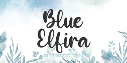 Proudly presenting: Blue Elfira Blue Elfira is a beautyful handwritten script font. Blue Elfira is perfect for product packaging, branding projects, magazines, social media, wedding invitations, or just used to express words above the background. Blue Elfira also comes with multillingual support. Enjoy the font, thank you!
 - Hello Magnolia by Adante Creative,
$23.00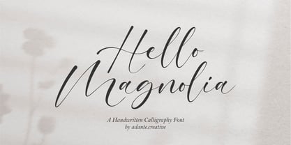 Hello Magnolia A Handwritten Calligraphy Font Hello Magnolia is perfect for product packaging, branding project, megazine, social media, wedding, or just used to express words above the background. Magnolia also multilingual support. Enjoy the font, feel free to comment or feedback, send me PM or email.
 - Blushmine by Adante Creative,
$23.00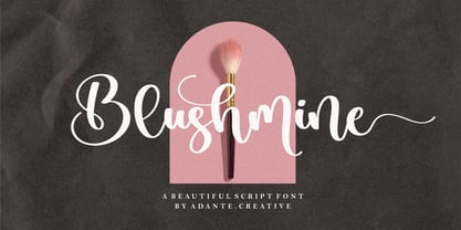 Introducing by Adante.Creative Proudly Present, Blushmine Blushmine A Beautiful Script Font Blushmine is perfect for product packaging, branding project, magazine, social media, wedding, or just used to express words above the background. Enjoy the font, feel free to comment or feedback, send me PM or email.
 - Biograf by Balpirick,
$15.00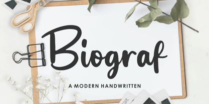 Biograf is a Modern Handwritten Font. Biograf is perfect for product packaging, branding project, megazine, social media, wedding, or just used to express words above the background. Biograf also multilingual support. Enjoy the font, feel free to comment or feedback, send me PM or email. Thank you!
 - Paws & Tails by whyteshark,
$15.00 This is a fun animal-based font design. Great for posters for school, pet shops, animal-companies/organizations. Use one letter to start your word or use all of them, you'll have a truly unique logo and company style with this font. Contain only upper case letters.
 - Silentclaire by Allouse Studio,
$16.00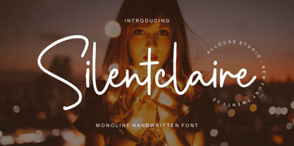 Proudly Presenting, Silentclaire A Monoline Handwritten Font Silentclaire is perfect for product packaging, branding project, megazine, social media, wedding, or just used to express words above the background. Silentclaire also multilingual support. Enjoy the font, feel free to comment or feedback, send me PM or email.
 - Thinna Bell by Allouse Studio,
$16.00 Proudly PresentingTinna Bell, a Bold Script Font. Tinna Bell is perfect on any tittle, product packaging, branding project, megazine, social media, wedding, or just used to express words above the background. Enjoy the font, feel free to comment or feedback, send me PM or email. Thank You!