10,000 search results
(0.019 seconds)
- FF Balance by FontFont,
$65.99 Dutch type designer Evert Bloemsma created this sans FontFont in 1993. The family has 8 weights, ranging from Light to Black (including italics) and is ideally suited for editorial and publishing, logo, branding and creative industries as well as small text. FF Balance provides advanced typographical support with features such as ligatures, small capitals, alternate characters, case-sensitive forms, fractions, and super- and subscript characters. It comes with a complete range of figure set options – oldstyle and lining figures, each in tabular and proportional widths.
 - FF Oneleigh by FontFont,
$51.99 Canadian type designer Nick Shinn created this serif FontFont in 1999. The family has 6 weights, ranging from Regular to Black (including italics) and is ideally suited for advertising and packaging, book text, festive occasions, film and tv as well as poster and billboards. FF Oneleigh provides advanced typographical support with features such as swashes, ligatures, small capitals, alternate characters, case-sensitive forms, and fractions. It comes with a complete range of figure set options – oldstyle and lining figures, each in tabular and proportional widths.
 - Golga by Gassstype,
$23.00 Here comes a New font, Golga is Unique Bold Display Font this is strong Font, that is written casually and quickly amazing. Then crafted carefully drawn into vector format. This font is great for your next creative project such as logos, printed quotes, invitations, cards, product packaging, headers, Logotype, Letterhead, Poster, Label, and etc.It is perfect for any design project as Invitation,logo, book cover, craft or any design purposes.this font is great for your creative projects such as watermark on photography, and perfect for logos & branding.
 - FF Engine by FontFont,
$47.99 Dutch type designer Alex Scholing created this display and sans FontFont in 1995. The family has 6 weights, ranging from Light to Bold (including italics) and is ideally suited for book text, editorial and publishing as well as software and gaming. FF Engine provides advanced typographical support with features such as small capitals, alternate characters, case-sensitive forms, fractions, super- and subscript characters, and stylistic alternates. It comes with a complete range of figure set options – oldstyle and lining figures, each in tabular and proportional widths.
 - Pinafore by Up Up Creative,
$10.00 Introducing Pinafore Complete, a broad, brush-style display font in four styles. Pinafore comes with upright and oblique styles as well as paper cut versions of each. It includes 363 glyphs such as small caps (see note below for more on this), multilingual support (including multiple currency symbols), an awesome ampersand, math symbols, and more. A note about small caps: There are TWO ways to access the small caps in this font family. For OpenType-savvy programs such as Adobe Illustrator and Adobe InDesign, these can be accessed from within the main font files using the character panel or the glyphs panel. For programs that do not access these OpenType features, I have also included small-caps-specific font files. In these files, the regular caps are accessed by typing capital letters and the small caps are accessed by typing lowercase letters.
 - Utshani by Scholtz Fonts,
$21.00 Utshani means "grass" in the African language: Zulu. Grass has softness but it also has great strength and many African craft implements are made from it. When we describe someone as being "like the grass", it is meant as a compliment for it means that they can be tender and strong. The fluid African font, Utshani, was designed to suggest the flexibility and strength of grass. In this way it contrasts with the majority of other "African-inspired" fonts, which tend to be heavy and hard-edged. It can be used in a wide variety of situations, in adverts and on posters and invitations. The font includes all upper and lower case letters, all numerals and punctuation as well as all special and accented characters. The font has been professionally letterspaced and kerned, and the inter-line gap has been carefully checked.
 - FF Tisa Sans by FontFont,
$58.99 Slovenian type designer Mitja Miklavcic created this sans FontFont in 2011. The family has 14 weights, ranging from Thin to Black (including italics) and is ideally suited for advertising and packaging, book text, festive occasions, editorial and publishing, logo, branding and creative industries, poster and billboards, wayfinding and signage as well as web and screen design. FF Tisa Sans provides advanced typographical support with features such as ligatures, small capitals, alternate characters, case-sensitive forms, fractions, and super- and subscript characters. It comes with a complete range of figure set options – oldstyle and lining figures, each in tabular and proportional widths. In 2013, FF Tisa Sans received the CommArts award and was also selected as one of Typographica’s favorite typefaces of 2012. This FontFont is a member of the FF Tisa super family, which also includes FF Tisa.
 - All Round Gothic by Dharma Type,
$24.99 Originally designed in 2012 by Ryoichi Tsunekawa, All Round Gothic is a font family inspired by classic sans serif fonts such as Avant Garde Gothic and Futura. All Round Gothic is a structured geometric sans, but also creates a sweet and cute atmosphere by removing unnecessary stems. With their bowls shaped by not-perfectly-geometric circles, All Round Gothic makes an organic impression in some degree. As a result, All Round Gothic became a new font family that covers between 1920s Bauhaus and contemporary design trends comprehensively and one of the most suitable family for any purpose such as text, headline, logo, poster, and animations thanks to clean and legible but soft and friendly letterforms. All Round Gothic includes 5 weights and obliques corresponding to each weight. Why don't you try this family if you got a little bored with classic sans serifs. This font is used in Minions movie.
 - Kiosk by Fenotype,
$19.00 Kiosk is a prominent display typeface pair. It is a sturdy condensed sans serif and an eloquent brush script. In addition there are textured “print” versions of them both. Kiosk fonts work as a pair or as themselves. Sans is great for sturdy headlines, menu titles, packaging or any such, the bigger the better. Script is great as a logotype, used for quotes, magazines, packaging and branding. Textured versions are the same fonts with a rugged outline and with a “stamp” texture inside the letters. Kiosk Script is equipped with several OpenType features. It has Contextual Alternates and Standard Ligatures that are automatically help to keep the connections smooth. They’re both automatically on. In addition it has Swash, Stylistic and Titling Alternates and even more alternates for some characters. The font is PUA encoded and you can access alternate characters from OpenType controls or manually from Character or Glyphs window.
 - Badhorse by Angga Mahardika,
$15.00 I created this font in 2016 with the name “Burtons”, and now here I am turning it into “Badhorse”. If you’re looking for the perfect touch of vintage flair for a design project, Badhorse is an exceptional choice. Pairing a rustic serif with a decorative handwritten script, Badhorse offers two distinct type designs that complement one another beautifully. This font duo is effective on product packaging, particularly for wares that prefer a handcrafted, artisan approach to their finished presentation. Badhorse is ideal for strong branding, identity, and logo design, as its letter forms effortlessly express a tone of familiarity, reliability, and timelessness. Advertising spreads and menu layouts will also take advantage of this modern classic, conjuring a sense of nostalgia and comfort in the viewer. Badhorse offers stylistic alternates and ligatures through OpenType, as well as symbols, punctuation, and international characters for additional language support.
 - Frescito by Mans Greback,
$49.00 Frescito is a modern sans-serif typeface that embodies a fresh, cool, and street-smart aesthetic. Designed to be both balanced and versatile, its clear and legible monoline style is designed for branding and advertising in editorial and digital design. The Frescito font family comes in the five classic weights: Thin, Light, Medium, Bold, and Black, along with a Variable font for ultimate flexibility and customization, as well as Italics. Inspired by the energetic spirit of the city and its vibration, Mans Greback set out to create a typeface that would stand out against vivid moment; a type that would work in a traditional café just as well as for contemporary merchandise. The result is a font that combines the best of both worlds: an air of freshness and modernity with an unpretentious, timeless and classy appeal. The font is built with advanced OpenType functionality and has a guaranteed top-notch quality, containing stylistic and contextual alternates, ligatures, and more features; all to give you full control and customizability. It has extensive lingual support, covering all Latin-based languages, from Northern Europe to South Africa, from America to South-East Asia. It contains all characters and symbols you'll ever need, including all punctuation and numbers.
 - Blessed Dreams by Yumna Type,
$15.00 It could be such frustrating work to find an attractive display font in accordance with your design project. Moreover, a wrong display font will only result in the failure of your design leaving your customers uninterested. However, you should feel no worry as we have the best answer to your problems. Blessed Dreams is a visually attractive display font with soft, gentle nuances caused by the swinging end of the wipes and curves. Each of the letters is interconnected as in the cursive font and the proportions are relatively similar for a legibility reason. Furthermore, you can apply this font, which also provides you with a clipart as a bonus, for big text sizes to be legible. In addition, you may make use of the available features here. Features: Multilingual Supports PUA Encoded Numerals and Punctuations Blessed Dreams fits best for various design projects, such as brandings, posters, banners, headings, magazine covers, quotes, printed products, merchandise, social media, etc. Find out more ways to use this font by taking a look at the font preview. Thanks for purchasing our fonts. Hopefully, you have a great time using our font. Feel free to contact us anytime for further information or when you have trouble with the font. Thanks a lot and happy designing.
 - Caslon Black by ITC,
$29.99The Englishman William Caslon punchcut many roman, italic, and non-Latin typefaces from 1720 until his death in 1766. At that time most types were being imported to England from Dutch sources, so Caslon was influenced by the characteristics of Dutch types. He did, however, achieve a level of craft that enabled his recognition as the first great English punchcutter. Caslon's roman became so popular that it was known as the script of kings, although on the other side of the political spectrum (and the ocean), the Americans used it for their Declaration of Independence in 1776. The original Caslon specimen sheets and punches have long provided a fertile source for the range of types bearing his name. Identifying characteristics of most Caslons include a cap A with a scooped-out apex; a cap C with two full serifs; and in the italic, a swashed lowercase v and w. Caslon's types have achieved legendary status among printers and typographers, and are considered safe, solid, and dependable. A few of the many interpretations from the early twentieth century were true to the source, as well as strong enough to last into the digital era. Caslon Black was designed by Dave Farey in the ITC library. - Ahmed by Linotype,
$187.99Ahmed is a modern Arabic headline face, first produced by Linotype-Hell Ltd. in the early 1980s. Originally developed as a simplified face, its design recalls the inscriptional and decorative tile work lettering of the medieval period. The strong treatment of the tails of certain characters departs from the more traditional style of tapering these finials, introducing a modern feel to the design. The contrasting proportions of the tall vertical strokes and the rather elongated counters lend a monumental look to Ahmed, allowing its effective use in titling. During the later 1980s Ahmed was developed into a traditional typeface, with the introduction of medial forms to improve character spacing and balance. Recently, Ahmed has been converted into the OpenType font format, ensuring its continued popularity as a heading face for newspaper typesetting. The Ahmed typeface contains two weights, Ahmed and Ahmed Outline. Both of the OpenType fonts include Latin glyphs from Clearface Gothic Roman inside the font files, allowing a single font to set text in both most Western European and Arabic languages. The two Ahmed fonts include the Basic Latin character set and the Arabic character set, which supports Arabic, Persian, and Urdu. They include tabular and proportional Arabic, Persian, and Urdu numerals, as well as a set of tabular European (Latin) numerals. - Sandokan by Matyas Machat,
$30.00 Sandokan is a brush script font with a character and morphology that nears Oriental calligraphy, Art Nouveau typefaces, psychedelic “flower power” fonts from the Sixties and Tuscan poster fonts from the 19th century. Its main features are the high contrast between thick and thin strokes and the extreme slanted angle in the typewriter imprints, creating inverse shadowing. The letter set is further accentuated by exotic decorative details and the often unusual connectors between small letters. The typeface supports all languages using the universal Latin character set. Sandokan is a slightly sweetened cultural cocktail. As such it looks best on everything that needs to come across as exotic and rather solid but unmistakeably eccentric - such as labels and packaging on exotic delicacies or circus posters.
 - Armorel Script by Gatype,
$12.00 Armorel script is a romantic, bold, elegant and fun vintage script font. It can be used for various purposes such as logos, wedding invitation, t-shirt, letterhead, signage, news, posters, badges, and more. To enable the OpenType Stylistic alternates, you need a program that supports OpenType features such as Adobe Illustrator CS, Adobe Indesign & CorelDraw X6-X7. There are additional ways to access alternates/swashes, using Character Map (Windows), Nexus Font (Windows), Font Book (Mac) or a software program such as PopChar (for Windows and Mac). How to access all alternative characters, using Windows Character Map with Photoshop: https://www.youtube.com/watch?v=Go9vacoYmBw Need help? If you need help or advice, please contact me by e-mail "chaidirgata@gmail.com" Thank you for your purchase!
 - Alternate Gothic Pro by SoftMaker,
$14.99 Alternate Gothic Pro is one of the fonts of the SoftMaker font library. Designed by Morris Fuller Benton in 1903 as a complement to his Franklin Gothic type, Alternate Gothic was created to solve a common problem: fitting headlines in narrow columns. For that purpose, it comes with three similar styles of varying widths. SoftMaker’s Alternate Gothic Pro typeface family contains OpenType layout tables for sophisticated typography. It also comes with a huge character set that covers not only Western European languages, but also includes Central European, Baltic, Croatian, Slovene, Romanian, and Turkish characters. Case-sensitive punctuation signs for all-caps titles are included as well as many fractions, an extensive set of ligatures, and separate sets of tabular and proportional digits.
 - Sanity by Popkern,
$- The design of Sanity typeface is modernized by abandoning any characteristics associated with hand writing, such as curved lines or elaborate corner details. The design is based on a rigid geometric grid and radiates confidence with its daring contrasts and provocative style. In large amounts of text the font “Sanity” can be hard to read due to a «dazzle» effect caused by alternating thick and thin strokes, particularly as the thin strokes are hardly visible at small point si es. Due to this quality, the “Sanity” font-family is best suitable for titles or large print advertisements. There are five key stylistic principles taken as a main framework for the creation of the “Sanity”: symmetry, contrast, geometry, artificiality and monospacing.
 - Angelliey by Cocodesign,
$10.00 Angelliey is a beauty script based on a modern calligraphy with natural hand writing look and feel. It can be used as digital signature as well. It has many alternates and ligatures which contain many swashes that you can play with. This type of font perfectly made to be applied especially in logo, and the other various formal forms such as invitations, labels, logos, magazines, books, greeting / wedding cards, packaging, fashion, make up, stationery, novels, labels or any type of advertising purpose. Features : uppercase & lowercase numbers and punctuation multilingual alternates and ligatures PUA encoded We highly recommend using a program that supports OpenType features and Glyphs panels like many of Adobe apps and Corel Draw, so you can see and access all Glyph variations.
 - Rabbits by Piñata,
$9.00 Rabbits is a super emotional hand-written font family that unites 10 different fonts. We’ve united these fonts with one common theme - childhood. Use these fonts to create any products for kids — children’s books layouts, mobile applications for children, as well as nursery interior design. We’ve given each rabbit a unique name. The names are arranged as the first 10 letters of the Latin alphabet: A — April, B — Bro, C — Chili, D — Dummy, E — Elf, F — Fatso, G— Goody, H — Hyper, I — Idol, J — Junior. Each rabbit has its own character, and you’ll definitely like Rabbits because of that. We’ve used an individual writing tool for every font. All the fonts were created on paper first and then digitized. Now, what’s your favorite rabbit?
 - Albion's Americana by Greater Albion Typefounders,
$18.00 Albion's Americana is a fun display family and a tribute to our transatlantic friends. The stars and stripes motif is applied to an American inspired all capitals Roman display face, producing something that is bold and boisterous and well...American. The regular face is intended for conventional use, while the 'Black', 'Red', 'White' and 'Blue' faces are designed to facilitate patriotic multi-coloured lettering (of course, you can use other colours as well). It's worth trying out different combinations here- Black and White alone work well, as does read, white and blue minus black. Albion's Americana Companion is also offered, intended as a small or all capitals face for subsidiary lettering. Next time you need some graphic typesetting with that American feel, this is your answer!
 - Monalliza by Ardyanatypes,
$20.00 "Monalliza" comes with an aesthetic style, and its serif-type tagline is Vintage and elegant. "Monalliza" is also equipped with the latest professional characteristics that present a sleek and attractive identity for your company or project for business purposes. It goes well with modern serifs and scripts that depict or stand firm as a title and brand representative for an elegant look. "Monalliza" also comes with multiple languages, making any country and language easy to use. It also comes with alternative Ligatures and styles to make your designs more attractive. "Monalliza" is suitable for branding projects and various design purposes such as business cards, name tags, and uniforms as a brand enhancement. Advertisements, posters, invitations, branding, logos, magazines, merchandise, presentations, etc.
 - Business Helpers JNL by Jeff Levine,
$29.00 Duluth, Minnesota's Horace P. Brouillet Syndicate (later known as Syndicuts, Inc.) was one of a number of stock cuts providers to the letterpress trade in the decades preceding paper, then electronic clip art. Brouillet's "Typeps" catalogs offered a wide range of images covering numerous subjects, as well as cartoons, catch words and automotive logos. Many of these images have been reproduced in a number of royalty-free clip art publications over the years. Twenty-Six of these newly-redrawn catch words are found within Business Helpers JNL in two styles. On the capital keys are the original white-on-black designs, modeled from the vintage source material. The lower case keys have the phrases separated from the decorative ovals and are in black type.
 - Sispany by Dora Typefoundry,
$19.00 Sispany is a sophisticated Sans Serif Font with a unique typeface that works well for your design projects and is carefully crafted to ensure premium quality and a luxurious feel. The shape of the letters makes this typography unique and stand out. It is suitable for logos, headlines, titles, and various other formal forms such as invitations, labels, logos, magazines, books, greeting/wedding cards, packaging, fashion, make up, stationery, novels, labels or all kinds of advertising purposes. Here's what's included: (uppercase & lowercase) Alternates & Ligatures Numbers & punctuation Characters with accents Supports Multiple Languages PUA Encoded This type of family has become the work of true love, making it as easy and fun as possible. I really hope you enjoy it! Thank you
 - Stencil Moonlight by Linotype,
$29.00Latvian designer and educator Gustav Grinbergs created Stencil Moonlight as an attempt to slightly lighten up the stencil type scene. Intended as a lively, semi-formal face, its shapes are smooth and compact. It leaves a very heavy feeling on the page, as its letters display a very fat bold design. Stencil Moonlight is available is two separate font styles, Regular and Small Caps. When used together, the Stencil Moonlight family can create the perfect combination for your next display need. Stencil Moonlight works best in larger sizes, where it is clear that its forms stem from an experiment with stencil design. Grinbergs recommends the face for application in package design, advertising, poster design, and perhaps even for the subtitling of foreign films! - Shinthink by alphArt,
$15.00 Shinthink is a handwritten script font with a simple and natural style and is great for your next creative projects such as watermark on photography, quotes, album cover, logo, business card, and many other design project. Shinthink comes with uppercase letters, lowercase letters, lowercase alternative letters, numbers, punctuation, ligature and multi-lingual support. To use alternative end text is just block end letters and select alternative letters on glyphs option. It may be used in almost any program by using your Operating System’s utilities (CharacterMap for Windows and Font Book for Mac.), as well as Illustrator, Photoshop CC 2017 and several other applications. We hope you enjoy this font. If you have any questions please don't hesitate to drop me a message :) Thank you, Best regards alphArt
 - Ambiguity by Monotype,
$50.99 Ambiguity is a type family with five distinct personalities or ‘states’, created as a tool for coaxing designers and brands out of their comfort zone. It embraces both tradition and radicality, as well as generosity and thrift, encouraging us to question our beliefs about the intersection of style and meaning. The family is designed by Charles Nix, who describes Ambiguity as “as much thought experiment as typeface.” Its five states—Tradition, Radical, Thrift, Generous and Normate—each express or subvert different aspects of typographic tradition. Tradition is conservative, relying on historical letter shapes. Radical rejects inherited ideas of proportion, making typically slender letterforms wide, and wide letterforms slender. “It’s contrarian,” says Nix. Thrift cherry picks the condensed shapes from Tradition and Radical, while Generous does the same for wide forms. Normate sits at the center, a synthetic blend of all of the others. “Tradition is very comforting,” says Nix. “It’s the mask of conservatism. It’s calming because it delivers the proportions we expect. With Thrift more fits into a smaller space, so it’s great where words want to get large, like gigantic headlines, or text needs to cram in, like small screen type. You get a sense of carefree and luxury from the Generous cut. One would expect the Radical to be used in a sort of Dadaist way, but in a classic context it provides an enjoyable jolt.” Ambiguity is a litmus test. Designers could spend hours trying on typefaces that offer just one of these voices. Ambiguity provides five different personalities—ideas—beliefs—each of which also work seamlessly together. “It’s a palettea, like idea cards,” he says. “It’s a way of making yourself see differently. My hope is that traditionalists will try on radical clothes and vice versa. It’s a way of exploring outside your comfort zone, breaking out of the doldrums, by stepping through a variety of voices.”
 - Baby Sillentha Script by Alpha Bento,
$12.00 Introducing Baby Sillentha Script Baby Sillentha Script a fresh & modern new script with a handcrafted calligraphy style, decorative characters and dancing baseline! Very pretty for invitations such as greeting cards, branding materials, business cards, quotes, posters and more!! Baby Sillentha Script comes with 360+ glyphs. Alternative characters are divided into several Open Type features such as Swash, Stylistic Sets, Stylistic Alternate, Contextual Alternate. The Open Type feature can be accessed using Open Type savvy programs such as Adobe Illustrator, Adobe InDesign, Adobe Photoshop version of Corel Draw X, and Microsoft Word. And this Font has provided PUA unicode (custom coded font). so that all alternative characters can be easily accessed in full by a craftsman or designer. Baby Sillentha Script Uppercase & Lowercase Letters International Languages & Symbols Support Punctuation & PUA Numbers Unicode Range Standard Alternative Style. If you don't have a program that supports OpenType features such as Adobe Illustrator and CorelDraw X Versions, you can access all the alternative glyphs using Font Book (Mac) or Character Map (Windows). Best Regards, Alpha Bento
 - Palo Slab by TypeUnion,
$30.00 Palo Slab is an epic font family made up of 9 weights in four widths, along with italic & oblique options to total a massive 108 styles. Using our 2020 release Palo as the base, the slab version began to take on its own life and personality to become a unique entity in its own right. From super punchy heavy weights to the delicate lighter weights, the Palo Slab super family is a versatile beast that offers you ultimate flexibility. The heavy weights ranging from Compressed Black to Wide Black are built with super tight spacing and love to be big and bold, so perfect for showing off your brand. The Italic styles add curves to the slab feel, providing a beautiful flow, but we've also included an oblique option if you want to use the blockier version. Palo Slab features extensive latin language support as well as OpenType features such as case sensitive punctuation, old style figures, scientific numbers and ligatures, + arrows. You can check out our 2020 release Palo here.
 - Kardinal by Ani Dimitrova,
$30.00 Kardinal is a sans serif humanistic type family. The family has 16 weights, ranging from Thin to Black with extra drawn italics and small caps versions. The Kardinal type family is ideally suites for small text, books and magazines, branding, posters, as well as web and screen design, headlines and more. Kardinal comes in 16 styles with extended language support. All weights contain standard ligatures, proportional figures, tabular figures, old style figure, numerals and arrows, matching currency symbols and fraction. The construction of characters combines clean grotesque style and calligraphic features with humanist fragrance. Out standing for the designs are the small serifs. They are giving the letters movement and freshness, as well as contribute to a better readability in different volume texts and including lots of details that give it a unique personality. The Regular and Medium weights are perfect for body text while the italic give an interesting texture to the text. The range of styles give a good flexibility to this family. The fonts are carefully hinted and perfect for digital use.
 - Tabwa by Scholtz Fonts,
$19.00The design of the Tabwa font was inspired by the font Neuland designed by Rudolf Koch in 1923. Rather than attempting to re-create his font in a digital form as so many others have done, I have tried to capture the "spirit" of his font and merge this with the spirit of Africa. As a result the characters differ markedly from Koch's original styles and have much less of an "Art Deco" look to them. To further modernize the font I have included all the characters missing in Koch's original (a full lower case, as well as all punctuation, diacritics, special characters etc). The result is a thoroughly modern re-interpretation of the original "Neuland". The numbers (0 to 9) bear no relation to Koch's originals but, I believe, are far more in keeping with the alphabetic characters in the font. The triangles that decorate the characters of this African font are typical of the patterns found in the Tabwa culture of central and west Africa (in the Congo region). - Albia Nova by Greater Albion Typefounders,
$9.50 Albia Nova is a bit of a new departure for Greater Albion-an unashamedly futuristic typeface. It was originally developed for a friend of ours-a set designer who needed some lettering on props for a science fiction play-the brief was to evolve conventional letter forms and speculate as to what they may look like in the future. As released Albia Nova is a more refined version of this idea, placing a bit more emphasis on readability (today) over evolution of the letterforms. The result is good for giving design projects a futuristic feel, but also has something of the 1970s and 1980s about it.
 - Honess by Zamjump,
$17.00 Honess is a luxurious handwritten script font with a thick classic feel this font is perfect for craft artists to elevate their work into beautiful masterpieces. Honess is also great for graphic designers looking for a cute font for their work. includes : - uppercase, - lowercase, - standard punctuation, - standard ligature, - bigining swash. - ending swash - numbers. - multi lingual to use a character with a line prefix is quite easy, that is, simply by typing an unterscore is added to the desired character, for example (_a) then the character a will have a line at the beginning, as well as a ending swash, type the character then followed by an underscore (a_).
 - Modjola by Hasta Type,
$20.00 Modjola is an elegant brushed handwritten font. It looks beautiful on a variety of designs requiring a personalized style, such as wedding invitations, thank you cards, weddings, greeting cards, logos and so on.
 - Anvil by Studio K,
$45.00 The days of hot metal may be behind us, but Anvil looks as if it has been forged in a smithy’s fire: a handsome, heavyweight display face that is both impressive and impactful.
 - Retrochips by Almarkha Type,
$18.00 Introducing Retrochips Fonts with a vintage touch reminiscent of past designs, making your design look unique and classic. Retrochips has 2 variants, Regular and Line, as a perfect blend in your graphic design.
 - Meghan by Akrtype Studio,
$15.00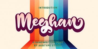 Meghan Smooth Handwritten Font is a casual and elegant handwritten font. Meghan Smooth Handwritten Font will look outstanding in any context, whether it’s being used on busy backgrounds or as a standalone headline!
 - Jamaistevie by Vladislav Ivanov,
$15.00Jamaistevie black is a very grungy but interesting 3D font, definitely better for a title than journaling, but particularly good for digital layouts as overlay text. It contains both Latin and Cyrillic alphabets. - Voklea by Sakha Design,
$12.00 Voklea is a cool, bold and trendy looking display font. Whatever the topic, this font will be a wonderful asset to your font library, as it has the potential to enhance any creation.
 - News Event JNL by Jeff Levine,
$29.00 A vintage newspaper front page from June 6, 1944 proclaimed “France Invaded” in a bold, condensed wood type that has been revived as News Event JNL – available in both regular and oblique versions.