10,000 search results
(0.051 seconds)
- Gestack by Almarkha Type,
$35.00 Hello Introducing, Gestack - Stylish Display Serif is an unique font that uses ligatures to smoothly link letters. Perfect for adding a unique twist to word-mark logos, monograms or pull quotes. Gestack has 11 ligatures as well as numbers and punctuation making it super fantastic. Ligature can be turned off if required standard writing needs.
 - Borgis Pro by RMU,
$45.00 Borgis Pro is a robust Clarendon-style font family, intended for use in body texts even on rough papers as well as in web design. All styles include small caps and oldstyle figures. Users who want to type in the Serbian language and take the Italic style should activate the OT feature Stylistic Alternatives.
 - Agane by Trim Studio,
$20.00 Agane is a Basic modern Sans Serif font. Design with oval as main shape, It's combine the basic sans type with smooth curve in the end, perfectly suited for graphic artists to complete their design such as web design, advertisements, posters, logos, product signs, and many more. Agane contains all standard glyphs and punctuations.
 - Space Quest by Lone Army,
$10.00 This font is inspired by aerospace. I use the negative spaces of each font to form planets or rockets. every glyph has its power. can be used as initials or as a word nicely. and also supports multilingual. the space design side is also found in punctuation to! thanks and enjoy the design! cherrs
 - Calhoun by Josh Grzybowski,
$19.99 Built with both thick and thin lines this display font uses heavy round terminals giving this almost didone-style font a more playful and slightly stylish look. Perfect for magazines and publications as well as for identity and branding. The character set contains typical OpenType features in addition to small caps, and old style numbers.
 - FM Bolyar Ornate Pro by The Fontmaker,
$29.00 FM Bolyar Ornate Pro is the latest member of our renowned Bolyar mega family and the perfect companion for our very successful FM Bolyar Pro . Developed to a new level of excellence this new improved ornate design is quite able to satisfy every typographic taste and meet the ever growing design requirements for high quality typefaces. If you are addicted to classic vintage style, then you could easily use Bolyar Pro Ornate for almost any project of desire - from letterheads, logos and catchy headlines to elegant packaging, book covers and wine labels. Alternates, Swashes and Ligatures will help you customize almost every single letter and fit perfectly to your artwork. Bolyar Ornate Pro provides a broad range of advanced typographical features such as: Five weights ranging from thin (100) to black (900) with full multilingual support of all Latin based languages as well as Cyrillic; 1000 glyphs per weight including three multilingual stylistic sets, swash designs and useful discretionary ligatures; Sub- and superscript basic Latin and Cyrillic glyphs as well as figures. Two positional models for lowercase accessed as OpenType case sensitive forms ñ base to base (default) and spur to spur (vertical center).
 - Kefir by ROHH,
$39.00 Kefir™ is charismatic, cheerful and full of character. It is inspired by such classics as Cooper and Windsor and serves as their modern alternative. It is a display font family with very strong personality and feels at home in editorial design, all kinds of headlines, posters, badges, websites and branding. Its light weights let you set friendly and legible paragraphs of text as well! Kefir has beautifully flowing lines, its nature is soft, rounded and elegant with charming retro vibes. The letterforms were crafted with much passion and love in order to send powerful positive message whenever used! Kefir has two additional stylistic sets to adjust the font to your liking and decide if you choose upright or sloping stems (in characters like h, m ,n , a) or go even more playful with some super-friendly letterforms. Kefir family consists of 7 styles + 1 variable font, letting you adjust the weight to your exact needs. It has extended latin language support as well as broad number of OpenType features, such as stylistic sets case sensitive forms, ligatures, swash caps, final forms, contextual alternates, lining & oldstyle figures, basic fractions, superscript and subscript, ordinals, currencies and symbols.
 - ITC Christoph's Quill by ITC,
$29.99ITC Christoph's Quill is just about everything you could want in a typeface: it's distinctive, beautiful, and exceptionally versatile. According to designer Russell Bean, ITC Christoph's Quill is the culmination of experimentation with a graphics tablet that spanned several years. Then one day, as if by magic, it all just fell into place. The design seemed to flow from my pen." Bean was born in Australia and, except for a brief stint with a photo-lettering firm in Southern California, has spent most of his career working down under. "I can recall a deep fascination for the written word," he says. "Even before learning to spell, read or write, I think I recognized that this was a means of visual communication." Bean's first job was in a small ad agency as a trainee in the production department, where he learned art techniques and how to handle print, as well as "the value of visual impressions," he says. His career path meandered from one design job to another, but always in the general direction of fonts and typefaces. Today, his workload consists of logo design commissions, font editing, typography and print production consultation to a select group of loyal clients - still leaving time, notes Bean, "to pursue my type design ambitions." ITC Christoph's Quill began life as a simple, visually striking font of caps, lowercase, punctuation and numerals. To this Bean added a bold weight, for when a little more strength is desirable. Next came a flock of alternate characters. Finally, Bean drew a set of decorative caps, a suite of logos, and a sprinkling of beginning and ending swashes. The net result is a type family that can add a signature flourish to a vast range of projects: from invitations and menus to logos, signage, packaging and more." - Sonrisa by CastleType,
$59.00 Sonrisa is a design that evolved from my sketches of the skeletal structure of Jakob Erbar’s Koloss, trying to discover its underlying essence without all the contrast and bulkiness of the original design. Sonrisa Thin was the resulting font, from which the other weights of the family were developed. Gentle curves, open counters, generous x-height, and sleekly tapered terminals give Sonrisa a very legible, modern, elegant appearance. When she saw the first draft of this typeface, the smile on my friend Jennifer’s face gave me the idea to call it “Sonrisa” (Spanish for “smile”). Jennifer, a clinical psychologist, described Sonrisa’s personality as: "happy, clean, clear, open, joyful, spacious, playful, calm. I can see it being used for body product lines such as oils and lotions. Can see it being used in home/travel magazines or even Architectural Digest. Yoga magazine, definitely." Sonrisa is what some foundries call a “Pro” typeface family with all the bells and whistles that provide typographic versatility: true small caps, oldstyle numerals, arbitrary fractions, discretionary ligatures, and other powerful OpenType features. All fonts in the family, except Sonrisa Titling, support most European languages, including modern Greek and languages that use the Cyrillic Alphabet. (Cyrillic glyphs designed in consultation with Ukrainian type designer, Sergiy S. Tkachenko.) Sonrisa is available in the original Thin, monoline version as well as six weights (Light, Regular, Medium, Bold, Extra Bold, Black), and a Titling font that is essentially a display font construction kit. If you enjoy using Sonrisa even half as much as I enjoyed creating it, then I know you will have a “sonrisa” (smile) on your face!
 - LTC Athena by Lanston Type Co.,
$29.95 LTC Athena brings a somewhat “lost” hot-metal typeface back from obscurity into digital Opentype format. In fall 2012, printing historian Rich Hopkins contacted P22 type foundry regarding some inked type drawings he had just uncovered from his acquisition of the Baltimore-based “Baltotype” company some 20 years ago. It is a rare face whose original matrices were destroyed and thought fully lost. The drawings included a full upper and lower case set, numerals, basic punctuation, and alternate forms of some letters. The design is a narrow deco-flavored design from the 1950s with a curious avoidance of straight lines in the stems and main strokes. The face has been expanded to over 340 characters by Miranda Roth and includes ligatures as well as a full Pan-European character set. It is released through the Lanston division of P22 in consideration of its earlier incarnation as a metal typeface.
 - Valentina SG by Spiece Graphics,
$39.00 Here’s what happens when your trusty felt tip marker takes a trip to cartoonland. Each of Valentina’s plump characters has a rough and splotchy texture. Some letters even bounce up and down like a 3-year old. As cartoon faces go, Valentina is a bit on the imperfect side. But that’s normal for a funny face. Use it in a variety of comical situations. Make convincing captions under your own artwork or design greeting cards with it. You can even blow it up to huge sizes to create a wild and crazy look. Valentina Medium is now available in the OpenType Std format. Some new characters have been added to this OpenType version as stylistic alternates. This advanced feature works in current versions of Adobe Creative Suite InDesign, Creative Suite Illustrator, and Quark XPress. Check for OpenType advanced feature support in other applications as it gradually becomes available with upgrades.
 - Rijk by Wilton Foundry,
$39.00 The font name comes from the Dutch word "Rijk" meaning "rich". I'd like you to consider Rijk as a good Pinot Noir: medium bodied, offering succulent juicy berry flavors, accentuated by delicate aromas of coffee and vanilla oak. Ruby red in color, it boasts of velvety tannins and a long fulfilling fruity aftertaste. Rijk has a structure that is delicate and fresh. The aromatics are very fruity like cherry, strawberry, and plum, often with notes of tea-leaf, damp earth, or worn leather… My intent was to create a script that is rich, while not overbearing. It will serve many noble and useful purposes because of its fresh and lively texture. It is also very legible because it has a slightly more upright angle. Use Rijk for headlines, packaging, identities, advertising and online. Available in OpenType, it includes a range of ligatures as well as a full range of class kerning.
 - MIR Next by Juliasys,
$22.00 MIR Next is a growing multi-script type family best described by the terms “humanist–semi–slab-serif”. Its character set contains Latin and Cyrillic, both extended, as well as Greek, covering more than 100 languages. Strong personality along with consistency between language systems were a basic aim when designing the family. As a result MIR has become a great tool for branding and international identities. A wide choice of symbols and numbers makes it also very useful for statistics, texts about mathematics and the sciences. Serious things are best be said in an unpretentious, relaxed way. MIR gives typography exactly that kind of appearance. Its texts emit a sense of authority but stay easily accessible at the same time. MIR’s name comes from the old Russian word Мир meaning both “world” and “peace” – a unity we will hopefully take for granted sometime in the future.
 - Monostep by YOKKMOKK,
$55.00 Monostep is not just another Typewriter. It can do so much more! It is available in five rigorously designed font styles; all of these come in Straight, Rounded and in Italics respectively. It contains geometric symbols as well as all of the characters of the Indo-European alphabet. What makes it so different, and thereby remarkable, are the 77 ligatures that combine letters in upper case, in upper case with lower-case letters and any combination of lower-case letters. Monostep is alive! It will be introduced into the typing script market with a highly characteristic corporate design. Various promotional gimmicks such as a specimen brochure, posters, a website, animations and a promo film with a distinct sound, including lyrics and a dance, make Monostep a truly recognizable label - they bring Monostep to life. That will make you want more: Let me see your Monostep! www.monostep.de
 - Deliberately by PizzaDude.dk,
$15.00 Made with a wide pen, with a lot of love! Loads of international letters, and 6 different versions of each lowercase letter (these cycles automatically AS you type - just like magic!)
 - Minimum Waste by PizzaDude.dk,
$15.00 Minimum Waste - the name is taken from a Sade song, but is meant more as a political statement. Please be aware about your everyday use to make sure the planet survives!
 - TRGrunge by Ingrimayne Type,
$9.00 As its name suggests, TRGrunge is a rough, grungy font that is surprisingly readable. Derived in 1997 from a 1989 sans-serif face, it was expanded with additional characters in 2021.
 - Few Grotesk by Studio Few,
$24.00 Tall X-Height, Angled Terminals and Medium Contrast, Few Grotesk is a UI font designed with personality. Originally conceived as a hybrid between Grotesque & Humanist, Few Grotesk pairs legibility with character.
 - Smoot by A New Machine,
$10.00 This all new hand drawn font comes as a serif and a script version. Mix and match to bring your designs whimsy and playfulness. Suitable for headlines, posters and call outs.
 - Spathe Pro by DBSV,
$10.00 About family “SpathePro” Spathe(Sword) the guy… There are many versions of the expression spathe, some of them are: A guy who says things by name we say is a sword, is correct in explaining a situation or an event. Sometimes we say again that a woman is beautiful and has a body like a sword!! It is one of the four versions of the pack of cards for example "ace sword". We also say of someone that he won a case with his sword (his sword), with transparency and knowledge of the case. It is also one of the oldest weapons used by humans in wars, sometimes used by the defendants to resolve their differences or for reasons of honor. While even today it is an Olympic game as fencing. This is a font as sharp as a swordfish… This series is composed and includes ten fonts with 630 glyphs each, with true italics, true Sloping and supports of course: Latin, Greek & Cyrillic.
 - The Planeta by Aminmario Studio,
$20.00 Planeta Font, this font was created to look as close to a natural handwritten script as possible by including some alternates lowercase, ligature and underlines. Built in Opentype features, this script comes to life as if you were writing it yourself. Comes with regular and italic. Also support multilingual.Perfect for any awesome projects that need hand writing taste. It's highly recommended to use it in opentype capable software - there are plenty out there nowadays as technology catches up with design ... Other than Photoshop, Illustrator and Indesign, many standard simple programs now come with Opentype capabilities - even the most basic ones such as Apple's Text Edit, Pages, Keynote, iBooks Author, etc. Even Word has found ways to incorporate it. Thanks for checking out this font. I hope you enjoy it! AminMario
 - Millestone by Aminmario Studio,
$20.00 Millestone Font This font was created to look as close to a natural handwritten script as possible by including some alternates lowercase, ligature and underlines. Built in Opentype features, this script comes to life as if you were writing it yourself. Comes with regular and italic. Also support multilingual.Perfect for any awesome projects that need hand writing taste. It's highly recommended to use it in opentype capable software - there are plenty out there nowadays as technology catches up with design ... Other than Photoshop, Illustrator and Indesign, many standard simple programs now come with Opentype capabilities - even the most basic ones such as Apple's Text Edit, Pages, Keynote, iBooks Author, etc. Even Word has found ways to incorporate it. Thanks for checking out this font. I hope you enjoy it! AminMario
 - FS Shepton by Fontsmith,
$80.00 Handy Andy Andy Lethbridge had only just completed his graphic design BA at the University of Portsmouth when he was spotted by Jason, who’d seen Andy’s exquisite hand lettering at his degree show and on Instagram. Keen to push the handwritten theme further, having recently launched a digitally-created, chalky script font (FS Sammy), Jason offered Andy a job and the chance to develop a suite of more stylised, truly hand-drawn fonts. Andy duly got out his pads, pencils and pens, and started experimenting with styles and textures. Magic followed. Imperfection perfected Most ‘handwritten’ typefaces are created entirely digitally. Not FS Shepton. From the start, the intention was to create a collection of alphabets of similar character but different texture and style – 100% hand-drawn and purposely imperfect, with the kind of inconsistent, organic shapes and textures of market stall signs, dashed off in chalk or paint. FS Shepton Regular, drawn with a wet brush pen, is solid with a rough outer edge and a casual but controlled feel. The dry brush used to create FS Shepton Light gives it more inner texture and a more formal, slanted, calligraphic style. FS Shepton Bold, drawn using a wider, looser dry brush pen, has a woody grain in the middle of its broad strokes and greater solidity where the brush moves more slowly. Fresh as a daisy Think of FS Shepton not as a family of three weights of the same font so much as a collection of three fonts penned by the same author. All of them – the light, regular and bold – were created independently as display fonts that offer something different to labelling, packaging, point-of-sale and advertising. Lovingly crafted by hand, they’re a good match for products and settings that share the same artisinal qualities: organic foods, drinks and healthcare products, as well as premium chocolate, coffee and condiments.
 - Brab by VSF,
$30.00 A bold grotesque typeface in the best traditions of the Star Wars logo. It has clean geometric lines, a humnaist character, it combines a tech feeling with a friendly organic feeling. Will work excellently as a white text on a busy background.
 - Aanaar by Letterjuice,
$66.00 This typeface comes from a self initiated project called Sápmi, which aims to contribute to keep a group of minority languages alive through solving issues in the education environment. This re-thought edition takes the name of Aanaar and joins our library with a bigger character set and two new weights which complete the typeface providing a big typographic palette as well as adding stylistic two-story a and g for more advanced readers as well as to enable the typeface to be used in other environments. The typeface was originally designed for children’s text books. Analysing kid’s typeface design, we identified some important problems and solved them within the boundaries we had. The main concern in a typeface which will be used by children is letter recognition, as they have not yet fully develop their reading skills. For example, letters like “a” and “g” share a very similar structure in this particular kind of typefaces, where the only distinctive part is the descender of the “g”. It is known that the lower part of the letter is the less important feature when reading, therefore we decided to make a clear distinction between them by having an “a” with a spur on the top right. This also helped distinguishing “a” and “o”. Children typefaces usually have one story “a”, making “a” usually too close to “o”. Additionally we moved the joint in “a” upwards and narrowed very slightly the “a” to make sure they cannot be mistaken. More generally, the x-height is fairly tall and the typeface has a bit of movement which give it a good rhythm helping moving along nicely when reading. Aanaar consists of 5 weights (Light, Regular, Medium, Bold and Black) plus two Italics (Light Italic and Italic).
 - Abril Titling by TypeTogether,
$35.00 Abril is an extension of the Abril typographic system that was engineered as a response to a very specific requirement from the editorial design community: a low contrast typeface for head- lines. Given its broad range of styles though, Abril deserves to be considered a separate font family on its own. Based on the original text styles of Abril, the letter shapes are sturdy, very legible, and deliver a newsy and trustworthy feel. The accented editorial style of the Scotch Roman finds continuity in this new type family, but some of the details have been ironed out for improved performance in headline, both in print and on screen. The family is conceived as four series of different widths, with four weights in each series plus matching italics, a total of 32 fonts. This wide range of styles allows for setting titles at almost any size. The wider series are aimed for smaller point sizes while the con- densed weights can deliver a striking and cohesive appearance as front cover headlines. Abril was designed as a versatile tool for those graphic and web designers looking for a workhorse with high impact. It is also an excellent companion for the rest of the Abril type family: Abril Titling and Abril Narrow.
 - Momoiro by Underground,
$29.00 Momoiro is a feminine typeface family, designed for editorial use. "The first case in which appeared a fashion content in a magazine was in 1672 in the magazine Le Mercure Galant, which was a magazine of entertainment and varied content, including fashion. But the first illustrated and specialized magazine was Le Journal Des Dammes Et Des Modes, created in 1797. "(Fashion Trends, 2011). On the basis of this historical period, the creation of typography has characteristics of a Baroque type. "In this category we mainly include the types created in the Netherlands during the seventeenth century and whose protagonists are the punch makers Reinhard Voskens and Christoffel Van Dijck. Baroque typography stands out for its accentuated play of irregular axes and contrasts that permeate the text of great vividness. " Therefore it has contrast in the thick and thin strokes, Roman serifs, humanistic axis. With this typography, we are not looking for a re-reading of the baroque, but rather a current typeface with humanistic characteristics of the handwriting, with a brush as a differential. Momoiro comes in two weights plus italics to cover as much design needs as possible. It compliments from OpenType features such as ligatures, swashes, true fractions, old style numerals and stylistic sets.
 - Malden Sans by Monotype,
$49.00 Malden Sans is a mischievous grotesque sans serif with charming details that gives designers a solid typographic voice. It was created by Michele Patanè with regular and condensed widths, as a utilitarian typeface family for print and digital environments. It was originally designed as part of a type system for cinema magazines, and embodies the devil-may care attitude of the silver screen. Designer Michele Patanè looked back to an earlier era of typography to create the typeface, embracing unusual details, rather than ironing them out. “There is a very naive way of using typography in the 30s and 40s, something not as clean as how it’s used in the late 50s and 60s when everything passed through a rationalisation of the typographic palette,” he explains. “In film magazines you can still see a bit of roughness, and I like that.” This is a design that’s desperate to be used in editorial environments, and has been created to stand up to lower quality paper. It would be equally at home on posters, packaging, and even in digital environments where designers are looking for something more expressive than another geometric sans serif. Malden Sans includes a Normal and Condensed range, with 7 weights in the normal and 6 in the Condensed, both including italics.
 - Tablet Gothic by TypeTogether,
$35.00 Graphic designers of any nationality and background know very well that the art of composing titles correctly is not easy, Especially when it comes to periodical publications where there is need for both flexibility and graphic coherence. Tablet Gothic was originally engineered as a titling type family, meant to help designers working on publications that require output as hard copies and a variety of digital platforms at the same time. As such, it is a grotesque sans serif that looks to the future of publishing with a clear understanding of its history, and reminiscences that go back to nineteenth century Britain and Germany. Tablet Gothic delivers the sturdy, straightforward and clean appearance expected from a grotesque, but it allows itself a good measure of personality to make it stand out on the page. Its 84 styles –six series of condensation and seven weights in each series plus obliques– guarantee that, whatever the publication format is, there's a Tablet Gothic font that will do the job and perform well both technically and aesthetically. Furthermore, the rounder styles, Tablet Gothic Wide, Normal and Narrow achieved amazing results at very small sizes, producing a beautiful texture and highly readable text blocks. Tablet Gothic fonts can be purchased individually, by series or as a complete bundle (best value!)
 - DT Enigmystic by Dragon Tongue Foundry,
$9.00 When reading text, the most informative parts of the written word for a human brain to identify, are the top and bottom edges of each word, and to a lesser degree, the leading and trailing edges. The overall shape has more useful info than the inner workings of each word. DT Enigmystic, is a display font family that gives you just that. The outer edge. At first glance, these letters don't look like standard letters, and yet, they are perfectly readable. And it is a 'somewhat' smart text, in that it will automatically complete the trailing edge of every word, whenever it sees a comma, period or space. Similarly, it will automatically complete the leading edge of every word following a space. When used as display test or as a heading, the first letter will need to be preceeded by a space, to achieve a full enclosed word outline. As with most of my fonts, do use Contextual Ligatures. This allows the letters to come alive. When generated here on this webpage, contextual ligatures are not turned on, and so the words do not appear completely closed at their beginnings and ends. But as can be seen in the poster images, these outlined words do automatically complete themselves when contextual ligatures are active.
 - Winterflows by Fargun Studio,
$12.00 Winterflows is a handwritten font with quick dry strokes and a signature style. It is perfect for branding projects, homeware designs, product packaging or simply as a stylish text overlay to any background image or posters.
 - Marguerita by ITC,
$29.00Marguerita is the work of designer David Quay, a pseudo-Latin, 1950s concept based on a copperplate script. The capitals are meant as initials only. Marguerita is idea when a cheerful, light-hearted effect is desired. - Crossell by Emboss,
$35.00 Crossell is a display typeface inspired by linoleum cuts and old comic strips. It comes in three weights and can be purchased solo or as a family. Take it home and give it a spin today.
 - Janger by Creativemedialab,
$18.00 Introducing Janger, a bold and fun display font. Janger features a reverse contrast style with a retro and psychedelic look that’s simply ideal for design such as posters, t-shirts, branding, heading, titles and many more
 - Rushfiel by Rotterlab Studio,
$10.00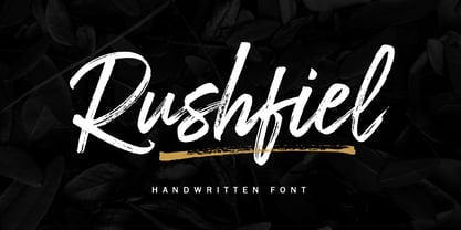 Introducing Rushfiel, a handwritten font made with quick-drying brush strokes in a distinctive styles. It's perfect for branding projects, household appliances design, product packaging or just as a text overlay for background images or posters.
 - Wildwest by Trustha,
$12.00 Wildwest is a dynamic and impactful brush font, giving it credence for usage as a display typeface. With a lot of movement and flow, Wildwest is a wonderful font that will give all your designs the touch they need.
 - Circuit by Holland Fonts,
$30.00A decorative tech typeface, designed for use in broadcast station identities and animations (Wired TV), with a slight reference to Rand's Westinghouse logo, of which a huge sign was used as a dinner table in the corporate guest quarters. - Single Tyne by Jonahfonts,
$35.00 A single top serif creates a modern look between serifs and a single weight font. SingleTyne contains short ascenders and descenders for tight line spacing designed as a display face that also works well for short sentences and paragraphs.
 - Zawya Pro Arabic by Protype,
$50.00 The family has 24 weights, ranging from Thin to Black in Normal, Condensed and Wide styles. It is ideally suited for advertising and packaging, editorial and publishing, logo, branding and creative industries, poster, and billboards, small text, wayfinding, and signage as well as web and screen design. Zawya Pro provides advanced support with features such as case-sensitive forms, fractions, super- and subscript characters, and stylistic alternates. It comes with a complete range of letters for Arabic and English with Arabic and Latin digits. As well as Latin-based languages, the typeface family also partly supports the Arabic, Urdu and Persian and more than 30 writing systems such as ( Afrikaans - Albanian - Catalan - Croatian - Czech - Danish - Dutch - English - Estonian - Finnish - French - German - Hungarian - Icelandic - Italian - Latvian Lithuanian - Maltese - Norwegian - Polish - Portuguese - Romanian - Slovak - Slovenian - Spanish - Swedish - Turkish Zulu - العربية Arabic - Urdu الفارسية - الأوردو Persian). In includes OpenType features for Arabic and English: Stylistic set 01 and 02 Numerator & denominator Fractions Ordinals Superscript standard ligatures discretionary ligatures Case Sensitive
 - Krellon by Nathatype,
$29.00 Krellon invites you to step back in time and embrace the elegance of the past with its vintage style. Rounded shapes define each character, creating a sense of approachability and friendliness. What makes Krellon so special is its subtle, textured appearance. The font carries a delightful roughness that adds authenticity to your text, as if each letter has endured the test of time. Beautiful ornaments are included as a bonus. Krellon fits in headlines, logos, branding materials, and many more.