10,000 search results
(0.03 seconds)
- Egovu by Twinletter,
$17.00 "Welcome to the distinctive world of typography! A genuinely distinctive sans-serif display typeface is Egovu. Egovu is the ideal option if you want a bold and distinctive style for your many different visual design tasks. What is so unique about Egovu? has incredible characteristics. Egovu allows you to be as creative as you like with its selection of ligatures and alternatives. Every project may simply be given a distinctive, personalized touch by using different letter combinations. Since we understand how crucial it is to communicate with a worldwide audience, Egovu supports numerous languages. Your message will be efficiently and clearly heard by individuals all across the world. Are you prepared to advance your design, then? Egovu is prepared to advance your initiatives. Egovu is ready to take your projects to the next level. Get this font now and see how Egovu turns every design into an unforgettable work of art.
 - Groovy by ArtyType,
$29.00 Groovy started out as a prospective variant in the ‘Flashback’ series but very quickly established its own distinct appearance, especially with the lower case letters blending into the format so well. There wasn't any preconceived idea to design a retro looking font in principle, it simply evolved that way, but I do think it has several characteristics reminiscent of style genres from the '70s. It’s probably quite subliminal and like me, you may find yourself thinking, what does that remind me of? The double-entendre'd title is quite apt too, not merely for reasons of its outwardly retro appearance but also because of the considered, rounded elements forming the negative spaces throughout. The font also has something of a chameleon-like personality, being both adaptable and capable of having a trendy / fun appearance, or alternatively something solid and stylish, depending on the use, as demonstrated in the banner examples here.
 - Frasa by Tokotype,
$39.00 Frasa is a contemporary serif family with characteristics that arise from the charms of Caslon and a touch of transitional style; the design offers distinctive proportions to serve long-running small text and the sturdiness of its own form to help as a headline font. Frasa shows that the family is shaped by the traditions of its ancestors through small details that show the personality of the typeface, such as pointed ball terminals and strong shoulders. The italic weights have their own beauty, which is created to humanize the form based on a stylized and natural cursive style with the aim of emphasizing the text's essential elements. The addition of small caps, old-style figures, ligatures, etc. to this type family satisfies conventional typographic requirements. Frasa typefaces can eventually lead to the use of powerful design tools to create editorial and casual design styles.
 - Queulat Condensed by Latinotype,
$- This font is the condensed version of Queulat, but keeping the same features as the original typeface. Queulat Cnd is a hybrid typeface that combines different styles, reflecting charm, freshness and, especially, a strong personality.. Since it is a condensed font, it is well-suited for publishing and subheadings. The font is inspired by Modern and Grotesk styles. The former is shown in some characteristic features such as teardrop terminals, which give the typeface an attractive unique look, making it an ideal choice for logotypes and labelling. The latter, with its rationality, makes Queulat Cnd a stable and strong face for headings and subheadings. The combination of styles can be clearly seen by comparing the Regular with the Alt version. The Regular version is more simple than the Alt one. Differently, the alternative version possesses more features of the Modern style, like teardrop terminals in ‘k’ and ‘v’.
 - Mogila Display by Letterfreshstudio,
$15.00 Mogila is a display font with a touch of style that's cheerful, elegant and strong. So it is suitable for use in product design and appearance, both in modern or vintage designs. OpenType feature with several alternative characters that allow you to mix and match letter pairs to suit your design. Mogila also includes 4 different styles, namely Regular,Italic, Bold and Outline which are made with different styles but still have the same characters. Mogila is included in a display font so it is very suitable for use in titles, poster products, logos, book menus, websites, books, t-shirts, posters, book covers, labels, business cards, branding, print templates and many other designs according to your needs. Mogila includes a complete set of upper and lowercase letters, as well as multi-language support, punctuation, ligatures and alternatives. Thank you very much for looking and Enjoying it!
 - Feronica by Skinny Type,
$14.00 Feronica Script is a new modern script font with an irregular baseline. Feminine style and style. Feronica Script looks beautiful in wedding invitations, thank you cards, quotes, greeting cards, logos, business cards and more. Perfect for use in ink or watercolor. Includes start and end letters, alternatives and support for many languages. To activate the OpenType Stylistic alternative, you need a program that supports OpenType features such as Adobe Illustrator CS, Adobe Indesign & CorelDraw X6-X7, Microsoft Word 2010 or a later version. There is an additional way to access alternatives / swashes, using the Character Map (Windows), Nexus Fonts (Windows), Font Book (Mac) or a software program such as PopChar (for Windows and Mac). How to access all alternate characters: https: //www.youtube.com/watch? v = Go9vacoYmBwhttps: //www.youtube.com/watch? v = XzwjMkbB-wQhttps: //www.yo … need help or have questions, let me know. I’m happy to help Thanks & Congratulations on Design!
 - René Menue by URW Type Foundry,
$39.99 Some time ago, I started to think about the idea of combining my passionate hobby cooking with my profession as a graphic designer. While browsing through cooking books, cooking magazines and graphic publications I noticed that there were no symbols and drawings easily recognizable for interested cooks (hobby or professional). So I decided to create symbols for all the classical cooking paraphernalia still found in grand mother’s kitchen cabinet. René Menue Symbol contains 99 kitchen symbols of classical design and quality. To complement the symbols typographically, there is René Menue, a fitting linear Sans Serif typeface with plenty of extra characters such as ligatures, figures etc. René Menue is a modern, slightly condensed and economic design with round shapes, very modern but classical at the same time. These features make it perfectly usable in many different publications, not necessarily restricted to cooking… A successful cooking and enjoy your meal!
 - Fondue by Latinotype,
$29.00 Fondue: an eclectic-flavoured contemporary typeface. Designed by Jorge Alberto Martínez and Latinotype Team. Fondue is a type family of eclectic shapes, inspired by Art Deco designs, in particular, the lettering used by the Mexican cartoonist Ernesto “El Chango” Cabral on almost the entire publication Revista de Revistas ("Magazine of Magazines"). Far from being a copy, Fondue expects to be an adaptation of the thinking of that time to be used in contemporary context. Fondue has a cursive ductus, wide horizontal proportion and large x-height. Its friendly consistent rhythm makes it ideal for medium-sized text, headlines, branding, and so on. The family comes in 6 weights, from Thin, which reminds of the cartoonist’s loose strokes, to Ultra Bold, the version with powerful and unique voice. Fondue has a set of 496 characters that support 207 different languages.. OpenType features include standard and discretionary ligatures as well as stylistic alternates.
 - Privilege Sign Two JNL by Jeff Levine,
$29.00 Unique and decorative signage for many drive-ins, motels, food stores and other businesses of the 1940s had what was referred to as “privilege signs” provided by one of the major cola brands. Consisting of the brand’s emblem on a decorative panel, the remainder of the sign would carry the desired message of the storekeeper (such as “Drive-In”) in prismatic, embossed metal letters. Inspired by the Art Deco sans serif style of those vintage signs, Privilege Sign Two JNL recreates the type design in both regular and oblique versions. The typefaces are solid black, but adding a selected color and a prismatic effect from your favorite graphics program can reproduce the look and feel of those old businesses. This is a companion font to Privilege Sign JNL, which recreates the condensed sans serif lettering of other privilege signs from the 1950s and early 1960s.
 - Seddon Penmans Paradise Capitals by Intellecta Design,
$29.50 John Seddon (1644-1700), was a famous English writing master, the leading calligrapher of his time, and master of Sir John Johnson’s Free Writing School in Priest’s Court, Foster Lane. His portrait was drawn by William Faithorne and was engraved by John Sturt as the frontispiece for his copy-books, such as ‘The Ingenious youth’s companion’ of c.1690 and 'The pen-man’s paradise' of c.1695. These were engraved after his work by others. Your extra-rare book - "The Pen-mans Paradise Both pleasent & Profitable OR Examples of all ye usuall hands of this Kingdome. Adorn'd with variety of ffigures an Flourishes done by Command of hand. Each ffigure being one continued & entire Track of the pen most where of may be struck as well Reverse (or to answer bothwayes) as Forward", London (1965). - (YES, that is the title of the book!) was the starting point to these new extra accurated works of Iza W, a series of revivals of the penmanship Seddon’s artworks, like this highly ornamented animal kingdom inspired capitals and alphabets: the Seddon Penmans Paradise Capitals typeface. And, on the other hand, you can get the animal and human kingdon inspired penmanship forms in the Bestiario font. The “SeddonsFleurons” will complete the collection. Fantastic choice to elaborated barocque/renaissance inspired and historical accurated layouts.
 - Dubia by Ilhamtaro,
$17.00 DUBIA is a western style font, a font that goes well with cowboy, rodeo and vintage designs. The font, which is based on a serif font, is bold and tends to carry a strong and tough character like a cowboy taming a wild horse. This font is allcaps so it is perfect for creating a title or headline on a poster or magazine cover design. To enable the OpenType Stylistic alternates, you need a program that supports OpenType features such as Adobe Illustrator CS, Adobe Indesign & CorelDraw X6-X7. Cheers!
 - Biscuit Juice by PizzaDude.dk,
$20.00 A biscuit and a cup of coffee, a biscuit and a cup of tee ... both are obvious - but what about a biscuit and a glass of juice? I loved that combination as a kid (and I even crumbled the biscuit in the juice...yuck...I wouldn't do that today!!! Anyway, here you have a legible uppercase font with a nice handmade look. I've added 4 different versions of each letter, which makes the font look really nice and slightly jumpy. I even added two nice swashes to the N and K. Enjoy!
 - Roper by Andrew Footit,
$12.00 Roper is a western styled font that comes in a sans and a serif version, each version has a regular, press light and a press heavy option. The press versions are a letterpress/stamped style. Although Roper is an all caps family of fonts and was designed as a display font, it can be used in many ways. Roper gives the user many options to choose from with regards to styling, this helps bring whatever it is you are creating with Roper font, come to life.
 - Rotunda by TipoType,
$24.00 Rotunda blends the best of three worlds: it’s geometric, humanist and grotesque. But, far from being a tasteless hybrid, it has a strong personality and British undertones that turn it into a stylish and sober classic font face. Thanks to its ample character set and many variables, it stands as a versatile, all-terrain font. Strong and elegant, modern and classic, firm and humanistic. It truly is a 21st Century classic. It includes a very thorough coverage for a wide variety of Latin alphabet-based language families.
 - Wintermint by Pink Broccoli,
$16.00 A funtastic and playful typestyle, Wintermint started as a digitization of a film typeface called Lori by LetterGraphics. This font is filled with bounce and liveliness taken from its original limited character set and fleshed out to a fully functional typeface. Flare serifs along with the occasional weird and wonderful curl gives this typeface a festive holiday vibe, but it could easily blend into a psychedelic design space, or just an all out wacky groove. Give it a spin, and see where Wintermint takes you.
 - Dr066 by 066.FONT,
$9.99 Dr066 is a display font that simulates the appearance of typewritten text. Each letter in Dr066 has been carefully designed to resemble the effect you get with a typewriter. This effect adds a sense of nostalgia to the text, as if it were from a bygone era, adding an authentic charm to the designs. Dr066 retains its varied and extravagant style, giving the text a lightness and a certain nonchalance. Its distinctive and daring letters make it ideal for projects that strive for a unique look.
 - Dosky by takoliko,
$10.00 Dosky is a groovy, retro, bubble font. It have a big and bubbly anatomy. Inspired by 70s vibe and culture. The font is perfect to create a project that have a retro feeling but have a little bit modern and modest on it. Dosky support multilingual language also came with 6 font style : Reguler, Condensed, Expanded and Oblique styles. Dosky can be used as a fun or a formal kind of project. It can easily be matched to your projects, and good for communicating your brands.
 - Uppercut Angle by Delve Fonts,
$39.00 Joachim Müller-Lancé's Uppercut is a rather sporting fellow, originally developed for the Krav Maga training center of San Francisco (Krav Maga is a simple and efficient self-defense system that has become equally popular in Hollywood and with law enforcement). Joachim has spent several years training, hitting things and people whenever he needs a break from kerning. Uppercut can be seen on the school's t-shirts and other articles. Despite bearing the same moniker as an upwards punch to the chin, the name actually fell together quite naturally as Uppercut is an all uppercase typeface, and the word "cut" is also historically used to describe a type style in hot metal type. For this slanted look, "Angle" felt just right (with thanks to Mia McHatton). The design idea sprang from pencil sketches for the center's new identity. Uppercut's shapes are not calligraphic or handwritten, more like lettering seen in comics or sports logos. Its brush movements are imaginary, not too literally brushy. During development, details were simplified and reduced until a bit of a cut-paper feel emerged, but more fluid like writing. The shapes are economical and efficient; simplicity makes the font versatile, holding up in small as well as big sizes. Uppercut is decidedly analog, muscular but not bulky, with the fluid but determined movements of a boxer or martial artist - not theatrical but powerful, fast, confident and dynamic. Well... it has punch. In the proportions, there is emphasis on a strong upper edge "keeping its guard up", while several stems protrude downward, giving the impression of leaping or being "light on the feet". Use Uppercut to pick up the pace, add snap, verve and drive - on movie posters for action and adventure, to advertise your dojo, rumble or prizefight, racing team or tuning shop, or invite friends to your barbecue with old time rock'n'roll and homemade hot pepper sauce.
 - Coegit by insigne,
$32.00 In the world of webfonts, Condensed proportions are key to maximizing your page's premium real estate while keeping your copy clean and catchy as you cut down to the essentials. Soon after the introduction of webfonts, I began to see Insigne's Le Havre used frequently for web headlines, not so much for its Art Deco look as for its more compact proportions. There seemed to be a need for a font that was designed to be used solely for the web's unique constraints. Enter Coegit Sans. Coegit is built specifically for web applications. Its highly Condensed forms range from thin--offering the greatest number of uses--to the attractive, accenting black. With three widths--Compressed, Compact, and the widest, Condensed --the family holds a total of sixteen fonts. The typefamily has also been hinted for excellent, onscreen display quality, even at small sizes. Overall, its lighter, humanist features provide the reader a more congenial welcome than its square, sans-serif counterparts can offer. Coegit is equipped for complex professional typography with stems, small caps and plenty of alts, including titling capitals. The face includes a number of numeral sets, including fractions, old-style and lining figures with superiors and inferiors. OpenType-capable applications such as Quark or the Adobe suite can take full advantage of automatically replacing ligatures and alternates. You can find these features demonstrated in the .pdf brochure. The family also includes glyphs to support a wide range of languages, including Central, Eastern and Western European languages. In all, Coegit supports over 40 languages that use the Latin script, making the new addition a great choice for multi-lingual publications and packaging. While the advanced OpenType features of webfonts are not currently supported in many browsers, the near future promises wide support. As acceptance of these features grow, Coegit Sans will prove to be a versatile element for your wide range of web projects.
 - Mercurial by Grype,
$16.00 Geometric/Technical style logotypes have been developed for car chrome labels since the early 1980’s, but automobile companies don't monopolize the style by any means. During the 80’s and 90’s, a lot of these logos leaned towards the geometric sans styles and the swiss styling of fonts like Handel Gothic, while playing with varying degrees of squared rounds and varying expanded widths per logotype. Mercurial has this flavor, but it wasn’t derived from logotypes. Instead, it began as a digitization of a film typeface from LetterGraphics in the early 70's known as "Sam". It visual ties to this genre of automotive logotypes and fonts like Handel Gothic lend a familiarity to it, yet it has an identity all its own. As with so many automotive logotypes, this singular style film typeface, lacked an expansive family which shows off all potential the logotypes have and what they "could" be and do. And that's where we come in. What originally began as this family’s Regular Width - Bold Style has been expanded into a collection of 3 Width Families, each containing 5 Weights. Here’s what’s included with the Mercurial Complete bundle: 396 glyphs per style - including Capitals, Lowercase, Numerals, Punctuation and an extensive character set that covers multilingual support of latin based languages. (see the final poster graphics for a preview of the characters included) 3 widths in the collection: Narrow, Regular, & Wide 5 weights in each width family: Light, Book, Regular, Medium & Bold. Here’s why the Mercurial Family is for you: - You’re in need of stylish sans font family with a range of widths and weights. - You’re love those 80’s automotive logos, but want more range of use. - You’re looking for an alternative to Handel Gothic. - You’re looking for a clean techno typeface for your rave poster designs. - You just like to collect quality fonts to add to your design arsenal.
 - Unquiet Spirits - 100% free

- Theater Nouveau JNL by Jeff Levine,
$29.00 Sheet music from the 1911 stage production of the comic opera “The Enchantress” featured the hand lettered names of both the star and composer in a monoline Art Nouveau style. This sans serif type design is now available as Theater Nouveau JNL in both regular and oblique versions.
 - ID Gotira by Izouuss Design,
$15.00 Inspired by many Blackletter styles, ID Gotira Blackletter is a contemporary take of the historic Blackletter, also sometimes referred to as Old English. Modern, versatile, while not losing it's classic touch, it's also equipped with multi-language support and works best for headlines, body text, branding, packaging and posters.
 - Baskara by Viswell,
$17.00 Baskara is a stylish calligraphy font, Baskara made with natural hand strokes that will be suitable for your various design needs such as branding, logo signatures, weddings, photography and many others. Baskara includes : Uppercase and Lowercase Character Numeral and Punctuation Stylishtic Alternates (Beggining and ending lowercase swash) Multilingual Support
 - Digitalis by G-Type,
$46.00 Digitalis was created from a desire to make an original, æsthetically pleasing rounded typeface using the minimum of strokes. Each character has been reduced to only the most essential elements. Due to the contrast between the thick and thin strokes Digitalis is surprisingly legible when set as text.
 - Pacific Island JNL by Jeff Levine,
$29.00 Lettering on the sheet music cover for the title song from the 1957 Marlon Brando movie "Sayonara" was the model for Pacific Island JNL. The design has an Asiatic influence, but also reflects a bit of show card lettering as well. Available in both regular and oblique versions.
 - Tufuli by NamelaType,
$17.00 Tufuli means "childish" in Arabic. In this font design I wanted to represent the characters as funny and flexible, just like childish characters can be. Tufuli has sloping terminal geometric shapes, giving it a playful feeling. Please also check out Tufuli's sibling Tufuli Arabic for more international fun.
 - Cutie Botie by Aminmario Studio,
$20.00 This is a playful child-like typeface perfect for any fun quirky design work! This font can be used for anything such as T-Shirt designs, phone cases, greeting cards, invitations, mugs and so much more! Get creative! Thanks for checking out this font. I hope you enjoy it!
 - Buddy Kids by Fox7,
$10.00 Buddy Kids is a fun-lettered handwritten font that is easy to read. You can use it for various projects, such as blog posts, logos, branding, ads, invitations, greeting cards, planners, photo albums, decorations, and much more. Add it to any of your designs, and enjoy the results!
 - Gokil by Eotype,
$12.00 Gokil is an unique bold display font with rounded edges. You can use this font in retro, vintage, and hipster designs. This font is perfect for a variety of projects, such as branding, poster displays, logo designs, magazines, headlines, stickers, and more.This font also has alternate and ligature features.
 - Chills by Comicraft,
$19.00 Is that the trees rustling, or the hinges on the gate? Pull up your covers as daylight grows dim... there is indeed a chill of fear in your heart and the blood in your veins is turning cold. Try your best not to shiver and shake... The Iceman cometh!
 - MD-Type Rounded by MD-Type,
$25.00 MD-Type Rounded is a modern, stylish font family. The family consists of five fonts (Regular, Bold, Light, Block, Black) which are formed by all capital letters. The strong and accented letters were rounded on the corners and therefore softened. The font family supports Turkish language as well.
 - Vrinda by Microsoft Corporation,
$49.00Vrinda™ is an OpenType font for the Indic script Bengali. It is based on Unicode™, contains TrueType outlines and was designed by Raghunath Joshi (Type Director) Vinay Saynekar for use as a UI font. Copyright ™ 2004 Microsoft Corporation. All Rights Reserved. Character Set: Latin-1, Bengali - Multicross by ParaType,
$30.00 Multicross font was designed by Dmitry Greshnev in 2003-2004 and is licensed by ParaType. Mesh creates the basic structure for this font. Multicross has Regular and Rounded styles. For use in advertising and display typography. Can be used as a screen font with anti-aliasing function switched off.
 - Beloved Sandra by Lunas Type,
$19.00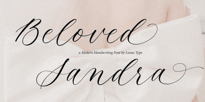 Introducing, Beloved Sandra! Beloved Sandra is a modern and luxury calligraphy font. Beloved Sandra will add charm and impression for your design. Beloved Sandra is perfect for many design needs such as merch, T-shirts, signature logo, wedding, book covers, social media posts, websites, events, and many more.
 - RoyHand RP by BluHead Studio,
$25.00RoyHand RP is a new OpenType font family release by BluHead Studio, LLC from the wonderfully talented English designer and illustrator Roy Preston. RoyHand, as the name would suggest, is based upon the handwriting of Roy himself. The family has three weights and is suitable for many everyday uses. - Soda Land by Typefactory,
$14.00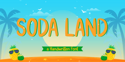 Soda Land is a fancy font that will bring playful feel to your designs. It is inspired by Summer theme typographies and it looks casual and natural. Soda Land is perfect for branding purposes such as logo, label, title, headline, product, social media, business card, quotes, and others
 - Qilla by Herlan Nawwi,
$10.00 Qilla is a simple and elegant font for your projects. Can be used for various purposes such as headings, logos, wedding invitation, t-shirt, letterhead, signage, labels, posters, badges etc. Qilla comes with two styles, upright and slanted version can be an alternative choice to suit your needs.
 - Cool Cat by Fox7,
$10.00 Cool Cat is a fun and comfortable handwritten font that is easy to read. You can use it for various projects, such as blog posts, logos, branding, ads, invitations, greeting cards, planners, photo albums, decorations, and much more. Add it to any of your designs, and enjoy the results!
 - Storytelling by Motokiwo,
$15.00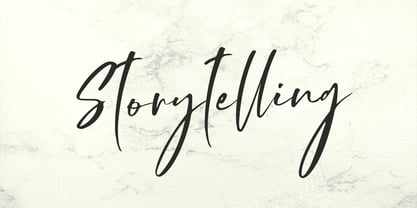 Storytelling is luxury and elegant modern calligraphy with natural handwriting style. It's great for various design purposes that need a classy feel such as logos, social media, wedding, branding, business cards, and many more. Storytelling contains uppercase, lowercase, numeral & punctuation, ligature, it's multi-lingual and already PUA encoded.
