10,000 search results
(0.03 seconds)
- Port Vintage by Onrepeat,
$25.00 Guided tour available here. Port Vintage is a new typeface expanded upon the original Port typeface, released in 2013, and being an experimental Didone typeface with a modern twist, inspired by the well known forms of typography masters such as Bodoni and Didot and the exuberance and elegance of calligraphy typefaces. A lot of changes were made, the whole typeface is now softer and has less rough edges, the time it took to mature made it possible to achieve an entirelly new and distinct flavour from the original Port, giving away the rough edges from Port and giving place to the soft transitions and curved connections between the stems and serifs of Port Vintage. Port Vintage melts the straight lines and strong contrasts of the Didone typefaces with the elegant lines of calligraphy in a geometric way, resulting in exuberant characters with geometric swashes that can be combined in countless ways. The result of this experiment is Port Vintage, an unique and rich display typeface meant to be used on big sizes and it’s main perk is the amount of alternative characters it features. Port Vintage is Open-Type programmed and includes hundreds of alternates, from swashes to titling alternates, ligatures and stylistic sets with each character having a thin version of itself, giving complete freedom to all your creative needs. Port Vintage is available in 10 different styles: Port Vintage Regular, being the base version and featuring the whole base character set; Port Vintage Regular Decorated, featuring richer forms and containing more ornamentated and more extravagant characters; Port Vintage Medium and Port Vintage Medium Decorated, designed for the occasions you need a bit more thickness and the decoration variants: Port Vintage Ornaments, containing a wide set of elements meant for the creation of fillets, vignettes and fleurons, resulting in an almost infinite number of possible combinations to embellish your designs and Port Vintage Words, a set of some of the most common words used in English, Spanish, French, German, Italian and Portuguese. All styles, except Port Vintage Ornaments and Port Vintage Words, include italic styles. For a better understanding of all the uses of Port Vintage and the full character list the reading of the manual is recommended.
 - Cryptocurrency by Bülent Yüksel,
$14.00 "Crypto Currency - Block Chain" quickly entered our lives and its use is increasing day by day. Blockchain became more popular in web, TV and printed works. It is necessary to use their logos when defining "Crypto Currencies". But it is not easy to access these logos fast. "Cryptocurrency Font Family" which I prepared for you, is a resource that you can reach without searching for too many logos. Cryptocurrency Font Family contains 200+ logos. These are the most popular "Block Chain" logos in recent years. The popularity rankings changed over time and you can contact me if you need new logos and changing logos. I can create the "Block Chain" logo you need or apply the changes. You can send your new logo and logo change requests to me at "buyuksel@hotmail.com". Subsequent corrections and additions will be completely free. After the first purchase, there is no additional payment for updates. When using Cryptocurrency Font Family, "Cryptocurrency No.00 Guide Map" is absolutely free to download and use. This will help you a lot to define coins. "Guide Map" contains the letter and the Unicode numbers. --- Contents --- Ardor ARDR, Bitcoin BTC, Bitcoin Cash BCH, Bitcoin SV BSV, Bitcoin Gold BTG, Bitcoin Diamond BCD, Bitcoin Private BTCP, Bitcoin Plus ZBC, Bitcoin Z BTCZ, Etherium ETH, Etherium Classic ETC, Xrp Ripple XRP, Ripple, Teher USDT, Litecoin LTC, Litecoin Cash LCC, Eos EOS, Binance Coin BNC, Monero XMR, Cardano ADA, Steller XLM, Tron TRX, Tezos XTZ, Unus Sed Leo LEO, Chain Link LINK, Cosmos Atom ATOM, Huobi Token HT, Neo NEO, Hedge Trade HEDG, Crypto.com CRO, Iota MIOTA, Dash DASH, Maker MKR, Usd Coin USDC, Ontology ONT, Nem XEM, Ve Chain VET, Dogecoin DOGE, Basic Attention BAT, Z Cash ZEC, Paxos Standard PAX, Ftx Token FTT, Decred DCR, Qtum QTUM, Syntehetix Network SNX, True Usd TUSD , Raven Coin RVN, Ox ZRX, Okex OKB, Algorad ALGO, Holo HOT, Centrality CENZ, Augur REB, ZB Token ZB, Seele SEELE, Omisego OMG, Swipe SXP, Waves WAVES, Horizen ZEN, Kucoin Shares KCS, Theta THETA, Nano NANO, Nervos Network CKB, Byton BTM, Lisk LSK, Molekular Futures MOF, Digibayt DGB, Bittorent BTT, Icon ICX, V Systems VSYS, Iost IOST, Abbc Coin ABBC, Komodo KMD, Nexo NEXO, Siacom SC, Monacoin MONA, Luna LUNA, Enjin ENJ, DxChain Token DX, Hyper Cash HC, Verge XVG, Bytecoin BCN, Steem STEEM, Zilliqa ZIL, Maidsafe Coin MAID, Energi NRG, Bitshares BTS, Digixdo DGD, Rif Taoken RIF, Aeternity AE, Block Stamp BST, Zcoin XSC, Matic Network MATIC, Quart QNT, Silverway SLV, Kyber Network KNC, Iexec Rlc RLC, Electironeum ETN, Ren REN, Status SNT, Status Euro EURS, Single Colleteral SAI, Nash Exchange NEX, Grin GRIN, Decentraland Mana MANA, Stratis STRAT, Solve SOLVE, Kick Token KICK, Aelf ELF, Golem GLT, Pumdi X NPXS, Enigma ENG, Metaversa Etp ETP, Digitex Futures DGTX, Elastos ELA, Gxchain GXC, Chiliz CHZ, Ripio Credit RCN, Aion AION, Fetch Ai FET, Loopring LRC, Dragon Coin DRG, Wayki Chain WICC, Thunder Token TT, Iotex IOTX, Nebulas NAS, Hedera Hashgraph HBAR, Bread BRD, Hyperion HYN, Ignis IGNIS, True Chain TRUE, Wax WAX, Tierion TNT, Wanchain WAN, Reddcoin RDD, Wink WIN, Gatechain Token GT, Diamond Platform DPT, Nuls NULS, Yap Stone YAP, Vertcoin VTC, Project Pai PAI, Denta Coin DCN, Ark ARK, Fun Fair FUN, Loom Network XMX, Edu Care EKT, Aragon ANT, Factom FCT, Populous PPT, Revain R, Harmony ONE, Qash QASH, Groestl Coin GRS, Civic CVC, Fantom FTM, Swiss Borg CHSB, Santiment Network SAN, Moeda Loyalty MDA, GoChain GO, Dent DENT, Edc Blockchain EDC, Storj STORJ, Divi DIVI, Pivx PIVX, Bancor BNT, Metal MTL, Loki LOKI, Wirex Token WXT, Bitkan KAN, Gnosis GNO, Network NEW, Thorchain RUNE, Odem ODE, Bibox Token BIX, Bosagora BOA, Oceon Protocol OCEON, Celer Network CELR, Chimpion BNANA, Mixin XIN, Veritasium VERI, Mine Bee MB, Bankera BNK, Bitcoin2 BTC2, Casino Coin CSC, Bitforex Token BF, Dynamic Trading DTR, Poseidon Network QQQ, Obyte GBYTE, Cloak Coin CLOAK
 - Grenale Slab by insigne,
$- Grenale Slab adds to the new standard of elegance within the Grenale family. Not your typical slab, Grenale has some unique forms that give it a look all its own. This glamourous slab still draws much inspiration from Grenale’s Didone sans and its haute couture influence. Independently attractive, it’s balanced and poised, with well formed strokes. Grenale Slab’s thin weights are simple but vibrant--elegant forms that naturally lend themselves to designer journals and high-end branding along with upscale applications. With added energy and power, the thicker weights give your work a firmer, statlier look. Grenale Slab’s upright versions are also matched by optically adjusted italics. The fashionable typeface includes a multitude of alternates that may be accessed in any OpenType-enabled application. The stylish features include a large group of alternates, swashes, and meticulously refined details with ball terminals and alternate titling caps to accessorize the font. Also included are capital swash alternates, old style figures, and small caps. Peruse the PDF brochure to see these features in action. OpenType enabled applications such as the Adobe suite or Quark can take full advantage of the automatic replacing ligatures and alternates. This family also offers the glyphs to support a wide range of languages. Any of Slab’s weights also provide a well-matched companion to its original counterparts, Grenale #2 and the original Grenale. It’s time to think high-class. Graceful and assured, the carefully crafted forms of Grenale Slab step pleasantly onto each page with elegant charm. Include its range of alternate glyphs, and this chic font is a superb choice for bringing a far more refined look to your copy.
 - Belgato by Molly Suber Thorpe,
$9.00 Belgato is a vintage-inspired typeface with delicate details. It comes in six weights – plus italics! – for a total of 12 fonts, making it a highly versatile display face. The variable font version allows for ultimateweight and slant customization in print and web. Belgato has Latin, Greek, and Cyrillic alphabets, and supports dozens of languages, making it ideal for multilingual branding, publications, ads, social media, and more! I had so much fun designing this typeface, playing with classic serif letterforms to create an elegant, mid-century modern vibe. Belgato Light is fresh, airy, and delicate – perfect for feminine branding. By contrast, Belgato Black boasts fat curves with thin details, perfectly-suited to bold layouts and retro branding projects. Each Belgato font has 665 glyphs, encompassing: - the Latin alphabet (including hundreds of accented characters) - the Modern Greek alphabet - the Cyrillic alphabet (for Russian, Ukrainian, Bulgarian, and Serbo-Croatian) - discretionary ligatures - stylistic and alternate glyphs - numerals (lining and old style), small figures, and fractions - extensive punctuation, symbols, and diacritical markings Software: No special software is required to use Belgato fonts. You can even use these fonts with Canva! To access Belgato’s variable font features, ligatures, and stylistic alternates, it is best to use software that supports these functions (Adobe programs, Corel Draw, Sketch, etc). Languages: Belgato supports dozens of languages which use the Latin, Greek, and Cyrillic alphabets. Among the most common languages it supports are: English, Bulgarian, Catalan, Croatian, Czech, Danish, Dutch, Filipino, Finnish, Flemish, French, German, Modern Greek, Hungarian, Icelandic, Indonesian, Italian, Luxembourgish, Maltese, Norwegian, Polish, Portuguese, Russian, Serbo-Croatian, Spanish, Swedish, Swiss German, Turkish, and Ukrainian.
 - Noam Text by TypeTogether,
$69.00 Adi Stern’s Noam Text shows that typographic progress is often in the small things — in the perfecting of familiar traditions and in staying loyal to the spirit of what came before. It can’t really be called progress unless it honours its history. In this way, TypeTogether is happy to introduce Noam Text: A Hebrew and Latin serif font that builds on its heritage with the twin tools of honour and progress. Since 1908, the Frank-Rühl fonts have dominated the Hebrew book and newspaper market. Noam Text’s design goal was to create a coherent family with both Latin and Hebrew serif text typefaces, each authentic to its own script, and which would serve as an alternative to last century’s predecessor. In short order, users will recognise Noam Text as a source of progress in its bilingual abilities. Hebrew and Latin have opposite reading directions, creating many issues: opposing directionality of the open counters; vertical stress in Latin, but horizontal in Hebrew; fewer extenders in Hebrew; and no Hebrew capital letters. All these have been taken into account in Noam Text’s modern design. Of unique importance — all punctuation marks have a Hebrew version, which makes each script complete and uncompromising. Among other technologically advanced details, Noam Text was programmed for all expected scenarios of mixing Hebrew, Latin, figures, and punctuation. Noam Text is intended mostly for setting long texts, so it strives to achieve maximum legibility in minimum space with its large x-height, short and fairly condensed Latin capitals, large and open counters, and low contrast. Originally derived from the Hebrew, the shallow horizontal curves and strong baseline serifs provide dynamism and enhance the reading flow. Noam Text Latin’s italic is rounded and reading friendly, is condensed to generate a lighter texture than the roman, and has a flowing stance. These virtues help it endure harsh printing conditions and subpar inks and paper. Noam Text’s three total weights provide a proper solution for integrating texts in both scripts, as well as a contemporary alternative for use in books, newspapers, and magazine design. Aligned with TypeTogether’s commitment to produce high-quality type for the global market, the complete Noam Text family displays an impressive amount of discretion, applying to wide use-cases by not edging too close to religious motifs or imbibing in secular indulgence. This means Noam Text can be the go-to family across the board and capitalise on the desire for clear typographic progress in this modern age.
 - Maestro by Canada Type,
$24.95 Out of a lifelong inner struggle, Philip Bouwsma unleashes a masterpiece that reconciles classic calligraphy with type in a way never before attempted. Maestro takes its cue from the Italian chancery cursive of the early sixteenth century. By this time type ruled the publishing world, but official court documents were still presented in calligraphy, in a new formal style of the high Renaissance that was integrated with Roman letters and matched the refined order of type. The copybooks of Arrighi and others, printed from engraved wood blocks, spread the Italian cancellaresca across Europe, but the medium was too clumsy and the size too small to show what was really happening in the stroke. Arrighi and others also made metal fonts that pushed type in the direction of calligraphy, but again the medium did not support the superb artistry of these masters or sustain the vitality in their work. As the elegant sensitive moving stroke of the broad pen was reduced to a static outline, the human quality, the variety and the excitement of a living act were lost. Because the high level of skill could not be reproduced, the broad pen was largely replaced by the pointed tool. The modern italic handwriting revival is based on a simplified model and does not approach the level of this formal calligraphy with its relationship to the Roman forms. Maestro is the font that Arrighi and his colleagues would have made if they had had digital technology. Like the calligraphic system of the papal chancery on which it is modelled, it was not drawn as a single finished alphabet, but evolved from a confluence of script and Roman; the script is formalized by the Roman to stand proudly in a world of type. Maestro came together on screen over the course of several years, through many versions ranging widely in style, formality, width, slant, weight and other parameters. On one end of the spectrum, looking back to tradition it embodies the formal harmony of the Roman capitals and the minuscule which became the lower case. On the other it is a flowing script letter drawing on the spirit of later pointed pen and engravers scripts. As its original designers intended, it works with simple Roman capitals and serifs or swash capitals and baroque flourishes. The broad pen supplies weight and substance to the stroke which carries energy through tension in balanced s-curves. Above all it is meant to convey the life and motion of formal calligraphy as a worthy counterbalance to the stolid gravity of metal type. The Maestro family consists of forty fonts distributed over two weights. The OpenType version compresses the family considerably down to two fonts, regular and bold, each containing the entire character set of twenty fonts, for a total of more than 3350 characters per font. These include a wide variety of stylistic alternates, ligatures, beginning and ending letters, flourishes, borders, rules, and other extras. The Pro version also includes extended linguistic support for Latin-based scripts (Western, Central and Eastern European, Baltic, Turkish, Welsh/Celtic, Maltese) as well as Greek. For more thoughts on Maestro, its background and character sets, please read the PDF accompanying the family.
 - Bowling by Ingrimayne Type,
$14.95 Bowling has letters on bowling pins. On the upper-case keys, the bowling pins are white with black letters and on the lower-case keys the pins are black with white letters. The lower-case letters can be colored and placed behind the upper-case letters to give two-color lettering. (The letters on the pins are from the typeface InsideLetters.)
 - Ruber by Artisticandunique,
$20.00 Ruber - Sans serif font family - Multilingual - 12 Styles You can easily use the sans serif font feature in many areas. You can compose your text with regular characters, highlight heavy characters and titles. Functional in many sizes and environments. If you are looking for a modern - geometric and sans serif style that can be effective in branding, you can easily use this font. It is also assertive about being a highly readable font with different weights. Have a good time.
 - Macondo Pro by JVB Fonts,
$30.00 The first purpose of this typeface was to provide an original and systematized style of calligraphy adapted into a modern digital font. The forms are inspired by some illustrations created for a tarot card game, itself inspired by the work of Colombian literature Nobel prize winning author, Gabriel García Márquez, "Cien Años de Soledad". Early versions of this font were made in 1997, but recently in 2009 it was substantially improved. Macondo includes several cap swashes and other stylish alternates. Macondo, as original typographic proposal was selected at Tipos Latinos 2012 Biennial, now the complete set of extended range for this typeface is prepared and improved to be commercialized. The new Macondo Pro can be available with extended capabilities of OpenType, as old style numbers, Swash Caps, slashed zero, some end-position lowercase, fractions, super and sub numbers, some stylish lowercase and discretional and/or contextual ligatures. The font also supports cyrillic, Greek and some East Europe languages.
 - Maradona Signature by NJ Studio,
$19.00 Maradona Signature a stylish signature font is a font with 59 ligatures,9 swash and ending swash. It features signature characters that will take your projects to the next level! This font is PUA code which means you can easily access all the glyphs and swashes that are full of signature! It also features many special features including glyphs and alternate ligatures. font designs that are made for various vector designs, printing such as digital wedding blogs, online shops, social media, while printing can be used in the field of product clothing, accessories, bags, pins, logos, business cards, watermarks and many others ... so it can make your product look cute and attractive, and also Multilingual support!!! Happy design ...
 - Dragon Fruit by NJ Studio,
$19.00 Hi...Thank for your visit :) dragon fruit a handwritten script font. It features beginning swash and ending swash characters that will take your projects to the next level! This font is PUA code which means you can easily access all the glyphs and swashes that are full of swash! It also features many special features including glyphs. font designs that are made for various vector designs, printing such as digital wedding blogs, online shops, social media, while printing can be used in the field of product clothing, accessories, bags, pins, logos, business cards, watermarks and many others ... so it can make your product look cute and attractive, and also Multilingual support!!! Happy design ...
 - Christian Signature by NJ Studio,
$19.00 Hi...Thank for your visit :) Christian Signature a stylish signature font with 51 ligatures, 26 swash and ending swash. It features ligatures characters that will take your projects to the next level! This font is PUA code which means you can easily access all the glyphs that are full of swash! It also features many special features including glyphs. font designs that are made for various vector designs, printing such as digital wedding blogs, online shops, social media, while printing can be used in the field of product clothing, accessories, bags, pins, logos, business cards, watermarks and many others ... so it can make your product look swash and attractive, and also Multilingual support!!! Happy design ...
 - Loventine by NJ Studio,
$19.00 Hi...Thank for your visit :) Loventine a modern calligraphy font with alternates, love swash, beginning swash and ending swash. It features ligatures characters that will take your projects to the next level! This font is PUA code which means you can easily access all the glyphs that are full of natural! It also features many special features including glyphs. font designs that are made for various vector designs, printing such as digital wedding blogs, online shops, social media, while printing can be used in the field of product clothing, accessories, bags, pins, logos, business cards, watermarks and many others ... so it can make your product look natural and attractive, and also Multilingual support!!! Happy design ...
 - Monkey by NJ Studio,
$19.00 Hi...Thank for your visit :) Monkey a script font. It features 2 beginning swash, 2ending swash and 7 stylishtic set alternate characters that will take your projects to the next level! This font is PUA code which means you can easily access all the glyphs and swashes that are full of swash! It also features many special features including glyphs. font designs that are made for various vector designs, printing such as digital wedding blogs, online shops, social media, while printing can be used in the field of product clothing, accessories, bags, pins, logos, business cards, watermarks and many others ... so it can make your product look cute and attractive, and also Multilingual support!!! Happy design ...
 - Daddy Day by NJ Studio,
$19.00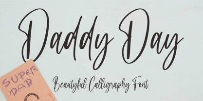 Hi...Thank for your visit :) Daddy Day a beautyful calligraphy font with beginning and ending swash. It features ligatures characters that will take your projects to the next level! This font is PUA code which means you can easily access all the glyphs and swash that are full of beautyful! It also features many special features including glyphs. font designs that are made for various vector designs, printing such as digital wedding blogs, online shops, social media, while printing can be used in the field of product clothing, accessories, bags, pins, logos, business cards, watermarks and many others ... so it can make your product look beautyful and attractive, and also Multilingual support!!! Happy design ...
 - Hello Mermaid by NJ Studio,
$19.00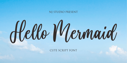 Hi...Thank for your visit :) Hello Mermaid a cute script font with beginning and ending swash. It features ligatures characters that will take your projects to the next level! This font is PUA code which means you can easily access all the glyphs that are full of natural! It also features many special features including glyphs. font designs that are made for various vector designs, printing such as digital wedding blogs, online shops, social media, while printing can be used in the field of product clothing, accessories, bags, pins, logos, business cards, watermarks and many others ... so it can make your product look natural and attractive, and also Multilingual support!!! Happy design ...
 - Daddy dear by NJ Studio,
$19.00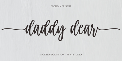 Hi...Thank for your visit :) Daddy dear a modern script font is a elegant script font. It features elegant characters that will take your projects to the next level! This font is PUA code which means you can easily access all the glyphs and swashes that are full of unique! It also features many special features including glyphs and alternate ligatures. font designs that are made for various vector designs, printing such as digital wedding blogs, online shops, social media, while printing can be used in the field of product clothing, accessories, bags, pins, logos, business cards, watermarks and many others ... so it can make your product look cute and attractive, and also Multilingual support!!! Happy design ...
 - Sasa by NJ Studio,
$19.00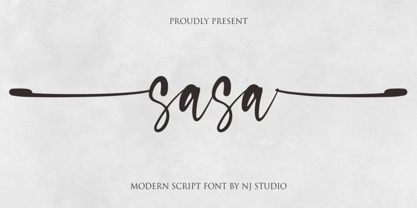 Hi...Thank for your visit :) Sasa a modern script font with beginning and ending swash. It features ligatures characters that will take your projects to the next level! This font is PUA code which means you can easily access all the glyphs and swash that are full of authentic! It also features many special features including glyphs. font designs that are made for various vector designs, printing such as digital wedding blogs, online shops, social media, while printing can be used in the field of product clothing, accessories, bags, pins, logos, business cards, watermarks and many others ... so it can make your product look authentic and attractive, and also Multilingual support!!! Happy design ...
 - Sweet Song by NJ Studio,
$19.00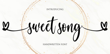 Hi...Thank for your visit :) Sweet song a handwritten script font. It features beginning swash and ending swash characters that will take your projects to the next level! This font is PUA code which means you can easily access all the glyphs and swashes that are full of swash! It also features many special features including glyphs. font designs that are made for various vector designs, printing such as digital wedding blogs, online shops, social media, while printing can be used in the field of product clothing, accessories, bags, pins, logos, business cards, watermarks and many others ... so it can make your product look cute and attractive, and also Multilingual support!!! Happy design ...
 - Lampard Signature by NJ Studio,
$19.00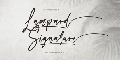 Hi...Thank for your visit :) Lampard Signature a stylish signature font 9 swash and ending swash. It features ligatures characters that will take your projects to the next level! This font is PUA code which means you can easily access all the glyphs that are full of swash! It also features many special features including glyphs. font designs that are made for various vector designs, printing such as digital wedding blogs, online shops, social media, while printing can be used in the field of product clothing, accessories, bags, pins, logos, business cards, watermarks and many others ... so it can make your product look swash and attractive, and also Multilingual support!!! Happy design ...
 - Dairy day by NJ Studio,
$19.00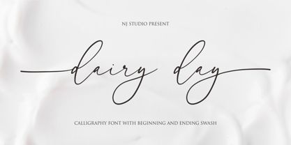 Hi...Thank for your visit :) dairy day a modern calligraphy font with beginning and ending swash. It features ligatures characters that will take your projects to the next level! This font is PUA code which means you can easily access all the glyphs that are full of natural! It also features many special features including glyphs. font designs that are made for various vector designs, printing such as digital wedding blogs, online shops, social media, while printing can be used in the field of product clothing, accessories, bags, pins, logos, business cards, watermarks and many others ... so it can make your product look natural and attractive, and also Multilingual support!!! Happy design ...
 - Make Cake by NJ Studio,
$19.00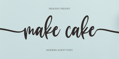 Hi...Thank for your visit :) Make cake a script font. It features beginning swash and ending swash characters that will take your projects to the next level! This font is PUA code which means you can easily access all the glyphs and swashes that are full of swash! It also features many special features including glyphs. font designs that are made for various vector designs, printing such as digital wedding blogs, online shops, social media, while printing can be used in the field of product clothing, accessories, bags, pins, logos, business cards, watermarks and many others ... so it can make your product look cute and attractive, and also Multilingual support!!! Happy design ...
 - Present Snow by NJ Studio,
$19.00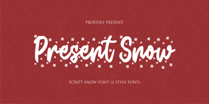 Hi...Thank for your visit :) Present Snow a script font is a beautiful script font with snow effect. It features Snow-themed characters that will take your projects to the next level! This font is PUA code which means you can easily access all the glyphs and alternates that are full of love! It also features many special features including glyphs and alternate. font designs that are made for various vector designs, printing such as digital wedding blogs, online shops, social media, while printing can be used in the field of product clothing, accessories, bags, pins, logos, business cards, watermarks and many others ... so it can make your product look cute and attractive, and also Multilingual support!!! Happy design ...
 - Pink blossom by NJ Studio,
$19.00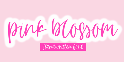 Hi...Thank for your visit :) pink blossom a handdwritten script font is a unique script font. It features bouncy characters that will take your projects to the next level! This font is PUA code which means you can easily access all the glyphs and swashes that are full of unique! It also features many special features including glyphs and alternate ligatures. font designs that are made for various vector designs, printing such as digital wedding blogs, online shops, social media, while printing can be used in the field of product clothing, accessories, bags, pins, logos, business cards, watermarks and many others ... so it can make your product look cute and attractive, and also Multilingual support!!! Happy design ...
 - Holla bella by NJ Studio,
$19.00 Hi...Thank for your visit :) Holla bella a lovely script font family is a beautiful script font. It features love-themed characters that will take your projects to the next level! This font is PUA code which means you can easily access all the glyphs and swashes that are full of love! It also features many special features including glyphs and alternate ligatures. font designs that are made for various vector designs, printing such as digital wedding blogs, online shops, social media, while printing can be used in the field of product clothing, accessories, bags, pins, logos, business cards, watermarks and many others ... so it can make your product look cute and attractive, and also Multilingual support!!! Happy design ...
 - Masterbaker by NJ Studio,
$19.00 Hi...Thank for your visit :) Masterbaker a modern script font is a unique script font. It features bread-themed characters that will take your projects to the next level! This font is PUA code which means you can easily access all the glyphs and swashes that are full of unique! It also features many special features including glyphs and alternate ligatures. font designs that are made for various vector designs, printing such as digital wedding blogs, online shops, social media, while printing can be used in the field of product clothing, accessories, bags, pins, logos, business cards, watermarks and many others ... so it can make your product look cute and attractive, and also Multilingual support!!! Happy design ...
 - Jaroslaw by NJ Studio,
$19.00 Hi...Thank for your visit :) Jaroslaw a monoline bold script font is a unique script font with many swash. It features swash characters that will take your projects to the next level! This font is PUA code which means you can easily access all the glyphs and swashes that are full of unique! It also features many special features including glyphs. font designs that are made for various vector designs, printing such as digital wedding blogs, online shops, social media, while printing can be used in the field of product clothing, accessories, bags, pins, logos, business cards, watermarks and many others ... so it can make your product look cute and attractive, and also Multilingual support!!! Happy design ...
 - Get Married by NJ Studio,
$19.00 Hi...Thank for your visit :) Get Married a modern calligraphy font with 192 alternate, swash and ligature. It features ligatures characters that will take your projects to the next level! This font is PUA code which means you can easily access all the glyphs that are full of natural! It also features many special features including glyphs. font designs that are made for various vector designs, printing such as digital wedding blogs, online shops, social media, while printing can be used in the field of product clothing, accessories, bags, pins, logos, business cards, watermarks and many others ... so it can make your product look natural and attractive, and also Multilingual support!!! Happy design ...
 - Rich and Famous by NJ Studio,
$19.00 Hi...Thank for your visit :) Rich and Famous a modern script font with beginning and ending swash. It features ligatures characters that will take your projects to the next level! This font is PUA code which means you can easily access all the glyphs and swash that are full of authentic! It also features many special features including glyphs. font designs that are made for various vector designs, printing such as digital wedding blogs, online shops, social media, while printing can be used in the field of product clothing, accessories, bags, pins, logos, business cards, watermarks and many others ... so it can make your product look authentic and attractive, and also Multilingual support!!! Happy design ...
 - Brounde by Ahmet Altun,
$17.00 Brounde font comes in four weights from extra light to medium. Legible texts can be created with its rounded slab serif configuration. Also it can be used in posters and every kind of graphic design works.
 - Telidon by Typodermic,
$11.95 Introducing Telidon—the typeface that brings the nostalgic charm of old dot matrix printers to life. It’s a typeface that’s full of character, inspired by the clunky, mechanical printers of the 1980s that used to hum, buzz and chug away, as they churned out reams of perforated pages. Telidon’s unique dot-matrix appearance isn’t just a throwback to a bygone era, it’s a design element that can help your words stand out from the crowd. With its quick and simple flavor, Telidon will add a jolt of energy to your text, making it perfect for headlines, titles, and logos. This versatile typeface comes in three widths, three weights, and italics, giving you the freedom to create dynamic layouts and add emphasis where needed. Whether you’re designing a retro-inspired poster, a tech-forward website, or anything in between, Telidon is the font that can take your project to the next level. But wait, there’s more! Telidon also has a grungy companion—Telidon Ink—that can give your design a rough-and-tumble edge. So why not add a little dot-matrix magic to your designs and give Telidon a try? You won’t be disappointed! Most Latin-based European writing systems are supported, including the following languages. Afaan Oromo, Afar, Afrikaans, Albanian, Alsatian, Aromanian, Aymara, Bashkir (Latin), Basque, Belarusian (Latin), Bemba, Bikol, Bosnian, Breton, Cape Verdean, Creole, Catalan, Cebuano, Chamorro, Chavacano, Chichewa, Crimean Tatar (Latin), Croatian, Czech, Danish, Dawan, Dholuo, Dutch, English, Estonian, Faroese, Fijian, Filipino, Finnish, French, Frisian, Friulian, Gagauz (Latin), Galician, Ganda, Genoese, German, Greenlandic, Guadeloupean Creole, Haitian Creole, Hawaiian, Hiligaynon, Hungarian, Icelandic, Ilocano, Indonesian, Irish, Italian, Jamaican, Kaqchikel, Karakalpak (Latin), Kashubian, Kikongo, Kinyarwanda, Kirundi, Kurdish (Latin), Latvian, Lithuanian, Lombard, Low Saxon, Luxembourgish, Maasai, Makhuwa, Malay, Maltese, Māori, Moldovan, Montenegrin, Ndebele, Neapolitan, Norwegian, Novial, Occitan, Ossetian (Latin), Papiamento, Piedmontese, Polish, Portuguese, Quechua, Rarotongan, Romanian, Romansh, Sami, Sango, Saramaccan, Sardinian, Scottish Gaelic, Serbian (Latin), Shona, Sicilian, Silesian, Slovak, Slovenian, Somali, Sorbian, Sotho, Spanish, Swahili, Swazi, Swedish, Tagalog, Tahitian, Tetum, Tongan, Tshiluba, Tsonga, Tswana, Tumbuka, Turkish, Turkmen (Latin), Tuvaluan, Uzbek (Latin), Venetian, Vepsian, Võro, Walloon, Waray-Waray, Wayuu, Welsh, Wolof, Xhosa, Yapese, Zapotec Zulu and Zuni.
 - Blacker Pro by Zetafonts,
$39.00 Blacker Pro is the revised and extended version of the original wedge serif type family designed by Cosimo Lorenzo Pancini and Andrea Tartarelli in 2017. Blacker was developed as a take on the style that Jeremiah Shoaf has defined as the "evil serif" genre: typefaces with high contrast, oldstyle or modern serif proportions and sharp, blade-like triangular serifs. Due to the high contrast in the design - slightly reminescent of didone typefaces - Blacker has been developed in two optical subfamilies. The display version offers tighter tracking, higher contrast and sharper corners for maximum effect at big sizes, while the text variant offers better readability and screen rendering at smaller sizes, with lower contrast and looser spacing. In the pro version, two additional condensed variant families have been added (condensed display and condensed text) allowing for more freedom and versatility in typesetting where space constraints are present. Also, three titling uppercase-only variants have been added, with a slightly extended feel, and two decorative subfamilies (inline and diamond). Each of these seven variants has been developed in six weights from light to heavy, with matching italics, for a total of 69 styles covering a wide range of editorial and advertising uses. All Blacker Pro feature a revised and extended character set covering over two hundred languages using the latin, cyrillic and greek alphabets. Open type features include small caps, positional numerals, fractions, superior & inferior figures, alternate forms, and an extended set of standard and discretionary ligatures. With its bold personality, Blacker aims to be a modern classic used for bold statements and self-conscious brands, making your text look great both on paper and on the screens.
 - 99 Names of ALLAH Linear by Islamic Calligraphy75,
$12.00 We have transformed the “99 names of ALLAH” into a font. That means each key on your keyboard represents 1 of the 99 names of ALLAH Aaza Wajal. The fonts work with both the English and Arabic Keyboards. We call this Calligraphy "Linear" for obvious reasons. The first "Alef" has a "fatha", this indicates that the name can be pronounced only one way, "AR-RAHMAAN". (in the zip file you will find a pdf file explaining the differences in the "harakat", pronunciation and spelling according to the Holy Quran). This calligraphy is very clear and no letters overlap. Decorative letters used in this calligraphy: "Mim, Aain, Sin, HHe, He, Kaf, Ta & Saad". Purpose & use: - Writers: Highlight the names in your texts in beautiful Islamic calligraphy. - Editors: Use with kinetic typography templates (AE) & editing software. - Designers: The very small details in the names does not affect the quality. Rest assured it is flawless. The MOST IMPORTANT THING about this list is that all the names are 100% ERROR FREE, and you can USE THEM WITH YOUR EYES CLOSED. All the “Tachkilat” are 100% ERROR FREE, all the "Spelling" is 100% ERROR FREE, and they all have been written in accordance with the Holy Quran. No names are missing and no names are duplicated. The list is complete "99 names +1". The +1 is the name “ALLAH” 'Aza wajal. Another important thing is how we use the decorative letters. In every font you will see small decorative letters, these letters are used only in accordance with their respective letters to indicate pronunciation & we don't include them randomly. That means "mim" on top or below the letter "mim", "sin" on top or below the letter "sin", and so on and so forth. Included: Pdf file telling you which key is associated with which name. In that same file we have included the transliteration and explication of all 99 names. Pdf file explaining the differences in the harakat and pronunciation according to the Holy Quran.
 - Rough Tongue by Comicraft,
$19.00 Here's The Thing -- it can be loosened, twisted, tied, tripped over, wagged, bitten, forked, stuck out or kept in your cheek. You need your tongue to talk, taste, chew, swallow and sing. You can keep a civil tongue in your head or you can give someone the rough side of your tongue...
 - Times Eighteen by Linotype,
$29.00In 1931, The Times of London commissioned a new text type design from Stanley Morison and the Monotype Corporation, after Morison had written an article criticizing The Times for being badly printed and typographically behind the times. The new design was supervised by Stanley Morison and drawn by Victor Lardent, an artist from the advertising department of The Times. Morison used an older typeface, Plantin, as the basis for his design, but made revisions for legibility and economy of space (always important concerns for newspapers). As the old type used by the newspaper had been called Times Old Roman," Morison's revision became "Times New Roman." The Times of London debuted the new typeface in October 1932, and after one year the design was released for commercial sale. The Linotype version, called simply "Times," was optimized for line-casting technology, though the differences in the basic design are subtle. The typeface was very successful for the Times of London, which used a higher grade of newsprint than most newspapers. The better, whiter paper enhanced the new typeface's high degree of contrast and sharp serifs, and created a sparkling, modern look. In 1972, Walter Tracy designed Times Europa for The Times of London. This was a sturdier version, and it was needed to hold up to the newest demands of newspaper printing: faster presses and cheaper paper. In the United States, the Times font family has enjoyed popularity as a magazine and book type since the 1940s. Times continues to be very popular around the world because of its versatility and readability. And because it is a standard font on most computers and digital printers, it has become universally familiar as the office workhorse. Times™, Times™ Europa, and Times New Roman™ are sure bets for proposals, annual reports, office correspondence, magazines, and newspapers. Linotype offers many versions of this font: Times™ is the universal version of Times, used formerly as the matrices for the Linotype hot metal line-casting machines. The basic four weights of roman, italic, bold and bold italic are standard fonts on most printers. There are also small caps, Old style Figures, phonetic characters, and Central European characters. Times™ Ten is the version specially designed for smaller text (12 point and below); its characters are wider and the hairlines are a little stronger. Times Ten has many weights for Latin typography, as well as several weights for Central European, Cyrillic, and Greek typesetting. Times™ Eighteen is the headline version, ideal for point sizes of 18 and larger. The characters are subtly condensed and the hairlines are finer. Times™ Europa is the Walter Tracy re-design of 1972, its sturdier characters and open counterspaces maintain readability in rougher printing conditions. Times New Roman™ is the historic font version first drawn by Victor Lardent and Stanley Morison for the Monotype hot metal caster." - Times Europa LT by Linotype,
$29.99In 1931, The Times of London commissioned a new text type design from Stanley Morison and the Monotype Corporation, after Morison had written an article criticizing The Times for being badly printed and typographically behind the times. The new design was supervised by Stanley Morison and drawn by Victor Lardent, an artist from the advertising department of The Times. Morison used an older typeface, Plantin, as the basis for his design, but made revisions for legibility and economy of space (always important concerns for newspapers). As the old type used by the newspaper had been called Times Old Roman," Morison's revision became "Times New Roman." The Times of London debuted the new typeface in October 1932, and after one year the design was released for commercial sale. The Linotype version, called simply "Times," was optimized for line-casting technology, though the differences in the basic design are subtle. The typeface was very successful for the Times of London, which used a higher grade of newsprint than most newspapers. The better, whiter paper enhanced the new typeface's high degree of contrast and sharp serifs, and created a sparkling, modern look. In 1972, Walter Tracy designed Times Europa for The Times of London. This was a sturdier version, and it was needed to hold up to the newest demands of newspaper printing: faster presses and cheaper paper. In the United States, the Times font family has enjoyed popularity as a magazine and book type since the 1940s. Times continues to be very popular around the world because of its versatility and readability. And because it is a standard font on most computers and digital printers, it has become universally familiar as the office workhorse. Times™, Times™ Europa, and Times New Roman™ are sure bets for proposals, annual reports, office correspondence, magazines, and newspapers. Linotype offers many versions of this font: Times™ is the universal version of Times, used formerly as the matrices for the Linotype hot metal line-casting machines. The basic four weights of roman, italic, bold and bold italic are standard fonts on most printers. There are also small caps, Old style Figures, phonetic characters, and Central European characters. Times™ Ten is the version specially designed for smaller text (12 point and below); its characters are wider and the hairlines are a little stronger. Times Ten has many weights for Latin typography, as well as several weights for Central European, Cyrillic, and Greek typesetting. Times™ Eighteen is the headline version, ideal for point sizes of 18 and larger. The characters are subtly condensed and the hairlines are finer. Times™ Europa is the Walter Tracy re-design of 1972, its sturdier characters and open counterspaces maintain readability in rougher printing conditions. Times New Roman™ is the historic font version first drawn by Victor Lardent and Stanley Morison for the Monotype hot metal caster." - Times Ten by Linotype,
$40.99In 1931, The Times of London commissioned a new text type design from Stanley Morison and the Monotype Corporation, after Morison had written an article criticizing The Times for being badly printed and typographically behind the times. The new design was supervised by Stanley Morison and drawn by Victor Lardent, an artist from the advertising department of The Times. Morison used an older typeface, Plantin, as the basis for his design, but made revisions for legibility and economy of space (always important concerns for newspapers). As the old type used by the newspaper had been called Times Old Roman," Morison's revision became "Times New Roman." The Times of London debuted the new typeface in October 1932, and after one year the design was released for commercial sale. The Linotype version, called simply "Times," was optimized for line-casting technology, though the differences in the basic design are subtle. The typeface was very successful for the Times of London, which used a higher grade of newsprint than most newspapers. The better, whiter paper enhanced the new typeface's high degree of contrast and sharp serifs, and created a sparkling, modern look. In 1972, Walter Tracy designed Times Europa for The Times of London. This was a sturdier version, and it was needed to hold up to the newest demands of newspaper printing: faster presses and cheaper paper. In the United States, the Times font family has enjoyed popularity as a magazine and book type since the 1940s. Times continues to be very popular around the world because of its versatility and readability. And because it is a standard font on most computers and digital printers, it has become universally familiar as the office workhorse. Times™, Times™ Europa, and Times New Roman™ are sure bets for proposals, annual reports, office correspondence, magazines, and newspapers. Linotype offers many versions of this font: Times™ is the universal version of Times, used formerly as the matrices for the Linotype hot metal line-casting machines. The basic four weights of roman, italic, bold and bold italic are standard fonts on most printers. There are also small caps, Old style Figures, phonetic characters, and Central European characters. Times™ Ten is the version specially designed for smaller text (12 point and below); its characters are wider and the hairlines are a little stronger. Times Ten has many weights for Latin typography, as well as several weights for Central European, Cyrillic, and Greek typesetting. Times™ Eighteen is the headline version, ideal for point sizes of 18 and larger. The characters are subtly condensed and the hairlines are finer. Times™ Europa is the Walter Tracy re-design of 1972, its sturdier characters and open counterspaces maintain readability in rougher printing conditions. Times New Roman™ is the historic font version first drawn by Victor Lardent and Stanley Morison for the Monotype hot metal caster." - Times Ten Paneuropean by Linotype,
$92.99In 1931, The Times of London commissioned a new text type design from Stanley Morison and the Monotype Corporation, after Morison had written an article criticizing The Times for being badly printed and typographically behind the times. The new design was supervised by Stanley Morison and drawn by Victor Lardent, an artist from the advertising department of The Times. Morison used an older typeface, Plantin, as the basis for his design, but made revisions for legibility and economy of space (always important concerns for newspapers). As the old type used by the newspaper had been called Times Old Roman," Morison's revision became "Times New Roman." The Times of London debuted the new typeface in October 1932, and after one year the design was released for commercial sale. The Linotype version, called simply "Times," was optimized for line-casting technology, though the differences in the basic design are subtle. The typeface was very successful for the Times of London, which used a higher grade of newsprint than most newspapers. The better, whiter paper enhanced the new typeface's high degree of contrast and sharp serifs, and created a sparkling, modern look. In 1972, Walter Tracy designed Times Europa for The Times of London. This was a sturdier version, and it was needed to hold up to the newest demands of newspaper printing: faster presses and cheaper paper. In the United States, the Times font family has enjoyed popularity as a magazine and book type since the 1940s. Times continues to be very popular around the world because of its versatility and readability. And because it is a standard font on most computers and digital printers, it has become universally familiar as the office workhorse. Times™, Times™ Europa, and Times New Roman™ are sure bets for proposals, annual reports, office correspondence, magazines, and newspapers. Linotype offers many versions of this font: Times™ is the universal version of Times, used formerly as the matrices for the Linotype hot metal line-casting machines. The basic four weights of roman, italic, bold and bold italic are standard fonts on most printers. There are also small caps, Old style Figures, phonetic characters, and Central European characters. Times™ Ten is the version specially designed for smaller text (12 point and below); its characters are wider and the hairlines are a little stronger. Times Ten has many weights for Latin typography, as well as several weights for Central European, Cyrillic, and Greek typesetting. Times™ Eighteen is the headline version, ideal for point sizes of 18 and larger. The characters are subtly condensed and the hairlines are finer. Times™ Europa is the Walter Tracy re-design of 1972, its sturdier characters and open counterspaces maintain readability in rougher printing conditions. Times New Roman™ is the historic font version first drawn by Victor Lardent and Stanley Morison for the Monotype hot metal caster." - Times by Linotype,
$40.99In 1931, The Times of London commissioned a new text type design from Stanley Morison and the Monotype Corporation, after Morison had written an article criticizing The Times for being badly printed and typographically behind the times. The new design was supervised by Stanley Morison and drawn by Victor Lardent, an artist from the advertising department of The Times. Morison used an older typeface, Plantin, as the basis for his design, but made revisions for legibility and economy of space (always important concerns for newspapers). As the old type used by the newspaper had been called Times Old Roman," Morison's revision became "Times New Roman." The Times of London debuted the new typeface in October 1932, and after one year the design was released for commercial sale. The Linotype version, called simply "Times," was optimized for line-casting technology, though the differences in the basic design are subtle. The typeface was very successful for the Times of London, which used a higher grade of newsprint than most newspapers. The better, whiter paper enhanced the new typeface's high degree of contrast and sharp serifs, and created a sparkling, modern look. In 1972, Walter Tracy designed Times Europa for The Times of London. This was a sturdier version, and it was needed to hold up to the newest demands of newspaper printing: faster presses and cheaper paper. In the United States, the Times font family has enjoyed popularity as a magazine and book type since the 1940s. Times continues to be very popular around the world because of its versatility and readability. And because it is a standard font on most computers and digital printers, it has become universally familiar as the office workhorse. Times™, Times™ Europa, and Times New Roman™ are sure bets for proposals, annual reports, office correspondence, magazines, and newspapers. Linotype offers many versions of this font: Times™ is the universal version of Times, used formerly as the matrices for the Linotype hot metal line-casting machines. The basic four weights of roman, italic, bold and bold italic are standard fonts on most printers. There are also small caps, Old style Figures, phonetic characters, and Central European characters. Times™ Ten is the version specially designed for smaller text (12 point and below); its characters are wider and the hairlines are a little stronger. Times Ten has many weights for Latin typography, as well as several weights for Central European, Cyrillic, and Greek typesetting. Times™ Eighteen is the headline version, ideal for point sizes of 18 and larger. The characters are subtly condensed and the hairlines are finer. Times™ Europa is the Walter Tracy re-design of 1972, its sturdier characters and open counterspaces maintain readability in rougher printing conditions. Times New Roman™ is the historic font version first drawn by Victor Lardent and Stanley Morison for the Monotype hot metal caster." - Astromonkey by Hanoded,
$15.00 Astromonkey - here he is, all new, all excited to be alive! Astromonkey comes from outer space, where he has rubbed shoulders with the Star Trekkers, the aliens and Major Tom, who is still floating in his tin can. The font is a squarish all caps, with a different set of glyphs for upper and lower case (so they mingle quite well) and Astromonkey himself - disguised as the paragraph glyph. Enjoy.