10,000 search results
(0.027 seconds)
- Ouster Sans by Skinny Type,
$15.00 Ouster Sans offers various options for creating logos, titles and titles. Great for books, editorial, packaging, advertising, branding and more. A modern sans serif font with a vintage touch, giving users the freedom to create compositions. Ouster Sans includes a Collection of Uppercase Letters, Styles, Latin Based Language Support, Numbers and Punctuation. Style Sets are available in Lowercase to Uppercase. Ouster Sans Also Included in 12 different weight and italic font file styles Ouster Sans is coded with PUA Unicode, which allows access to all features without special design software. Mac users can use Font Book, and Windows users can use Character Map to view and copy additional characters to paste into your favorite text editor/app. How to access all alternative characters, using the Windows Character Map with Photoshop: https://www.youtube.com/watch?v=Go9vacoYmBw How to access all alternative characters using Adobe Illustrator: http://youtu.be/iptSFA7feQ0nn feel free to message me if you have any issues or questions :) If you need any help or have any questions let me know or send an email. I'm happy to help :) Thanks & Happy Designing!
 - Treatise by Zephyris,
$- Treatise was born in a notebook at the back of a boring lecture on immunology with the simple thought of “How can I make a serif more fun?” When writing a scientific treatise, there are not many options for making it enjoyable. However, some little quirks and fun features in the font can take the serious edge off the writing.... Treatise is a light and open serif with some design quirks, which give it a slightly calligraphic feel; a single -storey “a” and “g,” a visible stroke mark on the “o,” and a curved arm on the “k.” These features are subtle enough to fit into a paragraph of text but bold enough to give a title some character. The Treatise family includes a true italic and a heavy-struck style bold, and several OpenType features; standard and discretional ligatures, contextual alternatives, and different figure styles. The character coverage includes Basic Latin, Latin-1 Supplement, and Latin Extended-A and will support most Latin-alphabet languages, including languages with more exotic characters such as Icelandic and Maltese.
 - Gastine Script by Assami Studio,
$14.00 Introducing Gastine Script modern calligraphy font. Hi Designer, Come again to complete your script font collection ...! Gastine Script is a calligraphy font. This is a modern thin font with an italic style. Here you will get a beautiful modern font. This font is available in several modern swirls that can make your work look elegant, sweet and perfect. With this style, this font will be suitable for logos, branding projects, design of household appliances, product packaging, mugs, quotes, posters, shopping bags, logos, t-shirts, book covers, business cards, invitation cards, greeting cards, and all your other beautiful projects. Gastine Script has 380+ glyphs included alternative, ligatures characters and various language support: ŠÀÁÂÃÄÅÆÇÈÉÊËÌÍÎÏŸŽÐÑÒÓÔÕÖØÙÚÛÜÝßàáâãäåæçèéêëìíîïñòóôõöøùúûêýÿŒœšž You can use this font for your work very easily. Because there are many features in it. Contains a complete set of upper and lowercase letters, punctuation, numbers, ligatures, alternates and multilingual support. This font also includes several ligatures and alternative styles Set Stylistic For those of you who have software that is able to work OpenType (Corel Draw / Photoshop / Illustrator / InDesign). Thank you!
 - TXT101 by 101 Editions,
$19.00 TXT101 is a fresh, friendly typeface for mock text and borders. As a retro-cool digital successor to the pencil marks that were hand-drawn as placeholder text in the analog era, TXT101 includes 52 styles, from Arch to Zigzag, with a couple of loops, several slants, and a swell set of waves. If your final copy is TBD, use TXT101 to mock up roman, bold, italic or light. TXT101 looks GR8 and is EZ to set. BWTM! Corner pieces make TXT101 a complete and charming bordering typeface. All patterns come in four weights, so you can make frames and borders for everything from little labels to big broadsides. Corners (north, south, east, west) are TTLY a snap to select from their own stylistic sets. DIY: MIX & MATCH TO CREATE COOL PATTERNS! Many styles have aligning baselines, so glyphs will connect. Single- and double-line variations abound, and you can combine weights (light, regular, bold, black) as well as styles. BTW, feel free to insert word spaces or leave them out.
 - Cyan Neue by Wilton Foundry,
$29.00 Cyan Neue is a substantial update variation to the original Cyan we launched in 2006. Most notably the contrast has decreased making it more contemporary. Many glyphs have been improved especially in the italics. The design of Cyan Neue was inspired by features found in classic Roman. It shows a preference for geometric Roman proportions while incorporating open centers (B,P,R) and compact serifs. The characters stay true to the same features as the capitals, resulting in an unusually distinctive style. There are many subtle details in Cyan Neue that become more interesting in display sizes, for instance the subtle curves in the serifs and the overall smoothness. Cyan Neue is a robust font that will exceed your expectations. Cyan Neue is clearly ideal for headlines, inscriptions, publications, annual reports, corporate identities, packaging.
 - Aretino by Eurotypo,
$24.00 Pietro Aretino (1492 – 1556) Was an Italian author, playwright, poet, satirist and blackmailer, who wielded influence on contemporary art and politics. The most vigorous and versatile vernacular writer of the 16th century He was a very versatile writer, famous for his Lascivious Sonnets – which caused great scandal at the time – but also for his satirical verses, addressed to all the powerful people in Italy, without forgetting the many plays that he wrote for the theatre. Part of the charm of his letters is that through them you may know the whole of Venetian society from the top to the bottom. The little-known church of San Luca in Venice (in St Mark's district) has been a place of pilgrimage for centuries for people who are decidedly not devout: journalists, writers, free thinkers. In 1556 Pietro Aretino, a unique character of the Italian and Venetian Renaissance period was buried there. Such strong of personality, has contributed to generate the powerful wind of change that emerged from the italian renaissance. We have inspired on that talent searching for a new sight the famous Venetian typefaces. Probably looking for more vigour and contemporary digital style. This typeface is slightly condensed, lighter and has more contrast between the thick and thin letter-strokes, it has concave bracketed serif. Their ascender and descenders strokes are very shorts. Aretino family is completed by four weigh: Regular, SemiBold, Bold and ExtraBold, while Italics has three weighs. These fonts came with a full OpenType features and CE languages.
 - Dakota Motors by Mans Greback,
$69.00 Dakota Motors is a bold script font. This retro font is expressive, and is constructed of sharp strokes and heavy letterforms. Use it for a cool logotype or headline to give your work that genuine look. Use underscore _ to make a swash. Example: Puch_ Use multiple underscores to make longer swashes. Example: RaceCar_____ (Download required.) The Dakota Motors family consists of four high-quality fonts: Regular, Italic, Bold and Bold Italic The font is built with advanced OpenType functionality and has a guaranteed top-notch quality, containing stylistic and contextual alternates, ligatures and more features; all to give you full control and customizability. It has extensive lingual support, covering all Latin-based languages, from Northern Europe to South Africa, from America to South-East Asia. It contains all characters and symbols you'll ever need, including all punctuation and numbers.
 - Carl Gauss by Mans Greback,
$59.00 Carl Gauss is a modern sans-serif font that combines geometric precision with the beauty of neo-classic design. Its clean lines and sleek appearance make it an excellent choice for logotypes, branding, and other projects that require a crisp, contemporary touch. The font's distinct elegance and attention to detail make it an attractive choice for a wide range of applications, from digital to print. Carl Gauss is designed to bring clarity and sophistication to your projects while maintaining a sense of warmth and approachability. The Carl Gauss font family includes eight high-quality styles to suit various design needs: Regular: A balanced, versatile style for everyday use Italic: Adds a touch of movement and expressiveness to the regular style Bold: A stronger, more assertive version for impactful designs Bold Italic: Combines the boldness of bold with the energy of italic Caps: An all-caps variant of the regular style for a more commanding presence The font is built with advanced OpenType functionality and has a guaranteed top-notch quality, containing stylistic and contextual alternates, ligatures and more features; all to give you full control and customizability. It has extensive lingual support, covering all Latin-based languages, from Northern Europe to South Africa, from America to South-East Asia. It contains all characters and symbols you'll ever need, including all punctuation and numbers.
 - Scrapyard Script by Mans Greback,
$69.00 Scrapyard Script is a bold, heavy font with a cool and funky vibe that captures the essence of street style and urban culture. Ideal for streetwear branding, concert posters, funky album covers, and other projects that require a cool, contemporary vibe, Scrapyard Script is a display font that adds an energetic, dynamic touch to your designs. Its unique style makes it a great choice for projects that need to stand out and make an impact. Use multiple _ ¤ # to make swashes of different lengths. Example: Rockstar____ (Download required.) The Scrapyard Script font family includes four high-quality styles to suit various design needs: Regular: A bold, paintbrush-inspired style with a youthful edge Italic: Adds a touch of movement and expressiveness to the regular style Bold: An even bolder and heavier presence for more impactful designs Bold Italic: Combines the assertiveness of bold with the energy of italic Built with advanced OpenType functionality, Scrapyard Script ensures top-notch quality and provides you with full control and customizability. It includes stylistic alternates, ligatures, and other features to make your designs truly unique. It has extensive lingual support, covering all Latin-based languages, from Northern Europe to South Africa, from America to South-East Asia. It contains all characters and symbols you'll ever need, including all punctuation and numbers.
 - Qualion by ROHH,
$39.00 Qualion™ is a modern geometric grotesk typeface with humanist and calligraphic inspirations. The base of design is a minimal geometric sans serif with subtle humanist touches. Letter shapes are crafted with the highest care for beautiful proportions and excellent legibility. Qualion™ is a sibling of Qualion Round™ & Qualion Text™ - type family adjusted to fit paragraph text and small sizes best (narrower width, greater contrast, larger ink traps and tapering, adjusted spacing and kerning & even more calligraphic, elegant true italics). This versatile sans serif is not only well suited to clean, minimal projects and text paragraphs, but it has lots of features making it perfect for branding, logo design and all kinds of display use. All fonts are packed with alternates, swashes, terminal forms and ligatures, which make Qualion™ a very original ornamental type great for posters and packaging design. Qualion™ family consists of 10 weights with corresponding oblique and true italic styles, that give total of 30 styles. Both Oblique and Italic styles were hand drawn to get sharp and fine letter shapes. It has extended language support, as well as broad number of OpenType features, such as small caps, case sensitive forms, standard and discretionary ligatures, swashes, terminal forms, stylistic sets, contextual alternates, lining, oldstyle, tabular and small cap figures, slashed zero, fractions, superscript and subscript, ordinals, currencies and symbols.
 - Slowglass by Adam Jagosz,
$29.00 Slowglass is a geometric semi-serif accompanied by geohumanist italics. Softly rounded edges lend it a friendly tone. The typeface includes two categories of stylistic alternates, available as font features as well as complementary font subfamilies. Text forms for increased legibility (Slowglass Text) and uncial-inspired unicase variants (Slowglass Alt). At over 1500 glyphs per weight, the fonts support 80+ Latin-based languages (incl. Vietnamese), 14 Cyrillic-based languages and polytonic Greek. OpenType features: Six sets of figures: proportional / tabular × oldstyle / lining / petite (ss20) Superscript and subscript figures Fractions, numerators, denominators Optional slashed zero Case-sensitive forms Glyph composition/decomposition (support for Navajo and Greek) Localization (Dutch, Marshallese, Bulgarian) Stylistic Sets: ss01 Roman: Two-story a, loopy α / Italic: Loopy α ss02 Roman: Simple g / Italic: Simple k ss03 Unicase r ss04 Alt f t г п т γ ss05 Descending η χ ss06 Unicase β ζ θ ξ ss07 Alt в г д ж з к п т ю ss08 Latinized ς, cursive и й ss09 Round Δ Λ Д д Л л Љ љ ss10 Full-stem a q ss11 Seriffed I ss12 Unicase A ss13 Unicase E Ω ss14 Descending F T Г П ss15 Descending G P Q Y ss16 Unicase M N И H Y ss17 Extending Φ Ψ ss20 Petite figures
 - Kandidat by Fontroll,
$30.00 Imagine being printer in the early nineteenth century, your stock isn’t the finest, your lead characters are worn out: Voilá Kandidat Rough. But wait, Kandidat isn’t the usual scan-an-old-book,-put-the-glyphs-in-a-font-and-you’re-done-font. Kandidat Rough has a variety of whopping 14 alternates for most characters. Our algorithm changes the letters automatically. All you have to do is turn on Contextual Alternates in your layout app. The algorithm is the best we’ve seen so far, and it’s so good that even same words appear in different forms. And should by coincidence words have the same glyphs, just assign a different Style Set to the first letter, and all other letters in the word will change as well (well, it depends a bit on your software). The mechanism isn’t perfect and maybe we stretched OpenType capabilities a bit over the top, but we yet haven’t seen any better routine for switching letters on the fly. Is it worth to mention that Kandidat Rough not only speaks English, but also German, French, Spanish, Dutch, Danish, Norwegian, Swedish, Croatian, Turkish and most likely some other languages? Maybe. To be sure whether your language is supported, this is the typeset of all letters: ABCDEFGHIJKLMNOPQRSTUVWXYZÀÁÂÃÄÅÆÇÈÉÊËÌÍÎÏÑÒÓÔÕÖØÙÚÛÜÝĆČĐĞ݌ފŸŽ abcdefghijklmnopqrstuvwxyzàáâãäåæçèéêëìíîïñòóôõöøùúûüýÿćčđğıœşšž Apart from that we also included the following punctuation and currency symbols: !"#$%&'()*+,-./:;?@[\]_{|}¡©«®°±¶·»¿×–—‘’‚“”„†•…‹›⁄≠☞ €¢$£¥ This sums up to nearly 3000 glyphs per font, and we have three of them: Regular, Italic and Bold. All neatly kerned. All in all a great repertoire for even the most demanding book or advert jobs with a look of old times. And now imagine you are sick of the rugged print experience Kandidat Rough delivers: go for Kandidat. This is our Scotch-ish ancestor the Rough version was made from. A sturdy, friendly, round, warm friend from the beginning of the nineteenth century. A bit dark, maybe. You will like it. Kandidat has the aforementioned type set plus complete Baltics, Eastern Europe and Cyrillic. Plus a couple of gimmicks like fleurons, stars, circled numbers, arrows, and, and, and… Kandidat Regular additionally has small caps for Latin based scripts (not Cyrillic). The spick and span Kandidat font set also consists of Regular, Italic and Bold cuts. The bold cut is on the very bold side and can nicely be used for headings, whereas Italic is a great companion for Regular. It took us some time and trouble to finish this project, but after all we are very proud of our little feat and hope you will enjoy Kandidat as much as we do. Enjoy!
 - Lisbeth by TypeTogether,
$39.00 Louisa Fröhlich’s Lisbeth is the charming all-italic trailblazer that handles branding and text with internal vividness. With no roman style, it’s an italic-only family whose creation was guided by imagination instead of restrictive writing tools. Some type families aren’t sure what they want. Lisbeth proceeds with the utmost confidence on its own terms — it’s a feisty three-dimensional thespian amidst the cast of strait-laced characters you’re used to. With branding and magazine usage in mind, Lisbeth addresses the distinct challenges of text and display in a characterful way. The curves of the text weights show a soft angularity, emphasising the handwritten quality and the subtle twist inside the letters. The stroke’s carefully balanced contrast is more pronounced in the vibrant heavier weights but almost absent in the graceful structure of the thin weight. The angle of the letters is almost upright and the x-height is relatively large, so longer texts can be read comfortably and without effort. Lisbeth is slightly condensed and so uses a smaller area to efficiently impart much information. So if a type design can be thought of as the clothing letters wear, then Lisbeth is an energetic, freely flowing stroke wrapped around practical and efficient letter proportions. Another highlight of the family is the quirky high-contrast display style, easily catching every eye. The design concept of the twisted stroke shows at the extreme here and makes the letters dance a little on the page. Even though the shapes behave wildly, every letter is carefully balanced in itself so that the rhythmic repetition of the lettershapes results in an even and harmonic total picture. Lisbeth’s five text weights (from thin to bold) perform excellently in text settings, and its funky display style amps up the internal shimmer within each glyph. It supports numerous languages (Latin-A extended) and comes with ligatures and contextual alternates to produce beautiful typography. The character set contains proportional lining and oldstyle figures, tabular figures, subscripts, superscripts, and fractions. The complete Lisbeth family, along with our entire catalogue, has been optimised for today’s varied screen uses.
 - Oktah Neue by Groteskly Yours,
$25.00 Oktah Neue is an extended version of a more limited Oktah family. Since its release in 2019, Oktah Neue received two major updates, the most recent in June 2022. The latest version of Oktah Neue is comes in 22 styles as well as one variable font. Oktah Neue inherits the best traits of Oktah—great legibility, simple geometric letters shapes, low contrast across all styles—but also introduces what Oktah fell short of: extensive language support and enhanced OpenType features. While working on Oktah Neue, we strove to create a neutral typeface that would be a workhorse for designers, typographers and other font users alike. Building onto the familiar shapes of Oktah, we tried to make them more neutral, at the same time preserving the unique character of the typeface. Certain characters remained the same, others have undergone a complete transformation, which left them better tailored for the wide implementation range of Oktah Neue. Over the past years the size of the character set in Oktah Neue was significantly expanded (currently standing at 2500+ characters). In addition to Extended Latin, new language systems (Extended Cyrillic, Greek — both Basic and Polytonic — and Hebrew) were introduced. The already vast Cyrillic set also includes localised forms for such languages as Bulgarian, Serbian and many others. Oktah Neue is OpenType friendly: it knows how to do alternatives, contextual alternatives, switch various between stylistic sets and adjust the height of punctuation and symbols as you type. Small Caps include all listed languages as well as numerals and symbols. Oktah Neue comes equipped with various styles of numerals — from standard Proportional Lining figures to Oldstyle, Tabular Oldstyle. Sub- and Superscript, Fractions and two sets of circled numbers. Oktah Neue is well-kerned with more than 3000 kerning pairs and automatically hinted. Oktah Neue comes in 22 styles (11 uprights and 11 italics), two of which — Ultra Light and Black Italic — can be downloaded free of charge to get a firsthand experience of what Oktah Neue is ready to offer. The latest update of Oktah Neue introduced a fully variable option: now, both axes (Slant and Weight) can be accessed in the same file for utmost convenience.
 - The font "GHOSTS ITALIC PERSONAL USE" by Billy Argel is a striking and characterful typeface that immediately captures the attention with its unique design. Crafted by the talented type designer Bill...
- Nesobrite by Typodermic,
$11.95 The Nesobrite typeface is a striking representation of the modern, boxy design aesthetic. Its linear, mechanical structure is the perfect embodiment of clean and neutral, with an austere edge that adds a touch of sophistication to any design. This font has been inspired by classic square-sans fonts, such as Bank Gothic and Microgramma, but with a contemporary twist that sets it apart. One of the most remarkable aspects of Nesobrite is its ability to imbue your message with a clear, professional, and authoritative voice. Its scientific vitality is sure to make your text come to life, whether it is for a technical report, a research paper, or a business presentation. The font’s versatility makes it ideal for conveying complex data and analytical information in a concise, clear, and easy-to-read manner. Nesobrite is also packed with useful features that make it an invaluable tool for any designer. Its small caps function is a useful addition for those looking to create designs that exude an air of formality and elegance. The font comes in five different widths and weights, as well as italics, which allows designers to use it in various contexts and settings. But what truly sets Nesobrite apart is its boxy design. The typeface’s clean and geometric structure is an ode to the modernist design movement, with its minimalistic and uncluttered aesthetic. Its sharp corners, angular edges, and right angles give it a distinct and eye-catching appearance that is sure to capture the attention of anyone who sees it. In conclusion, the Nesobrite typeface is the perfect tool for designers looking to create a sleek, modern, and professional look for their projects. Its linear, mechanical design, scientific vitality, and boxy design make it a versatile and dynamic font that is sure to elevate any project to new heights. With its range of weights, widths, and italics, Nesobrite is the perfect font for any designer looking to make a statement with their work. Most Latin-based European writing systems are supported, including the following languages. Afaan Oromo, Afar, Afrikaans, Albanian, Alsatian, Aromanian, Aymara, Bashkir (Latin), Basque, Belarusian (Latin), Bemba, Bikol, Bosnian, Breton, Cape Verdean, Creole, Catalan, Cebuano, Chamorro, Chavacano, Chichewa, Crimean Tatar (Latin), Croatian, Czech, Danish, Dawan, Dholuo, Dutch, English, Estonian, Faroese, Fijian, Filipino, Finnish, French, Frisian, Friulian, Gagauz (Latin), Galician, Ganda, Genoese, German, Greenlandic, Guadeloupean Creole, Haitian Creole, Hawaiian, Hiligaynon, Hungarian, Icelandic, Ilocano, Indonesian, Irish, Italian, Jamaican, Kaqchikel, Karakalpak (Latin), Kashubian, Kikongo, Kinyarwanda, Kirundi, Kurdish (Latin), Latvian, Lithuanian, Lombard, Low Saxon, Luxembourgish, Maasai, Makhuwa, Malay, Maltese, Māori, Moldovan, Montenegrin, Ndebele, Neapolitan, Norwegian, Novial, Occitan, Ossetian (Latin), Papiamento, Piedmontese, Polish, Portuguese, Quechua, Rarotongan, Romanian, Romansh, Sami, Sango, Saramaccan, Sardinian, Scottish Gaelic, Serbian (Latin), Shona, Sicilian, Silesian, Slovak, Slovenian, Somali, Sorbian, Sotho, Spanish, Swahili, Swazi, Swedish, Tagalog, Tahitian, Tetum, Tongan, Tshiluba, Tsonga, Tswana, Tumbuka, Turkish, Turkmen (Latin), Tuvaluan, Uzbek (Latin), Venetian, Vepsian, Võro, Walloon, Waray-Waray, Wayuu, Welsh, Wolof, Xhosa, Yapese, Zapotec Zulu and Zuni.
 - Motorix by Ampersand Type Foundry,
$24.00 Motorix is a typeface of alternatives. A versatile and highly flavorful constructivist design in three weights with corresponding italics, and hundreds of variant forms. Motorix’ interchangeable letterforms yield a multitude of combinations that elicit electronic rhythms and at times take on humanistic forms. The name Motorix is a pseudo-feminized variant (the ‘-ix’ suffix being derived from ‘-trix’) of the German word ‘motorik’, which refers to both electronic music and human motor skills. The typeface lives up to its energetic name, synthesizing precise rhythms and alphabetic waveforms into a uniquely upbeat and spunky typeface.
 - Barkanon by wearecolt,
$29.00 Barkanon is not your ordinary humanist sans serif typeface. Blending modern styling with classic humanist flow creates a bold and captivating look. Designed to be expressive in the right places and legible where needed. Barkanon is great for headings, body copy, logos, etc. Barkanon was picked to be a part of the 2024 Typodarium and an early version of the font was featured on James Edmonson's (Oh No Type Co) YouTube channel Barkanon covers 96 languages, 9 styles plus italics, with stylistic alternates, ligatures, and other opentype features.
 - FDI Tierra Nueva by FDI,
$25.00 Four fonts — found on a map of America, created by the spanish cartographer Diego Gutiérrez and the dutch engraver Hieronymus Cock anno 1562. From the start of the digitization by Sebastian Nagel in 2005, Tierra Nueva has gone a long way. On its journey of exploration it has grown to four members of a family (regular, bold, italic and script) with an overall count of almost 3.700 characters for different languages and purposes, extensively featured with useful typographic options. Over six years after the start of the expedition, it shall be launched. Land ahoy!
 - Sophia by Bosstypestudio,
$18.00 Sophia is a display font that strikes the perfect balance between classic and modern, combining serif and sans serif styles in a unique way. Its timeless appeal makes Sophia a great choice for stylish and impactful designs. The font family includes 5 different weights, uppercase, lowercase, punctuation, and multilingual support. Includes: Sophia Regular (uppercase & lowercase) Sophia Italic (uppercase & lowercase) Sophia Outline (uppercase & lowercase) Sophia Bold (uppercase & lowercase Sophia Heavy (uppercase & lowercase) Numbers & punctuation Foreign language support If you have any question, don't hesitate to contact me by email :bosstypestudio@gmail.com Thank you!
 - Stroma by Tokotype,
$39.00 Stroma is a serif display faces with moderate contrast and quirky cuts. Intended to use it on headlines in the editorial design environment or big type style graphics, The function of this typeface allows it to use on larger and compact text for any graphical elements that need special treatment. The details interpreted from the straight axis pointed into flourish calligraphic serif, the shape of the letter contains straight details and cuts, this gives them a rich and fine looks. The Stroma family includes four weights, ranging from Light to Bold with italic uprights.
 - WerkSerif by Wilton Foundry,
$19.00 We created a serif version of our popular "Werk" Sans Serif that will greatly enhance the Work family of fonts. Like “Werk” Sans Serif, “WerkSerif” is a sturdy, well-tuned font that is a true “werkhorse” with plenty of character without being overbearing. “WerkSerif”is an ideal choice for corporate branding offering a complete typographic solution with the sans and serif range of fonts — also a prime choice for distinctive and dynamic logotype use. “WerkSerif” comes in a range of offerings from Light to Regular, to bold and Black with matching Italics.
 - Dx Grove by Dirtyline Studio,
$20.00 introducing Dx Grove, a vintage-inspired font that seamlessly blends nostalgia with elegance, making it the perfect choice for your design projects. This timeless serif font comes in 4 Style regular and Condensed including the italic too. offering you versatility and style for your graphic design, branding, and packaging projects. Capture the essence of the past with Dx Grove free-spirited vintage charm, bringing a touch of yesteryear to your creations. Ideal for wedding invitations, branding, or projects that need nostalgic 90’s font aesthetics, this hand-drawn typeface is bold and versatile.
 - Grosen by Hurufatfont,
$23.00 Grosen Typeface Family is designed by Oğuzhan Cengiz in the years 2017-2019. It has a grotesque structure that contains humanistic effect. Although it is designed upon the basic geometric structure, it shows own style with expansion that makes a reference to serif at start and finish of round letters. Grosen Typeface Family has fourteen styles with seven weights and theirs real italics. These have advanced OpenType features; like small capitals, case sensitive signs and math symbols, alternative characters (a, g, M, J, &), automated fractions, oldstyle figures, tabular linings, proportional numbers...
 - Niveau Serif by HVD Fonts,
$40.00 Niveau Serif - the companion of Niveau Grotesk - is a type family of six weights plus matching italics & small caps. It was designed by Hannes von Döhren in 2013. Influenced by classical nineteenth century engravers faces, the fonts are based on geometric forms. Niveau Serif has a contemporary feel and combines the clearness of a Sans with the elegance of a typeface with serifs. Niveau Serif is equipped for complex, professional typography with alternate letters, arrows, fractions and an extended character set to support Central and Eastern European as well as Western European Languages.
 - Charmini by Luxfont,
$18.00 Charmini is an exquisite font with a soft and at the same time confident serifs, modern and with a touch of retro. Font lines are strict with smooth, perfect transitions. Charmini family includes 2 types of uppercase letters and has 9 font thickness options - from the lightest weights, suitable for large amounts of text to the heaviest weights, intended for headlines. Tech Specs: 36 fonts in family UPPERCASE and 2 versions of lowercase letters ligature fi ff fl Numbers & basic Punctuation Serif Typeface 9 variants of width + italic OTF font format ld.luxfont@gmail.com
 - Bocksay Mira by Trifásica Studio,
$9.00 Bocksay Mira is a text font family inspired by the manuscript Mira Caligraphiae Monumenta created between 1561 and 1596 by Georg Bocskay and Joris Hoefnagel for the Holy Roman Emperor. All shapes were taken from the original records in both regular and italic style: lower case (p. 5, 72), uppercase (p. 47, 121), small caps (p. 122, 7). The high contrast forms and the wide spacing makes this family suitable for long texts but also for titling uses, having always that calligraphic and stylish look. Find the original script here
 - Nizzoli by Los Andes,
$19.00 This typeface is a tribute to well-known Italian designer Marcello Nizzoli. Nizzoli is a modern sans serif font that offers a wide range of alternatives—a workhorse type well suited for headlines, posters, corporate identity and advertising campaigns. This modular design is based on geometric shapes and combines straight lines with rounded corners. The whole family is composed of four 7-weight subfamilies: one normal and one alternative plus rounded versions. Each subfamily includes matching italics. This typeface is my own interpretation of those curves and shapes found in Marcello Nizzoli’s designs.
 - JollyGood Proper by Letradora,
$18.00 JollyGood Proper is a fun, friendly typeface that is clean enough to use for longer texts. It is a complete family with 7 weights in regular and italic for a total of 16 fonts. It has an amazing character set, with support for most European languages, as well as alternates and ligatures. JollyGood Proper works well for packaging, children’s books, or wherever you need an informal text without being too cartoony.It is also an excellent replacement for The Comic Font that Must Not Be Named. Check out the other members of the JollyGood family
 - Special Charisma by Say Studio,
$17.00 Special Charisma is a stylish vintage font inspired by 70’s groovy vibe with a touch of modernity. It looks amazing at display sizes and is easily readable in text size. Olive Village comes with access to your OpenType features, large selection of alternate glyphs and ligatures. There are three versions of this font : REGULAR, ITALIC, and OUTLINE. WHAT'S INCLUDED : Multilingual Support For access to Stylistic Alternates is required software with glyphs panel like Photoshop and lllustrator. No special software is required to use Ligatures. Have a wonderful day, Saystudio
 - Marek Slab by Rosario Nocera,
$14.99 Marek is a slab serif font it takes it's name from a football player from the Naples soccer team “Marek Hamsik”. It is composed of 5 weights (thin, light, regular, bold and black with matching italics), it's ideal for big headers as for magazines, t-shirts, branding and much more. It is available in open type format and includes alternative fonts (a,K,k,g), ligatures, oldstyle and linear number. Moreover, it includes the glyph of the new bitcoin currency, supports more than 80 languages and it's composed of 392 glyphs.
 - Cartograph CF by Connary Fagen,
$35.00 Cartograph® CF is a handsome monospaced font family featuring lush italics, code-friendly ligatures, and a proportional set accessible via OpenType. With warmth and character, Cartograph excels in both code and prose. Also includes Powerline symbols and Greek, Cyrillic, and Japanese Katakana scripts. Cartograph® CF is designed to stand on its own, but will also pair well with contrasting typefaces, particularly text-friendly typefaces like Artifex CF, Artifex Hand CF, and Addington CF. All typefaces from Connary Fagen include free updates, including new features, and free technical support.
 - Pandtos by dayflash,
$31.99 Pandtos is a clear sans serif typeface based on geometric shapes. Precise lines and accurate curves are the main characteristics of this fresh and modern font family. While unique letterforms constitute Pandtos’ distinctive appearance, extended widths, tall x-heights and clear shapes provide good legibility and nice readability even at smaller sizes. With its contemporary feel, Pandtos is suitable for almost any type of analogue and digital application. The Pandtos font family includes unique letterforms, exclusive ligatures and extensive OpenType features. Pandtos comes in four weights with matching italics.
 - Secret Memories by Flawlessandco,
$9.00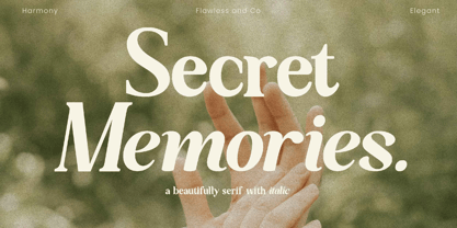 Secret Memories is a Serif Italic Font with a classy and elegant style in each character, so it's fitted for some wedding invitation display. There's some connected letters and some alternates that suitable for any graphic designs such as branding materials, t-shirt, print, business cards, logo, poster, t-shirt, photography, quotes .etc This font support for some multilingual. Also contains uppercase A-Z and lowercase a-z, alternate character, numbers 0-9, and some punctuation. If you need help, just write me! Thanks so much for checking out my shop!
 - The Skytripe by Aminmario Studio,
$20.00 Introducing The Skytripe font is modern and elegant handwritten with a quick stroke pen effect. This font was created to look as close to a natural handwritten script, as possible by including lowercase alternates, ligature and underlines. Perfect for any awesome projects that need hand writing taste. Comes with regular and italic. With built in Opentype features, this script comes to life as if you were writing it yourself. Don't hesitate if you have any questions. Thanks for checking out this font. I hope you enjoy it! AminMario
 - Urbane by Device,
$39.00 Urbane is a versatile all-purpose sans-serif family of six weights plus italics. It explores the same idea-space as early geometric modernist sans such as Futura, Erbar, Spartan and Elegant Sans, with a single-story a, a contemporary high x-height and very slightly condensed bowls. Perfect for headlines and running text, it is clear, classic and authoritative. Unusually for a geometric moderne sans, letter-widths are optically balanced, giving an even colour in setting. Includes a full international character set, lining, tabular and old-style numerals.
 - Mynor by The Northern Block,
$49.50 A modern squarish sans inspired by machine-readable typefaces of the 1950s, including OCR-A and B. Smooth curved contours with a humanist touch sit in harmony alongside pure straight lines. Contrasting shapes create a modern aesthetic pleasing to the eye and pixel perfect execution for modern-day scenarios. Details include seven weights with matching italics, six variable widths and 445 characters per style. Opentype features consist of five variations of numerals with stylistic zero’s, inferiors, superiors, fractions, case sensitive forms, ligatures, arrows and language support covering Western, South and Central Europe.
 - Valentiamo by Mchcrafter,
$18.00 Valentiamo is a Modern Stylistic Serif Family A new serif that we created special for branding needs, with extra ligature in unique shape add value of your brand. It so nice to leverage designer or product owner that need solutions to make their design look more stylish and modern. And specially for Valentiamo font, We prepared any ligatures, and any alternate characters to help you create unlimited variations for your creative needs. Valentiamo Family includes (Regular + Italic): All uppercase & lowercase letters All numbers 0-9 & Punctuation Ligatures & Alternates Symbols Multiligual Letters
 - Chunk by Fenotype,
$25.00 Inspired by the more than hundred years old classic Cooper Black, Chunk Black features a hefty character with rounded serifs and a soft yet sturdy overall appearance. Chunk Black provides a timeless and friendly feel and it’s very suitable for product and packaging design and any kind of display purposes from music business to restaurant menus and from t-shirts to band logos. Both Chunk Black and Chunk Black Italic are equipped with several OpenType -features and a total number of 87 alternate characters, set in Swash, Stylistic and Titling Alternates and Discretionary Ligatures.
 - Toffee by Font Kitchen,
$9.99 Add some sweet flavor to your next project with Toffee, the newest release from Font Kitchen. Sweet and sophisticated in 9 different weights, all with true italics. Toffee’s handcrafted glyphs and sharp serifs bring an old-fashioned flavor with a modern twist. We’ve slow-cooked Toffee with the finest ingredients, including stylistic alternates, fractions, ligatures, tabular/proportional figures, and more. Whether you need a bold, playful weight or something more light and elegant, Toffee is a great way to add a warm, inviting personality to your next project with a handmade feel.