2,618 search results (0.018 seconds)
  1. Commerciality - Unknown license
  2. Mississauga - Unknown license
  3. Alianna - Unknown license
  4. CHR32 - Unknown license
  5. Sudbury Basin 3D - Unknown license
  6. Solange - Unknown license
  7. Carbon Phyber - Unknown license
  8. Pseudo BRK - 100% free
  9. Vanishing Girl - Unknown license
  10. Port Credit - Unknown license
  11. Plain Cred - Unknown license
  12. First Blind - Unknown license
  13. Kustom Kar - Unknown license
  14. Sham - Unknown license
  15. Birdland Aeroplane - Unknown license
  16. Hubbard by Scriptorium, $12.00
    Hubbard is based on hand lettering from the Roycroft Arts and Crafts movement of turn-of-the-century New York. The Roycrofters were heavily influenced by the design concepts of William Morris and Charles Rennie MacKintosh. The font takes its name from Elbert Hubbard, leader of the Roycroft movement.
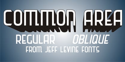
  17. Common Area JNL by Jeff Levine, $29.00
    The unusual hybrid of square letter forms mixed with Art Deco-influenced ones in the digital typeface Common Area JNL is brought to you by the hand lettering found on a vintage piece of sheet music for "William Tell". The typeface is available in both regular and oblique versions.
  18. Raleigh by Linotype, $29.99
    The Raleigh typestyle is based on Carl Dair's original 1967, Cartier typeface. which was designed for the Canadian Centennial and the 1967 Montreal World's Fair. It was renamed Raleigh after Dair's death. Adrian Williams added three weights for a display series, and Robert Norton designed the text version.
  19. Detective Bureau JNL by Jeff Levine, $29.00
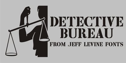
    Traditional stencil type faces have always projected images of strength, power, police, military or industry. The hand-lettered title card for 1951's "Detective Story" (directed by William Wyler) is a perfect example of this. A bold Roman letter style, it was the perfect inspiration for Detective Bureau JNL.
  20. Respective - Personal use only
  21. Letter Set C - Unknown license
  22. Letter Set B - Unknown license
  23. Minya - Unknown license
  24. Bulmer by Monotype, $29.00
    Cut as a private version for the Nonesuch Press in the early 1930s, Monotype Bulmer was first released for general use in 1939. Based on types, cut by William Martin circa 1790, used by the Printer, William Bulmer, in a number of prestigious works, including Boydell's Shakespeare. Martins types combined beauty with functionality. Narrower and with a taller appearance than Baskerville, it anticipated the modern face of Bodoni but retained vital qualities from the old face style. This new digital version of the Bulmer font family was drawn by Monotype following extensive research into the previous hot metal versions and a study of Bulmer's printed works. Additional weights have been designed together with a wide range of Expert and alternative characters.
  25. Almonte Woodgrain - Unknown license
  26. Pseudo (BRK) - Unknown license
  27. Frizzed (BRK) - Unknown license
  28. Zrnic Cyr - Unknown license
  29. Kenyan Coffee - Unknown license
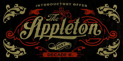
  30. Appleton by Decade Typefoundry, $35.00
    Back to 1880-1900 when a number of events were coming together, the country was evolving from a local market economy to mass merchandising, rail systems were being built and color lithography was becoming more affordable. The first rail cars full of oranges were being shipped from Southern California to the East - what a treat during a cold winter’s day. Labels were pasted on every fruit crate and these labels had large images of oranges and orange groves. With technological advances in soldered cans, canneries popped up all over the country. In order to market their products many California Canneries pooled their resources to form the California Fruit Canners Assn. in 1899. This font was inspired from that era. Loaded with alternates, swashes, stylistic and multilingual support.
  31. CaptivSystMRemiX - Unknown license
  32. Blue Highway Linocut - Unknown license
  33. Berylium - Unknown license
  34. Blue Highway Condensed - Unknown license
  35. Belgique NF by Nick's Fonts, $10.00
    Here's another example from the William H. Page Company, originally called French Clarendon XXX Condensed No. 117. This version dials up the contrast, making it suitable for tight headlines in large sizes. Both versions of this font support the Latin 1252, Central European 1250, Turkish 1254 and Baltic 1257 codepages.
  36. Salida by Matteson Typographics, $19.99
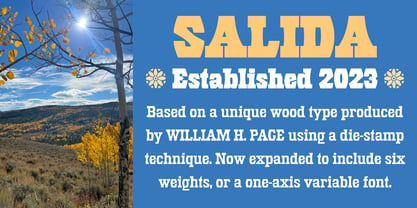
    Salida is a reimagining of William Page’s Series 504, a wood type created in 1887. Named for a town in Colorado on the Arkansas River, Salida is a strong and rustic display font reflecting the rugged landscape of the area. Salida is useful for impactful headlines, logos, packaging and signage.
  37. MPI French Antique by mpressInteractive, $5.00
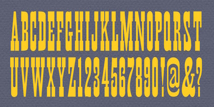
    French Antique was first shown in the specimen books of William H. Page & Company in 1869. The font is extremely tall and thin, with serifs taller than many character's widths. Lines are straight and clean with no fuss. French Antique can fit a lot of headline into a small space.
  38. Verger by David Engelby Foundry, $25.00
    The inspiration behind the design of the Verger typeface family comes from the classic Golden Type, which was originally crafted by William Morris. Although Verger is inspired by this classic typeface, it has several modern, expressive and distinctive styles of its own, especially in the design of its italic versions.
  39. Term - Unknown license
  40. Frizzed BRK - Unknown license
Looking for more fonts? Check out our New, Sans, Script, Handwriting fonts or Categories
abstract fontscontact usprivacy policyweb font generator
Processing