10,000 search results
(0.056 seconds)
- With Rose by Yoga Letter,
$14.00 With Rose is a unique, beautiful, and specially designed font that is very easy to use (easy to bring out lettering). Apart from its clear letters, this font is also perfect for all your work. This font is perfect for weddings, valentine's, promotions, business, social media, logos, branding, banners, typography, prints, posters, and more.
 - Hudsson Romano by Letterafandi Studio,
$16.00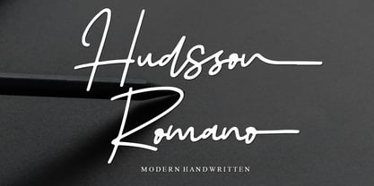 Hudsson Romano is a simple and quirky looking Signature handwritten font. It has a classy, elegant, and modern look that you can use for logos, branding, invitations, stationery, wedding designs, social media posts, and much more! This font is PUA encoded, which means you can access all of the glyphs and swashes with ease!
 - Pendry Script by ITC,
$29.00Pendry Script is the work of British designer Martin Wait, a typeface that emulates all the spontaneous hand-crafted qualities of a highly skilled lettering artist. It should be set closely whether capitals are used alone or with the lowercase alphabet. The fresh, informal style of Pendry Script is ideal for powerful, eye-catching headlines. - Age by Indian Summer Studio,
$35.00 The main 20-th century handwritten display font in the USSR, usually performed with a flat brush or a wide poster pen for all kinds of signage during 1920-1990s. It had also many analogues in other countries, but never was that popular as in the Soviet Union, used everywhere. The softened modern humanistic version.
 - CompassOne by Ingrimayne Type,
$9.00 CompassOne was a design I began in 1990 or so, but did not bother to finish until five years later. Its name comes from the fact that all the letters could have been drawn with a compass (which draws circles) and a straight edge. The typeface Demotte was a further development of this design idea.
 - Rephran by Mirror Types,
$20.00 Rephran is a font completely designed by hand, with brush and black indian ink,all the lines were softly made by hand. Every letter is like a piece of art, including the numbers and signs. Check the PDF in the gallery section to see the details. It includes Capitals, lower case letters, Signs and Numbers.
 - Paddingtoons by Inumocca,
$15.00 PADDINGTOONS inspiration from children book style, its realy simple and eyecathing. Paddingtoons Powerful Display font, All Caps With Variant for the Capital Letters. is perfect for Poster quotes, flyer, headings, Magazine, Children Books cover, blogs, logos, invitations and more. - Unique glyphs - Multilingual Characters - UPPERCASE - Lowercase - Numeric - Symbol - Punctuation Character inumoccatype illustration and typo Studio
 - Warilah by Letterafandi Studio,
$16.00 Warilah is a modern handwritten with characters that dance along the baseline. It can be used for various purposes such as logos, wedding invitations, headings, t-shirts, letterhead, signage, labels, news, posters, badges and so much more. This font is PUA encoded which means you can access all of the glyphs and swashes with ease!
 - Suorva by Sign Studio,
$15.00 Suorva from the sans serif family is made for display needs. Each side of his body is well-measured and consistent. Has a Stylistic Alternate Set ( S, Y, a, e, g, k, y) and also Discretionary Ligatures (uppercase). All Glyphs have PUA Encoded which will make it easier to use in general editor software.
 - Manda Rawles by Ws Studio,
$15.00 Manda Rawles is a dazzling script font. This font is neatly crafted and very detailed. Whatever the topic, this font will be a great asset to your font library, as it has the potential to enhance any creation. This font is PUA encoded which means you can access all the glyphs and sweeps easily!
 - Yugee Techno Sans by Pmfonts,
$10.00 Yugee Techno Sans are the fonts inspired by the pace of growth of our current technology. Created in a way that it works as display text as well as paragraph text. The fonts looks great at all sizes and with different spacing. The font family inlcludes 4 different font weights that suits your needs.
 - Brandon Grotesque Office by HVD Fonts,
$40.00 This special Office version of Brandon Grotesque is especially for all Microsoft Office applications (Word, Excel, Powerpoint …). It contains just the 4 basic styles which are stlye-linked and can be easily accessed by the "I" or "B" button in Office. The fonts are manually hinted so their appearance is also optimized for these applications.
 - Basique Pro by Par Défaut,
$25.00 Basique Pro is a modern, geometric sans serif font family. It contains more than 1000 characters including the Latin, Cyrillic and Greek alphabet. There are also 14 OpenType features (Superior; Inferior; Numerator; Denominator; Fraction; Tabular Lining; Slashed Zero; Small Capital; Small Capitals from Capitals; Standard Ligature; Case Sensitive; Ordinals; Access All Alternates; Stylistic Set)
 - Heal The World by Letterara,
$12.00 Heal The World is a cute and sweet handwritten font with an incredibly friendly feel. This font will turn any creative idea into a true piece of art! This font is PUA encoded which means you can access all of the cute glyphs with ease! It also features a wealth of special features including ligatures.
 - Kitchen Doodles by Outside the Line,
$19.00 Julia Child said, "I didn't start cooking until I was 32: up until then I just ate". Whether you cook or eat, design menus or place cards or cookbooks this set of 30 fresh Kitchen Doodle illustrations makes the job easier. Baking, cooking, mixing, chopping, grating, this little font has it all. Bon Appétit!
 - Abramo by PeachCreme,
$16.00 Abramo is a perfect blend of elegance and modernity. Abramo is a set of two modern fonts: an all-caps serif and a stylish script. the smooth curves of the serif create a feminine feel. Abramo works great for logos, social media posts, invites and many other projects. It comes with multilingual support also.
 - Isis by ITC,
$29.00Isis is the work of type designer Michael Gills, an all capital, classical looking display roman typeface with an open engraved effect. It can be used alone or in combination with most established classical roman typefaces. Isis is ideal for a wide range of headline applications and gives text a look of quality and excellence. - Rosereta by Almarkha Type,
$33.00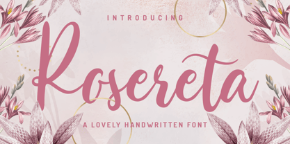 Rosereta - Lovely Script font with a natural handwritten feel. This handmade font will make your design has a beautiful natural touch for each details. It is perfect for any design project as Invitation,logo, book cover, craft or any design purposes. This font is PUA encoded which means you can access all of ligatures.
 - P22 Gothic Gothic by IHOF,
$24.95 The name says it all. Gothic from the old literary style and/or current subculture genre. And Gothic meaning a block or sans serif style of lettering. The concept was to take the classic German style lettering and create a contemporary extended block letter typeface. The result is a fusion of old and new.
 - Summer Peach by Sakha Design,
$10.00 Summer Peach is a dazzling script font. This font is neatly crafted and highly detailed. Whatever the topic, this font will be a wonderful asset to your font library, as it has the potential to enhance any creation. This font is PUA encoded which means you can access all glyphs and swashes with ease!
 - Larsson by GRIN3 (Nowak),
$19.00 Larsson is a hand-drawn, all-caps, ultra-narrow font created by Bartek Nowak. It contains two variations for each letter and a lot of ligatures. Use for invitations, greeting cards, posters, advertising, weddings, books, menus etc. Language support includes Western, Central and Eastern European character sets, as well as Baltic and Turkish languages.
 - Aventi by Sign Studio,
$15.00 Aventi is an absolutely elegant serif font. This typeface includes stylistic alternates set (a, e, g, y) and discretionary ligatures. It will elevate a wide range of design ideas, from cards to branding, labels, and more. This font is PUA encoded, which means you can access all of the glyphs, alternate characters, ligatures with ease.
 - Ludwig Sans by Hyber Type,
$40.00 Ludwig Sans is a modern Sans Serif Font Family inspired by american Gothics. It also contains many Alternates that are inspired by Ludwig Sütterlin’s Latin Script from 1911. All those Alternates can be combined seamlessly within the neutral Sans Serif Typeface, so you get both: a bread-and-butter type and a display font.
 - Chellinda by Portograph Studio,
$20.00 Chellinda Bold Script is a stylish and refined Script font. It looks beautiful on a variety of designs requiring a personalized style, such as wedding invitations, thank you cards, weddings, greeting cards, logos and so much more. This font is PUA encoded which means you can access all of the glyphs and swashes with ease!
 - John Brown by Hanoded,
$15.00 I realized I didn't have that many serif fonts, so I started sketching and came up with John Brown. John Brown is named after the sheriff in the Bob Marley song 'I Shot The Sheriff'. It is an all caps font, but upper and lower case can be freely interchanged for that great 'natural' look.
 - TA Bankslab by Tural Alisoy,
$33.00 The building of the Northern Bank of St. Petersburg's Baku branch was built in 1903-1905. It was the first Art Nouveau-style building in Baku, Azerbaijan. Later the bank was transformed into the Russian-Asian Bank. After the oil boom in Baku in the 19th century, branches of many banks and new banks were opened in the city. The branch of the Northern Bank of St. Petersburg was among the first banks that was opened in Baku. N.Bayev was the architect of the building for the branch of the Northern Bank of St. Petersburg located at Gorchakovskaya 3 in 1903-1905. The building currently houses the Central Branch of the International Bank of Azerbaijan. My purpose in writing this is not to copy and paste the information from Wikipedia. What attracted me to the building was the word "Банкъ" (Bank) written in Cyrillic letters, which was also used in Azerbaijan during the Soviet era. The exact date of the writing is not known. Every time I pass by this building, I always thought of creating a font of this writing someday. I had taken a photo of the building and saved it on my phone. I did a lot of research on the font and asked a lot of people. However, some did not provide information at all and some said they did not have any information. I was interested in the history of this font but I do not know if this font really existed or it was created by the architect out of nowhere. If there was such a history of this font, I wanted to recreate this font and make it available. If not, I had to create it from scratch in the same way, using only existing letters on the building. Finally, I made up my mind and decided to develop the font with all letters I have got. It was difficult to create a font based on the word, Банкъ. Because in the appearance of the letters, the midline of the letters on A, H, K was very distinct, both in the form of inclination and in more precise degrees. The serif part of the letters, the height of the upper and lower sides, differed from each other. I don't know whether it was done this way when the building was constructed or it happened over time. I prepared and kept the initial version of the font. I took a break for a while. I started digging on the story of the font again. Meanwhile, I was researching and got inspired by similar fonts. Unfortunately, my research on the font's history did not yield any results. I decided to continue finishing up the font. After developing the demo, I created the font by keeping certain parts of these differences in the letters. In addition, I had to consider the development of letters in the Cyrillic, as well as the Latin alphabet, over the past period. Thus, I began to look at the appearance of slab-serif or serif fonts of that time. In general, as I gain more experience in developing fonts, I try to focus on the precision of the design for each font. In recent years, I specifically paid attention to this matter. YouTube channel and articles by Alexandra K.'s of ParaType, as well as, information and samples from TypeType and Fontfabric studios on the Cyrillic alphabet were quite useful. I gathered data regarding the Latin alphabet from various credible sources. I do not know if I could accomplish what I aimed at but I know one thing that I could develop the font. Maybe someday I'll have to revise this font. For now, I share it with you. I created the font in 10 styles. 7 weight from Thin to Extra Black, an Outline, Shadow, and Art Nouveau. The Art Nouveau style was inspired by the texture in the background used for the text on the building. The texture I applied to capital letters adds beauty to the font. If you like the font feel free to use it or simply let me know if your current alphabet doesn't support this font.
 - TA Bankslab Art Nouveau by Tural Alisoy,
$40.00 TA Bankslab graphic presentation at Behance The building of the Northern Bank of St. Petersburg's Baku branch was built in 1903-1905. It was the first Art Nouveau-style building in Baku, Azerbaijan. Later the bank was transformed into the Russian-Asian Bank. After the oil boom in Baku in the 19th century, branches of many banks and new banks were opened in the city. The branch of the Northern Bank of St. Petersburg was among the first banks that was opened in Baku. N.Bayev was the architect of the building for the branch of the Northern Bank of St. Petersburg located at Gorchakovskaya 3 in 1903-1905. The building currently houses the Central Branch of the International Bank of Azerbaijan. My purpose in writing this is not to copy and paste the information from Wikipedia. What attracted me to the building was the word "Банкъ" (Bank) written in Cyrillic letters, which was also used in Azerbaijan during the Soviet era. The exact date of the writing is not known. Every time I pass by this building, I always thought of creating a font of this writing someday. I had taken a photo of the building and saved it on my phone. I did a lot of research on the font and asked a lot of people. However, some did not provide information at all and some said they did not have any information. I was interested in the history of this font but I do not know if this font really existed or it was created by the architect out of nowhere. If there was such a history of this font, I wanted to recreate this font and make it available. If not, I had to create it from scratch in the same way, using only existing letters on the building. Finally, I made up my mind and decided to develop the font with all letters I have got. It was difficult to create a font based on the word, Банкъ. Because in the appearance of the letters, the midline of the letters on A, H, K was very distinct, both in the form of inclination and in more precise degrees. The serif part of the letters, the height of the upper and lower sides, differed from each other. I don't know whether it was done this way when the building was constructed or it happened over time. I prepared and kept the initial version of the font. I took a break for a while. I started digging on the story of the font again. Meanwhile, I was researching and got inspired by similar fonts. Unfortunately, my research on the font's history did not yield any results. I decided to continue finishing up the font. After developing the demo, I created the font by keeping certain parts of these differences in the letters. In addition, I had to consider the development of letters in the Cyrillic, as well as the Latin alphabet, over the past period. Thus, I began to look at the appearance of slab-serif or serif fonts of that time. In general, as I gain more experience in developing fonts, I try to focus on the precision of the design for each font. In recent years, I specifically paid attention to this matter. YouTube channel and articles by Alexandra K.'s of ParaType, as well as, information and samples from TypeType and Fontfabric studios on the Cyrillic alphabet were quite useful. I gathered data regarding the Latin alphabet from various credible sources. I do not know if I could accomplish what I aimed at but I know one thing that I could develop the font. Maybe someday I'll have to revise this font. For now, I share it with you. I created the font in 10 styles. 7 weight from Thin to Extra Black, an Outline, Shadow, and Art Nouveau. The Art Nouveau style was inspired by the texture in the background used for the text on the building. The texture I applied to capital letters adds beauty to the font. If you like the font feel free to use it or simply let me know if your current alphabet doesn't support this font.
 - California Starlight by Cititype,
$17.00 California Starlight is a monoline signature font. Look like natural strokes using a roller pen. This is an upright font with a gently stroke follows the flow of the text. The uppercase size is higher, it's intended for a unique and prominent impression when used for 'branding', Tall and prominent yet integrated in the gentle flow of the lowercase. We propose this font for branding, logotype, photography caption, wedding invitation cards and merchandices, quote writing, craft projects, and various other unique prints. Stylistic Set Alternate (SS01 and SS02) is a swash at the beginning and end of the lowcase, also equipped with ligatures to add a unique impression and natural strokes. modern, sophistics and natural make this font a must have.
 - Leal by VP Creative Shop,
$14.00 Introducing Leal serif typeface - regular and italic fonts Leal is long and retro typeface loaded with 2 fonts, alternate glyphs and multilingual support. It's a very versatile font that works great in large and small sizes. This font is perfect for branding projects, home-ware designs, product packaging, magazine headers - or simply as a stylish text overlay to any background image. FEATURES Uppercase, lowercase, numeral, punctuation & Symbol regular italic alternate glyphs Multilingual support No special software is required to type out the standard characters of the Typeface. Canva friendly How to access alternate glyphs? To access alternate glyphs in Adobe InDesign or Illustrator, choose Window Type & Tables Glyphs In Photoshop, choose Window Glyphs. In the panel that opens, click the Show menu and choose Alternates for Selection. Double-click an alternate's thumbnail to swap them out. Feel free to contact me if you have any questions! Mock ups and backgrounds used are not included. Thank you! Enjoy!
 - Arcadian by VP Creative Shop,
$12.00 Introducing Arcadian - elegant serif typeface Arcadian is fragile and elegant typeface with alternate glyphs and multilingual support. It's a very versatile font that works great in large and small sizes. This font is perfect for branding projects, home-ware designs, product packaging, magazine headers - or simply as a stylish text overlay to any background image. FEATURES Uppercase, lowercase, numeral, punctuation & Symbol regular and italic alternate glyphs Multilingual support No special software is required to type out the standard characters of the Typeface. Canva friendly How to access alternate glyphs? To access alternate glyphs in Adobe InDesign or Illustrator, choose Window Type & Tables Glyphs In Photoshop, choose Window Glyphs. In the panel that opens, click the Show menu and choose Alternates for Selection. Double-click an alternate's thumbnail to swap them out. Feel free to contact me if you have any questions! Mock ups and backgrounds used are not included. Thank you! Enjoy!
 - Greenth by VP Creative Shop,
$30.00 Greenth is vintage, bold typeface with latin and Cyrillic support. Every font contains 1221 glyphs, tons of alternate glyphs, ligatures and multilingual support. It's a very versatile font that works great in large and small sizes. Greenth is perfect for branding projects, home-ware designs, product packaging, magazine headers - or simply as a stylish text overlay to any background image. Uppercase, numeral, punctuation and Symbol Each font contains 1221 glyphs Alternate glyphs Ligatures Cyrillic support - Russian, Ukrainian, Bulgarian and more Multilingual support - Afrikaans, Albanian, Bulgarian, Danish, Dutch, English, Estonian, Finnish, French, German, Icelandic, Italian, Norwegian, Portugese, Russian, Spanish, Swedish, Zulu To access alternate glyphs in Adobe InDesign or Illustrator, choose Window Type & Tables Glyphs In Photoshop, choose Window Glyphs. In the panel that opens, click the Show menu and choose Alternates for Selection. Double-click an alternate's thumbnail to swap them out. Feel free to contact me if you have any questions! Mock ups and backgrounds used are not included. Thank you! Enjoy!
 - Akashii by Variatype,
$20.00 Step into the artful world of Akashii, a Japanese brush font that embodies the beauty of traditional calligraphy with a contemporary flair. Crafted with precision and inspired by the elegance of brush strokes, Akashii is a visual symphony that captures the spirit of Japan's rich artistic heritage. The strokes of Akashii tell a story, conveying both strength and grace. Whether you're designing invitations, branding materials, or adding a touch of Eastern charm to your artistic creations, Akashii elevates your work with its unique cultural character. Dive into the world of Akashii and let your designs resonate with the poetic elegance of Japanese calligraphy. This brush font is more than a typeface; it's a brushstroke of cultural authenticity, inviting you to infuse your projects with the artistry of Japan. FONT FEATURES Additional Accents 68 Languages Ligatures Swashes SOFTWARE RECOMMENDATION Adobe Photoshop CC 2020 or the latest Adobe Illustrator CC 2020 or the latest
 - Mr Orange by Hipopotam Studio,
$28.00 Mr Orange is a typeface based on our handwritten letters which we used in some of our books H.O.U.S.E, D.E.S.I.G.N and Who Eats Whom. It has up to three alternate glyphs for each character, even for every diacritic letter. We do use our fonts in our books so we know that switching alternate glyphs can be a pain in the ass. Thats why we’ve created a very cool Contextual Alternates feature. It automatically sets alternate glyphs depending on frequency of appearance of the same character. The script doesn’t throw random glyphs. It’s checks if lets say letter “A” appears more then once in a sequence of characters. For example in the word “ANAKONDA”, the third “A” and the second “N” would be changed to glyphs from first stylistic set, the second “A” would also be changed but to glyph from second stylistic set. We’ve designed different rules for basic characters and different for diacritics and punctation. It really works great but of course you can always fine tune it by hand. This option has one obvious advantage for web fonts. Browsers that support OpenType calt feature will be able to display alternate characters. And since you can’t put by hand alternate glyphs on your website this is the only way to use them.
 - Bridone by Tipo Pèpel,
$22.00 Introducing the innovative and original Josep Patau’s new recipe, salsa and wild-type master. 1. In a font, combine a bit of slightly outdated British slab types from the late Victorian period. If you find Vincent Figgins’s variety, do not discard. You'll find plenty to choose from in his specimens, some of then with unexpected vitality an enviably condition, despite it’s age. As aging wine, they had improve their quality with time. Cut Didones into thin slices and add. 2. In a blender, whisk the strength of these Slab serif with highly contrasted strokes from Bodoni or Didot’s neoclassical types. Adjust the mix to get a sweeter or spicier taste, but do not forget to emphasize the contrast to avoid the dressing off. 3. On the page, set the wide variety of weights as your menu demands. If you want to feed fill the stomach of the hungriest holders, use Bridone Titling as main course. If you are serving a traditional menu, starter, main and dessert, then simmer a combination of weights and sizes according to your space. It will not disappoint, much less your guests . 4. Spread thoroughly the page, serve and enjoy . If you like natural, switch to Bridona, your pages will thank you.
 - Mayfair by Canada Type,
$24.95The long awaited and much requested revival of Robert Hunter Middleton's very popular classic is finally here. Mayfair Cursive was an instant hit for Middleton in 1932, and it went on being used widely until late into the 1970s, in spite of it never having crossed over to film type technology. Like a few of its contemporary designs, most notably the work of Lucien Bernhard, Mayfair is a formal script that is somewhat based on traditional italic forms with swash uppercase, but also employs subsidiary hairline strokes in some of its lowercase as an emphasis to the script's cursive traits. Why these gorgeous letters never made the leap into photo typesetting is a mystery to us. But here they are now in digital form, almost three quarters of a century since they first saw the light in metal. Mayfair was redrawn from original 48 pt specimen. It also underwent a major expansion of character set. Plenty of swash characters and ligatures were added. An alternate set of lowercase was also made, in order to give the user a choice between connected and disconnected variations of the same elegant script. Mayfair ships in all popular font formats. While the Postscript Type 1 and True Type versions come in two fonts (Mayfair and Mayfair Alt), the OpenType version is a single font containing all the extra characters in conveniently programmed features that are easily accessible by OpenType-supporting software applications. We are quite sure today's graphic designers will be appreciative of having access to the face that all but defined menus, romance covers, wine and liquor labels and chocolate boxes for almost two 20th century generations. - Bones Stone by Azetype,
$19.00 Presenting Bones Stone! A Bold Script Font with more than 9 Alternates and Extra. This font made with the perfect combination of each character. You can type by Mix & Match with an alternate version and extra swashes to get a unique combining. It looks original and can be used for all your project needs. Each glyph has its own uniqueness and when meeting with others will provide dynamic and pleasing proximity. This font can be used at any time and any project. You can see in the presentation picture above, Bones Stone looks Authentic on design projects. So, Bones Stone Font can't wait to give its touch to all your design projects such as quotes, poster design, personal branding, promotional materials, logotype, product packaging, etc. Besides that, Bones Stone also has some ligature that gives a surprise when you type certain characters combining. The ligatures are ff, tt, and ll. WHAT'S INCLUDED? 1. Bones Stone Basic • The first version comes with uppercase, lowercase, ligatures, numeral, punctuation, symbols, and Standard Latin Multilingual Support (Afrikaans, Albanian, Catalan, Danish, Dutch, English, French, German, Icelandic, Indonesian, Italian, Malay, Norwegian, Portuguese, Spanisch, Swedish, Zulu, and More). 2. Bones Stone Stylistic Alternate • The Second version comes with uppercase, lowercase, ligatures, numeral, punctuation, symbols, and Standard Latin Multilingual Support (Afrikaans, Albanian, Catalan, Danish, Dutch, English, French, German, Icelandic, Indonesian, Italian, Malay, Norwegian, Portuguese, Spanisch, Swedish, Zulu, and More). 3. Bones Stone Stylistic Set • It comes with 12 stylistic glyphs. Just access using Opentype Tools. 5. Bones Stone Swash • It comes with 47 underline swashes. Just type c_1 until c_47 to feature all. Enjoy the Font and Happy Creating! Thank You Azetype Studio
 - Alingtone by Azetype,
$12.00 Presenting Alingtone Font Duo! A Display Font with 2 Versions, Alternates, and Extra. This font made with the perfect combination of each character. You can type by Mix & Match with an alternate version and extra swashes to get a unique combining. It looks original and can be used for all your project needs. Each glyph has its own uniqueness and when meeting with others will provide dynamic and pleasing proximity. This font can be used at any time and any project. You can see in the presentation picture above, Alingtone looks Versatile on design projects. So, Alingtone Font can't wait to give its touch to all your design projects such as quotes, poster design, retro design, vintage design, business, advertisment, personal branding, promotional materials, logotype, product packaging, etc. Besides that, Alingtone Script also has some ligature that gives a surprise when you type certain characters combining. The ligatures are ee, ll, oo, ii, nn, yy, ff, rr, tt, and ss. WHAT'S INCLUDED? 1. Alingtone Script • The First Version comes with uppercase, lowercase, ligatures, numeral, punctuation, symbols, and Standard Latin Multilingual Support (Afrikaans, Albanian, Catalan, Danish, Dutch, English, French, German, Icelandic, Indonesian, Italian, Malay, Norwegian, Portuguese, Spanisch, Swedish, Zulu, and More). 2. Alingtone San • The Second Version comes with ALLCAPS, numeral, punctuation, symbols, and Standard Latin Multilingual Support (Afrikaans, Albanian, Catalan, Danish, Dutch, English, French, German, Icelandic, Indonesian, Italian, Malay, Norwegian, Portuguese, Spanisch, Swedish, Zulu, and More). 3. Alingtone Script Alternate • It comes with uppercase, lowercase, numeral, punctuation, and symbols. 4. Alingtone Swash • It comes with 21 underline swashes. Just type c_1 until c_21 to feature all. Enjoy the Font and Happy Creating! Thank You Azetype Studio
 - IM FELL French Canon - Unknown license

- Das Riese by Intellecta Design,
$22.90 Das Riese, a type specimen by the most productive Brazilian type foundry, Intellecta Design, is a mix of victorian and art deco influences. A beautiful display type for tiling with uppercases only. It's shadows and volumes refer to pre-modern age whereas its surface to last century 20's. This heavy sans serif strokes characters have a particular appearance, a parallel line texture that reminds Bifur, typeface created in 1929 by A. M. Cassandre. The sideways absence of volume at some leaning letters right side in addition to the patchy darkness of shadows support its handmade design. A type full of historical references designed to small titles printed in big sizes. It's impossible not to think about posters when you look at Das Riese strong face. - (source Slanted Magazine #8)
 - South Central by Loshaj Foundry,
$9.00 "To us it ain't vandalism. It's just letting the people know: We grew up here. This is our neighborhood. And as they pass by they know where we're at." – Los Angeles gang member Graffiti is equivalent to local news, its intended purpose is to inform general populace where gang members are, where they operate, as far as territory lines, and which neighborhoods are at war. Gang Graffiti can be used for: – Marking territory with graffiti. – It's a form of gang advertisement. – Letting people know who's in the gang, living, dead, or in prison. – Which neighborhoods they are at war with. – Who are their allies. Graffiti has along history, specifically Los Angeles gang graffiti, which has has been around since the 1930s. South Central typeface includes uppercase letters, numbers, and select punctuation glyphs.
