10,000 search results
(0.429 seconds)
- Molaste by madeDeduk,
$14.00 Molaste is a retro font come with 80's retro style serif. You can explore and combine creating rhythm for comfortable reading. Vintage and refined use this font for any branding, product packaging, invitation, quotes, headline, label, poster, logo etc. Feature Uppercase & Lowercase Number & Symbol International Glyphs Multilingual support Alternative Ligature Feel free to drop us a message any time and follow my shop for upcoming updates Hope you enjoy it.
 - Callge Style by Sensatype Studio,
$15.00 An Unique Modern Display Font that we created special for Elegant and Classy branding needs, with extra characters alternate in unique shape will be ready to add value of your brand. Callge Display Ligature Sans Serif ready with: Any options to get creative variations (combination of Any Alternates) Preview as a inspirations that you can do with Callge font Ready with Lowercase and Uppercase characters Wish you enjoy our font. :)
 - Geson Bamer by TypeClassHeroes,
$14.00 Geson Baker is a retro font come with 80's retro style serif. Retro and refined you can explore and combine creating rhythm for comfortable reading. This font supports more than 100 Latin-based languages and has extensive Cyrillic and Greek support for languages like Russian, Bulgarian, Ukrainian, and many more. Feature Uppercase & Lowercase Number & Symbol International Glyphs (Cyrillic & Greek) Multilingual support Alternative Ligature Hope you enjoy it.
 - Jatmika Typeface by Gassstype,
$23.00 Introducing our latest display typeface called Jatmika Typeface- Modern Blackletter Typeface – Display Vintage Serif can make your logotype become more interesting. Best Vintage font multilingual support. inspired by the decorative arts and architecture movement Jatmika Typeface fonts is perfect for your project and allows you to create designs, headlines, posters, logos, badges, and many more that are beautiful. It is also best used for posts, logos, posters, certificates, labels and more.
 - Tilda by Etewut,
$30.00 Tilda is a sans serif typeface with big potential. It’s gonna be your daily font, because it perfectly fits to different tasks. Tilda is good as long text but also cool as eye-catch title. This font can be like human ages: childhood, adolescence, youth, adulthood and maturity: stylish THIN, fancy LIGHT, great REGULAR, golden BOLD, brilliant HEAVY And beautiful Isabella Bersellini created illustrations, say her hello! http://www.isabellabersellini.com
 - Romagna by AlienValley,
$5.00 Romagna is a modern and highly versatile sans-serif typeface designed for readability without sacrificing aesthetics. There are 8 included styles to pick from including regular + bold weights plus italics and 2 different uppercase styles so you can either go with a classic look or a modern futuristic theme. Features Modern design Easy to read characters Great for both headlines & large chunks of text Multilingual support Great versatility 8 Included styles
 - Serona by Balevgraph Studio,
$16.00 Serona - Beautiful Duo with Ornaments We are so exited to present Serona, a combination of sans serif fonts and signature styles complemented by beautiful ornaments, Serona with Modern Elegant Style is perfect for branding, logos, invitations, Magazine and more. Serona Features: Multilingual Ligatures Alternates Swashes PUA encoded Files Included: Serona Regular Serona Italic Serona Signature Serona Signature Slanted Serona Ornaments We are ecstatic if our fonts can help your project.
 - Highbary Sunfest by Letterena Studios,
$17.00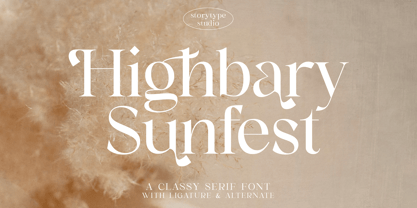 Highbary Sunfest is a classic serif font with a unique style and modern look. It is perfect for elegant and luxury logos, book or movie title design, fashion brands, magazines, clothes, lettering, quotes, and much more. Add it to any of your creative projects, and you will be amazed by the results. This font is PUA encoded, which means you can access all of the glyphs and swashes with ease!
 - Erangle by Gatype,
$14.00 Erangle is an elegant serif typeface inspired by a vintage type specimen I found recently at an art fair. Thin to thick contrasting lines and elegant curves make Beginta the perfect font for this type of logo and display purposes. Hope you enjoy it Feel free to contact you with any questions or concerns you may have and I will get back to you as soon as I can.
 - Air Factory by Khaito Gengo,
$22.00 Air Factory was originally designed for a merchandise company, and ordered to design iconic but plain forms. Air Factory is a very simple and modern sans-serif font inspired by early 1900’s typefaces, like Futura, and consisting of 5 weights and stencil type(free). This contemporary typeface would be good used for restaurant, retail, book, poster etc. Air Factory also features various ligatures, stylistic alternates, fractions, and languages as well.
 - Mentah 1 by Sulthan Studio,
$10.00 This sketch font Sans serif was born from the lines in the font that we created for the (Rajin) font and we redeveloped it into a different style with a more minimalist and more powerful setting and looks stunning for any smooth and bold writing that can be used anywhere in your work This font has complete uppercase and lowercase letters with 4 thicknesses, numbers, punctuation, and also language support
 - Maletha Collection Signature by Yoga Letter,
$13.00 "Maletha Collection" is a font duo that combines elegant serif fonts and beautiful signature fonts. This font is very nice and can be used for all kinds of your work. "Maletha Collection" is perfect for making banners, posters, prints, logos, stickers, social media, weddings, promotions, decorations, portraits, presentations, and others. This font is very complete, because it is equipped with basic characters, uppercase, lowercase, multilingual support, numeral and punctuation.
 - Modet by Plau,
$30.00 Modet is a versatile and friendly humanist sans-serif prepared for all typographic tasks. It is quite readable in smaller sizes and shows its character in larger sizes. You can change the face of Modet through its many alternate characters and OpenType features. This versatility makes it a great performer in editorial and branding projects. Modet comes in 10 roman styles, from thin to 'ultra black' and speaks 289 languages.
 - Gellaby by Asenbayu,
$15.00 Gellaby is a bold semi-serif display font with a unique and chubby shape. You can use this font in retro, vintage, modern and playful designs. This font is perfect for a variety of projects, such as branding, product label, poster displays, logo designs, magazine, headline, sticker and more. Gellaby font feature opentype, kerning, alternative style and ligature. Gellaby include uppercase letters, lowercase letters, numeral, punctuation and multilingual support.
 - Berdicon by Beewest Studio,
$10.00 Verdicon is an elegant and distinctive serif font family that is a great solution for your projects. These include vertical and diagonal styles, each with eight weights ranging from thin to thick. It is a classic and versatile typeface, perfect for fashion, contrast, modern and legible designs. With it, you can create logos and banners, use them in advertising, packaging, book and magazine covers, titles, descriptions and more.
 - Stonehill by Great Scott,
$22.00 Stonehill is a bold handpainted sans serif typeface for display or packaging use. Stonehill has 3 glyphs for each letter and with contextual alternates activated in apps that supports this it will cycle thru these alternates to keep the same glyphs from repeating too much. Or, you can always pick and choose from the alternates manually to keep it fresh! Stonehill is available in two cuts - regular and oblique.
 - Emosia by Gatype,
$14.00 Emosia is an elegant serif typeface inspired by a vintage type specimen I found recently at an art fair. Thin to thick contrasting lines and elegant curves make Beginta the perfect font for this type of logo and display purposes. Hope you enjoy it Feel free to contact you with any questions or concerns you may have and I will get back to you as soon as I can.
 - Helena Handbasket NF by Nick's Fonts,
$10.00The 1888 edtion of James Conner's Sons United States Type Foundry specimen book listed this little gem simply as "Antique Light". Its original, rather anemic outlines have been beefed up and its serifs have been rounded, with the result that this face will get noticed wherever it goes. Both versions of this font include the complete Latin 1252 and CE 1250 character sets, with localization for Romanian and Moldovan. - Hello Giraffe by Evo Studio,
$11.00 Hello Giraffe font is inspired by the style of letters in comics which have a less serious and fun character. The letters in this font are sans serif with a font character appearance that gives a fun impression and design for children. The Hello Giraffe font is very suitable for creating designs with non-serious concepts, designs for children, book headers, and of course for text in comics.
 - Authentic Romantic by SilverStag,
$14.00 A brand new year is here and a brand new font is here as well. I have to say I had so much fun working on this funky slab serif typeface. I have created some quirky letters and over 100 ligatures + the font comes in four weights - light, regular, medium & italic. The font also includes full language support, punctuation, numerals and detailed instructions how to use ligatures in most of the apps on your computer, as well as in Canva. I invite you to check out the preview images, and I hope you will be immersed in my vision for this creative typeface that, I am sure, will work for all kinds of interesting projects you might be working on this year. If you end up publishing your designs on Instagram, tag me - @silverstagco and I will make sure to showcase your design and work to my audience as well! Authentic Romantic - Slab Serif Font Includes: 100+ Ligatures Numerals & Punctuation Language Support Detailed instructions on how to use alternates in most of the apps on your computer as well for Canva Happy creating everyone!
 - Mati by Sudtipos,
$19.00 Father's Day, or June 17 of this year, is in the middle of Argentinian winter. And like people do on wintery Sunday mornings, I was bundled up in bed with too many covers, pillows and comforters. Feeling good and not thinking about anything in particular, Father's Day was nowhere in the vicinity of my mind. My eleven year old son, Matías, came into the room with a handmade present for me. Up to this point, my Father's Day gift history was nothing unusual. Books, socks, hand-painted wooden spoons, the kind of thing any father would expect from his pre-teen son. So you can understand when I say I was bracing myself to fake excitement at my son's present. But this Father's Day was special. I didn't have to fake excitement. I was in fact excited beyond my own belief. Matí's handmade present was a complete alphabet drawn on an A4 paper. Grungy, childish, and sweeter than a ton of honey. He'd spent days making it, three-dimensioning the letters, wiggle-shadowing them. Incredible. A common annoyance for graphic designers is explaining to people, even those close to them, what they do for a living. You have to somehow make it understandable that you are a visual communicator, not an artist. Part of the problem is the fact that "graphic designer" and "visual communicator" are just not in the dictionary of standard professions out there. If you're a plumber, you can wrap all the duties of your job with 3.5 words: I'm a plumber. If you're a graphic designer, no wrapper, 3.5 or 300 words, will ever cover it. I've spent many hours throughout the years explaining to my own family and friends what I do for a living, but most of them still come back and ask what it is exactly that I do for dough. When you're a type designer, that problem magnifies itself considerably. When someone asks you what you do for a living, you start looking for the nearest exit, but none of the ones you can find is any good. All the one-line descriptions are vague, and every single one of them queues a long, one-sided conversation that usually ends with someone getting too drunk listening, or too tired of talking. Now imagine being a type designer, with a curious eleven year old son. The kid is curious as to why daddy keeps writing huge letters on the computer screen. Let's go play some ball, dad. As soon as I finish working, son. He looks over my shoulder and sees a big twirly H on the screen. To him it looks like a game, like I'm not working. And I have to explain it to him again. This Father's Day, my son gave me the one present that tells me he finally understands what I do for a living. Perhaps he is even comfortable with it, or curious enough about that he wants to try it out himself. Either way, it was the happiest Father's Day I've ever had, and I'm prouder of my son than of everything else I've done in my life. This is Matí's font. I hope you find it useful.
 - Splinter2 - Personal use only

- Neue Swift by Linotype,
$50.99 The original Swift (1985) proved its worth in corporate identities, magazines and newspapers and occasionally in books. It is a versatile type and can be used in a wide range of circumstances. It is a striking type, with large serifs, large counters and letters that produce a particularly strong horizontal impression. This means that words and lines in Neue Swift are easily distinguished, even where there are large spaces between words, as can occur in newsprint. Neue Swift's large, robust counters were designed to improve legibility particularly in newspapers. It was designed in the early eighties, when papers were less well printed than they are today, and its special features help it survive on grey, rough paper printed on fast rotary presses. Today it is used more often outside newspapers than in them. Neue Swift (2009) is the newest version of the Swift concept. It has been improved by technical and aesthetic enhancements, and has been expanded into a family of twelve variants. Featured in: Best Fonts for Logos, Best Fonts for Websites, Best Fonts for PowerPoints
 - Binate by Monotype,
$49.99 Binate provides a smart and adaptable solution for the modern creative. Designed with functionality at its core, Binate offers a synergetic blend of neutrality and expression — all within a contemporary superfamily. Binate combines the characteristics of a workhorse sans serif and an elegant brush-inspired display style. The Binate family delivers a wide variety of possibilities and combinations for designers with its vast range of weights from Hairline to Black. Built for purpose, Binate offers designers a diverse spectrum of expression, as Binate is as comfortable in the tiny details on packaging as it is in large formats like billboards and posters. Binate’s apertures present a crisp and rigid style that evoke a utilitarian design, yet experimenting with some of Binate’s lower hooks can offer a more approachable and friendly demeanor. All of Binate's companions — like its Italics — can unlock new layers of creativity and tone of voice, and they all feel at home on both digital and print mediums. Binate encourages you to experiment with its impressive weight ranges and arms you with ample tools to refine and tweak endlessly.
 - Corporative by Latinotype,
$26.00 The first typeface developed by Latinotype Team. Corporative is a semi serif font that has a marked personality and distinctive traits, what makes it suitable to be used at large text sizes.Since it is a condensed font, it can also be used in smaller sizes. Corporative and Corporative Sans come with the Latinotype’s standard set of 350 characters, making it possible to use the font in 128 different languages. Corporative provides users with a wide range of characters, weights and widths for every project. By combining different variants,designers can achieve the best results. The family consists of 64 fonts: a basic family that includes 8 weights plus italics, an alternative family of 8 weights with matching italics and 2 condensed families, one regular and one alternative, both with italics. Latinotype has added new faces to its team. Latinotype Team nowcomprises: Javier Quintana, César Araya, Bruno Jara, Luciano Vergara and DanielHernández. Corporative was created by Latinotype Team and developed by Javier Quintana and César Araya, under the supervision of Luciano Vergara, Miguel Hernández and Daniel Hernández.
 - Kiester by Adam Fathony,
$23.00 Kiester, A Display Typefaces with Variable Weight. Kiester is a modern elegant variable font. Basically this is a Sans with a small touch of serif on every letters. A Simplicity yet very legible with various width and weight that you can explore, combine, create and help you designing something such as Poster, Headlines, Logotype, Branding, and etc. In a Total of 5 Style Font even more if you are using the Single Files Variable, you can slide the weight on the sweetest spot of Kiester. Language Support : Afrikaans, Albanian, Asu, Basque, Bemba, Bena, Catalan, Chiga, Cornish, Danish, Dutch, English, Estonian, Faroese, Filipino, Finnish, French, Friulian, Galician, Ganda, German, Greek, Gusii, Icelandic, Indonesian, Irish, Italian, Jola-Fonyi, Kabuverdianu, Kalenjin, Kinyarwanda, Low German, Luo, Luxembourgish, Luyia, Machame, Makhuwa-Meetto, Makonde, Malagasy, Malay, Manx, Morisyen, North Ndebele, Norwegian Bokmål, Norwegian Nynorsk, Nyankole, Oromo, Portuguese, Romansh, Rombo, Rundi, Rwa, Samburu, Sango, Sangu, Scottish Gaelic, Sena, Shambala, Shona, Soga, Somali, Spanish, Swahili, Swedish, Swiss German, Taita, Teso, Vunjo, Welsh, Western Frisian, Wolof, Zulu
 - Oorrnnoott by sugargliderz,
$44.00 This is a series that takes unfinished typefaces that were either previously ideated but not realized or were close to completion but left incomplete due to dissatisfaction with certain aspects, and brings them to completion. "Oorrnnoott" was originally a project named "Petitgothiquemignon" or "Sangoth". In the process of refining "Kropotokin", several ideas were incorporated into the design. Well, I say "incorporated," but it was designed on a whim, as usual. After all, it was started around 2005, and I don't usually leave notes or anything (which isn't the best habit), so I don't remember the emotions or thoughts behind its creation. Please consider this typeface as a very typical sans-serif font, as that is what I was aiming for when I excavated it this time. Please use it for body text, headlines, eye-catching designs, or whatever you like.
 - PMN Caecilia eText by Monotype,
$29.99PMN Caecilia™ is the premiere work of the Dutch designer Peter Matthias Noordzij. He made the first sketches for this slab serif design in 1983 during his third year of study in The Hague, and the full font family was released by Linotype in 1990. The PMN prefix represents the designer's initials, and Caecilia is his wife's name. This font has subtle variations of stroke thickness, a tall x-height, open counters, and vivacious true italics. Noordzij combined classical ductus with his own contemporary expression to create a friendly and versatile slab serif family. With numerous weights from light to heavy, and styles including small caps, Old style figures, and Central European characters, PMN Caecilia has all the elements necessary for rich typographic expression. eText fonts - the optimum of on-screen text quality With our new eText fonts that have been optimised for on-screen use, you can ensure that your texts remain readily legible when displayed on smartphones, tablets or e-readers. The poor resolution of many digital display systems represents a major challenge when it comes to presenting text. It is necessary to make considerable compromises, particularly in the case of text in smaller point sizes, in order to adapt characters designed in detail using vector graphics to the relatively crude pixel grid. So-called 'font hinting' can help with this process. This, for example, provides the system with information on which lines are to be displayed in a particular thickness, i.e. using a specific number of pixels. As font hinting is a largely manual and thus very complex technique, many typefaces come with only the most necessary information. What is unimportant for a text printed in high resolution can result in a poor quality image when the same text is displayed on a screen, so that reading it rapidly becomes a demanding activity. Specially optimised eText fonts can help overcome this problem. An extremely refined and elaborate font hinting system makes sure that these fonts are optimally displayed on screens. Monotype has not only adopted font hinting for this purpose but has also thoroughly reworked the fonts to hone them for display in low resolution environments. For example, the open counters present in the letters C, c, e, S, s, g etc. have been slightly expanded so that these retain their character even in small point sizes. Also with a view to enhancing appearance in smaller point sizes, line thickness has been discreetly increased and x-height carefully adjusted. Kerning has also been modified. Don't leave the on-screen appearance of your creations to chance. Play it safe and use eText fonts to achieve perfect results on modern display devices. Many typefaces, including many popular classics, are already available as eText fonts and new ones are continually being published. The eText font you can purchase here are available for use as Desktop Fonts or Web Fonts. Should they be used in Mobile Devices such as smartphones, tablets or eReaders, please contact our OEM specialists at sales-eu@monotype.com. - We Love Nature Forest by kapitza,
$79.00 We Love Nature Forest is inspired by long walks in the woods and features decorative wintery pine needles, fir branches and cones. Perfect for designing your seasonal cards. It consists of 52 highly detailed, hand drawn illustrations. The illustrations can be used on their own to create beautiful designs, or in combination with other illustrations in the We Love Nature font collection.
 - Tilda Script by Roman Polishchuk,
$25.00 Tilda Script Family is a clean and lining script with regular and non-connect versions in four weights. With this family you can craft solid logotypes with a unique look, set posters and ads, and even run longer lines of copy on packaging. Tilda Script is a versatile family with extensive language support and advanced typographic features including:Ligatures, Stylistic Alternates, Stylistic Sets.
 - Ingy Star Tilings by Ingrimayne Type,
$9.00 IngyStarTilings allows one to create a variety of patterns that have stars. Some of them are quite common and others less so. A sample file is available that shows possible patterns that can be constructed with this typeface, including some non-star repeating patterns. As the posters indicate, some of the patterns constructed with the regular version are intended to be multicolored.
 - Luna Brush by Ksenia Belobrova,
$19.00 Luna Brush is a fresh handwritten script based on informal calligraphy. Luna Brush Script includes OpenType features – ligatures and stylistic alternates for lowercases and capital letters. Luna Brush Extras includes a set of icons and swashes that can help you to add some personal charm to your designs, so it is perfect for branding, packaging, titling, posters, greeting cards, blogs, etc.
 - Le Monde Journal Std by Typofonderie,
$59.00 A highly legible typeface in 4 series Le Monde Journal by definition is intended for newspaper use & at small sizes. It’s an economical and workshorse typeface adapted to any extrem condition of uses. Even though it has the same colour as Times, it appears more open. The reading flow has been made more fluent & less abrupt. The glyphs counters are bigger, as if they were “alluminating the interior.” The form, characterized by its serifs, remains embedded in our visual memory. Intermediate weights like Book can be considered as a grade supplement of the Regular. Italics accompany Le Monde Journal. With a more delicate design & a distinctive rhythm, they remain noticeable when used with the romans. Its companion, Le Monde Sans can extend your typographic palette. For beautiful page layout, use it in conjunction with Le Monde Livre for titling sizes. The verticals metrics and proportions of Le Monde Journal are calibrated to match perfectly others Typofonderie families. This family was designed in 1994 as bespoke typeface family for the French newspaper Le Monde. The family is not used any more by this newspaper from November 2005. Bukva:raz 2001 Type Directors Club .44 1998 European Design Awards 1998
 - Diaria Pro by Mint Type,
$40.00 Diaria started as a project in Typeface Architecture for Master in Advanced Typograghy at EINA, Centre Universitari de Disseny i Art de Barcelona, a course tutored by Laura Meseguer and Íñigo Jerez Quintana. Later it has developed into Diaria Pro, an extensive typeface including Cyrillic script, small caps, and various OpenType features. Diaria Pro is a low-contrast serif typeface designed as a primary text face for the newspapers. Its large x-height and static exteriors allow comfortable reading in narrow columns, and calligrafic counters as well as dynamic serifs add humanist detail to overall perception and incline contrast axis without affecting interletter counterforms. Besides extensive language support, Diaria Pro includes various OpenType features: ligatures, discretionary ligatures, small caps, 6 sets of digits, superiors, inferiors, fractions, ordinals, upper-case punctuation, and some language-specific features. Diaria Pro also has a sans-serif companion - Diaria Sans Pro. Some of the styles of Diaria Pro can be found in Mint Type Editorial Bundle together with other fonts which make some great pairs. Check it out!
 - Pepperwood by Adobe,
$29.00Pepperwood font is a joint work of the typeface designers K.B. Chansler, C. Crossgrove and C. Twombly. These artists also created the typefaces Rosewood, Zebrawood and Ponderosa together and as the names suggest, all of these typefaces are so-called wood types. The origins of this kind of typeface can be found in the early 19th century. Called Italian or Italienne, these typefaces quickly became very popular. They are distinguished by square serifs whose width is larger than the stroke width of the characters. When the letters are set together, the heavy serifs build dark horizontal bands. Pepperwood font has a couple of unique characteristics of its own. Small squares decorate the middle of the letters and the edges of the serifs are not straight, rather, they have small, fine tips. Pepperwood is reminiscent of the Wild West with its shootouts and heroes, but also suggests the glamor of the 1970s with their platform shoes and wild hair-dos. The different weights allow a large range of design possibilities. Used carefully in headlines, Pepperwood font is sure to draw attention. - Enchanter by Cloveron Media,
$49.00 Cloveron Media unveils its first serif font that goes beyond the formal nature of typography. It celebrates the artistic expressions of graphic designers within themselves. The Name Mary Anne Remulla is the Master Designer behind the Enchanter Font. She aims to make graphic designers filled with delight and enjoy typography with its extensively artistic alternates and multilingual characters. The Font Style The serif style, known for its formal touch to typographic design, infuses the font with its professionalism as its regular. Using its middle alternate adds a hint of unique touch without losing the serif style's essence. The Enchanter font's start and end alternates are the designer's illustrations of design balance, which elevates its charm and enticing nature that adds to its overall artistic power. "I am fascinated by art and so by design. A font with alternates was my great revelation that I can do typography artistically, enthusiastically, and with freedom. I later found myself fascinated and lost in paper space, which then ended up that I completed my first font creation with extensive alternates for each letter." - Mary Anne Remulla
 - Eksja by Protimient,
$29.00 Eksja is a modern slab serif available in four weights, each with a corresponding italic. All the fonts in the family have small caps, the extended latin character set, diacritical f-ligatures, enclosed numerals (numbers in circles) and case-sensitive punctuation. The general design of the typeface has been with a strong human touch in mind. The ends of the serifs have been given a subtle rounding, just enough to take the edge off which, when coupled with the largely humanist structure of the design, creates an open, friendly and approachable design, abandoning the usual geometric severity commonly associated with slab serif typefaces. Eksja contains quite a comprehensive numerals system. Obviously, each font has the standard proportionally and tabularly spaced lining and old-style figures but, crucially, the tabular numerals share the exact same width in each font variant. That means that you can choose to use the thin, regular, bold, black and their italic forms all in the same setting and they will always line up. In addition to the 'normal' numerals there are super-script and sub-script numerals and OpenType fractions that can be automatically composed as you type. There are also the enclosed numerals, numbers inside a circle, that are useful for numerically listing items and, thanks to the wizardry of OpenType, they can contain any number of digits (typically, enclosed numerals are precomposed single digits, only encompassing the 0–9 range, the enclosed numerals in Eksja can go to double digits, triple digits or, in fact, any number of digits*). *The automation of the enclosed numerals is accessed via either "Stylistic Set #1" or "Stylistic Alternates" which requires the use of an application that supports OpenType stylistic sets or stylistic alternates, such as Adobe's InDesign or Photoshop.
 - Imagist by Fenotype,
$35.00 The mystic sadness of the sight Of a far town seen in the night. Like the poetry movement of the early 20th century, from which the font takes its name, Imagist relies on the power of concrete images and brings an organic vibration to the words it forms. Imagist is a lively and decorative serif typeface with prominent features that appear especially in the letters K, R, M, N, W, V, k, w, v and y. Powerful ball terminals also bring recognizable attraction. Imagist contains six weights and corresponding Italics. Italics have a cursive-style letter s for as Stylistic Alternate. Old Style Numerals and Small Caps can be found in all cuts. Poem by T. E. Hulme.
 - Old Kharkiv by Bohdan Hdal,
$24.00 Old Kharkiv was inspired by the first half of the 20th century photo with a signage on the building of the Ivan Kotlyarevsky Kharkiv National University of Arts. During the development, the font has acquired unique features not from the original signage, for example, drops in uppercase were replaced with sharp serifs. This font contains the letters of all the main European languages, Cyrillic and basic special characters. Some uppercase letters (where allowed their form) have decorative elements (swashes) to use them as drop caps or initials. There are stylistic alternatives for some Ukrainian letters. Also, as a bonus, this font contains up to a dozen graphic elements that you can use in your layout.
 - Buyan by Yu Type,
$12.00 Meet Buyan, a unique typeface family that draws inspiration from the iconic Mongolian film title "Nugel Buyan" 1963. Buyan is your go-to All Caps and Sans-Serif typeface, crafted with a sleek Condensed design that effortlessly blends style with readability. Elevate your projects with this versatile display font, adding a cool and contemporary touch to your text. This font family boasts a comprehensive range with 6 distinct weight styles and italics, allowing you to play with contrast and customize your text to suit your creative vision. Whether you're working on branding, headlines, or any display application, Buyan is the perfect choice to bring a modern and impactful aesthetic to your work. Elevate your design game with Buyan!
