10,000 search results
(0.046 seconds)
- Simple Elevation by Funk King,
$5.00 Simple Elevation is a progression of architectural-inspired fonts. The glyphs as font-bats designed as buildings that can be read.
 - Savage Initials by Wiescher Design,
$39.50 Savage Initials are just that: wild, spontaneus capital letters that are meant to be extraordinary embellishments. Your wild designer, Gert Wiescher
 - Presentation JNL by Jeff Levine,
$29.00 Presentation JNL is built on the letterforms of Gilbert JNL (which in turn was modeled after Eric Gill's classic sanserif design).
 - Poor Richard by Red Rooster Collection,
$45.00 Based on the Keystone Type Foundry design, circa 1919. The l/c ‘g’ appears as an alternate character in our font.
 - Chendolle by Rometheme,
$6.00 Chendolle is a bold display font, it has a fun and cute style and is perfect for creating playful kids designs.
 - Equestrienne by Red Rooster Collection,
$45.00Designed by Les Usherwood. Digitally engineered by Paul Hickson. Les never released this completed typeface before his untimely death in 1983. - Ongunkan Anglo Saxon Spirit by Runic World Tamgacı,
$45.00 I present it to you as a hollow-style transparent design of the Anglo-Saxon Runic inscription. Use it with pleasure.
 - Queen Bella by Epiclinez,
$18.00 Queen Bella is a bold and bouncy handwritten script font. Use it for any design project that requires a personalized appearance!
 - Nathan Classic by IM Studio,
$12.00 Nathan Classic is a sweet and unique design. This font is very suitable for products, logos, invitation letters and many others.
 - Bilanthy by Maulana Creative,
$13.00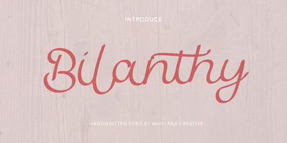 Give your designs an authentic handcrafted feel. � Bilanthy Handwritten Font� is perfectly suited to stationery, logos and much more. Many Thanks!
 - Octagon French by Intellecta Design,
$16.90Originally compiled by George Nesbitt (1838) this font has newer lowercase designs. Probably comes from an earlier French font, never acknowledged. - 57 Rodeo by Baseline Fonts,
$24.00A practical yet unique display face designed to offer attention-getting headlines and an alternative to the normal wild west faces. - C-V Dashes by ARTypes,
$10.00C-V dashes are transcribed from 72-pt ornaments designed by Enric Crous-Vidal and issued by Typefoundry Amsterdam c. 1950. - Lesmore by Red Rooster Collection,
$45.00Designed by Les Usherwood. Digitally engineered by Paul Hickson. Another typeface from Les Usherwood that was released after his 1983 death. - Cykor by K94 Studio,
$9.00 Cykor is a display typeface with reversed contrast inspired by typography of the late 70s designed in 2020 by Kacper Janusiak.
 - Down River by Epiclinez,
$18.00 Down River is a sweet hand-lettered font. This smooth buttery font is a perfect companion for your next design project!
 - Reverse Gothic JNL by Jeff Levine,
$29.00 Reverse Gothic JNL is a design based on vintage reverse letterpress type for creating interesting headlines with white-on-black text.
 - Raphtalia by Nurf Designs,
$36.00 Raphtalia is a fun and bold font with a unique vintage appeal! Designed with a distinct retro feel and lovely elements,
 - Plain Script by ParaType,
$25.00Designed at ParaType in 1995 by Tagir Safayev. Based on informal handwriting (caps-only). For use in advertising and display typography. - Ekistra by Dharma Type,
$14.99 Crazy sans for happy, fun time. There are two other fonts designed by in the same concept. -Deluta Black -Xesy -Ekistra
 - Graphique-AR by ARTypes,
$35.00Graphique-AR is a digital version of a type designed by Hermann Eidenbenz and issued by the Haas foundry in 1946. - Elongated Roman by Aboutype,
$24.99An ultra light thins all caps Victorian design with a slight stroke contrast. Elongated Roman requires subjective display kerning and compensation. - Nobbin by Barmoor Foundry,
$15.00 Nobbin was designed to be used in a children's picture book called "Nothing to do..." written and illustrated by Tracy Sabin.
 - BAUHANS by driemeyerdesign,
$19.95 BAUHANS is a upper case typeface family which comes in 2 styles. The geometrical design gives it a distinct architectural style.
 - Snow by kapitza,
$69.00 The inspiration behind Snow, Kapitza's 2009 festive font, is the beauty of snow crystals and the interplay between their unique designs.
 - Hazilim MF by Masterfont,
$59.00 Hazilim is a vivid choice when you want to effortlessly make your designs stand out with a remarkable wild crafted handwriting.
 - Amsterdam Old Style by Red Rooster Collection,
$45.00 An original design, loosely based on a typeface from an old wood type specimen book from the turn-of-the-century.
 - Boink Dropshadow by Robert Petrick,
$19.95 Boink Dropshadow is a variation on my ITC Boink font. This is a great font for headlines & fun to design with.
 - Mayan by Grummedia,
$20.00Designed for a role-playing scenario, this alphabet was fun to create and fun to ‘translate’ when incorporated into replica stelae. - Irina by ParaType,
$25.00 Designed at ParaType in 1995 by Tagir Safayev. Based on informal handwriting (caps-only). For use in advertising and display typography.
 - Geistig by Michael Browers,
$15.00 Geistig is a set of 26 individual letter monogram designs. Geistig works great for monograms, drop caps, and unique display settings.
 - Madeline by Trim Studio,
$19.00 Madeline is a beautiful Handwritten Typeface, which is carefully designed to meet the beauty of feel and touch of the craft.
 - Story by Suomi,
$25.00 Story font is an experiment to convert the script-style calligraphy into bitmap format. Made alongside Tale fonts, with different design.
 - Molor by Sons Of Baidlowi Typefoundry,
$8.00 Molor Font is a sans serif font with an amazing feel. It will turn any design idea into a stand out.
 - Ornaments 4 AR by ARTypes,
$30.00Ornaments 4 are based on the Amsterdam Apollo and Gracia ornaments and the Amsterdam Crous-Vidal dashes (designed by Crous-Vidal). - Berliant by Naqsya.Co,
$15.00 Introducing Berliant, a modern signature font. This font was designed by handwriting, and it has unique forms of calligraphy, the writing style is very natural. The Features of this fonts are: Standart ligatures Discretionary ligatures Berliant has PUA Unicode (Private Use Areas) Programs that support this font are Adobe Photo Shop, Adobe Illustrator, Adobe Indesign, Corel Draw and Microsoft Office. To enable the OpenType Stylistic alternates, you need a program that supports OpenType features such as Adobe Illustrator CS, Adobe Indesign & CorelDraw X6-X7. Languages supported: Breton, Catalan, Czech, Danish, Estonian,French, German, Hungarian, Icelandic, Italian, Romanian, Scottish Gaelic, Slovak, Latvian, Lithuanian, Norwegian, English, Finnish, Polish, Portuguese, Slovenian, Spanish, Swedish, Turkish, Welsh. Basically all European languages that are based on the Latin alphabet. Berliant can be used for various purposes such as headings, logos, wedding invitation, t-shirt, letterhead, signage, labels, news, posters, badges etc.
 - Iwan Stencil by Linotype,
$40.99 Iwan Stencil is a new revival of an old display typeface. Based on type originally designed by Jan Tschichold in 1929, the style was revived by Klaus Sutter in 2008. The letterforms in this peculiar design are very high contrast; all of the thin bits are much thinner than the thick parts. They have a modern, upright axis. All in all, the creation has a bit of a Bodoni-gone-crazy touch. The thin elements are the unique part of the design that binds this face together. They almost naturally fade away in the stencil gaps (or pylons), making you wonder if you are really looking at a stencil face at all. These thins contribute greatly to the typeface's overall serif-style, making the design at least a semi serif typeface, if not a full serif one. The lowercase n, for instance, has no serifs of its own, but many of the other letters have clear ones, or serif-like terminals. A serif stencil face is a peculiar variety, especially in this day and age, but in the past they were much more common, if not the norm, The Iwan Stencil typeface has only one weight. Naturally, this is just for display. Use Iwan Stencil to cut real stencils, or only to create the effect of stenciled type in your design work. Ivan Stencil includes all of the characters that you have come to expect in a font. Just because this design was originally made in 1929 does not mean that is has a 1929 character set. Instead, it includes a 21st century, with extended European language support Jan Tschichold, who we have to thank for today's Iwan Stencil inspiration, was a man of many faces. A trained calligrapher who went on to codify the New Typography, would go on to become a teacher, a classical book designer, and the creator of the Sabon typeface. Like all young designers, he was occasionally in need of money. Before his emigration from Germany in 1933, he took on many kinds of commissions. In the late 1920s, a time full of waves of economic turmoil within Germany and across the world, he began designing a typefaces for different European companies, mostly display things like this. For a time during the mid-1920s, Jan Tschichold went by the name Iwan" "
 - Ysobel by Monotype,
$29.99 The Ysobel™ typeface family is not only elegant; it is also exceptionally legible and space economical. A collaborative design effort between Robin Nicholas, as lead designer and project director, Delve Withrington and Alice Savoie of Monotype Imaging, the project had the primary design goal of creating a typeface family for setting text in newspapers and periodicals. The result, however, is also ideal for any application that requires quick and easy assimilation of text. According to Nicholas, “The idea for the design started when I was asked to develop a custom version of Century Schoolbook. I wanted to give the design a more contemporary feel, although the client ultimately decided to keep their typeface closer to the original. The project nevertheless gave me ideas for a new design. Since designing Nimrod, some 30 years ago, I had wanted to make a more modern typeface family for newspapers and magazines – this seemed the ideal candidate.” Ysobel (pronounced “Isabel”) has the soft, inviting letter shapes of Century Schoolbook but contrasts these with more incised serifs and terminals. Its capitals are also narrower than those of Century Schoolbook, and care was taken to ensure that they harmonize perfectly with the lowercase. Ysobel’s x-height is full-bodied without disrupting lowercase proportions. In addition, curved terminals, such as those in the “C,” “c” and “e,” were drawn more open as an aid to legibility and readability in text copy. Weight stress is near vertical, and hairlines are robust to ensure character fidelity in small point sizes. Development began with the text version of the family, which has four weights, each with an italic companion. All weights feature lining and old style numerals, fractions, superiors and extended Latin language coverage. Small caps are also available in the Roman Regular design. Ysobel Display is a completely redrawn version of the typeface; it is narrower, and has a slightly smaller x-height, thinner hairlines and subtle design changes to improve its appearance when set at large sizes. The Display Italic received particular attention to make it ideal for setting headlines, subheads and short blocks of copy. Changes include a slightly greater italic angle and more cursive treatment of some letter shapes. Alternative styles of capital “J” and “Q,” to provide variation, are available in all weights.
 - Good Times by Typodermic,
$11.95 Introducing Good Times, the techno-inspired typeface that will take your designs to the next level. With its wide, capsule-shaped design, Good Times is perfect for high-tech, sports, and scientific themes. The letterforms were inspired by the lettering used on Pontiac cars from 1989-1994 and is designed with straight lines, simple forms, and unconnected strokes. Whether you’re designing for a futuristic tech company or a cutting-edge sports brand, Good Times has you covered. The font comes in seven different weights, including oblique styles, so you can choose the perfect weight for your project. For a more edgy look, check out Good Times Bad Times, a rusty texture variant that adds a rugged feel to your designs. And with OpenType technology, you can automatically substitute common letter pairings with customized ones for a genuine chipped metal aesthetic. But that’s not all. If you’re looking for lowercase letters, be sure to check out Good Timing, the follow-up to Good Times. With its sleek, modern look, Good Timing is the perfect complement to Good Times, offering even more design possibilities. So whether you’re creating a high-tech ad campaign or a scientific presentation, Good Times is the font that will make your design stand out. With its distinctive capsule-shaped design and versatile weights, you can create designs that are both bold and sophisticated. So why wait? Try Good Times today and see the difference for yourself! Most Latin-based European writing systems are supported, including the following languages. Afaan Oromo, Afar, Afrikaans, Albanian, Alsatian, Aromanian, Aymara, Bashkir (Latin), Basque, Belarusian (Latin), Bemba, Bikol, Bosnian, Breton, Cape Verdean, Creole, Catalan, Cebuano, Chamorro, Chavacano, Chichewa, Crimean Tatar (Latin), Croatian, Czech, Danish, Dawan, Dholuo, Dutch, English, Estonian, Faroese, Fijian, Filipino, Finnish, French, Frisian, Friulian, Gagauz (Latin), Galician, Ganda, Genoese, German, Greenlandic, Guadeloupean Creole, Haitian Creole, Hawaiian, Hiligaynon, Hungarian, Icelandic, Ilocano, Indonesian, Irish, Italian, Jamaican, Kaqchikel, Karakalpak (Latin), Kashubian, Kikongo, Kinyarwanda, Kirundi, Kurdish (Latin), Latvian, Lithuanian, Lombard, Low Saxon, Luxembourgish, Maasai, Makhuwa, Malay, Maltese, Māori, Moldovan, Montenegrin, Ndebele, Neapolitan, Norwegian, Novial, Occitan, Ossetian (Latin), Papiamento, Piedmontese, Polish, Portuguese, Quechua, Rarotongan, Romanian, Romansh, Sami, Sango, Saramaccan, Sardinian, Scottish Gaelic, Serbian (Latin), Shona, Sicilian, Silesian, Slovak, Slovenian, Somali, Sorbian, Sotho, Spanish, Swahili, Swazi, Swedish, Tagalog, Tahitian, Tetum, Tongan, Tshiluba, Tsonga, Tswana, Tumbuka, Turkish, Turkmen (Latin), Tuvaluan, Uzbek (Latin), Venetian, Vepsian, Võro, Walloon, Waray-Waray, Wayuu, Welsh, Wolof, Xhosa, Yapese, Zapotec Zulu and Zuni.
 - ITC Tyfa by ITC,
$29.99 Some words from the designer, Frantisek Storm... Designed by Josef Tyfa in 1959, digitalized by F. Storm in 1996. This Roman and Italic are well-known perhaps to all Czech graphic artists and typographers ever since their release. Although this type face in some details is under the sway of the period of its rise, its importance is timeless, in contradistinction to other famous types dating from the turn of the sixties which were found, after some time, to be trite. The italics live their own life, only their upper-case letters have the same expression as the basic design. Thin and fragile, they work excellently, emphasizing certain parts in the text by their perfect contrast of expression. When seen from a distance they are a little bit darker than the Roman face. Tyfa Roman was released in 1960 by Grafotechna in Prague for hot setting. Later on, Berthold produced letter matrices - "rulers" for Staromat devices, used for manual photosetting of display alphabets. In the eighties it was available on dry transfers of Transotype and today it is offered also by ITC. The meticulously executed designs of the individual letters in the 288 point size are arranged into a set of signs on a cardboard of about B2 in size. The yellowed paper reveals retouches by white paint on the ink. Blue lines mark the baseline, the capital line, the ascender and descender lines and the central verticals of the letters. With regard to the format of the flat scanner, the designs had to be reduced, with the use of a camera, to the format A4, i.e. to the upper-case letter height of about 30 mm. These were then scanned in 600 dpi resolution and read as a bitmap template to the FontStudio programme. The newly created bold type faces derive from Tyfa's designs of the letters "a", "n", "p", the darkness of which was increased further, approximately by 3%, to enhance their emphasizing function. The text designs have hairstrokes thickened by one third; the contrast between thin and thick strokes has been modified, in order to improve legibility, in sizes under 12 points. We have used electronic interpolation to produce the semi-bold designs. Josef Tyfa himself recommends to choose a somewhat darker design than the basic one for printing of books.