3,213 search results
(0.02 seconds)
- 1431 Humane Niccoli by GLC,
$38.00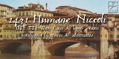 Niccolo Niccoli (1364-1437) was a wealthy bibliophile and an acclaimed scribe, in Florence (Italy). He was one of the most important Italian calligrapher in this early time of rediscovering Roman script. Of rare accomplishment was his adaptation of the so called Italian humanistic minuscule script. We were inspired from his late work to create this present Font. We have added a lot of accented and other characters (U/V, I/J...) who was not existing in the original and replacing "long s" by a small "s" for a modern use. The OTF encoding was used for intelligent alternates, permitting to use different forms of the same lower case or capital in a single word, reproducing easily the charming variety of a real manual scripture.
 - Parliament by Hoefler & Co.,
$49.99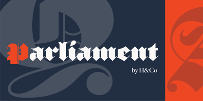 The Parliament typeface was designed by Jonathan Hoefler beginning in 1995. A burlesque typeface in the Regency Blackletter style, Parliament was inspired by the ‘Four-line Pica Black No. 1’ typeface of William Caslon Jr (1821), whose enigmatic design for the letters E, G, I, N, V and Y hinted at a broader ambition to modernize the arcane shapes of the gothic alphabet’s capital letters. Parliament completes this project for the first time by including two sets of alphabets, one archaic and one modern, along with a third set of ‘small caps’ that restores to the blackletter the versatility of Roman type. Parliament was first used for the 1998 ATypI Conference in Lyon, and was published by Hoefler&Co in 2022.
 - Glot by Wordshape,
$20.00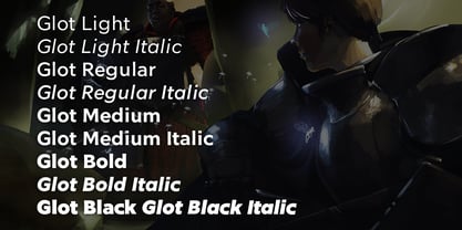 Glot is a ten-member flared terminal sans serif family of typefaces based on a mix of proportions of Roman square capitals and hyper-readable sans serifs. Glot comes in five weights with matching true italics: Light, Regular, Medium, Bold and Black. The Glot family has a wide range and is incredibly functional, working well for longer texts as well as display typography. After designing the house typefaces for a handful of the most predominant multi-player online games out there, we decided that it was time to bring the battlefield to the people. Glot comes armed with ample language support (Central, Eastern, and Western European) and OpenType ornamental spiked alternate characters for when one needs a hint of danger.
 - Henriette by Typejockeys,
$-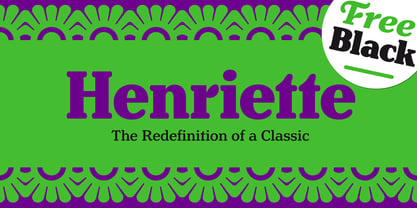 The redefinition of a classic In the 1920s the Viennese government decided to standardize the street signs across the city. A typeface was especially constructed for the purpose. It was available in a Heavy and a Bold Condensed version, to support short street names as well as longer ones. As the years went by, the typeface was adopted and redrawn by several enamel factories. These adaptations lead to variations on the design, and to the fact that there isn’t a Viennese street sign font but 16 – in part severely – different versions. Henriette is not a digitization of any of those versions; rather, it is influenced by all of them. The italic versions are completely original and designed to accompany the Roman.
 - Arquitecta Standard by Latinotype,
$16.00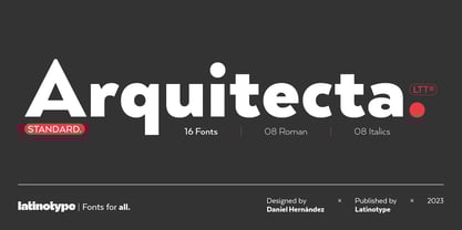 Arquitecta Standard. The humanist typography as a rational project. Since the experimentation from the Bauhaus through modern sans history we looked for a new mix to construct a rational geometric typeface with humanist proportions suitable for text layout and continuous reading. Inspired by American & European hand lettering from the first half of the past century, Arquitecta finds his own space as a great alternative for paragraphs in front of classics like Futura, Kabel or Avant Garde. The family contains 8 upright romans and 8 italics with the following features: - European accents. - Ink traps to avoid press impressing spots & hinting optimized. - Small X-height with accentuated ascenders and descenders. Arquitecta Standar update: Improvements of proportions and drawing. The set was extended to the current one of Latinotype.
 - Cartesius by T4 Foundry,
$21.00Veteran designer Bo Berndal has created Cartesius, an oldstyle serif typeface with roots in the 16th and 17th centuries, France and Venice. Bo Berndal: "Rene Decartes, the great French philosopher, was invited to Sweden in the 17th century, when the country was at the height of its power. In the university city of Uppsala he used the Latin name form Cartesius. The typeface that carries his name is inspired by letterforms from the 1600s, but upper case letters are of pure Roman type". Cartesius holds up well even under less than perfect circumstances, and is suitable for magazine and book design. It comes with a full range of styles, including small caps. Swedish type foundry T4 premiere new fonts every month. Cartesius is our fifth introduction. - Axion by Type Innovations,
$39.00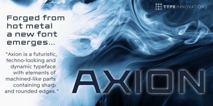 Axion is an original design by Alex Kaczun. It is a display font not intended for text use. It was designed specifically for display headlines, logotype, branding and similar applications. The entire font has an original look which is strong, dynamic, machine generated and can be widely used in publications and advertising. Axion is a futuristic, techno-looking and dynamic typeface with elements of machined-like parts containing sharp and rounded edges. This attractive display comes in roman with lower case and lining figures. The font is also available with true-drawn slant italics. Other design style variations include small capitals with old style figures. The large Pro font character set supports most Central European and many Eastern European languages.
 - ZT Mota by Khaiuns,
$14.00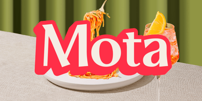 ZT Mota is a bold and elegant typeface. It has a temperamental character but is more flexible towards various stylistic designs, reflecting more in its graphics the transitional stage between classical serifs of varying proportions, leaning towards the stylized types of Roman culture. All the ZT Mota styles are based on the same core but with a completely different expression which is to have an extra large x-height and bold so that the font looks bold as if the writing on the font was actually carved out of stone, perfect for an efficient choice for use of distinguishable displays such as headlines, packaging, magazines, posters, and advertisements, among others. I hope you have fun using ZT Mota Thanks for using this font ~ Khaiuns X zelowtype
 - Rare Bird Specimen IV by Rare Bird Font Foundry,
$50.00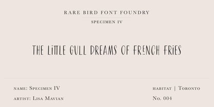 This unassuming sans serif, lettered by Toronto based artist Lisa Mavian of Post Calligraphy, is loaded with robust and charming features and illustrations. OBSERVATIONS Specimen IV is a clean, hand-lettered sans with a quirky personality that does not take itself too seriously. These humble and winsome characters are sure to be a winning addition to your flock of fonts! DEFINING CHARACTERISTICS OpenType programming, formal title & preposition word art, Roman numerals, old-style numerals, realistic double-letter ligatures, complete set of swashed uppercase alternates, select swashed lowercase alternates, complete set of swashed numerals, select swooping descender alternates, 7 complete sets of alternate uppercase letters, 52 graphic iconography alternates. POTENTIAL SIGHTINGS Wedding menus, signage, logo design, chocolate packaging, children's literature, mobile apps.
 - Borest by Flavortype,
$20.00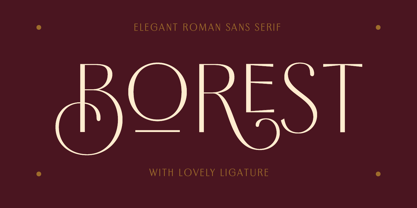 Borest, a new carefully crafted roman sans serif display font. The ideas for this font has a wide range of reference, from vintage, classic, art deco, until the modern era. So the looks of this font must be in the wide range of the reference above. Borest has a versatile and luxury feel as you can see in our creations on the display, such as Branding, Header, Logotype, Poster, Magazine, Packaging, Wedding Invitation with art deco style, and more. It shows that Borest can accommodate various design style. Borest comes with OpenType Features. such as Stylistic Alternates as an Ascender swash and Descender Swash and Ligatures. Every glyphs for alternates are curated for the best and without eliminating the characteristics of this font.
 - Honesty Sans by Océane Moutot,
$32.90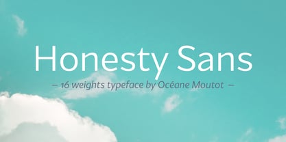 Honesty was the first font published by the Studio in 2020. It was a typeface with flared stems. 2 years later, we are now publishing Honesty Sans. It is inspired by the original design but is revisited as a sans serif this time. Honesty Sans keeps the inspiration from the incise genre and font such as Albertus or the Trajan but with softness, thanks to its low contrast and smooth curves. Honesty Sans is highly lisible, which offers a variety for use, from titles, edition of texts, branding, magazines and so on. Its large variety of glyphs, including accents, old-style numbers and ligatures will give uniqueness to your designs. Honesty Sans is available in 16 styles, from thin to heavy in roman and italic.
 - Pomarosa by Andinistas,
$29.95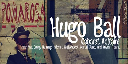 Pomarosa is a typographic family that consists of capital roman letters and twisted lower case letters set randomly. Each one of them is characterized by its multiple calibers and widths. Pomarosa was planned to accompany graphic works done with different techniques and materials such as hand made collages. The narrowness of its glyphs involve its audience with abstract imprecision. Its spirit was born between fabric snippets intervened with pencil and painting. Its three members work in group and also in words or phrases with a non-finished look. Regular Pomarosa and Standard Pomarosa have 260 glyphs each. Both of them simulate to have been done by a right-handed person that works with its left hand. Pomarosa dingbats has 26 illustrations useful for frames and textures.
 - Jenthill by Katsia Jazwinska,
$15.00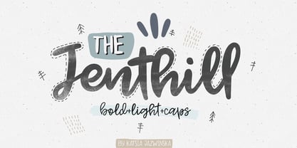 Introducing Jenthill - a lovely font family which includes 4 font styles: - a wonderful script typeface Jenthill - Jenthill Light - a delicate version of Jenthill - 2 uppercase fonts Jetnthill Caps and Jenthill Light Caps which are perfect for headings. Each font consists of about 380 glyphs and includes basic punctuation, numbers, roman typeface and international characters, so the font can be used with most of the European languages. Each font in this family is amazing in itself and perfectly combined with each other. So, if you are looking for a font that simulates the soft-edged handwriting, the Jenthill is just for you! Every letter of this font has been carefully crafted to look wonderful and helps you to add a little fancy to your work.
 - Agilo Handwriting Pro by SoftMaker,
$15.99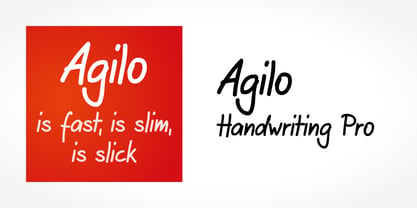 Digitized handwriting fonts are a perfect way to give documents the “very special touch”. Invitations look simply better when handwritten than when printed in bland Arial or Times New Roman. Short handwritten notes look authentic and appealing. There are numerous occasions where handwritten text makes a better impression. Agilo Handwriting Pro is an upright, medium weight handwriting font with a simplified, slightly sloped print (non-connecting) style that mimics true handwriting closely. Use Agilo Handwriting Pro to create stunningly beautiful designs easily. This typeface comes with many pre-made ligatures and alternative characters for sophisticated typography – all easily accessible as OpenType features. A “random” feature even allows for automated random switching between variations of the same character, resulting in type that looks authentically handwritten.
 - Bonsai by Three Islands Press,
$29.00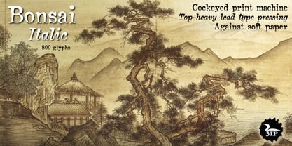 Years ago, I developed an interest in the Japanese art of dwarfed potted trees, bonsai. I bought some books on the subject from Brooklyn Botanic Garden. In one -- Handbook on Bonsai: Special Techniques (seventh printing, February 1976) -- the type was bad. Old worn lead type, I suspect, spread wide in the tops of characters and disappearing on the bottoms. Two decades later, I came across my Brooklyn Botanic Garden collection and was struck again by this interesting type. Inspired, I made a typeface. Didn't take me long to decide on a name for it, either: a name with a double-meaning, based both on its look and its inspiration. Bonsai, the typeface, has two styles, a roman and a true italic.
 - Basco Std by Typofonderie,
$59.00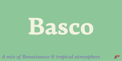 A mix of Renaissance & tropical atmosphere Basco is an exploration of the Renaissance style, a period in which letterforms were informed primarily by hand writing. It is clearly a contemporary interpretation of calligraphic shapes forms. The serifs are subtly asymmetrical. Slightly curved arches on the n, m and u are noticeable, creating an interesting tension in the text. Bruno Mello’s distinctive style is most obvious in his mastery of super fluid curves. It is a result of his extensive exploration of calligraphic forms, their tensions and dynamics, mixing angularities with curves. The roman weights include alternate swashes, as well as initial and terminal glyphs. The italics, based on chancellery script, feature simple stroke endings, most visible on the s and c. ➼ Basco minisite
 - Glot Round by Wordshape,
$20.00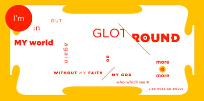 Glot Round is a ten-member flared terminal sans serif family of typefaces based on a mix of proportions of Roman square capitals and hyper-readable sans serifs with slightly rounded corners. Glot Round comes in five weights with matching true italics: Light, Regular, Medium, Bold and Black. The Glot family has a wide range and is incredibly functional, working well for longer texts as well as display typography. After designing the house typefaces for a handful of the most predominant multi-player online games out there, we decided that it was time to bring the battlefield to the people. Glot Round comes armed with ample language support (Central, Eastern, and Western European) and OpenType ornamental spiked alternate characters for when one needs a hint of danger.
 - Figgins Brute by Intellecta Design,
$14.90"A capital titling face with numerals, erroneously labelled in Figgins specimen book of 1817 as an 'antique' or roman. With a very bold, nearly monoline construction and squared serifs as thick as the main stroke, this type surpassed even the fat face style in blackness, it was popularised by the advent of handbills and early advertising posters, which needed bold type styles to project commercial messages from a distance. A sign-writer friend of mine theorises that the Egyptian style originated with the North African campaigns (hence Egyptian) of Napoleon Bonaparte, and the type historian Ruari McLean also suggests that the Egyptian style originated with signwriters 'block' letters, just like the prototypical (and contemporary) sans serif of Caslon IV." (Ben Archer) - Portmeirion No.6 by Greater Albion Typefounders,
$14.50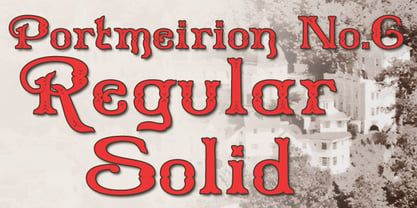 Portmeirion No.6 started life as an experiment by our designer, who was exploring the possibilities of a completely 'over-the-top' display Roman face, bringing in elements of Tuscan and 'Circus' design, along with anything else he felt like. He's instilled a little more discipline in the finished result...but just ever so little. We have Fred Stevens, a regular reader of our website to thank for the name. He's comment on seeing a preview of the design was 'Over the top, Italianesque decorative and intriguing. add some 60's TV and voila Portmeirion.' Why No.6-well you'd need to know a bit about 1960s television to understand that, but we'll give you a hint..."Where am I?"..."In the village".
 - Garnet Euro Typewriter by Coniglio Type,
$19.95Garnet is a rare TT typewriter face, made digital from analog samples gathered with great care by Coniglio Type. A time and place; type and life. Garnet Euro Typewriter is the first new release by designer Joseph V Coniglio in over 5 years. It is contemporary designer type, made from the struck steel hammers of an art deco san serif face transferred from a mechanical 1926 Royal Portable typewriter. It has an obsessively complete commercial roman character set ––for the pre-opentype environment of the late 1990's. Yes, it has that great “Monopoly Game” question mark -- and all on a period-piece typewriter! You should have no trouble grafting that sorely needed Euro symbol.” –And he very well did! - Illuminated Initials by Kaer,
$24.00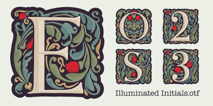 Illuminated Initials font family has Regular and Colored styles and inspired by medieval initials. It's all you need to precisely imitate dark-ages style text. Use this font as a decorative element at the beginning of a paragraph or section, other part of the paragraph should be in regular black letter font. You’ll get Drop Caps & Numbers set. --- *You can use color fonts in PS CC 2017+, AI CC 2018+, ID CC 2019+, macOS 10.14 Mojave+ * *Please note that the Canva & Corel doesn't support color fonts!* *Please download this test file with only A letter ( https://www.dropbox.com/s/fbt3wpu2j3t0ymv/IlluminatedInitials-Test.otf?dl=0 ) to check your app & system.* --- Please feel free to request any help you need: kaer.pro@gmail.com Best, Roman.
 - Imperial Granum by Greater Albion Typefounders,
$18.00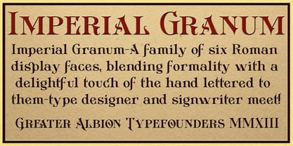 Imperial Granum is designed primarily as a Roman Title and lettering face, combining formality and dignity with a delightful touch of 'Arts and Crafts' like hand drawn design. The regular form of Imperial Granum (which is inspired by a beautifully hand-lettered early 20th century food advertisement) offers two sizes of capitals, in order to provide true 'small-capitals' lettering. Similarly, the Ornamental form consists exclusively of capitals and is designed to be able to mix and match with the regular form. The miniscule form can, of course, be used in its own right, but is primarily intended to complement the regular and ornamental forms. All three faces are offered in regular and bold weights. Explore some Edwardian Arts and Crafts typographical fun today!
 - Medieval Knots by Kaer,
$21.00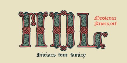 Medieval Knots font family has Regular and Colored styles. It inspired by Celtic knots initials and lines. It's all you need to precisely imitate medieval style text. Use this font as a decorative element at the beginning of a paragraph or section, other part of the paragraph should be in regular black letter font. You’ll get Drop Caps & Numbers set. --- *You can use color fonts in PS CC 2017+, AI CC 2018+, ID CC 2019+, macOS 10.14 Mojave+ * *Please note that the Canva & Corel doesn't support color fonts!* *Please download this test file with only A letter ( https://www.dropbox.com/s/w6n0zmga231xng1/MedievalKnots-Test.otf?dl=0 ) to check your app & system.* --- Please feel free to request any help you need: kaer.pro@gmail.com Best, Roman. Thank you!
 - Hont by Remedy667,
$18.00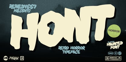 Hont, the original Haunted Font is here. We've captured the essence of an old-school horror film and now you can use it to create awesome-looking titles for all your projects. With its chunky appearance, this font is perfect for vintage poster designs, t-shirt designs, logos, or anything that needs a hint of spooky. Hont is the ultimate Haunted Font that looks amazing on all projects. Inspired by classic mid-century horror films, it will give your projects just the right amount of classic horror. Features Doubles Elimination gives you a more natural look. Inspired by classic mid-century horror films. Includes a Remedy667 Font Catalog PDF, all your favorite fonts in one handy catalog. Possibly haunted, may possess you to create awesome work.
 - Paper Tiger by Fenotype,
$35.00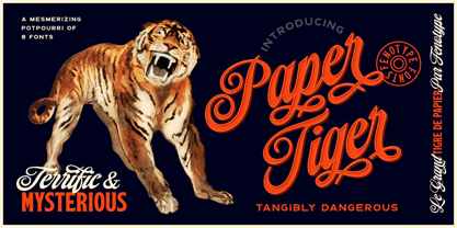 Paper Tiger is a splendid display font package by Fenotype. It’s a Victorian Script accompanied by a condensed flared serif in two weights and a chunky sans serif. Together they make a powerful set for creating logotypes, posters, packaging design, headlines or any display use online or offline. Paper Tiger fonts are available as normal clean versions, as well as “Print” versions that have rugged outlines and eroded texture inside. Paper Tiger suits great for book covers, restaurant menus, food products, craft ale labels, organic teas, sport teams logos and any such. Paper Tiger Script is equipped with Contextual Alternates and Standard Ligatures that keep the connections smooth. Both features are automatically on. In addition it has Swash, Stylistic and Titling Alternates for some extra flair.
 - Bodihel by Sealoung,
$15.00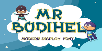 Bodihel is a cute and chunky charactered display font. Add this colorful and bold display font to each of your creative ideas and notice how it makes them come alive! Get inspired by its authentic feel and use it to create gorgeous wedding invitations, beautiful stationary art, eye-catching social media posts, and cute greeting cards. I highly recommend using a program that supports OpenType features and Glyphs panels such as Adobe Illustrator, Adobe Photoshop CC, Adobe InDesign, or CorelDraw, so you can see and access all Glyph variations. FEATURE: ALL CAPS We hope you enjoy the font, please feel free to comment if you have any thoughts or feedback. Or simply send me a PM or email me. Thank you!
 - Boxiest by IbraCreative,
$27.00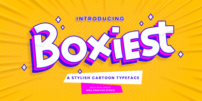 Boxiest is a stylish cartoon typeface that effortlessly combines playfulness with a touch of modern flair. Its bold and chunky letterforms are reminiscent of cartoon characters, creating a sense of whimsy and fun. With its clean lines and geometric shapes, Boxiest exudes a contemporary aesthetic that adds a dash of style to any design. Each letter is like a carefully constructed box, giving the typeface a unique and distinctive look. Whether used for children's books, comic strips, or vibrant signage, Boxiest injects a lively and energetic vibe, instantly capturing attention and igniting imagination. This versatile typeface brings a delightful and fashionable twist to any project, making it a perfect choice for those seeking a stylish and eye-catching cartoon-inspired font.
 - ITC Dartangnon by ITC,
$29.99ITC Dartangnon is a work of English designer Nick Cooke and began with the thought, It's a long shot but it might just work as a font." It started as a doodle with a chunky pencil. "So many script fonts look too stylized so I thought I'd try to produce one that looks more like handwriting." He scanned the doodles and used Fontographer to draw a set of monoline letters. "Working quickly I soon drew the whole alphabet, and without being too pedantic about the characters joining exactly, I arrived at this script." ITC Dartangnon is an energetic font which remains legible even in small point sizes. And, Cooke adds, "It is supposed to be used as upper and lowercase only, NEVER just caps."" - Caslon #540 by ITC,
$29.00The Englishman William Caslon punchcut many roman, italic, and non-Latin typefaces from 1720 until his death in 1766. At that time most types were being imported to England from Dutch sources, so Caslon was influenced by the characteristics of Dutch types. He did, however, achieve a level of craft that enabled his recognition as the first great English punchcutter. Caslon's roman became so popular that it was known as the script of kings, although on the other side of the political spectrum (and the ocean), the Americans used it for their Declaration of Independence in 1776. The original Caslon specimen sheets and punches have long provided a fertile source for the range of types bearing his name. Identifying characteristics of most Caslons include a cap A with a scooped-out apex; a cap C with two full serifs; and in the italic, a swashed lowercase v and w. Caslon's types have achieved legendary status among printers and typographers, and are considered safe, solid, and dependable. A few of the many interpretations from the early twentieth century were true to the source, as well as strong enough to last into the digital era. These include two from the American Type Founders Company, Caslon 540 and the slightly heavier Caslon #3. Both fonts are relatively wide, and come complete with small caps, Old style Figures, and italics. Caslon Open Face first appeared in 1915 from the Barnhart Bros & Spindler Foundry, and is not anything like the true Caslon types despite the name. It is intended exclusively for titles, headlines and initials, and looks elegant whether used with the more authentic Caslon types or by itself. - Dederon Serif by Suitcase Type Foundry,
$75.00Dederon Serif has been specifically designed for book setting. Preliminary sketches were drawn in 2004. Its inspiration – particularly its weight and width proportions – can be traced to the Liberta typeface from the TypoArt type foundry in former Eastern Germany. After a careful study of the model, the design of Dederon branched off into its own direction, finding its distinctive voice and becoming a wholly original type family. Dederon Serif kept most of the elements typical for the Old Style Roman lettering, such as the angle of the stress, the medium x-height, and lower contrast. In large sizes, the typical shapes of the letters stand out – the calligraphic feel characteristic for the Czech typefaces by Oldrich Menhart, the unusual serifs hinting at the angle of the pen, the shapes of the stems, or the terminals of dots and ears. Upon finishing the serif version, a Serif-serif variant called Dederon Serif was added. The construction principles are also derived from the Old Style Roman model, which lends the lettering its open, humanist feel. Yet the design also conforms to the rules of the modern Serif serif. Most characteristics of Dederon Serif match the serif version – the weight of individual cuts, the width proportions, x-height, ascenders' and descenders' length, and the slope of the italics. Each version of Dederon Open Type Std contains the standard Western Latin character set and the Central European characters; a number of basic and accented ligatures, small caps; old style, small caps and caps, table, fraction and superscript numerals; expert glyphs and alternative characters. This brings the total to a comfortable 820 glyphs per weight, permitting truly professional use in the most demanding projects. - Dederon Sans by Suitcase Type Foundry,
$75.00Dederon Serif has been specifically designed for book setting. Preliminary sketches were drawn in 2004. Its inspiration — particularly its weight and width proportions — can be traced to the Liberta typeface from the TypoArt type foundry in former Eastern Germany. After a careful study of the model, the design of Dederon branched off into its own direction, finding its distinctive voice and becoming a wholly original type family. Dederon Serif kept most of the elements typical for the Old Style Roman lettering, such as the angle of the stress, the medium x-height, and lower contrast. In large sizes, the typical shapes of the letters stand out — the calligraphic feel characteristic for the Czech typefaces by Oldrich Menhart, the unusual serifs hinting at the angle of the pen, the shapes of the stems, or the terminals of dots and ears. Upon finishing the serif version, a sans-serif variant called Dederon Sans was added. The construction principles are also derived from the Old Style Roman model, which lends the lettering its open, humanist feel. Yet the design also conforms to the rules of the modern sans serif. Most characteristics of Dederon Sans match the serif version — the weight of individual cuts, the width proportions, x-height, ascenders' and descenders' length, and the slope of the italics. Each version of Dederon Open Type Std contains the standard Western Latin character set and the Central European characters; a number of basic and accented ligatures, small caps; old style, small caps and caps, table, fraction and superscript numerals; expert glyphs and alternative characters. This brings the total to a comfortable 820 glyphs per weight - The Augustus font is a distinctive typeface that exudes elegance and classical charm, reminiscent of the grandeur associated with its namesake, the revered Roman Emperor Augustus. This font is charac...
- Nastaleeq Asc by Ascender,
$155.99Nastaleeq (Nasta?l?q) ASC is a script font supporting Urdu. Urdu is the nation language of Pakistan. The Nastaleeq ASC font is Unicode encoded. The Nastaleeq ASC font requires an application program which supports Arabic fonts (right-to-left composition). Urdu is also spoken in Afghanistan, Bahrain, Bangladesh, Botswana, Fiji, Germany, Guyana, India, Malawi, Mauritius, Nepal, Norway, Oman, Qatar, Saudi Arabia, South Africa, Thailand, the UAE, the UK and Zambia. - Saturday Script by Nicky Laatz,
$16.00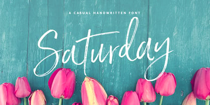 Say hello to Saturday Script! A a care-free, casual, handwritten script with authentic tell-tale dry brush imperfections. Saturday Script has the added bonus of having 'multiple personalities'! Saturday Script has 2 sets of lowercase stylistic sets, allowing you to make each word look completely unique to the next. Whether you need "flaunty & loud" or "soft & romantic" Saturday Script has the look for you. There are 2 variants of Saturday Script, to add even more flexibility to your designs: Regular, and Oblique
 - Goddess by Device,
$39.00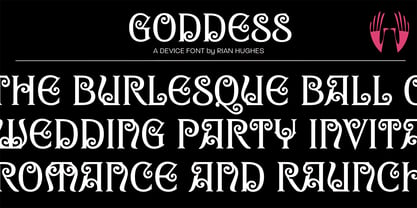 Decadent, baroque and refined. Sinuous curves, ornate swashes and alternates that can be customized to suit your burlesque ball, bodice-ripping romance novel or high-fashion label. The “Swash” version includes swash capitals that can be toggled on or off using the ‘swash’ option in Adobe apps. The “Title” version includes drop-caps that connect with an underline that runs under the regular characters. These again can be toggled on and off using the ‘swash’ option. Also includes optional stylistic alternates and ligatures.
 - Sweet Monica by Gatype,
$9.00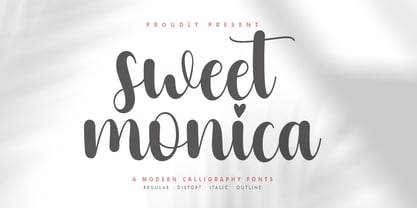 Sweet Monica is an elegant script with a creative mood and perfect form, inspired by today's beautiful calligraphy. thick, balanced and varied, born for luxury and beauty. In my example I show how this script can be used. It's great for logotypes, branding, wedding invitations, romantic cards, alcohol labels, packaging, name spelling and more. Sweet Monica comes with beautiful uppercase and lowercase letters, numbers, and punctuation. In addition to the main character set, there are many alternative characters, early and late sweeps.
 - Aubgane by Pista Mova,
$15.00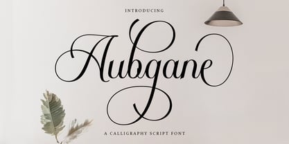 Aubgane is a classy display script inspired by the romantic era. It's unique and pairs perfectly with most of our typography. A sweet compliment to a serif or sans serif, whether bold or more subtle. It also supports multilingual. Multilingual SupportFuture updates for free — Our typography works best in design software. Please note that while our fonts work well in Canva, Canva itself does not support advanced open type features such as special characters. For support please email me at pistamova02@gmail.com.
 - East Botany by Reyrey Blue Std,
$16.00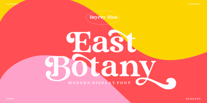 Say Hi to East Botany. A new bold and stylish font with modern, groovy and retro look. It comes with large selection of alternate glyphs to give your any project to a unique design. East Botany is perfect for luxury logo and branding, classy editorial design, woman magazine, cosmetic brand, fashion promotional, blog design, modern advertising design, card invitation, art quote, book/cover title, and modern and more. Features : · All Uppercase and Lowercase · Number & Symbol · Supported Languages · Alternates and Ligatures · PUA Encoded
 - Cottonwood Market by Make Media Co,
$18.00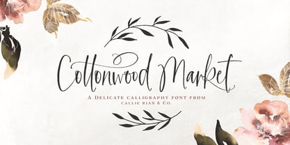 Cottonwood Market is a sweet, upright calligraphy font with loads of decorative alternates and a charming signature feel. This lovely little calligraphy font is packed with alternates, ligatures, and an authentically inked texture. It’s both romantic and delicate, with thin lines and signature glyphs. Just check out that swanky ‘k!’ Cottonwood Market has plenty of personality for branding, bridal, merchandise, signage, signatures, and more! With over 90 ligatures and alternates to play with, you can have some serious fun with this font.
 - Venettica Script by Letterhend,
$16.00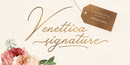 Please meet Venettica Signature, a romantic script typeface. As you can see, this typeface has elegant look with natural feel. The swashes make the font looks even more unique. You can play around and mix and match the swashes, combining into a great signature! They works perfect for you who needs a typeface for headline, logotype, apparel, invitation, branding, packaging, advertising etc. This typeface is comes in uppercase, lowercase, punctuation, symbols, numerals, stylistic set alternate, ligatures, etc also support multilingual.