10,000 search results
(0.032 seconds)
- Shoganai by Hanoded,
$15.00 I really like the Japanese language, as it has words that describe a whole world of meaning. Like Shoganai. It literally means: ‘It cannot be helped’. That’s life, get used to it. Shoganai sums up a lot of the Japanese culture and way of thinking: if things cannot be helped, then accept it and move on. Shoganai is a set of Brush fonts: a thinner, script font and a heavy display font. Use if for book covers, product packaging and more. If you can’t use it, then, well, Shoganai.
 - 360 by Wilton Foundry,
$29.00Distorted fonts are great but are mostly not very practical - 360 is an attempt to create a simple distorted font that can be used far beyond a few logos or headlines. Each 360 character averages roughly half the number of sharp angles of a regular sans serif. This gives it an unusually fresh and timeless appeal and creates a dynamic presence across body text that is very legible and compact without looking overly condensed. 360 was chosen as a name because it can be used as an everyday font, all year round, and because 360 has so many unusual angles that don't conform to normal font conventions. 360 also happens to be a cool number: 360 makes a highly composite number. 360 is also a superior highly composite number and a colossally abundant number. A circle is divided into 360 degrees for the purpose of angular measurement. 360° is also called round angle. 360 is a convenient standard since, 360 being highly composite, it allows a circle to be divided into equal segments with each segment measured in integer degrees rather than fractional degrees. 360 is the sum of a twin prime (179 + 181). A year is roughly calculated as 360 days. - Ambiguity by Monotype,
$50.99 Ambiguity is a type family with five distinct personalities or ‘states’, created as a tool for coaxing designers and brands out of their comfort zone. It embraces both tradition and radicality, as well as generosity and thrift, encouraging us to question our beliefs about the intersection of style and meaning. The family is designed by Charles Nix, who describes Ambiguity as “as much thought experiment as typeface.” Its five states—Tradition, Radical, Thrift, Generous and Normate—each express or subvert different aspects of typographic tradition. Tradition is conservative, relying on historical letter shapes. Radical rejects inherited ideas of proportion, making typically slender letterforms wide, and wide letterforms slender. “It’s contrarian,” says Nix. Thrift cherry picks the condensed shapes from Tradition and Radical, while Generous does the same for wide forms. Normate sits at the center, a synthetic blend of all of the others. “Tradition is very comforting,” says Nix. “It’s the mask of conservatism. It’s calming because it delivers the proportions we expect. With Thrift more fits into a smaller space, so it’s great where words want to get large, like gigantic headlines, or text needs to cram in, like small screen type. You get a sense of carefree and luxury from the Generous cut. One would expect the Radical to be used in a sort of Dadaist way, but in a classic context it provides an enjoyable jolt.” Ambiguity is a litmus test. Designers could spend hours trying on typefaces that offer just one of these voices. Ambiguity provides five different personalities—ideas—beliefs—each of which also work seamlessly together. “It’s a palettea, like idea cards,” he says. “It’s a way of making yourself see differently. My hope is that traditionalists will try on radical clothes and vice versa. It’s a way of exploring outside your comfort zone, breaking out of the doldrums, by stepping through a variety of voices.”
 - Broaek by Linecreative,
$10.00 Broaek is a display typeface with a modern impression. This font consists of 3 types of styles, namely regular, thin, and outline. This font is perfect for use in headlines, posters, branding, titles, and other graphic designs. What you get dear, you will get : 1. Broaek- A clean San serif font including Upper & Lowercase characters(Regular,thin,Outline) 2. Numbers and Pointing 3. Supports Multi linguage (Latin Western Europe)
 - Olivine by URW Type Foundry,
$35.00 In an era of typographic neutrality, Pria Ravichandran adds spirit and flavour to the humanist sans, a genre that is known for legibility. Introducing Olivine. Olivine is a versatile type family that performs admirably across sizes. It is designed with maximum care ensuring legibility across various sizes, angles and distances. The sturdy shapes and the exaggerated ink traps fade to produce an even typographic colour and a lively texture in smaller text sizes. In larger display settings, the details become self-conscious and highlight the spectacular quality of the design. Olivine is neither experimental nor minimal, striking a balance between formality and friendliness. Olivine is clean as well as organic at the same time. Consisting of seven weights in roman and italics, the type-family address typographic hierarchy for texts of all kinds and sizes. Distinctive, yet neutral letterforms add personality to the type family. The counter-forms are large and open giving the design plenty of internal space which is balanced against the generous spacing of the characters. These features of Olivine make the reading process enjoyable in digital as well as the print medium. No squinting to read this type-family! If you are looking to add some flavour into your design, try Olivine. It is a trend-setting typeface that we predict is going that extra mile. Try before you buy, Olivine Medium and Medium Italic are available free for unlimited commercial usage.
 - Brolike by Alit Design,
$21.00 Presenting the ✨Brolike Typeface✨ by alitdesign. Inspired by cassette music album covers in the 70s and 80s, a retro font was created in a calm and simple style but still gives an interesting and unique impression. Besides that, combined with a dynamic stencil style, the Brolike font becomes more stylish, especially if the design to be made uses swash on alternative fonts to create, for example, lettering or a logotype that is designed to make your design cool and different. Brolike font is very suitable for making designs with retro concepts, simple and playful designs, for example making magazine cover designs, music covers, YouTube thumbs, text headers, logotypes and so on with an elegant retort theme. Besides that this font is very easy to use both in design and non-design programs because everything changes and glyphs are supported by Unicode (PUA). Brolike font has a total of 746 glyphs including symbol, multilingual and alternative glyphs. We really enjoyed the process of making the Brolike font, we hope you are also happy when using the Brolike font. Language Support : Latin, Basic, Western European, Central European, South European,Vietnamese. In order to use the beautiful swashes, you need a program that supports OpenType features such as Adobe Illustrator CS, Adobe Photoshop CC, Adobe Indesign and Corel Draw. but if your software doesn't have Glyphs panel, you can install additional swashes font files.
 - Neufile Grotesk by Halbfett,
$30.00 Neufile Grotesk has its roots in some of the earliest commercially available sans-serif typefaces. This highly legible sans-serif design is well-suited for many display and text-based typographic uses. Users can apply the fonts effortlessly to a large number of messages and media, from advertising to book design. The typeface family ships in two different formats. Depending on your preference, you can install the typeface as a single Variable Font or use the family’s eight static OpenType font files instead. Those weights run from Extralight through Black. While the static-format fonts offer a good intermediary-step selection, users who install the Variable Font have vastly greater control over their text’s stroke width. The Neufile Grotesk Variable Font’s weight axis allows users to differentiate between almost 1,000 possible font weights. That enables you to fine-tune your text’s exact appearance on-screen or in print. But even the eight static fonts satisfy the need for flexibility, creating harmonious variations of texture and emphasis. Whichever format you choose, the Neufile Grotesk fonts include several sophisticated OpenType features. In addition to standard ligatures, there are a few discretionary ligatures and a stylistic set replacing “a”, “g”, and “R” with geometric-sans-style forms. Other features include numeral variants – there are proportional and tabular versions of lining figures and oldstyle figures – as well as fractions and numbers in circles. The fonts have arrows and a feature for setting case-sensitive forms, too.
 - Capsbats by Typephases,
$25.00 Everything your head should not be or would rather not do is here. A complete collection of 225 illustrations (plus bonus shadows) in three fonts. The illustrations collected in the Capsbats keep the free-flowing lines of the ink-on-paper sketches. As a dingbat, or pictorial typeface, the Capsbats are very versatile: you can use them immediately in any application. The vectorial format of the font file means they are scalable with no loss of quality. And you can customize them in no time in your favourite graphics program. They can be used out of the box, as accents or spot illustration, or enlarged, combined, coloured, textured... to achieve an infinite variety of results easily. With Capsbats you have an incredible resource for your concept illustration needs: enlarge them and you can create a high impact page layout, posters, magazine covers and book jackets, advertising... The Capsbats Shadows are bonus silhouettes that you can use in very different situations. Use these shadows to fill them with your own patterns, or use them as a mask or clipping path, to paste the images you want inside them. The possibilities are endless. We didn't limit our imagination in drawing them, so why would you when using them? The book 1000 Heads is a compendium of the drawings featured in the Capsbats and Entestats and it gives a glimpse of the limitless applications of this collection.
 - Rotis Sans Serif by Monotype,
$45.99 Rotis is a comprehensive family group with Sans Serif, Semi Sans, Serif, and Semi Serif styles, for a total of 17 weights including italics. The four families have similar weights, heights and proportions; though the Sans is primarily monotone, the Semi Sans has swelling strokes, the Semi Serif has just a few serifs, and the Serif has serifs and strokes with mostly vertical axes. Designed by Otl Aicher for Agfa in 1989, Rotis has become something of a European zeitgeist. This highly rationalized yet intriguing type is seen everywhere, from book text to billboards. The blending of sans with serif was almost revolutionary when Aicher first started working on the idea. Traditionalists felt that discarding serifs from some forms and giving unusual curves and edges to others might be something new, but not something better. But Rotis was based on those principles, and has proven itself not only highly legible, but also remarkably successful on a wide scale. Rotis is easily identifiable in all its styles by the cap C and lowercase c and e: note the hooked tops, serifless bottoms, and underslung body curves. Aicher is a long-time teacher of design and has many years of practical experience as a graphic designer. He named Rotis after the small village in southern German where he lives. Rotis is suitable for just about any use: book text, documentation, business reports, business correspondence, magazines, newspapers, posters, advertisements, multimedia, and corporate design.
 - VTC-KomikaHeadLinerChewdUp - Personal use only

- Today Sans Now by Elsner+Flake,
$59.00 With the publication of the “Today Sans Now” Elsner+Flake extends its offering of the “Today Sans Serif” type family, developed in 1988 by Volker Küster for Scangraphic, by another cut so that the gradation of the stroke width can now be more finely calibrated. The type complement is available for 72 Latin-based languages as well as Cyrillic. Where available, small caps were integrated, and mathematical symbols as well as fractions were included. In order to make the symbols for text applications in regard to headlines more flexible, the insertions which were formerly added, for technical reasons in order to sharpen the corners, were eliminated, and the optical size adjustments of the vertical and diagonal stem endings (I, v, H, V) to the horizontal bars (z, Z) were scaled back. Already since the end of 1984, Volker Küster experimented with broad sticks of chalk and a broad felt pen in order to develop a new sans serif typeface which, in the interest of easy legibility, would be built on the basic structures and proportions of the Renaissance-Antiqua. Using a normal angle of writing, his experiments lead to the form structure of the characters: a small contrast between bold and light weights, serif-like beginning and end strokes in some of the lower-case characters, and the typical, left-leaning slant of all round lower-case letters and the typical left-leaning axis of all round letter forms. In this way, a rhythmization of a line of type was achieved which created a lively image without being “noisy”. With this concept, Volker Küster has enlarged the Sans Serif by a distinctive, trend-setting form variation.
 - Supertuba by Tipos Pereira,
$10.00 Supertuba is a :) geometric sans vernacular humanist :) display type family with 6 weights. There's literally dozens of ligatures in this font so It works very well for flyers, package, stickers and posters, also you can use it as a text font if you're looking for something slightly bold. Supertuba has multilingual support and useful open type features. Letter boards that used to be seen in churches, dive bars and butcher shops are the main inspiration for this typeface. The name Supertuba came from an old supermarket that no longer exists in the city of Indaiatuba , I just believe this name is super fun (at least in Portuguese) and wanted to keep it alive. I was in Indaiatuba when I get started designing this typeface so this is fair enough. Supertuba the third piece of a particular trilogy of fonts that Stubby and Stubby Rough take part, from the lazy vernacular drawing to an unusual geometry. Enjoy!
 - Eragu by Twinletter,
$15.00 ERAGU is a display typeface that is unlike any other, both in terms of shape and the impression it gives when used in words or sentences. It also has a new and unusual appearance that makes it truly unique and quirky. All of your projects will be unique in the market if you use this font; it will pique the interest of everyone who sees it, and it will be simple to remember every message you will convey to the audience because, in just a few seconds, everyone will be interested in the appearance of your project if you use this font. Logotypes, food banners, branding, brochure, posters, movie titles, book titles, quotes, and more may all benefit from this font. Of course, using this font in your various design projects will make them excellent and outstanding; many viewers are drawn to the striking and unusual graphic display. Start utilizing this typeface in your projects to make them stand out.
 - Hebrewish by JAB,
$18.00I decided to create Hebrewish because the only Hebrew Latino font I have ever seen didn't really live-up to my expectations. Each Roman letter and Arabic numeral in this font is based directly on one or more of the Hebrew characters. Originally I was tempted to create an upper case only - since there is no lower case in Hebrew that I know of. But, as this would have limited it's usefulness, I changed my mind and added a lower case also. Nevertheless, those who want to create very Hebrew looking text, need only use the upper case. I've also added some typical Judaic symbols for the artistic minded, e.g. David's star *, the Menorah ^(Jewish candelabrum) and brackets{ } based on this, as well as brackets [] which, used together, produce a 'Ten commandments' stone-tablet symbol(use this [~] for another version). In short, you can either have some fun with this font or use it for serious work - the choice is yours. - Hero Sandwich Ingredients by Comicraft,
$19.00 As comic book readers know all too well, team ups are every super hero’s bread and butter... when the brave and the bold are in a pickle, and super villains are running onion rings around them, here’s how they roll: They Meat! They Team-Up with your taste buds! They Fight Hunger! Yes, some hero combos may get along better than others, but they are always more powerful together. So take a footlong bite out of crime, and make the subways safe again with our mouthwatering HERO SANDWICH! Prepared with plastic gloves on by those awfully nice chaps at the Comicraft deli. Anyway you slice it, these five Ingredients can be layered to generate a Hero Sandwich with the carbs and protein you need to deliver a knuckle sandwich to the bulking agents of your deadliest foes! See these families related to Hero Sandwich Ingredients: Hero Sandwich Combos Hero Sandwich Pro
 - Thought by Scholtz Fonts,
$15.00 Thought, with its versatile five styles, is ideal for contemporary display work. It has style, flair, legibility, and interesting, flowing letter shapes. The Family: -- REGULAR - of medium weight - clear and legible; -- BLACK - for bolder statements and best readabilty; -- LINEAR 25 - light weight, mono width line -- LINEAR 45 - medium weight, mono width line -- ZEST - variable line, casual, exaggerated appearance Use a combination of styles for product branding, book covers, invitations, greeting cards. Thought has not been designed to be used in "ALL CAPS". The best effects for headings and subheads are obtained with an initial upper case letter followed by lower case characters. If you are using upper and lower case then it is not necessary to use kerning. Thought contains over 250 characters - (upper and lower case characters, punctuation, numerals, symbols and accented characters are present). It has all the accented characters used in most European languages.
 - Celestina by Piñata,
$- Celestina is the lively spirit, just like drops of ink on a piece of paper or clouds in the sky. The same spirit is maintained by the rounded letters of the script and by the characters' small whorls. Celestina has come to life as a result of a peculiar game in which I tried to bring together the letters with different tempers with help of calligraphic instruments. I wanted to create a very light and playful font which would look like a quick inscription on a piece of paper, but would also be easy to read in a text array. As I was working on the font, my cat Celestina has been very interested in the brush painting process, and I had no other option but to name the font after her! Celestina works perfect for both Moomins stories and personal blogs, as well as for the design of hand-made things, and even just then when you want to put yourself into a good mood!
 - Samaritan Tall Lower by Comicraft,
$49.00 Fifteen hundred years from now, a man will be selected to go back in time to prevent a catastrophic event which turned his world into a dystopia. Sent back in time, he was enveloped in empyrean fire, the strands of energy that make up time itself. Crash-landing near Astro City in late 1985, he learned how to master and channel the empyrean forces that had suffused his body -- finally learning to control his powers in time to prevent the destruction of the Space Shuttle Challenger, the event he had been sent to avert. He described himself to journalists as nothing more than "a Good Samaritan", and has continued to help his fellow man in Astro City ever since. John JG Roshell has also been struggling with the empyrean challenge of fitting all of Kurt Busiek's ASTRO CITY dialogue into balloons with the regular Samaritan font, so he created the Samaritan Tall font to help his fellow comic book letterers! It's kinda the same thing, really.
 - Ithornët - Personal use only

- Fatso - Unknown license

- Vampliers by Remedy667,
$18.00 Vampliers is a handmade horror font, inspired by the lettering of classic sci-fi and horror film posters. It’s perfect for Halloween party invites, posters, packaging design… Any project you want to give that “vintage spooky” feel, Vampliers will protect your neck.
 - Tomseig Northek by Warisand,
$17.00 Tomseig Northek is a Vintage Font inspired by beautiful vintage sign art and lettering. The font comes with unique alternate design characters to give your designs an elegant and artistic look. It is perfect for logo and packaging design, short phrases or headlines.
 - Thenna LV by Miroslav Cunic,
$25.55 ThennaLV Bold is a slightly contrasted and a bit extended (not just basic) font family with two styles suitable for typing headlines in newspapers or magazines, giving the name of a book, composition and more. The font family consists Latin and cyrillic characters.
 - Shire Script by Bean & Morris,
$35.00 Shire Script includes alternate characters and discretionary ligatures to help you create settings when informality is called for. Variety in the lowercase x heights and connectors give an overall effect of handwritten headings and text. However, by considered drawing, legibility is not compromised.
 - Gimoc Botuned by Warisand,
$17.00 Gimoc Botuned is a Vintage Font inspired by beautiful vintage sign art and lettering. The font comes with unique alternate design characters to give your designs an elegant and artistic look. It is perfect for logo and packaging design, short phrases or headlines.
 - Barinek by Warisand,
$17.00 Barinek is a Vintage Font inspired by beautiful vintage sign art and lettering. The font comes with unique alternate design characters to give your designs an elegant and artistic look. It is perfect for logo and packaging design, short phrases or headlines.
 - Headey by Alex Couture,
$15.00 Headey is a clean and lining brush script with a bouncing baseline. Include OpenType alternates and common ligatures. Try the alternates and ligatures to give your designs looks good, fresh, casual, stylish, and modern. That's it! I really hope you enjoy it.
 - Moycen by Muksal Creatives,
$10.00 Introducing Moycen font is the perfect blend between bold, modern and feminine. It's strong yet soft, urban and high fashion. The hard lines with subtle rounded edges gives it a perfect mix of contemporary typography and classic design. Versatile is an understatement.
 - Blue Almonds by Creative Corner,
$12.00 Thank you for visit! Blue Almonds is a cute handwritten font, gives a vibe of natural happines and positivity, a little dreamy. It's a good choice for themes like: lifestyle, blogs, products, food, cosmetics, newspaper titles, signatures, travel, quotes and many many more.
 - Nurekas by Warisand,
$17.00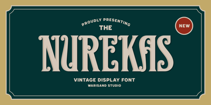 Nurekas is a Vintage Font inspired by beautiful vintage sign art and lettering. The font comes with unique alternate design characters to give your designs an elegant and artistic look. It is perfect for logo and packaging design, short phrases or headlines.
 - Ariel Conditios by Warisand,
$17.00 Ariel Conditios is a Vintage Font inspired by beautiful vintage sign art and lettering. The font comes with unique alternate design characters to give your designs an elegant and artistic look. It is perfect for logo and packaging design, short phrases or headlines.
 - Gods Eunorak by Warisand,
$17.00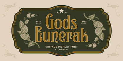 Gods Eunorak is a Vintage Font inspired by beautiful vintage sign art and lettering. The font comes with unique alternate design characters to give your designs an elegant and artistic look. It is perfect for logo and packaging design, short phrases or headlines.
 - Drogheda by Fontdation,
$20.00 Introducing our latest font release: Drogheda. A reversed-contrast slab serif with a strong but flexible personality. Crafted with high attention to the details, gives you the best designing experience. Suits best for poster designs, headlines, quote writings, etc. THANKS AND ENJOY!
 - Hands Up by Huy!Fonts,
$15.00 Hands Up is a useful collection of hand designs, with or without shirt. It has from pointing hand to annoying hands or happy hands and some give-the-finger hands. They are drawing in a clear cartoon style, suitable for modern designs.
 - Varly by moretype,
$16.00 Varly is a single weight handwritten style font. It's slight slant and dynamic shapes create a font that is honest and charming but still lively enough to add flare. Varly can bring a personal touch to any project it is used in.
 - Bophyse by Warisand,
$17.00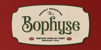 Bophyse is a Vintage Font inspired by beautiful vintage sign art and lettering. The font comes with unique alternate design characters to give your designs an elegant and artistic look. It is perfect for logo and packaging design, short phrases or headlines.
 - Hent Eunoyalk by Warisand,
$17.00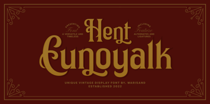 Hent Eunoyalk is a Vintage Font inspired by beautiful vintage sign art and lettering. The font comes with unique alternate design characters to give your designs an elegant and artistic look. It is perfect for logo and packaging design, short phrases or headlines.
 - Kaliurang Signature by Letterafandi Studio,
$10.00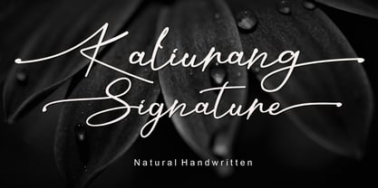 Kaliurang Signature is a modern handwritten font by Letterafa Studio. It has flowing letters that will give your designs a unique and sweet look. Kaliurang Signature is perfect for logos, greeting cards, package design, brand identity, craft design and any DIY project.
 - My Aunt Celia by Quadrat,
$25.00 My Aunt Celia was designed as a quaint, quasi-elegant display face using caps and small caps. The family consists of two fonts: regular and alternate which, between them, provide many special swash characters, tall caps and ligatures for lively, quirky, mixed settings.
 - P22 Vidro by IHOF,
$24.95 Vidro is a glass technique introduced by the Dutch in Japan in the 16th century. Vidro glassworks, such as decorations and children's toys, enrich the live of Japanese people. P22 Vidro is comprised of simple forms that express both irregularity and fluidity.


