10,000 search results
(0.031 seconds)
- Fun City by ABSTRKT,
$20.00 FunCity is a family of typefaces designed for multi-layered use. There are six levels of letter thickness from thin to extremely bold and all styles of the family represent basically a different variations of the same letterforms. As the same letters in every typeface in this family use the same amount of space, it creates a possibility of overlaying and using more than one style simultaneously, which lead to almost endless variations.
 - MIR Next by Juliasys,
$22.00 MIR Next is a growing multi-script type family best described by the terms “humanist–semi–slab-serif”. Its character set contains Latin and Cyrillic, both extended, as well as Greek, covering more than 100 languages. Strong personality along with consistency between language systems were a basic aim when designing the family. As a result MIR has become a great tool for branding and international identities. A wide choice of symbols and numbers makes it also very useful for statistics, texts about mathematics and the sciences. Serious things are best be said in an unpretentious, relaxed way. MIR gives typography exactly that kind of appearance. Its texts emit a sense of authority but stay easily accessible at the same time. MIR’s name comes from the old Russian word Мир meaning both “world” and “peace” – a unity we will hopefully take for granted sometime in the future.
 - Tavern by FontMesa,
$25.00 Tavern is a super font family based on our Algerian Mesa design, with Tavern we've greatly expanded the usability by creating light and bold weights plus all new for 2020 with the introduction of extra bold and black weights Tavern is now a five weight family. The addition of the bold weight made it possible to go further with the design by adding open faced shadowed, outline and fill versions. Please note, the fill fonts are aligned to go with the open faced versions, they may work with the outline versions, however you will have to apply them one letter at a time. The Tavern Fill fonts may also be used a stand alone font, however, the spacing is much wider than the regular solid black weights of Tavern. In the old days of printing, fill fonts rarely lined up perfect with the open or outline font, this created a misprinted look that's much in style today. To create that misprinted look using two different colors, try layering the outline fonts offset over the top of the solid black versions. Next we come to the small caps and X versions, for a font that's mostly seen used in all caps we felt a small caps would come in handy. The X in Tavern X stands for higher X-height, we've taken our standard lowercase and raised it for greater visibility in small text and for signage where you want the look of a lowercase but it needs to be readable from the street. In August of 2016 I started the project of expanding this font into more weights after seeing the font in use where someone tried creating a bold version by adding a stroke fill around the letters. The result didn't look very good, the stroke fill also caused the shadow line to merge with the serifs on some letters. This lead me to experiment to see if a new bold weight was possible for this font and I'm pleased to say that it was. After the bold weight was finished I decided to type the regular and bold weights together in a first word thin second word bold combination, however the weight difference between the two wasn't enough contrast. This lead me to wonder if a lighter weight was possible for this font, as you can see yes it was, so now for the first time in the history of this old 1908 type design you can type a first word thin second word bold combination. So why the name change from Algerian to Tavern? Since the original font was designed in England by the Stephenson Blake type foundry I decided to give this font a name that reminded you of the country it came from, however, there were other more technical reasons. During the creation of the bold weight the engraved shadow line was sticking out too far horizontally on the bottom right of the serifs dramatically throwing the whole font off balance. The original font encountered this problem on the uppercase E, L and Z, their solution was a diagonal cut corner which was now needed across any glyph in the new bold weight with a serif on the bottom right side. In order to make the light and regular weights blend well with the bold weight diagonal cut offs were needed and added as well. This changed the look of the font from the original and why I decided to change the name, additional concerns were, if you're designing a period piece where the font needs to be authentic then this font would be too new. Regular vs. Alt version? The alternate version came about after seeing the regular version used as a logo and secondary text on a major product label. I felt that some of the features of the regular version didn't look good as smaller secondary text, this gave me the idea to create an alternate version that would work well for secondary text in an advertising layout. But don't stop there, the alternate version can be used as a logo too and feel free to exchange letters between both regular and alternate versions. Where are the original alternates from Algerian? Original alternates from Algerian are built into the regular versions of Tavern plus new alternates have been created. We're excited to introduce, for the first time, all new swash capitals for this classic font, you're going to love the way they look in your ad layout, sign or logo. The best way to access alternate letters in Tavern is with the glyph map in Adobe Illustrator and Adobe InDesign products, from Adobe Illustrator you can copy and paste into Photoshop as a smart object and take advantage of all the text layer style features Photoshop has to offer. There may be third party character maps available for accessing alternate glyphs but we can't advise you in that area. I know what you're thinking, will there be a Tavern Condensed? It takes a lot of hours to produce a large font family such as this, a future condensed version will depend on how popular this standard version is. If you love Tavern we're happy to introduce the first weathered edge version of this font called Bay Tavern available in February 2020.
 - Yalta Sans by Linotype,
$29.00 Yalta Sans combines the warmth of a traditional humanist design, the clarity of a grotesque and the modernity of a square sans. Several design traits contribute to this melding of diverse typographic concepts. Characters find their foundation in stroke-based shapes rather than constructed forms. Curve stokes are also slightly squared and counters are open. Curved strokes join verticals at nearly right angles to create a strong horizontal stress, aiding the reading process. The resulting design is exceptionally legible while still inviting. Although Yalta Sans is clearly differentiated from its calligraphic ancestors, many details of the design emulate the distinctive characteristics of typefaces from the Renaissance. Tapering horizontal stokes also give Yalta Sans a dynamic relationship with linear grotesque while its angled stroke terminals echo the work of a calligraphic brush Yalta Sans italics are cursive designs that are in keeping with humanistic letterforms and are markedly narrower than the Roman characters. Lining and old style figures, small caps and a suite of ligatures also make for a remarkably versatile typeface family.
 - Silent Seas by Dismantle Destroy,
$19.00 This font was inspired by music from the band Silverstein. The main characteristics are the incredibly thin, orgainic lines.
 - Sqwared by Monotype,
$25.00 Sqwared is a square sans serif type family... with flares! This typeface has a retro, hand-painted quality – the slight flaring of its verticals evoke the steady brush of a signwriter. Sqwared benefits from large, open counters and a generous x-height that aids clarity and legibility, while a wide footprint gives these fonts a degree of stature and an air of confidence. Each character was drawn while immersed in a late sixties/early seventies vibe, but there’s no reason why Sqwared can’t be used for your contemporary designs. There are 16 fonts altogether, ranging from Thin to Ultra weights in both roman and italic. It has a Latin character set that covers all Latin European languages. Sqwared will dazzle in headlines, add flair and distinction to your logo designs, bring flamboyance to your branding material, and your body text will most definitely be unique! Variable fonts are included in this family, so you can tune the weight of each font to your exact preference. Key features: 8 weights in Roman and Italic Old Style Figures included Full European character set (Latin only) 440 glyphs per font.
 - Diamond Lady by Redy Studio,
$19.00 Diamond Lady is so gorgeous, she’ll steal your heart with her hand-lettering and handwritten font shapes, The idea of this font was to create as realistic as the possible texture of hand lettering and keep the style of Signature. Diamond Lady is a handwriting font with delicate curves and a unique blend of thick and thin lines. This font offers all the sophistication and beauty you could ask for in one package. It will help you to create an authentic modern signature or a stylish handwritten effect for your logotype and headlines. The font contains 94 ligatures, so it would be perfect for logos and branding with handwriting/sig logos look. She’s got all the real hand-lettered shine, loveliness, and romance attached to the art of hand lettering. Don’t hesitate, just get it! Diamond Lady features: A full set of upper & lowercase characters Numbers & punctuation 94 Gorgeous ligatures Multilingual symbols PUA Encoded Characters – Fully accessible without additional design software. Feel free to give me a message if you have a problem or question. Thank you so much for taking the time to look at one of our products.
 - Touch Of Nature - Unknown license

- Ulga Grid Rounded by ULGA Type,
$19.00 ULGA Grid Rounded is the smooth, rounded sibling of ULGA Grid and ULGA Grid Solid. The typeface consists of three weights, regular, medium and bold, with corresponding oblique styles. Every character in the extended ULGA Grid family shares the same width. ULGA Grid Rounded features a rounded square design, giving this typeface a soft, yet sturdy appearance. A contradictory mix of stiffness and suppleness, characters slide around like lead-filled snakes trying to find their way through a maze. If this typeface were a snack, it would be a smooth, chocolatey treat - too much of it and you’ll feel dizzy and a bit sick. But, hey, I’m not your dad, do what you want. Learn from your mistakes, that’s what I say. A versatile display typeface that can be used for a wide range of purposes including CD covers, posters, packaging, advertising, name badges for robots, brochures and film titles. Mix and match with ULGA Grid and ULGA Grid Solid, use the alternatives, sneak in an oblique style to spice things up, but most of all this is a fun typeface family. The character set supports Western Europe, Vietnamese, Central/Eastern Europe, Baltic, Turkish and Romanian.
 - Humanista by KaiserType,
$30.00 "Humanista" is the name of a multilingual chancery script font by Bertram Kaiser. The idea in this long-term project was to blend the boundaries between analogue calligraphic handwriting and designing a font digitally, while using all technical possibilities of modern type design. All glyphs were originally written with a broadnib and then carefully vectorized, creating a human charme inside the font. In this design you will find influences from great calligraphy masters like Hermann Zapf or Werner Schneider. The pro version comes along with a big variety of alternate glyphs, initial and terminal forms, swash capitals and ligatures, which gives you the possibility of designing individual text layouts. Inside the font you will also find a set of italic roman capitals plus fitting numerals and interpunction, which can be treated like a font itself. You can activate them through the Open-Type menue (stylistic-set 4) or set manually via the glyphs window (ADOBE applications). When using the feature "swashletters" make sure to also activate the feature "contextual alternates" to get an appealing textdesign with alternating swashletters. This font can be used for display sizes as well as for smaller textsizes like on Invitationcards or in magazines.
 - Niemeyer by Latinotype,
$36.00 Oscar Niemeyer is one of the greatest architects of our time—his unique way of mixing straight lines and abstract curves gives rise to an unmistakable and characteristic style. This typeface is my own tribute to Brazilian architect Oscar Niemeyer. The design process started when my wife and I visited Brazil while she was running a series of workshops on calligraphy. In my spare time, I would walk through the streets of beautiful cities like Rio de Janeiro or São Paulo, enjoying the local architecture and urban life. I had also the opportunity to attend to some of the workshops during which I was able to observe the organic of calligraphy and people. Then, I started to draw some shapes that reflected everything about this beautiful place: Niemeyer’s architecture and work and, in his own words ‘the curves on the body of the beloved woman’. This versatile typeface comes in 8 weights with matching italics, alternative characters, oldstyle figures and much more! Niemeyer is well-suited for logotypes, advertising, publishing, branding and corporate use. Special thanks to everyone in the Latinotype Team (especially to César Araya) for their support, help with corrections and digital editing.
 - ITC Kahana by ITC,
$29.99As if gliding in on the tide, ITC Kahana floats across the page with the pulse and sway of the sacred Hawaiian hula dance. The original drawings for this display typeface were created while designer Teri Kahan lived in the Aloha State, and its bold verticals symbolically convey the power and strength of the Polynesian people. Kahan has spent most of her life working with letters. She discovered Speedball lettering pens in her teens, opened a design studio that specialized in the lettering and calligraphic arts while in her early twenties, and grew her business in California and Hawaii. Today, she embraces new design challenges and digital technology, but letters are still at the core of her work. In ITC Kahana, Kahan created a design that is both distinctive and versatile. Menus, posters, display headlines, packaging and brochures fall easily within this typeface's range. And the word “kahana” is more than just a namesake: in Hawaiian, “kaha” means “to mark, draw, place, turn or surf,” and “na” means “belonging to.” ITC Kahana also includes an enchanting decorated alphabet in the lowercase position that expands this typeface's usefulness to the designer. - Mollusca Font Trio by Ferry Ardana Putra,
$10.00 Mollusca is font that include three amazing typefaces! First, you will get a Mollusca Display - a bold and fun display typeface which is very suited for your cartoony design. It also included Mollusca Display Extruded version which can be useful for any doodle-like style! Then, second typeface is Mollusca script - a script and and stylistic typeface that include ligatures and unique feel! Combine both of display and script version to make your outstanding design! The last but not least, you will get super unique handcrafted doodle font which we called Mollusca doodle! This three-musketeers will make an incredible combo for your beloved project! Don't forget, we also give you a beautiful ornaments to make your combo more perfect! This font is really perfect for logo design, t-shirt, vintage and cartoony badge, quotes, branding, packaging, comic, cartoon design, cute wallpaper, book cover, etc. Mollusca features: A full set of upper & lowercase characters Numbers & punctuation Multilingual language support PUA Encoded Characters Swashes and Ligatures Ligatures OpenType Features Doodle Font! Ornaments Bonus For more information about accessing alternative, you can see this link: http://adobe.ly/1m1fn4Y Tutorial for Mollusca font trio: https://youtu.be/p4S4216jq1A
 - PIXymbols Signet Shadow by Page Studio Graphics,
$29.00Monogram font provides a striking effect, giving your monogram or business logo a custom-designed look. A bordered font includes a choice of components to project your own individuality. The parts align automatically as you press the keys. - ITC Studio Script by ITC,
$29.99ITC Studio Script was designed by Robert Evans, an informal script for applications in which a calligraphic look would be appropriate. The font includes a wide variety of alternate characters, which give a graphic designer's creativity no limits. - Spice by BA Graphics,
$45.00An elegant new design with just a slight bit of flare. A face which will work for both headlines and text. Its delicate serif gives a bit of class while its swash 's' adds a touch of fun. - Vagabond by Studio K,
$45.00 Vagabond is a vintage font family whose natural home is on the back porch, ranch or railroad. A rugged slab serif with a lived-in look, it’s lends a note of earthy authenticity to any graphic design project.
 - Afiany by Maulana Creative,
$12.00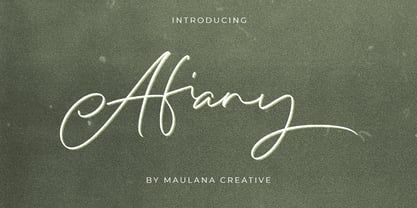 Afiany Brush Handwritten Script Font Give your designs an authentic handcrafted feel. "Afiany Brush Handwritten Script Font" is perfectly suited to signature, stationery, logo, typography quotes, magazine or book cover, website header, clothing, branding, packaging design and more.
 - Magic Bright Script by Typestory,
$10.00 Magic Bright is a stunning and comprehensive duo font (script and serif), ideal for giving your projects a branded but friendly feel. The two included styles can be combined together perfectly but are also beautiful on their own.
 - CLASSIC Line by WAP Type,
$25.00 frontline classic font Font a stylish Font. It’s useful for any Design project. Decal, card, e-card, Good for Logos & Headlines, Poster,Tag design, Newspaper & Magazine Ad Design and many more. True type and Open type font files
 - ITC Tomism by ITC,
$29.99ITC Studio Script was designed by Robert Evans, an informal script for applications in which a calligraphic look would be appropriate. The font includes a wide variety of alternate characters, which give a graphic designer's creativity no limits. - Starbell by Aah Yes,
$4.95Starbell is a fun-font, a serif typeface with all letters and numbers interspersed with stars for a fun and festive feel. The zip files contain both OTF and TTF versions of the font -install one version only. - Lokanova by limitype,
$11.00 Lokanova is a display font with a sans serif type designed in a bold and unique style to give the impression of a firm but still playful design. Lokanova is available with uppercase, lowercase, number, symbol and multilingual
 - Groom by Scholtz Fonts,
$19.00Groom is a a casual brush script refined and developed from handwritten letters. It combines dramatic though readable caps with more readable, smoothly connecting and more formal lowercase to give a script that is both confident and legible. - Dream Island by Epiclinez,
$14.00 Dream Island is a simple, relaxed, and fine handwritten font. Its simple style makes it fitting to a wide range of designs, so add it confidently to your informal or casual ideas, and you will love the results.
 - Suredog by Fontmill Foundry,
$20.00One year old Suredog font. Affectionate with print and good with other sans but will probably chase a serif. Suredog is truly deserving of a loving home for the rest of her life. Please give Suredog a chance. - Casualties Pro by The Type Fetish,
$45.00 Casualties Pro is an OpenType font that contains four variations of every character in its extended character set. OpenType-savvy applications will be able to rotate through the variations to give a more random look to the text.
 - Loftype by Gleb Guralnyk,
$15.00 Hello! Presenting a design set named "Loftype". It includes a font files with various OpenType features - lots of ligatures and alternate characters with swashes (you can access them trough "OpenType" tab, or manually insert them from "Glyphs" tab).
 - Barollo by Greater Albion Typefounders,
$16.00 Barollo is a boisterous, lively, display family of two typefaces, offered in regular and shaded form. It’s ideal for eye-catching banners and posters that call for clear and forceful type, with a sense of fun and life.
 - Bathsy by Maulana Creative,
$11.00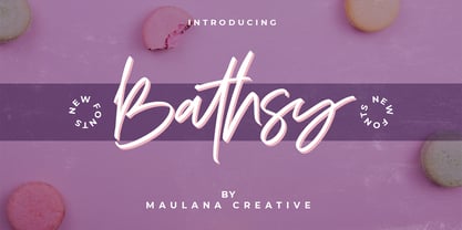 Bathsy Signature Brush Script Font Give your designs an authentic handcrafted feel. "Bathsy Signature Brush Script Font" is perfectly suited to signature, stationery, logo, typography quotes, magazine or book cover, website header, clothing, branding, packaging design and more.
 - Bowman by ParaType,
$25.00Bowman is an informal slab-serif face written by hand with a marker. Its live and playful nature makes it suitable for comic books, illustrations, informal advertising and package design. Designer Alexandra Korolkova. Released by ParaType in 2010. - Pitlines by Mevstory Studio,
$20.00 Pitlines is a display fonts collection. Pitlineswill perfect for many project: fashion, magazines, logo, branding, photography, quotes, blog header, poster, advertisements, etc. Files Includes: Pitliness Regular.otf Pitlines Italic.otf What's Included? Uppercase & alternate uppercase letters, numbers, punctuation Multilingual support
 - HS Masrawy by Hiba Studio,
$59.00 HS Masrawy is an Arabic display typeface. It is useful for titles and graphic projects where a contemporary, streamlined look is desired. The font is based on the simple lines of Kufi calligraphy. The font has a new modern idea where the vertical strokes have a constant value in all of its five weights. It has (5) weights and supported Arabic, Persian and Urdu compatible with Unicode (6.2). HS Masrawy is the first released typeface of collaboration between Hasan Abu Afash and Egyptian designer Abdulsamie Rajab Salem.
 - Filler Variable by CarnokyType,
$80.00 Filler is a display variable font that allows you to flexibly change the width ratio of font characters from extra narrow to extremely wide shapes. The typeface includes complete Latin language support with contrasting drawing of accents and punctuation. The character set includes special symbols, such as a set of emoticons or arrows that support OpenType features. In addition to the variable font, Filler also offers five width styles – Compressed, Condensed, Medium, Extended, Expanded. The font is intended primarily for strong display use in large proportions.
 - Valsity by Ingrimayne Type,
$9.00 Valsity is a squarish slab-serif family with five weights and two widths, each with an italics for a total of twenty members. With negligible contrast, it is almost monoline. It is for decorative uses; it is too square and lacks the contrast to make it a good choice for extensive text. Valsity began with a blending of two other squarish slab-serifs, Valgal and Kwersity, and its name reflects that ancestry. From there it took on a life of its own, often diverging from its parents.
 - Ardina Title by DSType,
$50.00 Ardina was designed for the Portuguese newspaper Jornal de Notícias. Right after the exclusivity period, we decided it was a wonderful addition to our type library, therefore we redesigned it and included an extended set of characters. Ardina is a soft and warm news typeface, with five weights and matching italics, three grades (Display, Title, and Text), and slightly narrow proportions but with a very nice x-height. It’s the right typeface for a serious newspaper that intends to achieve a very contemporary feeling.
 - Itoya by The Northern Block,
$39.00 Itoya is a contemporary sans serif font influenced by Western and Japanese ideologies. A fusion of modern machine-like functions with a warmer, emotional and more spiritual ethic. The marriage of a western precision and eastern expression forms a sharp functional font with a modern edge ideally suited to graphic novels, fashion and product design. Details include seven carefully chosen weight with true cursive italics, over 600 characters, alternative lowercase a, e, g and y. Five variations of numerals, ligatures, manually edited kerning and Opentype features.
 - Ardina Display by DSType,
$50.00 Ardina was designed for the Portuguese newspaper Jornal de Notícias. Right after the exclusivity period, we decided it was a wonderful addition to our type library, therefore we redesigned it and included an extended set of characters. Ardina is a soft and warm news typeface, with five weights and matching italics, three grades (Display, Title, and Text), and slightly narrow proportions but with a very nice x-height. It’s the right typeface for a serious newspaper that intends to achieve a very contemporary feeling.
 - Fiesole by Eurotypo,
$22.00 Fiesole was inspired by calligraphic models; it is a bookface font family to be used for text, display and caption. Fiesole has three different lengths of items (ascenders-descenders). Old style figures have been included in the fonts. Spacing of Small Caps has been adjusted to obtain good legibility and integrity with Capitals and lower cases. Fiesole Text: Two weights. Fiesole Display: Two weights. Fiesole Caption: Five weights. They include also CE languages, swashes, small caps, ligatures, discretionary ligatures, alternates, old style figures and case sensitive forms.
 - Gastromond by James Todd,
$40.00 Gastromond began about five years ago with a question: why are fat faces always based on Didot or Bodoni models? Was there a reason that the stresses of these display faces was always vertical or horizontal and never angled? It was time to find out. Gastromond is meant to blend the Renaissance stylings of the Garamond types with the Victorian outlandishness of the fat faces. The result is an emphatic take on a classic genre. Loaded with swashes and alternates, Gastromond has enough character to go around.
