2,210 search results
(0.047 seconds)
- Chubbly by Greater Albion Typefounders,
$10.00 The Chubbly family started life as an alphabet for an illustrated children's book. These big, chubby and friendly letterforms are easy to read and have a sense of fun about them. They're ideal where simple eye-catching geometric letterforms are required, for posters, signs and advertising with a sense of fun.
 - Publio by Tour De Force,
$25.00 Publio is small unusual and unique font family, characterized with sharp, triangular semi-serifs.
 - Chubs by Type.p,
$24.00 "Chubs," a typeface specifically designed for large display sizes, perfect for making a bold statement. Each letter in Chubs has been meticulously crafted to possess a thick and prominent appearance, ensuring that your designs leave a lasting impact on viewers. Chubs's distinctive weight and blackness make it an ideal choice for a wide range of applications, including posters, packaging, and logos. Whether you want to create eye-catching promotional materials or design a powerful brand identity, Chubs has got you covered. Within the Chubs typeface family, you'll find two distinct styles, each with its own personality and visual appeal. The first style, "Chubs Black," features letters with a captivating slit, reminiscent of a belly that overlaps. This distinctive groove adds an extra layer of visual interest and uniqueness to your designs. On the other hand, "Chubs Filled" offers a solid and plump appearance, without the characteristic slit. This style amplifies the chubby nature of the letters, resulting in a bold and impactful display. To further enhance your creative options, both styles within the Chubs family include an alternate character set featuring a wink shadow in every letter. These additional characters provide a touch of fanciness and playfulness, allowing you to experiment and add unique elements to your designs. Choose "Chubs" for your next big project, and witness the boldness and charm that sets your designs apart from the rest. Let Chubs bring your ideas to life and make a powerful visual statement that captures attention and leaves a lasting impression.
 - Chub by Chank,
$39.95Chub was inspired by and dedicated to: Jimmy Dean Pork Sausage, J Otto, Ben & Jerry, Spunk, Chuck Jones, Run DMC, those teenage kids with their big baggy pants, French Market coffee, George Clinton, Bill Clinton, Chistina Ricci, Sesame Street and the letter C. God bless all those big, fat, fun things that make life grand. - Pabloco - Unknown license

- Pueblito by Corradine Fonts,
$15.00 Pueblito is a hand drawn font with a rustic and antique appearance. Was inspired from old books and newspapers but express a very own personality and not necessary represent a specific classic style. The family consists of twelve fonts in six weights plus a set of ornaments in order to compose all kind of texts. Using Pueblito in your projects, you can obtain an original aged flavor and just by adding a subtle texture effect will help you to obtain the desired vintage look.
 - Qualico by Jonahfonts,
$30.00 A semi-serif font in vogue in the 1970s. Usage recommendations include captions, packaging, cards, posters, ads, book jackets, manuals, and menus.
 - Vipond Chubby - Unknown license

- Chubby Cheeks - Unknown license

- Chubby Lines by Yumna Type,
$15.00 It can be a difficult task to find a unique, attractive, prominent display font for your design because you always want to use a more distinctive font than the others. Therefore, Chubby Lines offers you the best solution. It is a lovely display font in rounded shapes to express soft, friendly nuances to your design. Its unique geometry details and contrast sketch lines create a visually interesting font. To be easily readable, this font is best applied for big text sizes, which also provides you with a special clipart as a bonus. Furthermore, you can enjoy the available features here. Features: Multilingual Supports PUA Encoded Numerals and Punctuations Chubby Lines fits best for various design projects, such as brandings, posters, banners, headings, magazine covers, quotes, printed products, merchandise, social media, etc. Find out more ways to use this font by taking a look at the font preview. Thanks for purchasing our fonts. Hopefully, you have a great time using our font. Feel free to contact us anytime for further information or when you have trouble with the font. Thanks a lot and happy designing.
 - Chubby Melisa by Sipanji21,
$15.00 Chubby Melisa is a Cute and Thick Handwritten Font with a relaxed theme, featuring a lovely style. No matter the topic, but this font is awesome for every kids or child project, this font will be an incredibly asset to your fonts’ library, as it has the potential to elevate any creation.
 - Chubby Monster by Sipanji21,
$17.00 "Chubby Monster" is a display font with chubby and bold characters. Fonts like this are often used in various designs that aim to convey a cute or adorable feel. The chubby and bold letterforms give a cheerful and inviting appearance, making it suitable for a wide range of design projects that want to emphasize a sense of playfulness, such as children's designs, toy products, or cute decorations. If you have further questions about using this font or need assistance in a specific design context, please feel free to ask!
 - Chubby Elephant by Putracetol,
$25.00 Chubby Elephant - Bold Playful Display Font. This font is very bold and playful. With a childish style, it will be very suitable for your project, which is related to children. Such as story books, illustrations, comic books, t-shirts, posters, greeting cards, logos, branding, stickers, svg, crafting. This font can be installed on MAC OS and Windows OS, it can also be installed in the procreate and cricut applications. Come with lot of ligatures character, its help you to make great lettering. This font is also support multi language.
 - Chubby Chicks by Putracetol,
$22.00 Chubby Chicks - Funky Display Font. Chubby Chicks a bold, quirky display font with a fun and trendy cute characters. With a childish style, it will be very suitable for your project, which is related to children. Such as story books, illustrations, comic books, t-shirts, posters, greeting cards, logos, branding, stickers, svg, crafting. The alternative characters were divided into several Open Type features such as Swash, Stylistic Sets, Stylistic Alternates, Contextual Alternates, and Ligature. The Open Type features can be accessed by using Open Type savvy programs such as Adobe Illustrator, Adobe InDesign, Adobe Photoshop Corel Draw X version, And Microsoft Word. This font is also support multi language.
 - Chibi Chubby by Sipanji21,
$18.00 "Chibi Chubby" is a thick and realistic display font that mimics handwritten characters often associated with kids' styles. Fonts like this generally feature chubby, rounded, and playful letterforms, resembling the handwriting of a child. The thick strokes and rounded shapes contribute to its friendly and approachable appearance. This font could be an excellent choice for various projects targeting children, such as book covers, posters, invitations, or any design requiring a playful and charming typographic style. Its resemblance to children's handwriting adds a personalized and relatable touch to the text, making it appealing for kids-themed designs.
 - Publica Sans by FaceType,
$- Publica Sans is a clean geometric typeface, equipped with a variety of OpenType features to give you all you need for great typography: Alternates, arrows, rare currency symbols, case sensitive forms, various sets of figures and discretionary ligatures. Publica Sans has two sisters: Publica Play and Publica Slab Take a close look at our gallery (especially ‘OpenType Features 1–6’) to discover the versatility of Publica Sans. Alternates Give your typography a certain spin with the variety of alternate letters provided. Currency You need to set prices in exotic countries? No problem: Publica Sans gives you loads of rare currency symbols. Case Sensitive Forms Sometimes you write in all caps and there are some symbols (e.g. brackets) that need some extra treatment to make it look perfect – that’s what case sensitive forms are for. Figures Publica Sans provides 6 sets of figures, like lining, tabular, oldstyle, numerators ... Discretionary Ligatures Ligatures can make your logo or headline look spicy. So there are plenty of them.
 - Publica Slab by FaceType,
$- ‘Publica Slab’ is the serifed sister of Publica Sans and Publica Play – packed with subtle open type features, tabular options, rare currencies signs and symbols and arrows, ‘Publica Slab’ provides everything you need for big design tasks like signage, corporate design and magazine design. Take a close look at our gallery (especially ‘OpenType Features 1–6’) to discover the versatility of Publica Slab. Alternates Give your typography a certain spin with the variety of alternate letters provided. Currency You need to set prices in exotic countries? No problem: Publica Slab gives you loads of rare currency symbols. Case Sensitive Forms Sometimes you write in all caps and there are some symbols (e.g. brackets) that need some extra treatment to make it look perfect – that’s what case sensitive forms are for. Figures Publica Slab provides 6 sets of figures, like lining, tabular, oldstyle, numerators ... Discretionary Ligatures Ligatures can make your logo or headline look spicy. So there are plenty of them.
 - Publica Play by FaceType,
$- Publica Play is Publica Sans’ and Publica Slab’s playful sister. It comes with loads of subtle open type features, tabular options, rare currencies signs and symbols and arrows – ‘Publica Play’ has everything you need for playful design tasks. Take a close look at our gallery (especially ‘OpenType Features 1–7’) to discover the versatility of Publica Play. Alternates and Stylistic Sets Give your typography a certain spin with the variety of alternate letters provided. Explore the Stylistic Sets provided. Currency You need to set prices in exotic countries? No problem: Publica Play gives you loads of rare currency symbols. Case Sensitive Forms Sometimes you write in all caps and there are some symbols (e.g. brackets) that need some extra treatment to make it look perfect – that’s what case sensitive forms are for. Figures Publica Play provides 6 sets of figures, like lining, tabular, oldstyle, numerators ... Discretionary Ligatures Ligatures can make your logo or headline look spicy. So there are plenty of them.
 - Res Publica by Linotype,
$29.99Res Publica is a workhorse. It is quite anonymous as typeface, without any distinctive marks. But it gives a harmonious text body, well suited for large amounts of text, such as official public reports, magazines based mainly on text, school books, and so on. The public" concept is part of the name. Res Publica is Latin for "public matters". The word republic has the same origin. Res Publica was released in 1992. - Publius by Scriptorium,
$18.00 - Public-Enemy - 100% free

- Publication JNL by Jeff Levine,
$29.00If Publication JNL looks very familiar, this is no accident of design. It is Jeff Levine’s rendering of De Vinne, a classic typeface designed in honor of T.L. De Vinne (circa 1890-91) and given the gentle nuance of emulating hand-set type. - Public Interest by Bogstav,
$16.00 Public Interest in my all caps fine looking handmade font. Each letter has 5 different versions and they automatically cycle as you type - making your text look even more lively and vibrant!
 - Public Beat by PizzaDude.dk,
$15.00 Public Beat is full of fun and party! Look how the letters jumps and bounces while you type your text - well, that's the Contextual Alternates that are having a party! Each lower-case letter has 4 different versions, that automatically cycles when you type. A great trick to make your text look scrambled and realistic
 - Publicity Gothic by NicePrice Font Collection,
$4.99 - Publicity Gothic by SoftMaker,
$9.99 Publicity Gothic is an all caps advertising typeface published by SoftMaker.
 - Public Secret by Hanoded,
$15.00 A Public Secret (or Open Secret) is something that is widely known, although it is not supposed to be. Public Secret is a hand drawn font (I used a fineliner) that I made in between building a shower, a toilet and a laundry room… Yes, it’s all in a day’s work! ;-)
 - Public Figure by Hanoded,
$15.00 During the Covid pandemic, I noticed that a lot of public figures (politicians, actors, influencers and even kings and princesses) had to apologise for not following the social distance rules, the lockdown rules or the 'stay at home' rules. They threw parties, went on holidays abroad and - in general - made a nuisance of themselves. When I finished this font, I decided to call it Public Figure! Public Figure is quite a neat, handmade font. It doesn't stick to the rules (but does like to keep up appearances), likes to party (but manages to stay safe) and brightens up your work (without being too gaudy). Public Figure comes with two alternate sets for the lower case glyphs (that cycle as you type) and a massive amount of diacritics, including Vietnamese.
 - Publicity Headline by HiH,
$8.00 Publicity Headline is an allcaps advertising font. Its heavy weight and robust strength allows it to be used against complex backgrounds or reversed out on dark backgrounds without getting lost. It also has a warm, friendly feeling for the conventional headlines indicated by the name. Publicity Headline is a distinctive and appealing font for creating bold and unusual headlines. This font includes the alternate R & S and the CO, LY & ST ligatures that were part of Gaunt’s original design. In addition, the ligatures AV, AW, WA, WO & YO are provided; along with AT, OF, AND & THE in the form of underlined small caps.
 - Public Works by Aerotype,
$29.00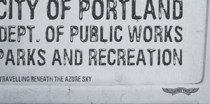
- FS Pimlico by Fontsmith,
$80.00 Born in the 70s Personal influences are unavoidable in type design and usually find their way through into finished fonts. At Fontsmith, one period in particular provides inspiration, according to FS Pimlico designer, Fernando Mello. “Jason and Phil have always known that I’m very into the visual language of the 70s. I know that Jason shares my love of the 70s and Phil will sometimes admit to being a fan, too. I think that’s the reason they were both so supportive in the development of this font. “And, of course, we all share an interest in good-humoured and intelligent design. We like to think it’s a Fontsmith characteristic.” Back from black FS Pimlico started in an unusual place: with a tubby, penguin-like lowercase “a” that Fernando Mello had been sketching. From “a” grew the rest of the alphabet – a bubbly, fat, friendly family with a brush-written quality that became FS Pimlico Black. The black weight certainly isn’t the normal starting point for creating a regular and bold weight, but Fernando pressed on, driven by a glut of influences: brush-writing; Letraset and early digital systems catalogues; the type of Herb Lubalin and Tony di Spigna; 70s clothes and vinyl; and 70s revival disco nights in London’s Pimlico and Vauxhall. Natural or flourished Not often do fonts come along that seem to span the ages. FS Pimlico is at home in an office environment providing a fresh clear identity in communications or providing text that’s clear and easy to read. But it likes to party, too, 70s style. With the OpenType features switched on, a designer can totally change the look of their work, and create point-of-sale, headlines and titles that stand out and get noticed.
 - Publishing Script by Fontscafe,
$39.00 Publishing script pack combines the sensuality and elegance of Tango Argentino, evocative of special moments, of the new avant-garde font "Publishing Script" with the wildness and daring of "Publishing Draft Script". Two handmade new script fonts with 105 variations, between alternatives and swashes, plus 32 exclusive stylistic Ligatures that convey unequivocally fluidity and audacity. The distinction and vintage-contemporary approach of "Publishing Script", from the handmade character of the universe of the Fonts Café creations, which conserves the depth of the vintage/retro style mixed with an avant-garde stylish look. The authenticity and the self-confident approach of the "Publishing Draft Script", as a tool to rediscover the most intimate human being feelings, which introduces the new Fonts Café concept of Bio-write script! A perfect combination of style, readability and flexibility, a "must have" for your next Publishing projects!
 - Publica Sans Round by FaceType,
$22.00 Publica Sans Rounded is the rounded version of Publica Sans. A clean geometric typeface, equipped with a variety of OpenType features to give you all you need for great typography: Alternates, arrows, rare currency symbols, case sensitive forms, various sets of figures and discretionary ligatures. Publica Sans Rounded has two other sisters: Publica Play and Publica Slab Take a close look at our gallery (especially ‘OpenType Features 1–6’) to discover the versatility of Publica Sans. Alternates Give your typography a certain spin with the variety of alternate letters provided. Currency You need to set prices in exotic countries? No problem: Publica Sans gives you loads of rare currency symbols. Case Sensitive Forms Sometimes you write in all caps and there are some symbols (e.g. brackets) that need some extra treatment to make it look perfect – that’s what case sensitive forms are for. Figures Publica Sans provides 6 sets of figures, like lining, tabular, oldstyle, numerators ... Discretionary Ligatures Ligatures can make your logo or headline look spicy. So there are plenty of them.
 - Public Secret DEMO - Personal use only

- Public Notice JNL by Jeff Levine,
$29.00Public Notice JNL is based on a wood type alphabet originally shown in George Nesbitt’s 1838 catalog as “Gothic.” The image sample used for a model had only the basic A-Z characters, an ampersand and an exclamation point, so numbers and additional characters were designed and added to the digital version. - Public Transportation JNL by Jeff Levine,
$29.00On the sides of freight cars, passenger trains, trolleys, buses and cable cars was once found identifying letters and numbers with a bold, yet quaint hand-painted look. Public Transportation JNL emulates the old-style look of those bygone years. - Public Utility JNL by Jeff Levine,
$29.00 Public Utility JNL digitally duplicates the look of those small white-on-black self-adhesive stickers used by cities, power companies and telecommunication firms in order to identify utility poles and other service locations. A blank rectangle is available on both the solid and broken vertical bar positions.
 - Public Works JNL by Jeff Levine,
$29.00Public Works JNL emulates the hand-made lettering found on older signs printed by silk screen for local governments. - Public Safety JNL by Jeff Levine,
$29.00 Public Safety JNL was inspired by a 1940s-era health poster issued through the WPA (Works Progress Administration). The font’s bold, blockish sans lettering commands attention and has been made available in both regular and oblique versions.
 - Song Publisher JNL by Jeff Levine,
$29.00 Song Publisher JNL features a design based on the 1945 Art Deco-era hand lettered sheet music title "When the Old Gang's back on the Corner (Singin' Sweet Adeline Again)". It's a good thing sheet music wasn't sold by the word count found in song titles, because this twelve word example would have been more costly than titles such as "Nola", "Tenderly" or "Ciribiribin".


Page 1 of 56Next page