10,000 search results
(0.046 seconds)
- TDR by VSF,
$16.00 A heavy futuristic display font that can be strecthed and squiched without losing its identity.
 - Hastrico DT by DTP Types,
$46.00 Sans serif grotesque with a rounded feel that makes it suitable for text or display.
 - Apollon by Umka Type,
$15.00 Apollon is an angular display font. Made for social media posts and game design purposes.
 - BD Schablone by Typedifferent,
$25.00 BD Schablone is a bold, human stencil with an anticipation of the digital lcd display.
 - Allstar by Fly Fonts,
$15.00Allstar is a bold retro font with serious attitude! It works best in display sizes. - Deadspace by Tension Type,
$15.00 Deadspace is a sci fi display typeface suitable video games, movie posters, logos and headlines.
 - Molgen by Sealoung,
$17.00 Introducing Molgen Modern Display Serif Font Molgen Modern Display Serif Font is a distinctive and versatile typeface designed to make a statement. With a unique blend of classic serifs and contemporary display elements, it is a font that encapsulates the perfect balance between tradition and innovation. In the world of typography, Molgen is your gateway to elegance and modernity. Key Features: Serif Meets Display: Molgen is the epitome of a harmonious coexistence between the timeless serif font and the contemporary display style. Its serifs are pronounced yet not overwhelming, making it an ideal choice for a wide range of applications. Versatility: Whether you're designing a striking logo, crafting eye-catching headlines, or preparing an elegant invitation, Molgen can handle it all with grace and sophistication. Distinctive Characters: Each character in Molgen is meticulously crafted, ensuring that every letter oozes character and charm. From A to Z, you will find unique touches that set Molgen apart. Multilingual Support: Whether your audience speaks English, French, Spanish, or any other language, Molgen has comprehensive multilingual support, ensuring that your message is clear and effective worldwide.
 - Eva Antiqua SG by Spiece Graphics,
$39.00 Based on the 1922 Klingspor model by German designer Rudolf Koch, this hand-drawn quill roman has an informal and curiously delicate appearance. The typeface was known in Germany as Koch Antiqua and in the rest of Europe as Locarno. Eve, as it was called in the United States, continues to enjoy great popularity in advertising and book publishing circles. This deluxe version includes display light, display heavy, and display black as well as the hard-to-find display light and heavy (Koch Kursiv) italics. Eva-Paramount, which is based on Morris Benton's 1928 ATF Paramount, has also been included. It contains a set of alternates characters that are in keeping with the light and heavy display letter styles. Eva-Antiqua is also available in the OpenType Std format. Alternates are now merged together into each style as stylistic alternates or as swashes. These advanced features currently work in Adobe Creative Suite InDesign, Creative Suite Illustrator, and Quark XPress 7. Check for OpenType advanced feature support in other applications as it gradually becomes available with upgrades.
 - Crown Title - Unknown license

- Candy Night by FadeLine Studio,
$15.00 Introducing CANDY NIGHT! A Hand Drawn slab serif font! Made by hand to provide a natural, unique and modern style. This font is carefully designed to maintain the balance of each letter. Very easy and convenient to use.
 - DIN Next Arabic by Monotype,
$155.99 DIN Next is a typeface family inspired by the classic industrial German engineering designs, DIN 1451 Engschrift and Mittelschrift. Akira Kobayashi began by revising these two faces-who names just mean ""condensed"" and ""regular"" before expanding them into a new family with seven weights (Light to Black). Each weight ships in three varieties: Regular, Italic, and Condensed, bringing the total number of fonts in the DIN Next family to 21. DIN Next is part of Linotype's Platinum Collection. Linotype has been supplying its customers with the two DIN 1451 fonts since 1980. Recently, they have become more popular than ever, with designers regularly asking for additional weights. The abbreviation ""DIN"" stands for ""Deutsches Institut für Normung e.V."", which is the German Institute for Industrial Standardization. In 1936 the German Standard Committee settled upon DIN 1451 as the standard font for the areas of technology, traffic, administration and business. The design was to be used on German street signs and house numbers. The committee wanted a sans serif, thinking it would be more legible, straightforward, and easy to reproduce. They did not intend for the design to be used for advertisements and other artistically oriented purposes. Nevertheless, because DIN 1451 was seen all over Germany on signs for town names and traffic directions, it became familiar enough to make its way onto the palettes of graphic designers and advertising art directors. The digital version of DIN 1451 would go on to be adopted and used by designers in other countries as well, solidifying its worldwide design reputation. There are many subtle differences in DIN Next's letters when compared with DIN 1451 original. These were added by Kobayashi to make the new family even more versatile in 21st-century media. For instance, although DIN 1451's corners are all pointed angles, DIN Next has rounded them all slightly. Even this softening is a nod to part of DIN 1451's past, however. Many of the signs that use DIN 1451 are cut with routers, which cannot make perfect corners; their rounded heads cut rounded corners best. Linotype's DIN 1451 Engschrift and Mittelschrift are certified by the German DIN Institute for use on official signage projects. Since DIN Next is a new design, these applications within Germany are not possible with it. However, DIN Next may be used for any other project, and it may be used for industrial signage in any other country! DIN Next has been tailored especially for graphic designers, but its industrial heritage makes it surprisingly functional in just about any application. The DIN Next family has been extended with seven Arabic weights and five Devanagari weights. The display of the Devanagari fonts on the website does not show all features of the font and therefore not all language features may be displayed correctly.
 - DIN Next Devanagari by Monotype,
$103.99DIN Next is a typeface family inspired by the classic industrial German engineering designs, DIN 1451 Engschrift and Mittelschrift. Akira Kobayashi began by revising these two faces-who names just mean ""condensed"" and ""regular"" before expanding them into a new family with seven weights (Light to Black). Each weight ships in three varieties: Regular, Italic, and Condensed, bringing the total number of fonts in the DIN Next family to 21. DIN Next is part of Linotype's Platinum Collection. Linotype has been supplying its customers with the two DIN 1451 fonts since 1980. Recently, they have become more popular than ever, with designers regularly asking for additional weights. The abbreviation ""DIN"" stands for ""Deutsches Institut für Normung e.V."", which is the German Institute for Industrial Standardization. In 1936 the German Standard Committee settled upon DIN 1451 as the standard font for the areas of technology, traffic, administration and business. The design was to be used on German street signs and house numbers. The committee wanted a sans serif, thinking it would be more legible, straightforward, and easy to reproduce. They did not intend for the design to be used for advertisements and other artistically oriented purposes. Nevertheless, because DIN 1451 was seen all over Germany on signs for town names and traffic directions, it became familiar enough to make its way onto the palettes of graphic designers and advertising art directors. The digital version of DIN 1451 would go on to be adopted and used by designers in other countries as well, solidifying its worldwide design reputation. There are many subtle differences in DIN Next's letters when compared with DIN 1451 original. These were added by Kobayashi to make the new family even more versatile in 21st-century media. For instance, although DIN 1451's corners are all pointed angles, DIN Next has rounded them all slightly. Even this softening is a nod to part of DIN 1451's past, however. Many of the signs that use DIN 1451 are cut with routers, which cannot make perfect corners; their rounded heads cut rounded corners best. Linotype's DIN 1451 Engschrift and Mittelschrift are certified by the German DIN Institute for use on official signage projects. Since DIN Next is a new design, these applications within Germany are not possible with it. However, DIN Next may be used for any other project, and it may be used for industrial signage in any other country! DIN Next has been tailored especially for graphic designers, but its industrial heritage makes it surprisingly functional in just about any application. The DIN Next family has been extended with seven Arabic weights and five Devanagari weights. The display of the Devanagari fonts on the website does not show all features of the font and therefore not all language features may be displayed correctly. - DIN Next Cyrillic by Monotype,
$65.00DIN Next is a typeface family inspired by the classic industrial German engineering designs, DIN 1451 Engschrift and Mittelschrift. Akira Kobayashi began by revising these two faces-who names just mean ""condensed"" and ""regular"" before expanding them into a new family with seven weights (Light to Black). Each weight ships in three varieties: Regular, Italic, and Condensed, bringing the total number of fonts in the DIN Next family to 21. DIN Next is part of Linotype's Platinum Collection. Linotype has been supplying its customers with the two DIN 1451 fonts since 1980. Recently, they have become more popular than ever, with designers regularly asking for additional weights. The abbreviation ""DIN"" stands for ""Deutsches Institut für Normung e.V."", which is the German Institute for Industrial Standardization. In 1936 the German Standard Committee settled upon DIN 1451 as the standard font for the areas of technology, traffic, administration and business. The design was to be used on German street signs and house numbers. The committee wanted a sans serif, thinking it would be more legible, straightforward, and easy to reproduce. They did not intend for the design to be used for advertisements and other artistically oriented purposes. Nevertheless, because DIN 1451 was seen all over Germany on signs for town names and traffic directions, it became familiar enough to make its way onto the palettes of graphic designers and advertising art directors. The digital version of DIN 1451 would go on to be adopted and used by designers in other countries as well, solidifying its worldwide design reputation. There are many subtle differences in DIN Next's letters when compared with DIN 1451 original. These were added by Kobayashi to make the new family even more versatile in 21st-century media. For instance, although DIN 1451's corners are all pointed angles, DIN Next has rounded them all slightly. Even this softening is a nod to part of DIN 1451's past, however. Many of the signs that use DIN 1451 are cut with routers, which cannot make perfect corners; their rounded heads cut rounded corners best. Linotype's DIN 1451 Engschrift and Mittelschrift are certified by the German DIN Institute for use on official signage projects. Since DIN Next is a new design, these applications within Germany are not possible with it. However, DIN Next may be used for any other project, and it may be used for industrial signage in any other country! DIN Next has been tailored especially for graphic designers, but its industrial heritage makes it surprisingly functional in just about any application. The DIN Next family has been extended with seven Arabic weights and five Devanagari weights. The display of the Devanagari fonts on the website does not show all features of the font and therefore not all language features may be displayed correctly. - DIN Next Paneuropean by Monotype,
$92.99DIN Next is a typeface family inspired by the classic industrial German engineering designs, DIN 1451 Engschrift and Mittelschrift. Akira Kobayashi began by revising these two faces-who names just mean ""condensed"" and ""regular"" before expanding them into a new family with seven weights (Light to Black). Each weight ships in three varieties: Regular, Italic, and Condensed, bringing the total number of fonts in the DIN Next family to 21. DIN Next is part of Linotype's Platinum Collection. Linotype has been supplying its customers with the two DIN 1451 fonts since 1980. Recently, they have become more popular than ever, with designers regularly asking for additional weights. The abbreviation ""DIN"" stands for ""Deutsches Institut für Normung e.V."", which is the German Institute for Industrial Standardization. In 1936 the German Standard Committee settled upon DIN 1451 as the standard font for the areas of technology, traffic, administration and business. The design was to be used on German street signs and house numbers. The committee wanted a sans serif, thinking it would be more legible, straightforward, and easy to reproduce. They did not intend for the design to be used for advertisements and other artistically oriented purposes. Nevertheless, because DIN 1451 was seen all over Germany on signs for town names and traffic directions, it became familiar enough to make its way onto the palettes of graphic designers and advertising art directors. The digital version of DIN 1451 would go on to be adopted and used by designers in other countries as well, solidifying its worldwide design reputation. There are many subtle differences in DIN Next's letters when compared with DIN 1451 original. These were added by Kobayashi to make the new family even more versatile in 21st-century media. For instance, although DIN 1451's corners are all pointed angles, DIN Next has rounded them all slightly. Even this softening is a nod to part of DIN 1451's past, however. Many of the signs that use DIN 1451 are cut with routers, which cannot make perfect corners; their rounded heads cut rounded corners best. Linotype's DIN 1451 Engschrift and Mittelschrift are certified by the German DIN Institute for use on official signage projects. Since DIN Next is a new design, these applications within Germany are not possible with it. However, DIN Next may be used for any other project, and it may be used for industrial signage in any other country! DIN Next has been tailored especially for graphic designers, but its industrial heritage makes it surprisingly functional in just about any application. The DIN Next family has been extended with seven Arabic weights and five Devanagari weights. The display of the Devanagari fonts on the website does not show all features of the font and therefore not all language features may be displayed correctly. - Goma Mono by Daniel Uzquiano,
$20.00 Goma Mono is a display monospaced rounded sans serif font built in ten styles. This family, with five weights, covers a wide variety of character due to the large difference in thickness. The typeface can be used perfectly in display sizes and logos. Goma Mono is released with 414 glyphs and includes Open Type features.
 - MBF Taurian by Moonbandit,
$15.00 Introducing Taurian, a bold and elegant display typeface. Inspired by the majestic horn of the bull, taurian can gives a proud, strong and bold elegance to your projects. Passionately built with the utmost details on each glyph. Ideal use as a headline, title, display, logo, and many other. opentype features include: ligature alternate kerning
 - Jasmine Daily by Stringlabs Creative Studio,
$25.00 Jasmine Daily is a sweet playful display font with an elegant style. Fall in love with its dynamic charm, and make this fancy display part of your craft library. It will elevate a wide range of design projects to the highest level, be it branding, headings, wedding designs, invitations, signatures, logos, labels, and much more!
 - Meoowly by Stefani Letter,
$12.00 Meoowly is an amazing display font. It is the perfect choice for cat related and anything project! This display font is the perfect choice for making original and outstanding designs. This font is PUA encoded which means you can access all of the cute glyphs with ease! It also features a wealth of including ligatures.
 - Adelita by Type-Ø-Tones,
$40.00 Adelita by Adela de Bara, Laura Meseguer / OpenType, 4 styles Adelita has its origins from Adela de Bara’s hand drawings, a display typeface with balls at the end of the strokes. Helped by Laura Meseguer, this artist entered our catalogue in the nineties with four weights: three display faces and a collection of naive dingbats.
 - Yarikha by ActiveSphere,
$30.00 Yarikha is a geometric display font and works best in display applications, such as posters, logos and titles. It has five weights: regular, semibold, demibold, bold and extrabold, each available in italic, making a total of ten styles. Each style has a full upper and lower-case, accents, punctuation and a selection of monetary symbols.
 - Vermicello by ParaType,
$30.00 An original display typeface was designed for ParaType in 2007 by Isabella Chaeva. Informal handwriting shapes of letters are formed by several separate elements — traces of monoline writing tool like broad felt-tipped pen. The name of the font reveals the fact that curvy strokes resemble worms. For use in advertising and display typography.
 - Juby Rounded by Fontsphere,
$12.00 Juby Rounded - Heavy, visible and distinctive display font, rounded brother of the Juby Font. Designed especially for display purposes. Can be used successfully in posters, headlines, visual identities, and everything needs to stand out. Font containing uppercase and lowercase characters, numerals and a large range of punctuation. The family has 3 weights with matching italics.
 - Quartz MS by Microsoft Corporation,
$39.00Quartz MS captures the display of text on an LCD (Liquid Crystal Display) and LED (Light Emitting Diode) screen. Quartz MS was designed by Terrance Weinzierl of Ascender Corporation for Microsoft. The Quartz MS has a technical, industrial quality. It can be used to good effect when a futuristic, scientific or technical impression is desired. - Ambassador by Juraj Chrastina,
$39.00 Hairline display fonts are elegant and subtle with touch of luxury. They are the Champagne of type. Ambassador represents a classy typeface best suitable for magazines, cosmetics packaging, advertising or any kind of fine and sensitive design. The quality of the display-oriented spacing and kerning of this font is ensured by Igino Marini.
 - Plathorn by insigne,
$24.00 Vast and untamed, the American West once stretched as free and wild as imagination itself. Still beautiful, the Wild West of long ago and the new West of today is now to be found in insigne’s new face, Plathorn. That’s right, folks. When the West called, Jeremy Dooley reached up like Pecos Bill, grabbed it by the reins and pulled it in, then using its wide, roaming elements to design this functional font that still has an unbroken spirit burning deep inside. This down right, no-nonsense, orthodox face leaves off any of that extra fancy stuff that doesn't belong on a ride. Plathorn comes with a family of cowhands as wide as the Rockies, bringing specifically tailored condensed and extended sub-families along with it too. By design, it’s not very obtrusive like its unorthodox reversed tension brethren. Leave those for the next font rodeo. This mount features barely a hint of a serif that hearkens back a hundred years or so to sign painters and package lettering artists of early twentieth century. They're sure to put the sharpness, gumption and grit you need into your copy. So grab a tall glass of Plathorn and drink in the deep taste of America’s big country. Put it in your next magazine. Put it in your brand. This typeface’s offbeat appeal is bound to bring a bit of wild U.S. to your free-spirited work.
 - POP. 1280 - 100% free

- Siena by Monotype,
$29.99The blackness of the Siena Black font makes it a good choice for display and packaging. - Cicero Series 2 by Alphabet Agency,
$15.00 Cicero Series 2 is a decorative serif display font that expresses a dominant yet prestigious presence.
 - Beachday by RahagitaType,
$25.00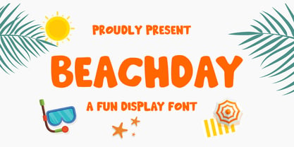 Inspired by vacations, Beachday is a super fun and playful display font with a whimsical feel!
 - Badwulf by Oleg Stepanov,
$11.00 Badwulf is a hand-lettered display font. It is good for cartoons, children's books and games.
 - SiliusEngraved by Intellecta Design,
$30.90A decorative display font great for large header-like usage. Available design only with versals caps. - Dixie by Dieza Design,
$14.00 DIXIE is a font inspired by handwritting. Perfect for displaying Headlines, poster, logos, flyer, and other.
 - Evening River by Letterhend,
$19.00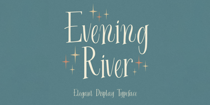 Introducing, Evening River an elegant display typeface. this font is perfect for headline, packaging, branding, etc.
 - Teutura by Maciej Świerczek,
$15.00 Teutura is a geometric, modern display font inspired by old blackletter typefaces (e.g. Fraktur, Gutenberg Textura).
 - Stana by Wirtu,
$9.00 Stana is all caps, clean and tall display font. There are more than 150 glyphs included.
 - Vemanem Pro by ffeeaarr,
$11.00 Vemanem is dynamic sans serif display fonts, you can use it for advertising, movie, titles & more.
 - Boulette by RMU,
$30.00 Boulette is a gorgeous pop art-style display font for kids, cartoons, comics and much more.
 - Flasher by BLV Supply,
$10.00 Flasher is a display font, all caps, traditional tattoo style, simple doodle line with vintage feels,
 - Movie House JNL by Jeff Levine,
$29.00 Double Feature JNL reworks the classic Huxley Vertical into an elegant trilinear Art Deco display face.
 - Fry's Baskerville by Bitstream,
$29.99Isaac Moore’s recutting of Baskerville’s design for the Fry Typefoundry, long admired as a display design.

