10,000 search results
(0.054 seconds)
- Brown Fox by Wilton Foundry,
$29.00BrownFox was created because I saw a need for a condensed, loose handwriting - I used my trusty nylon marker to create this font - it is rough, yet thin and elegant. BrownFox has a few surprises like some serious ascenders and descenders with an exaggerated x-height. Caps are intentionally simple to maintain an even rhythm. BrownFox works very well in caps, upper-lowercase, lowercase only, small and large. This font will be useful in many applications from invitations through CD album covers. The name was inspired by the other ipsum lorem.:-) - Retroma Vibes by Arterfak Project,
$24.00 Try something different, we proudly present our new exploration named "Retroma Vibes" a mixed font inspired by retro collage art and clipping of old newspapers. Feel the old school taste with this block font mixed of sans serif, condensed serif, blackletter, handwriting, and old typewriter style, combined into a chaotic collage style. You can also mix and match the letter by using the alternates characters or switching with the lowercase which gives you a more attractive design. What you'll get : Uppercase Lowercase Numbers & punctuation Stylistic alternates Multilingual support Hope you enjoy this font!
 - Kurdis by That That Creative,
$32.00 Kurdis Varibel Font Family is a modern sans serif family with six widths and five Weights Making 30 Set Styles and of course 10,000 more combinations when considering the Variable options. This Typeface is a real work horse for titles. At its condensed Width it is sophisticated and professional with well considered ink traps that help it really stand out at Large Sizes. the Regular width works well for longer bodies of text on websites or posters and the Wide Styles give an elevated look to your average wide sans serif.
 - Congress Sans by Club Type,
$36.99 This sans serif type was completed in 1985, a descendant of the earlier serifed Congress shown for the first time at the Association Typographique International Congress, which proved to be so popular in 1980 at Kiel; designed to present a style equally appealing in European languages. Many characters are more condensed than is usual, while others have been exaggerated. The concept being to bring an equality of importance to the whole, producing a collection of International characters working together in harmony on the page-a common aim that Europeans wish of any Congress.
 - Special Edition JNL by Jeff Levine,
$29.00 The Teapot Dome scandal was a 1920s bribery scandal involving Secretary of the Interior Albert Bacon Fall. Fall leased Navy petroleum reserves at Teapot Dome in Wyoming [along with some California reserves] at low rates with no competitive bidding. The San Francisco Examiner for Feb. 20, 1924 ran the two line headline “U.S. Senator Named as Oil Stock Speculator; Whitney to Face Quiz Today on Slush Fund”. The headline was set in a condensed, slightly squared sans serif typeface. This is now available as Special Edition JNL in both regular and oblique versions.
 - Decize by Eurotypo,
$36.00 Decize font is a classic “Didona”, characterized by extreme contrast in thick strokes and thin strokes, by the use of very short serifs, and by the vertical stress of the letters. This version, designed by Carine de Wandeleer, is slightly condensed and is also enriched by a full set of OpenType features of tails, ligatures, alternates and swashes. Decize Italica is a true "italic" This font was designed and carefully drawn to combine with Decize Regular, it has 652 glyphs and the same OpenType features than the regular version.
 - Sync by Peter Huschka,
$28.99 The Sync font family is a layered system for chromatic typesetting. With its stylistic variety it enables a wide range of eye-catching combinations with colors and patterns. The very first sketches were inspired by some hand-painted characters on a weathered beach sign at the French Côte d’Argent and currently the font family comes with a total of 28 single fonts. The primary font »Sync Base« is a powerful, condensed Sans Serif. Sharp cut edges, narrow wedge-shaped counters and low ascenders and descenders make the compact character of the typeface. In perfect sync with the primary font, the family includes the retro styles Lines, Engravings, Stripes and Shadows and the texture styles Invisible and Jungle. Each one of them with multiple fonts. As all Sync fonts have the same metrics, they can easily be layered in different colors to create the desired effects by using graphic applications that allow utilizing layers. Sync fonts work especially well in larger sizes and were designed for large display purposes, covers, branding, packaging, headlines, editorials, advertising, posters and the like. Check the gallery for examples. By the way, the graphics in some of the visuals come from the Linotype »Picture Yourself™« collection designed by Karin Huschka and Peter Huschka. Sync & enjoy!
 - Linotype Ergo Paneuropean by Linotype,
$103.99Linotype Ergo was designed by American Gary Munch, and was a winner in Linotype's Second International Digital Design Contest in 1997. Conceived as a blend of traditional and modern type concepts, it works as a legible text family as well as a lively display or headline font. The word ergo means consequently," but it also comes from the Greek word "ergon" for "work." Consequently, Munch sees this family as full of energy -- an ideal font for working hard to make a point, and able to get it across with friendly vigor. The strokes of the characters are carefully designed to accommodate the tendency of the eye to enlarge horizontals and perceive verticals as lighter. The lowercase forms have open, friendly counters and are enhanced by small quirks, such as the slightly leaning s and the wide t. The deep branching of curves from main strokes helps this humanist sans to be very readable at smaller sizes. Linotype Ergo has four normal-width weights, five condensed weights, and two compressed weights - all with companion Italics! The family also includes a clever "Sketch" font for use in headlines, bringing the total number of font styles to 23. Ergo is available with Greek and Cyrillic and as W2G fonts with Hebrew." - Aeroko Variable by Monotype,
$279.99 Meet Aeroko, a slick variable typeface that evokes grit and speed, a dynamic play, a future–present competitive edge that evokes motorsport and all progressive brand design. This is a robust type system that creates memorable brand headlines. Powered by four display weights and three widths. Turbo-charged by a two-axes variable font. High performance brands can expect Aeroko to out-pace in every graphic condition. Aeroko is bold and assertive, it moves fast in headlines, it flexes when and where you need it. The forms are boxed and solid from Condensed to Wide, and they provide a distinct contrast when paired with rounder text fonts. Aeroko’s secondary power unit is harnessed from the ever adaptable variable font format. Variable font technology enables vast levels of typographic scale and expression, furthermore it allows Aeroko to react instantly in any digital space to maximize results. Aeroko evokes confidence, this is a typeface that actively encourages you to be courageous and daring with type in your own way. Brands demand distinct and robust typography, much in the same way that drivers demand pace. Aeroko meets these demands with ease, delivering assurance and weight across a valiant aesthetic. Aeroko is designed by Krista Radoeva and the Monotype Studio.
 - Grand Atlantic by Fenotype,
$35.00 Grand Atlantic is a powerful display package by Fenotype. It’s a genuine Brush script packed with features and Swoosh extras and it’s a striking condensed flared serif in two weights, designed with the same sharp edges on the flares as the Brush. Together they make stunning logotypes, posters or headlines. On top of that there’s a “Printed” version of each. Printed versions are the same but with rugged outlines and a print texture. Grand Atlantic is great for creating powerful identities for artisanal coffee brands, craft beer, organic juice or a sports teams. Grand Atlantic Brush is equipped with Standard Ligatures and Contextual alternates that help keeping the connections between letters smooth. They’re automatically on as you should normally keep them. On top of that Grand Atlantic Brush has Stylistic, Titling and Swash Alternates for standard characters if you need more ornamental letters and if you want to break up the rectangular word shapes. There’s even more alternates in the glyph palette, making it total more than 600 glyphs. Grand Atlantic Swoosh contains 52 shapes designed to go with the Brush. There’s many “terminal swashes” that you can put in the end of a word and it will connect to the last letter, and swirl under the word from there.
 - Linotype Ergo W2G by Linotype,
$124.99Linotype Ergo was designed by American Gary Munch, and was a winner in Linotype's Second International Digital Design Contest in 1997. Conceived as a blend of traditional and modern type concepts, it works as a legible text family as well as a lively display or headline font. The word ergo means consequently," but it also comes from the Greek word "ergon" for "work." Consequently, Munch sees this family as full of energy -- an ideal font for working hard to make a point, and able to get it across with friendly vigor. The strokes of the characters are carefully designed to accommodate the tendency of the eye to enlarge horizontals and perceive verticals as lighter. The lowercase forms have open, friendly counters and are enhanced by small quirks, such as the slightly leaning s and the wide t. The deep branching of curves from main strokes helps this humanist sans to be very readable at smaller sizes. Linotype Ergo has four normal-width weights, five condensed weights, and two compressed weights - all with companion Italics! The family also includes a clever "Sketch" font for use in headlines, bringing the total number of font styles to 23. Ergo is available with Greek and Cyrillic and as W2G fonts with Hebrew." - Targa Pro by Zetafonts,
$39.00 For many years license plates in Italy have been using a quite peculiar sans serif monospace typeface with slightly rounded corners and a geometric, condensed skeleton. These letterforms have been used by Cosimo Lorenzo Pancini as an inspiration for Targa, published as the first-ever Zetafonts typeface in 2003. Almost twenty years later, Francesco Canovaro has brought the project under scrutiny for a complete redesign, keeping its inventions, solving its issues, and making it into a versatile multi-weight typeface. The original type family has been developed in two subfamilies: Targa Pro Mono (which keeps the original monospace widths) and Targa Pro Roman (with proportional widths), both in five weights plus italics. The original family also included the handmade version Targa Hand which has been paired with a new Targa Pro Stencil to allow for more versatility and choice for display use. All weights of Targa Pro feature an extended latin character set covering over 200 languages, as well as a full set of Open Type features including positional numbers, alternates and stylistic sets. Halfway between postmodern appropriation of utilitarian design and rationalist design, Targa Pro sits comfortably at the crossroads between artificial nostalgia and modernist functionality, ready to surprise the user with its versatility and quirky Italian flavour.
 - Aeroko by Monotype,
$49.99 Meet Aeroko, a slick variable typeface that evokes grit and speed, a dynamic play, a future–present competitive edge that evokes motorsport and all progressive brand design. This is a robust type system that creates memorable brand headlines. Powered by four display weights and three widths. Turbo-charged by a two-axes variable font. High performance brands can expect Aeroko to out-pace in every graphic condition. Aeroko is bold and assertive, it moves fast in headlines, it flexes when and where you need it. The forms are boxed and solid from Condensed to Wide, and they provide a distinct contrast when paired with rounder text fonts. Aeroko’s secondary power unit is harnessed from the ever adaptable variable font format. Variable font technology enables vast levels of typographic scale and expression, furthermore it allows Aeroko to react instantly in any digital space to maximize results. Aeroko evokes confidence, this is a typeface that actively encourages you to be courageous and daring with type in your own way. Brands demand distinct and robust typography, much in the same way that drivers demand pace. Aeroko meets these demands with ease, delivering assurance and weight across a valiant aesthetic. Aeroko is designed by Krista Radoeva and the Monotype Studio.
 - Wooden Nickel NF Pro by CheapProFonts,
$10.00 A nice, black display face - for a retro/western poster look. I have kept the quirky “t”, increased the dot above “i” and “j” slightly, improved the spacing/kerning and modified/added all the usual diacritics. A pretty easy reworking of a good quality font. Nick Curtis says: "An old favorite, Bernhard Antique Bold Condensed, cleaned up and fattened up. Warm, charming, personable … suitable for any occasion." ALL fonts from CheapProFonts have very extensive language support: They contain some unusual diacritic letters (some of which are contained in the Latin Extended-B Unicode block) supporting: Cornish, Filipino (Tagalog), Guarani, Luxembourgian, Malagasy, Romanian, Ulithian and Welsh. They also contain all glyphs in the Latin Extended-A Unicode block (which among others cover the Central European and Baltic areas) supporting: Afrikaans, Belarusian (Lacinka), Bosnian, Catalan, Chichewa, Croatian, Czech, Dutch, Esperanto, Greenlandic, Hungarian, Kashubian, Kurdish (Kurmanji), Latvian, Lithuanian, Maltese, Maori, Polish, Saami (Inari), Saami (North), Serbian (latin), Slovak(ian), Slovene, Sorbian (Lower), Sorbian (Upper), Turkish and Turkmen. And they of course contain all the usual “western” glyphs supporting: Albanian, Basque, Breton, Chamorro, Danish, Estonian, Faroese, Finnish, French, Frisian, Galican, German, Icelandic, Indonesian, Irish (Gaelic), Italian, Northern Sotho, Norwegian, Occitan, Portuguese, Rhaeto-Romance, Sami (Lule), Sami (South), Scots (Gaelic), Spanish, Swedish, Tswana, Walloon and Yapese.
 - Idiom by Reserves,
$39.99 Idiom is an extra-condensed, tightly spaced display face with congruent forms exuding a strong sense of rhythm and elevation. The basic stenciled geometric shapes are reminiscent of the decorative style found with P22 Albers and Futura Black. Careful consideration of each letter's construction, relative to all characters, lends Idiom a decided sense of cohesion and sophistication. The included non-traditional 'weights' (Medium and Bold) are completely blacked out, creating entirely new letterforms that exhibit a very stark, contemporary sense. Increasing the versatility of the Idiom family, a selection of OpenType features allow access to a set of contrasting linear punctuation forms, unconventional ligatures, case-sensitive punctuation and more. Features include: Basic Ligature set including 'f' ligatures (ae, oe, fi, fl, ff, fh, fj, ft, fa, ct, st, rt, ot, ta, sa, mi, si, vi, su, oc, oo, ru, ib) Alternate characters (M, W, T, ß, _, $, @, (), {}, [], /, \, |, -, –, —, +, -, ±, ≤, ≥, , «, », and more) Case forms (shifts various punctuation marks vertically to a position that works better with all-capital sequences, in this case the numerals or letters with ascenders) Slashed zero Full set of numerators/denominators and superscript/subscript Automatic fraction feature (supports any fraction combination) Extended language support (Latin-1 and Latin Extended-A) *Requires an application with OpenType and/or Unicode support.
 - FF Sizmo by FontFont,
$50.99 FF Sizmo™ is available in two flavors. One is an honest, industrial strength, somewhat condensed, sans serif family. The other builds on the first, and is a display design with horizontally connecting baseline strokes. The five weights of basic the FF Sizmo typefaces are ideal for print and digital projects. Character spacing is generous, counters are open and apertures are wide and clear. Banners, navigational links, sub heads, and short blocks of contextual copy are natural on-screen uses for the design. Print projects from branding to way-finding also fall easily into FF Sizmo’s range of applications. The “line” versions of FF Sizmo can be arresting stand-alone typefaces – or distinctive complements to the basic roman and italic designs. In either instance, the line designs make powerful statements in headlines, subheads, posters and cover art. OpenType® fonts automatically insert beginning, middle or ending line element characters into the copy. Drawn by Verena Gerlach, both designs were inspired by the same source, a commercial signage system that enabled quick and easy copy changes. “The idea for the typeface,” explains Gerlach, “is a housing complex index board, on which movable white plastic capital letters were fixed by a thick line to the wooden board. This line is an important part of the font’s appearance.”
 - Green Berry by Gassstype,
$28.00 Introducing of our new product Green Berry it is a unique font and also has vintage display 2 style font. Can make it easier to convey the message in your design. Use for awesome display, labeling, movie sceen, poster, movie title, gigs, album covers, logos, and much more.
 - Gokil by Eotype,
$12.00 Gokil is an unique bold display font with rounded edges. You can use this font in retro, vintage, and hipster designs. This font is perfect for a variety of projects, such as branding, poster displays, logo designs, magazines, headlines, stickers, and more.This font also has alternate and ligature features.
 - Sellebou by Creativemedialab,
$20.00 Sellebou is a modern display font. It consists of three weights, display, regular and text. Straight lines combined with a slight curve make Sellebou look modern and unique. Try uppercase for a simple look. Sellebou is perfect for website headers, logos, Instagram stories, magazines, or fashion-related branding.
 - Furriatt by DVType,
$16.00 Furriatt is a heavy weight bold all caps display typeface. It’s perfect for posters, logos, merch, covers and all stuff you want to print or display in larger format. Font also contain alternative characters set, you could match it with standard glyph to get the best rhythm of letters.
 - MBF Dimension Drive by Moonbandit,
$18.00 Dimension drive is a modern wide and quirky sans serif display font. Wavy lines paired with geometric and sharp edge to emphasize dynamic in the design. This typeface design is a perfect for a modern theme. Best usage on logo, poster, display, headline, t-shirt design and many more.
 - Rachee by Studio Sun,
$18.00 Rachee Display is a modern serif typeface. Inspired by late Renaissance-era type and intended for display font, perfect for logotype, logogram, title, caption, and more. Rachee comes with 6 weights with some opentype features (Linnning figure, full 'ff' ligature, luballin avantgarde ligature, stylistic set, fraction, and more).
 - The Monokill by Eldertype Studio,
$15.00 The Monokill is modern vintage display typefaces, This font has 2 styles, namely clean - textured which will make the display look good. Choose between varying texture strength for your desired effect. Already PUA Encoded and I think this font is perfect for Logos, Advertising, Apparel Design, Labels, Signage, Etc.
 - Somaton by ParaType,
$25.00 This original display family was designed by Vladlen Erium in 2000 for advertising and display typography, especially for advertising of teenage goods and services. The caps-only face has modern letterforms, dynamic slanted styles, and stable upright ones. It is very useful for creating a memorable product image.
 - Luruh Light by Sebeningjingga,
$5.00 Overview: Pixel perfect design. 1 style included. Works on PC & Mac Perfect for both printing and screen display. Usage: Luruh light font family is perfect for both printing and screen display, and is most suitable for modern design, technology, sci-fi, futuristic style, flat design and web design.
 - Kish by That That Creative,
$15.00 KISH is a super quirky display type with reverse contrast. Imagine if the old west and the 70s had a lovechild with a sense of humor; now imagine that that child was a display font. That's KISH. It's the perfect typeface for adding sophisticated playfulness to any design project.
 - Chilia by Craft Supply Co,
$15.00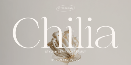 Chilia is a stylish serif font where contemporary upper serifs meet a feminine allure, making it ideal for beauty and display purposes. With its unique blend of modern and elegant features, Chilia adds a touch of sophistication with eye-catching presence that perfect for captivating displays that demand attention.
 - Wishful Gloria by Invasi Studio,
$17.00 With its loop, curly, & playful strokes, Wishful Gloria creates a display font. The font comes in uppercase all caps with OpenType features. Alternate characters and ligatures can be used to give the composition a unique feel. Suitable for display needs such as quotes, branding, logo, poster, cover design, etc
 - Bajt Rounded by Fontsphere,
$12.00 BAJT Rounded is a futuristic all-caps display font. It was created as a rounded version of the BAJT Font. Use for awesome display, illustrations, posters, logos, t-shirts, titles, and much more.. The font includes multilingual support (Latin-1), uppercase letters, numerals and a large range of punctuation.
 - Mindsight by Get Studio,
$23.00 Mindsight Funky Retro Display Font is a vibrant and energetic typeface that captures the essence of vintage aesthetics. With its playful curves and bold strokes, it adds a touch of nostalgia and creativity to any design project, making it perfect for eye-catching headlines, posters, and artistic displays.
 - MBF Mechania by Moonbandit,
$17.00 Mechania is a geometric sans serif display font. Bold and wide design gives this typeface a strong presence. Balance in the round and sharp edge to keep the clarity. Best use for a modern minimalist theme, other usage includes logo, poster, display, headline, t-shirt design and many more.
 - Coengkil Olstd by Olexstudio,
$19.00 COENGKIL Olstd Display Font will look gorgeous on all your designs, poster design, book design, branding materials, logo's, and all project design other. WHAT'S INCLUDED COENGKIL Olstd Display Font contains standard characters, All Chacacter is Uppercase, numbers, punctuation, Stalistic ALternates, ligatures and international glyphs Happy Designed.! regard olexstudio
 - Regima by Martype co,
$20.00 Regima, a minimalist display font, perfect for logotype, branding, editorial and etc. Regima is a sleek and modern minimalist display font that is tailor-made for logotypes, branding, editorial designs, and more. With its clean lines and simple yet sophisticated design, Regima exudes an air of elegance and professionalism.
 - Ultramarina by Huy!Fonts,
$24.95 Halfway between nineteenth century display wood letters and the American grotesk sans-serif of the early twentieth, we can find Ultramarina, a display font for use in large body headlines, which show its power of attraction to quality food, the country’s legume, and gentlemen with a mustache and apron.
 - Twist by Superfried,
$32.50 Twist is an experimental, curvy, display typeface designed by Superfried. As its name suggests, it features intricate twists and turns. Twist has a very retro feel and its chunky structure leads to a distinct, high-impact display font. Twist has been featured on the Behance curated typographic gallery TypographyServed.com.
 - Signboard JNL by Jeff Levine,
$29.00Signboard JNL is based on die-cut cardboard display lettering once made by the Duro Decal Company (now Duro Art Industries) of Chicago, Illinois. Available in various sizes, these letters and numbers could be affixed to a number of different surfaces to make affordable signs, displays and show cards. - Oscarios by Attractype,
$13.00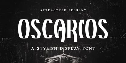 Oscarios fonts is a stylish display font. You can use it in a modern, clean and professional design. This font is perfect for your various projects such as brand identity, technology, business cards, web, stationery, displays, sports and more. Oscarios font contains uppercase, lowercase, numbers, punctuation and multilingual support.
 - Silver Linings by Clevus,
$14.00 Proudly present Silver Linings Typeface. Say hello to Silver Linings A classy eighties magazine inspired serif condensed - with a complementary lowercase version. In true Eighties style, they also come in varying degrees of Condensed form - mix and match them to create eye-catching effects. Don't forget to use all caps too in your mixing and matching - it adds contrast and impact to your type design. Design tips! : Tighten your letterspacing for larger titles to create a range of looks. Comes with alternatives and ligatures, and helps to create stunning magazine imagery, quotes, posts, blog posts, branding projects, logo, poster and much more. Font Features : Lettres, numbers, symbols, and punctuation 20+ alternates and ligatures No special software required they may be used even in canva, any basic program /website apps that allows standard fonts That's it folks! Multilingual Support Language Support: Danish, English, Estonian, Filipino, Finnish, French, Friulian, Galician, German, Gusii, Indonesian, Irish, Italian, Luxembourgish, Norwegian Bokmål, Norwegian Nynorsk, Nyankole, Oromo, Portuguese, Romansh, Rombo, Spanish, Swedish, Swiss-German, Uzbek (Latin). Follow My Shop For Upcoming Updates Including Additional Glyphs And Language Support. And Please Message Me If You Want Your Language Included or If There Are Any Features or Glyph Requests, Feel Free to Send me A Message. Have a Good Day !
 - FF Meta by FontFont,
$108.99 German type designer Erik Spiekermann, created this sans FontFont between 1991 and 2010. The family has 28 weights, ranging from Hairline to Black in Condensed and Normal (including italics) and is ideally suited for advertising and packaging, book text, editorial and publishing, logo, branding and creative industries, small text as well as web and screen design. FF Meta provides advanced typographical support with features such as ligatures, small capitals, alternate characters, case-sensitive forms, fractions, and super- and subscript characters. It comes with a complete range of figure set options—oldstyle and lining figures, each in tabular and proportional widths. As well as Latin-based languages, the typeface family also supports the Cyrillic, Greek, and Hebrew writing systems. FF Meta Variable are font files which are featuring two axis and have a preset instance from Hairline to Black and Condensed to Roman In 2011, FF Meta was added to the MoMA Architecture and Design Collection in New York. This FontFont is a member of the FF Meta super family, which also includes FF Meta Correspondence , FF Meta Headline , and FF Meta Serif . FF Meta® font field guide including best practices, font pairings and alternatives. Featured in: Best Fonts for Resumes
 - ZT Bros Oskon 90 s by Zelow Type,
$13.00 ZT Bros Oskon 90s is a captivating typographic creation that seamlessly blends the aesthetic charm of the 1990s retro era with a modern touch. With unmatched serif elegance and a unique 90s style, this font offers 72 variations, including sharp Condensed forms, graceful Expanded, and captivating italic styles. Every character in ZT Bros Oskon 90s is meticulously crafted, creating a vintage ambiance that is truly enchanting. Featuring 6 font weights ranging from Extra Light to Bold, this font provides you with the flexibility to create a wide range of striking and memorable designs. Features of ZT Bros Oskon 90s: 72 Unique Variations Aesthetic Retro Vibes from the 1990s Elegant Serif Style Condensed, Expanded, and Italic Forms 6 Font Weights: Extra Light, Light, Regular, Medium, Semi-Bold, Bold Exceptional Creative Versatility ZT Bros Oskon 90s is the perfect choice for graphic design projects, branding, posters, and other promotional materials that require a captivating retro touch. Unleash limitless creativity with this font and infuse a nostalgic 1990s vibe into every one of your creations. ZT Bros Oskon 90s has 6 free styles, you can get them on my GUMROAD I hope you have fun using ZT Bros Oskon 90s. Thanks for using this font ~ Zelowtype