10,000 search results
(0.022 seconds)
- Panoramic by Supfonts,
$9.00 Panoramic will be perfect for wedding lettering, beautiful frame for your home, book covers, greeting cards, logos, marketing, magazines or anything that requires cute handwritten lettering :) What's inside: Panoramic Script Multilingual support Cricut support If you have any questions, please contact me directly or in instagram @superdizigner
 - British Times by Fikryal,
$18.00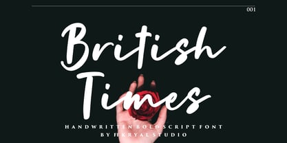 British Times is a handwritten font perfect for crafting, branding, invitation, stationery, wedding designs, social media posts, advertisements, product packaging, product designs, label, photography, watermark, special events, or anything. British Times comes with a full set of uppercase and lowercase letters, ligatures, multilingual symbols, numerals, and punctuation.
 - Margenta by Sronstudio,
$15.00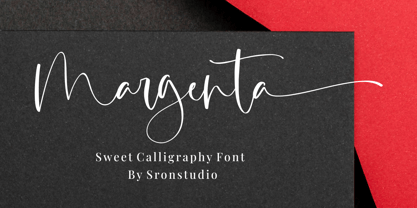 Margenta is a beautiful calligraphy font perfect for crafting, branding, invitation, stationery, wedding designs, social media posts, advertisements, product packaging, product designs, label, photography, watermark, special events or anything. Margenta comes with full set of uppercase and lowercase letters, swash alternates, ligatures,multilingual symbols, numerals and punctuation.
 - FF DuDuchamp by FontFont,
$30.99 Belgian type designer Dung van Meerbeeck created this script FontFont in 1992. The font is ideally suited for festive occasions, film and tv as well as poster and billboards. FF DuDuchamp provides advanced typographical support with features such as ligatures. It comes with proportional lining figures.
 - Hypne Pop by Sitintahitam,
$9.00 Hypne Pop is inspiring by retro pop culture, groovy, and funky. Hypne Pop comes with 9 weight unique regular and unique slanted style. Hypne Pop have a different characters in every style. This font also suitable for making headlines, stickers, T-shirt design, logotypes, poster, magazine, etc.
 - Basic Lettering JNL by Jeff Levine,
$29.00 Sometimes lettering without any frills or formality gets a message across better than the use of fancier typefaces. The simple charm of the hand-lettered phrase "Safety Comes First" found on a vintage WPA (Works Progress Administration) poster served as the model for Basic Lettering JNL.
 - Zimric by Ingrimayne Type,
$5.00 Zimric is a family with 28 styles. It has the look of neat hand printing. It is monoline and sans-serif, friendly and legible. The Zimric family has three widths, each width has four or five weights, and each weight comes in both upright and italic styles.
 - NS Mudolf by Novi Souldado,
$35.00 NS Mudolf is inspired by the lettering of vintage prints, signs and labels. It comes with five font styles and extra swashes, ligatures and stylistic alternates. It's ideal and perfect for creating a design piece such as letterheads, posters, signage, charters, labels, packaging, logotypes, and more.
 - MuX1ne by Machine Cult,
$14.00 A geometric-ish font family that's a bit off-kilter, offering three families: Regular, Rounded and Hatch as well as the bonus Noise, catchwords and dingbats for some occasions. Each font comes in Light, Regular and Bold styles. Complete latin character set with a range of ligatures.
 - Coliseu by Hanoded,
$15.00 Coliseu is a gorgeous, all caps Art Deco style font. Clean lines, rounded edges and an appealing style make Coliseu a very useful font. It was named after the beautiful Coliseu do Porto - an art deco landmark in that Portuguese city. Coliseu font comes with all diacritics.
 - Astrologer Symbols by Deniart Systems,
$20.00 Contains over 130 symbols based on the Western astrology system - it features the 12 zodiac signs, the 12 astrology symbols, the 12 corresponding planets, along with the 30 phases of the moon and charting signs. NOTE: this font comes with an interpretation guide in pdf format.
 - FF Franklinstein by FontFont,
$30.99 German type designer Fabian Rottke created this display FontFont in 1996. The font is ideally suited for music and nightlife, poster and billboards as well as software and gaming. FF Franklinstein provides advanced typographical support with features such as ligatures. It comes with proportional lining figures.
 - Orange Blossom by Fikryal,
$15.00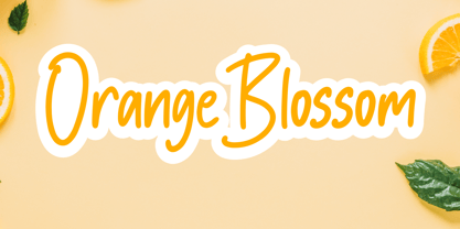 Orange Blossom is a beautiful display font perfect for crafting, branding, invitation, stationery, wedding designs, social media posts, advertisements, product packaging, product designs, label, photography, watermark, special events or anything. Orange Blossom comes with full set of uppercase and lowercase letters, ligatures,multilingual symbols, numerals and punctuation.
 - Kathaline by Fikryal,
$15.00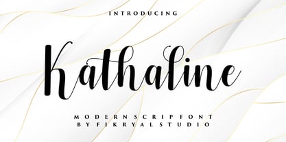 Kathaline is a natural script font perfect for crafting, branding, invitation, stationery, wedding designs, social media posts, advertisements, product packaging, product designs, label, photography, watermark, special events, or anything. Kathaline comes with full set of uppercase and lowercase letters, alternates, ligatures,multilingual symbols, numerals and punctuation.
 - Paradiso AOE by Astigmatic,
$19.95 Inspired by logotype of the Paris Resort and Casino in Las Vegas comes the Paradiso typeface, complete with an unusual array of leaning and unusually large capitals versus a petite lowercase that have a loosely drawn feel. Definitely a typeface with capitals to be used in moderation!
 - Dearlove by Fikryal,
$16.00 Dearlove is a beautiful calligraphy font perfect for crafting, branding, invitation, stationery, wedding designs, social media posts, advertisements, product packaging, product designs, label, photography, watermark, special events or anything. Dearlove comes with full set of uppercase and lowercase letters, swash alternates, ligatures,multilingual symbols, numerals and punctuation.
 - Avineo by Valentino Vergan,
$16.00 Avineo is a unique modern display typeface, which comes with a set of creative lowercase characters. The Avineo typeface has an ultra-fat look, which makes it perfect for logo and poster design. The Avineo typeface also comes in three styles, Regular, Outline and Extended, each style has an oblique version. The Avineo typeface comes with multilingual support for languages such as: Danish, English, Finnish, French, German, German (Switzerland), Norwegian Bokmål, Norwegian Nynorsk, Portuguese, Spanish, Swedish, Swiss German. The Avineo typeface has a unique design, which will make your next project standout. The Avineo typeface can cover a wide range of projects such as: brand packaging, brochures, magazines, logos, posters, flyers, book covers, quotes, branding, billboards, social media, pictograms and much more. If you are looking for something unique, bold and creative for you next project, the Avineo typeface is the font for you. WHAT YOU GET: Avineo Regular.otf Avineo Oblique.otf Avineo Outline.otf Avineo Outline oblique.otf Avineo Extended.otf Avineo Extended oblique.otf AVINEO INCLUDES A FULL SET OF: Uppercase and lowercase letters. Numbers. Punctuation. Ligatures. Alternates. Multilingual Symbols. We hope you enjoy using the Avineo typeface.
 - Speakeasy by Sudtipos,
$79.00 Speakeasy is a 5-font combo thematically built as a toolset for designing menus and liquor labels as well as coffees, restaurants and signs when the desire is to communicate with style. Originally put together to be used by the most famous speakeasy in Buenos Aires, this set contains a script, a minor (almost flat) wedge serif, a flare serif, a sans serif, and a bold Didone. The seed for the script was found in a German lettering book, and the other fonts reflect the familiar advertising and announcement styles of the early 20th century. The Speakeasy script comes with two different ways to connect the letterforms. Also included are many alternates, swashes, endings and flourishes — all accessible via OpenType features or glyph palettes. Speakeasy Modern and Speakeasy Flare are small cap fonts, and come with a few alternates. Speakeasy Sans and Speakeasy Gothic come with full sets of majuscules and minuscules, but contain small caps and a few alternates as well. A few rules and ornaments are also sprinkled throughout the set. This combination of fonts worked wonderfully for the project that called for it. Hopefully it will work just as well for your project.
 - Maressy by Tegaki,
$16.00 Hi all, Maressy created with stylish and modern brush characters. Maressy is a modern brush script font that comes with Extended Latin Characters. This font was PUA encoded. Maressy works perfectly for logos, display, product branding, wedding invitation card, stationary, packaging, clothing, flyer, apparel, magazines, brochures, lable, posters, badges, etc. Maressy comes with 241 glyphs and 26 alternate characters contain with opentype features. Maressy also comes with 10 standard ligatures that allowing you to make stuff looks more exclusive and pro standard. You can access all those alternate characters by using OpenType savvy programs such as Adobe Illustrator, Adobe InDesign and CorelDraw X6-X7, Microsoft Word 2010 or later versions. There are additional ways to access alternates/swashes, using Character Map (Windows), Nexus Font (Windows), Font Book (Mac) or a software program such as PopChar (for Windows and Mac). For other programs that doesn't support OpenType features or Glyphs Panel such as Photoshop, you can use Character Map in Windows to access the alternate characters. If you need help or advice, please contact me by e-mail "tegakiscript@gmail.com" Thank you for your purchase!
 - Pushkin is a font that seems to embrace the art of storytelling with each letter it forms. Just hearing the name, you can almost feel the romantic brushstrokes of history and literature it's named af...
- As of my last update, Rammstein isn't widely recognized as a standard or commercially available typeface in the traditional sense, such as Helvetica or Times New Roman. Instead, Rammstein's associati...
- Wolverhampton by Greater Albion Typefounders,
$12.50 Wolverhampton is a new Neo-Victorian face from Greater Albion Typefounders. It's something of an example of starting with a small idea and running with it. This family of three typefaces (Regular, Small Capitals and Capitals) was inspired by a line of lettering seen on a late 19th Century enamel advertisement made by Chromo of Wolverhampton (hence the family name). The family grew, topsy-like, from a recreation of these initial fifteen capital letterforms to the three complete typefaces offered here. The three typefaces are ideal for advertising and poster work with a Victorian, Edwardian, or 'Steam-punk' theme. They would also be eminently suitable for signage inspired by the same eras or (as we've seen a number of our other typeface families prove very popular) for book covers of period related novels and historical works. Finally, these slender elegant display faces are just plain fun!
 - Albyona by SIAS,
$34.90 Albyona English Nº 1 is ideal for titlings and headings in novels or fairy tales. It has a sentimental flavour of history, memories and the good-old-days feeling. Suitable for children’s books, fantasy literature, crime novels, natural food packaging and poison labeling, for infancy memories, vanitas kitsch items, dungeon museum bar menu cards, introductions to herbalism and witchcraft manuals. Albyona supports every Euro-Latin language. For the choice of a similar font go to Abendschroth.
 - Waterloo Bold by ITC,
$29.99The slab serif Waterloo Bold was designed by Alan Meeks. He chose unique and individual forms to give this alphabet its unmistakable character. The cross strokes of the capitals are not in the optical center, the serifs have light furrows, and the figures have a slight slant tot he right, giving this font a dynamic, flowing look. Waterloo Bold is reminiscent of cigars, whiskey and the 1930s and should be used only in headlines in large point sizes. - Angustina by Diego Massaro,
$30.00 Angustina is an elegant display typeface, it takes inspiration from classic letter styles. I chose the font name after reading the classic Italian novel “The Tartar Steppe”. I was inspired by the sickly, stoic and mysterious man who differs for his willingness to stay at Fort Bastiani. Angustina conveys distress and stinging sensation with extreme contrasts between thick and thin strokes and exasperated serifs. The alternate of hairline and bracketed serifs gives Angustina a modern and military appearance.
 - Bethlehem Ephrath by HiH,
$10.00 One menorah that I have long found particularly appealing was named The Tree of Life Menorah, a replica of which I gave as a gift one holiday to a kindly old couple who were neighbors and became friends. It had a simple, organic elegance that I see in the best of Art Nouveau sculpture. To me personally, Judeism is a celebration of life, like the triumph of the flower that blossoms in the crack of the city sidewalk. Just as Hanukkah celebrates the rededication of the temple and the miracle of the oil, it celebrates the victorious quest for freedom of the Hebrew people led by Judah Maccabee. Hanukkah represents determination and courage and faith — and it represents the presence of God in the lives of His people. It is interesting to note that the founding of the Albanian nation in the early twentieth century grew out of the resistance of the Albanian people to the imposition of Greek language and culture in the aftermath of the dissolution of the Ottoman Empire. The typeface, HADASSAH, designed by Henri Friedlander (1904-1996), is my favorite Hebrew typeface. Thirty years in the crafting, I believe it is unsurpassed for its shear beauty, combining a subtle modulation of stroke with a simplicity and clarity of form. No doubt, that is why it has become so popular. For me, the Sîyn/Shîyn characters are especially satisfying. For a Hanukkah message in Hebrew, I would choose HADASSAH LIGHT for a headline and print it as large as I could. If, however, you are looking for a friendly, warm face for a seasonal message in a roman-letter based language, may I suggest BETHLEHEM EPHRATH. It will be as comfortable as a bulky, hand-knit sweater on a frosty afternoon and reflects the solid, encompassing, family orientation of this holiday. It was on the way to Ephrath that Jacob’s beloved wife Rachel gave birth to Benjamin and then died from her labor. It was to Ephrath that Naomi and Ruth returned and in Ephrath that we have the wonderful, heart-warming story of the marriage between Ruth and her Redeemer-Kinsman, Boaz. And it was to Ephrath that prophet, Samuel, went to find a new king and there in Ephrath that the prophet annointed a small shepherd boy named David. The Proverbs tell us to seek wisdom. Never underestimate the impact you have on others. Words of kindness can change people’s lives. The Talmud says that the highest form of wisdom is kindness. Be wise this holiday season. The font BETHLEHEM EPHRATH is based on the typeface Accent with the permission of URW++ of Hamburg, Germany. Like most display fonts, it is most effective at 18 points and larger. Like most script fonts, it is most effective when set with both upper and lower case. Although this font is readable in all caps (many scripts are not), that does not make it a good idea. Do so only with caution.
 - Ollie by Eclectotype,
$40.00 Meet Ollie, a casual signage script whose friendly, bouncy exterior belies a heart of sophisticated OpenType programming. This font is designed to make the most of OpenType savvy applications, and as such is recommended for professional design use. Or to put it another way: Make sure that contextual alternates and ligatures are always turned on! Ollie includes about 900 glyphs, many of which are automagical substitutions to keep the text flowing smoothly, and to pseudo-randomly pick different glyphs to avoid repetition. With contextual alternates turned on (as they should be by default), most lowercase letters will alternate between at least two different forms. The powerful OpenType programming makes the font itself ‘look back’ (up to eight characters) on previously used letters; typing “banana” will give you three different a’s and two different n’s (the last a is a special ‘end form’ character). The calt feature controls many other ‘special effects’ which all add together to give a smooth-flowing, hand-lettered look. These effects include start and end forms (and indeed, ‘loner’ forms) of many letters, which are automatically substituted in at beginnings or ends of words, or when the previous or next letter doesn't connect. Another special feature tests to see if there is room for the crossbar of t (or tt ligature) to extend further over the previous or next letter, or both, as is often the case. The last main effect of the calt feature is to substitute certain letters typed before any ‘e’ character, to make for a more natural connection (see the pe combination in ‘Eclectotype’ in the first poster). Ligatures should be on by default, for a much nicer looking tt combination, and a few others besides. The swash feature should be used sparingly (one glyph at a time, really) to apply a more extravagant look to g,j and y in the lower case, and quite a few of the upper case too. Oldstyle figures are included, as well as the lining defaults. Now to delve into the stylistic alternates... These are all included in the salt feature, or for uses of applications that support them, separated into stylistic sets thus: ss01 - (with swash feature on) L and G swashes get even swashier. ss02 - standard s changes to a connected script s form. ss03 - r takes on a script form. ss04 - z also gets a scriptier look. [the previous three sets also change any versions of s, r or z with diacritics] ss05 - a useful underline function. When enabled, typing two or more underscores will extend a cool underline under the previous letters. More underscores = longer underline. ss06 - the Polish script lslash changes to its more standard form. ss07 - E, S and B change to a more top-heavy alternate form. ss08 - An alternate form for A characters. ss09 - Alterative rounder forms of M and N. ss10 - An alternate ampersand. That about wraps up the features. Now all that’s left is for you to license the font and get experimenting!
 - FS Untitled Variable by Fontsmith,
$319.99Developer-friendly The studio has developed a wide array of weights for FS Untitled – 12 in all, in roman and italic – with the intention of meeting every on-screen need. All recognisably part of a family, each weight brings a different edge or personality to headline or body copy. There’s more. Type on screen has a tendency to fill in or blow so for each weight, there’s the choice of two marginally different versions, allowing designers and developers to go up or down a touch in weight. They’re free to use the font at any size on any background colour without fear of causing optical obstacles. And to make life even easier for developers, the 12 weight pairs have each been designated with a number from 100 (Thin) to 750 (Bold), corresponding to the system used to denote font weight in CSS code. Selecting a weight is always light work. Easy on the pixels ‘It’s a digital-first world,’ says Jason Smith, ‘and I wanted to make something that was really functional for digital brands’. FS Untitled was made for modern screens. Its shapes and proportions, x-height and cap height were modelled around the pixel grids of even low-resolution displays. So there are no angles in the A, V and W, just gently curving strokes that fit, not fight, with the pixels, and reduce the dependency on font hinting. Forms are simplified and modular – there are no spurs on the r or d, for example – and the space between the dot of the i and its stem is larger than usual. The result is a clearer, more legible typeface – functional but with bags of character. Screen beginnings FS Untitled got its start on the box. Its roots lie in Fontsmith’s creation of the typeface for Channel 4’s rebrand in 2005: the classic, quirky, edgy C4 headline font, with its rounded square shapes (inspired by the classic cartoon TV shape of a squidgy rectangle), and a toned-down version for use in text, captions and content graphics. The studio has built on the characteristics that made the original face so pixel-friendly: its blend of almost-flat horizontals and verticals with just enough openness and curve at the corners to keep the font looking friendly. The curves of the o, c and e are classic Fontsmith – typical of the dedication its designers puts into sculpting letterforms. Look out for… FS Untitled wouldn’t be a Fontsmith typeface if it didn’t have its quirks, some warranted, some wanton. There’s the rounded junction at the base of the E, for example, and the strong, solid contours of the punctuation marks and numerals. Notice, too, the distinctive, open shape of the A, V, W, X and Y, created by strokes that start off straight before curving into their diagonal path. Some would call the look bow-legged; we’d call it big-hearted. - FS Untitled by Fontsmith,
$80.00 Developer-friendly The studio has developed a wide array of weights for FS Untitled – 12 in all, in roman and italic – with the intention of meeting every on-screen need. All recognisably part of a family, each weight brings a different edge or personality to headline or body copy. There’s more. Type on screen has a tendency to fill in or blow so for each weight, there’s the choice of two marginally different versions, allowing designers and developers to go up or down a touch in weight. They’re free to use the font at any size on any background colour without fear of causing optical obstacles. And to make life even easier for developers, the 12 weight pairs have each been designated with a number from 100 (Thin) to 750 (Bold), corresponding to the system used to denote font weight in CSS code. Selecting a weight is always light work. Easy on the pixels ‘It’s a digital-first world,’ says Jason Smith, ‘and I wanted to make something that was really functional for digital brands’. FS Untitled was made for modern screens. Its shapes and proportions, x-height and cap height were modelled around the pixel grids of even low-resolution displays. So there are no angles in the A, V and W, just gently curving strokes that fit, not fight, with the pixels, and reduce the dependency on font hinting. Forms are simplified and modular – there are no spurs on the r or d, for example – and the space between the dot of the i and its stem is larger than usual. The result is a clearer, more legible typeface – functional but with bags of character. Screen beginnings FS Untitled got its start on the box. Its roots lie in Fontsmith’s creation of the typeface for Channel 4’s rebrand in 2005: the classic, quirky, edgy C4 headline font, with its rounded square shapes (inspired by the classic cartoon TV shape of a squidgy rectangle), and a toned-down version for use in text, captions and content graphics. The studio has built on the characteristics that made the original face so pixel-friendly: its blend of almost-flat horizontals and verticals with just enough openness and curve at the corners to keep the font looking friendly. The curves of the o, c and e are classic Fontsmith – typical of the dedication its designers puts into sculpting letterforms. Look out for… FS Untitled wouldn’t be a Fontsmith typeface if it didn’t have its quirks, some warranted, some wanton. There’s the rounded junction at the base of the E, for example, and the strong, solid contours of the punctuation marks and numerals. Notice, too, the distinctive, open shape of the A, V, W, X and Y, created by strokes that start off straight before curving into their diagonal path. Some would call the look bow-legged; we’d call it big-hearted.
 - Plaquette by FaceType,
$24.00 ‘Plaquette’ is a collection of retro typefaces ranging from victorian to bauhaus to the sixties. They are all equipped with a load of OpenType features such as alternates, catchwords, stylistics sets and others. Plaquette 3D A chromatic set of fonts including gradient and outline layers. Crisp and precise. Plaquette Lovecraft A vintage typeface with some sweet discretionary ligatures to make your typography exciting. Take a look at the many alternates. Plaquette Sittl A clean geometric style with many alternative letters, some inspired by Paul Renner’s original Futura. Plaquette Labels This set provides you with 220 different shapes ideal for logos, plates and… labels.
 - Dog Eared by Andy Babb,
$19.20 Each character of Dog Eared began its life as a half-inch wide strip of paper, folded and Scotch-taped into formation, and then scanned and recreated digitally. Dog Eared is distinguished from other folded paper style typefaces by its robustness and versatility: each numeral and upper- and lowercase letter has a stylistic alternate. Dog Eared Striped is a traditional single color font, while Dog Eared Solid is a chromatic variant that can be used for a two-toned effect. Layer and multiply Dog Eared Striped and Dog Eared Solid together to achieve even more color variety.
 - Qoutiens by ZetDesign,
$15.00 Qoutiens is a signature style font. made by following the handwritten pattern to produce a natural and elegant shape and produce a beautiful and classy shape. This font also comes with an Opentype feature to add an alternative style to the design. happy work and enjoy this awesome font ..
 - Rottweiler by Nurf Designs,
$17.00 Rottweiler is a handwritten font with a classic and retro style. This font is great for your next creative project such as logos, printed quotes, invitations, cards, product packaging, headers, logotypes, letters, posters, apparel designs, labels, and etc. Rottweiler comes with uppercase, lowercase, numerals, punctuations, ligatures & multilingual support characters.
 - Allentown by Nurf Designs,
$16.00 Allentown is a script font with a vintage and retro style. This font is great for your next creative project such as logos, printed quotes, invitations, cards, product packaging, headers, logotypes, letters, posters, apparel designs, labels, and etc. Allentown comes with uppercase, lowercase, numerals, punctuations, ligatures & multilingual support characters.
 - Yellow Peas by Roland Hüse Design,
$24.00 Yellow Peas is a geometric sans serif typeface that comes in 5 different weights. Contains Western and Eastern European languages, Vietnamese accented characters, Russian Cyrillic and Thai character set. Yellow Peas is a clean and modern font with stylistic alternates, standard and discretionary ligatures. Also includes Small Caps feature.
 - Saddlery by FontMesa,
$25.00Saddlery includes the first font that you can use alone or add the optional second fill font behind the first using different colors for a more decorative look. You will need an application that works in layers in order to use the fill fonts that come with FontMesa fonts. - Mazreha by Sronstudio,
$23.00 Mazreha – Display Font comes with an elegant and modern touch this font is perfect for branding, invitation, stationery, wedding designs, social media posts, advertisements, product packaging, product designs, label, photography, watermark, special events, and more. Features: Uppercase and lowercase letters Lowercase Swashes Alternates Ligatures Multilingual, numerals, and punctuation
 - Popfun by Surotype,
$20.00 Popfun is a display typeface with playful taste. It comes in two different styles, normal and extrude paired with a mono style, this font fits perfectly. Really playful font to make it easier for you creative work such as — branding, film titles, packaging, advertising, posters, and web or app.
 - Soulmate by Haksen,
$18.00 Introducing Soulmate - an elegant, luxurious and classy script. Soulmate comes with many alternates so you can create a luxury design. I recommend using Adobe to design with this font. The Glyphs menu contains all the alternates. If you have any questions, please contact me for support at : edhi.sarwo@gmail.com
 - Lugo Rockwell by madeDeduk,
$16.00 Introduce Lugo Rockwell is a brush vintage handwritten font to give an incredible impression for all your project design come with a lot ligatures and Alternative to make everything look realistic handmade handwritten. Included: Uppercase & Lowercase Number & Symbol International Glyphs Multilingual Support Ligature Alternative Hope you enjoy it.