10,000 search results
(0.263 seconds)
- Ambiance BT by Bitstream,
$50.99The beautiful calligraphic typeface Ambiance comes from master designer Rob Leuschke. The complete array of characters includes a swash alternate for each upper and lowercase letter. Called contextual alternates in OpenType, the swash characters are automatically substituted in the appropriate context when you select them. - Muge by Linecreative,
$18.00 Muge is awesome for branding and logotype, Muge has a modern, trendy and elegant impression. Muge Comes with Ligatures and lots of alternate characters & unlock types featured so you can mix and match like a you want. Muge also supports multi-language (Western Europe Latin)
 - FF Voodoo by FontFont,
$30.99 German type designer Klaus-Dieter Lettau created this display FontFont in 1995. The family contains 2 weights and is ideally suited for music and nightlife. FF Voodoo provides advanced typographical support with features such as ligatures. It comes with proportional oldstyle and proportional lining figures.
 - Qamassan by Anomali Creative,
$15.00 QAMASSAN is a Bohemian Vintage Typeface. It's retro, bold, and playful. Perfect if you need a dose of fun in your project. QAMASSAN fits perfectly into those nostalgic moodboards and vintage logos. It come with a unique lower and uppercase plus numbers, punctuation & multilingual letters.
 - Wickenburg by VersusTwin,
$21.99 Wickenburg is a rough and tumble grunge slab typeface that has taken a lickin' but keeps on coming back for more. It is a powerful heavyweight serif that makes a strong design statement. Pick up this bad boy and take him for a ride!
 - FF Chemo by FontFont,
$41.99 German type designer Critzla created this display FontFont in 1997. The family has 11 weights, and is ideally suited for music and nightlife. FF Chemo provides advanced typographical support with features such as ligatures and case-sensitive forms. It comes with proportional oldstyle figures.
 - HARBER by bb-bureau,
$60.00 The name ‘HARBER’ comes from the first letters drawn. It is a sans serif family designed of dots on a grid, that gives it this round and rhythmic aesthetic. Only dots grow, approaching or moving away, changing the aspect of letters but keeping its characteristics.
 - Arkhania by Adorae Types,
$16.00 Light the fire and get your spells ready for Halloween with this witchy font, Arkhania. This display family offers three different styles from which you can pick the one that best describes the atmosphere and mood of your composition: Striped, fun and wicked, Regular, a more strong and classical look, and Hollow, old styled and classy. All three typefaces inspired by the Triple Moon Goddess and its phases: Maiden, Mother, & Crone. Arkhania family features: 423 glyphs 3 styles 84 icons, drawings, swashes and flags Standard ligatures Alternate characters Contextual alternates Swashes more... In addition, there is Arkhania Sigils, a style filled with swashes, icons, drawings and symbols. Play with them, combine a few, choose from different beginnings and endings and create your own swashes, underlines and frames. You can also find flags and boxes along with common connectors. Tips for a clean and modern look: Combine this typeface with a sans serif, light or thin font, like Aeonian (Aeonian Light was used for these images), and let Arkhania cast a spell on the viewer.
 - El Pececito is a refreshing and whimsical font that showcases the creativity and playful spirit of its designer, deFharo. This font stands out for its unique blend of simplicity and eccentricity, mak...
- ITC Legacy Sans by ITC,
$40.99 ITC Legacy¿ was designed by American Ronald Arnholm, who was first inspired to develop the typeface when he was a graduate student at Yale. In a type history class, he studied the 1470 book by Eusebius that was printed in the roman type of Nicolas Jenson. Arnholm worked for years to create his own interpretation of the Jenson roman, and he succeeded in capturing much of its beauty and character. As Jenson did not include a companion italic, Arnholm turned to the sixteenth-century types of Claude Garamond for inspiration for the italics of ITC Legacy. Arnholm was so taken by the strength and integrity of these oldstyle seriffed forms that he used their essential skeletal structures to develop a full set of sans serif faces. ITC Legacy includes a complete family of weights from book to ultra, with Old style Figures and small caps, making this a good choice for detailed book typography or multi-faceted graphic design projects. In 1458, Charles VII sent the Frenchman Nicolas Jenson to learn the craft of movable type in Mainz, the city where Gutenberg was working. Jenson was supposed to return to France with his newly learned skills, but instead he traveled to Italy, as did other itinerant printers of the time. From 1468 on, he was in Venice, where he flourished as a punchcutter, printer and publisher. He was probably the first non-German printer of movable type, and he produced about 150 editions. Though his punches have vanished, his books have not, and those produced from about 1470 until his death in 1480 have served as a source of inspiration for type designers over centuries. His Roman type is often called the first true Roman." Notable in almost all Jensonian Romans is the angled crossbar on the lowercase e, which is known as the "Venetian Oldstyle e."" ITC Legacy® Sans font field guide including best practices, font pairings and alternatives.
 - Mauritius by Canada Type,
$29.95 Ten years or so after his unique treatment of Garalde design with Trump Mediaeval, Georg Trump took on the transitional genre with Mauritius, which was to be his last typeface. He started working on it in 1965. The Stuttgart-based Weber foundry published a pamphlet previewing it under the name Barock-Antiqua in 1967, then announced the availability of the metal types (a roman, a bold and an italic) a year later. The global printing industry was already in third gear with cold type technology, so there weren't that many takers, and Weber closed its doors after more than 140 years in business. Subsequently, Trump’s swan song was unfairly overlooked by typography historians and practitioners. It never made it to film technology or scalable fonts. Thus, one of the most original text faces ever made, done by one of the most influential German type designers of the 20th century, was buried under decades of multiple technology shifts and fading records. The metal cuts of Mauritius seem to have been rushed in Weber’s desperation to stay afloat. So the only impressions left of the metal type, the sole records remaining of this design, show substantial problems. Some can be attributed to technological limitations, but some issues in colour, precision and fitting are also quite apparent, particularly in Mauritius Kursiv, the italic metal cut. This digital version is the result of obsessing over a great designer’s final type design effort, and trying to understand the reasons behind its vanishing from typography’s collective mind. While that understanding remains for the most part elusive, the creative and technical work done on these fonts produced very concrete results. All the apparent issues in the metal types were resolved, the design was expanded into a larger family of three weights and two widths, and plenty of 21st century bells and whistles were added. For the full background story, design analysis, details, features, specimens and print tests, consult the PDF available in the Gallery section of this page.
 - Neumatic Compressed by Arkitype,
$12.00 Neumatic compressed has a super compressed character set, increased cap height and tight kerning that combine to give you the ability to create large, beautiful and effective headlines and copy for your artwork. Neumatic Compressed packs punch when it comes to large copy lines and is perfect for posters, display copy, headlines in printed materials like magazines and books . The family comes in 8 weights from extra light to Black so it's versatile. Its extra light weight can give you some great height due to how narrow it is. Play around with the opentype Superscript with an underline or the Opentype stylistic sets which turns the default squared dots on i's, j's and punctuation to round dots.
 - Realtime Stencil Rounded by Juri Zaech,
$30.00 Realtime Stencil Rounded is part of the Realtime type family which draws inspiration from information displays. The result is a technical yet friendly design with details that serve function and visual impact alike. As a monospaced typeface it lends itself to tabular designs, sturdy columns and tidy layouts. Nevertheless Realtime Stencil Rounded comes with a feature for setting continuous text — a proportional design employable through OpenType — it further comes in five weights, from light to black, and with a character set that covers over 200 latin languages. Please see the Realtime Stencil Rounded Type Specimen PDF in the gallery. Realtime Stencil Rounded is the soft companion to the standard Realtime Stencil typeface which is available separately.
 - Realtime Stencil by Juri Zaech,
$30.00 Realtime Stencil is part of the Realtime type family which draws inspiration from information displays. The result is a technical yet friendly design with details that serve function and visual impact alike. As a monospaced typeface it lends itself to tabular designs, sturdy columns and tidy layouts. Nevertheless Realtime Stencil comes with a feature for setting continuous text — a proportional design employable through OpenType — it further comes in five weights, from light to black, and with a character set that covers over 200 latin languages. Please see the Realtime Stencil Type Specimen PDF in the gallery. A soft version of Realtime Stencil is available separately: Realtime Stencil Rounded. Its soft edges apply warmth to the otherwise rather technical appearance.
 - P22 Barabajagal by IHOF,
$29.95 P22 Barabajagal is a unique take on the display fat face by way of doodling fun. Somewhat informed by the shapes of an early 1970s film type called Kap Antiqua Bold, this font’s aesthetic is the stuff of boundless energy and light humour, where an uncommon “peak” angle drawing perspective results in sturdy trunks, fat bottom curls, and active ascenders eager for mobility in space. This is the kind of font that makes you wonder whether it was drawn with rulers, protractors and compasses, or just by a mad doodler’s crazy-good free hand. Regardless, Barabajagal easily turns the geometry of modern forms into an exercise in sugar-loaded fun. It’s a very good tool to use in design geared at kids and young adults, such as food and toy packaging, books, animation, cartoons and games. Barabajagal comes with over 550 glyphs, lots of alternates, and a few ligatures and swash caps. It also contains extended support for Latin languages.
 - Beardstown by Swell Type,
$15.00 Beardstown is solid, hardworking & no-nonsense. It may be a little gritty & rough around the edges, but it can also be open, warm and welcoming. Beardstown is a little Midwestern town on a river with a town square where you can buy comic books from a spinner rack at the front of the drugstore and read 'em with a root beer float from the soda counter in the back. The Beardstown font is perfect for t-shirts, sports graphics, beer cans, trading cards, carnival posters and record albums. But that’s it. I mean, you could use it on foofy hipster stuff like organic produce, vegan meat substitutes, electric car accessories or mountain bike parts, but you risk Beardstown coming over there to kick your butt. Features: three versions of each letter and two versions of each number automatically rotate for authentic print texture thirteen catchwords (like "and" "of" "for" & "the") accessible in Discretionary Ligatures support for 223 languages including Western & Central Europe, Vietnamese & Cyrillic
 - Fantini by Canada Type,
$29.95 Fantini is the revival and elaborate update of a typeface called Fantan, made in-house and released in 1970 by a minor Chicago film type supplier called Custom Headings International. In the most excellent tradition of seriously-planned American film faces back then, CHI released a full complement of swashes and alternates to the curly art nouveau letters. Fantan didn't fare much among the type scene's big players back then, but it did spread like electricity among the smaller ones, the mom-and-pop type shops. But by the late 1980s, when film type was giving up the ghost, most smaller players in the industry were gone, in some cases along with little original libraries that existed nowhere else and became instant rarities on their way to be forgotten and almost impossible to resurrect for future technologies. Fantini is the fun and curly art nouveau font bridging the softness and psychedelia of the 1960s with the flirtatious flare of the 1970s like no other face does. Elements of psychedelia and funk flare out and intermix crazily to create cool, swirly letters packed with a lot of joy and energy. This is the kind of American art nouveau font that made its comeback in the late 20th century and is now a standard visual in the branding drive of almost every consumer product, from coffee labels to book and music covers to your favorite sugar or thirst-crunching fix. Alongside Fantini's enormous main font come small caps and three extra fonts loaded with swashy alternates and variations on plenty of letters. All available in all popular font formats. Fantini Pro, the OpenType version, packs the whole she-bang in a single font of high versatility for those who have applications that support advanced type technologies. In order to make Fantini a reality, Canada Type received original 2" film specimen from Robert Donona, a Clevelander whose enthusiasm about American film type has never faltered, even decades after the technology itself became obsolete. Keep an eye out for that name. Robert, who was computer-reluctant for the longest time, has now come a long way toward mastering digital type design.
 - Mastadoni by Eclectotype,
$40.00 Mastadoni is a bold headliner/masthead typeface, with high vertical contrast in a Didone style. That's the starting point at least. There's much more to this font than another modern clone. It is a specialized (only one weight) typeface that comes in five optical grades. Use G1 at very large sizes and G5 at smaller sizes. The grades can be combined so that the thins of type set at different point sizes appear the same thickness - a very useful feature for magazine layouts. Optical grades could also be used in circumstances where a logo needs to be size-specific; the text on your bistro sign can afford to be more delicate than that on your coffee cups. This is a typeface with a big x-height, small cap-height and stubby ascenders and descenders, which contribute to an overall appearance somewhat different from must Didones, and make for some interesting layout possibilities in tight spaces. Mastadoni features a number of useful OpenType features. All fonts include standard ligatures and automatic fractions. In the discretionary ligature feature, you'll find the esoteric "percent off" glyph. Just type '%ff' with dlig engaged and there it is! Case-sensitive forms are available in all the fonts. The contextual alternates feature performs a subtle trick that resolves an optical illusion whereby two ascenders next to each other appear to be different heights. The Roman and Italic styles have a different group of stylistic sets as follows: Roman: SS01 substitutes a less decorative 4; SS02 is a different eszett; SS03 substitues the # with an attractive numero glyph; and SS04 gives an alternate K. Italic: SS01 and SS03 are the same as in the Romans; SS02 gives you more bulbous variants of v, w, and y letters; SS04 is a single storey g; SS05 changes C, G and S to non-ball-terminal varieties; and SS06 changes the swash versions of E, L, N and Q (when the swash feature is engaged). Speaking of the swash feature, the italic fonts feature swash capitals from A to Z, and swash variations for lower case h k m n v w and z. Lastly, the discretionary ligature feature in the italic fonts has vi, wi, KA and RA ligatures. Mastadoni is a typeface that would find itself immediately at home in glossy magazines, while offering a different aesthetic palette from the more standard choices of Didones.
 - Resist Sans by Groteskly Yours,
$25.00 Resist Sans is a free-spirited neo-grotesque that embodies both the innate desire for revolt and a tendency towards uniformity. While Resist Sans preserves the neat, minimalist look which is associated with neo-grotesques, it also accentuates the tentativeness of each letter form. The name, too, hints at the rebellious character of the typeface. Resist Sans comes in 28 styles (14 uprights and matching obliques). Text vs Display Resist Sans comes in two versions: Display and Text, which serve different purposes but remain interchangeable and even complementary in some cases. Resist Text is equipped with deep ink traps and optical compensators, which really come into play at smaller sizes. The Display version is smoother and more consistent, so better for use in larger sizes and headlines. Styles/Weights Each of the two versions of Resist Sans comes in 7 weights (Thin to Black) and is equipped with matching Obliques, which brings the total number of styles to 28. Two trial styles (Text Light and Display Medium Oblique) can be downloaded free of charge. Each style contains 900+ glyphs, awesome OpenType features, and around 1500 kerning pairs. Language Support Resist Sans is truly multilingual. It supports most European and Latin-languages and features Extended Cyrillic, which gives access to such languages as Ukrainian, Bulgarian, Serbian, Russian, Macedonian and many more. Free Styles Two styles of Resist Sans can be downloaded for free on MyFonts. Type Specimen Resist Sans PDF Type Specimen can be downloaded here: Resist Sans PDF Type Specimen
 - Eclectic One by Altered Ego,
$45.00STF Eclectic One is a visual cornucopia of symbols, like the junk drawer in your kitchen. Stuff you'll need someday for a graphic element, bullet or dingbat application. Perfect for website icons! The Eclectic family is legendary, with a cult-like following among the inititated. As one of the first dingbat fonts available on the web, it gain popularity after its design in the early 1990s. With over 150 characters in the complete set, you'll find yourself using Eclectic One almost daily to add spice to your otherwise san-serif typographic existence. This font is essentially a soap opera of typographic image elements, created for projects when I couldn't find the "thingbat" I needed. Almost more of a collection of illustrations, there are many characters which connect to form patterns, and of course it's like a "small neutral European country" army knife for the creative community. EcOne features complete hour, quarter, and half-hour notations in an analog clock design glyph, recycled/recyclable symbols, a registration mark, a toaster, globes, sideways diamond arrows, spaceships, stoplights, the "running man," several atomic references, da buzz saw, target icons, the unusual smiley face floating in a ball (with a drop shadow, no less!), and the fish skeleton which complements the fallout shelter symbol, and more. Make your own juxtapositions! One reviewer proclaims "for whatever you do, Eclectic One is an excellent dingbat source." Available in Mac and PC formats. License it today! - Giureska by URW Type Foundry,
$39.99 I always admired the beauty of Gothic letters, but lamented their low readability. The revivals of Gothic faces are beautiful, but they revive everything, including the traits that prevent readability. Blackletters are fine in ads and titles, but can’t be used in long texts (like books on Middle Ages, Medieval romances etc) where they would be the perfect historical choice. And I wanted to change this scenario. With Giureska, instead of taking one particular face to revive, I chose the best traits from many Gothic faces, i.e. the forms that were pleasant to look and easy to read. For the ‘small caps’, I studied uncial scripts and made a similar selection, adapting everything to make a unified font. With three weights, true italics and the uncials, Giureska can endure a variety of projects, bringing the appeal of Middle Ages much beyond the cover.
 - Dorset by Positype,
$49.00 Dorset marks Léon Hugues first script typeface and first release with the Positype Flourish label. Built crosscurrent to a strict revival or calligraphic digitization, Dorset’s aim was to understand how a font could interact with various calligraphic influences in a single execution and how that interpretation by Léon would lead to new, exclusive design choices. The design purposely chose to connect various gestures from Spencerian handwriting and copperplate calligraphy and meld that with his initial experiments with fine, flat nibs. The result is wholly unique and useful when clear, open, and legible script typography is desired. OpenType features included in this typeface allow the user to seamlessly move from an italic to connected script, while the various stylistic sets can lead you to variations of texture and rhythm, allowing for a more personal and exact expression.
 - Touch Me by Latinotype,
$69.00 Touch Me is a Script hand-drawn style typeface—designed by Coto Mendoza—resulting from polyrhythmic exploration, sign deconstruction and altered calligraphic contrast plays with watercolour brush. Coto has been using these experimental calligraphy techniques when creating the catchwords for Macarons, the Boho Family, Bikini Season Script and Matcha Script and so forth. Touch Me was inspired by a character in a story written by Coto while attending a literary workshop with Ina Groovie in Santiago de Chile. The character is a tribal girl who lives on an island in the Caribbean. She is heir of ancestral knowledge and possesses wild beauty, very passionate and sensual: intense, strong and free. These features are reflected in the polyrhythm of the typeface's curves: an irregular baseline, variable x-height, different lengths of initial and terminal strokes (that sometimes expand and sometimes shrink) and amount of brush pressure that generates changes in contrast within the characters. This way, when composing, signs with stroke contrast randomly alternate with monolinear ones and with signs of altered contrast, thanks to the typeface's OpenType programming. The family, with more than 3,000 glyphs, provides a number of alternative characters, swashes, ligatures, initial and terminal forms, in short, a vast ocean of choices! Touch Me is a spontaneous typeface with a fresh and unique personality. It is the perfect choice for short text in both print and digital formats. The family comes with a Script Regular version and a seductive Script Drop that you will enjoy a lot! The Extras set includes some catchwords, dingbats and ornaments that allows for endless composition options. The family also comes with a Caps version —designed by Luciano Vergara—in 2 styles: a funny and big-headed condensed Sans Grotesk display of inverted vertical proportion plus a Grotesk, neutral and slightly expressive Petite. Both versions, available in 6 weights, have been especially designed to create hierarchies when composing. This allows for balance between strokes of different weight when it comes to the Sans and Script fonts. Come and dare yourself! Touch Me! Thanks Alisa for sharing your amazing and beautiful picture with us.
 - Mymra by TipografiaRamis,
$35.00 Mymra fonts – an upgraded version of Mymra Forte and Mymra Mono (2009), with a careful re-dress of glyph shapes, and the extension of glyph amounts – which enables support of more Latin languages. One more weight – Black – has been added to the original three of Mymra Forte fonts. Fonts are intended for use in a vast variety of publications.
 - !Disc Inferno® BASIC - Unknown license

- Akoodi by Product Type,
$17.00 Introducing Akoodi, the ultimate superhero font for all your design projects! This bold and stylish serif font features a superhero theme that’s perfect for creating eye-catching titles and headlines for movie posters and graphic design projects. With its strong, prominent serifs and unique character design, Akoodi is a versatile font that can be used for a wide range of projects, from branding and marketing materials to book covers and packaging designs. The font includes a full set of upper and lowercase letters, punctuation, and numerals, making it a complete solution for all your design needs. With its superhero theme and stylish serifs, Akoodi is a font that will make your projects stand out from the crowd. So why wait? Grab your copy of Akoodi today and start creating designs that are as bold and daring as a superhero! Furthermore, Akoodi is equipped with advanced features that make it easy to use and customize. The font comes with a full set of alternate characters, including a range of ligatures and swashes, which add an extra touch of style to your designs. Additionally, the font is fully compatible with a wide range of design software, making it simple to use no matter what your design process looks like. What’s Included : - File font - All glyphs Iso Latin 1 - Ligature, Alternate - We highly recommend using a program that supports OpenType features and Glyphs panels like many Adobe apps and Corel Draw, so you can see and access all Glyph variations. - PUA Encoded Characters – Fully accessible without additional design software. - Fonts include Multilingual support
 - FF Scratch by FontFont,
$41.99 Dutch type designer Max Kisman created this display FontFont in 1990. The family contains 2 weights and is ideally suited for poster and billboards and sports. FF Scratch provides advanced typographical support with features such as ligatures and case-sensitive forms. It comes with proportional lining figures.
 - FF Rian's Dingbats by FontFont,
$41.99 British type designer Rian Hughes created this pi and symbols FontFont in 1993. The family has 5 weights, and is ideally suited for poster and billboards.It provides an extensive collection of wonderful dingbats and expressive graphic cartoons. It comes with tabular lining and proportional lining figures.
 - David Aubert by TeGeType,
$29.00 The name of this typeface, David Aubert, comes from the calligrapher of Philippe Le Bon and Charles Le téméraire, both Dukes of Burgundy who worked and lived in Brussels in the 1500s. This revival of his writing is a good example of the bâtarde bourguignonne style.
 - Quijibo by Matt Frost,
$20.00 Hand-made slab serif. It’s cute, it’s versatile. It has a decorated version called Quijiboquail and a non-decorated version just called Quijibo. Each comes in three weights, plus italic. Each has 3,000+ kerning pairs. Go to http://facebook.com/frostfoundry to share this and see more!
 - Cognac by Solotype,
$19.95Many years ago, we bought a bunch of proofs that had apparently come from the defunct Van Loey-Nouri foundry in Belgium. Cognac was an incomplete alphabet among them, which we completed. Just a guess, but 1910 seems like a probable date for this art nouveau design. - AC Texto by Antoine Crama,
$- Texto is a synonym of SMS (Short Message Service) in french. As a SMS that you would send or receive from a friend, this typeface is friendly, warm and informal. It is a humanist sans-serif typeface that comes in 9 weights to meet all needs.
 - Sugar Melon by Supfonts,
$12.00 Sugar Melon will be perfect for wedding lettering, beautiful frame for your home, book covers, greeting cards, logos, marketing, magazines or anything that requires cute handwritten lettering :) What's inside: Multilingual support Cricut support If you have any questions, please contact me directly or in instagram @superdizigner
 - Albertiny by Nurf Designs,
$19.00 Albertiny comes with an awesome look and has a variety of alternative characters. Albertiny is the perfect fit for all of your logos, branding, social media, and crafty DIY projects. It has OpenType features (alternates, swash, ligature) that can help you find different sensations with each use.
 - S Water Jump by Supfonts,
$10.00 Water Jump will be perfect for wedding lettering, beautiful frame for your home, book covers, greeting cards, logos, marketing, magazines or anything that requires cute handwritten lettering :) What's inside: Multilingual support Cricut support If you have any questions, please contact me directly or in instagram @superdizigner
 - Gorgone by Letterhend,
$14.00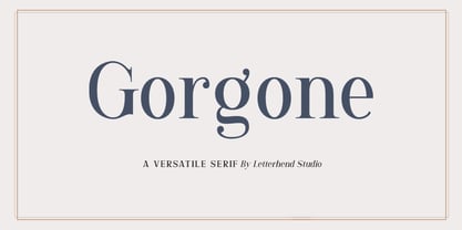 Gorgone, a versatile serif that brings the luxury feel. Gorgone is suitable for headlines, logotypes, apparel, invitations, branding, packaging, advertising and more. This typeface is comes in uppercase, lowercase, punctuations, symbols & numerals, stylistic set alternate, ligatures, and also multi-lingual support and is already PUA encoded.
 - The Outlander by Daily Studio,
$14.00 The Outlander - Design by Daily Studio This ttypeface can make your design look strong. Simple accessible on any of yor projects. Is great for headers, logos, and quotes. Comes with a full uppercase, lowercase, punctuation, and standard multilingual support. With 255 glyphs and in OTF format.
 - Plutonian by Patria Ari,
$19.00Inspiring from space aircraft theme, Plutonian was made with simple geometric shapes and come with 3 different weights. With this typeface, you can use it for logo, title, magazine cover, headline, powerpoint templates design, signs, and many more. What's included? - Uppercase Characters - Lowercase Characters - Multilingual support. - Ruberoid by Pepper Type,
$30.00 Ruberoid is a squarish geometric sans-serif family reminiscent of Italian designs of 1950s and 1960s, but featuring considerably rounder shapes to give it a more contemporary feel. The typeface comes in 9 weights with companion oblique styles and contains support for Latin, Greek, and Cyrillic scripts.
 - Tape Back by Adam Ladd,
$5.00 The Tape Back family comes in three weights. Each are monoline in weight and have a modern yet slightly quirky appearance. It is informal but has some stability with its linear forms. The slant backwards makes it unique, and it displays well even for body text.
