10,000 search results
(0.037 seconds)
- Royale Kingdom by Balpirick,
$15.00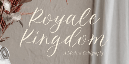 Introducing by Balpirick Studio. Royale Kingdom is a Modern Calligraphy Font that's perfect for adding a touch to your design projects! With its natural, organic feel and unique character. Crafted with care and attention to detail, this font is incredibly versatile and can be used for a range of design projects, including logos, branding, invitations, and more. Its modern, handwritten style gives it a unique character that's sure to make an impact. - also multilingual support Enjoy the font! Feel free to comment or feedback! Thank you!
 - Guerrilla Handshake by Hanoded,
$15.00 Shaking hands is quite a complicated process: do it too lightly and you appear weak, grab too hard and you’re too eager. There are also those with a ‘Guerrilla Handshake’ - grabbing your hand unexpectedly, shaking it vigorously and yanking it toward them. Guerrilla Handshake font was actually made by hand, using Chinese ink and a brush. I did use the brush vigorously, but I made sure not to shake or yank it too much! Guerrilla Handshake comes in a slightly backslanted ‘regular’ version and an italic version.
 - Skicack by upirTYPO,
$17.00Skicack is scribbled form of classic bold font. Creates nice texture when used in small sizes (especially printed), and hard heavy look in big sizes. Comes with complete Central European character set, and few additional symbols (see gallery images). Ideal for headlines, CD covers, T-shirts, clothes designs, webpages, banners, and everywhere where you need something special! As you can see on gallery image, it´s really easy to create nice background-patterns, and as it is a font, you can scale it to any size! - Salvador History by Balpirick,
$15.00 Introducing by Balpirick Studio. Salvador History is a Handbrushed Script Font that's perfect for adding touch to your design projects! With its natural, organic feel and unique character. Crafted with care and attention to detail, this font is incredibly versatile and can be used for a range of design projects, including logos, branding, invitations, and more. Its modern, handwritten style gives it a unique character that's sure to make an impact. - also multilingual support Enjoy the font! Feel free to comment or feedback! Thank you!
 - Gildersleeve by Greater Albion Typefounders,
$7.95 Gildersleeve evokes the spirit of the Arts and Crafts movement of the 1920s. Think of a hand-cut Roman display face, with loving care lavished over each serif and letterform. Gildersleeve is offerered in the classic combination of a regular face, a bold face, an italic and an italic bold. Any of them are ideal for poster or cover work, as well as for chapter and section headings in a longer document, in combination with a text face such as Vertrina or Clementhorpe Text.
 - Kula by Jadugar Design Studio,
$20.00 I am proud to introduce Kula, a fun font. It is bold with three variations: outline, shadow and blur. These 4 fonts are very pleasing to use in your poster design, giving some headings to your text and many more options to play with these set of fonts. Its unique curves with slab look is fantastic choice for your next project. Kula has been crafted with care and I tried to make this some thing special for you. I hope you will enjoy this font family!
 - Hachura by Outras Fontes,
$24.00 Hachura is a sketchy typeface designed by Ricardo Esteves. Its general proportions are based on the garalde models, with traditional roman serifs. It was initially made by hand using a drawing technique to create a font that simulates the unfinished aspect of a work in constant progress. This textured face is useful for display sizes, making a very visible presence. Because of its basic dimensions and careful distribution of black and white, it still also very readable in text sizes like 10 or 8 points.
 - Kia Ora by Something and Nothing,
$15.00 Kia ora is a M?ori-language greeting which is used as an informal greeting, equivalent to "hi" or "hello", or an expression of thanks. The koru (M?ori for loop or coil) is a spiral shape based on the appearance of a new unfurling frond. It is an integral symbol in M?ori art, carving and tattooing, where it symbolises new life, growth, strength and peace. Its shape conveys the idea of perpetual movement, while the inner coil suggests returning to the point of origin.
 - HT Neon by Dharma Type,
$19.99 HT Neon shines as if to invite us.This rounded and monoline font is very striking. But it is readable because the characters are arranged naturally when they are typed. HT Neon is great to use on your design projects such as Shop Sign,Packaging, Logotype and more.When you type the character “µ”, it becomes a electrical cord! Holiday Type Project offers retro hand drawing scripts. Inspired by retro script on shopfront lettering, wall paint advertisements in Italy around 1950s. Check out the script fonts from Holiday Type!
 - dT Delicatta by dooType,
$40.00 Easy to use, but hard to miss. That’s dT Delicatta. An elegant script face that adds a special touch to any message. Script typefaces usually come packed with endless features and, more often then not, all those possibilities take their toll on the designer or art director. With usability in mind, we kept dT Delicatta simple and straightforward to use while delivering refined shapes that enhance your or your client’s communication. dT Delicatta is a revised, improved and virtually new font of our old classic Delicatta
 - Blistering by Olivetype,
$18.00 Say hello to Blistering, a cool and versatile brush typeface that can make any design stand out. With its scratchy texture and care free feel, this font can be used for any design style or project. Whether you need an energetic typeface for logos, a hipster font for a clothing line, or a retro brush font for branding. Blistering has the personality to fit any style. So what’s included : Basic Latin Uppercase and Lowercase Numbers, symbols, and punctuations Ligatures Multilingual Support Simple Installations Works on PC & Mac
 - HT Fera Text by Hype Type,
$34.00 Transitional serif font inspired by the italian’s lettering tradition, in particular by the street sign letters you can find around Florence. All elements are designed to be elegant and easy-to-read, even in a long blocks of text. -- The HT Fera Text is freely inspired by the typographical tradition of Florence's municipality and its streets. Letters shape, contrasts, junctions, stems, teardrops, they are all the result of careful research carried out on the Dante's streets, redesigned in a contemporary mood. -- hype-type.com / kidstudio.it
 - Automoto by Device,
$39.00 Automoto is built from a limited number of curved and straight segments that have been flipped and rotated. It has an extensive set of two- and three-letter ligatures that form a triple ribbon resembling a model car racetrack. For clarity, some character combinations were excluded as they proved to be ambiguous in context. The upper- and lowercase characters can be freely intermixed according to taste.
 - Nitro Chargers by Mevstory Studio,
$25.00 Nitro Chargers an awesome sports fonts, modern cutouts, and dynamic slant. Ideal for fast car racing sports titles, running matches, cycling, automotive game logos and monograms or other modern dynamic text. Nitro Chargerscompare favorably with legibility and size, creating the effect of power and speed. Designed as a fast and dynamic font, but with a slightly different font design, check it out and grab it right away.
 - Driven Unicase Extended by Typekirk,
$12.00 Driven Unicase Extended is sleek and modern, yet hearkens back to the first advertising to catch my eye as a kid in the glorious 1970s – automobile ads that captured the thrill of speed, for sports cars I dreamed of experiencing. Driven is available in 6 individual weights or as a family of 6 fonts, plus ornaments. Includes accented characters supporting for many European languages.
 - Maranello by Mevstory Studio,
$25.00 Maranello an awesome sports fonts, modern cutouts, and dynamic slant. Ideal for fast car racing sports titles, running matches, cycling, automotive game logos and monograms or other modern dynamic text. Adegor compare favorably with legibility and size, creating the effect of power and speed. Designed as a fast and dynamic font, but with a slightly different font design, check it out and grab it right away.
 - Flick by Trequartista Studio,
$25.00 Flick an awesome sports fonts, modern cutouts, and dynamic slant. Ideal for fast car racing sports titles, running matches, cycling, automotive game logos and monograms or other modern dynamic text. Flick compare favorably with legibility and size, creating the effect of power and speed. Designed as a fast and dynamic font, but with a slightly different font design, check it out and grab it right away.
 - Overspray - Personal use only

- PF DIN Text by Parachute,
$79.00 The purpose of the original DIN 1451 standard was to lay down a style of lettering which is timeless and easily legible. Unfortunately, these early letters lacked elegance and were not properly designed for typographic applications. Ever since its first publication in the 1930’s, several type foundries adopted the original designs for digital photocomposition. By early 2000, it became apparent that the existing DIN-based fonts did not fulfil the ever-increasing demand for a diverse set of weights and additional support for non-Latin languages. Parachute® was set out to fill this gap by introducing the PF DIN series which has become ever since the most comprehensive and sophisticated set of DIN typefaces. It was based on the original standards but was specifically designed to fit typographic requirements. Its letterforms divert from the stiff geometric structure of the original and introduce instead elements which are familiar, softer and easier to read. The first set of fonts was completed in 2002 as a group of 3 families which included condensed and compressed versions. With its vast array of weights, the extended language support, but most of all its meticulous and elaborate design, it has proved itself valuable to numerous design agencies around the world. Ever since its first release, it has been used in diverse editorials, packaging, branding and advertising campaigns as well as a great number of websites. It was quoted by Publish magazine as being “an overkill series for complex corporate identity projects”. The whole PF DIN Text type system (with normal, condensed and compressed styles) includes 45 weights from Hairline to Extra Black including true-italics. Additionally, every font in the Pro series is powered by 270 very useful symbols for packaging, environmental graphics, signage, transportation, computing, fabric care. There are 2 versions to choose from: The PRO version is the most powerful. All weights support Latin, Cyrillic, Greek, Central/Eastern European, Romanian, Baltic and Turkish, with 20 advanced opentype features including small caps. The standard STD version is more economic. All weights support Latin, Central/Eastern European, Romanian, Baltic and Turkish, with 18 advanced opentype features including small caps. In 2010 Parachute® released 4 new families DIN Monospace, DIN Stencil, DIN Text Arabic and DIN Text Universal. All these are complemented by the popular DIN Display version. Altogether the Parachute DIN series is a set of 8 superfamilies with a total of 96 weights.
 - Boldini by Luxfont,
$18.00 Introducing the unique family of COLORED fonts "Boldini" with minimalistic clean letters of a harmonious form in the style of modern POP culture. You no longer need to adjust the gradient for each letter, letters are immediately printed in gradient! Gradient fonts is perfect for headlines for fashion websites, magazines, and print design, and the basic solid font is suitable for branding boutique signs as well as for large amounts of text, because the font is very readable in a small size. Font family has two thicknesses - bold & regular, 6 gradient directions, gradient fonts also 2 type - with transparency and without transparency, as well as 2 basic monochrome fonts. Font consists of letters of the same height without division into uppercase and lowercase glyphs. *See also these fonts, which based on this family: Culoare & Anaglyph. Which means that if necessary you can combine these families and they will be absolutely stylistically identical and complement each other. Check the quality before purchasing and try the FREE DEMO version of the font to make sure your software supports color fonts. Features: Such color combinations in gradients are universal and very convenient for repainting. IMPORTANT: - OTF SVG fonts contain vector letters with gradients and transparency. - Multicolor OTF version of this font will show up only in apps that are compatible with color fonts, like Adobe Photoshop CC 2017.0.1 and above, Illustrator CC 2018. Learn more about color fonts & their support in third-party apps on www.colorfonts.wtf - Don't worry about what you see all fonts in black and not in multicolor in the tab “Individual Styles” - all fonts are working and have passed technical inspection, but not displayed in multicolor they, just because the website MyFonts is not yet able to show a preview of colored fonts. Then if you have software with support colored fonts - you can be sure that after installing fonts into the system you will be able to use them like every other classic font. Question/answer: How to install a font? The procedure for installing the font in the system has not changed. Install the font as you would install the classic OTF | TTF fonts. How can I change the font color to my color? · Adobe Illustrator: Convert text to outline and easily change color to your taste as if you were repainting a simple vector shape. · Adobe Photoshop: You can easily repaint text layer with Layer effects and color overlay. Try to experiment, it is so interesting and very easy! ld.luxfont@gmail.com
 - We The People by K-Type,
$20.00 This typeface is extrapolated from the ‘We the People’ calligraphy of the handwritten US Constitution Preamble which employed a style based on German Text and Square Text exemplars from George Bickham’s penmanship copy-books, the most celebrated being The Universal Penman published in 1743. The original Constitution document was transcribed onto parchment by Jacob Shallus, a Pennsylvania Assistant Clerk, over a weekend in 1787. Shallus’s biographer, Arthur Plotnik (The Man Behind the Quill, 1987), notes that he was paid $30, a modest monthly wage at the time. He also suggests that the calligraphic headings, ‘We the People’ and ‘Article’, may have been inserted by Shallus’s 14 year old trainee son, Francis, “The manner in which the ‘Article’ headings are squeezed into the space Shallus allowed for them suggests a second hand—and perhaps not a very experienced one.” The unconventional backslant of the headings would seem to support this contention, and at the end of the document there is perhaps a novice’s inconsistency in the structure of the letter n between that used for ‘done’ and those used for ‘In Witness’. However, one has to admire the elegant swagger of the wavy t, h and l which the K-Type font extends to the b, f and k. Also, the simpler, Schwabacher-style W, an enlarged version of the lowercase w, is a little less flamboyant than the capital W from the German and Square texts in Bickham’s manuals. For designers using OpenType-aware applications, the typeface includes some Alternates, including a Bickham-style W, the letters t, h and n with added flourishes, two simpler forms of the A, and a few roman numerals for numbering articles. Also some ornamental flourishes and a round middle dot/decimal point. Punctuation marks are drawn in square, calligraphic style, but an alternative round period/full stop, for use with currency and numerals, is available at the period centered position (though placed on the baseline), accessed by Shift Option 9 on a Mac, or Alt 0183 on Windows. The full phrase, ‘We the People’, has been placed at the trademark keystroke and can be accessed by Option 2 (or Shift Option 2) on a Mac, or Alt 0153 on Windows. For designers who find the backslant awkward or unpleasant, the licensed typeface also includes two additional fonts which have a vertical aspect that may be more conducive to graphic design layouts. ‘We The People Upright’ and ‘We The People Upright Bold’ both retain the distinctive style, and the heavier weight is only slightly emboldened, just enough to add some punch.
 - TT Norms Pro by TypeType,
$39.00 Introducing TT Norms® Pro, version 3.200! The updated font now supports more languages and boasts a larger character set. These implementations have made the typeface even more advanced and convenient. TT Norms® Pro is a functional geometric sans serif for aesthetic design choices and TypeType studio's bestseller. It has been a massive success since its release, and rightfully so! This stylish, elegant, and versatile font will become the full-fledged core of your collection. TT Norms® Pro is ideally suited for products in any domain: streaming services, banking, clothing brands, or the automotive industry. It's equally convenient to use in both web and printing. Now, the TT Norms® Pro typeface includes the most extensive font package, both in terms of font styles and character sets. The base version of TT Norms® Pro consists of 22 fully redesigned font styles and 4 additional subfamilies. Besides, this font boasts the most comprehensive language support in the TypeType collection. We've added the characters of extended Cyrillic and Latin writing systems to the updated TT Norms® Pro and configured the new languages support. The character set has become more extensive—we've added currency symbols with their minuscule version and minuscule mathematical symbols. The 3.200 version of TT Norms® Pro includes: 44 roman font styles, 44 italics, and 2 variable fonts; 7 roman and 7 italic font styles in TT Norms® Pro Mono; 2 variable fonts: TT Norms® Pro Variable with three parameters of variation (weight, width, and slant) and TT Norms® Pro Mono Variable with weight and slope axes of variation; 1993 characters in each font style, including an extended set of punctuation marks, symbols, and currencies; 5 widths: TT Norms® Pro with classic proportions, monospaced TT Norms® Pro Mono, narrower-proportioned TT Norms® Pro Compact and TT Norms® Pro Condensed, and wider TT Norms® Pro Expanded; 38 OpenType features, including a large number of ligatures, fractions, numerators, and denominators; 17 stylistic sets; - 280+ languages support, counting in new symbols for French, Norwegian, Bulgarian, Uzbek, Abkhaz, and more; Flawless kerning and manual TrueType hinting. TT Norms® Pro has already become the signature font of Intercom, Inc., Sartorius AG, CSN, CBSN, Shieldex, and many other global brands. Customization is available for TT Norms® Pro upon request—we adjust the font to suit your project. Learn more about customization options in the corresponding website section. In addition to the TT Norms® Pro, we've designed the TT Norms® Pro Serif typeface. These fonts complement each other perfectly, making an ideal typeface pair.
 - Silver Streak by Swell Type,
$20.00 Inspired by the streamlined lettering of trains, cars and advertisements from the 1930s and 1940s, Silver Streak is a font family that combines Art Deco elegance with refined craftsmanship and modern features. Silver Streak's contrasting strokes and tastefully rounded corners conjure an era of refined, vintage elegance. An extravagant palette of 25 weights — from gracefully tall and thin to commandingly wide and heavy, along with a variable font for unlimited options between — provide unforgettable branding possibilities for luxury items ranging from jewelry, clothing and perfume to the sleek badges of high performance sports cars. Features: Five widths from Compressed to Extended Each with five weights from Light to Heavy Complete family includes a Variable font for precise control of weight and width Support for 223 languages, including Western & Central Europe, Russian Cyrillic, Serbian/Macedonian, Ukranian and Vietnamese Alternate hook-cornered capitals (accessible as Opentype Discretionary Ligatures) Alternate round-topped A in two versions, each with international accents (accessible as Stylistic Alternates)
 - Headlight Blue by Kitchen Table Type Foundry,
$16.00 Several roads have been closed around my village, so I need to drive alongside narrow country roads ro get my groceries done. The roads are so narrow that two cars cannot pass, so you need to use the (muddy) kerbs. A lot of cars these days have Xenon lights and they shine really bright and blue. I am non xenon-phobic, but I can tell you that the ‘old’ yellowish headlight were softer on the eyes, especially when you’re trying to navigate narrow country roads! Yes, I know, a long story leading nowhere, but a little personal story (in my opinion) is better than a boring text full of technical bla bla. A font is a font after all and I don’t need to explain what it looks like, because you can see that for yourself! Headlight Blue is a handmade, all caps display font. It comes with all the trimmings, including two sets of alternates that cycle as you type.
 - Oh, if fonts could talk, Growing Script by Nuryanto Dwi would be the charming, smooth-talking poet at the party, captivating everyone with its elegant flourishes and oh-so-expressive curves. Released...
- The DecadentaFrax font, designed by the renowned typographer Manfred Klein, embodies a unique amalgamation of creativity and intricate design principles that vividly display Klein's penchant for inno...
- Prismatic Spirals by MMC-TypEngine,
$93.00 PRISMATIC SPIRALS FONT! The Prismatic Spirals Font is a decorative type-system and ‘Assembling Game’, itself. Settled in squared pieces modules or tiles, embedded by unprecedented Intertwined Prismatic Structures Design, or intricate interlaced bars that may seem quite “impossible” to shape. Although it originated from the ‘Penrose Square’, it may not look totally as an Impossible Figures Type of Optical Illusions. More an “improbable” Effect in its intertwined Design, that even static can seem like a source of Kinetical Sculptures, or drive eyes into a kind of hypnosis. Prismatic Spirals has two related families, its “bold” braided version Prismatic Interlaces and the Pro version. While the default is simpler or easier to use, as all piece’s spin in same way, PRO provides a more complex intricate Design which requires typing alternating caps. Instructions: Use the Map Font Reference PDF as a guide to learn the 'tiles' position on the keyboard, then easily type and compose puzzle designs with this font! All alphanumeric keys are intuitive or easy to induce, you may easily memorize it all! Plus, often also need to consult it! *Find the Prismatic Spirals Font Map Reference Interactive PDF Here! (!) Is recommended to Print it to have the Reference in handy or just open the PDF while composing a design with this typeface to also copy and paste, when consulting is required or when it may be difficult to access, depending on the keyboard script or language. As a Tiles Type-System, the line gap space value is 0, this means that tiles line gaps are invisibly grouted, so the user can compose designs, row by row, descending to each following row by clicking Enter, same as line break, while advances on assembling characters. Background History: The first sketches of my Prismatic Knots or Spirals Designs dates back then from 2010, while started developing hand-drawn Celtic Knots and Geometric Drawings in grid paper, while engage to Typography, Sacred Geometry and the “Impossible Figures” genre… I started doing modulation tests from 2013, until around 2018, I got to unravel it in square modules or tiles from the grid, then idealized it as fonts, along with other Type projects. This took 13 years to come out since the first sketches and 6 months in edition. During the production process some additional tiles or missing pieces were thought of and added to the basic set, which firstly had only the borders, corners, crossings, nets, Trivets connectors or T parts and ends, then added with nets and borders integrations. Usage Suggestions: This type-system enables the user to ornate and generate endless decorative patterns, borders, labyrinthine designs, Mosaics, motifs, etc. It can seem just like a puzzle, but a much greater tool instead for higher purposes as to compose Enigmas and use seriously. As like also to write Real Text by assembling the key characters or pieces, this way you can literarily reproduce any Pixel Design or font to its Prismatic Spirals correspondent form, as Kufic Arabic script and further languages and compose messages easily… This Typeface was made to be contemplated, applied, and manufactured on Infinite Decorative Designs as Pavements, Tapestry, Frames, Prints, Fabrics, Bookplates, Coloring Books, Cards, covers or architectonic frontispieces, storefronts, and Jewelry, for example. Usage Tips: Notice that the line-height must be fixed to 100% or 1,0. In some cases, as on Microsoft Word for example, the line-height default is set to 1,15. So you’ll need to change to 1,0 plus remove space after paragraph, in the same dropdown menu on Paragraph section. Considering Word files too, since the text used for mapping the Designs, won't make any literal orthographical sense, the user must select to ignore the Spellcheck underlined in red, by clicking over each misspelled error or in revision, so it can be better appreciated. Also unfolding environments as Adobe Software’s, the Designer will use the character menu to set body size and line gap to same value, as a calculator to fit a layout for example of 1,000 pts high with 9 tiles high, both body size and line gap will be 111.1111 pts. Further Tips: Whenever an architect picks this decorative system to design pavements floor or walls, a printed instruction version of the layout using the ‘map’ font may be helpful and required to the masons that will lay the tiles, to place the pieces and its directions in the right way. Regarding to export PNGs images in Software’s for layered Typesetting as Adobe Illustrator a final procedure may be required, once the designs are done and can be backup it, expanding and applying merge filter, will remove a few possible line glitches and be perfected. Technical Specifications: With 8 styles and 4 subfamilies with 2 complementary weights each (Regular and Bold) therefore, Original Contour, Filled, Decor, with reticle’s decorations and 2 Map fonts with key captions. *All fonts match perfectly when central pasted for layered typesetting. All fonts have 106 glyphs, in which 48 are different keys repeated twice in both caps and shift, plus few more that were repeated for facilitating. It was settled this way in order for exchanging with Prismatic Spirals Pro font which has 96 different keys or 2 versions of each. Concerning tiles manufacturing and Printed Products as stickers or Stencils, any of its repeated pieces was measured and just rotated in different directions in each key, so when sided by other pieces in any direction will fit perfectly without mispatching errors. Copyright Disclaimer: The Font Software’s are protected by Copyright and its licenses grant the user the right to design, apply contours, plus print and manufacture in flat 2D planes only. In case of the advent of the same structures and set of pieces built in 3D Solid form, Font licenses will not be valid or authorized for casting it. © 2023 André T. A. Corrêa “Dr. Andréground” & MMC-TypEngine.
 - Prismatic Interlaces by MMC-TypEngine,
$93.00 PRISMATIC INTERLACES TYPEFACE! Prismatic Interlaces is a decorative system and ‘Assembling Game’, itself. Settled in squared pieces modules or tiles, embedded by unprecedented Intertwined Prismatic Structures Design, or intricate interlaced bars that may seem quite “impossible” to shape. Although it originated from the ‘Penrose Square’, it may not look totally as an Impossible Figures Type of Optical Illusions. More an “improbable” Effect in its intertwined Design, that even static can seem like a source of Kinetical Sculptures, or drive eyes into a kind of hypnosis. Prismatic Interlaces has two related families, both as a kind of lighter weight versions Prismatic Spirals Default & Pro. While Default is simpler or easier to use, same way as Prismatic Interlaces, Pro provides a more complex intricate Design that requires typing alternating caps. Instructions: Use the Map Font Reference PDF as a guide to learn the 'tiles' position on the keyboard, then easily type and compose puzzle designs with this font! All alphanumeric keys are intuitive or easy to induce, you may easily memorize it all! Plus, often also need to consult it! *Find the Prismatic Interlaces Font Map Reference Interactive PDF Here! (!) Is recommended to Print it to have the Reference in handy or just open the PDF while composing a design with this typeface to also copy and paste, when consulting is required or when it may be difficult to access, depending on the keyboard script or language. As a Tiles Type-System, the line gap space value is 0, this means that tiles line gaps are invisibly grouted, so the user can compose designs, row by row, descending to each following row by clicking Enter, same as line break, while advances on assembling characters. Background History: The first sketches of my Prismatic Knots or Spirals Designs dates back then from 2010, while started developing hand-drawn Celtic Knots and Geometric Drawings in grid paper, while engage to Typography, Sacred Geometry and the “Impossible Figures” genre… I started doing modulation tests from 2013, until around 2018, I got to unravel it in square modules or tiles from the grid, then idealized it as fonts, along with other Type projects. This took 13 years to come out since the first sketches and 6 months in edition. During the production process some additional tiles or missing pieces were thought of and added to the basic set, which firstly had only the borders, corners, crossings, nets, Trivets connectors or T parts and ends, then added with nets and borders integrations. Usage Suggestions: This type-system enables the user to ornate and generate endless decorative patterns, borders, labyrinthine designs, Mosaics, motifs, etc. It can seem just like a puzzle, but a much greater tool instead for higher purposes as to compose Enigmas and use seriously. As like also to write Real Text by assembling the key characters or pieces, this way you can literarily reproduce any Pixel Design or font to its Prismatic Spirals correspondent form, as Kufic Arabic script and further languages and compose messages easily… This Typeface was made to be contemplated, applied, and manufactured on Infinite Decorative Designs as Pavements, Tapestry, Frames, Prints, Fabrics, Bookplates, Coloring Books, Cards, covers or architectonic frontispieces, storefronts, and Jewelry, for example. Usage Tips: Notice that the line-height must be fixed to 100% or 1,0. In some cases, as on Microsoft Word for example, the line-height default is set to 1,15. So you’ll need to change to 1,0 plus remove space after paragraph, in the same dropdown menu on Paragraph section. Considering Word files too, since the text used for mapping the Designs, won't make any literal orthographical sense, the user must select to ignore the Spellcheck underlined in red, by clicking over each misspelled error or in revision, so it can be better appreciated. Also unfolding environments as Adobe Software’s, the Designer will use the character menu to set body size and line gap to same value, as a calculator to fit a layout for example of 1,000 pts high with 9 tiles high, both body size and line gap will be 111.1111 pts. Further Tips: Whenever an architect picks this decorative system to design pavements floor or walls, a printed instruction version of the layout using the ‘map’ font may be helpful and required to the masons that will lay the tiles, to place the pieces and its directions in the right way. Regarding to export PNGs images in Software’s for layered Typesetting as Adobe Illustrator a final procedure may be required, once the designs are done and can be backup it, expanding and applying merge filter, will remove a few possible line glitches and be perfected. Technical Specifications: With 8 styles and 4 subfamilies with 2 complementary weights each (Regular and Bold) therefore, Original Contour, Filled, Decor, with reticle’s decorations and 2 Map fonts with key captions. *All fonts match perfectly when central pasted for layered typesetting. All fonts have 106 glyphs, in which 49 are different keys repeated twice in both caps and shift, plus few more that were repeated for facilitating. It was settled this way in order for exchanging with Prismatic Spirals Pro font which has 96 different keys or 2 versions of each. Concerning tiles manufacturing and Printed Products as stickers or Stencils, any of its repeated pieces was measured and just rotated in different directions in each key, so when sided by other pieces in any direction will fit perfectly without mispatching errors. Copyright Disclaimer: The Font Software’s are protected by Copyright and its licenses grant the user the right to design, apply contours, plus print and manufacture in flat 2D planes only. In case of the advent of the same structures and set of pieces built in 3D Solid form, Font licenses will not be valid or authorized for casting it. © 2023 André T. A. Corrêa “Dr. Andréground” & MMC-TypEngine.
 - FF Kaytek Rounded by FontFont,
$50.99 Kaytek™ Rounded completes the Kaytek typeface family with seven carefully rounded weights. Every style of the typeface takes up exactly the same amount of space, thanks to the careful creation by Radek Łukasiewicz. This means designers can switch between styles without the text being reflowed, making it particularly useful in magazines, where space might be limited, and also on the internet, where hover links appear in a different style. Kaytek Rounded comes in seven weights, from Thin to Black. It pairs also with Kaytek Sans, Kaytek Slab, and Kaytek Headline.
 - Antique Spenserian by Dharma Type,
$24.99 This antique script is based on Spencerian script released from MacKellar, Smiths, & Jordan in the 19th century. This family comes in two varieties, Standard and ornamented capitals. The Standard has orthodox style for formal text and display. This makes it possible you to use this style for any projects. The unique Ornamented is suitable for eye-catching part of your project: headlines, wedding invitations and logo. Every glyphs were added antique and distressed effect by hand work with great care to be looked like natural. Use your ideas to enjoy this exclusive script.
 - PR Viking by PR Fonts,
$20.00 This typeface is inspired by the angular shapes of runes; the early writing of Northern European peoples. The letters have been given an eroded finish, as though they were carefully carved a thousand years ago, and weathered over time. This font includes at least two versions of every letter one simple, one more ornate, with all alternate characters for other European languages. The Alternates Font includes additional variations of some characters as well as Ligatures, astrological and elemental symbols. More Nordic symbols are available in the Valknut font.
 - Peanut Square Layer by PizzaDude.dk,
$19.00 This is a font that will fit in the "hard to read section" because it may not be super legible at first sight - that is because of the negative space. But when you combine the two layers (Layer and Box) the letter suddenly appears very legible! Play around with your favourite colour palette while adjusting the transparency in order for the colours to blend, giving a really nice handcrafted look! You have 4 different versions of each letter to play around with and of course there is multilingual support!
 - Dancing Matilda by Balpirick,
$15.00 Introducing by Balpirick Studio. Dancing Matilda is a Modern Handwritten Script Font that's perfect for adding a personal touch to your design projects! With its natural, organic feel and unique character. Crafted with care and attention to detail, this font is incredibly versatile and can be used for a range of design projects, including logos, branding, invitations, and more. Its modern, handwritten style gives it a unique character that's sure to make an impact. - also multilingual support Enjoy the font! Feel free to comment or feedback! Thank you!
 - Architype Albers by The Foundry,
$50.00 Architype Konstrukt is a collection of avant-garde typefaces deriving mainly from the work of artists/designers of the inter-war years, whose ideals have helped to shape the design philosophies of the modernist movement in Europe. Due to their experimental nature character sets may be limited. Architype Albers draws on early grid-based attempts by Josef Albers, in 1926, to design an alphabet by reducing the forms to purely geometric elements – the square, triangle and parts of a circle – and in the process creating an unusual stencil effect typeface.
 - Klip Klop by Samuelstype,
$24.00 Designed by Hans Samuelson in 2023. With two weights and many variations Klip Klop offers a large set of characters for playful lettering. The flavouring is strong avant garde and the build is strict geometrical with even stroke thickness throughout. One unusual feature is that the bottom and top horizontal strokes are centered on the baseline and capital height. This renders the same optical size between the thin and the medium but different actual heights and baselines. Use it for Headlines or signage in any medium! Klip Klop!
 - Delicious Pro by Yes Please,
$45.00 Delicious Pro from Yes Please is a bold, contemporary take on the classic Americana script. Inspired by the vibrant history of early 20th Century American packaging vernaculars, Delicious Pro delivers unique flavor packed with gestural personality perfect for headlines, packaging and more! Delicious Pro features conventional ligatures, a standard set of accents and symbols, and a full set of extended custom styling ligatures to provide a versatile end-user experience. Delicious Pro has played hard for Nike Women's Training, Nike Sportswear, IFC and more. Delicious Pro is designed by Lee Schulz.
 - Architype Van Doesburg by The Foundry,
$99.00 Architype Konstrukt is a collection of avant-garde typefaces deriving mainly from the work of artists/designers of the inter-war years, whose ideals have helped to shape the design philosophies of the modernist movement in Europe. Due to their experimental nature character sets may be limited. Architype Van Doesburg derives from the 1919 experimental geometric alphabet by Theo van Doesburg, whose work was heavily influenced by De Stijl theories, specifically rectangularity. The typeface has been constructed on the same 5 x 5 grid, and is limited by his ‘single alphabet’ theory.
 - Chokey Pro by AVP,
$45.00 Chokey Pro is a richly featured, multi-language, joined handwriting script with a host of uses. Derived from La Carte, Chokey Pro works well wherever a sense of informality and spontaneity is required. Use it for menus and wine lists, newsletters, recipes - even poetry. The idea was to create a stylish but legible script that would handle fairly sizeable chunks of copy. With 500 alternative letters (including over 100 combinations), a full range of small caps, superior characters and number variants, Chokey Pro will meet the demands of even the most sophisticated texts.
 - Radar by Type-Ø-Tones,
$60.00 Radar is a revival of the sans serif typeface “Grotesca Radio”, from the Spanish foundry Richard Gans, which existed from 1888 to 1975. His authorship is attributed to the German type designer and master punchcutter Carl Winkow. Although the new version of this font has always tried to keep accurate similarities with the original typeface, Radar is not intended as a strict revival, but as a contemporary interpretation. In this new version the user can find some alternate characters that give the typeface a more art-déco or neutral flair.
 - Core Bandi by S-Core,
$59.00 Core Bandi is a grunge 3D font supported by equivalent ‘flat’ styles named Core Bandi Face. This typeface is very cute and has rhythmic flow line, but not distracted. And you can easily make various color combination with CoreBandi & CoreBandi Face. Its really hard to find doodled 3D Korean(Hangul) fonts even in Korea because Hangul has as many as 11,172 characters. Supported codepages are MS Windows 1252 Latin1 and MS Windows 949 Korean consisting of 11,172 Korean letters and Symbols except Chinese. We recommend to use for books, magazines and posters.
