8,391 search results
(0.106 seconds)
- Iridium by Linotype,
$29.99Iridium™ was designed by Adrian Frutiger in 1972 for Linotype. It is in the modern" style like Bodoni or Didot, in that it has the sparkle created by a high thick/thin contrast and a symmetrical distribution of weight. But the sometimes harsh and rigid texture of the modern style is tempered by Frutiger's graceful interpretation. Iridium itself is a very hard, brittle and strong metal; yet the Latin and Greek roots of the word mean rainbow, or iridescence. And indeed, this font is infused with a more lustrous and complex spirit than the average rather stark modern typeface - note the stems that gently taper from waist to serif, the nicely curved ovals of the round characters, and the slight bracketing of the serifs. Iridium was originally designed for phototypesetting, and Frutiger himself cut the final master photo-mask films by hand. This digital version has all the craftsmanship of that original and includes the roman, a true italic, and the bold weight. Iridium works particularly well for book and magazine text and headlines." - Aeolus Pro by DBSV,
$50.00 Aeolus Pro is a second attempt at writing a monoline style. Completed after many design transformations. And here (as in KhamaiPro) attempted to provide a different visual design with style as Staccato: (dashed line) Rail: (double line) Tribe: (triple line) and finally a New style Shadow. Also (Bold, BoldItalic) has the advantage of involving between styles… (Rail, RailItalic, Tribe, TribeItalic, Shadow and ShadowItalic) for example: …you have a text frame with some text or one word or one letter with Bold or BoldItalic style with e.g. (color blue), if you duplicate the text frame or duplicate the Layer (as is, without shifting position - text) and you make changes ONLY (the Style* and color of text) in second text frame, would have the effect of filling the gap at the following styles... *(Rail, RailItalic, Tribe, TribeItalic, Shadow and ShadowItalic) you can see the presentation of the photo “Multiplex”. This series of 20 fonts with 624 glyphs each is composed and includes true italics and supports Latin, Greek and Cyrillic.
 - Jamie Handwriting by Mans Greback,
$49.00 Jamie Handwriting is a charming hand-script font. Its contextual and stylistic alternates makes for a typography indistinguishable from a true handwritten text. Jamie Handwriting's cute and quirky lettering fits any project or contexts that requite that extra bit of genuineness and life. It is wild and funny to look at, and its quick movements emits a happy optimism. The family consists of ten high-quality styles: The weights Thin, Light, Medium, Bold, Black as well as each style as Regular and Alternate. The different thicknesses ensures it will work in any size, and the Alt style prevents any repeating characters. Jamie Handwriting is built with advanced OpenType functionality and has a guaranteed top-notch quality, containing stylistic and contextual alternates, ligatures and more features; all to give you full control and customizability. It has extensive lingual support, covering all Latin-based languages, from North Europe to South Africa, from America to South-East Asia. It contains all characters and symbols you'll ever need, including all punctuation and numbers.
 - Bohemia by Linotype,
$29.99Argentinean designer Eduardo Manso created the Bohemia type family in 2003. Bohemia's cunning and elegant essence shows off refined letters that evoke the Transitional style typefaces like Baskerville, though most Baskerville-like designs tend not to be as curvaceous as Manso's! True to form, Bohemia shines in smaller text sizes, like 9 point and above, while still maintaining a unique character and spirit. Bohemia is a great alternative to better-known text faces. The critics have been raving. Bohemia came to Linotype via its fourth International Type Design Contest (ITDC) [Link] in 2003, where it received one of the three top awards. Under the name Argot, this typeface received a Certificate of Excellence in Type Design from the Type Directors Club of New York in 2004. Bohemia was also selected for inclusion in the 21st International Biennale of Graphic Design 2004 in Brno, Czech Republic, and was later named one of the most relevant works in the Bienal Letras Latinas 2004 exhibition, which traveled through Buenos Aires, San Paolo, Santiago, and Vera Cruz." - Antica by Sudtipos,
$39.00 Antica has sharp triangular serifs, and in 8 weights with true italics, it forms a family that stylistically finds its origins in Latin styles of the nineteenth century. The font incorporates additional swashes, small caps and stylish alternates that advance the aesthetic from its roots and make it appropriate for modern design. Commonly named ‘Latin types’ did not vary in weight, but we decided to create Antica with a range that goes from thin to black and we also added extra curlicues to the letterforms. Antica borrows from the versatility and freedom granted to type founders of the nineteenth century – a time when the meteoric growth of mass-produced consumer goods led to an increased demand for publicity that needed fresh, attention grabbing typefaces. And as an homage to these Latin types we designed Antica to function well with an array of projects from stylized labels and formal editorial design requiring small type sizes to large-scale posters and billboards. The Antica family supports a wide variety of Latin alphabet-based languages.
 - Langston by Type Innovations,
$39.00 Langston is an original design by Alex Kaczun. It’s part of a series of lettering experiments, manipulating body proportions, characteristic elements and spacing to achieve some dramatic visual effects. It is hard to characterize if Langston is an outline or inline font. The outline has the same thickness and proportions as the stems. And the inter-letter spacing is also visually similar. This creates a dynamic and interesting visual harmony throughout. Furthermore, certain design elements like the accents and punctuation symbols, break with the outline treatment, and morph into an interesting play between inline and outline. The overall effect is stunning and mesmerizing. Langston is a display font not intended for text use. It was designed specifically for display headlines, logotype, branding and similar applications.This attractive display comes in roman with lower case and lining figures.The font is also available with true small capitals and old style figures. A special version was created with decorative initial capitals to further enhance the possibilities. The large Pro font character set supports most Central European and many Eastern European languages.
 - Liesel by Magpie Paper Works,
$26.00 What happens when historical calligraphy and modern lettering kiss? Liesel! This six-font, hand-lettered family is loosely based on traditional letterforms. Used alone, Liesel Regular reflects a warm, antique aesthetic. But when you pair her with Brush, Pencil, and Shadow - all of which were designed for layering - a modern, artistic look emerges! Experiment with textures, overlays and blending modes to create realistic water colored text. Both Liesel Printed & Liesel Shadow Printed are highly detailed, distressed versions of their solid counterparts, and can be layered to recreate an authentic letterpress or screen printed effect. Opentype features programmed into each text font include contextual alternates, stylistic alternates, swashes, true fractions, and old style numerals. Each Liesel font features PUA coding so all characters, including swashes and alternates, can be accessed with Character Viewer (Mac), Character Map (PC) or PopChar. For more information, including a complete PUA code listing, please review our user guide. We recommend pairing Liesel with Quimbly. Please note: because its outlines are complex & highly detailed, Liesel Printed and Liesel Printed Shadow may process slowly in some applications.
 - Othuf by Twinletter,
$13.00 Introducing “Othuf Font” – Where Handwriting Meets Elegance. Othuf Font is the epitome of handwritten elegance. With its captivating handwriting theme, this font is your key to adding a touch of sophistication and authenticity to your creative projects. Whether you’re designing invitations, posters, or branding materials, Othuf Font effortlessly grabs attention and infuses your designs with the charm of true handwriting. Crafted with meticulous detail, Othuf Font exudes the timeless beauty and grace of handwritten script, forging an immediate connection with your audience. Its versatility knows no bounds, making it a perfect fit for various applications, from wedding stationery to logo design. Othuf Font enhances readability and style with its graceful strokes and flowing lines, providing a natural and appealing look to your text. It also offers support for multiple languages, ensuring that it resonates with a global audience. Elevate your creative projects with the classic elegance of Othuf Font. Explore this exceptional typeface today and let your designs exude the beauty of authentic handwriting. – PUA Encoded Characters – Fully accessible without additional design software.
 - Bolgica by Soerat Company,
$25.00 Bolgica is a Neo-grotesque slab serif inspired by the slab serifs of the 1800’s century. By combining modern elements in several letter characters, the Bolgica family is very suitable for various design needs such as advertising, packaging, logos, editorial and publishing, branding and other creative industries. The family has 9 weights, as well as the matching true italics forms, provides typographical support with features such as ligatures, alternate characters, case-sensitive forms, fractions, and super and subscript characters. It comes with a complete range of figure set options – old style and lining figures, each in tabular and proportional widths. With over 752 glyphs per style, Elioth supports around 150+ languages in Latin and Cyrillic script. Family overview: 9 weights (from Thin to Heavy) + italics Extended Latin Cyrillic 726 glyphs Variable Font 150+ languages OpenType Features: Localized Forms Subscript and scientific inferiors Superscript (Superiors) Numerators and Denominators Fractions Lining Figures Tabular Figures Oldstyle Figures Circled Number Case-Sensitive Forms Standard and Discretionary Ligatures Stylistic Alternates Contextual Alternates
 - Habana Deco ML by HiH,
$12.00 Habana Deco ML was inspired by a hand-lettered sign on the stucco exterior of a small pharmacy in modern-day city of Havana, Cuba. It, in turn, was based on the fat-faced Art Deco lettering of the late 20s and early 30s, especially the Futurismo posters out of Italy, as well as alphabets designed in The Netherlands, France, USA and even the Soviet Union. There are 24 stylistic alternate glyphs (SALT), many inspired by a variety of these sources, including a couple from the sign in the front of the Congress Hotel in South Beach, Miami. The others features of the Habana Deco include 363 glyphs, 184 kerning pairs (KERN), 14 ornaments and shapes (ORNM) and 15 discretionary ligatures (DLIG). This is a font with which you can have fun. The zip package includes two versions of the font at no extra charge. There is an OTF version which is in Open PS (Post Script Type 1) format and a TTF version which is in Open TT (True Type)format. Use whichever works best for your applications.
 - Glorisa by Black Studio,
$18.00 Glorisa is a new elegant serif font that will add a touch of luxury and style to your projects. This is a very versatile font that works well in large and small sizes. Perfect for editorial projects, magazine headers, Logo designs, Clothing Branding, product packaging, and showcasing masculine and feminine qualities. Glorisa is equipped with uppercase, lowercase, numbers and full punctuation + Multi language support and PUA-encode. To activate the OpenType Stylistic alternative, you need a program that supports OpenType features such as Adobe Illustrator CS, Adobe Indesign & CorelDraw X6-X7, Microsoft Word 2010 or a later version. Features: 3 Font weight Uppercase & lowercase letters Alternative & Ligature Styles Numbers & Punctuation Characters with accents Supports Multiple Languages This type of family has become a work of true love, making it as easy and enjoyable as possible. I really hope you enjoy it! I can't wait to see what you do with Glorisa! Feel free to use #Black Studio tags and #Glorisa Serif fonts to show what you've been up to.
 - Oman by Par Défaut,
$35.00 With five weights and four contrasts, all grouped in three version : sans-serif, slab, serif and all this doubled by a true italic, Oman regroup 120 different styles declined in four variables. Perfect from headlines to text, Oman will meet your needs with a many languages to support (Latin pro, Cyrillic), 14 OpenType features (Fraction, Numerator, Denominator, Tabular figure, Oldstyle figure, Small capital, Small capital from capital, Ordinal, Stylistic set, Case sensitive, Discretionary ligature, Contextual alternate and All access alternate). • Numerator and Denominator includes numerals and currency • Tabular Figure includes : numerals, currency, OldStyle numerals, small capital numerals, small capital currency. • Small Capital features includes the Latin & Cyrillic alphabet with the accents. • Ordinal feature includes the Latin & Cyrillic alphabet. • Two Stylistic set for “a” & “g” includes accents. • Discretionary Ligature includes “AE”, “AÉ”, “IJ”,“OE”, available in lowercase, small capital and ordinal. • Contextual Alternate includes ligatures for arrows : <-->^|v|<->v^|. Add n, d or +, for numerator, denominator or case arrows. All Case sensitive characters become after the uppercase and number.
 - Magnum Sans Pro by FontMesa,
$39.00 Magnum Sans Pro is a strong neutral sans serif consisting of eleven weights with true Italic, Oblique and an alt upright set called Alfa. The definition of Magnum is a large wine bottle that's twice the capacity of one 750ml bottle, today the name is used in any product offering double the capacity, Magnum Sans achieves this by offering two slanted and two upright versions plus a standard and pro set. Designed to be highly readable, Magnum Sans Pro is ideal for text, signage, headlines and media broadcasting or anywhere else quick readable lettering is needed. With the stylistic alternates and swash caps you can expand your creativity in logo designing. Sprinkle in an alternate letter or two makes for a dynamic appeal that's sure to get attention in advertising. This Pro set includes additional language support for Vietnamese, Pin Yin and Greek. Opentype features in the Pro set include, Alternate Fractions, Case Sensitive Forms, Denominators, Numerators, Discretionary Ligatures, Standard Ligatures, Old-style Figures, Tabular Figures, Proportional Figures, Ordinals, Scientific Inferiors, Superscript, Subscript, Stylistic Alternates, Swash Caps, Arrows and Enclosed Alphanumerics.
 - Himalia Callisto by Dora Typefoundry,
$18.00 Introducing a cool unique display font named Himalia Callisto experimental typeface Embracing the classic era combined with a modern twist. ready to logos, titles, branding, magazines, album covers, book covers, films, clothing designs, quotes, invitations, flyers, posters, greeting cards, product packaging, printed quotes for any project you can think of. Himalia Callisto is equipped with uppercase, lowercase, numbers and full punctuation + Multi language support and PUA-encode. To activate the OpenType Stylistic alternative, you need a program that supports OpenType features such as Adobe Illustrator CS, Adobe Indesign & CorelDraw X6-X7, Microsoft Word 2010 or a later version. Features: • Uppercase & Lowercase letters • Numbers & Punctuation • Characters with accents • Supports Multiple Languages This type of family has become a work of true love, making it as easy and enjoyable as possible. I really hope you enjoy it! I can't wait to see what you do with Himalia Callisto! Feel free to use the #Dora Typefoundry tag and # Himalia Callisto font to show what you've done visit my Instagram : https://www.instagram.com/doratypefoundry/
 - Electricity Generation by Ali Hamidi,
$10.00 Electricity Generation is a cute, quirky and casual handwritten font. Its informal style and casual vibe will make this font a go-to choice for each of the creations that require a relaxed touch.
 - Rocket Space by Fargun Studio,
$13.00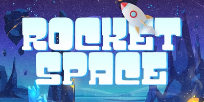 Rocket Space is unique and fun display font, It embodies playfulness and authenticity and is the perfect choice for a label, book cover, children’s book, comic, poster, banner, packaging, merchandise, logotype, and much more.
 - Ruly by Enrich Design,
$24.95 Ruly is my newest font creation. My roommate in college always had the coolest writing. I thought that it deserved to be a font. The font is a great choice for newsletters, cards, etc.
 - Aliya Jayner by Liartgraphic,
$15.00 Aliya Jayner was created by Liartgraphic Studio and is a modern script concept with many alternative, multi-lingual choices. This typeface is good for use on product brands, magazines, book covers, packaging, and others.
 - Avenir Next Thai by Linotype,
$79.00 Avenir Next Pro is a new take on a classic face—it’s the result of a project whose goal was to take a beautifully designed sans and update it so that its technical standards surpass the status quo, leaving us with a truly superior sans family. This family is not only an update though; in fact it is the expansion of the original concept that takes the Avenir Next design to the next level. In addition to the standard styles ranging from ultralight to heavy, this 32-font collection offers condensed faces that rival any other sans on the market in on and off—screen readability at any size alongside heavy weights that would make excellent display faces in their own right and have the ability to pair well with so many contemporary serif body types. Overall, the family’s design is clean, straightforward and works brilliantly for blocks of copy and headlines alike. Akira Kobayashi worked alongside Avenir’s esteemed creator Adrian Frutiger to bring Avenir Next Pro to life. It was Akira’s ability to bring his own finesse and ideas for expansion into the project while remaining true to Frutiger’s original intent, that makes this not just a modern typeface, but one ahead of its time. Avenir Next Variables are font files which are featuring two axis, weight and width. They have a preset instance from UltraLight to Heavy and Condensed to Roman width. The preset instances are: Condensed UltraLight, Condensed UltraLight Italic, Condensed Thin, Condensed Thin Italic, Condensed Light, Condensed Light Italic, Condensed, Condensed Italic, Condensed Demi, Condensed Demi Italic, Condensed Medium, Condensed Medium Italic, Condensed Bold, Condensed Bold Italic, Condensed Heavy, Condensed Heavy Italic, UltraLight, UltraLight Italic, Thin, Thin Italic, Light, Light Italic, Regular, Italic, Demi, Demi Italic, Medium, Medium Italic, Bold, Bold Italic, Heavy, Heavy Italic.
 - Avenir Next Rounded by Linotype,
$42.99Avenir Next Pro is a new take on a classic face—it’s the result of a project whose goal was to take a beautifully designed sans and update it so that its technical standards surpass the status quo, leaving us with a truly superior sans family. This family is not only an update though; in fact it is the expansion of the original concept that takes the Avenir Next design to the next level. In addition to the standard styles ranging from ultralight to heavy, this 32-font collection offers condensed faces that rival any other sans on the market in on and off—screen readability at any size alongside heavy weights that would make excellent display faces in their own right and have the ability to pair well with so many contemporary serif body types. Overall, the family’s design is clean, straightforward and works brilliantly for blocks of copy and headlines alike. Akira Kobayashi worked alongside Avenir’s esteemed creator Adrian Frutiger to bring Avenir Next Pro to life. It was Akira’s ability to bring his own finesse and ideas for expansion into the project while remaining true to Frutiger’s original intent, that makes this not just a modern typeface, but one ahead of its time. Avenir Next Variables are font files which are featuring two axis, weight and width. They have a preset instance from UltraLight to Heavy and Condensed to Roman width. The preset instances are: Condensed UltraLight, Condensed UltraLight Italic, Condensed Thin, Condensed Thin Italic, Condensed Light, Condensed Light Italic, Condensed, Condensed Italic, Condensed Demi, Condensed Demi Italic, Condensed Medium, Condensed Medium Italic, Condensed Bold, Condensed Bold Italic, Condensed Heavy, Condensed Heavy Italic, UltraLight, UltraLight Italic, Thin, Thin Italic, Light, Light Italic, Regular, Italic, Demi, Demi Italic, Medium, Medium Italic, Bold, Bold Italic, Heavy, Heavy Italic. - Generis Slab by Linotype,
$29.00The idea for the Generis type system came to Erik Faulhaber while he was traveling in the USA. Seeing typefaces mixed together in a business district motivated him to create a new type system with interrelated forms. The first design scheme came about in 1997, following the space saving model of these American Gothics. Faulhaber then examined the demands of legibility and various communications media before finally developing the plan behind this type system. Generis’s design includes two individually designed styles; each of with is available with and without serifs, giving the type system four separate families. Each includes at least four basic weights: Light, Regular, Medium, and Bold. Further weights, small caps, old style figures, and true italics were added to each family where needed. The Generis type system is designed to meet both optical criteria and the highest possible measure of technical precision. Harmony, rhythm, legibility, and formal restraint make up the foreground. Generis combines aesthetic, technical, and economic advantages, which purposefully and efficiently cover the whole range of corporate communication needs. The unified basic form and the individual peculiarity of the styles lead to Generis’ systematic, total-package concept. The clear formal language of the Generis type system resides beneath the information, bringing appropriate typographic expression to high-level corporate identity systems, both in print and on screen. The condensed and aspiring nature of the letterforms allows for the efficient setting of body copy, and the economic use of the page. A range of accented characters allows text to be set in 48 Latin-based languages, offering maximal typographic free range. This previously unknown level of technical and design execution helps create higher quality typography in all areas of corporate communication. Optimal combinations within the type system: Generis Serif or Generis Slab with Generis Sans or Generis Simple. - DT Skiart Serif Leaf by Dragon Tongue Foundry,
$10.00 ‘Skiart Serif Leaf’ has been on a long growing path getting to where it is now. Originally inspired by the san serif font ‘Skia’ by Mathew Carter for Apple. ‘Skiart’ was designed to feel more like a serifed font, but without any serifs. It took a step between sans serif and serif fonts. Next on the path towards a serif font came Skiart Serif Mini, with tiny serifs added. This was a true serif font, although they were subtle. This font ‘Skiart Serif Leaf’ is the next in the series. After many reiterations, ‘Skiart Serif Leaf’ was built and rebuilt many times until finally, this version deserved to be presented to the world. Style and flow had been added to this font. It remained fully readable and feels as clean and normal as any of the best body copy serifs, and yet has an original modern flair to it. The font feels strong and solid while having a subtle organic flow in its form. If compared to one of the more commonly used serifs like ‘Times New Roman’, the ‘Skiart Serif Leaf’ lowercase is more open with a taller x-height, increasing its readability and friendliness. The serifs are smaller and less distracting. They are not pretending to be ligatures. This font may be organic but is not in anyway script like. Where ‘Times’ makes its p q b d forms out of a barely touching oval and stem, the ‘Serif Leaf’ forms are much more firmly attached, appearing clearly as single letters. The standard setting for the a’s and g’s are round single story, feeling warmer and more inviting in the ‘Serif Leaf’ font. Much more friendly than the stuffy double storied versions in fonts like ‘Times’ etc. ‘Skiart Serif Font’ comes with a somewhat organic italic.
 - Generis Serif by Linotype,
$29.00The idea for the Generis type system came to Erik Faulhaber while he was traveling in the USA. Seeing typefaces mixed together in a business district motivated him to create a new type system with interrelated forms. The first design scheme came about in 1997, following the space saving model of these American Gothics. Faulhaber then examined the demands of legibility and various communications media before finally developing the plan behind this type system. Generis’s design includes two individually designed styles; each of with is available with and without serifs, giving the type system four separate families. Each includes at least four basic weights: Light, Regular, Medium, and Bold. Further weights, small caps, old style figures, and true italics were added to each family where needed. The Generis type system is designed to meet both optical criteria and the highest possible measure of technical precision. Harmony, rhythm, legibility, and formal restraint make up the foreground. Generis combines aesthetic, technical, and economic advantages, which purposefully and efficiently cover the whole range of corporate communication needs. The unified basic form and the individual peculiarity of the styles lead to Generis’ systematic, total-package concept. The clear formal language of the Generis type system resides beneath the information, bringing appropriate typographic expression to high-level corporate identity systems, both in print and on screen. The condensed and aspiring nature of the letterforms allows for the efficient setting of body copy, and the economic use of the page. A range of accented characters allows text to be set in 48 Latin-based languages, offering maximal typographic free range. This previously unknown level of technical and design execution helps create higher quality typography in all areas of corporate communication. Optimal combinations within the type system: Generis Serif or Generis Slab with Generis Sans or Generis Simple. - Journal Sans New by ParaType,
$40.00 The Journal Sans typeface was developed in the Type Design Department of SPA of Printing Machinery in Moscow in 1940–1956 by the group of designers under Anatoly Schukin. It was based on Erbar Grotesk by Jacob Erbar and Metro Sans by William A. Dwiggins, the geometric sans-serifs of the 1920s with the pronounced industrial spirit. Journal Sans, Rublenaya (Sans-Serif), and Textbook typefaces were the main Soviet sans-serifs. So no wonder that it was digitized quite early, in the first half of 1990s. Until recently, Journal Sans consisted of three faces and retained all the problems of early digitization, such as inaccurate curves or side-bearings copied straight from metal-type version. The years of 2013 and 2014 made «irregular» geometric sans-serifs trendy, and that fact affected Journal Sans. In the old version curves were corrected and the character set was expanded by Olexa Volochay. In the new release, besides minor improvements, a substantial work has been carried out to make the old typeface work better in digital typography and contemporary design practice. Maria Selezeneva significantly worked over the design of some glyphs, expanded the character set, added some alternatives, completely changed the side-bearings and kerning. Also, the Journal Sans New has several new faces, such as true italic (the older font had slanted version for the italic), an Inline face based on the Bold, and the Display face with proportions close to the original Erbar Grotesk. The new version of Journal Sans, while keeping all peculiarities and the industrial spirit of 1920s-1950s, is indeed fully adapted to the modern digital reality. It can be useful either for bringing historical spirit into design or for modern and trendy typography, both in print and on screen. Designed by Maria Selezeneva with the participation of Alexandra Korolkova. Released by ParaType in 2014.
 - Generis Simple by Linotype,
$39.00The idea for the Generis type system came to Erik Faulhaber while he was traveling in the USA. Seeing typefaces mixed together in a business district motivated him to create a new type system with interrelated forms. The first design scheme came about in 1997, following the space saving model of these American Gothics. Faulhaber then examined the demands of legibility and various communications media before finally developing the plan behind this type system. Generis’s design includes two individually designed styles; each of with is available with and without serifs, giving the type system four separate families. Each includes at least four basic weights: Light, Regular, Medium, and Bold. Further weights, small caps, old style figures, and true italics were added to each family where needed. The Generis type system is designed to meet both optical criteria and the highest possible measure of technical precision. Harmony, rhythm, legibility, and formal restraint make up the foreground. Generis combines aesthetic, technical, and economic advantages, which purposefully and efficiently cover the whole range of corporate communication needs. The unified basic form and the individual peculiarity of the styles lead to Generis’ systematic, total-package concept. The clear formal language of the Generis type system resides beneath the information, bringing appropriate typographic expression to high-level corporate identity systems, both in print and on screen. The condensed and aspiring nature of the letterforms allows for the efficient setting of body copy, and the economic use of the page. A range of accented characters allows text to be set in 48 Latin-based languages, offering maximal typographic free range. This previously unknown level of technical and design execution helps create higher quality typography in all areas of corporate communication. Optimal combinations within the type system: Generis Serif or Generis Slab with Generis Sans or Generis Simple. - Generis Sans by Linotype,
$29.00The idea for the Generis type system came to Erik Faulhaber while he was traveling in the USA. Seeing typefaces mixed together in a business district motivated him to create a new type system with interrelated forms. The first design scheme came about in 1997, following the space saving model of these American Gothics. Faulhaber then examined the demands of legibility and various communications media before finally developing the plan behind this type system. Generis’s design includes two individually designed styles; each of with is available with and without serifs, giving the type system four separate families. Each includes at least four basic weights: Light, Regular, Medium, and Bold. Further weights, small caps, old style figures, and true italics were added to each family where needed. The Generis type system is designed to meet both optical criteria and the highest possible measure of technical precision. Harmony, rhythm, legibility, and formal restraint make up the foreground. Generis combines aesthetic, technical, and economic advantages, which purposefully and efficiently cover the whole range of corporate communication needs. The unified basic form and the individual peculiarity of the styles lead to Generis’ systematic, total-package concept. The clear formal language of the Generis type system resides beneath the information, bringing appropriate typographic expression to high-level corporate identity systems, both in print and on screen. The condensed and aspiring nature of the letterforms allows for the efficient setting of body copy, and the economic use of the page. A range of accented characters allows text to be set in 48 Latin-based languages, offering maximal typographic free range. This previously unknown level of technical and design execution helps create higher quality typography in all areas of corporate communication. Optimal combinations within the type system: Generis Serif or Generis Slab with Generis Sans or Generis Simple. - GFWet - Unknown license

- GFWaterproof - Unknown license

- Water Melon by Struggle Studio,
$16.00 Water Melon – with Extras is a fun and charming display font. It embodies playfulness and originality and is the perfect choice for children’s or parents’ activities and school projects, clothing, food posters and birthday cards.
 - Hey Baby by Muksal Creatives,
$12.00 Hey Baby is a cute and charming display font. Whether you use it for cartoon related designs, children games or just any creation that requires a lovely touch, this font will be an amazing choice.
 - Barry by Juraj Chrastina,
$29.00 The Barry family combines two opposite weights. This display face has a great effect if the two fonts are used together. If you want to make your design ordinary, Barry is not the right choice.
 - Lebensjoy by Monotype,
$29.99Lebensjoy was used by the Co-op chain stores in Sweden for a nationwide fortnightly flyer (called Livsgldje = Joy of Life) during 1993 and 1994. They wanted a simple but still lively and active letterform. - Bergas by Griyotype,
$10.00 Bergas is a cool, whimsical and wavy display font. Whether you use it for cartoon related designs, children games or just any creation that requires a lovely touch, this font will be an amazing choice.
 - Freich by Nasir Udin,
$15.00 Freich is a mighty bold typeface with a vintage vibe and rebellious feeling. Perfect choice for posters with super hero or propaganda themes. Its sharp and strong letter forms will make any statements more powerful.
 - Ghazal by Fo Da,
$40.00 Ghazal is a display Arabic font with High contrast mainly used for headlines, it comes in single weight. This font is an excellent choice for all kinds of creative projects such as branding and advertising.
 - Dundee Castle NF by Nick's Fonts,
$10.00An offering by lettering artist Harvey Hopkins Dunn for the 1930 classic, American Alphabets, provided the inspiration for this graceful, engaging typeface. Use it liberally to exude elegance, or to turn on the charm. Both versions of the font include 1252 Latin, 1250 CE (with localization for Romanian and Moldovan). - FF Casus by FontFont,
$51.99 FF Casus was drawn for print – but is also as natural for textual content in interactive design. It brings warmth and a subtle, handcrafted quality to pages in books and periodicals as well as banners and informational copy on large and small screens. It pairs flawlessly with a wide range of sans serif typefaces to create inviting and easy to read text copy. Drawn by Eugene Yukechev, FF Casus is a fresh take on the robust serif typefaces produced early in the 18th century. The FF Casus™ typeface family takes advantage of slightly narrowed proportions, moderate contrast in stroke weight and an ample x-height to achieve high levels of legibility and efficient use of space. Born in Novosibirsk, Russia, in 1980, Yukechev earned degrees in philology in addition to editorial and graphic design. He also graduated from the British Higher School of Design in Moscow, studying type and typographic design. Yukechev now runs the Moscow-based studio “Schrift Publishers” and the online “Type Journal” with his colleagues. The six weights of FF Casus – each with an italic complement – are available as OpenType® Pro fonts with an extended character set supporting most Central European and many Eastern European languages. Looking for something new – with the panache and warmth of an old book face? FF Casus may be the perfect choice.
 - Controwell by Alit Design,
$14.00 Visiting the end of 2018, we launched "Controwell Victorian Typeface" which adheres to Serif and Script style. Controwell Regular has 2 layers that give a cool metal effect. Besides that, there are many alternative character choices that suit your taste. This charming Controwell Script is very well suited combined with Controwell Serif Regular. the elegant and unique impression looks very hard. just like the serif font, this script also has many alternative character choices, up to "SS10" and 600 glyphs. You create designs with modern Victorian themes or classically themed themes that are suitable for collecting Controwell Victorian Typeface, in addition to many choices of your character is also very easy to use. just choose and change some characters, the design that you design is ready to be printed or published on social media. This font is very suitable for logotype design, packaging design, beer design, vodka, whiskey label, poster design, victorian book cover and design.
 - Rafisqi by Suamzu Art,
$13.00 Rafisqi is a new font for a minimalist logo design. This font is suitable for creating word markers, titles, taglines. Use alternatives to set separate fonts in your text, unite thick and thin lines with your design techniques, so as to produce a very unique shape. Rafisqi font is perfect for designing company logos, online game logo, magazine covers, biographical book covers, business cards and all your design work, of course. to be more attractive in appearance, it helps you combine the Rafisqi font with other fonts so that your design looks more attractive Rafisqi is the display font, so it can not be the best choice for continuous text. Font contains: 3 letter styles 3 choices of basic replacement letters 3 number choices Ligature punctuation All character options are included in one font. You can use ligature in most major image editors, just look for the glyhps menu there. For example, in Adobe Illustrator you must select the Window Type glyhps menu item.
 - Rimba Andalas by Arterfak Project,
$14.00 Introducing Rimba Andalas, a playful ethnic font with extra ornaments. This experimental font inspired by the shapes of tree branches and combined with rough strokes such as ancient symbols found inscribed in caves. Perfect for the natural theme, traditional, cultural, folk, tribal, children, adventures and social movement. Rimba Andalas is a display font, suitable for the headline, logo, apparel, books, poster, signage, and more. You can mix and match the uppercase and lowercase to get more unique tribal handwritten, also equipped with swashes as the decoration. Fonts featured : - Uppercase - Lowercase - Numbers & symbols - Ligatures - Accents Hope you like it! Thank you for your support and happy designing!

