7,482 search results
(0.02 seconds)
- MBF Alligra by Moonbandit,
$17.00 MBF Alligra is a modern geometric display font. It is inspired by a combination of modern digital life and the free will of human nature. This typeface is a perfect choice for urban life theme. Use Alligra as a logo, poster, headline, title, text and many more.
 - Barkeliy by Balpirick,
$15.00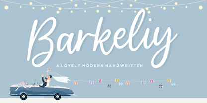 Barkeliy feels distinct and delicate. This flowing handwritten font is the perfect choice for a wide variety of designs. Fall in love with its incredibly versatile style and use it to create gorgeous wedding invitations, beautiful stationary art, eye-catching social media posts, and much more!
 - Puighut Brush by Realtype,
$11.00 Always handwritten fonts with an authentic look. Modern handwritten font with brush texture. Its authentic texture makes it the perfect choice for branding and digital design. This font is perfect for branding, logos, web, instagram, quotes, business cards, signs, headers, blogs, branding, invitations, and more! Thank you!
 - Little Bosquee by Doehantz Studio,
$12.00 Little Bossque is a modern sans serif family. Its variety of weights provide a range of choices that will help you find the best typographic color for your project. Lighter weights are well-suited for body text while heavier ones are ideal for high impact headlines
 - Letterhear by FallenGraphic,
$20.00 Letterhear a modern script with a feminimst calligraphy style, decorative characters . in this font script there are many alternative choices of characters Support Ligature, and Stylistic set. So beautiful on invitation like greeting cards, branding materials, business cards, quotes, posters,wedding invitations and more!! Thank you!
 - Theyriad Script by FallenGraphic,
$20.00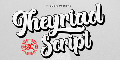 Theyriad Script is the great choice for watermarks on photography, logo designs, quotes, album covers, business cards, and many other design projects. Theyriad Script is here to elevate your work to the highest level. Features: -Accents (Multilingual Characters) -PUA encoded -Numerals and Punctuations (OpenType Standard) -Many alternates
 - Southiya by Stringlabs Creative Studio,
$25.00 Southiya is an equally elegant and authentic script, full of love. Use it to add a romantic spark to any design project! The Southiya font is a great choice to increase the prominence in your project. Although the typography is traditional, the basic elements are great.
 - Noman by Arendxstudio,
$15.00 Noman - Bold Display Fontl, retro looking display font. Whether you use it for cartoon related designs, children games or just any creation that requires a lovely touch, this font will be an amazing choice. Features : • Character Set A-Z • Numerals & Punctuations (OpenType Standard) • Accents (Multilingual characters) Ligature
 - Summer Knock by Seemly Fonts,
$14.00 Summer Knock is a unique and interesting display font. A little bit quirky, this font is a great choice for a wide variety of contexts! It looks stunning on thank you cards, quotes, greeting cards, logos, business cards, and every other design which needs a creative spark.
 - Mixbox by Sabrcreative,
$20.00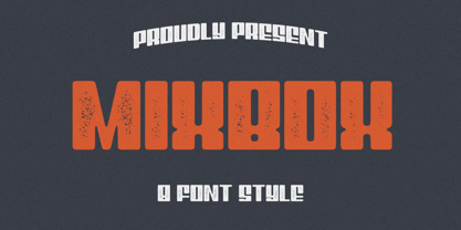 Evoke the spirit of a bygone era in your designs with the enchanting Mixbox Vintage Retro Display Font. This typeface seamlessly merges vintage charm with modern versatility, making it an ideal choice for designers seeking to infuse their projects with a touch of nostalgia and sophistication.
 - Calledliner by Stringlabs Creative Studio,
$25.00 Calledliner is a sweet and simple script with an authentic vibe. Use it to turn any design project into a true standout! The Calledliner font is a great choice to increase the prominence in your project. Although the typography is traditional, the basic elements are great.
 - Box Lunch JNL by Jeff Levine,
$29.00Just two capital letters from a sign inspired Box Lunch JNL from Jeff Levine. The restaurant - an early 1950s favorite in Miami Beach, Florida specialized in fried chicken meals and other delights of the day - long before the big corporate chains took over the local landscape. - Amient by Piotr Łapa,
$30.00 Amient is a modern, experimental, display typeface inspired by contemporary typography. It has a very eccentric and expressive character. The letterforms are eclectic but consistent at the same time. Amient is a bold choice for bold projects. It will work well on posters, covers, titles, and logotypes.
 - Gotten by Stringlabs Creative Studio,
$25.00 Gotten combines authenticity and elegance into one truly stunning script. Use it to turn any design project into a true piece of art! The Gotten font is a great choice to increase the prominence in your project. Although the typography is traditional, the basic elements are great.
 - Letter Gothic by Monotype,
$29.99Letter Gothic font was designed by Roger Roberson for IBM sometime between 1956 and 1962. Inspired by Optima, the typeface originally had flared stems. A monospaced sans serif font designed for use on an IBM Selectric typewriter, Letter Gothic font is a good choice for tabular material. - Hoodoo U NF by Nick's Fonts,
$10.00This roly-poly romp through the alphabet is based on Jürgen Riebling's irrepressible Mr. Big from the 1970s. Big, bold, bubbly and a little brash, it's a natural choice for happy headlines. Both versions contain the complete Latin 1252, Central European 1250 and Turkish 1254 character sets. - Princetown by ITC,
$40.99Richard Jones designed Princetown, an all caps font with strong, geometric letterforms, in 1981. Princetown's design was inspired by college and university sportswear, with its blocky forms and heavy outline. The Princetown font is an excellent choice for any work associated with sports or collegiate life. - With A Twist by Letters by Wordsworth,
$23.00 With A Twist is not shy, not ordinary, not predictable which makes it the perfect choice for attention-getting titles. With A Twist Monoline is slightly more retiring and fun to fill in. Pull up a stool, order a martini & have some font fun - With A Twist.
 - Pondang Brush by Realtype,
$23.00 Always handwritten fonts with an authentic look. Modern handwritten font with brush texture. Its authentic texture makes it the perfect choice for branding and digital design. This font is perfect for branding, logos, web, instagram, quotes, business cards, signs, headers, blogs, branding, invitations, and more! Thank you!
 - John Handy by ITC,
$29.99John Handy is the work of British designer Timothy Donaldson and based on his own handwriting. Part of the ongoing trend for casual letterforms in display typography, John Handy is an excellent choice for letters, greeting cards, menus, wherever an elegant yet personal look is desired. - Overmind Demons by Sipanji21,
$19.00 "Overmind Demond" is a striking display font designed with a futuristic theme in mind. Its sleek and modern letterforms exude a sense of technological advancement and innovation, making it a perfect choice for a wide array of design projects centered around futuristic concepts or space exploration.
 - Pelican by Monotype,
$29.00Pelican was designed by Arthur Baker and released by Agfa Compugraphic in 1989. Pelican is a calligraphic typeface that is distinguished by the irregular shapes of the lowercase letters. The rough-edged quality of Pelican makes it a good choice for informal display work and short texts. - Grandix by ZetDesign,
$15.00 Grandix is a very elegant handwritten font. created with original handwriting in mind for a flexible and beautiful font. The font is equipped with an open type feature for easy creation. These fonts are also created in several families to give the user the choice they want.
 - Jack Knife by Mike Zuidgeest,
$14.00 The "Jack Knife" font is a unique, handcrafted font that perfectly captures the spirit of the medieval time period. With its spiky, pointy design, this font exudes strength, courage, and boldness – making it the perfect choice for anyone looking to add a touch of daring to their brand. The sharp, jagged edges of the "Jack Knife" font give it a rugged, rustic feel that is both timeless and modern. Its bold, thick strokes make it easy to read even from a distance, while the intricate details and delicate curves add a touch of elegance and sophistication. Whether you're looking to create a bold, daring logo for a whisky brand or add a touch of adventure to your design, the "Jack Knife" font is the perfect choice. Its unique design and versatile style make it suitable for a wide range of projects, from branding and packaging to advertising and social media. So if you're looking for a font that embodies the spirit of the medieval period and exudes strength, courage, and boldness, look no further than the "Jack Knife" font – the perfect choice for anyone who wants to make a bold statement with their design.
 - Ravensara Sans by NaumType,
$19.00 Ravensara Sans — fashionable, high-contrast humanist sans. Ravensara family was born from the idea of taking the concept of Didone to weight extremes. Ravensara Sans is available in 7 weights, including Thin, Light, Regular, Medium, SemiBold, Bold and Black. Depending on weight, Ravensara Sans, like the other members of this font family, show quite different behavior. Heavy weights function above all as display fonts and work particularly great in all-caps. Medium weights of Ravensara Sans represent humanist grotesque, descended from the pages of fashion magazines. Thin weight perfectly complements the others if you need an especially wide choice of weights. Also, all the weights work great in all-caps. Ravensara Sans is a part of the Ravensara superfamily, united by the same anatomy, which currently also includes Ravensara Serif and Ravensara Stencil. If you need to achieve classic Haute Couture look — Ravensara Sans is a great choice. It’s a perfect choice for fashion logos, headlines, short texts, magazines, due to its simplicity looks great in oversize typography, branding, identity, website design, album art, covers, posters, advertising, etc. Ravensara Sans extends multilingual support to Basic Latin, Western European, Euro, Catalan, Baltic, Turkish, Central European, Pan African Latin and Afrikaans.
 - Destrion by IbraCreative,
$17.00 Destrion – A Modern Display Serif Typeface Destrion, a contemporary display serif typeface, seamlessly blends classic elegance with a modern aesthetic, making it a distinctive choice for various design applications. With its refined letterforms, Destrion exudes sophistication and versatility, making it suitable for both digital and print media. The typeface strikes a balance between tradition and innovation, featuring distinctive serifs that add a touch of timeless charm while incorporating sleek, contemporary details. Destrion’s well-crafted characters exhibit a harmonious balance between readability and artistic flair, making it an ideal choice for headlines, logos, and editorial design where a touch of refined personality is desired. The typeface’s unique personality and attention to detail set it apart, making Destrion a compelling choice for designers seeking a modern display serif that effortlessly captures attention and conveys a sense of timeless style. Destrion is perfect for branding projects, logo, wedding designs, social media posts, advertisements, product packaging, product designs, label, photography, watermark, invitation, stationery, game, fashion and any projects. Fonts include multilingual support for; Afrikaans, Albanian, Czech, Danish, Dutch, English, Estonian, Finnish, French, German, Hungarian, Italian, Latvian, Lithuanian, Norwegian, Polish, Portuguese, Slovak, Slovenian, Spanish, Swedish.
 - Anselm Sans by Storm Type Foundry,
$63.00One of the good practices of today’s type foundries is that they release their type families as systems including both serif and sans serif type. Usually, the sources of inspiration need to be well tried with time and practice, since production of a type family is such a laborious and complex process. From the beginning, it needs to be clear that the result will be suited for universal use. Such systems, complete with the broad, multi-lingual variations permitted by the OpenType format, have become the elementary, default instrument of visual communication. Non-Latin scripts are useful for a wide scope of academic publications, for packaging and corporate systems alike. And what about outdoor advertisement designated for markets in developing countries? Cyrillics and Greek have become an integral part of our OpenType font systems. Maybe you noticed that the sans serif cuts have richer variety of the light – black scale. This is due to the fact that sans serif families tend to be less susceptible to deformities in form, and thus they are able to retain their original character throughout the full range of weights. On the other hand, the nature of serifed, contrasted cuts does not permit such extremes without sacrificing their characteristic features. Both weights were drawn by hand, only the Medium cut has been interpolated. Anselm Ten is a unique family of four cuts, slightly strengthened and adjusted for the setting in sizes around 10 pt and smaller, as its name indicates. The ancestry of Anselm goes back to Jannon, a slightly modified Old Style Roman. I drew Serapion back in 1997, so its spirit is youthful, a bit frisky, and it is charmed by romantic, playful details. Anselm succeeds it after ten years of evolution, it is a sober, reliable laborer, immune to all eccentricities. The most significant difference between Sebastian/Serapion and Anselm is the raised x-height of lowercase, which makes it ideal for applications in extensive texts. Our goal was to create an all-round type family, equally suitable for poetry, magazines, books, posters, and information systems. - Anselm Serif by Storm Type Foundry,
$63.00 One of the good practices of today’s type foundries is that they release their type families as systems including both serif and sans serif type. Usually, the sources of inspiration need to be well tried with time and practice, since production of a type family is such a laborious and complex process. From the beginning, it needs to be clear that the result will be suited for universal use. Such systems, complete with the broad, multi-lingual variations permitted by the OpenType format, have become the elementary, default instrument of visual communication. Non-Latin scripts are useful for a wide scope of academic publications, for packaging and corporate systems alike. And what about outdoor advertisement designated for markets in developing countries? Cyrillics and Greek have become an integral part of our OpenType font systems. Maybe you noticed that the sans serif cuts have richer variety of the light – black scale. This is due to the fact that sans serif families tend to be less susceptible to deformities in form, and thus they are able to retain their original character throughout the full range of weights. On the other hand, the nature of serifed, contrasted cuts does not permit such extremes without sacrificing their characteristic features. Both weights were drawn by hand, only the Medium cut has been interpolated. Anselm Ten is a unique family of four cuts, slightly strengthened and adjusted for the setting in sizes around 10 pt and smaller, as its name indicates. The ancestry of Anselm goes back to Jannon , a slightly modified Old Style Roman. I drew Serapion back in 1997, so its spirit is youthful, a bit frisky, and it is charmed by romantic, playful details. Anselm succeeds it after ten years of evolution, it is a sober, reliable laborer, immune to all eccentricities. The most significant difference between Sebastian/Serapion and Anselm is the raised x-height of lowercase, which makes it ideal for applications in extensive texts. Our goal was to create an all-round type family, equally suitable for poetry, magazines, books, posters, and information systems.
 - Sylar by The Northern Block,
$16.70 A linear modern typeface suited for branding & advertising projects. The variations in weight give great contrast when used across body copy & headlines.
 - Neumatic Compressed by Arkitype,
$12.00 Neumatic compressed has a super compressed character set, increased cap height and tight kerning that combine to give you the ability to create large, beautiful and effective headlines and copy for your artwork. Neumatic Compressed packs punch when it comes to large copy lines and is perfect for posters, display copy, headlines in printed materials like magazines and books . The family comes in 8 weights from extra light to Black so it's versatile. Its extra light weight can give you some great height due to how narrow it is. Play around with the opentype Superscript with an underline or the Opentype stylistic sets which turns the default squared dots on i's, j's and punctuation to round dots.
 - Ermis Pro by Wannatype,
$62.00 Ermis Pro – handwritten, multilingual, natural Ermis Pro is a cross between a perfectly finished, comprehensive, classically cut old face type and handwriting. It combines the slightly irregular contours you see in very small letter sizes caused by the flow of ink on paper with the elegant look and feel of a serif font. This makes Ermis Pro the perfect choice for stylish printed materials with a personal touch, doubtlessly winning fans in the worlds of fiction and fantasy alike. Ermis Pro is robust and easy to read in both display and body copy. With its comprehensive character set, it is suitable for a wide range of typographical uses. Besides the standard Latin, the character set includes the Greek and Cyrillic alphabets as well as extended Latin with pan-African letters and the complete International Phonetic Alphabet (IPA). Ermis Pro also comes with numerous OpenType features such as discretionary ligatures, small capitals and nine number variants. The typeface features upright and italic fonts in three weights: Light, Regular and Bold.
 - Cabrito Serif by insigne,
$33.00 The Cabrito family is making a statement again. Launched as a supplement to the children's book, The Clothes Letters Wear, the original Cabrito is carefree, fun and easy on the eyes. Now, by balancing this friendly connection with new elegance, Cabrito Serif arrives: attractive copy text with an extra sophisticated sensibility incorporated into the design. Still bright and playful, this new Cabrito is cleaner and leaner, ensuring that its polished appearance retains legibility. 54 fonts include upright alternates, ligatures, and old figures. The range includes extended and condensed variants. To see any of these interactive features, see the PDF manual. The family also includes language support for 72 Latin-based languages, and there are more than 600 glyphs. Cabrito Serif can be used for logos and packaging, as well as for brochures and web pages. It’s readability makes it an excellent choice for a wide range of jobs. Take a walk with Cabrito Serif and see how much fun it is. By the way, look at some other Cabrito members and see how much you love the original, Inverto, Contrast or Didone.
 - GemFont One - Personal use only

- Basilica by Monotype,
$29.99Basilica is a calligraphic typeface that will add style and grace to short copy. Use the Basilica font for poetry, menus and stationery. - Two Reeler JNL by Jeff Levine,
$29.00While watching a 1920s Charlie Chaplin short film, Jeff Levine was taken with the unusually modern looking lettering of the title cards in that silent movie. The lettering was not only right for its time, but could also be adapted to both Art Deco and Techno applications. From this classic film comes the font Two Reeler JNL, a bit of yesterday with an eye toward the future. - Café Brasil by Sofia Mohr,
$39.00 Café Brasil is a font designed to represent coffee, especially for use in packaging, brand titles, logos and menus. Based on the shape of a coffee bean, Café Brasil has delicate details and ligatures that represent the liquid, foam and steam of a good cup of coffee. In March 2014, Café Brasil was chosen to be part of the main exhibition at the “Tipos Latinos 2014”.
 - Alright, imagine a font that captures the eerie yet whimsical vibe of a Tim Burton movie, entangling the gothic with the playful in each curve and stroke. That's "Scars Before Christmas" by Juan Casc...
- Blackduck by Eurotypo,
$60.00 “Blackduck” font is a typical Gothic, usually named “Blackletter” . This typeface was born with the name of “Textur” and developed from Carolingian cursive. It was used in the middle age as sacred script, became increasingly narrower, his vertical lines were emphasized and his strokes very compacted to save space. Along the time the early German print typefaces derived in others styles that were more readable such as Schwabacher and Fraktur, very popular in Germany and sometimes associated to the identity of the country. The font "Blackduck" was inspired mixing carefully the last two “Blackletters”. We try to joine some characteristics of both to reach good legibility without loosing the strong impact and powerfulness of the shapes. Some minuscules like the “o” “c” “e” “d” are rounded on both sides, while both strokes join in an angle at the top and at the bottom. Some other lower cases are formed by an angular and rounded stroke. This font contains a full set of OpenType features; swashes, stylistics alternates, old style figures (Arabic numeral were carefully shape integrated), ligatures and some extras ornaments were added to help in your design. "Blackduck" includes diacritic signs for Central European languages.
 - Henrician by Greater Albion Typefounders,
$16.50 Henrician can claim two sources of inspiration. One of these was a set of beautiful capital letterforms seen on the cover of a 19th century album of engravings. The engravings contained therein depicted lovely examples of half-timbered Tudor architecture and there was a clear 'Tudor' intent behind the letterforms. The second source of inspiration is more conceptual-the title lettering of period films from the 30's to the 60's…think if the opening text when Errol Flynn plays Robin Hood, or think of Richard the Lionheart, or even that great comedy Classic 'Carry on Henry', and it's discussion of Sir Thomas de Cobbler….but we digress! Henrician is a set of eight display and text (but perhaps not Body Text) faces in a 'Tudor Revival' spirit. Like any good revival design they are somehow at home with a wide range period themed design work, covering the medieval until, perhaps, the 18th century, just so long as we're more concerned with fun and appearance than strict historical accuracy. The family will be at home in the realms of advertising, posters, cover design and web design. Try Henrician out today!
 - Cíclope by Andinistas,
$19.95 Cíclope is a typeface family designed by Carlos Fabián Camargo in 2012 and used to write the headlines. Its idea is based on an army of stone soldiers that with their size and strength cause earthquakes. Under this concept he obtained stencil and sans serif letters with monstrous shapes and torn counterforms. Its usefulness as well as readability consists in imitate rocks with scars and cracks. For that reason, Cíclope family has three sizes, each with their respective italics distributed at different levels of corrosion. In addition, each file contains 260 glyphs useful for designing words and phrases with systematically eroded treatments for advertisement material. Thus Cíclope works as a raw material in the exploration of new graphic design. Finally, Cíclope concept has grotesque, geometric and humanistics letters roots that seem disastrous but each and every detail has been planned with high definition drawing. Most importantly, it expresses a big amount of grunge style with cracked edges and medium contrast between thin and thick strokes. In that sense, the writing seems impaired and special for design of logos, posters, flyers, brochures and worn, crusty or demolished graphic design.
