8,097 search results
(0.019 seconds)
- Tire Swing BB by Blambot,
$6.00 Tire Swing BB is lighthearted without being silly. It's whimsical without being cliche. It's a body copy font, or great for headers, and includes lots of European characters.
 - Madani by NamelaType,
$49.00 Madani is a geometric sans serif consisting of 9 weights ranging from Thin to Black and matching Oblique. With a touch of character choice, adding tails to some glyphs on the stylistic set 1 and pointing joined at some of the tapered characters in the stylistic set 2, suitable for display and body text font.
 - Chocolate Pro by Sudtipos,
$79.00Most everyone agrees that chocolate is irresistible. Now the Koziupa & Paul tag team is offering you a choice of three irresistible flavors, from the bittersweet Amargo, to the mouth-watering Dulce, you now have three different possibilities for the pleasure of your taste buds. The OpenType versions includes de 3 flavors all in one. - Diafragma by ParaType,
$30.00 Typeface was designed in 2021-2022 by Alexey Chekulaev. It has small serifs and original contours, it’s also well read in small sizes. Each style has 1400 characters of Latin, extended Cyrillic, Greek, including small caps, as well as alternate characters. Diafragma is a good choice for headings, logos, branding, packaging, publications and websites.
 - One Crayon by Balpirick,
$15.00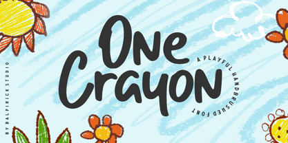 One Crayon is a Playful Handbrushed Font. One Crayon is a cute and informal display font. It embodies playfulness and authenticity and is the perfect choice for any children activity or school project. One Crayon also multilingual support. Enjoy the font, feel free to comment or feedback, send me PM or email. Thank you!
 - Balcon by Tour De Force,
$25.00 Balcon is condensed sans family designed to be your first web font choice. Contains 5 weights: Light, Regular, Bold, ExtraBold and Black, it fits perfect into any project, from editorial editions to packages, labels, posters. If you're looking for a bit decorative version of this family, feel free to check Balcon Round sans family.
 - FM Clog by The Fontmaker,
$21.00 The Clog font family is represented by four different outlines - Normal, Open Face, Shadowed and Engraved. Each of them could be your best choice when designing a wine label, package or magazine headline. By using Open Face and Shadowed outlines you will discover how easy it is to produce unique design of its own style.
 - Blood Moon by Ardyanatypes,
$20.00 Blood Moon - typeface is a typographic creation that combines unique and captivating elements. Crafted specifically to celebrate the Halloween ambiance, this font carries the aura of a mysterious and thrilling Blood Moon - typeface" With an elegant serif design, the font seamlessly blends sophistication and tension, making it a perfect choice for various design projects.
 - Modon Arabic by Zaza type,
$29.00 Modon is a bold condensed display Arabic and Latin typeface that has a very particular appearance. It combines the characteristics of different genres, While its design is influenced by Kufic and the Naskh style. It’s a perfect choice for bold headlines, oversize typography, fashion logos, branding, identity, website design, album art, covers, posters, advertising, etc.
 - Mermaid Babies by Subectype,
$14.00 Mermaid Babies is a fun, jolly and incredibly charming display font. It embodies playfulness and authenticity and is the perfect choice for any children activity or school project. What's Included : - Multilingual Support I hope you enjoy this font. If you have any questions please don't hesitate to drop me a message :) Thank You, Subectype
 - Banegsa by Rvandtype,
$9.00 Banegsa is a sans serif font. Its elegant and cool look makes it the perfect choice for logos, branding, invitations, stationery, wedding designs, social media posts, and so much more. Banegsa Font is PUA encoded which means you can access all of the glyphs. Features : uppercase & lowercase numbers and punctuation multilingual Alternate Characters PUA encoded
 - Algeron by Jolicia Type,
$19.00 Algeron is a thin serif font with an ethnic feel and a modern twist, many alternates choices so that you can combine according to your style. Give your text some elegance and personality and also you can use discretionary ligatures curves add a unique style Algeron include file : - Full uppercase, lowercase, numbers, punctuation + multilingual letters.
 - Hackish Script by Letterhend,
$17.00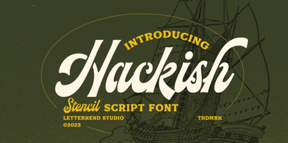 Hackish is a captivating stencil script font that effortlessly infuses your designs with a touch of class and a dash of vintage charm. Its unique blend of elegance and ruggedness makes it the perfect choice for projects seeking a timeless and sophisticated appeal Features : Uppercase & lowercase Numbers and punctuation Alternates & Ligatures Multilingual PUA encoded
 - Trochilida NF by Nick's Fonts,
$10.00This Albert Auspurg offering from 1915 for the German foundry Schelter & Giesecke was originally called Kolibri, or Hummingbird. The design combines formal elegance with a carefree, wide stance, making it a perfect choice for inviting headlines. Both versions of this font include the complete Unicode Latin 1252, Central European 1250 and Turkish 1254 character sets. - Khonsong Rounded by Jipatype,
$27.00 Introducing "Khonsong Rounded" a rounded semi-condensed sans serif font that embodies a harmonious blend of modernity, futurism and softness. With its sleek and contemporary appearance, Its semi-condensed proportions strike a perfect balance between space-saving efficiency and legibility, making it an ideal choice for various applications, from online media to print media.
 - Kyrial Display Pro by Mostardesign,
$29.00 Designed in 2011 by Olivier Gourvat, this font family has generous proportions with a range of weights make it a versatile family for print and web design work. Kyrial Display Pro is also a practical typographic choice to express strength, elegance, and conceptual clarity. Kyrial offers lots of OpenType goodness and broad language support.
 - Foureight by Top Type,
$10.00 Hello everyone.. I introduce the latest product with the name Foureight. Foureight is a font with a signature type. This font is equipped with multilingual, ligature, swash, and stylistic alternate so that it becomes many choices for you to use. This font can be used for signature, brand, invitation, advertising, web, banner and more. Thanks
 - Maltiner Display by Arterfak Project,
$28.00 Introducing Maltiner Display: A versatile, elegant, and sophisticated condensed serif font inspired by classic typography and newspaper headlines. Designed to excel in display settings, Maltiner Display prioritizes typographic excellence, offering a bold yet refined aesthetic. With unique letterforms and sharp edges, Maltiner Display provides ligatures and special characters, the perfect choice for luxury projects.
 - Emphasize by SSI.Scraps,
$28.00 Emphasize is a unique textured brush font. it is an incredibly versatile handwritten brush font. With its neat and beautiful arrangement of letters, this typeface will look outstanding in both formal and non-formal designs. It deliveries a strong feel and it’s the perfect choice for logos, branding, social media posts, magazines and much more!
 - Klarise by Olivetype,
$17.00 Klarise is a cool handwritten brush font. Its informal style and casual vibe will make this font a go-to choice for each of the designs that require a relaxed touch yet strong character. So what’s included: Basic Latin A-Z & a-z. Numbers, symbols, and punctuations Multilingual Support. Accented Characters : ÀÁÂÃÄÅÆÇÈÉÊËÌÍÎÏÑÒÓÔÕÖØŒŠÙÚÛÜŸÝŽàáâãäåæçèéêëìíîïñòóôõöøœšùúûüýÿžß Thank you
 - Kohirug by Twinletter,
$15.00 Looking for a font that exudes style and elegance? Look beyond the KOHIRUG Blackletter font. This font evokes a strong, confident personality with striking details on each side of the lettering. Whether you’re creating a vintage-inspired project or want to add a bold classic look to your visuals, this font is a perfect choice.
 - Las Valles Textured by Kaligra.co,
$29.00 Las Valles Textured is a tall, ultra-condensed sans serif font offered in 4 styles. Combining vintage charm with modern appeal, it boasts unique ligatures and versatile choices. The mix of rounded and regular styles adds a fresh touch. Particularly suitable for headlines, quotes, logos, web, and print design, including magazine covers, posters, and signage.
 - Epokha by ITC,
$29.99 Epokha is the work of Colin Brignall, an unusal slab serif typeface influenced by the poster styles of the early 20th century. Its robust geometric construction commands attention in a fresh, contemporary way. Epokha is made even more flexible by a number of alternative letter forms and should be set tightly for maximum effect.
 - Emerge BF by Bomparte's Fonts,
$40.00 Emerge BF was inspired by Admiral, c.1900, from the Keystone Type Foundry. Its relatively condensed proportions allow for a close fit in a distinctive, yet highly legible form. It's a great choice for headlines and text settings (where it shows a beautifully crisp, typographic color) on book covers, magazine advertisements, posters and so forth.
 - Asterixa by Iwm Design,
$10.00 Asterixa is a modern serif font designed for display use. This uppercase font exudes an elegant and powerful aesthetic with a classic touch refined for the contemporary era. With Asterixa, you'll discover a distinctive and graceful presence, making it the perfect choice for design projects that demand a blend of classic beauty and modern appeal.
 - Systema by Gspr one,
$4.00 "Systema" is an innovative typeface that combines modularity and pixelated style in a surprising way. Its letters continuously transform, taking on shapes ranging from soft circles to sharp squares, with occasional flashes that add a touch of vitality. This versatility makes it the perfect choice for design projects looking for a dynamic and unique aesthetic.
 - FS Untitled Variable by Fontsmith,
$319.99Developer-friendly The studio has developed a wide array of weights for FS Untitled – 12 in all, in roman and italic – with the intention of meeting every on-screen need. All recognisably part of a family, each weight brings a different edge or personality to headline or body copy. There’s more. Type on screen has a tendency to fill in or blow so for each weight, there’s the choice of two marginally different versions, allowing designers and developers to go up or down a touch in weight. They’re free to use the font at any size on any background colour without fear of causing optical obstacles. And to make life even easier for developers, the 12 weight pairs have each been designated with a number from 100 (Thin) to 750 (Bold), corresponding to the system used to denote font weight in CSS code. Selecting a weight is always light work. Easy on the pixels ‘It’s a digital-first world,’ says Jason Smith, ‘and I wanted to make something that was really functional for digital brands’. FS Untitled was made for modern screens. Its shapes and proportions, x-height and cap height were modelled around the pixel grids of even low-resolution displays. So there are no angles in the A, V and W, just gently curving strokes that fit, not fight, with the pixels, and reduce the dependency on font hinting. Forms are simplified and modular – there are no spurs on the r or d, for example – and the space between the dot of the i and its stem is larger than usual. The result is a clearer, more legible typeface – functional but with bags of character. Screen beginnings FS Untitled got its start on the box. Its roots lie in Fontsmith’s creation of the typeface for Channel 4’s rebrand in 2005: the classic, quirky, edgy C4 headline font, with its rounded square shapes (inspired by the classic cartoon TV shape of a squidgy rectangle), and a toned-down version for use in text, captions and content graphics. The studio has built on the characteristics that made the original face so pixel-friendly: its blend of almost-flat horizontals and verticals with just enough openness and curve at the corners to keep the font looking friendly. The curves of the o, c and e are classic Fontsmith – typical of the dedication its designers puts into sculpting letterforms. Look out for… FS Untitled wouldn’t be a Fontsmith typeface if it didn’t have its quirks, some warranted, some wanton. There’s the rounded junction at the base of the E, for example, and the strong, solid contours of the punctuation marks and numerals. Notice, too, the distinctive, open shape of the A, V, W, X and Y, created by strokes that start off straight before curving into their diagonal path. Some would call the look bow-legged; we’d call it big-hearted. - FS Untitled by Fontsmith,
$80.00 Developer-friendly The studio has developed a wide array of weights for FS Untitled – 12 in all, in roman and italic – with the intention of meeting every on-screen need. All recognisably part of a family, each weight brings a different edge or personality to headline or body copy. There’s more. Type on screen has a tendency to fill in or blow so for each weight, there’s the choice of two marginally different versions, allowing designers and developers to go up or down a touch in weight. They’re free to use the font at any size on any background colour without fear of causing optical obstacles. And to make life even easier for developers, the 12 weight pairs have each been designated with a number from 100 (Thin) to 750 (Bold), corresponding to the system used to denote font weight in CSS code. Selecting a weight is always light work. Easy on the pixels ‘It’s a digital-first world,’ says Jason Smith, ‘and I wanted to make something that was really functional for digital brands’. FS Untitled was made for modern screens. Its shapes and proportions, x-height and cap height were modelled around the pixel grids of even low-resolution displays. So there are no angles in the A, V and W, just gently curving strokes that fit, not fight, with the pixels, and reduce the dependency on font hinting. Forms are simplified and modular – there are no spurs on the r or d, for example – and the space between the dot of the i and its stem is larger than usual. The result is a clearer, more legible typeface – functional but with bags of character. Screen beginnings FS Untitled got its start on the box. Its roots lie in Fontsmith’s creation of the typeface for Channel 4’s rebrand in 2005: the classic, quirky, edgy C4 headline font, with its rounded square shapes (inspired by the classic cartoon TV shape of a squidgy rectangle), and a toned-down version for use in text, captions and content graphics. The studio has built on the characteristics that made the original face so pixel-friendly: its blend of almost-flat horizontals and verticals with just enough openness and curve at the corners to keep the font looking friendly. The curves of the o, c and e are classic Fontsmith – typical of the dedication its designers puts into sculpting letterforms. Look out for… FS Untitled wouldn’t be a Fontsmith typeface if it didn’t have its quirks, some warranted, some wanton. There’s the rounded junction at the base of the E, for example, and the strong, solid contours of the punctuation marks and numerals. Notice, too, the distinctive, open shape of the A, V, W, X and Y, created by strokes that start off straight before curving into their diagonal path. Some would call the look bow-legged; we’d call it big-hearted.
 - Optima Cyrillic by Linotype,
$65.00Many typefaces are distinctive or attractive at the expense of legibility and versatility. Not so the Optima® family. Simultaneously standing out and fitting in, there are few projects or imaging environments outside of its range. Although Optima is almost always grouped with sans serif typefaces, it should be considered a serifless roman. True to its Roman heritage, Optima has wide, full-bodied characters – especially in the capitals. Only the E, F and L deviate with narrow forms. Consistent with other Zapf designs, the cap S in Optima appears slightly top-heavy with a slight tilt to the right. The M is splayed, and the N, like a serif design, has light vertical strokes. The lowercase a and g in Optima are high-legibility two-storied designs. Optima can be set within a wide choice of line spacing values – from very tight to very open. In fact, there are few limits to the amount of white space that can be added between lines of text. Optima also benefits from a wide range of letter spacing capability. It can be set quite tight, or even slightly open – especially the capitals. If there are any guidelines, Optima should be set more open than tight. It’s not that readability is affected that much when Optima is set on the snug side; it’s just that the unhurried elegance and light gray typographic color created by the face are disrupted when letters are set too tight. Optima is also about as gregarious as a typeface can be. It mixes well with virtually any serif design and a surprisingly large number of sans serif faces. The Optima family is available in six weights, from roman to extra black, each with an italic counterpart. In addition, the family is available as a suite of OpenType® Pro fonts, providing for the automatic insertion of small caps, ligatures and alternate characters, in addition to offering an extended character set supporting most Central European and many Eastern European languages. When you’re ready to find its perfect pairing, browse these fantastic matches: Monotype Century Old Style™, Dante®, Frutiger® Serif, Joanna® Nova, Malabar™, and Soho®. - Soho Gothic by Monotype,
$29.99 “There is just something magical about type design,” says Sebastian Lester. “If you draw a successful typeface it can travel the world, taking a part of you with it.” If this is true, his Soho® Gothic family has taken him far and wide. Understated, modern and exceptionally versatile, the family has been put to good use in just about every application imaginable. A good choice for virtually any type of project, The Soho Gothic family performs equally well as the backbone of a global brand as it would in an edgy fashion magazine. Versatile, extensive, customizable, and multilingual – the Soho Gothic typeface family has it all.With the same proportions as Soho, its slab serif cousin, Soho Gothic ranges across seven weights, from a willowy hairline to a brawny ultra – each with a complementary italic.Lester took care to ensure that the Soho and Soho Gothic designs work in perfect harmony. According to him, “The typefaces were developed alongside each other so that I could consider every aspect of each design and be certain that they would be absolutely compatible.”Soho Gothic is a more understated and more subtle design than Soho. Features that give the design its distinctive tone are the flat, crisp apexes of the diagonal characters like the A and V, and the marked horizontal stress in the a, g and s. “I wanted the family as a whole to radiate effortless modernity,” recalls Lester, “to be a master communicator that works in all conditions and at all sizes.” A collection of alternate and “semi-slab” characters were also part of Lester’s plan. “I like to develop alternate characters for all my type designs,” he says. “I believe they give graphic designers greater flexibility and make a typeface more valuable.” Soho Gothic is available as OpenType® Pro fonts that have an extended character set which supports most Central European and many Eastern European languages. If you’re looking to complete your designs, consider pairing it with Bembo® Book,Joanna® Nova,Neue Frutiger®,PMN Caecilia®,or ITC Stone® Serif.
 - Optima by Linotype,
$45.99 Many typefaces are distinctive or attractive at the expense of legibility and versatility. Not so the Optima® family. Simultaneously standing out and fitting in, there are few projects or imaging environments outside of its range. Although Optima is almost always grouped with sans serif typefaces, it should be considered a serifless roman. True to its Roman heritage, Optima has wide, full-bodied characters – especially in the capitals. Only the E, F and L deviate with narrow forms. Consistent with other Zapf designs, the cap S in Optima appears slightly top-heavy with a slight tilt to the right. The M is splayed, and the N, like a serif design, has light vertical strokes. The lowercase a and g in Optima are high-legibility two-storied designs. Optima can be set within a wide choice of line spacing values – from very tight to very open. In fact, there are few limits to the amount of white space that can be added between lines of text. Optima also benefits from a wide range of letter spacing capability. It can be set quite tight, or even slightly open – especially the capitals. If there are any guidelines, Optima should be set more open than tight. It’s not that readability is affected that much when Optima is set on the snug side; it’s just that the unhurried elegance and light gray typographic color created by the face are disrupted when letters are set too tight. Optima is also about as gregarious as a typeface can be. It mixes well with virtually any serif design and a surprisingly large number of sans serif faces. The Optima family is available in six weights, from roman to extra black, each with an italic counterpart. In addition, the family is available as a suite of OpenType® Pro fonts, providing for the automatic insertion of small caps, ligatures and alternate characters, in addition to offering an extended character set supporting most Central European and many Eastern European languages. When you’re ready to find its perfect pairing, browse these fantastic matches: Monotype Century Old Style™, Dante®, Frutiger® Serif, Joanna® Nova, Malabar™ and Soho®.
 - Fincastle Sans JNL by Jeff Levine,
$29.00 Fincastle Sans JNL is an all-caps titling font in both regular and oblique versions. It's clean, legible monoline design complements any layout from ad copy to personal stationery.
 - Linotype Seven by Linotype,
$29.99Linotype Seven is part of the Take Type Library, chosen from the contestants of Linotype’s International Digital Type Design Contests of 1994 and 1997. This prize-winning font was designed by the German artist Christian Vornehm. The font looks as though hastily drawn with a wide, bristly brush, as though the scribe was in a hurry. Linotype Seven is loaded with energy and spontaneity. It is intended exclusively for short headlines in larger point sizes. - Angleface by ArtyType,
$29.00 With initial thoughts of creating something tubular, I had in the back of my mind the kind of contemporary chrome furniture that became ubiquitous throughout the 60s and that concept remained with me throughout the development process. The font-styling idea worked out very well in this case, resulting in plenty of optional character variations for my chosen theme, most of which are included in both styles of light and bold character sets.
 - Linotype Down Town by Linotype,
$29.99Linotype Down Town is part of the Take Type Library, chosen from the contestants of Linotype’s International Digital Type Design Contests of 1994 and 1997. The cheerful character of this fun font from German designer Critzler is perfect for comics or posters. The figures dance across the base line, swinging between thick and thin, big and small. Linotype Down Town is intended exclusively for headlines and short texts in at least 18 point. - Marble by URW Type Foundry,
$59.99 Marble is part of Asterisk Type Collection by URW Type Foundry. Marble is a modern sans serif with a distinct character and comes in 108 styles plus Variable Fonts. It grew from the desire to create full bodied letters in contrast to the economy of most sans serif faces. Designed for corporate and publishing use it is rounded and approachable, its three styles (Condensed, Normal and Wide) range from slender elegance to warmth and playfulness without ever being informal. Designed by Alessia Mazzarella and Vaibhav Singh, Marble derives its character from the generous roundness of the x-heights which is balanced by the striking horizontal or vertical cuts to the terminals. The result is a readable font that encourages the eye to move from one shape to the next and that offers a range of possibilities for digital and print. The Marble family has nine weights in Latin for each variant. Eminently versatile, it’s ideal for establishing hierarchies of information with a wealth of choices for headlines, subheadings, captions and body copy styles that are all in harmony with each other. The Wide style allows headlines to be set with width and presence.
 - Cresta by James Todd,
$40.00 Loaded with personality and functionality, Cresta is built to look good while surviving the worst conditions. It is at home on screen and in a magazine. Its six weights are intended to be used everywhere. Unlike most typefaces, Cresta was built without a reference. For this project, everything design choice was based on what worked best for a workhorse sans serif family. Cresta was originally created as the primary typeface for this website. This meant it needed to work in copy, headlines, and navigation across all devices, browsers and operating systems. This meant it needed to be sturdy and have enough character to make it stand out from other UI typefaces. With its large x-height, ample counters, and giant apertures, Cresta is meant for easy utility in rough conditions. Even with all of this, that doesnít mean that its dull; as the weights increase, the style of Cresta becomes more appearant. This style is defined most apparently by the terminals on the lowercase r and the angle of the joins between the curved and straight strokes (such as in the connection on the n).
 - Milk And Honey by Gatype,
$18.00 Milk And Honey is a modern vintage serif font packaged in a modern and classy style, complete with your OpenType feature access to access a large selection of alternative fonts and bindings, the choice of fonts you like from large and small font variations for a luxurious and elegant look. A unique, fun and versatile serif family with 20 ligatures and 97 alternatives to enhance any design you love. This font is perfect for branding projects, Logo design, Apparel Branding, packaging, magazine titles, advertisements, T-shirts, postcards and more. This typeface has been enriched with additional alternate characters of up to 329 glyphs. Hope it helps to capture the soul of any design. Finally, there are no words that can be said other than "Success and enjoy. Milk And Honey is coded with PUA Unicode, which allows full access to all additional characters without having to design any special software. Mac users can use Font Book, and Windows users can use Character Map to view and copy any additional characters to paste into your favorite text editor/app. How to access all alternative characters using Adobe Illustrator: https://www.youtube.com/watch?v=XzwjMkbB-wQ
 - Cavole Slab by insigne,
$22.00 Cavole Slab is a new slab serif, designed in early 2011, that has a strong influence from Dutch typography. The name is an altered form of the Portuguese word for feather, emphasizing the typefaceís soft and friendly character. Slab serifs give this face plenty of impact and make it an excellent choice for contemporary designers. The font family includes a very dark and powerful black all the way down to a hairline thin weight, giving a tremendous versatility. The family also features dynamic italics that add plenty of emphasis and momentum. Cavole Slab is suitable for both headline and text settings and should easily find its place in a number of different settings, from corporate identity to magazine body copy. There are six weights that come with complementary italics, and each font includes over 450 characters and extended Latin-based language support. The typeface family comes in OpenType format, and OpenType alternates are easily accessible through OpenType enabled applications such as the Adobe suite or Quark. Please see the informative .pdf brochure to see what OpenType features are available and to see them in action.
 - Sure! The Advanced Dot Digital-7 font, designed by the talented team at Style-7, is a modern and aesthetically pleasing font that captures the essence of digital sophistication with a touch of retro ...