3,531 search results
(0.018 seconds)
- As of my last update in early 2023, there isn't a widely recognized font specifically named "Avril Lavigne" officially affiliated with the artist or endorsed as part of her brand. However, the concep...
- Testify by Epiclinez,
$19.00 Testify is a cool and fun typeface, carefully handcrafted to become a true favorite. Its old school charm makes it appear wonderfully down-to-earth, readable, and ultimately, incredibly versatile. Testify will look outstanding in any context, whether it’s being used on busy backgrounds or as a standalone headline! This font is supporting Multi-Languages, which includes: Afrikaans Albanian Catalan Danish Dutch English Estonian Finnish French German Italian Norwegian Portuguese Spanish Swedish Zulu.
 - Chicago Doodles by Outside the Line,
$19.00 Armchair travel to the Windy City with Chicago Doodles. 31 illustrations of buildings, skylines, transportation, food, Chicago landmarks, signs and a script word Chicago. For other city, state and country doodles take a look at Paris, London, Waikiki and New Orleans Doodles. Also Cowboy and Lake Vacation Doodles too.
 - Katydid JNL by Jeff Levine,
$29.00 Vintage sheet music for a song from the Broadway Musical “Kiss Me Kate” is the inspiration for Katydid JNL. The play’s name was written in a ball-and-line type of lettering which somewhat resembles either 'Tinker Toys' or celestial mapping.
 - Ongunkan Phrygian by Runic World Tamgacı,
$50.00 Phrygia is the Greek name of an ancient state in western-central Anatolia (modern Turkey), extending from the Eskişehir area east to (perhaps) Boğazköy and Alishar Hüyük within the Halys River bend. The Assyrians, a powerful state in northern Mesopotamia to the south, called the state Mushki; what its own people called it is unknown. We know from their inscriptions that the Phrygians spoke an Indo-European language. Judging from historical records supported by ceramic evidence, settlers migrating from the Balkans in Europe first settled here a hundred or more years following the destruction of the Hittite empire (ca. 1200 B.C.). Most of what is known about Phrygian archaeology and its language derives from excavations at the capital city Gordion, located about 60 miles southwest of the modern Turkish capital of Ankara (also a Phrygian site). Gustav and Alfred Körte first excavated Gordion in 1900. The excavators did not reach Phrygian levels, but they did reveal burials dated to the late eighth century B.C. with Phrygian ceramic, metal, and wooden artifacts. From 1950 to 1973, Rodney S. Young of the University of Pennsylvania led excavations at Gordion. Archaeological work at the site resumed in 1988 and continues to the present.
 - Radio Show JNL by Jeff Levine,
$29.00 The 1933 sheet music compilation entitled "Kate Smith Memories Song Book" had the singer's name hand lettered in a bold, spurred serif typeface. This lettering design became the basis for Radio Show JNL, which is available in both regular and oblique versions.
 - Beat Boy by PizzaDude.dk,
$18.00 Searching for some company? Beat Boy is ready to take action - He wants to put that beat to your designs. I am not sure which category Beat Boy fits in...is it graffiti? Comicbook text? Something for candy labels? Cute posters or hardcore skater flyers? ... the purposes of use could be many!
 - Chepina Script by Vástago Studio,
$7.00 This is a type design based on a retrospective food design posters from 1950 in the United States. The intention was to create handmade letters ideal for handmade projects. The principal reference was the book of Steven Heller Mid-Century Ads. This typeface was the graduation project of my degree as graphic designer.
 - Schwandner Versalia by Intellecta Design,
$35.00 A highly intrincated decorative capital from the work of Johann Georg Schwandner (1716-1791). An accurate historical revival and interpretation of Iza W, at Intellecta Design. State-of-art to use in headings, chapter initials from books, magazines and other publications. Also use in baroque and renaissance inspired layouts, or modern mixed proposals.
 - Tabloid Edition JNL by Jeff Levine,
$29.00 The headline across the October 7, 1918 edition of the UK’s Daily Mail stated: "Germany Asks the Allies for Peace". Set in extrabold sans serif lettering, it’s now available digitally as Tabloid Edition JNL in both regular and oblique versions. This is another “redrawn from the headlines” typeface from Jeff Levine Fonts.
 - Envoy by Tim Rolands,
$20.00 Envoy is a serif type inspired primarily by Garalde oldstyle types like those of Claude Garamond. As such, it is particularly well suited for book and magazine text. Characteristic details more typical of Venetian oldstyle faces serve to give Envoy just a bit more personality. The base family includes regular, italic, bold, bold italic and small capitals. Expert sets add ligatures and alternate letterforms. Display sets include letterforms customized for titling. Originally designed in 1995 and 1996, for the 1996 Morisawa International Typeface Design Competition, Envoy was later revived, completed and publicly released in 1998. During the initial design, the family was known as Truman in honor of Northeast Missouri State University becoming Truman State University, but the name was changed to Envoy prior to entry in the competition.
 - Montauk by profonts,
$51.99 Montauk Pro is named after a small village in Suffolk County, New York on the South Shore of Long Island. It is the easternmost area in Long Island, and thus the easternmost area in New York State. It is home to Montauk Point State Park, site of the Montauk Point Lighthouse. It is named after the Montauk Indians. Montauk Pro is a casual, jaunty and quite beautiful handwriting script. It comes with six styles as light, light italic, regular, regular italic, bold and bold italic, each style with about 1.000 characters covering the complete Latin glyph set for West and East including Baltic and Turkish, including a large selection of ligatures, character combinations and alternates to make this beautiful script design a perfect font for OTF-savvy applications like e.g. InDesign or Quark Xpress 7.
 - Elfabet - Unknown license

- WL Dot Matrix by Writ Large,
$5.00 WL Dot Matrix is another typographic flashback to computing of the mid 1980s, when 9-pin dot-matrix printers were the state of the art. Compatible with the cleaner WL Rasteroids family, WL Dot Matrix explores some of the common failure modes of old printers: smudging ribbons, slipped tractor feeds, and gummed up print heads.
 - Jacopo Mediaeval NF by Nick's Fonts,
$10.00This stately typeface takes its inspiration from Erbar Medieval, designed by Jakob Erbar for the Ludwig & Mayer foundry of Frankfurt am Main, released in 1914. Equally at home in headlines or text blocks, this face is both elegant and inviting. Both versions contain the complete Latin 1252, Central European 1250 and Turkish 1254 character sets. - Instructor by Chank,
$59.00Introduced as the Chank Font of the Month for May 1998, Instructor was drawn Roger Lootine and fontified by Chank. Roger was an instructor at Art Instruction School. You know the "Draw Tippy the Turtle" ads? That's where Roger used to teach. He also draws a cool comic called Residue. "Roger's got the best handwriting I've ever seen, and you can download it today!" says Chank. "How lucky are you? Way lucky!" Now available in OpenType format for your Personal or Commercial Use. - Thequilla by Rometheme,
$25.00 Thequilla is vintage monoline script font. It has vintage, elegant, old school, classy, and cool. It’s a great font for fashion, apparel projects, signature, album cover, logo, branding, magazine, social media, & advertisements, but also works great for other projects. Highlight: - Easy instalation - Work on PC or Mac - PUA Encoded Support - Basic Latin A-Z and a-z - Numbers - Symbols - No special software is required, The fonts can be opened and used in Adobe Illustrator, Adobe Photoshop, Adobe InDesign, even work on Microsoft Word.
 - Rail Route Stencil JNL by Jeff Levine,
$29.00 Rail Route Stencil JNL is based on a hand-cut paper stencil depicting a logo for the Baltimore and Ohio (B&O) Railroad. The lettering is from the motto encircling an image of the Capitol dome: "Linking 13 Great States with the Nation". This motto was not present on some other versions of the B&O logo.
 - Emeritus by District,
$30.00 Emeritus is born from the carved letters found on buildings and monuments in Washington, DC. Muscular and low contrast but with assymetrical flared serifs that soften its stately presence. Small caps, inline caps, chiseled characters, and multiple weights and numerals offer an array of typographic voices. Notably academia, military, monumental, automotive, logos, signage, and so on.
 - Headlined Solid by Thinkdust,
$10.00 Where Headlined creates bold statements, Headlined Solid states facts. Simple, sans serif and steady as a rock, Headlined Solid does what needs to be done, no more and no less. For pragmatism and clarity of form this font couldn’t be better. Alternatively if you're looking for something a little more filthy, check out the original Headlined.
 - OL America The Beautiful by Dennis Ortiz-Lopez,
$40.00 Oh Beautiful, for Spacious Skies, for Amber Waves of Grain This font was designed to honor the Land of My Birth, The United States of America, a Nation that has given me the Freedom to be what I want to be, to Create what I feel fit to create and to Live in Peace. God Bless America!
 - On The Ground by Fascination Workshop,
$10.00 On the Ground is a picture font made from drawings of found objects. These object were found on the ground while walking around different cities in the United States. The font uses varying drawing styles (from detailed to pictographic) but they all have a similar irregularity, unifying the characters. Perfect for animations, signs, greeting cards, posters, etc.
 - Skaligari by PintassilgoPrints,
$24.00 Skaligari is a sharp and energetic typeface, somewhat expressionist, somewhat eighties, punk, new wave, always edgy. It's an all-caps font with two options for each letter and also for each numeral. Turn on the Contextual Alternates OpenType feature to instantly cycle these glyphs. There are yet stylistic alternatives, as well as graphical elements to add a twist here and there. Wild and full of energy, Skaligari is a winning choice for sports and music-related ideas, skate films and labels, logos, apparel, zines. And, as creativity has no limits, how about some wedding invitations? Just play it loud!
 - LTC Goudy Ornate by Lanston Type Co.,
$24.95 Goudy Ornate (also known as Ornate Title) was designed in 1931 by Frederic Goudy. He states "It is a simple, decorative face that has been used by some good presses for use on title-pages where size is more important than blackness of line." The new Lanston version includes a lower case and full character set designed in the style of Frederic Goudy.
 - Jane Plain NF by Nick's Fonts,
$10.00Here's a clean, simple architectural-blueprint style, eminently suitable for subheads and text blocks. Inspired by and named for a gentlewoman who gave up a career as an architect in Bolivia to care for the elderly in the United States. All versions of this font include the Unicode 1250 Central European character set in addition to the standard Unicode 1252 Latin set. - Risky Biscuit by PizzaDude.dk,
$16.00 Risky Biscuit is wants to go its own ways. It is never too much or too little - just perfect in its awkwardness! You may think surfer, skater, DJ or hand craft - that’s okay, because Risky Biscuit is all that and even more! Comes with contextual alternates - meaning 5 different letters AND small caps for each vowel…and of course multilingual support!
 - chocolat_bleu - Personal use only

- Show Card Stencil JNL by Jeff Levine,
$29.00 For decades, the National Show Card Writer Company of Minneapolis, MN produced sign making kits used by shopkeepers, schools, churches and many other types of organizations. The standard sets were comprised of two part stencils that when overlaid, produced finished lettering, or a buyer could choose the same type style designs with a standard stencil letter. From one of these templates comes Show Card Stencil JNL, in both regular and oblique versions. Take note that the U, V and W have the heavier vertical strokes reversed. As this was the way the original stencil design was manufactured, it has been retained for this digital type as well.
 - Maye Calistial by Maulana Creative,
$13.00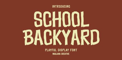 School Backyard playful display font. Regular stroke, fun character with a bit of ligatures and alternates. To give you an extra creative work. School Backyard font support multilingual more than 100+ language. This font is good for logo design, Social media, Movie Titles, Books Titles, a short text even a long text letter and good for your secondary text font with script or serif. Make a stunning work with School Backyard font. Cheers, Maulana Creative
 - Psychedelic Xylophones by Mysterylab,
$22.00 Perfect in its imperfection, Psychedelic Xylophones is a retro trippy hippie font that brings a hand-lettered groove to your text graphics. It features a large complement of two-character alternate glyphs that adds a subtle sway and an ebb-and-flow that results in some customized surprises and other more subtle variations to your text. It's great for that bendy, melty, warped headline psychedelic poster thing. Try it on retro t-shirt messages and surf/skate graphics, or a daring branding choice for drink or snack packaging. The alternate glyphs are turned on by default but can be over-ridden easily in the Glyphs panel of many popular software packages.
 - Thunder Inferno by Mans Greback,
$79.00 Thunder Inferno is a gothic black metal typeface with sharp serifs. Rooted in the aesthetics of heavy metal and the occult, this typeface is a harbinger of darkness and intensity. Evocative of Halloween and gothic grandeur, Thunder Inferno also captures a march toward darkness. It serves as a rebellious voice for skate culture and alternative lifestyles. Crafted exclusively in uppercase, this font is a growl in typographic form, a visual cacophony that grabs your attention and refuses to let go. Capitalize the first and last letters of any word for symmetrical heavy metal style. Example: Heavy metaL Enclose any word in < > ( ) [ ] { } to give it wings. Example: [HawkstylE]
 - Johabu by Monotype,
$29.99Johabu is based on Gebrochene Fraktur, a lighter softer sort of type, compared to the German forms of the same period. Johabu was drawn by Johannes Bureus, around 1620, cut and cast by Peter van Selow in Stockholm. Johannes Bureus, archaeologist and linguist, designed and let Selow cast runes in 1598, and he became the first Swedish keeper, archivist, of the National Record Office State Archives. - Furius by Typogama,
$29.00 Furius is a display typeface inspired by the split serif style of woodcut or chiseled letters found in roman inscriptions and later popularized by the western genre in the United States. Created as a display typeface, Furius combines a host of Opentype features and equally incoporates a full extended latin and cyrillic character set to provide a versatile and complete design solution for titles or display settings.
 - Sticky Annie by Sander's Conspiracy,
$20.00Sticky Annie is the latest in the series of fonts I've designed that are named after my wife. Little bundles of overlapping sticks or lines make up each character. It's made to look good at small font sizes, but the bigger, the better. At small sizes it's fun and a little childish. At bigger sizes, especially in all-caps, it looks intricate, distinctive and stately. - Boucle by TipografiaRamis,
$29.00 Bouclé is a monoline decorative typeface family of three subfamilies—Plain, Round and Loopy. Plain and Round come in two weights—regular and bold. Bouclé Plain, as its name states, has minimal decorative features in comparison with Bouclé Round, and especially Bouclé Loopy. Thus, Bouclé Plain fonts could be better used for display text purposes. Round and Loopy fonts are reserved for highly decorative cases.
 - Bylander by Mans Greback,
$59.00 Bylander is a stateful serif typeface. With robust, heavy letterforms reminiscent of a foundry's hammer hitting molten metal, and an unpaired weight, Bylander's characters seem forged from the core of the Earth. Its rounded corners whisper tales of smoothened river stones, and its gentle curves combined with its industrial mass makes Bylander a paradox; both intimidating in its boldness and welcoming in its approach.
 - Tzur by Hacollective,
$45.00 Tzur is a Hebrew sense-serif font with a nostalgic scent. The shape of the letters has two qualities - Raw and processed - and they are combined without canceling each other out. The resulting product is a font that conveys power, stability, and prominence, and echoes typographic values that correspond with the graphic/visual language that was accepted in The early years of the State of Israel.
 - London Doodles by Outside the Line,
$19.00 London is always hip. With William and Kate and the 2012 Summer Olympics it made sense that London Doodles would be second in the City Series following Paris Doodles. 29 illustrations and a script word London. Kate’s ring, the Queen’s carriage, crown, skyline, cityscapes, cars, double-decker bus, castles, bridge, tea items, flag and more.
 - VLNL Bon Bon by VetteLetters,
$35.00 Exuberantly delicious and lusciously sweet! VLNL Bon Bon embodies the perfect after dinner treat. Chocolate is a known aphrodisiac and bonbons are its most romantic carrier. Bonbon is not for nothing the French word for ‘good’ twice! You could definitely consider VLNL Bonbon the typographic equivalent of these exquisite chocolate sweets. Inspired by lettering on an Amsterdam church facade and a ladies clothing store window, Donald DBXL Beekman started drawing the first incarnation of Bon Bon already in 2004. The original idea was an alphabet design with slanted oval inner shapes and extremely long and striking serifs. This proved to be a quite demanding design job, so It took Bon Bon some time to get finished. But now it’s here in all its extravagant glory. Most recently a number of lowercase characters were added to make Bon Bon more versatile. Totally insane and over-top-the-top it has been called. But hey, we all love Bon Bon. Don't we?
 - Topaz - Unknown license


