3,531 search results
(0.017 seconds)
- Argufy by Ali Hamidi,
$10.00 Argufy is a cool, vintage styled and organic display font. It will look stunning on any food menu, poster flyer or print. Use this font for your designs and explore its endless possibilities.
 - TXT Menu Item by Illustration Ink,
$3.00Add some personality to scrapbooks, greeting cards, invitations, announcements, signs, menus, restaurant themes, and more. The thick, brush-stroked lines of Menu Item lend unique character to the letters of this cool font. - Voklea by Sakha Design,
$12.00 Voklea is a cool, bold and trendy looking display font. Whatever the topic, this font will be a wonderful asset to your font library, as it has the potential to enhance any creation.
 - Bucknord by Sibelumpagi,
$15.00 Bucknord is a cool and playful handmade marker font. This font is designed to help your needs such as logos, product packaging, invitations, branding, headlines, signage, labels, book covers, posters, quotes, and more.
 - Faqro Pro by ffeeaarr,
$9.00 Faqro is a cool and casual looking display font. No matter the topic, this font will be an incredible asset to your fonts’ library, as it has the potential to elevate any creation.
 - Oklahoma Pro by Die Typonauten,
$29.00 A large update of a successful type face: Oklahoma. There is a new style (Oklahoma Pro Marshal) and a cool Open Type Feature. Alternate characters and an effect - we call it “dancing baseline”.
 - Picture this: "Teen Spirit" by Steven J. Lundeen is not just a font; it's the embodiment of youth rebellion, a visual shout that echoes through the halls of high school, sticking it to the man with e...
- Ethique by Zealab Fonts Division,
$18.00 Ethique is a minimalist, luxury and gorgeous font that is both classically elegant and inherently modern. Create unique word mark logos, beautiful wedding invitations, use it as an elegant solution for your next magazine layout, or choose Ethique for any graphic design that require a sleek look with an elegant flair. Ethique features a unique style of design and contains multi-lingual support.
 - Rigid Display by Studio Fat Cat,
$20.00 Rigid Display is a sans serif font designed for display needs such as titles, logos, etc. with a different touch. Rigid Display provides 5 weights for its users to have freedom in handling. This fresh font is an alternative that will refresh your font library and also the viewers so feel free to choose it as the main pawn for your project
 - Restless Heart by Bhubbiberry Studio,
$16.00 Restless Heart is serif font features a mixed modern-classic design inspired by the Art Nouveau era. Restless Heart support multilingual languages, numbers, punctuation and alternative-ligatures. Create gorgeous & beautiful logotype, use it as an elegant solution for your next magazine layout, or choose Restless Heart for any graphics that require a catchy look with a elegant flair. Warm regards.
 - Pepita Script by Fenotype,
$25.00 Pepita is a flexible and easy to use connected script. Pepita has plenty to offer: a selection of 72 ornaments and plenty of ligatures and alternate characters: try turning on Contextual Alternates, Swash or Stylistic Alternates in any Opentype savvy program or manually choose the characters from the glyph palette. For best results combine all 3 weights of the font.
 - Spacy Avocado by PizzaDude.dk,
$15.00 Due to some grease on a menu, I misread "Spicy Avocado" as "Spacy Avocado" which led me to the name of this font. I love Avocados and I love things that are a bit spacy, and I love the combination of these two! Space Avocado is my handdrawn, layered headline font. Mix the layers or use them as a single font - you choose!
 - Avayo by Fontop,
$11.00 Avayo is a modern sans serif typeface. It is perfect for creating alphabet logos, branding, titles, headlines, but also looks great when being used casually, in copies and texts. Avayo looks simple but special and distinct and is defined by its round cut design. Avayo font family comes in five weights to help you choose the best option depending on your purpose.
 - Fidelia Script by Melli Diete,
$59.00 Fidelia – OpenType-Pleasure and fun treasure. 3 options in each weight – All in one! Fidelia is a dynamic & modern headline script typeface. You can dive with her into the miracles of Open Type Waters, or simply use the glyphs palette of your layout program the choose between every variation. Fidelia has many alternate letters, ligatures, fleurons, ornaments & ampersands for typographic variety. Play!
 - Smartburst by Bogstav,
$14.00 Are you throwing a party, growing eco friendly potatoes or having a babyshower? Is so - go ahead and give Smartburst a try for the design. The friendly and rounded edges makes the letters look soft and legible. I've added 5 different versions of each letter, and they automatically cycle as you type. Or, you can choose them individually from the glyph menu.
 - Wicked Awesome by Nicky Laatz,
$22.00 Say hello to Wicked Awesome! A playful all caps cutout-style font. Lowercase letters have filled letters (A,O,B etc) and the Uppercase keys have the regular unfilled letters. Pick and choose which letters you want filled to get the look you are after :) Great for greeting cards, quotes, social media posts, posters, playful branding, and so much more!
 - Rukinax by Twinletter,
$15.00 Choose the Rukinax font for your Halloween project. This human readable typeface is perfect for party projects, invitations, cards, posters, or whatever you want. This font is here to make your Halloween project memorable. Of course with this font your various design projects will be perfect and amazing, get a beautiful title and start using our font for your special project.
 - Dez Squeeze Pro by Dezcom,
$32.00 Dez Squeeze Pro is a display family in seven bold widths. Choose the width that fits the space available for your headline. Dez Squeeze Pro is a very bold display face with multiple language support, nearly 600 glyphs, stylistic sets, Unicase, and many alternates. Dez Squeeze Pro is Bold enough for knock-out photographs, so go ahead, knock yourself out.
 - Pesto Fresco Italic by Resistenza,
$29.00 Pesto Fresco Italic is a new version of Pesto Fresco handwritten lettering system, a font family built of 27 styles. Overlapping Pesto Fresco Italic Regular with any of the other decorative styles you will get different graphic effects, so just choose the one that fits best with your layout. This font can be used for different purposes from packaging design to web design.
 - Parties by Monotype,
$29.99Parties Pi is a symbol font designed by Carolyn Gibbs. With a collection of 37 images, this is a versatile set of artistic elements great for instant illustrations, icons, or bullet points. Choose from opera masks, party hats, balloons, trumpets, candy, birthday cakes, martini glasses, and more! The icons in the Parties Pi are best used at larger point sizes. - Onion Mill by PizzaDude.dk,
$15.00 Onion Mill is based on my own handwriting, when I want to mimic the classic letters from comics. This type of texting can be super useful when you have a massive amount of text that needs to be good looking, as well as legible! You have 4 different versions of each letter to choose from - enough to randomise the appearance of your text!
 - Longhai by Realtype,
$16.00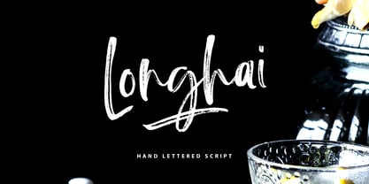 Longhai is a textured, natural and handcrafted brush font with an underline swash. This font is perfect for modern projects, headers, blogs, logos, websites, branding, and more! Longhai Swash include 26 hand drawn strokes to underline Longhai text. This as a separate font, choose it from your font menu and type in any A-Z character to create a swash.
 - Taurus by Fenotype,
$30.00 Save time and effort – choose your type wisely. Use Taurus and you’ll achieve impact without having to resort to cheap tricks. We have done the work for you: just type out words using Taurus and you’ll have a logo for a Wall Street law firm – or for that precious vintage Barolo. Refinement. Sophistication. Seriousness. Sex appeal. Taurus has it all.
 - BD Supper by Typedifferent,
$45.00 "BD Supper" is a friendly and humorous geometric-organic sans serif typeface great for use on food packaging and in gastronomy-related topics. It features a wide selection of alternate characters to choose from. Use them as you like. With two weights regular and bold, «BD Supper» fits the needs to structure a body text with a headline and to create logotypes.
 - ABTS Crestwing by Albatross,
$19.95 ABTS Crestwing is a unique initial font with extraordinary flexibility and beauty. There are 5 wing styles to choose from. The wings are accessed through typing numbers. The 5 pairs are: [1, 2] [3, 4] [5, 6] [7, 8] & [9, 0]. The odd numbers in the pairs will give you a left wing, and the even numbers will give you a right wing. The letters are separated into upper and lowercase. Uppercase has a crest point, the lowercase does not, giving you the ability to string letters together to form words and phrases, and place the tip of the crest above the letter of your choosing. Optional endcaps are available using the brackets on your keyboard "[, ]." This allows you to cap off a word if you wish not to use a wing to do so. Crestwing is both beautiful and unique, and works best at large sizes.
 - Determine by Haksen,
$18.00 DETERMINE is a strong modern sans style with upper and lowercase feel nice balanced. Its wide range of uppercase with alternates and ligatures allow versatile design options and works perfectly for headlines, logos, posters, packaging, T-shirts and much more. Font Features : Regular and Italic version Character set A-Z Ligatures in Uppercase Alternates in Uppercase Numerals & Punctuation Accented Characters Multiple Languages Supported Recommended to use in Adobe Illustrator or Adobe Photoshop with opentype feature. Ligatures feature is default setting in Adobe Illustrator or Adobe Photoshop in Uppercase character. So when you want not to use the ligatures. Open glyphs panel : In Adobe Photoshop choose tool Window Character and then please klick fi symbol In Adobe Illustrator choose tool Window Type Open Type and then please klick fi symbol If you have questions, just send me a message and I'm glad to help. Have a great day, Haksen
 - Kongfusher by Java Pep,
$15.00 Kongfusher is the layered font that comes up with 2 styles engraved layer. You can save your time to mix and match the styles you need. Kongfusher font has 4 fonts including: regular, full engraved, half engraved, and extruded. This font is perfect for logotype, flyers, posters, branding and identity, or application in mobile. OpenType features can be utilized to let you choose and mix of alternates. For many applications this will be automatic. But otherwise, if your application does not support OpenType you must install an application to access the character map for access to these features. For the step to use character map you must choose "private use area" at "Unicode" options. How to use character map for access OpenType features https://youtu.be/ARD2cqZ2rdM If you have any questions or technical support don't hesitate to comment, message or contact java.indonesian@yahoo.com. Have a nice day.
 - Imagine if your high school chemistry teacher decided to become a typographer, and their first project was to somehow capture the essence of every "Eureka!" moment they ever had in a font. The result...
- Stay Kids by Krakenbox Studio,
$15.00 Stay Kids is handwritten Font. It has cute, fun, & cool. It’s a great font for fashion, apparel projects, signature, album cover, logo, branding, magazine, social media, & advertisements, but also works great for other projects.
 - Noyram by Patria Ari,
$15.00 Noyram is a strong brush script typeface with stunning alternate glyphs. With so many alternative glyphs, you can make an experiment by combining regular and alternate glyphs to get cool phrase with great preview.
 - Basketball by Evo Studio,
$10.00 Basketball is a bold and authentic slab serif font. It has a cool style and it will make any of your designs stand out. Use it for sports, racing design, or anything sports-related.
 - Gerando by ArimaType,
$18.00 Gerando is a cool and adaptable display font. Add this modern font to each of your favorite designs and make them instantly stand out. If you have questions, please contact us at arimatype@gmail.com
 - Chic Cat by AEN Creative Studio,
$16.00 Chic Cat is a cool and uniquely designed decorative font. No matter the topic, this font will be an incredible asset to your fonts’ library, as it has the potential to elevate any creation.
 - Gladsome Morning by Seemly Fonts,
$14.00 Gladsome Morning is a cool, clean, and simple display font. It will look stunning on any food packaging design, poster, flyer, or print. Use this font for your designs and explore its endless possibilities.
 - Kohaku Monoline by HayyType Foundry,
$12.00 Kohaku Monoline! A Monoline font with a Japanese style. With thin strokes and an extraordinary curve, Kohaku Monoline is perfect for branding projects, cool text, product packaging - or simple style for your poster text.
 - Chistmas Joyful by Creaditive Design,
$12.00 Christmas Joyful is a cool and fun decorative font. No matter the topic, this font will be an incredible asset to your fonts’ library, as it has the potential to elevate any cristmas creation.
 - Lucky Lunch by PizzaDude.dk,
$15.00 A font to boost your creative work - handmade strokes and a scribbled 3d effect! Use the 4 different versions to create cool effects. With, or without shadow and with or without the worn effect!
 - HERITAGE DREAMS by Letterena Studios,
$9.00 Heritage Dreams is a cool and vintage styled serif font. No matter the topic, this font will be an incredible asset to your fonts’ library, as it has the potential to elevate any creation.
 - Shy Darling by Seemly Fonts,
$14.00 Shy Darling is a cool and romantic display font. It is perfectly suited for stationery, logos, t-shirt, paper, print design, website header, photo frame, flyer, music cover, poster, image slider, and much more.
 - Rodenberg by Zealab Fonts Division,
$18.00 Rodenberg is multipurpose display typeface with cool characters, inspired by urban culture that combine the classic and modern style. It is perfect for headlines, logotypes, signs, posters, greeting card, letterhead, t-shirts and more.