6,229 search results
(0.021 seconds)
- Peaknose by FadeLine Studio,
$15.00 Peaknose is a fancy comic typeface, cute and beautiful. Although It is also suitable for other purposes such as posters, shopping bags, headline, insignia, badge, t-shirt, logo, branding, cover book, badge, birthday invitation, greeting cards, etc. Peaknose is also suitable for use in the design style as retro, vintage, minimalist, flat, cartoon, modern design, etc. With the combination and some color, you can easily create a compelling message and look beautiful for your design Peaknose comes with a complete set of standard characters, punctuation & international glyphs, are also available web fonts.
 - Barefoot by Ingrimayne Type,
$14.95 Suppose you were at a sandy beach and you wanted to write a message by making footprints in the sand. You might end up with letters much like those in Barefoot, a typeface made with bare feet. It is all caps but most of the letters on the lower-case keys differ from those on the upper-case keys. It looks best at large point sizes where the details of the feet are clear. It comes with a large assortment of accented letters to support most European languages.
 - Tropical Trouble by SavoringSurprises,
$10.00 Tropical Trouble is a hand lettered sans-serif font. The super tall and super skinny font could be used for a variety of projects, such as labels for a jar or a name on a tumbler! Contains over 200 accented characters for language support. Some of the languages supported are: English, Spanish, Portuguese, German, Italian, French, Polish, Catalan, Irish, Norwegian, Croatian, Gaelic, and more! If you would like to know if a certain language is supported, please contact me with the language and/or any special characters you want to know about.
 - 1820 Modern by GLC,
$38.00 This family was inspired mainly (Normal and Italic style ) by a Didot pattern font used in Rennes (France, Britanny) by Cousin-Danelle, printers, for Antiquités historiques et monumentales ‡ visiter de Montfort ‡ Corseul, par Dinan... Saint Malo... etc. an historic guidebook for a journey through a part of (French) Brittany in 1820, and many other books. The present version contains 1820 Modern Normal and Italic, 1820 Modern Large Normal and 1820 Modern Narrow Normal, each style with small caps. This font may be used together with 1906 French News and/or 1906 Titrage.
 - Melodica by Scholtz Fonts,
$19.95 Melodica was so named because the characters dance easily across the page as music wafts across a room. The font was designed to meet the need of designers that need clarity, sensuousness, a suggestion of the oddball, and a modicum of humor. With its boldly curvy caps, and large x-height lower case characters, Melodica suggests a boldness of purpose while enjoying a well modulated delicacy of line. Use Melodica for any purpose that wants a happy, vibrant, slightly quirky yet "not too far from the norm" solution. Language support includes all European character sets.
 - Frozenflare by Balpirick,
$15.00 FROZENFLARE is a Sweet and Soft Handbrushed Font. It is suitable for svg designs, mug decorations, pottery, shirts, hats, tote bags, card making, wall art, interior prints, and various other creations. Whatever the topic, this font will be a wonderful asset to your font library, as it has the potential to enhance any creation. This font only has all uppercase letters, but if accessed with lowercase letters it will automatically become uppercase. also multilingual support Enjoy the font, feel free to comment or feedback, send me PM or email. Thank you!
 - Saxo Grammaticus by Jonas Stensgaard,
$8.00 Saxo Grammaticus is a beautiful and friendly family that works great with family themes, elegant & classy material and professional settings. It's so versatile you'll find yourself coming back to it over and over for your projects, and that's whether you're looking to create logos, quotes, poster designs, brochures, packaging, anything with big letters like headlines, wedding invitations, holiday cards, advertisements, signs and on and on and on... There is a total of 107 ligatures and 76 alternates! That's plenty of options for any designer wanting to give those big letters a little extra wham bam!
 - Parking Lot Sale JNL by Jeff Levine,
$29.00 Here’s a novelty font emulating the plastic pennant streamers that were popular in the 1950s and 1960s used to decorate a store parking lot or used car lot for a sales event. The typeface inside the individual pennants is Manufacturer JNL, which can be used for body copy associated with titles made by this font. Parking Lot Sale JNL is available in regular (black letters on white pennants) and black (with white letters). A blank pennant for word spacing or end caps is available on the backslash key.
 - Travel East JNL by Jeff Levine,
$29.00 “Tropical Type” was Alf Becker’s 148th submission to “Signs of the Times” magazine (a publication for the sign trade) where for years Becker would provide a monthly lettering design to inspire other sign writers. This particular design has more of a Far East flair to it, and was redrawn digitally as Travel East JNL, which is available in both regular and oblique versions. Special thanks to Tod Swormstedt of the American Sign Museum and S.T. Media Group for providing the sample image from which the font was derived.
 - Banret by Ryzhychenko Olga,
$12.00 Banret is built using simple geometric shapes. It is mostly the result of my experiments on the other font I made earlier in 2016, called Inventor. Font is inspired by old fonts of the beginning of the 20th century. Capital letters are built with one to four proportions. The font has four weights: normal, and bold, and two alternatives: ribbon, and flag. As far as it is a decorative font, it is not designed for large amounts of text. But it is perfect for creating branding elements, logos, slogans and posters.
 - Going Clap by Ahmad Jamaludin,
$17.00 Introducing Going Clap, the font that's all about bold and nostalgic vibes! This chunky slab serif typeface is your secret weapon for making text pop with artistic and vintage flair. With 8 unique font families, including Condensed, Normal, Semi Expanded, Expanded, and their cool shadow versions, you'll find the perfect style for any project. But that's not all! When you choose Going Clap, you'll also get a fantastic bonus—56 retro mascot illustrations for that extra touch of character and nostalgia. What's included? Going Clap Main File Has 8 fonts: Condensed, Normal, Semi Expanded, Expanded, Condensed Shadow, Normal Shadow, Semi Expanded Shadow, Expanded Shadow Instructions (Access special characters, even in Cricut Design) Unique Letterforms Works on PC & Mac Simple Installations Accessible in Adobe Illustrator, Adobe Photoshop, Microsoft Word even Canva! PUA Encoded Characters. Fully accessible without additional design software. Thank you, Dharmas Studio
 - TX Signal Signifier by Typebox,
$39.00Eight designers present a set of icons that indicate the fun and fantastic world of signage. Each collaborator's solution represents a completely different interpretations on signage vernacular. Akira Kobayashi's "Subsumption", obscured by foliage, offers a perspective that signs on Japanese roads can be vague and beautiful. M.A.D.'s "People Signs" is a graphical association of people signage with a variety of well known situation symbols. Cynthia Jacquette's "Honest Arrows" are a series of arrows that attempts to honestly tell you how to get from point A to Point B in a big, confusing city. Mike Kohnke's "Road Kill" and the "Bump & Bruise" highlight how signs make for perfect targets when unloading a round of buckshot, and the licking a contruction barrier often endures. Joachim Muller-Lance's "Traffic Blends" places faces on things! Hey, didn't you give your first car a nickname? Cars are alive, you know - they guzzle and smoke all day. Jean-Benoît Lévy's "Inner-State" was inspired while reading the California driver handbook to pass a driver's test. Kevin Roberson's "Tail Lighting" reminds us to drive carefully and not to forget to signal. Diana Stoen's "Drivers Out There" shows us "driver personality archetypes", including the lil'ol lady that everyone tries to avoid. - Space Rocks by Wing's Art Studio,
$10.00 Space Rocks! A Retro Sci-Fi Font Inspired by 1950s Television Serials “Oh boy, oh boy, oh boy! The next episode of Space Rocks is on tonight! What’s it about? Well, it’s all to do with this family of astronauts who crash land on Mars and how they survive all sorts of alien creatures and killer storms! The science is really real too! Who needs school!!!” And so goes the story of one young fan whose imagination is captured by the latest offering in a golden-age of TV science-fiction. A brand of 1950s programming that offered a light-hearted and optimistic view of the future full of exploration, discovery and hazardous adventure! Sometimes even a cautionary tale to live on in your nightmares! With Space Rocks I want to capture this vibe with an all-caps design inspired the opening titles of these shows, fully hand-drawn with a range of discretionary ligatures that add a comic (not atomic!) touch. The package includes Regular and Outlined (all hand-drawn) versions with a complete set of alternatives to help maintain the analogue look. This font also includes unique uppercase and lowercase characters, along with numerals, punctuation, language support, underlines and symbols. It’s perfect for movie and television titles, album covers, posters or any design that needs a dramatic, spacey and fun look. Check out the visuals to see it in action.
 - Blank Manuscript by Aah Yes,
$14.95Blank Manuscript allows you to produce sophisticated musical scoresheets even on basic Word Processors - anything from simple plain staves to complex full-page orchestral scores of your own design, to write in the notation yourself. The basic stuff is really easy and straightforward, but there's some quite advanced things you can do as well. So Copy and Save these Instructions. • The main stuff is simple and tends to follow the initial letter. Treble, Bass and Alto clefs are on upper case T B A (there are more clefs, below). The 5 Lines for the clefs are on L or l. • A small v will give a small vertical line (like a bar line) and a Big U will give a Big Upright - these can start or end a line or piece. • Time Signatures - type the following letters: Think of W for Waltz and it's easy to remember that 3/4 time is on W. Then from that they go up or down together like this: V=2/4 W=3/4 X=4/4 Y=5/4 Z=6/4 Compound Times are on H I J K like this: H=3/8 I=6/8 J=9/8 K=12/8 Common Time and Cut Common symbols can be found on semi-colon and colon respectively (all begin with Co- ). 2/2 3/2 are on lower case a and b, 7/4 and 7/8 are on lower case c and d, 5/8 is on small k (think POL-k-A) • Flat signs are on the numbers. Flat signs on LINES 1 to 5 are on numbers 1 to 5. Flat signs on SPACES 1 to 5 are on numbers 6 to 0 (space 1 being above line 1, space 5 being above the top line of the stave). Sharp signs are on the letters BELOW the long-row numbers. Which is q w e r t for the sharp signs on Lines 1 to 5, and y u i o p for sharp signs on spaces 1 to 5. Doing it this way means it works the same for all clefs, whether Treble, Bass, Alto, Tenor or any other. Sharp and Flat Signs always go in this order, depending on how many sharps or flats your key signature requires: Treble Clef Sharps t i p r u o e Flats 3 9 7 4 2 8 6 Bass Clef Sharps r u o e t i w Flats 2 8 6 3 1 7 = Alto Clef Sharps o e t i w r u Flats 7 4 2 8 6 3 1 • Guitar Chord Boxes are on G and g (G for Guitar) Upper Case G has a thick line across the top Lower case g has an open top, for chords up the fretboard TAB symbols are available: Six-string Tablature is on s & S for Six. Four-string Tablature is on f & F for Four. (Lower case has the "TAB" symbol on it, Upper Case has just the lines to continue.) Five-string tablature, is on lower case "j" (as in BAN-j-O) and of course L or l will continue the 5 lines. •RARE CLEF SIGNS including Tenor Clef, are on various punctuation marks, i.e. dollar, percent, circumflex, ampersand & asterisk, above the numbers 4 to 8. NOTE: The important symbols were kept on the letter and number keys, which are fairly standard all over, but some of the less important symbols are on various punctuation keys, which in different countries are not the same as on my keyboard. If it comes out wrong on your system, all I can say is it's right on the systems we've tried, and they'll be in here somewhere, probably on a different key. CLOSING THE ENDS OF THE LINES and BAR-LINES is done with the 3 varieties of brackets - brackets, brace and parentheses - Left/Right for the Left/Right end of the line. Parentheses L/R () which are above 9, 0 give a clef with a small vertical upright (the same as a bar line). Brace L/R and Brackets L/R (both on the 2 keys to the right of P on my keyboard) will close off a staff line with tall upright bars. Brace gives a double upright - one thick, one thin. Brackets give a single tall upright. A Big Upright is on Big U, (Big U for Big Upright) and a small vertical line is on small v (small v for small vertical). The Big Upright is the maximum height, and the small vertical is exactly the same height as a stave. And there's a tall upright Bar, on Bar (which is to the left of z on my keyboard, with Shift,) which is the same height as the bar on upper case U but twice as broad. • There's a staff intended for writing melodies, which is a little bit higher up than an ordinary treble clef giving a space underneath to put lyrics in - on m and M for Melody line. Lower case has the Treble Clef on, Upper case M has just the higher-up staff lines with no clef. (Use mMMMMMMM etc.) However this clef will be in the wrong place to put in sharp and flat signs, key signatures and so on, so if you use this clef you'll have to write the sharps, flats and key signature yourself. There's also a clef that's smaller (less tall) than the ordinary clef, but with the same horizontal spacing so it will align with other standard-sized clefs - on slash (a plain clef) and backslash (with a Treble Clef). • There are some large brackets for enclosing groups of staves, such as you'd use on large orchestral scores, on Upper Case N O P Q R, which can aid clarity. N and O on the left, Q and R on the right. P is a Perpendicular line to be used on both sides to increase the height of the enclosure, in this way but with the staff lines in between: N Q P P P P P P O R OTHERS —————————————— • Repeat marks are on comma (left) and period/full stop (right). • Hyphen is left as a sort of hyphen - it's a thin line like a single staff line, with the same horizontal spacing as ordinary staff lines - in case you want to draw a line across for a Percussion Instrument, or a Title or Lyric Line. • Space is a Space, but with HALF the width or horizontal spacing as ordinary staff lines, so 2 space symbols will be the same width as a clef symbol or line. • Grave (to the left of 1 on the long row, or hold down Alt and type 0096 then let go) gives a staff line that is one eighth the width of an ordinary staff line. • If you want manuscript in a clef and key which requires a flat or sharp sign in the space underneath the 5 lines, they’re on = equals and + plus . SYMBOLS • Many of these symbols will only be useful if you have worked out in advance which bars will need them, but they are here in case you've done that and wish to include them. • Symbols for p and f (piano and forte) are on 'less than' and 'greater than' < > (above comma and full stop) and m for mezzo is on Question, next to them. They can be combined to make mp, mf, ff, pp, etc. These signs -- and other signs and symbols like Pedal Sign, Coda Sign and so on -- can be found on various punctuation mark keys, including above 1, 2, 3 in the long row, and others around the keyboard. There's a sort of logic to their layout, but in different countries the keys are likely to give different results to what is stated here, so it's probably best to just try the punctuation and see if there's any you might want to use. (But on my keyboard a Coda sign is on circumflex - because of the visual similarity. Pedal sign is on underscore. A "Sign" symbol is on exclamation mark.) They were only included in case you really need them to be printed rather than handwritten. • However, a Copyright symbol is deemed necessary, and also included are a "Registered" symbol and a TradeMark symbol. They are found in the conventional places, and can be accessed by holding down ALT and typing 0169, 0174 or 0153 respectively in the numberpad section and letting go. • Staff lines with arco and pizz. above are on capital C and D respectively ---C for ar-C-o. • An empty circle above a staff line (to indicate sections by writing letters A, B, C or 1,2,3 inside for rehearsal marks) is on n. The actual signs for an A, B, C and D in a circle above the staff line can be produced by holding down ALT and typing 0188, 0189, 0190 and 0191 respectively and letting go. • The word "Page", for indicating page numbers, is on the numbersign key. • The two quotes keys, (quote single and quote double) have symbols representing "Tempo is", and "play as triplets", respectively. • INSTRUMENT NAMES There's a whole lot of Instrument Names built in (over a hundred) which can be printed out above the clef, and you do it like this. Hold down Alt and type in the given number in the numberpad section, then let go. For Piccolo it's 0130, for Flute it's 0131, Cornet is on 0154, Violin is on 0193, and the numbers go up to over 0250, it's a fairly complete set. There's also a blank which is used to align un-named clefs on 0096. Put them at the very beginning of the line for the best results. Here they are: WOODWIND Piccolo 0130 Flute 0131 Oboe 0132 Clarinet 0133 Eng Horn 0134 Bassoon 0135 Soprano Sax 0137 Alto Sax 0138 Tenor Sax 0139 Baritone Sax 0140 Saxophone 0142 Contrabassoon 0145 Recorder 0146 Alto Flute 0147 Bass Flute 0148 Oboe d'Amore 0149 Cor anglais 0152 Pipes 0241 Whistle 0242 BRASS Cornet 0154 Trumpet 0155 Flugelhorn 0156 Trombone 0158 Euphonium 0159 Tuba 0161 French Horn 0162 Horn 0163 Tenor Trombone 0164 Bass Trombone 0165 Alto Trombone 0166 Piccolo Cornet 0167 Piccolo Trumpet 0168 Bass Trumpet 0170 Bass Tuba 0171 Brass 0172 VOICES Vocal 0175 Melody 0176 Solo 0177 Harmony 0178 Soprano 0179 Alto 0180 Tenor 0181 Baritone 0182 Treble 0183 Bass 0197 (see also PLUCKED STRINGS) Descant 0184 Mezzo Soprano 0185 Contralto 0186 Counter Tenor 0187 Lead 0206 BOWED STRINGS Strings 0192 Violin 0193 Viola 0194 Cello 0195 Contrabass 0196 Bass 0197 Double Bass 0198 Violoncello 0199 Violin 1 0200 Violin 2 0201 Fiddle 0252 PLUCKED STRINGS Harp 0202 Guitar 0203 Ac. Gtr 0204 El. Gtr 0205 Lead 0206 Bass 0197 Ac. Bass 0207 El. Bass 0208 Slide Gtr 0209 Mandolin 0210 Banjo 0211 Ukelele 0212 Zither 0213 Sitar 0214 Lute 0215 Pedal Steel 0216 Nylon Gtr. 0238 Koto 0239 Fretless 0244 KEYBOARDS + ORGAN Piano 0217 El. Piano 0218 Organ 0219 El. Organ 0220 Harpsichord 0221 Celesta 0222 Accordion 0223 Clavinet 0224 Harmonium 0225 Synth 0226 Synth Bass 0227 Keyboards 0228 Sampler 0249 PERCUSSION and TUNED PERCUSSION Percussion 0229 Drums 0230 Vibes 0231 Marimba 0232 Glockenspiel 0233 Xylophone 0234 Bass marimba 0235 Tubular Bells 0236 Steel Drums 0237 Kalimba 0240 OTHERS Harmonica 0246 Mouth Organ 0247 FX 0251 Intro 0243 Verse 0245 Refrain 0248 Chorus 0250 un-named 0096 (this is a small spacer stave for aligning clefs without a name) ALSO copyright 0169 registered 0174 TradeMark 0153 Rehearsal marks 0188-0191 (giving A, B, C, D in a circle, an empty circle is on n ) Clef signs for Treble Bass Alto without any staff lines 0253-0255 An Alphabetic List of all signs: a 2/2 time b 3/2 time c 7/4 time d 7/8 time e sharp sign, centre line f Tab sign for 4-string tab g Guitar Chord Box, no nut h half-width stave I sharp sign, third space up j Tab sign for 5-string tab k 5/8 time l Lines - 5 horizontal lines for a stave m Melody Clef - a standard clef but placed higher up, with Treble sign n Stave with an empty circle above o sharp sign, fourth space up p sharp sign, space above stave q sharp sign, bottom line r sharp sign, fourth line up s Tab sign for 6-string tab t sharp sign, top line (fifth line up) u sharp sign, second space up v vertical line (bar-line) w sharp sign, second line up x Fretboard, four strings y sharp sign, first space up z Fretboard, five strings A Alto Clef B Bass Clef C “arco” above stave D “pizz.” above stave E Double Vertical Lines F Four Horizontal lines (for 4-string tab) G Guitar Chord Box with nut H 3/8 time I 6/8 time J 9/8 time K 12/8 time L Lines - 5 horizontal lines for a stave M Melody Clef - a standard clef but placed higher up, plain N Bounding Line for grouping clefs - top left O Bounding Line for grouping clefs - bottom left P Bounding Line for grouping clefs - Perpendicular Q Bounding Line for grouping clefs - top right R Bounding Line for grouping clefs - bottom right S Six Horizontal lines (for 6-string tab) T Treble Clef U tall, thin Upright line V 2/4 time W 3 / 4 time X 4/4 time Y 5/4 time Z 6/4 time 1 flat sign, first line up (the lowest line) 2 flat sign, second line up 3 flat sign, third line up 4 flat sign, fourth line up 5 flat sign, fifth line up (the top line) 6 flat sign, first space up (the lowest space) 7 flat sign, second space up 8 flat sign, third space up 9 flat sign, fourth space up 0 flat sign, space above stave - Aragones - Unknown license

- Shooby by BA Graphics,
$45.00A cool looking animated outline and shadow font. - Razkes Brush by Rvandtype,
$11.00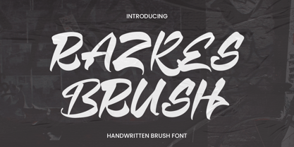 Razkes Brush is a cool urban style font. Its elegant and cool look makes it the perfect choice for logos, branding, invitations, stationery, wedding designs, social media posts, and so much more. Features : Numbers and punctuation Multilingual PUA encoded
 - RAYOH by Product Type,
$13.00 Rayoh is a stylish and freedom-loving graffiti display font. With two variations available, regular and shadow, this font gives a unique touch to projects that require rich and beautiful handwriting. With Rayoh, you can bring freedom and creativity to your designs. This font combines bold graffiti and beautiful handwriting elements to create an amazing combination. Expressive designs and bold characters make Rayoh the perfect solution for projects that want to stand out. With this font, you can create a striking poster, a cool merchandise design, or unforgettable promotional material. Their different variations provide flexibility in customizing the desired style and effect. Use regularly for a plain look and bring out the beauty of handwriting, or choose shadow for a dramatic shadow effect that adds depth and dimension to your design. Rayoh is the right choice for those who want to add a touch of freedom and uniqueness to their creative projects. Immediately choose Rayoh as your flagship font and see how your design steals attention and attracts potential customers in no time. What’s Included : - File font - All glyphs Iso Latin 1 - Ligature, Alternate - We highly recommend using a program that supports OpenType features and Glyphs panels like many Adobe apps and Corel Draw, so you can see and access all Glyph variations. - PUA Encoded Characters – Fully accessible without additional design software. - Fonts include Multilingual support
 - Death World by Typefactory,
$14.00 Death World is a fancy display font. It embodies playfulness and authenticity and is the perfect choice for any children activity, fantasy, game font, party invitation, or school project. Add this fun display font to your designs and notice how it makes them come alive!
 - Grand Label by Gleb Guralnyk,
$14.00 Hi, presenting a bold vintage font - Grand Label. It's an old-school typeface with decorative elements, included as a separate font file for more convenient manipulating and recoloring. Grand Label font supports most of Latin European languages (check out the screenshots with available characters).
 - Osaka Chips by Ergibi Studio,
$15.00 Osaka Chips is a unique all uppercase characters font equipped with extrude effects that make this font look more attractive and very suitable for a variety of funny needs such as chips packaging, snack and food packaging, quotes, needs of school children, and more.
 - Befano by Balevgraph Studio,
$10.00 BEFANO is a simple and modern sans serif font. It’s playfulness make it great for creative projects. Excellent for headlines, caption, brand logo, t-shirt, school & university, and more. What's Included? Uppercase & Lowercase Numbers & Punctuation Ligature & Stylistic Alternate Multilingual Support PUA Encoded Regular & Italic
 - Easter Chalk by Yoga Letter,
$14.00 "Easter Chalk" is handwritten in chalk. This font is very easy to use because it has been specially designed. This font is equipped with uppercase, lowercase, numerals, punctuations, and multilingual support. It is suitable for Easter, summer, spring, back-to-school themes, and others.
 - Soft2911 by Ivan Kostynyk,
$15.00 This font was a product of self-initiated project I started a while back. It started and finished as a project that I was working on while procrastinating at school, for fun; however, I spent enough time to not give it out for free.
 - Aylea by Lafitte 58,
$16.00 Aylea a modern and relaxed display font. It embodies playfulness and authenticity and is the perfect choice for any children activity, school project, Christmas, New Year, Birthday and many more. Add this playful font to your designs and notice how it makes them come alive!
 - Jacky Hand by Open Window,
$4.95 Jacky Hand is a waxy new font totally drawn by my 6 year old son while practicing his handwriting. This is a totally diverse font perfect for a wide range of uses from horror posters to childlike naiveté, or to inject some preppy school spirit.
 - Leophard by Arterfak Project,
$16.00 Create a great combination design with this font family! Leophard font family is a modern slab serif that is inspired by sporty design and vintage style. There are 6 different styles that you can apply in your design projects. This font is made with tenacious basic shapes, the visuality of strength, old school movement, and modern minimalist style. - Regular style - good for your titles, sub-headlines or body text for readability. - Bold style - recommended for your titles, naming, labels or logos. - Bold inline style - is cool for your big typographic designs that are showing the precision of the shapes. - Outline style - good for your additional text, or minimalism design purposes. - Shadow style - suitable for vintage logos, minimalist effects, and titles. - Stencil style - inspired by street art and letterpress design. Recommended for design project which visualizes strength and movement. Make a great combination on your label designs, brand, poster headlines, movie titles, storefront, monograms, sport designs and merchandise design.
 - Loopy BRK - Unknown license

- Loopy (BRK) - Unknown license

- Corsa Grotesk by Typedepot,
$39.00 Corsa Grotesk is our very own tribute to two typographic giants: the Futura and Avenir typefaces. It is Designed with geometric simplicity in mind with well balanced strokes and modern touch. Generous proportions and x-height with more contemporary details - the single story ‘a’ and the horizontally barred ‘k’ being just two of many examples makes it shine in every jobs it takes. Corsa Grotesk blends the classic geometric aesthetics into a well-balanced font with generous proportions and minimal contrast. It features 10 weights ranging from Hairline to Black plus matching italics, as well as Cyrillic support for Bulgarian and Russian localizations. Filled with all the essential OpenType features like tabular figures, fractions, ligatures etc, it is a great choice for branding, advertising, user interfaces or any text that needs a bit of polish and a slick, present-day look that still feels familiar. With its 2.0 version we managed to polish the font even more. We revisited every path and fixed all the inaccuracies throughout. Corsa Grotesk now comes with way better and consistent spacing and kerning, just the right amount of contrast and balance. Live Tester | Download Demo Fonts | Subscribe
 - Ephemera Sickles by Ephemera Fonts,
$35.00 A debut from the most anticipated vintage digital typefoundry by Gilang Purnama and Ilham Herry, who stucked their mind, body and soul back into the first era of 18th century. They build this intense visual-time machine that no one capable before. Started by the visual branding of the Ephemera Fonts, they bring every letters of it to the another level of journey. They called it Ephemera Sickles. Ephemera Sickles is a ornamented letterhead style typeface-inspired by the era of victorian (1800-1900) and this style was commonly used by engrossers at the turn of the century to embellish official documents, such as diplomas and other certificates. Carefully crafted for every single letters with the soul of Sickels Lettering, Spencerian, and some research from the Penmanship Journal book. The style is named after Charles Sickels, who headed the art department of Electro-Light Engraving Co. in New York City during the early 20th century. There’s no doubt that such a very strong presence typeface like Ephemera Sickles will bring a powerful identity to your visual project. Will be a perfect joint for a logo, visual branding, poster, beer label, packaging, classic bar decor, vintage hotel, et cetera.
 - Martini at Joe's by steve mehallo,
$19.56 Googie Architecture, also known as "Midcentury Coffee Shop Modern," was born in California during the Atomic Age. Martini at Joe's is based on lettering from several historic Googie sources - many of which no longer exist. The futuristic Martini at Joe's collection was named for Northern California's famous Italian-themed "Joe's" restaurants, some of which are still serving up large portions of charbroiled beef steak, canned buttered veggies and pretty decent martinis. Martini at Joe's contains many fabulous typographic extras – and is available in single font packages or as a 15 font interchangeable Megaset (with "italic-esque" obliques and "retro obliques"). Martini at Joe's is perfect for use as commercial signage, on the menu for your coffee shop, supper club, tiki bar, fish grotto, smorgy, space port or destination casino. It also holds its own in any vintage store, on greeting cards, t-shirts, hi-brow gallery announcements, product skins, your 'zine masthead, on the faceplate of your futuristic microwave oven, tv dinner packaging, at millionaire's conferences or even embellishing the fuselage of your latest jet airline venture. Martini at Joe's: there's no better way to say, "Hold the olive, I'm having a moment."
 - Sketchen by Mike Zuidgeest,
$10.00 Hey there! As the proud creator of Sketchen, I'm stoked to introduce you to my latest font creation! Sketchen is a sketch style font that's just perfect for outdoor advertising and menus. Imagine a beachy vibe, summer vibes, and a whole lot of fun – that's what Sketchen brings to the table! I designed Sketchen to capture the essence of summertime and the carefree attitude of beach life. With its playful, hand-drawn style, Sketchen adds a whimsical touch to any design project. Whether you're creating a menu for a tiki bar or promoting a surf competition, Sketchen is the perfect font to convey a sunny, laid-back feeling. Sketchen's bold, eye-catching letters ensure that your designs won't be missed. And with its relaxed, playful vibe, it's sure to make a splash in any setting. So why not give Sketchen a try and see what kind of summery designs you can come up with? With Sketchen, you can add a touch of fun to all your outdoor advertising and menu design projects. So let your creativity run wild and see where Sketchen takes you!
 - Argo Supernova by Eliezer Grawe,
$9.00 Argo Supernova is a sans serif font, inspired by science fiction titles. Delicate on the thinest weights, strong on the thickest ones, it is perfect for modern branding and logo design, editorial design, web design, packaging and various other projects. Argo Supernova has a geometric and open structure, with shapes that create a solid texture on the page. Its large x-height produces good reading in long texts and its peculiarities, such as curved bars and endings, generate a strong presence in titles. The Argo Supernova family consists of 8 weights with matching italics, with Extended Latin character set. The italics makes use of more curves and smoothness, creating an interesting variation in design. • 16 styles: 8 weights + 8 italics; • 602 glyphs in each weight; • Special SS02 feature: "bend" alternates for majority of caps characters with curved details; • OpenType features: Access All Alternates, Stylistic Alternates, Standard Ligatures, Discretionary Ligatures, Numerators, Denominators, Fractions, Superior and Inferior Numbers, Kerning, Localized Forms, Lining Figures, Oldstyle Figures, Proportional Figures, Tabular Figures, Slashed Zero, Stylistic Set 1 to 6. • Supporting 219 latin based languages, which are spoken in different 212 countries.
 - Calaveras by Design is Culture,
$29.00 In August of 2009, I was commissioned by Zoo York, a New York City based skateboard company, to visit Buenos Aires to study and document street typography. As soon as my taxi driver took the bustling street Entre Ríos, it was clear that the city and I were going to be good friends. Many of the independently owned businesses on Entre Ríos are adorned with handmade signage. These signs are painted in a style called Fileteado which is a century-old Argentinian type of lettering and floral ornamentation. Nowadays, Fileteado is still a prominent part of the city’s landscape, coloring the façades of restaurants, bars and coffee shops. Calaveras and Diablitos are two new typefaces that were inspired by Fileteado. Stylistically, the fonts are a return to a rhythmic and playful sensibility reminiscent of Vitrina and Cuba, two fonts that I designed in 1996. Along with dynamism and dance, these new fonts incorporate a rigor and functionality essential to labelling any font a ‘workhorse.’ The names Calaveras and Diablitos, came from the name of a song by the infamous Buenos Aires rock band, Los Fabulosos Cadillacs. —Pablo A. Medina
 - Diablitos by Design is Culture,
$29.00 In August of 2009, I was commissioned by Zoo York, a New York City based skateboard company, to visit Buenos Aires to study and document street typography. As soon as my taxi driver took the bustling street Entre Ríos, it was clear that the city and I were going to be good friends. Many of the independently owned businesses on Entre Ríos are adorned with handmade signage. These signs are painted in a style called Fileteado which is a century-old Argentinian type of lettering and floral ornamentation. Nowadays, Fileteado is still a prominent part of the city’s landscape, coloring the façades of restaurants, bars and coffee shops. Calaveras and Diablitos are two new typefaces that were inspired by Fileteado. Stylistically, the fonts are a return to a rhythmic and playful sensibility reminiscent of Vitrina and Cuba, two fonts that I designed in 1996. Along with dynamism and dance, these new fonts incorporate a rigor and functionality essential to labelling any font a ‘workhorse.’ The names Calaveras and Diablitos, came from the name of a song by the infamous Buenos Aires rock band, Los Fabulosos Cadillacs. —Pablo A. Medina
 - LD Enquirer by Illustration Ink,
$3.00Have you Enquired lately? It's time...so choose the thick lines and slightly uneven character placement of LD Enquirer...perfect for light-hearted scrapbook pages, journaling, greeting cards, and tags. - Midnight Tales by VP Creative Shop,
$39.00 Introducing Midnight Tales - Vintage Font Midnight Tales is vintage, elegant font with tons of alternate glyphs, ligatures and multilingual support. It's a very versatile font that works great in large and small sizes. Midnight Tales is perfect for branding projects, home-ware designs, product packaging, magazine headers - or simply as a stylish text overlay to any background image. Uppercase, lowercase, numeral,punctuation & Symbol Alternate glyphs Ligatures Multilingual support How to access alternate glyphs? To access alternate glyphs in Adobe InDesign or Illustrator, choose Window Type & Tables Glyphs In Photoshop, choose Window Glyphs. In the panel that opens, click the Show menu and choose Alternates for Selection. Double-click an alternate's thumbnail to swap them out. Feel free to contact me if you have any questions! Mock ups and backgrounds used are not included. Thank you! Enjoy!
 - Kompot Sans by VP Creative Shop,
$20.00 Kompot typeface with 2 styles Kompot Sans is swirly, vintage typeface with 2 styles to enchant your next project. They are loaded alternate glyphs and multilingual support. Very versatile fonts that works great in large and small sizes. Basic latin, advanced latin, basic Cyrillic and advanced Cyrillic character sets are supported! Kompot Sans is perfect for branding projects, home-ware designs, product packaging, magazine headers - or simply as a stylish text overlay to any background image. Uppercase numeral, punctuation & Symbol Regular Outline Alternate glyphs Multilingual support Basic and Advanced Cyrillic support How to access alternate glyphs? To access alternate glyphs in Adobe InDesign or Illustrator, choose Window Type & Tables Glyphs In Photoshop, choose Window Glyphs. In the panel that opens, click the Show menu and choose Alternates for Selection. Double-click an alternate's thumbnail to swap them out.
 - Quilin by VP Creative Shop,
$30.00 Introducing Quilin Serif - latin and cyrullic Quilin is luxury, vintage typeface loaded with alternate glyphs, ligatures and multilingual support. It's a very versatile font that works great in large and small sizes. Quilin is perfect for branding projects, home-ware designs, product packaging, magazine headers - or simply as a stylish text overlay to any background image. Uppercase, lowercase, numeral, punctuation & Symbol Alternate glyphs Ligatures Multilingual support Cyrillic support How to access alternate glyphs? To access alternate glyphs in Adobe InDesign or Illustrator, choose Window Type & Tables Glyphs In Photoshop, choose Window Glyphs. In the panel that opens, click the Show menu and choose Alternates for Selection. Double-click an alternate's thumbnail to swap them out. Feel free to contact me if you have any questions! Mock ups and backgrounds used are not included. Thank you! Enjoy!


