3,291 search results
(0.025 seconds)
- Thequilla by Rometheme,
$25.00 Thequilla is vintage monoline script font. It has vintage, elegant, old school, classy, and cool. It’s a great font for fashion, apparel projects, signature, album cover, logo, branding, magazine, social media, & advertisements, but also works great for other projects. Highlight: - Easy instalation - Work on PC or Mac - PUA Encoded Support - Basic Latin A-Z and a-z - Numbers - Symbols - No special software is required, The fonts can be opened and used in Adobe Illustrator, Adobe Photoshop, Adobe InDesign, even work on Microsoft Word.
 - Abitare Sans by FSD,
$60.27 Abitare Sans was originally commissioned by the group Rizzoli Corriere della Sera. It’s a typeface of 30 weights designed to be used in Abitare magazine. The request of the president Mario Piazza was a new CP Company with some redesigned glyphs, but the result is a radical evolution of its concept being intended to be used as a font for text far more readable. In Abitare Sans the geometric structure was kept without neglecting the numerous editorial requirements.
 - Mano by Linotype,
$29.99Linotype Mano is a fresh new font from the Swiss designer Marco Ganz. Urgent and vital, the typeface suggests swift communication or the latest trends: spontaneous and informal, personal and individual. Ganz deliberately gave the characters a marked lean to the right, similar to that of quick handwriting. But Linotype Mano is not only nimble and quick, it also retains its legibility as a text font. Linotype Mano is as dynamic, brisk and casual as modern pop music. - chocolat_bleu - Personal use only

- Show Card Stencil JNL by Jeff Levine,
$29.00 For decades, the National Show Card Writer Company of Minneapolis, MN produced sign making kits used by shopkeepers, schools, churches and many other types of organizations. The standard sets were comprised of two part stencils that when overlaid, produced finished lettering, or a buyer could choose the same type style designs with a standard stencil letter. From one of these templates comes Show Card Stencil JNL, in both regular and oblique versions. Take note that the U, V and W have the heavier vertical strokes reversed. As this was the way the original stencil design was manufactured, it has been retained for this digital type as well.
 - Nemocón by Andinistas,
$59.67 Nemocon is a display font family designed by Carlos Fabian Camargo G. Nemocon It is ideal for making attractive messages. Nemocon has over 2200 glyphs distributed in 6 files OT designed from handmade lettering and usability testing. • Nemocon Script (1382 glyphs): based on the rotation of a flat tip brush. Its letters correspond to the uninterrupted calligraphic logic, as well as similar ingredients as the ones used in font Brush Script by Robert E. Smith, created for the American Type Founders in 1942. • Nemocon Tuscan (375 glyphs): Inspired by representative types of wood from the 19th century, specifically speedball brawny Tuscan capitals with serifs fishtail shaped. • Nemocon Catchwords (115 glyphs) + Nemocon Catchwords Shadow (115 glyphs): categorically inflated words with and without shadows, to accompany, highlight and prioritize. • Nemocon Dingbats (114 glyphs) + Nemocon Containers(150 glyphs): unconventional pictograms consisting warm and comforting thoughts designed to highlight words or phrases which needed multicolored illustrations or drawings in black and white.
 - Maye Calistial by Maulana Creative,
$13.00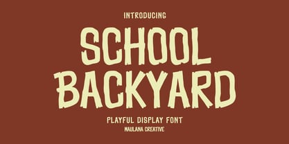 School Backyard playful display font. Regular stroke, fun character with a bit of ligatures and alternates. To give you an extra creative work. School Backyard font support multilingual more than 100+ language. This font is good for logo design, Social media, Movie Titles, Books Titles, a short text even a long text letter and good for your secondary text font with script or serif. Make a stunning work with School Backyard font. Cheers, Maulana Creative
 - VLNL Bon Bon by VetteLetters,
$35.00 Exuberantly delicious and lusciously sweet! VLNL Bon Bon embodies the perfect after dinner treat. Chocolate is a known aphrodisiac and bonbons are its most romantic carrier. Bonbon is not for nothing the French word for ‘good’ twice! You could definitely consider VLNL Bonbon the typographic equivalent of these exquisite chocolate sweets. Inspired by lettering on an Amsterdam church facade and a ladies clothing store window, Donald DBXL Beekman started drawing the first incarnation of Bon Bon already in 2004. The original idea was an alphabet design with slanted oval inner shapes and extremely long and striking serifs. This proved to be a quite demanding design job, so It took Bon Bon some time to get finished. But now it’s here in all its extravagant glory. Most recently a number of lowercase characters were added to make Bon Bon more versatile. Totally insane and over-top-the-top it has been called. But hey, we all love Bon Bon. Don't we?
 - Topaz - Unknown license

- Karmella by Mantype Studio,
$20.00 Karmella a classy serif font with a handful of curvy ligatures. Think Wild Mango with a twist! This font is both bold and elegant.. modern yet vintage.. either way, it is sure to bring attention to your brand and designs! Karmella includes alternate letters (letters with the curvy swashes). These letters are embedded into the font file and easily accessible in programs such as photoshop and illustrator. You can access these in more basic design programs but you will need to use your character map or font book
 - Taxon by Hoftype,
$49.00 Taxon is a straightlined Sans with a clean, fresh and unsentimental look. Related to classical faces like Optima and Imago, it appears more contemporary and merges the austere linearity of the Grotesk with the elegance of the Antiqua. The Taxon family consists of 12 styles and is well suited for ambitious typography. It comes in OpenType format with extended language support. All weights contain ligatures, superior characters, proportional lining figures, tabular lining figures, proportional old style figures, lining old style figures, matching currency symbols, fraction- and scientific numerals, matching arrows and alternate characters.
 - HT Espresso by Dharma Type,
$19.99 The biggest feature of HT Espresso is a mixture of straight line and curve.It is like a cup of espresso with a bite-sized piece of chocolate. You can connect all the letters with thin line and It would attract notice. Holiday Type Project offers retro hand drawing scripts. Inspired by retro script on shopfront lettering, wall paint advertisements in Italy around 1950s. Check out the script fonts from Holiday Type!
 - Stone Orbit by Olivetype,
$18.00 Introducing Stone Orbit – a very cool font for those looking to make a bold statement. This rough tough brush font is sure to give your project an edge! It's carefree and packed with attitude. Its unique letter forms create an interesting texture that stands out from other fonts, making it ideal for posters and logos. It's versatile enough to fit any style — whether it's grunge, urban, or old school! Stone Orbit font includes : Basic Latin Uppercase and Lowercase Numbers, symbols, and punctuations Multilingual Support. Fully accessible without additional design software Simple Installations works on PC & Mac Thank You and Happy Designing!
 - CalligraPhillip by JOEBOB graphics,
$19.00 This font was written with a calligraphic pen, loosely based on old-school calligraphy.
 - Aerosol - Unknown license

- Smashing by PintassilgoPrints,
$26.00 Smashing is a stout typeface, with a twist. It’s a massive all-caps font with bouncing glyphs, positively bold yet quite good-humored. Its upper and lower case slots stores different lettershapes, providing handy options to choose from. When working with OpenType savvy applications you can turn on the contextual alternates feature to instantly get alternating glyphs, which add spontaneity to your artwork and prevent neighbor double letters from using the same glyph. Also try the discretionary ligatures feature to get some cool interlocking pairs. A smashing font for truly smashing designs!
 - Obschepit by Zaporozhan Dmitriy,
$15.00 When did it start. One day I was designing some stuff for a fast food café. By style the Café was made as an old Soviet canteen. So I had to do a special accent on this in menu, advertising posters and other print products. I decided to do this by interesting old school font. There are many cool retro fonts on the Internet, but not one of them satisfied me on 100%. The next step was to look at the old posters and find some inspiration. So I found some cool pictures with exact letters that I needed, but there were no typefaces to buy so that I can print some text with this exact letters. That's why I decided to do such typeface for my own. You can use this typeface in the field of nutrition, and it also will suit for cinema posters.
 - Same Old Joke by Bogstav,
$15.00 Same Old Joke is a happy and handmade font. Use it for anything that needs a hand lettered expression. Works well with prints, cards, packaging or perhaps even a poster of your favourite chocolate! Each version of the font is full of personality, and was carefully handdrawn to keep both the legibility and the handmade feeling. I put in ligatures to substitute the most common letter repeating - to make it look even more handmade!
 - Freude by Typejockeys,
$25.00 Freude was originally developed for the album artwork of the Austrian musician Tombeck. The word Freude means “joy” in German. Supplemented by the addition of lowercase letters and refined by various OpenType features, the Freude typeface is charmingly playful. Created for everything fun, its design is relaxed and amiable – perfect for mama’s boys, chocolate freaks and pranksters alike. Thanks to its balanced letterforms, Freude is equally entertaining in both large and small sizes.
 - Comply Slab by Arkitype,
$12.00 Comply Slab is inspired by action and extreme sports, Comply gets it's name from the well known skate trick the “No Comply”. This type family doesn't mess about! With 9 weights from thin to black, Comply Slab will give you some great options to use. This font family will “kill it” in both print and digital, in headlines for editorial, posters, banners, websites, apparel, packaging, logos or magazines just to name a few. If you want to make a statement that gets the message across in a slick way with some cool looking glyphs Comply Slab is the font! There is an alternate R and S so you can choose to go with the cool default sharp glyphs or swap them for a more traditional chamfered corner version. Each of the 9 weights has an italic version to add even more action.
 - Interrupt Display Pro by T4 Foundry,
$21.00Torbjörn Olsson's Interrupt is a salty dog of a sanserif, harboring memories of freighters unloading their cargo in a run-down port. Interrupt works great for signs, and looks just fine painted on the side of a wooden crate or stencilled on an old tarpaulin. Interrupt is recommended for use over 36 points. You have run out of packing crates and would like to use it on paper? Sure, Interrupt can add its sturdy sailor's gait to any medium... just don't set any novel in Interrupt. Not even Melville. Interrupt is an OpenType typeface for both PC and Mac. - Astor by Lab-Dot,
$24.99 New Eurostile! A redesigned Eurostile font, Astor font, was created inspired of one of most used fonts in the world. Idea was to make new, contemporary design of old Eurostile font which was created 1962. by designer Aldo Novarese. Main characteristics and features of Astor font are: beautiful design and contemporary font. May be used like display font, cargo font, OCR font. Most of glyphs have same thickness and high modularity in combining 2 or more glyphs. Good for architect’s projects, labeling, making environmental typography installations, for use of some interior or exterior designs, furniture designs etc.
 - Rodrigues by Mans Greback,
$59.00 Rodrigues is a casual signature script, designed by Amin Mario and Mans Greback in 2020. A font full of personality and curves, created using quick strokes to for a natural handwritten effect, which to gives the font an organic look in a digital world. The typeface comes with OpenType features such as alternates and ligatures, a bold style and multiple decorative elements. Use { } < > [ ] anywhere in a word to create a swash. Example: Mag[ical The font has extensive lingual support, covering all European Latin scripts. It contains all characters you'll ever need, including all punctuation and numbers.
 - Pinkhoff Caps by TypeFaith Fonts,
$10.00 This fantastic beautiful Amsterdam School fonts brings alive the roaring twenties and crashing thirties. An art deco typeface from the Netherlands that summons a thirties vibe for a nostalgic twist on chic lines. It's the work of designer Leon Hulst, and you can see from the layout examples here that nostalgia means ruin, and it has become super cool to use a ruin vibe in retro aesthetics. Yep, there's a touch of class to that worn out look and feel, and the beautiful lines of the typography and numerals show how the barely restrained charisma of art deco can be coupled with the new obsession with all things vintage.
 - Backpacker by Trim Studio,
$12.00 Backpacker is a playful display font with an incredibly cheerful theme. Perfect for any school-themed crafts!
 - P22 Torrone by IHOF,
$29.95 Precursors to Torrone, the fonts are found among the type experiments of Art Deco artists in 1930’s Europe. Fonts of this type with chunky, geometry-driven lower case letters combined with somewhat flamboyant, brush-influenced upper case can be found in the logotypes for Mignon Chocolate Factory in Germany and Baci bon-bons still in use today by Italy’s Perugina Candies. Torrone includes alternate lower case characters and full Central European glyph sets with over 550 characters included!
 - Nutcake CatchWords by Andinistas,
$49.00 INSPIRED BY THE LOVERS OF LETTERS AND ANCIENT ANIMATED DRAWINGS: We present one of our most desired typographical tools of 2019: NUTCAKE CATCH-WORDS! Designed and produced by #carlosfabiancg and #a_freitez at different times and places in Venezuela and Colombia. Each word design was like “travel to the old school of hand lettering of 1930” due to the number of options and alternatives we discarded to solidify meticulous researches and Bezier drawings, based on analysis and synthesis of empty and full calligraphy, first done with a round brush and then perfected with pencil and paper. For this reason, each NUTCAKE CATCH-WORDS design contains a high dose of cursive expressiveness, apparently handwritten, and that is why our customers can take advantage of more than 160 words compiled in a single OTF file. NOTE: if you need any new word with the NUTCAKE CATCH-WORDS style, please write us and we will gladly design it to include it in your file. Below the list of 160 catch words: and, An, All, As, After, Ante, Avec, Break, Bright, Big, Back, Both, Best, Body, Butter, Breakfast, By, Bajo, Coffe, Café, Closet, Can, Cocktail, Cookies, Custom, Cabe, Con, Contra, Could, Crisp, Candy, City, Chocolate, Chocolat, Come, Del, Don't, Deliver, Desde, Di, Durante, Enjoy, Eat, Example, El, En, Entre, Front, Fire, Free, Fashion, For, Fresh, Friday, Family, Going, Great, Go, Heres, Here, Hand, Hacia, Hasta, Have, I'm, It’s, Imagine, It, Join, Just, Jam, Kitchen, Kiss, Know, Keep, Like, Life, Lady, La, Las, Les, Los, Le, Love, Money, More, Master, My, Mediante, Now, now, New, new, next, nuevo, nueva, Off, out, ofertas, oferta, offer, offers, Please, Para, Per, Page, Quality, Queen, Question, Valley, Queso, Right, Road, Save, See, Show, Something, So, Según, Sin, So, Sobre, Sale, Shop, Style, Styles, Sweet, Special, To, the, The, Theres, There, To, This, Three, They, That, Tras, Think, Time, Take, Transfer, Until, Vacation, Value, Vote, What, Hats, With, Welcome, Which, You, Y, You're, you, Zip, Zoom, Zombie.
 - Collegiate by K-Type,
$20.00 Collegiate is a full font based on the lettering around an old mosaic tile badge at Liverpool Collegiate School.
 - Boondoggle by Wilton Foundry,
$29.00I created this font to capture the innocence and playfulness of doodle lettering that is created in schools everywhere. Typographic rules are non-existent and the characters are sometimes oddly and incorrectly shaped but that's exactly what gives it charm. What really got me started was Napoleon Dynamite, his drawings and "typography". This font does not mimic what you see in the movie at all, but it attempts to capture the same spirit of high school "doodle typography". My favorite line: "I am pretty much the best artist I know". The font was named after Boondoggle keychains, the other craft most scholars acquire at some point in their school careers. - Random Phrase by Bogstav,
$18.00 Every now and then you can use a good phrase, and luckily there's a lot to choose from. This font also have a lot to choose from, because I've added 7 different (and hastily written) versions of each letter.
 - KD Pempo by Kassymkulov Design,
$19.00 A retro multiline display font for your old-school, nostalgic projects. Supports a large set of characters incl. Cyrillic script.
 - Picky Action by PizzaDude.dk,
$17.00 Sometimes you may be picky about your choices: What’s for dinner? Where are we going for vacation? Vanilla or chocolate? Which font suits this product the best? The answers are many, but on that last question, the answer could be Picky Action - because of the super clean and smooth letters, that goes well with anything that needs a fresh, legible and loose look (without being to loose!) I have added a Regular, Italic and rounded versions of these two. Enjoy!
 - Rukou by DizajnDesign,
$39.00 Rukou originated as a logo for a fashion designer. The idea was to make a fusion of a geometric typeface with the flavour of childish features. Rukou was inspired by school hand-writing models, but adds very specific and interesting features to it. Rather than focusing on readability, the primary goal was to have a unique type texture. This is the reason why lowercase is disconnected. The disconnected letters opened the possibility to create the special shapes for individual letters. The typefaces consist of two different styles inside one font. You can choose to set your titles in uppercase, or lowercase/titlecase. As each style has a slightly different texture, there is the opportunity to combine them in interesting ways. The uppercase can even be set in small paragraphs
 - Hadnich by Arterfak Project,
$28.00 Inspired by the vintage brush typography, we proudly present Hadnich. the versatile script font. Carefully designed with the taste of old school sign painting which has the neat letterforms, attractive move and combined in modern form. Complete your font library with this cool brush font. Works perfectly for logo, signage, apparel, labels, poster, and many more! Make sure you get more variants of typographic design with a ton of alternates characters that you can access easily! There are stylistic sets 01-14, ligatures, swashes also accented characters, packed in a total of 350++ glyphs! Worth every penny. Uppercase Lowercase Numbers & symbols Stylistic sets 01-14 Ligatures Multilingual characters Thank you for watching. Keep it real!
 - Barbieri by Re-Type,
$45.00 Barbieri is a casual sans type family, based on a German lettering style from the 1960s. The original hand-drawn alphabet was used in a rather peculiar edition of Der Barbier von Bagdad, an opera composed by Peter Cornelius. Our efforts to identify the cover designer have been, so far, unsuccessful. As fans of informal typography and popular lettering styles, we thought these few thin letters deserved a re-incarnation as a complete type family. Andrés Torresi and Marta Sánchez Marco were in charge of the production work. Now Barbieri has 6 weights suitable for packaging, posters, and music covers. It resembles a certain 'Americana' spirit, though with a Germanic twist.
 - Macha by Positype,
$16.00 Macha shares the same DNA as its sibling Anago, but is a completely different species than the former or any of my other sans serifs (Aaux Next, Air, Akagi Pro or Wasabi). It's no-nonsense construction bears many influences from Gill Sans and Frutiger while stubbornly blending my own humanist touch. The focus on developing Macha was just to get to the point with each letterform and discard the rest. Macha takes a little but gives a lot. A fully-loaded character set includes: Small Caps, Proportional Lining and Oldstyle Numerals, Tabular Lining and Oldstyle Numerals, Fractions, Ordinals, Inferiors, Superiors, Stylistic Alternates, Ligatures, Case-sensitive, and more.
 - Kamuy by Andinistas,
$39.95 Kamui is a font designed by Carlos Fabian Camargo G. and used to write headlines. Its strategy makes it ideal for covers and advertisements with Japanese-style manga comics requiring latin style. Precisely its purpose was inspired by typographical classics such as Mistral by R. Excoffon and Zapfino by H. Zapf that then were diluted by separate strokes as blackletter calligraphy. However, high doses of miscegenation and lettering untimely torn between 50% esthetic and 50% legibility. That way his radical expression is highly profitable for composing and designing words and phrases with Eastern look. And more importantly, the writing seems drawn quickly with thin-tipped brush staining over a rough surface, from that process comes the idea of corroded outlines and changes in contrast. In conclusion, some diagonal strokes, horizontal, curved and vertical stand or hide from their simulation of scarcity or abundance of ink clots. That way each stroke seems inconsistent, footprint of the 423 brush drawing glyphs in Regular Kamuy. In that sense, the OpenType features included are: Standard Ligatures, Contextual Alternates, discretionary ligatures, swash, stylistic alternates, alternatives for titles, ordinals, fractions. And to end the Variable “Kamuy Dingbats” has is 52 fictitious drawings and zamurais.
 - Cíclope by Andinistas,
$19.95 Cíclope is a typeface family designed by Carlos Fabián Camargo in 2012 and used to write the headlines. Its idea is based on an army of stone soldiers that with their size and strength cause earthquakes. Under this concept he obtained stencil and sans serif letters with monstrous shapes and torn counterforms. Its usefulness as well as readability consists in imitate rocks with scars and cracks. For that reason, Cíclope family has three sizes, each with their respective italics distributed at different levels of corrosion. In addition, each file contains 260 glyphs useful for designing words and phrases with systematically eroded treatments for advertisement material. Thus Cíclope works as a raw material in the exploration of new graphic design. Finally, Cíclope concept has grotesque, geometric and humanistics letters roots that seem disastrous but each and every detail has been planned with high definition drawing. Most importantly, it expresses a big amount of grunge style with cracked edges and medium contrast between thin and thick strokes. In that sense, the writing seems impaired and special for design of logos, posters, flyers, brochures and worn, crusty or demolished graphic design.
 - Warhol by Andinistas,
$34.00 Warhol is a font family designed by Carlos Fabian Camargo. Its 3 fonts work in groups or independent. His carefree soul lies in the sensibility, creativity and abstract motivations listening to the album: The Velvet Underground & Nico released in 1967. Preparations for his typographic design were illustrated by imagining extravagant, fascinating and hard-to-resist ideas, That is why his brushstrokes of the alphabet were born of irregularity, with naive character and expressive drawing, notable with the discordance and instability of drawing by Andy Warhol, infiltrated with pop folk art and artisan harmony. Warhol is a font family offers uppercase, lowercase and numbers that work at the beginning, middle or end of words, achieving calligraphic expressiveness. In that order of ideas Warhol font family offers the following vantages: • Warhol Script (694 glyphs): handwritten letters drawn with a thin-thickness tool, simulating interesting imperfections in their contours and connections. * Warhol Script Bold (694 glyphs): Thick letters that appear to be drawn with a brush of inflated and irregular thickness • Warhol Extras (140 glyphs): Words with letters written with pen, highlighting meaningful criteria that function as perfect companions between words designed in Warhol Script and Bold.
 - Little Cecily by Olga Umpeleva,
$25.00 Little Cecily was designed on the base of a Russian calligraphy sample book for primary schools “Propisi pryamogo pis’ma” (Moscow, 1914). Such kind of scripts were implemented in school programs at the end of 19th-beginning of 20th century. There was an opinion that the straight writing is easier for learning and better for children from a medical point of view. The letterforms of the typeface are characterized by simplified constructions and upright design which distinguishes it from the list of typical school scripts and convey to it a naive charm and originality. The character set covers standard Western and Cyrillic code pages and it includes alternative letters and contextual forms for connected writing.


