10,000 search results
(0.022 seconds)
- Bullmars by LetterStock,
$21.00 **Bullmars Font** This pair was inspired by playful poster design that i saw on some coffee shop, It was crafted by hand specially to add natural handmade feeling in its brand identity than i make it clean with pentool. **Opentype features** Bullmars Font is very good looking in logo, labels, product packaging, invitations, advertising and others. This fonts works with folowing languages: Afrikaans, Albanian, Asu, Basque, Bemba, Bena, Chiga, Cornish, Danish, English, Estonian, Filipino, Finnish, French, Friulian, Galician, German, Gusii, Indonesian, Irish, Italian, Kabuverdianu, Kalenjin, Kinyarwanda, Low German, Luo, Luxembourgish, Luyia, Machame, Makhuwa-Meetto, Makonde, Malagasy, Malay, Manx, Morisyen, North Ndebele, Norwegian Bokmål, Norwegian Nynorsk, Nyankole, Oromo, Portuguese, Romansh, Rombo, Rundi, Rwa, Samburu, Sango, Sangu, Scottish Gaelic, Sena, Shambala, Shona, Soga, Somali, Spanish, Swahili, Swedish, Swiss German, Taita, Teso, Vunjo, Zulu Thank you for using this font. LS
 - Rocketlers by LetterStock,
$23.00 **Rocketlers Font** This pair was inspired by the retro motorbike poster design that i saw on some coffee shop, It was crafted by hand specially to add natural handmade feeling in its brand identity than i make it clean with pentool. **Opentype features** Rocketler Font is very good looking in logo, labels, product packaging, invitations, advertising and others. This fonts works with following languages: Afrikaans, Albanian, Asu, Basque, Bemba, Bena, Chiga, Cornish, Danish, English, Estonian, Filipino, Finnish, French, Friulian, Galician, German, Gusii, Indonesian, Irish, Italian, Kabuverdianu, Kalenjin, Kinyarwanda, Low German, Luo, Luxembourgish, Luyia, Machame, Makhuwa-Meetto, Makonde, Malagasy, Malay, Manx, Morisyen, North Ndebele, Norwegian Bokmål, Norwegian Nynorsk, Nyankole, Oromo, Portuguese, Romansh, Rombo, Rundi, Rwa, Samburu, Sango, Sangu, Scottish Gaelic, Sena, Shambala, Shona, Soga, Somali, Spanish, Swahili, Swedish, Swiss German, Taita, Teso, Vunjo, Zulu Thank you for using this font. LS
 - Kaufmann by URW Type Foundry,
$35.99 Kaufmann is a joining script designed for American Type Founders by Max R Kaufmann, a letterer, typographer and art director of McCalls magazine. Monotone in weight and with short descenders, the Kaufmann font family is useful for advertising and display work.
 - Sugar Buttons by Supfonts,
$14.00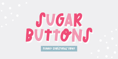 Sugar Buttons is perfect for your holiday projects. Use it for Christmas cards, winter crafts for decor and more! What's inside: - Sugar Buttons Script - Multilingual support - Cricut support If you have any questions, please contact me directly or in instagram @superdizigner
 - Tanto by Lomax Design,
$17.00 Tanto is a boxy, futuristic sans-serif that is not directly inspired by any particular typestyle, but is more of an exploration of shapes. It has a very modern feel and although very geometric, still has a character that's not robotic.
 - Zombie Sunrise by Fonts of Chaos,
$10.00 Zombie Sunrise is a hand drawn font taking inspiration from the 60's horror zombie movies. When you buy this font you receive for free 6 exclusive patterns that you can use directly in Photoshop or any other graphic software.
 - Stencil Modernistic JNL by Jeff Levine,
$29.00Stencil Modernistic JNL was modeled directly from an early 1960s lettering stencil that favored the Art Deco style. There is minimum kerning due to the nature of this typeface, so designers should use their own judgment when working with it. - Mimeograph Lettering JNL by Jeff Levine,
$29.00 Mimeograph Lettering JNL is based on one of the numerous plastic lettering templates once manufactured by the A.B. Dick Company of Chicago and is available in both regular and oblique versions. The mimeograph utilized a porous drum which inked the backside of a waxed stencil sheet. Unlike traditional stencils which have cut out areas that are directly inked or painted, a mimeo stencil has the area to be printed scratched away by removing the wax coating with a stylus. The resulting image allows the ink from the drum to seep through the sheet and transfer to the blank paper. As with a companion font (Mimeograph Template JNL), the character shapes follow the routed letters of the template, complete with rounded terminals. A previous font release [designed with flat terminals and some alternate characters] is available as Interoffice Memo JNL.
 - Blakstone by Albatross,
$19.00 Borne of geometry, found-type and a genuine love of texture, Blakstone has a lot to offer the letterpress style type genre. With 25 styles including hatches, halftones, grunge, linen, inline, shadow, fills, and outlines, Blakstone becomes useful as a layered type system. Combine styles to control colors on different layers to achieve your desired effect or just use a single style to keep it simple. Blakstone is full of open-type features including ligatures, discretionary ligatures, superscript numbers, subscript numbers, and automatic open-type fractions. Another great feature of Blakstone is its support for 130 International languages and dialects. Blakstone has many uses in the design world including signage, branding, invites and cards, clothing design, the music industry, restaurant and grocery signage, coffee shops, the list goes on. Blakstone has a texture for any occasion.
 - Escritura Hebrew by Vanarchiv,
$21.00 It was my first attempt to drawing a Hebrew alphabet to mach directly with other typeface (Latin) which I already designed. The Latin version is an handwriting display typeface influenced by chancery handwriting from the Italian Renaissance (broad-nib pen). One of the most typographic characteristic is there wavy forms, especially the serifs, where contains some of the main calligraphic references from this font family. The Hebrew script contain reverse contrast, the vertical proportions are more tall and the stroke weight is slightly more strong than latin lowercase to produce a correct visual balance between them, especially on small sizes (text proportions). This Hebrew square book-hand was influenced by Sephardic script style. The Latin characters contains interrupted strokes, the same was made for Hebrew letterforms to transpose correctly the same calligraphic approach between these two different alphabets.
 - Salas by AdultHumanMale,
$20.00 Salas is a fun, chunky, slab serif omnicase display font. It's blocky and loud, so it can scream from Posters and Headlines. Think of a clown with poor hearing making a Skype call, he's shouting, but you like it. Anyway: it has over 300 glyphs, several variations on the standard alphabet and lots of those extra foreign features for sending international ransom notes. OpenType coded, it has various letter pairings that interlock automatically to create a more randomized, bespoke feel to your copy. It also has some extra characters available directly through your glyphs palette. Play around with it, I hope you like it.
 - Utility Signage JNL by Jeff Levine,
$29.00 Utlity Signage JNL is a collection of fifty-two various "all purpose signs" we've all seen in hardware and variety stores is perfect for spot illustrations in ad copy, making one-off images for props in a stage play or production or even for novelty jokes or gags. NOTE: Usage of this font to create printed or digital "stock signs" for resale is not part of, nor allowed under the terms of the standard Jeffrey N. Levine Software License Agreement. A separate license for the manufacture and distribution of derivative products is required by contacting the font author directly. Please refer to the EULA for further details.
 - Memoire by Reserves,
$49.00 Memoire is an elegant linear hairline contemporary sans. It is based on the underlying form of Vanitas, yet is rendered in a nearly monolinear hairline weight. Memoire is intended to be used selectively for headline use starting at 60pt and above. Stylistically, Memoire retains Vanitas’ alluring, sophisticated sensibility that is directly inspired by high fashion. The delicate linear form creates a sense of cohesiveness and lends the typeface an intriguing lightness of character. The upright styles are complimented by a pairing of optically adjusted true italics, which were purposefully adapted to retain the sharpness of their counterparts. Abandoning traditionally executed cursive italic letterforms retains Memoire’s sharp characteristic through each style.
 - Hanseat by profonts,
$41.99 Hanseat is a profonts typeface family by Ralph M. Unger, heavily inspired by Germany’s official DIN 1451 Engschrift. Originally, the German DIN (Deutsches Institut für Normung / German Committee for Industrial Standardization) typefaces were taken as the standard traffic fonts for street signs and house numbers. During the 1980s, the DIN fonts became digitally available for sign making systems, initially again primarily for traffic sign purposes. However, later on, the DIN fonts became also popular in the world of designers and art directors. Hanseat is a modern, contemporary interpretation of the DIN fonts, responding to the ever growing demand for such typeface designs reflecting the spirit of the industrial area.
 - Drunk Cowboy by Chank,
$99.00 Drunk Cowboy is a bouncy version of the popular Old West type style, inspired by hand-made signage in Paducah, Kentucky. The strokes are loopy and loose. The exaggerated terminals give this font a loud, boisterous presence. Drunk Cowboy is a brutish rogue that emanates the fierce independence of Rio as played by Marlon Brando in One Eyed Jacks, but it is most like Paul Newman's Butch Cassidy—a mischievous wise-cracker. And there's gold worth mining for in this font. Dig deep enough and you'll find swash characters and special ligatures, like Th, ST, CT, NT and other popular letter combinations found in the Cowboy dialect.
 - Wacamóler Caps - Personal use only

- Turbo Modul by PizzaDude.dk,
$15.00 The future is square! Well, at least according to Turbo Modul! Maybe the future is square, but it is also funky - just like Turbo Modul ... and its pretty unpredictable! Turbo Modul is loaded with alternative letters with arrows pointing in all directions, all made to pimp your designs! I've also added ligatures to substitute double letters, and there's a slight difference from caps and lowercase. Wow! That's a lot of different combinations! I tell you what ... I take a look at the posters I've made, and hopefully it will make you want to try out the font. I had a lot of fun doing the font, and maybe you will have a lot of fun using it! ;)
 - Bumbon by Luxfont,
$18.00 Introducing unusual Sans Serif font family. Font is concise and minimalistic. But behind the apparent simplicity of the font is hidden the original feature in the form of modernized uppercase glyphs, which can be used as an accent in the header or logo. Pure letterings with excellent readability have 2 thicknesses. Font will emphasize the high status of the business and complement modern branding design, and the general versatility of the font provides for its widespread use in various directions and is combined with different styles in design. Balanced glyphs will fit into the typographic design and will not distract attention from the main point. Features: Bold, Bold Italic, Regular, Regular Italic Upgraded uppercase letters Kerning ld.luxfont@gmail.com
 - NOH Squadra by OhType!,
$30.00 SQUADRA is a serif typeface with more than 220 characters, framing a perfect union between typefaces of his style and unconventional shots from the calligraphic pen; Its strong and imposing appearance, the pronounced contrast between his strokes and changes in traditional aesthetics provide you with elegance and distinction to differentiate over other types of the same class. Easy modifiable and great graphic content to small and large format SQUADRA is able of generating a clear and direct message, suit almost any topic and perfect for use in posters, logos and editorial headlines. Infinitely versatile typeface that evokes both the beauty and finesse of the plants as power its thorns and its deadly poison.
 - White Block by Nathatype,
$29.00 Looking for a font that will make your branding stand out? Do you sometimes have an appetite for a bit more wholesome typography? Looking for a fabulous, stylish, and adventure font? We've got what you want. White Block-A Display Font White Block is a bold display font with a modern look. This display font is perfect for anything adventurous, and direct. Designed primarily as a captivating font that easy to read but still stylish, A real head-turner for your presentation, designs, branding, quotes, invitation, website illustrations, and much more. Our font always includes Multilingual Options to make your branding globally acceptable. Features: PUA Encoded Numerals and Punctuation Thank you for downloading premium fonts from Natha Studio
 - Eclectic Pixel Web by Altered Ego,
$45.00Eclectic PixelWeb is a collection of three sizes of popular web icons in the pixel aesthetic. With 80+ icons designed for creating e-commerce, navigation, and interface designs. Use it as a starting point in your favorite vector program, or use the icons as is - they are optimized for sizes at 20 point and will work in Flash and other web graphics programs. Shopping carts, directional arrows, buttons galore! It's like a pinata in font format, surprises for everyone! This font includes: a new and search buttons, home, security, email, search, and a host of other icons and images to make designing your next website a breeze!. Available in Mac and PC formats, in TrueType, PostScript and OpenType formats. - Volaroid by Din Studio,
$22.00 Introducing Volaroid font duo , simply font with modern and vintage style combination. This will bring a modern and vintage atmosphere together. Minimalist design for your best project. Volaroid font best use for logotype, branding, and t-shirt printing. Whats included? : - volaroid script - volaroid sans Volaroid feature : - Swash (A-Z,a-z) - SS 1 (A-Z,a-z) - SS 2 (a-z) - SS 3 (a-z) - SS 4 (a-z) - S.Alt 1&2 (b,d,h,k,l,t) - PUA encoded - Multilingual Support. --- Notes = Every swash, stylishtic set and alternates have include in Volaroid Script (ttf.otf,woff) I hope this font can meet your design needs. Feel free to contact me in the message or direct email donis4design@gmail.com.
 - FS Aldrin by Fontsmith,
$80.00 Elegant and round Having harboured a desire for a rounded font within the Fontsmith library for some time, Phil Garnham recognised that FS Emeric offered the perfect skeleton around which to design it. Most new rounded fonts rely on scripts or other in-app automation to form their characters. For all their warmth and approachability, they too often conjure images of jelly sweets and sausages. Not so FS Aldrin, where every curve and transition has been crafted by hand, giving a distinctive look and elegant feel. Design highlights FS Aldrin enjoys wide-open ‘lunar’ counters and soft, tube-like terminals. These improve legibility, especially on backlit signage and screens. The open proportions and circular strokes are juxtaposed against a more serious technical aspect that exists within each counter shape. The lighter weights feel precise and efficient, perfect for notes on blueprints or technical drawings. The heavy weights are equally crafted but more playful by their rotund nature, and are perfect for strong headlines or packaging projects. UI icons A suite of 268 icons complement the typeface beautifully and extend the design language in all directions. They cover a range of commonly used applications and themes ranging from ecommerce to weather, and also serve as a solid starting point for a bespoke brand icon set or UI. In addition, born of FS Aldrin’s astronomical theme and playful nature is a special collection of space-themed icons, including rockets, shuttles and lunar modules (hint: if you type the word BUZZ with ligatures enabled, an astronaut appears). Earth to Buzz Buzz Aldrin was the pilot of Apollo 11’s lunar module, the one that put man on The Moon for the very first time. Early on in the project’s life, FS Aldrin emerged as the ideal hook on which to hang the font’s space helmet (hardly surprising given Phil’s fascination with space travel and astronomy). An approach was made to Buzz’s management to see if he would sanction the association. Not only was the great man himself happy to see his name on a typeface, he also asked to use it in his upcoming keynote talks, book launches and online projects.
 - Sassoon Handwriting Starter by Sassoon-Williams,
$45.99 Sassoon fonts package for handwriting starters The three upright "infant" fonts developed to meet the demand for letters to produce pupil material for handwriting as well as for reading. Letters have extended ascenders and descenders ideal on screen and print. They facilitate word recognition. The exit strokes link words together visually, also crucially, they space the letters for improved legibility. The "joined" font puts the skills gained into practice producing joined-up handwriting. Together these typefaces provide a valuable resource for Teachers to create consistent material across the curriculum. Sassoon Infant Tracker B font: This font with its direction arrows helps pupils to start in the correct place. Motor movements can be refined by keeping inside the line. When starting and direction is no problem, the arrow font can be dropped and the Dotted font used. Sassoon Infant Dotted B font: Writing over the dots of this font refines motor skills. The aim here is to give confidence by reinforcing starting points, exits and to now encourage fluidity. Sassoon Infant font: With some words in this font and a baseline beneath to copy onto, pupils can use their learned starting points and exit strokes to write freely along the baseline - still unjoined. Once learned, this leads to spontaneous joins along the baseline leading logically to a joined-up hand. Sassoon Joined font: Having learned to write letters with correct starts and exits, this is when the joined font for teaching handwriting can be used. With some words in this font and a baseline beneath to copy onto, pupils can use their learned starting points and simply extend their exit strokes to make joined-up writing. The default joins the font provides are recommended, however there are alternative letterforms that are so important for some Teachers which can be accessed. Create ‘pen lifts’ anytime too! NOTE: Fonts display unjoined by default on this website and are delivered that way - joining is controlled by your text editing application such as Word or TextEdit, read more for instructions… Free to download PDF resources: Stylistic Sets and how to access the alternative letters feature in these OpenType fonts. Using the separate letter fonts Using the joined font Teachers copybooks using these fonts: How to teach pre-cursive Copybook How to teach cursive handwriting Copybook
 - FS Joey Paneuropean by Fontsmith,
$90.00Kangaroo FS Joey was the offspring of a project with Rudd Studio to develop a logotype for an online streaming TV service, in 2008. While under wraps, the secret project was code-named Kangaroo. The logotype led to a second project, to design a corporate typeface for the service. It was the first big project Fernando Mello had worked on with Jason Smith. “Like any designer who just joined a team, I was very excited about it, drawing and sketching lots of ideas. I remember Jason and I experimenting with lots of possibilities, for both the logo and the typeface.” Online As the font for a Spotify-style, internet-based service, FS Joey needed to be highly legible on-screen, including at very small sizes. There had to be a range of weights, and they’d have to work well in print, too. It was also important that it felt corporate, not too quirky, while still having a strong character of its own. Quirkiest “We designed three weights specifically for use on the Web,” says Jason Smith. “There was the usual fight between me and my team. I wanted at least one identifiable letter that was a quirk. As always I went straight for the lowercase ‘g’, and it was drawn numerous times with lots of variation. I got the quirkiest one accepted by the client.” But, later in 2009, the Competition Commission blocked Project Kangaroo, and Fontsmith were left with a couple of weights of an as yet unused font. From Kangaroo, Joey was born. A favourite “Straight away, people started to notice the typeface,” says Jason. “I can take the credit for pushing the art direction and standing up for the quirks. But it was Fernando who was the key to pulling it all together and adding his own distinct flavour. Now it’s one of my favourite designs in our library.” Fresh and friendly, geometric and energetic, Joey is available in five weights, all with italics, all finely-tuned for both screen and print. - FS Joey by Fontsmith,
$80.00 Kangaroo FS Joey was the offspring of a project with Rudd Studio to develop a logotype for an online streaming TV service, in 2008. While under wraps, the secret project was code-named Kangaroo. The logotype led to a second project, to design a corporate typeface for the service. It was the first big project Fernando Mello had worked on with Jason Smith. “Like any designer who just joined a team, I was very excited about it, drawing and sketching lots of ideas. I remember Jason and I experimenting with lots of possibilities, for both the logo and the typeface.” Online As the font for a Spotify-style, internet-based service, FS Joey needed to be highly legible on-screen, including at very small sizes. There had to be a range of weights, and they’d have to work well in print, too. It was also important that it felt corporate, not too quirky, while still having a strong character of its own. Quirkiest “We designed three weights specifically for use on the Web,” says Jason Smith. “There was the usual fight between me and my team. I wanted at least one identifiable letter that was a quirk. As always I went straight for the lowercase ‘g’, and it was drawn numerous times with lots of variation. I got the quirkiest one accepted by the client.” But, later in 2009, the Competition Commission blocked Project Kangaroo, and Fontsmith were left with a couple of weights of an as yet unused font. From Kangaroo, Joey was born. A favourite “Straight away, people started to notice the typeface,” says Jason. “I can take the credit for pushing the art direction and standing up for the quirks. But it was Fernando who was the key to pulling it all together and adding his own distinct flavour. Now it’s one of my favourite designs in our library.” Fresh and friendly, geometric and energetic, Joey is available in five weights, all with italics, all finely-tuned for both screen and print.
 - Bfrika by Holland Fonts,
$30.00Bfrika is an 'Africa inspired' typeface and a contribution for the typographic issue 'National Typographica' of I-Juici Magazine, in South Africa. This geometrical decorative design represents bold simplicity, directness and rythm. The name evolved from text for the spread in the magazine. The B replaces the A. Africa be free. Bfrika. The concept behind Bfrika is to generate an unpredictable visual rhythm in an attractive decorative presentation. Filling up the white space around the letters accentuates form over function, thus creating an interference of visual impressions with its legibility. This visual rhythm is amplified by its redundancy in a text, only pausing at a break or a word space. Based on the concept of separate printing forms in letterpress, Bfrika Two Tone and Bfribat Two Tone separate the letter from the outside form in two fonts. Placing two text frames exactly on top of each other and assigning each part of these font to a frame in a different color, offers a quick way to add color. Originally Bfrika was designed for I-Jusi magazine #17, National Typografika, South Afrika 2001. Bfribat and both two tone fonts were created for Building Letters, a fund raiser for orphanages in Kenya and Uganda (www.buildingletters.org) and are also available for Mac and PC at www.hollandfonts.com and will be distributed in 2004 through associated foundries. - Deft Brush by wearecolt,
$16.00 A beautiful brush font created directly from original drawn characters. Deft Brush features a number of ligature and alternative glyphs to add to the hand drawn look. A great front for bold headlines, titles and crafty logotypes. Available as both .otf and .woff
 - Cast And Crew JNL by Jeff Levine,
$29.00 Cast and Crew JNL is a condensed monoline font that lends itself well to any text project where more copy needs to fit into a limited space. A perfect example of this is a movie poster's cast, director, producer and other acknowledgements.
 - Sunetta by Linotype,
$29.99An inkstone, a brush, ink, and paper. In China, one speaks of “wenfang sibao” — the four treasures of the scholar’s study. With these centuries-old hand tools, Werner Schneider created a calligraphic type trilogy of the highest aesthetic order; he named this typeface family after Buddha’s stepbrother, Sunetta. Sunetta is an outstanding choice for contemporary display type purposes. Its combination of lively forms overcome sterile text passages, lending them a more personal note and feeling. But Sunetta is not only recommended for documents bestowing distinction and accolades; the fonts are superb for shorter text passages as well. Sunetta’s spirited flow raises it above the fray that so many generic letterforms find themselves mired in, creating an unforgettable impression. Sunetta’s three complementary styles, Sunetta Flair, Sunetta Charme, and Sunetta Magic, offer three varying degrees of calligraphic verve. The family’s base font, Sunetta Flair, harkens back to the showcard lettering styles of the 1950s, while remaining distinctly European in taste. Sunetta Charme has a more swash-type appearance, while Sunetta Magic is joyfully decorative — its brush-written strokes dance across the line. Together, they may help you reach typographic nirvana. - M Dynasty PRC by Monotype HK,
$523.99 M Dynasty PRC is a handwritten style Simplified Chinese typeface. Handwritten font designs are derived directly from hand-drawn lettering or handwriting using analogue tools. Handwritten style Simplified Chinese fonts can include typefaces that reference or reinterpret traditional calligraphy, using classical exemplars by calligraphic masters.
 - Gustav by Supfonts,
$16.00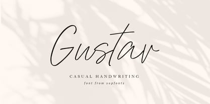 Gustav it is a Calligraphy chick font with exquisite accents. It is perfect for branding, wedding invitations and invitation cards and many more What's inside: Gustav Script Multilingual support Cricut support If you have any questions, please contact me directly or in instagram @supfonts
 - M Li HK by Monotype HK,
$523.99 M Li HK is a handwritten style Traditional Chinese typeface. Handwritten font designs are derived directly from hand-drawn lettering or handwriting using analogue tools. Handwritten style Traditional Chinese fonts can include typefaces that reference or reinterpret traditional calligraphy, using classical exemplars by calligraphic masters.
 - M Cute HK by Monotype HK,
$523.99 M Cute HK is a handwritten style Traditional Chinese typeface. Handwritten font designs are derived directly from hand-drawn lettering or handwriting using analogue tools. Handwritten style Traditional Chinese fonts can include typefaces that reference or reinterpret traditional calligraphy, using classical exemplars by calligraphic masters.
 - M Cute PRC by Monotype HK,
$523.99 M Cute PRC is a handwritten style Simplified Chinese typeface. Handwritten font designs are derived directly from hand-drawn lettering or handwriting using analogue tools. Handwritten style Simplified Chinese fonts can include typefaces that reference or reinterpret traditional calligraphy, using classical exemplars by calligraphic masters.
 - M Yuppy HK by Monotype HK,
$523.99 M Yuppy HK is a handwritten style Traditional Chinese typeface. Handwritten font designs are derived directly from hand-drawn lettering or handwriting using analogue tools. Handwritten style Traditional Chinese fonts can include typefaces that reference or reinterpret traditional calligraphy, using classical exemplars by calligraphic masters.
 - M Li PRC by Monotype HK,
$523.99 M Li PRC is a handwritten style Simplified Chinese typeface. Handwritten font designs are derived directly from hand-drawn lettering or handwriting using analogue tools. Handwritten style Simplified Chinese fonts can include typefaces that reference or reinterpret traditional calligraphy, using classical exemplars by calligraphic masters.
 - M Dynasty HK by Monotype HK,
$523.99 M Dynasty HK is a handwritten style Traditional Chinese typeface. Handwritten font designs are derived directly from hand-drawn lettering or handwriting using analogue tools. Handwritten style Traditional Chinese fonts can include typefaces that reference or reinterpret traditional calligraphy, using classical exemplars by calligraphic masters.
 - M Bei HK by Monotype HK,
$523.99 M Bei HK is a handwritten style Traditional Chinese typeface. Handwritten font designs are derived directly from hand-drawn lettering or handwriting using analogue tools. Handwritten style Traditional Chinese fonts can include typefaces that reference or reinterpret traditional calligraphy, using classical exemplars by calligraphic masters.
 - M Yuppy PRC by Monotype HK,
$523.99 M Yuppy PRC is a handwritten style Simplified Chinese typeface. Handwritten font designs are derived directly from hand-drawn lettering or handwriting using analogue tools. Handwritten style Simplified Chinese fonts can include typefaces that reference or reinterpret traditional calligraphy, using classical exemplars by calligraphic masters.
