10,000 search results
(0.019 seconds)
- Directions by Monotype,
$29.99 - China - Unknown license

- Directo by Green Type,
$37.00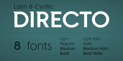
- ALS Direct by Art. Lebedev Studio,
$63.00 ALS Direct is an open and dynamic typeface with clear-cut letterforms that make it instantly readable. It lends text a neutral, yet agreeable and modern feel. Direct has nine font styles convenient for the purposes of navigation signage. Regular-style letterforms are rather wide, because direction signs are likely to appear before readers at an angle, so the type needs to withstand perspective distortions. And as signs and boards may vary in size, Direct was developed to include several width variations. Condensed fonts can be used where horizontal space is limited, allowing you to keep proper height and readability of the characters. A signage typeface must be easily readable from some distance away and have simple letterfoms with clear-cut features to quickly identify characters. Designing a type for a potentially wide range of purposes calls for a universal approach. If not destined to be used for navigation in a particular building, it shouldn’t incorporate any peculiar elements to agree with certain design or architecture. All of the above determined our choice of a sans serif with large apertures and definite features allowing readers to instantly recognize letters. Descenders are made compact not to interfere with the line below. And the low contrast between thick and thin strokes renders all elements equally perceptible. The x-height is significant, close to the cap height, which inhances readability of the lowercase type. There are two reasons why directions must not be set in all caps. Firstly, lowercase letters are more diverse and include ascenders and descenders identifying some of the letters in the line. And secondly, having learned to read, people recognize word shapes rather than individual letters, which makes lowercase text more readable. With Direct being a signage typeface, first to be developed were its width variations, and different weight styles and italics were added later. Another thing to be kept in mind was that signs often use dark background colors, and black type on a white background appears smaller than white type on a black background. Direct is the first Cyrillic typeface created for navigation purposes. Before that, designers could use the Cyrillic version of Frutiger (Freeset) developed by Adrian Frutiger for the Paris Charles de Gaulle International Airport, and a number of other, mostly body copy, neutral sans serif types. However, signs and boards were dominated by Arial, which Direct would be glad to replace offering elegance and lucidity of form instead of type bluntess. Direct was designed as a signage typeface, but its neutral style and clear-cut letterforms suggest various other ways of application.
 - Direct Mail by Partnrz,
$15.00 Direct mail designers rejoice! Finally, a font family made just for you. Created to be as in-your-face as possible: for use as a primary headline; for dates and phone numbers; and for coupon heads and price points. Tired of kerning numbers for your coupons and prices? Then you'll love this font! All of the kerning has been done for you. (No more spacey 1's!) Designed for a tight kern - just track it in on larger sizes. Instead of standard weights, this font was designed to fit different width needs. Have a long headline, but your client wants it in one line and tall? Use the extra-condensed. Need something really bold for a phone number or price point, but you don't have much height available? Use the fat. And there are two more widths for those in-betweens. And to top it off - you can get them all in an oblique as well.
 - Chiva by words+pictures,
$20.00 - Chika by George Studio,
$8.00 Chika is a handwritten modern script font with a bold style and modern look. This font is suitable for logos, branding, product design, product packaging, photography, watermarks, social media posts, advertisements, invitations, stationery, labels, logos, magazines, books, greeting/wedding cards, fashion, make up, and more. other. What's Included: Uppercase & lowercase Numbers and punctuation Multilingual support fastener Alternative Washing Works on PC & Mac Simple installation Accessible in Adobe Illustrator, Adobe Photoshop, Adobe InDesign, even works in Microsoft Word. PUA Coded Characters – Fully accessible without additional design software. Thank you for your purchase! Hope you enjoy with our fonts!
 - Chiga by Jafar07,
$17.00 Looking for a font that stands out? Chiga is the answer! This modern serif font features unique curves on every letter and clean, straight strokes that give it a distinctive, eye-catching character. Chiga is ideal for branding, posters, and other professional projects. This font is not only elegant and unique but also easy to read, Chiga is sure to make an impact. What are you get? Special Ligatures & Alternates Numbers & Punctuation Multilingual Support Works onMac PC & Mobile Simple Installations
 - Chinte by FonTastic Designs by Chez,
$10.99 Looking for a fun new font? Look no further I have just what you've been waiting for. This new novelty font that I call Chinte is a bold fullcase font. This font comes with multiple languages and symbols. And had multiple uses: Branding, Logos, and many more of your projects.
 - Chipa by Eurotypo,
$75.00 Chipa has all the advantages of OpenType technology that allows a variety of combinations: Swashes, old style numerals, standard ligatures, contextual alternates, discretional ligatures, word ending and tails. These fonts were specially designed for creating logotypes and packaging design, can also be used in advertising, flyers and posters, for its good legibility and accurate kerning. Chipa support the Central European character set as well as basic Western languages.
 - China Town - Unknown license

- China Market by Pelavin Fonts,
$20.00 The initial characters in China Market were created in 1996 for a logo featuring the Temple of Heaven in Beijing where emperors from the Ming and Qing dynasties worshiped heaven and prayed for abundant harvests. The font was completed in 2010. It is composed of a regularly positioned curved and straight components as if part of a decorative grillwork or other architectural detail. While its influences and origins are clear, its appearance is relies more upon the geometry of its basic elements and the modular structure than a specific stylistic idiom.
 - China Syndrome by Hanoded,
$15.00 A really, really long time ago, I watched a movie called ‘The China Syndrome’ (starring Jane Fonda, Jack Lemon and Michael Douglas). It was one of those disaster movies that were quite popular at the time (I also recall airports, alien viruses and skyscraper fires). Anyway, when I finished this font, I suddenly (and quite inexplicably) remembered that movie, so I named this font after it. China Syndrome is a legible brush font - ideal for your product packaging and halloween posters. Maybe use it for a metal album cover, a book about nuclear disasters or, dunno, the logo of your really strong coffee brand. Whatever. Just enjoy!
 - Firecat - Unknown license

- Abrect by Hackberry Font Foundry,
$24.95 My first font for the summer of 2009, Abrect is a new sans serif font where I try to maximize the x-height and keep the design fresh and personal. It fits in with my continuing objective of designing book fonts that I can really use. Abrect is a tangent for me just taking an idea out to its end. In particular, it is a radical modification of my first font in 1993, Nuevo Litho. The hand-drawn shapes vary a lot, many pushing the boundaries of the normal character. With many of the new releases I see, the digital perfection is getting pretty extreme. It’s looking like a Rococo stage of development for many with decoration taking over from function. I'm consciously trying to head a different direction. This is not a normal font for me in that it has caps, lowercase, with the appropriate figures for each case, no small caps. This is the first time I have skipped small caps in over a decade. This font has all the OpenType features in the display set for 2009 except for the small caps. There are several ligatures for your fun and enjoyment: bb gg ff fi fl ffi ffl ffy fj ft tt ty Wh Th and more and many of them are experimental in form. Enjoy!
 - Delectables by ITC,
$29.99A former lettering artist at Hallmark Cards, Rob Leuschke now has his own thriving design businesses, Alphabytes and the new TypeSETit. Growing up in St Charles, Missouri, where he still lives, Rob showed great artistic promise at an early age. He earned a BFA in graphic design at the University of Missouri at Columbia. After graduation, his stint at Hallmark Cards gave him the opportunity to learn from and work with some of the best lettering artists in the industry. Rob struck out on his own in 1987 and now boasts a long list of clients from all over the world. Rob has created over 250 custom typefaces, and his work has been exhibited in New York. Ambiance BT is Rob’s first typeface published by Bitstream, with more to follow. - Dilectus by TeGeType,
$29.00 Inspired by Paleochristian engravings and writings, this font has a timeless aspect while keeping a real monumentality. It was originally designed to serve as a visual identity for a group of museums.
 - Divert by Little Fonts,
$15.00 Based on the outline of each character, Divert works by re-directing each outline as a single meandering stroke that moves back and forth to create a quirky yet clean typeface. The typeface contains an uppercase character set plus two lowercase character sets (one standard and one alternate) and two sets of numerals. Plus all punctuation and basic latin European accents. See glyphs for full character set.
 - Diverting by Java Pep,
$17.00 Diverting is an aesthetic signature font that comes with more than 30 ligatures set so it can feel like a handwritten style vibe. For switching on the swash under line, you can write type "underscore (_) + (plus) and number 1 until 6". Diverthing font also have alternate subtitutions for uppercase and some lowercase, this font is perfect for branding, advertising, handwritten quotes, social media post, headlines, subtitle, wedding invitations, greeting cards, signature name, logotype, etc.
 - Directa Serif by Outras Fontes,
$30.00 Directa Serif is a text type family designed to save space with the maximum readability. Because of its general forms and proportions (a little bit condensed, big x-height, low contrast) it can be used in smaller sizes than usual for body text. It is highly recommended for newspapers, magazines, corporate communication and so on. Directa Serif Family is composed by 14 fonts (7 weights and its italics) with a large set of characters, including Western, Central European, Baltic, Scandinavian, Icelandic, Romanian and Turkish unicode ranges. Each font also includes several ligatures, a complete set of Small Caps, sets of lining, old style and tabular figures, as well as fractions, superior and inferior numbers. These features can be easily accessed using any OpenType-compatible software.
 - Stage Direction JNL by Jeff Levine,
$29.00 On the cover of the 1932 sheet music for "Without Your Love", the credits for the stage play "The Dubarry" are listed under the name of the star and the play's title. These hand lettered credits served as the work model for Stage Direction JNL, which is available in both regular and oblique versions.
 - Mini Pics Directional by NicePrice Font Collection,
$4.99 - China Doll JNL by Jeff Levine,
$29.00 A 1960 edition of the Speedball® Pen lettering instruction book yielded the model for China Doll JNL.
 - China Dragon JNL by Jeff Levine,
$29.00 China Dragon JNL was inspired by a vintage letterpress logo cut on sale in an online auction. The logo for The China Dragon restaurant (presumably from the 1950s or 1960s) had a wonderfully eclectic hand-lettered look. Some of the original characters were modified slightly to conform with the ones created for the remainder of the typeface, but the original styling remains intact. The unique design of this font allows it to adapt well to Art Nouveau or Mideastern project styles. In January of 2006, Jeff Levine Fonts started with just ten designs. A little more than seven years later, in April, 2013 the release of China Dragon is the 700th font added to this ever-growing library.
 - West of China by Monotype,
$29.99 - Chica Mono - Unknown license

- Shifty Chica - Unknown license

- Chino Tattoo by Otto Maurer,
$25.00 Chino Tattoo is best for all Tattooartists and Tattoofans. You can use it to make Tattooflashs for your Tattoostudio. Chino Tattoo is a typical Tattoostyle Font. The Chinostyle comes from the Gangs of the USA (with latin roots). They often have Chist-Symbols.
 - Chika Tattoo by Otto Maurer,
$25.00 This Font is the Sisterfont of Chinotattoo. The different is the thorn in every letter! Chika Tattoo is best for all Tattooartists and Tattoofans.You can use it to make Tattooflashs for your Tattoostudio. Chika Tattoo is a typical Tattoostyle Font. The Chinostyle comes from the Gangs of the USA (with latin roots) They often have Chist-Symbols.
 - Chica Maravilla by Artisan Studio,
$16.00 Chica Maravilla is a work that is purely a result of handwriting, and has a natural characteristic. This is perfect for invitations, signatures, blogs, social media, business cards, product brands. OpenType features can be accessed by using OpenType smart programs such as Adobe Photoshop, Adobe Illustrator, Adobe Indesign, Corel Draw and Microsoft Office.
 - ITC Chino by ITC,
$40.99 ITC Chino is a type family (Display & Text) designed by Hannes von Döhren and Livius Dietzel. ITC Chino Pro brings legibility and distinction to text copy. It is also a friendly design that will invite readers into content at large or small sizes. It is a melding of soft brush stokes and crisp edges. This is readily apparent in the bolder italic weights where the straight stems provide a counterpoint to the cursive terminals. The Typefamily is highly legible in a wide range of sizes. The text side of the family contains five weights of roman, each with an italic companion. Ranging from Light to Black, ITC Chino Pro provides a rich typographic palette. The OpenType fonts have an extended character set to support Central and Eastern European as well as Western European languages. Each font includes small caps, fractions, old style-, lining-, tabular numbers, scientific superior/inferior figures and a set of arrows.
 - Chiba Script by Brainware Graphic,
$12.00 Chiba Script is a casual script font inspired by hand lettering and vintage sign painting. Chiba Script has only single weight, bold weight.
 - Thai One On by Emboss,
$24.95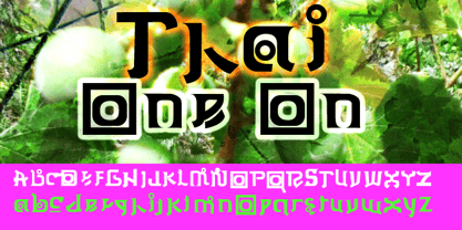
- Directa Serif Variable by Outras Fontes,
$170.00 Directa Serif Variable is a text type family in one single font file. It explores new possibilities for the original type family released by Outras Fontes some years earlier, which is designed to save space with the highest readability. The variable font is composed of two axes of variation: Weight (100–900) and Italic (0–1). It also contains 18 predefined styles between Thin and Heavy and their respective italics. So now you can adjust the weight of the type by interpolating it in real time using any variable font compatible app. There are hundreds of possibilities between the values of 100 (Thin) and 900 (Heavy). And if you're feeling adventurous, you can also use the Italic axis to interpolate instances between Roman (0) and Italic (1) and see what happens in the middle. This new technology can be very useful for web and video animations. Directa Serif Variable is also highly recommended for newspapers, magazines, corporate communication and so on. It has a large set of characters, including Western, Central European, Baltic, Scandinavian, Icelandic, Romanian and Turkish unicode ranges. The variable font also includes several ligatures, a complete set of small caps, sets of lining, old style and tabular figures, as well as fractions, superior and inferior numbers. These features can be easily accessed using any OpenType-compatible software.
 - Nine One One BA by BA Graphics,
$45.00A heavy serif grunge font with a western feel, great for that extreme look for today.. - Detectives Inc - Personal use only

- BN Defect - Unknown license

- Defect Scam by PizzaDude.dk,
$12.00 Defect Scam could easily have been a name for a punk band. But it's not - it's the name of my stencil wannabe font. But, it was inspired by a combination of some punkband's LP cover and the vibes of that genre of music - but not overdoing it by making an obvious punk font! Well, you get 4 different versions of each letter in the Regular, Black and Fill versions, as well as multilingual support!
 - Direkta JNL by Jeff Levine,
$29.00Direkta JNL take the classic Art Deco influenced lettering of the 30s and 40s and adds a diagonal triangular cut into the letters, creating an air of forward movement. - ARB-187 Moderne Caps AUG-47 by The Fontry,
$25.00 Beginning in January, 1932, Becker, at the request of then-editor E. Thomas Kelly, supplied SIGNS of the Times magazine’s new Art and Design section with an alphabet a month, a project predicted to last only two years. Misjudging the popularity of the “series”, it instead ran for 27 years, ending finally two months before Becker’s death in 1959, for a grand total of 320 alphabets, a nearly perfect, uninterrupted run. In late 1941, almost ten years after the first alphabet was published, 100 of those alphabets were compiled and published in bookform under the title, “100 Alphabets”, by Alf R. Becker. And so, as published in August, 1937, The Fontry presents the truly "modern" version of Becker’s 187th alphabet, Moderne Caps, complete with OpenType features and Central European language support.


Page 1 of 250Next page