4,696 search results
(0.009 seconds)
- Abel Pro by MADType,
$39.00 Abel is a modern interpretation of the condensed flat-sided sans serif. Originally used for newspaper headlines and posters, this style can also be used for text on the web. Its angled terminals and spiked stems give it enough style to be unique at display sizes, while its mono-weight still works well at smaller text sizes.
 - Artist Colony JNL by Jeff Levine,
$29.00Artist Colony JNL is the third type design inspired by some online examples from an early 20th Century French book of decorative hand lettering. While Arte Critique JNL and French Art Initials JNL embrace the Art Noveau style, Artist Colony JNL leans more toward the emerging Art Deco Movement of the late 1920s and early 1930s. - Griezelig by Hanoded,
$15.00 I love creating fairytale fonts, but for some reason I haven’t made one for quite a while. So, without further ado, I present Griezelig! Griezelig in Dutch means ‘scary’ or ‘creepy’. The word itself even looks kind of creepy! Griezelig was loosely based on two of my favourite (but unfortunately rather inconspicuous) fonts called Hexenhammer and Bronwen.
 - Buckle by Wilton Foundry,
$29.00Keep up that great western tradition with Buckle Bold! Buckle was created to be a contemporary twist to old "cowboy" fonts. It is bold while retaining a narrow width. When reduced down, it has a slightly worn look caused by the reduced double diamonds inside the capitals - which does not look out of place at all. - Goudy Titling by Matteson Typographics,
$19.95 Goudy Titling was designed by Steve Matteson. It is based on the 2" wood engravings Frederic Goudy made for his book ‘The Trajan Capitals’ - a seminal book about the history of the Roman letter. These letterforms predate the work of Father Catich’s exhaustive study of the Trajan Column and, while remarkably faithful to the inscription, have Goudy’s interpretive fingerprints.
 - Fathing by Multype Studio,
$17.00 Introducing, Fathing Script. This is a modern script font. It maintains its classy calligraphic influences while feeling contemporary and fresh. Fathing is perfect to use in logotype / wordmark, badge, sign board, poster, headline text, apparel, wedding invitation, etc. This font has many opentype features like ligature, stylistic alternate, contextual alternate, swash, etc and support multi language
 - Kasuga Brush by insigne,
$21.99 Kasuga Brush is a contemporary script with eastern influence and authentic brush drawn character. The script offers two variants. One is slightly distressed along the character's edges while the other is painted with a dry brush for interesting texture. Sixty-four optional ligatures add a realistic, hand-drawn effect and ensure that no two letters in a word repeat.
 - Antartida by Latinotype,
$26.00 Antartida is a sans serif typeface, while it is monolinear simple structure give it a kind of neutral feeling, is functional, clean and minimal. Is a family of 8 fonts, 4 weights and italics. This typeface contains alternate glyphs that help to emphasize text or headlines. You can also see AntartidaEssential, a simpler and less expensive version.
 - Wahwoh by 38-lineart,
$14.00 WAHWOH is a heavy allcaps font which is perfect for heavy titles and headlines. The uppercase looks rough while the lowercase looks sharp. This typeface gives the impression of street style, bold, retro, urban and modern style. Clear and bold, easy to combine with other artwork and typefaces, this is the reason why you should have this font.
 - Humorist JNL by Jeff Levine,
$29.00 The May 7, 1936 issue of “The Film Daily” carried an ad for the Will Rogers Memorial Hospital Fund. (In August of 1935 Rogers, along with famed aviator Wiley Post died in a plane crash.) While the fundraising for the hospital was a serious event, Rogers is remembered as a humorist, hence the font’s name of Humorist JNL.
 - Art Deco Monograms JNL by Jeff Levine,
$29.00 The same monograms found on a 1930s-era business card that inspired Golden Beach JNL are reproduced as Art Deco Monograms JNL. Left-side monograms are on the upper case A-Z, while the lower case a-z are the right side monograms. A vertical bar is on the period key for a centerpiece between the two initials.
 - Wrought by Jon Cartagena,
$10.00 Wrought is a bold geometric display font by Jon Cartagena. It's purpose is to give a rugged, heavy feeling to your designs. Wrought is available in four weights: Thin, Light, Regular, and Bold. Each character is carefully designed to be vertically aligned at the center. This gives Wrought a unique flair, while promoting a harmonious look through each word.
 - Devama SRF by Stella Roberts Fonts,
$25.00 Devama SRF was designed by Typodermic's Ray Larabie and provided for Stella Roberts Fonts. Available in Regular, Backlash and Forward, this typeface evokes a retro-80s look while still remaining clean and fresh. The net profits from my font sales help defer medical expenses for my siblings, who both suffer with Cystic Fibrosis and diabetes. Thank you.
 - Vecta Serif by Wilton Foundry,
$29.00I think it is one of our most useful fonts in that it doesn't draw much attention to itself while it is quite refreshingly different. Almost all shapes in Vecta are rounded to provide a friendly effect. Proportions are somewhat condensed providing economic space usage. Vecta looks equally at home in headlines as well as body text. - Theater Lights JNL by Jeff Levine,
$29.00 Vintage sheet music for the title song from the film "Forty Second Street" was the inspiration for Theater Lights JNL. While the idea of letters comprised of circles (to simulate bulbs) can be both vintage [as in marquee lights] or modern [simulating dot matrix printers], it is always a fun approach to a tried-and-true style.
 - Skie by Adam Ladd,
$25.00 Skie is a simple gothic sans serif with normal, condensed, and wide widths. Its distinguishing characteristics are the small x-height with tall ascenders and a minimal amount of contrast, while the apertures are semi-open to help in readability. The simple design keeps the appearance fairly neutral and presents a blend of modern and vintage qualities.
 - Alber New by moretype,
$35.00 Alber New is the revamped version of Alber originally released in 2006. While retaining its original appeal Alber New has been overhauled from the ground up with improved outlines, spacing and kerning. Alber New also boasts an extending character set including small caps, subscript and superscript allowing it to cope with the most demanding of jobs.
 - Afternoon Tea by Open Window,
$19.95 Afternoon Tea is inspired by a lettering specimen featured in Letters and Lettering by Paul Carlyle and Guy Oring published in 1938. The striking features are the elegant balance between thick and thin strokes (demonstrating its obvious ink pen influence) while maintaining a sturdy presence which is ideal for titles and headings. Afternoon Tea is caps only.
 - Eighty Miles by Four Lines Std,
$15.00 Introducing "Eighty Miles" font's thick and attention-grabbing characters ensure that your message takes center stage. While "Eighty Miles" embraces wild shapes, it never compromises on readability. Each character is carefully crafted to ensure that your audience can enjoy the whimsy without missing a beat. It's a font that's as fun to read as it is to look at.
 - Brefid by Gian Studio,
$16.00 Brefid is a luxurious yet elegant display font. characters that suit today's styles will be very interesting for you to create any design work with a classy model while still maintaining a calm and impressive style to look at. You're sure to have inspiration to match your creativity! Free updates for more versions in the future. Thank You
 - PiS HansHand Pro by PiS,
$28.00 HansHand started out in 2003 as a simple free font, the adaption of my grimy handwriting. For its 10th anniversary it got a complete overhaul and lots of new characters. Now also available in BOLD for the first time, featuring scribbles, strokes, circles and boxes to underline the fast taking-notes-while-on-the-phone look!
 - Beauty Green by BonjourType,
$13.00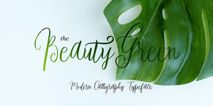 Proudly Present, BeautyGreen Font. BeautyGreen is a modern script font, masterfully designed to become a true favorite. It maintains its classy calligraphic influences while feeling contemporary and fresh. Fall in love with it and bring your projects to the highest levels! Fonts featured : Uppercase, Lowercase, Numbers, Symbols, Accents, Stylistic, Swash, and Ligatures. BeautyGreen also multilingual support
 - Art Lover JNL by Jeff Levine,
$29.00While browsing through a Dan Solo type reference book, Jeff Levine fell in love with the multiline stylings of one particular typeface, then sat down and re-drew from scratch his own interpretation of the design. Jeff's version is called Art Lover JNL - offering kudos to art in general, the Art Deco movement and (of course) type design. - Prospect Heights JNL by Jeff Levine,
$29.00 While the inspiration for Prospect Heights JNL may have been a piece of vintage sheet music entitled "My Ohio Lullaby", the name is classically New York. To be precise, it's a neighborhood in the Borough of Brooklyn. Prospect Heights JNL is available in both the regular version (with an engraving line) and a solid (plain) version.
 - Arakne by Scriptorium,
$12.00While working on a font based on Spencerian Script (a popular late 19th century handwriting style) we did some experimenting with original designs which created the general feel of Spencerian and brought to mind the spidery handwriting of old ladies and Dickensian clerks. The result was Arakne, a spidery script font with a really striking look. - Night Life JNL by Jeff Levine,
$29.00 Night Life JNL follows the classic lettering forms of the Art Deco era of the 1930s and 1940s. On the upper case letters, the A,B,E,F,H,K,P and R have extended horizontals, while the lower case a,b,e,f,h,k,p and r have those extensions removed and are more traditional in design.
 - Ladislav by Suitcase Type Foundry,
$39.00 The Ladislav font revitalises Sutnar’s legacy, while not explicitly copying any of his original fonts. It however keeps true to their technicist character and initial principles of character creation - a simple modular system of combined geometrical segments. This approach affects all round shapes of capital and lowercase letters, as well as the shapes of the majority of numbers.
 - Estika by ZetDesign,
$15.00 estika is a modern handwritten font and pays attention to the anatomy of some text to create a flexible yet elegant form. This font is available in regular and italic forms with open type features to enrich the choice of style when used. This font is perfect for informal uses while maintaining the beauty of writing
 - Langoustine Rouge NF by Nick's Fonts,
$10.00A typeface named Sorbonne, unearthed by intrepid font-finder Dan X. Solo, provided the pattern for this quaint little charmer. The exaggerated serifs make it stand out in a crowd, while still retaining an understated elegance. This font contains the complete Latin language character set (Unicode 1252) plus support for Central European (Unicode 1250) languages as well. - Vecta by Wilton Foundry,
$29.00I think it is one of our most useful fonts in that it doesn't draw much attention to itself while it is quite refreshingly different. Almost all shapes in Vecta are rounded to provide a friendly effect. Proportions are somewhat condensed providing economic space usage. Vecta looks equally at home in headlines as well as body text. - Kybul by Invasi Studio,
$19.00 A bubbly, sweet font with a cutoff letterform on detail. Kabul takes another step and brings the bubbly into a casual style. Perfect for use in big sizes on posters or flyers. It's a good combination with sans font. Its imperfections keep it casual while still providing legibility. This is a great combination of casual and retro eras.
 - On The Ground by Fascination Workshop,
$10.00 On the Ground is a picture font made from drawings of found objects. These object were found on the ground while walking around different cities in the United States. The font uses varying drawing styles (from detailed to pictographic) but they all have a similar irregularity, unifying the characters. Perfect for animations, signs, greeting cards, posters, etc.
 - Olpal by Bunny Dojo,
$16.00 A Display Serif, a Monoweight Sans, and an Inline form combining the two, Olpal is a versatile companion for your next adventure. With surprising vitality for a workhorse font, Olpal embraces any job – and whistles while it works. Neutral – with a hint of pizzazz – the font's strong legibility and compressed footprint make it a brilliant fit in any environment.
 - Nosta by Protimient,
$29.95Nosta is a modern text typeface. It was designed to be easily legible and therefore expressly suitable for setting sizeable lengths of continuous text such as magazine articles, books and essays. It achieves this through, amongst other things, finely balanced proportions, optimal character spacing and an adherence to predictable letter forms. Despite this, however, Nosta manages to retain a contemporary look and feel by using a variety of modern type design devices such as the efficacious wedge serif. The italic avoids using too many of the cursive elements that are often found in traditional italics and has only a modest slant, giving it a modern look that does not overly disrupt the text while still providing emphasis. While designed for continuous text, Nosta can also be used as a display face, making it a good all round typeface, suitable for many applications. - Dashie by Muksal Creatives,
$17.00 The "Dashie" font is a captivating modern display typeface with a strong feminine touch. Designed with a blend of retro and vintage elements, this font carries an elegant and alluring vibe. Dashie boasts smooth lines while still exuding gracefulness. Each letter possesses a unique form, with soft contours and slightly curved angles, delivering a sense of sophistication and timelessness. This font is exceptionally fitting for creating feminine branding logos due to its gentle yet powerful characteristics. When integrated into designs, Dashie has the ability to infuse a classic touch of retro or vintage, emanating an aura reminiscent of the past yet maintaining a fresh and modern feel. Dashie is the perfect choice for crafting a visually captivating and memorable identity for brands seeking to stand out with an elegant, feminine style, while incorporating retro or vintage nuances into their brand.
 - Ark by Fenotype,
$25.00 Let Ark, an Art Nouveau-infused high-contrast serif, transport your designs into the realm of elegant psychedelia. Ark draws deep inspiration from Heinz Keune's Edda, a remarkable design from 1900. While its vibe might evoke the groovy 70s and the mesmerizing world of trippy album covers, Ark transcends any assumed historical shabbiness. It trims the style into a refined and neatly cut serif, suitable for gallery-worthy presentations, all while maintaining a strong and unmistakable connection to its original roots. The standard letters of Ark maintain a respectable demeanor, only scratching the surface of the font's psychedelic potential. To truly unlock its full potency, try the Swash or Stylistic Alternates, or dig for even more Alternates from the Character palette. Needless to say, that Ark is a natural match for anything trendy, artsy, wierd and fun.
 - Monto Grotesk by Lucas Tillian,
$28.00 Monto is a superfamily — this is the Grotesk + Grotesk Display part of it. Monto Grotesk is a modern sans serif typeface that combines the strengths of the neo-grotesque and geometric genres. While maintaining an established and trusted look, the design is influenced by a contemporary geometric aesthetic, making it a modern yet timeless companion. The Grotesk is split into two sub-families (Monto Grotesk and Monto Grotesk Display). While Grotesk is intended to be used in long paragraphs and copy text, Grotesk Display is perfect for striking headlines. To achieve maximum legibility, Grotesk emphasizes its characters vertical strokes, focusing on a coherent rhythm and having more open counters in contrast to Display which features a reduced tracking and more geometric and round forms. Furthermore, individual characters change their entire shape to best suit their areas of operation.
 - Monolog by Polytype,
$20.00 Monolog is an especially monolinear rounded display typeface, designed to work great alongside monoline illustrations, logos and icons, while still performing well in some text settings. A number of contemporary quirks in its construction establish visual interest, while Monolog’s clean, geometric forms allow it to remain extremely versatile, great for a wide range of applications and themes. Some good uses would include branding and identity work, signage, packaging, web and app design; anywhere from a hip coffee shop to a contemporary arts gallery, a music festival or a craft microbrewery. Stand-out features include double-stacked capital ligatures, abbreviation and catchwords ligatures, interesting capital forms, and alternates – including a stylistic set to swap the default circular forms for ovals to give Monolog a more condensed and pragmatic style. Big thanks to Ilya Ruderman, who kindly helped me to improve my cyrillic alphabet.
 - Latim by Ixipcalli,
$26.00 Latim es una tipografia inspirada en el esitlo románico latino La fuente amplía su uso proporcionando 4 pesos desde delgado hasta negrita; mientras que los pesos más delgados han reducido el contraste y las correcciones ópticas para crear una apariencia cálida y suave. Los tamaños de letra grandes, puede apreciar las formas de las letras, mientras que la misma moderación y enfoque crean una textura uniforme para tamaños de letra pequeños y lectura larga. ------- Latim is a typeface inspired by the Latin Romanesque style The font expands its use by providing 4 weights from thin to bold; while thinner weights have reduced contrast and optical corrections to create a warm, soft look. Large font sizes, you can appreciate the shapes of the letters, while the same restraint and focus create an even texture for small font sizes and long reading.
 - Goudy by Ascender,
$40.99 Goudy Forum is a revival and dramatic expansion by Tom Rickner, type designer at Ascender Corporation, of Frederic W. Goudy’s 20th typeface design, "Forum Title". The Pro font began twenty years ago while Tom Rickner was a student at the Rochester Institute of Technology (RIT). Tom printed a type specimen using the Forum Title foundry hot metal types. Then in 1993 Tom began to digitize the font from that specimen while working as an independent type designer. Fifteen years passed before Tom dusted off the digital data and began working in earnest on font with a full Latin 1 character set. Steve Matteson, type director at Ascender, encouraged Tom to take this font further still, and soon the glyph repertoire and feature set blossomed to a robust Pro font with a myriad of advanced typographic OpenType features.