10,000 search results
(0.039 seconds)
- Ford's Folly by Ascender,
$50.99Ford's Folly is a lively yet sophisticated handwriting font designed by Ascender's Jim Ford. It captures the look and spirit of the designer's handwriting using a using a Sharpie™ Extra Fine felt pen. This casual script font evokes an energetic feeling, and has very legible letterforms without quirky distractions. Jim Ford took his hand global by creating a massive multilingual character set. The font features the WGL Pan-European character set (Eastern Europe, Cyrillic, Greek and Turkish) and advanced typographic features for use with OpenType-savvy applications. The font is a fun and attractive handwriting font that is great for greeting cards, menus, advertisements, scrapbooking and many other projects that can benefit a personal appearance. - Radeil by Craft Supply Co,
$20.00 Radeil Vintage Font – A Unique Sans Serif Introduction to Radeil Vintage Radeil Vintage is a distinctive sans serif font with a timeless appeal. It blends vintage charm with modern simplicity. This font stands out with its unique stamp-style and rough texture. Design Features Radeil Vintage showcases a rough, textured look, resembling a hand-stamped imprint. Its characters have a slightly eroded appearance, adding to the vintage feel. The font maintains clean lines, typical of sans serif fonts, ensuring readability. Versatility and Usage Ideal for various design projects, Radeil Vintage is versatile. It’s perfect for logos, posters, and branding that require a retro touch. Its distinct style enhances both digital and print media.
 - Thought by Scholtz Fonts,
$15.00 Thought, with its versatile five styles, is ideal for contemporary display work. It has style, flair, legibility, and interesting, flowing letter shapes. The Family: -- REGULAR - of medium weight - clear and legible; -- BLACK - for bolder statements and best readabilty; -- LINEAR 25 - light weight, mono width line -- LINEAR 45 - medium weight, mono width line -- ZEST - variable line, casual, exaggerated appearance Use a combination of styles for product branding, book covers, invitations, greeting cards. Thought has not been designed to be used in "ALL CAPS". The best effects for headings and subheads are obtained with an initial upper case letter followed by lower case characters. If you are using upper and lower case then it is not necessary to use kerning. Thought contains over 250 characters - (upper and lower case characters, punctuation, numerals, symbols and accented characters are present). It has all the accented characters used in most European languages.
 - Ah, the Grandesign Neue Roman – if fonts were dinner parties, this one would arrive in a tuxedo, waltzing in with the grace of a bygone era, yet with a sparkle in its serif that whispers, "I've got a...
- Teeshirt by Typodermic,
$11.95 Hey there, so you want to look like a walking throwback to the 1980s? Well, lucky for you, Teeshirt is here to help you achieve that coveted slovenly appearance. If you’re looking for a typeface that screams, “I don’t care” then Teeshirt is your new best friend. It’s designed to mimic vintage t-shirt lettering, so you can rock that “I just rolled out of bed and put on the first thing I found on my floor” look. And if you’re worried about being too uniform with your letters, fear not! Teeshirt has got you covered with letter pair ligatures. Because who wants to look like they put any effort into their appearance, right? And if you’re feeling adventurous and want to shake things up a bit, you can always disable the “standard ligatures” feature in your application. Teeshirt comes in two styles: Regular and Pressed. The bouncy Regular style will make it look like your letters are ready to jump right off your shirt, while the orderly Pressed style will give you that crisp, just-ironed look (although let’s be real, who has time for ironing?). So what are you waiting for? Embrace your inner sloth and give Teeshirt a try. Because who needs effort and a polished appearance when you can look like a hot mess instead? Most Latin-based European writing systems are supported, including the following languages. Afaan Oromo, Afar, Afrikaans, Albanian, Alsatian, Aromanian, Aymara, Bashkir (Latin), Basque, Belarusian (Latin), Bemba, Bikol, Bosnian, Breton, Cape Verdean, Creole, Catalan, Cebuano, Chamorro, Chavacano, Chichewa, Crimean Tatar (Latin), Croatian, Czech, Danish, Dawan, Dholuo, Dutch, English, Estonian, Faroese, Fijian, Filipino, Finnish, French, Frisian, Friulian, Gagauz (Latin), Galician, Ganda, Genoese, German, Greenlandic, Guadeloupean Creole, Haitian Creole, Hawaiian, Hiligaynon, Hungarian, Icelandic, Ilocano, Indonesian, Irish, Italian, Jamaican, Kaqchikel, Karakalpak (Latin), Kashubian, Kikongo, Kinyarwanda, Kirundi, Kurdish (Latin), Latvian, Lithuanian, Lombard, Low Saxon, Luxembourgish, Maasai, Makhuwa, Malay, Maltese, Māori, Moldovan, Montenegrin, Ndebele, Neapolitan, Norwegian, Novial, Occitan, Ossetian (Latin), Papiamento, Piedmontese, Polish, Portuguese, Quechua, Rarotongan, Romanian, Romansh, Sami, Sango, Saramaccan, Sardinian, Scottish Gaelic, Serbian (Latin), Shona, Sicilian, Silesian, Slovak, Slovenian, Somali, Sorbian, Sotho, Spanish, Swahili, Swazi, Swedish, Tagalog, Tahitian, Tetum, Tongan, Tshiluba, Tsonga, Tswana, Tumbuka, Turkish, Turkmen (Latin), Tuvaluan, Uzbek (Latin), Venetian, Vepsian, Võro, Walloon, Waray-Waray, Wayuu, Welsh, Wolof, Xhosa, Yapese, Zapotec Zulu and Zuni.
 - Alverata PanEuropean by TypeTogether,
$119.00 Gerard Unger’s new typeface Alverata is a twenty-first-century type-face inspired by the shapes of Romanesque capitals in inscriptions of the eleventh and twelfth centuries, without being a close imitation of them. It is additionally based on the early twentieth-century model, but tweaked so as to prevent blandness and monotony. Alverata performs beautifully in both screen and on paper, delivering excellent legibility. Its letters are open and friendly in small sizes and lively and attractive in large sizes. They are robust, and show refinement in their detail. Unger’s Alverata is an extensive type family, with versions for both formal and informal applications, and with Greek and Cyrillic relatives. Alverata consists of three different fonts: Alverata, Alverata Irregular and Alverata Informal, that vary in form and width, but maintain the same spirit. The Irregular version is particularly inspired by the Insular letterforms, the uncials, and their constantly changing positioning. Alverata strikes a balance among Europe’s diversity of languages, combining contemporary typographical practices with features of medieval letterforms, from the time when Europe came into being. Visually, some written languages, such as Czech and Maltese, differ quite strongly from languages like English and German, notably because of their many accented characters. While other typefaces will show this difference, Alverata removes it. As a result, Alverata enables harmonious convergence of languages. For the development of the Greek letterforms, Unger collaborated with Gerry Leonidas (University of Reading) and Irene Vlachou (Athens), and with Tom Grace on the Cyrillic letterforms.
 - Mantika Informal Paneuropean by Linotype,
$67.99Jürgen Weltin's Mantika Informal is pretty difficult to categorize, but very easy to like. This particularly reader-friendly typeface in regular and bold weights, brings to the table the informal fluidity of a script, the consistency of an inclined italic, and the open and airy forms and contrast of a humanist sans. The result is a warm, approachable, and very legible typeface that is never static and staid, but rather invites an attentive, reading eye. The original idea behind Mantika Informal lay in the challenge to create a typeface for setting children's books. German designer Jürgen Weltin aimed to create a reading typeface for those just starting to learn how to read. On the one hand, it should help create clear word-images; on the other, its letterforms should remain uncomplicated but resist mechanical and industrial sterility. Mantika?s subtle cursive lines stress the printed word's connection with handwriting, in addition to making the transition from school writing exercises to printed texts seamless and effortless. The resulting slightly organic and cursive forms that developed during the design process are so captivating that Mantika Informal may be used for a multitude of unintended applications - anywhere a friendly and informal yet sophisticated character could lend a helping hand, Mantika is there, giving a fresh accent to anything from packaging design to food products. With a broad character set encompassing support for Cyrillic and Green, Mantika Informal's two fonts make for a versatile and dynamic typeface that surely will find its place in a broad range of applications. - Geo Deco by Tipo Pèpel,
$28.00 Geodeco font family brings to you the recovery of the typographic forms from the beginning of the 20th century, with a strong ArtDecó flavour but from a new point of view: modernity and geometry. Modernity in the visual contrast between lowercase and capital letters, where rounded shapes are opposed to the breaks and graphic tensions of the strokes of the capital letters. which gives it an enormous originality. Generous doses of internal whites, assure a powerful legibility even with the spite of its short ascending and descending strokes. What we get is a coherent and martial look where fluidity and homogeneity is the main note. Soft and rounded minuscule, with large internal whites for super legibility, bombproof, especially on screens, where Geodeco lives with an astonishing naturalness. The capital letters, used alone as display, or as companions of the minuscule characters, give the family a touch of originality and exotic flavor. Like the spices in the food; a brief but intense note. Breaking the rectangular shapes so that the appearance of the letter comes out benefits from enlarging the internal whites and making them consistent with the white of the lower case. GeoDeco works very well in plain text with the obvious limitation that it is not a type for small bodies, but exceptionality weldon for plain text and signage. Maximum visibility, total beauty on screens. A family of this new century with the flavour of that epoch of experimentation that were the years 20. Extensive multilanguage support and almost all Opentype functionalities. Try it and it will convince you - for sure!
 - Mantika Informal by Linotype,
$50.99 Jürgen Weltin's Mantika Informal is pretty difficult to categorize, but very easy to like. This particularly reader-friendly typeface in regular and bold weights, brings to the table the informal fluidity of a script, the consistency of an inclined italic, and the open and airy forms and contrast of a humanist sans. The result is a warm, approachable, and very legible typeface that is never static and staid, but rather invites an attentive, reading eye. The original idea behind Mantika Informal lay in the challenge to create a typeface for setting children's books. German designer Jürgen Weltin aimed to create a reading typeface for those just starting to learn how to read. On the one hand, it should help create clear word-images; on the other, its letterforms should remain uncomplicated but resist mechanical and industrial sterility. Mantika?s subtle cursive lines stress the printed word's connection with handwriting, in addition to making the transition from school writing exercises to printed texts seamless and effortless. The resulting slightly organic and cursive forms that developed during the design process are so captivating that Mantika Informal may be used for a multitude of unintended applications - anywhere a friendly and informal yet sophisticated character could lend a helping hand, Mantika is there, giving a fresh accent to anything from packaging design to food products. With a broad character set encompassing support for Cyrillic and Green, Mantika Informal's two fonts make for a versatile and dynamic typeface that surely will find its place in a broad range of applications.
 - ALS Dereza by Art. Lebedev Studio,
$63.00 Dereza is a grotesque typeface designed specially for display use in children’s books and magazines. Books for little ones are usually set in grotesques, and a vigorous font would make a nice addition to the main face. Playful and lively, Dereza is great for any non-grown-up design such as games and toy boxes, cookie jars and cereal packs, clothing labels and other things meant for kids. It looks super in speech bubbles. The Dereza family includes four fonts, from light to bold, with ligatures, lowercase figures and accented characters.
 - Mocacino by Arkalandara,
$120.00 The elegant handwritten font for this brand exudes sophistication and timeless charm. Its strokes are fluid and graceful, reminiscent of a skilled calligrapher's penmanship. The letters are carefully crafted with a balance of curves and straight lines, creating a harmonious and refined look. The font maintains a moderate size, allowing for readability without sacrificing the delicate details that make it elegant. Each letter flows seamlessly into the next, creating a sense of continuity and grace. The spacing between characters is thoughtfully considered, striking the right balance between openness and cohesion.
 - Fette Deutsche Schrift by Lamatas un Slazdi,
$35.00 Fette Deutsche Schrift also known as Koch-Fraktur or Kochschrift was created by Rudolf Koch for Klingspor foundry between 1908 and 1910. The basis of this font is a publication in the magazine “Das Plakat” of September 1921. The font contains swash capitals to use as dropcaps, contextual alternates, glyphs for line endings, ligatures, discretional ligatures for use in German, ornaments and other OpenType features. It supports all the European languages using Latin alphabets (including slashed S and slashed long s used in Latvian old orthography till 1930s).
 - Core Bandi by S-Core,
$59.00 Core Bandi is a grunge 3D font supported by equivalent ‘flat’ styles named Core Bandi Face. This typeface is very cute and has rhythmic flow line, but not distracted. And you can easily make various color combination with CoreBandi & CoreBandi Face. Its really hard to find doodled 3D Korean(Hangul) fonts even in Korea because Hangul has as many as 11,172 characters. Supported codepages are MS Windows 1252 Latin1 and MS Windows 949 Korean consisting of 11,172 Korean letters and Symbols except Chinese. We recommend to use for books, magazines and posters.
 - Asly Brush by Artisan Studio,
$12.00 Asly Brush is the font style handmade dancing and then live trace to have Grungy brush and unique forms of calligraphy, the writing style is very natural. The Features of this fonts is: Standart ligatures Stylistic Alternates Stylistic sets PUA Unicode (Private Use Areas) Can be used for various purposes.such as headings, logos, wedding invitation, t-shirt, letterhead, signage, labels, news, posters, badges etc. To enable the OpenType Stylistic alternates, you need a program that supports OpenType features such as Adobe Illustrator CS, Adobe Indesign & CorelDraw X6-X7
 - Birthday Party by Senekaligrafika,
$12.00 "Birthday Party" is a playful handwriting font special for childish display,that puts a smile on your project and will inspire you to create something fun and memorable.It is perfect for greeting card, headings, flyer, product packaging, book cover, printed quotes, logos, etc. "Birthday Party" will help you to create special and touching typographical design for childish projects, for every day or the happiest day in life, summer vacations, baby shower, happy birthday cards and many more. It is really universal and modern font. The owner of endless possibilities!
 - Freibeuter NR by Otto Maurer,
$23.00 FREIBEUTER NR is a typical Western font but this is based on a FAMOUS Motorcycle Club from the television that everyone knows. The word FREIBEUTER is the German version of pirate. FREIBEUTER did in earlier times what pirates do, but they do it with the government togetherness. NR stands for NIEDERRHEIN, this is the area where I live and work. The PATCH Version is the best way to make fast a nice Banner or Patch with this font. You can use the WrapTEXT tool in Illustrator or Photoshop to wrap the banner in al forms!
 - Pandtos by dayflash,
$31.99 Pandtos is a clear sans serif typeface based on geometric shapes. Precise lines and accurate curves are the main characteristics of this fresh and modern font family. While unique letterforms constitute Pandtos’ distinctive appearance, extended widths, tall x-heights and clear shapes provide good legibility and nice readability even at smaller sizes. With its contemporary feel, Pandtos is suitable for almost any type of analogue and digital application. The Pandtos font family includes unique letterforms, exclusive ligatures and extensive OpenType features. Pandtos comes in four weights with matching italics.
 - Mercusuar by Fauzistudio,
$12.00 Mercusuar font FAMILY – an expansion on Mercusuar that includes 16 fonts, regular and italic, from Thin weight to Bold, and still has all the clean lines and trendy minimalist vibes! Mercusuar is a stunningly crisp upper and lowercase typeface that looks incredible in both large settings as a display text. Includes: Mercusuar Thin (Regular & Italic) Mercusuar Extralight (Regular & Italic) Mercusuar Light (Regular & Italic) Mercusuar Regular (Regular & Italic) Mercusuar Medium (Regular & Italic) Mercusuar Semibold (Regular & Italic) Mercusuar Bold (Regular & Italic) Numbers & punctuation Foreign language support Hope you enjoy. Intuisi Creative
 - Chefira by Keristyper Studio,
$14.00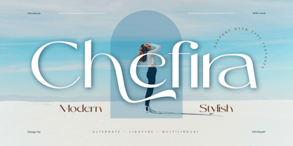 Chefira is a modern and stylish sans-serif font that exudes simplicity and sophistication. With its clean lines and contemporary look, it's the perfect choice for a wide range of design projects, from branding to editorial design. Featured: Standard, Uppercase & Lowercase Numeral & Punctuation Multilingual : ä ö ü Ä Ö Ü ß ¿ ¡ Alternate & Ligature PUA encoded We recommend programs that support the OpenType feature and the Glyphs panel such as Adobe applications or Corel Draw, so you can use all the variations of the glyphs. Hope you enjoy our fonts!
 - Ye Carbon by Yinon Ezra,
$30.00 Slab-serif typeface, with pulsating and flexible forms, which gives the font its humanistic character. Ye Carbon crystallized into its forms in search for graphic language that would represent a sense of matter, of letters written by hand. The delicate finishes at the edges of the letters, and the flexibility of the of shapes, gives a feeling of matter, and bring the font to life. Ye Carbon will be a wonderful tool for variety of uses, thanks to its neat nature, and its forms in motion vibe, a rare and winning combination.
 - Sygma by MJType,
$15.00 Sygma Display Typeface Serif, an elegant and sophisticated serif font. This font is designed to add a touch of class and refinement to any project and is sure to make a lasting impression on any audience. With its clean lines and refined details, Sygma Display Typeface Serif is the perfect choice for professional design projects, including branding, poster, and specific advertise. Whether you’re a designer, marketer, or just looking to add a touch of elegance to your personal projects, I hope Sygma Display Typeface Serif is an excellent choice.
 - Madness Attitude by IKIIKOWRK,
$19.00 Proudly present Madness Attitude - Street Brush Type, created by ikiiko. Inspired by the brush strokes on the street, where the raw, rough lines show a strong character of freedom expression. The font has a sloppy & dirty stroked texture, so it fits perfectly for making a poster, magazine layout, youth stuff, sleeve cover, party flyer, quotes, or simply as a stylish text overlay to any background image. What's Included? Uppercase & Lowercase Numbers & Punctuation Multilingual Support Works on PC & Mac Enjoy our font and if you have any questions, you can contact us by email : ikiikowrk@gmail.com
 - Agadir by Eurotypo,
$29.00 Agadir is a font inspired by a logo of the 60s. Its fundamental characteristic is that it is regular, with the possibility of choosing between ascending and descending of two different lengths. Agadir font is the perfect mix of elegant and casual. The Open Type features include standard and contextual alternates, swatches, stylistic sets, ligatures. All this makes the text lively and bouncy, without the monotony of obviously repeated letterforms. Agadir looks good in children's books, book covers, magazines, logos, fashion, restaurant menus, packaging, wedding invitations, greeting and business cards and where you want it.
 - Debar by Prominent and Affluent,
$30.00 Inspired by newspaper headlines, this sleek and sophisticated font turns heads with its bold strokes and clean lines that exude professionalism. Debar is perfect for any project where you need a timeless design that's innovative at the same time. It comes in two styles: regular and oblique, making it highly flexible to use across various themes. With Debar at your fingertips, there are no limits to what you can achieve. Whether creating stunning logos or crafting captivating marketing materials, this versatile font will elevate every project to new heights of excellence.
 - Young Finesse by Doyald Young,
$50.00Young Finesse is a light, two-weight, announcement face with a large x-height whose characters contain only a few straight lines. It is based on the titling font that I designed for the dust jacket of my book Fonts & Logos. Its inspiration comes from Hermann Zapf’s Optima, a serifless roman text face, based on Renaissance inscriptions.Young Finesse italic has a set of elaborate swash caps that reference 16th-century writing hands. Both Young Finesse and Home Run include Richard Isbell’s “interrabang,” appropriately used for statements that are both interrogative and exclamatory. - Wak by ParaType,
$30.00 Wak is a lively calligraphy-based sans serif. The simplicity and smoothness of its forms is combined with the sharpness and suddenness of the details. There are six weights from light to extra bold, with a variety of alternative signs, additional ligatures and initial and final forms with swashes. Lowercase letters repeat the uppercase pattern. The font is intended for short inscriptions and texts and is adapted for use on the screen. Wak was designed by Viktor Fitzner, character set expanded by Alexander Lubovenko. The font was released by ParaType in 2018.
 - Rodixu by Product Type,
$17.00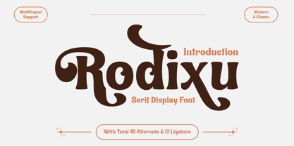 Rodixu is a classic serif font that exudes elegance and sophistication. Each character is carefully crafted with clean lines and balanced proportions, making it perfect for any project that requires a refined touch. Its timeless appeal makes it suitable for anything from editorial layouts to branding materials. With its stylistic alternates and ligatures, Rodixu offers a range of design possibilities and can elevate any project to the next level. Whether you’re creating a logo, website, or print materials, Rodixu is a font that will help you achieve a polished and professional look.
 - Grodsky by Vintage Voyage Design Supply,
$15.00 Grodsky is a modern high contrast Antiqua with well-defined, recognizable features. Based on the architecture of classic Antiqua fonts, Grodsky is typical of the typefaces from the first half of the 20th century: pronounced serifs, contrasting geometry, and an interplay of right angles and flowing lines. Grodsky has a lot of stylistic alternates and ligatures and true small caps. They give you more authentically typographic style. Grodsky comes with oldstyle and modern, fraction and tabular figures. The font is well suited for both headlines and body text.
 - Straight Angles by Celebrity Fontz,
$24.99Straight Angles is a precisely designed three-dimensional font with a clean and futuristic look. The predominant angles are 90 degrees and 180 degrees with parallel and perpendicular lines. Each character is surrounded by a crisp black border of even thickness throughout the font. Upper- and lower-case letters are the same, providing a constant maximum top height while the stems extending below are allowed to show off their distinct personalities in order to spice things up. The 3D extrusion effect makes text appear to stand out from the page. - Aughlesia by Aldedesign,
$18.00 Aughlesia is a stylish script font that features a varying baseline, smooth line, modern, and with a depth love. For those of you who need a touch of love and modernity for your designs or branding, it can be used for various purposes such as headings, wedding, invitation, signature, logos, branding, t-shirt, letterhead, signage, labels, news, posters, badges, and more. We designed this font with OpenType features to give an artistic touch on it. Aughlesia includes: -Stylish modern handwritten calligraphy script -Beautiful Swash (Ending tail) -Beautiful Titling (Beginning tail) -Special Ligatures -Multilingual Support
 - CPL Kirkwood by Kimmy Design,
$15.00 CPL Kirkwood is a distressed condensed bold slab and sans serif typeface. With both the serif and sans serif type options, it can be used in a broad range of design works. Included is a set of Extras that give the typeface an array of symbols, lines and banners. INSTALL NOTE: If you have purchased CPL Kirkwood ALL and are installing via Font Book, it is best to install in small groups rather than opening all font files at once. Once one group is installed (SLAB + SLAB Italics) you open and install the next group.
 - Modern Elvish by Typelove Fontworks,
$9.00 Modern Elvish is a humanist sans serif typeface created for the Tengwar “English” mode as popularized in the Lord of the Rings books and films. I imagined the famous elves of this lore living in contemporary times and needing a no nonsense modern typeface for their branding, communications and UX design. Use this typeface for your RPG, LARPing or Cosplay needs. This typeface uses advanced font features such as ligatures and contextual alternates to convert any English text. I would recommend typing in English first, then converting to a font of this typeface.
 - Racetrack by Type Innovations,
$39.00 Racetrack is the work of American type designer, Alex Kaczun, and was conceived as a result of developing a logo for a client. Alex was experimenting with a uniform grid pattern, outline and inline, connecting the dots which lead to this interesting typeface effect. Racetrack is a bold display font, which also works well at many point sizes. It has a futuristic appeal with straight lines and sharp corners. The uniform strokes, inline treatment and symmetry make for a powerful headline. The applications for this font design are endless.
 - Magenta Diamond by Balpirick,
$15.00 Magenta Diamond - a Monoline Handwritten that's clean, elegant and perfect for a range of design projects! With its smooth, effortless lines and understated sophistication, this font is the perfect choice for those who want a modern look that's still timeless in its appeal. Crafted with precision and care, this font is incredibly versatile and can be used for a range of design projects, including logos, branding, invitations, packaging, and more. With its simple yet refined aesthetic, it's sure to make a lasting impression on anyone who sees it.
 - Basim Marah by Hiba Studio,
$59.00 Basim Marah is an Arabic display typeface and is useful for titles and graphic projects. The font is based on the simple lines of free style calligraphy. A collaborative effort, Basim Marah was designed and drawn by Basim Salem Al Mahdi from Iraq and then digitalized as a typeface by Hasan Abu Afash from Palestine. In November, 2008, Basim Marah was upgraded by working with Mirjam Somers an award-winning Arabic type designer to the DecoType font format for use in WinSoft Tasmeem which is now bundled with InDesign CS4.
 - Povetarac Display by Tour De Force,
$25.00 Povetarac Display font family is part of Povetarac Superfamily together with Povetarac Sans and Povetarac Didone. Available in 6 weights and one variable font file, Povetarac Display relays on lively uppercase proportions that took inspiration from vintage typefaces. It is well balanced, elegant and fully recognizable high contrasted sans serif family. One of its characteristics are straight and wide terminals. With sharp overhang, Povetarac Display works pretty well in all situations – from editorial use to branding, websites or just titles. Comes with 3 Stylistic Sets, SmallCaps and Fractions and extended Latin character map.
 - Noah Letter by Aminmario Studio,
$20.00 Noah Letter is a natural signature font, that is readable and stylish. This font was created to look as close to a natural handwritten script, as possible by including alternates lowercase, swash lowercase, ligature and underlines. Built in Opentype features, this script comes to life as if you were writing it yourself. Perfect for any awesome projects that need hand writing taste. Comes with regular and italic. Also support multilingual. This is suitable for branding, quotes, invitations, stationery, wedding design, logos, watermarks on photography, signatures, advertisement, album covers, business cards, clothing, magazines, posters, and more!
 - Eckhardt Dualine JNL by Jeff Levine,
$29.00 While searching online for vintage type inspirations, an image was spotted of an old letterhead for a steel manufacturing company. The hand lettering of the word 'Ludlum' only offered D,L,M and E as visual examples, but from this Jeff Levine has designed Eckhardt Dualine JNL - a Deco-flavored dual-line type font. As with a number of other releases that emulate hand-lettering or sign painting, Jeff has named this font in honor of his good friend, the late Albert Eckhardt, Jr.; who ran Allied Signs in Miami from 1959 until his passing.
 - Linotype Octane by Linotype,
$29.99Linotype Octane is part of the Take Type Library, selected from the contestants of Linotype’s International Digital Type Design Contests of 1994 and 1997. The font was designed by German artist Norbert Reiners, a tall, thin font with a narrow line width and marked stroke contrast. The regular and bold weights seem somewhat static while the italic cuts make a dynamic impression. Linotype Octane is available in four weights, each of which contains a number of ligatures. The cool and reserved Octane is best used for shorter texts and headlines in larger point sizes. - Caché by ArtyType,
$29.00 Caché is a stylish, condensed sans serif font family in 3 versatile weights (Light, Medium & Bold) with an extended Latin character set. The typeface features economical letterforms with distinctively sheared terminals and occasional stencil characteristics. Designed as a practical all-rounder, it really does live up to its name, providing legibility along with added panache to any heading or copy. In practice, its surprisingly adaptable to most projects; and as usual with ‘ArtyType’ fonts, there are several alternate characters available via the glyph palette, providing that extra dimension when personalising your design projects.