10,000 search results
(0.041 seconds)
- Alimentary by Missy Meyer,
$12.00 Alimentary (adjective): relating to nourishment or sustenance. If you've seen my other fonts, you know I tend to lean into food-based names. This name has to do with food and science combined, so it's double nerdy in the ways I like to be nerdy! I started with Alimentary Medium, which was inspired by my shorter, wider font MacGuffin - I wanted something taller, narrower, with a hip and retro feel. When I finished the Medium weight, I felt like I wanted a Light weight. Then a Heavy weight. Then I figured, "what the heck," and made an outline version of the Medium weight too. In the end, I wound up with four members of the Alimentary family, each with over 700 glyphs! Not only do they all have the basics (A-Z, a-z, 0-9, and tons of punctuation), but they also each have 330 characters for European language support, and a limited selection of Greek, Coptic, and Cyrillic characters. Plus a double handful of alternates and ligatures to add a little variety to your designs! And of course, all of the Alimentary fonts are super-smoothed, with reduced nodes and clean curves, so whether you're cutting them out, printing them, engraving them, or using them in a way I haven't even thought of, these fonts will be sharp and crisp!
 - DT Skiart Subtle by Dragon Tongue Foundry,
$9.00 ‘Skiart Serif Subtle’ is now available online. Originally inspired by the san serif font ‘Skia’ by Mathew Carter for Apple. ‘Skiart’ was designed to feel more like a serifed font, but without any serifs. It took a step between sans serif and serif fonts. Next on the path towards a serif font came Skiart Serif Mini, with tiny serifs added. This was a true serif font, all be it on the small side. Skiart Serif Subtle is less of a serif than Skiart Serif Mini, in that it doesn’t have actual 'serifs' as such. It has a subtle flare where a serif might normally be found. It remains fully readable and feels as clean and normal as any of the best body copy serifs, and yet still has the strong solid bones of all the other Skiart font families. If compared to one of the more commonly used serifs like ‘Times New Roman’, the ‘Skiart Serif Subtle’ lowercase is more open with a taller x-height, increasing its readability and friendliness. The serifs are smaller and less distracting. They are not pretending to be ligatures. Where ‘Times’ makes its p q b d forms out of a barely touching oval and stem, the ‘Serif Subtle’ forms are much more firmly attached, appearing clearly as single letters. The standard setting for the a’s and g’s are round single story, feeling warmer and more inviting in the ‘Serif Mini’ font. Much more friendly than the stuffy double-storied versions in fonts such as ‘Times’ etc.
 - Gendouki by Typodermic,
$11.95 Introducing Gendouki, the ultimate futuristic typeface that will transport your designs to the cutting-edge of technology. With its striking filament stencil lines, reminiscent of spacecraft access panels, Gendouki is the perfect choice for projects that demand a bold and hyper-futuristic look. Imagine using Gendouki as a large, low-contrast backdrop element, setting the stage for your content to shine. The sleek and modern lines of the font will add depth and dimension to your design, creating a dynamic visual experience that’s sure to capture your audience’s attention. But that’s not all. Gendouki is also perfect for producing movement in your paragraphs when applied as a techno drop-cap. Watch as your text springs to life, animating your words and drawing your reader in with its captivating energy. So if you’re looking for a font that combines the sleek, hyper-futuristic look of a spacecraft with the sharp, clean lines of modern design, look no further than Gendouki. Try it today and take your designs to a whole new level of cool. Most Latin-based European writing systems are supported, including the following languages. Afaan Oromo, Afar, Afrikaans, Albanian, Alsatian, Aromanian, Aymara, Bashkir (Latin), Basque, Belarusian (Latin), Bemba, Bikol, Bosnian, Breton, Cape Verdean, Creole, Catalan, Cebuano, Chamorro, Chavacano, Chichewa, Crimean Tatar (Latin), Croatian, Czech, Danish, Dawan, Dholuo, Dutch, English, Estonian, Faroese, Fijian, Filipino, Finnish, French, Frisian, Friulian, Gagauz (Latin), Galician, Ganda, Genoese, German, Greenlandic, Guadeloupean Creole, Haitian Creole, Hawaiian, Hiligaynon, Hungarian, Icelandic, Ilocano, Indonesian, Irish, Italian, Jamaican, Kaqchikel, Karakalpak (Latin), Kashubian, Kikongo, Kinyarwanda, Kirundi, Kurdish (Latin), Latvian, Lithuanian, Lombard, Low Saxon, Luxembourgish, Maasai, Makhuwa, Malay, Maltese, Māori, Moldovan, Montenegrin, Ndebele, Neapolitan, Norwegian, Novial, Occitan, Ossetian (Latin), Papiamento, Piedmontese, Polish, Portuguese, Quechua, Rarotongan, Romanian, Romansh, Sami, Sango, Saramaccan, Sardinian, Scottish Gaelic, Serbian (Latin), Shona, Sicilian, Silesian, Slovak, Slovenian, Somali, Sorbian, Sotho, Spanish, Swahili, Swazi, Swedish, Tagalog, Tahitian, Tetum, Tongan, Tshiluba, Tsonga, Tswana, Tumbuka, Turkish, Turkmen (Latin), Tuvaluan, Uzbek (Latin), Venetian, Vepsian, Võro, Walloon, Waray-Waray, Wayuu, Welsh, Wolof, Xhosa, Yapese, Zapotec Zulu and Zuni.
 - Kirsty - Unknown license

- Marine Corps by Mevstory Studio,
$25.00 Get ready to explore cutting-edge typography with Marine Corps, an incredible Industrial Sans Serif Font designed to bring a strong mechanical vibe to your projects. Marine Corps is a font that reflects the strength and rigor of the industrial world. This font was inspired by a warship I saw in person. This font is designed with three styles: Marine Corps Regular Marine Corps in line Marine Corps stamp
 - AZ Varsity by Artist of Design,
$20.00 AZ Varsity font was inspired from a combination of typical collegiate t-shirts designs and also the current wave of Hollister t-shirt designs (rough look). This font utilizes an "old look" to the line work which is designed to have a "worn feel" to it. It is designed to compliment it's sister font, AZ Vintage Brushed. This font is designed for use as a worn and antiqued headline or subheadline.
 - Sincerely Yourz by Outside the Line,
$19.00 Sincerely Yourz is another font in the Love Letters series from Outside the Line. It is a hand-printed font with extra letter spacing. All the letters have about the same height. All vowels are lower case whether they are caps or not. This font has a fresh contemporary hand-lettered look. While it can be used as a headline font it is really designed for body copy.
 - Mentah 1 by Sulthan Studio,
$10.00 This sketch font Sans serif was born from the lines in the font that we created for the (Rajin) font and we redeveloped it into a different style with a more minimalist and more powerful setting and looks stunning for any smooth and bold writing that can be used anywhere in your work This font has complete uppercase and lowercase letters with 4 thicknesses, numbers, punctuation, and also language support
 - Sunny Sumo by Mix Fonts,
$13.00 Meet the MIX SUNNY SUMO, the perfect blend of playful and bold that’s sure to make your designs stand out. This three-piece font family includes SUNNY SUMO, SUNNY SUMO LINE, and SUNNY SUMO XOs, each with their own unique style. SUNNY SUMO and SUNNY SUMO LINE are layering fonts, which means you can use them separately or stack them to create dynamic designs. And for those fun finishing touches, SUNNY SUMO XOs offers a variety of doodles including X marks, circles, erase marks, and cross-offs that can be used alongside any graphic work. Designed as a bold handwritten sans serif, SUNNY SUMO is ideal for display fonts and headlines that require attention. This versatile font can be used by designers for logos, book covers, greeting cards, posters, packaging, and so much more. As a multilingual font, SUNNY SUMO supports multiple languages, including all the characters, glyphs, and accent marks needed for specific languages. With SUNNY SUMO, you can strike the perfect balance between relatable and professional, making it a great choice for anyone seeking a playful, bold, and fun layering font. MIX SUNNY SUMO and MIX SUNNY SUMO LINE come with the following glyphs: ABCDEFGHIJKLMNOPQRSTUVWXYZ abcdefghijklmnopqrstuvwxyz 0123456789 !@#$%^&*()`~♥✿•· .,:;'”\|/?{}[]<>“”‘’-–—_÷×+−±≈=≠≥≤ …‚„©®™‹›«»°¹²³¡¿₱¢€£¥½¼¾¶§№† ÁÀÂÃÄȦÅĂĀĄÆĆĈČĊÇÐĐĎÉÈÊĚËĖĒĘḞǴĜǦĠḠĤȞḦḢIÍÌÎÏĪĮĴḰǨĹĽŁḾṀŃŇÑ ÓÒÔÕÖŌŐØŒṔṖŔŘṘŚŜŠŞȘŤṪŢȚÚÙÛŨÜŮŬŪŰŲẂẀŴẄẆÝŶŸŹẐŽŻƵ áàâãäȧåăāąæćĉčċçðđďéèêěëėēęḟǵĝǧġḡĥȟḧḣıíìîïīįĵḱǩĺľłḿṁńňñ óòôõöōőøœṕṗŕřṙśŝšşșťṫţțúùûũüůŭūűųẃẁŵẅẇýŷÿźẑžżƶ MIX SUNNY SUMO XOs comes with the following glyphs: ABCDEFGHIJKLMNOPQRSTUVWXYZ
 - Cross Stitch Gothic by Gerald Gallo,
$20.00 Cross Stitch Gothic is not intended for text use. It was designed for use as fancy monograms or initials. Cross Stitch Gothic is based on upper case characters 28 stitches tall and contains the characters A-Z. Most characters extend above the capital line or below the base line.
 - LGF Avadar by LGF Fonts,
$9.00 Avadar is a typeface with a fine serif of straight lines and an inner line that breaks the glyph in two. The type is indicated for use in large or very large sizes, especially for display graphics; the spacing between glyphs makes the readability of the text increase.
 - Greenwich Mean - Unknown license

- Lavire by Nathatype,
$29.00 Elevate your design projects with the distinctive and captivating Lavire. Lavire is an uppercase display serif font that is effortlessly made in a truly unique typographic masterpiece. Each uppercase letter in Lavire is a work of art in itself. The serifs, which are typically known for their traditional elegance, take on a modern and imaginative twist with Lavire's addition of artistic lines and flairs. The artistic lines and flairs in this font are carefully crafted to enhance the overall composition of each letter. They bring a sense of motion and dynamism to the font, making it particularly well-suited for projects that seek to convey a sense of movement or elegance. Lavire fits in headlines, logos, posters, flyers, branding materials, print media, editorial layouts, and many more designs. Find out more ways to use this font by taking a look at the font preview.
 - Costa Std by Typofonderie,
$59.00 A mediterranean style sanserif in 4 styles The original idea of Costa was to create a contemporary mediterranean typeface style. Costa is a synthesis of the purity, as found on Greek capitals, and softness, found in Renaissance scripts. First thing was the design concept that take its roots on the Chancery script. Such writing style appeared during Italian Renaissance. Later few typefaces have been developed from such cursive models. Today most serifed typeface italic take their roots on such triangular structure we can find on gylphs like the n, p, or d. The Costa capitals remains close to pure sanserif models when the lowercases features an ending serif on many letters like the a, n, d, etc. This ending serif being more like a minimal brush effect, creating a visual contrast and referencing the exoticness of the typeface. Knowing that the Costa typeface family began life in the 90s as a bespoke typeface for Costa Crociere, an Italian cruise company — it suddenly makes sense and explains well why Jean François Porchez focused so much on Italian Chancery mixed to a certain exotism. The curvy-pointed terminals of the Costa n can obviously get find on other glyphs, such as the ending of the e, c and some capitals. So, the sanserif looks more soft and appealing, without to be to pudgy or spineless. The general effect, when set for text, remains a sanserif, even not like Rotis Semiserif. Costa is definitly not a classical typeface, or serif typeface which convey past, tradition, historicism as Garamond does beautifully. Because of the Costa crocieres original needs, Costa typeface was designed to be appropriate for any uses. Anytime you’re looking for good mood, qualitative effects, informal tone, cool atmosphere without to be unconvential or blowzy, Costa will convey to your design the required chic and nice atmosphere, from large headlines sizes, brands, to small text sizes. It’s a legible typeface, never boring. A style without neutrality which doesn’t fit comfortably into any typeface classification! Does it proves the novelty of its design and guarantees as well as its originality? Its up to you to be convinced. Barcelona trip Originally not planned, this need appeared because of a trip to Barcelona at the time of the project, where Jean François was giving a lecture. He wanted to pay an homage to that invitation to create something special. So, he designed during his flight some variations of the Spanish Ch, following ideas developed by the Argentinian type designer Rubén Fontana for his typeface called Fontana ND (published by the Barcelona foundry Bauer). Then, he presented during his lecture variations and asked to the audience which design fit the best to their language. They selected the design you can find in the fonts today. Read more about pairing Costa Type Directors Club 2000 Typographica: Our Favourite Typefaces 2004
 - Mercurial by Grype,
$16.00 Geometric/Technical style logotypes have been developed for car chrome labels since the early 1980’s, but automobile companies don't monopolize the style by any means. During the 80’s and 90’s, a lot of these logos leaned towards the geometric sans styles and the swiss styling of fonts like Handel Gothic, while playing with varying degrees of squared rounds and varying expanded widths per logotype. Mercurial has this flavor, but it wasn’t derived from logotypes. Instead, it began as a digitization of a film typeface from LetterGraphics in the early 70's known as "Sam". It visual ties to this genre of automotive logotypes and fonts like Handel Gothic lend a familiarity to it, yet it has an identity all its own. As with so many automotive logotypes, this singular style film typeface, lacked an expansive family which shows off all potential the logotypes have and what they "could" be and do. And that's where we come in. What originally began as this family’s Regular Width - Bold Style has been expanded into a collection of 3 Width Families, each containing 5 Weights. Here’s what’s included with the Mercurial Complete bundle: 396 glyphs per style - including Capitals, Lowercase, Numerals, Punctuation and an extensive character set that covers multilingual support of latin based languages. (see the final poster graphics for a preview of the characters included) 3 widths in the collection: Narrow, Regular, & Wide 5 weights in each width family: Light, Book, Regular, Medium & Bold. Here’s why the Mercurial Family is for you: - You’re in need of stylish sans font family with a range of widths and weights. - You’re love those 80’s automotive logos, but want more range of use. - You’re looking for an alternative to Handel Gothic. - You’re looking for a clean techno typeface for your rave poster designs. - You just like to collect quality fonts to add to your design arsenal.
 - West Kingdom by Putracetol,
$22.00 West Kingdom is a modern script inspired by streetwear in combination with a hand lettering style. Ideal for logos, badge, label, apparel, club, event, handwritten quotes, product packaging, header, poster, merchandise, social media & greeting cards. West Kingdom has many opentype features like ligature, alternate, swash and also multi language support.
 - Charlotte Script by Vástago Studio,
$10.00 A funny Script typeface with a simple construction for to show a dynamic texture playing with the baseline. This letters are inspired on the work of House Induestries mixing a traditional serif with a playful script, like some retrospective alphabets in the vintage ads. Enjoy it, and thanks for buy it!
 - Patriot by Barnbrook Fonts,
$30.00 Patriot is the sans-serif version of Exocet and, like Exocet, is based upon early Greek and Roman stone-carving, yet it adheres more closely to the shared historical source material. Patriot was developed to include unique forms and alternative characters, becoming a striking original typeface in its own right.
 - Antibes by Barmoor Foundry,
$15.00 Antibes is a casual italic face with print caps and cursive lowercase letters. Antibes works well with colorful, freeform illustration and travel-related material like illustrated travel brochures and callouts for maps. All-caps paragraphs are an easy read and letter-spaced all-cap treatments can be used for titling.
 - Palmilla 2.0 by RodrigoTypo,
$25.00 Palmilla 2.0 is a continuation of palmilla which added more glyphs such as Alphabets, Cyrillic was added like Greek, in addition to Alternatives such as Ligatures, more Ligatures were also added in Latin to play more with the title, in total there are six special weights for informal and creative titles.
 - MPI Deco by mpressInteractive,
$5.00 Deco is a minimal, easy-to-read gothic without fuss. Geometry is sharp, strokes are uniform throughout, and characters are slightly condensed. This version is based on wood type of unknown origin, but the design was likely based on lettering from the Art Deco period of the 1920s and '30s.
 - Coldcoast by Putracetol,
$22.00 Coldcoast is a modern handwritten script that inspired by streetwear and combination hand lettering style. Coldcoast is ideal for logos, badges, labels, apparel, clubs, events, handwritten quotes, product packaging, headers, posters, merchandise, social media posts, greeting cards and more. Coldcoast includes OpenType features like ligatures, alternates and also support multiple languages.
 - Earthpig by Scriptorium,
$12.00Earthpig is based on samples of poster lettering from classic club posters of the 1960s, from venues like the Fillmore in San Francisco and the Armadillo in Austin. It combines elements of several different styles to recreate the unique look of poster lettering of the psychedelic era. It's far out, man. - Penny Arcade by Solotype,
$19.95A popular caps-only type of late Victorian times was called Mural, brought out by Boston Type Foundry in 1890. We always liked it, drew a lowercase for it, and then strengthened it by adding a bit of weight. It now has a nice, understated retro look for paragraphs of copy. - Smash by Cool Fonts,
$24.00 Smash is nicely distressed and has cracks, chunks and blobs. Some people think it looks like a crappy FAX or broken typewriter. It is compatible with Overexposed, so you can mix and match letters so you don't have two of the same messed up letters in a row.(Pretty cool huh?)
 - Oxe by Tipos do aCASO,
$12.95Distort, expand and shrink. Working the shapes of letters as something fluid, like clay or rubber. The unexpected result leads young designers to bewilderment. Oxe is common expression among people in the northeast of Brazil, a slang that expresses amazement and baptizes the digital type created in 1999 by Buggy. - Pink Lemonade by Typadelic,
$19.95 Pink Lemonade (formerly called Fresh Paint) is just like cool, tart lemonade on a hot summer’s day...refreshing! With varying widths and irregular sizes of the lowercase letters, Pink Lemonade lends a bouncy rhythm to text. Works very well for scrapbooking, invitations, children’s books, recipe books, titling, display purposes, etc.
 - Musee by DSType,
$26.00First inspired in a leaf from Missale Romanum ex Decreto Sanctrosancti Concilii Tridentinii Restitutum, printed by the Plantin Workshop at Antwerp in 1642, Musee was designed for booktext purposes and is very elegant and highly readable even in small sizes. Includes plenty of OpenType features, like SmallCaps, Alternates and Swashes. - Adana by astype,
$19.00 The roots of Adana going back to the year 1930, to the Berlin-based German graphic designer Wilhelm Berg. His typeface can be interpreted as an answer to Lucian Bernhards Schönschrift. Adana Circular and Regular play well together in all kinds of adverts, as well with designs like Bodoni or Didot.
 - Storyboard by Atlantic Fonts,
$26.00 Storyboard is expressive, rough, partly connected and full of painterly, brushed energy like the sketches of a storyboard. It's bold and kind of edgy, but can be friendly too. There are tons of ligatures you can turn on or off depending on the look you're after. So what's your story?
 - Subliminal BF by Bomparte's Fonts,
$40.00 Subliminal BF presents a cool, distinctive look that’s a superb selection for a wide variety of uses from music CD covers to packaging. Like Glow Gothic BF, it represents experimentation in the realm of halftone effects. At smaller than headline sizes it “colors up” to exhibit a unique, kinetic sensation.
 - Opkrop by Jipatype,
$25.00 Opkrom is Thai language mean Crispy or Crunchy. With informal sans serif style look like semi handwriting give feel friendly and warm . It support major Latin scripts and Thai scripts. It have stylistic set for Thai script. Opkrop is suited for headline on packaging, print ad and various graphic work.
 - Moline Quotes Sans by Ayska,
$20.00 Introducing Moline Quotes Sans Typeface. it looks natural like a handmade which has a fast dry brush style. That is ideally suited for advertising and packaging, logo, branding and creative industries. The Moline Quotes Sans Typeface is designed to make your next great project look more natural and stand out.
 - Cardillac Text by Hoftype,
$49.00 Cardillac Text is the down to earth version of the subtle and high contrasted Cardillac family. More suitable for longer text and for strong headline applications. The Cardillac Text Family consists of 16 styles, provides many features which allow its application for ambitious typography. It comes in OpenType format with extended language support. All weights contain small caps, ligatures, superior characters, proportional lining figures, tabular lining figures, proportional old style figures, lining old style figures, matching currency symbols, fraction- and scientific numerals, matching arrows and alternate characters.
 - Orgon by Hoftype,
$49.00 Orgon, a new linear typeface family, fresh and easy but with a warm touch. It appears uncomplicated, unpretentious, but still distinctive. Its quiet text flow allows smooth reading even for longer texts. The Orgon family comprises 16 styles and is well suited for ambitious typography. It comes in OpenType format with extended language support. All weights contain ligatures, small caps, superior characters, proportional lining figures, tabular lining figures, proportional old style figures, lining old style figures, matching currency symbols, fraction- and scientific numerals and matching arrows.
 - Sina Nova by Hoftype,
$- Sina Nova is the slimmer sister of Sina. It has a slightly vertical tendency, a higher x-height which makes it more open in small text sizes. Its economical proportions allow an even more universal application. Sina comes in 12 styles and in OpenType format. All styles contain standard and discretional ligatures, small caps, proportional lining figures, tabular lining figures, proportional old style figures, lining old style figures, matching currency symbols, fraction- and scientific numerals. Sina supports Western European, Central and Eastern European languages.
 - Antrophys by Maulana Creative,
$14.00 Antrophys is a casual signature script font. With regular mono-line stroke, fun character with a bit of ligatures. To give you an extra creative work. Antrophys font support multilingual more than 100+ language. This font is good for logo design, Social media, Movie Titles, Books Titles, a short text even a long text letter and good for your secondary text font with sans or serif. Make a stunning work with Antrophys font. Cheers, MaulanaCreative
 - Bitumen by Hanoded,
$12.00 Bitumen is a sticky, black, and highly viscous liquid form of petroleum. When I created this font, it reminded me a bit of asphalt, hence the name. Bitumen is a handmade font based on Schmallfette Grotesk by Walter Haettenschweiler and Haettenschweiler font. The font was made with a Japanese brush pen, hence the bold lines. Bitumen comes in two styles: the regular, fat display font and a lighter version - both with italics.
 - Coflocks by Maulana Creative,
$13.00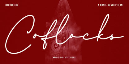 Coflocks is an signature script font. With mono-line stroke, fun character with a bit of ligatures and alternates. To give you an extra creative work. Coflocks font support multilingual more than 100+ language. This font is good for logo design, Social media, Movie Titles, Books Titles, a short text even a long text letter and good for your secondary text font with sans or serif. Make a stunning work with Coflocks font. Cheers, MaulanaCreative
 - Betsyclove by Maulana Creative,
$12.00 Betsyclove is a modern romantic signature script font. With regular mono-line stroke, fun character with some of ligatures. To give you an extra creative work. Betsyclove font support multilingual more than 100+ language. This font is good for logo design, Social media, Movie Titles, Books Titles, a short text even a long text letter and good for your secondary text font with sans or serif. Make a stunning work with Betsyclove font. Cheers, MaulanaCreative

