10,000 search results
(0.14 seconds)
- Technical Forest by Maciej Świerczek,
$- Design style ready to use in headlines, tags and quotes refering to technology, sci-fi, modern economy and more recent themes. The name of this font is connected to its simplicity and combination of its soft and sharp style in lines - just like tree branches and leaves. Also inspired by block form of runes - related to nature in its full floral character. However kept in clear and precisely designed form of technical font.
 - Gothic Story by Mvmet,
$10.00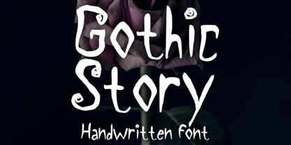 Gothic Story is a kid-friendly gothic handwritten display font, inspired by 90s gothic movies. It will be perfect for your gothic and Halloween-themed needs! You can use it for anything ranging from t-shirts and clothing, to your gothic book designs, Halloween party needs, greeting cards, stickers, posters, banners, or anything that needs a cool touch. Try it to create fabulous designs and feel the gothic and Halloween vibes with it!
 - Felicity by Fenotype,
$35.00 Felicity is a tightly cut heavyweight display serif. Felicity has strict kerning and it creates strong looking words just by typing - but if you need even more try any of Felicity’s many OpenType features: Discretionary Ligatures, Stylistic, Titling or Swash Alternates. Felicity has also a small selection of ornaments you can from the Character Window. Felicity is also equipped with Contextual Alternates and Standard Ligatures that prevents letters from colliding. Both features are automatically on.
 - Lazy Morning by Hanoded,
$15.00 I can’t remember when I had a true lazy morning.. I was a looong time ago, before I had children! Even now, when I’m down with the flu, I can’t stay in bed for too long - it really seems like a waste of time! Lazy Morning is a nice handwritten font. I made it with a Sharpie pen. It comes with all diacritics and double letter ligatures for you to play with.
 - CRM American Horror by CRMFontCo,
$35.00 The Classic Charles Rennie Mackintosh Font has been a massive seller over the years. Its use in the Hollywood motion picture "Spider Man 2", has now been emulated by the branding of the the new Fox TV series "American Horror Story". Very unusual for the horror genre, this slightly tweaked version of the classic original mirrors how the show's producers have used it.
 - ALS Pobeda by Art. Lebedev Studio,
$20.00 Pobeda is a bright jobbing typeface inspired by the Moscow Victory Day Parade commemorating the 70th anniversary of the end of the Second World War. At the heart of the typeface is the recognizable rapid silhouette of the famous MiG-29. This cool typeface looks great on souvenir objects, in print and on the web, adding some technical flair to any material.
 - Mestiza Sans by Antonio Lechuga,
$30.00 Mestiza Sans is the new family of the Mestiza system, the perfect complement to the serif version, reinforcing and expanding the possibilities of use and combination. It discreetly and harmoniously preserves the relics of the serifs, bringing the artisanal to the contemporary in a mix that continues to evoke elegance and strength. It's ideal for headlines, branding, and editorial projects.
 - Flower Children JNL by Jeff Levine,
$29.00 At the apex of the 1960s-70s Hippie movement, San Franscisco's Haight-Ashbury district was the epicenter of the Love Generation, and the Fillmore (East and West) were the city's musical venues. Inspired by a 1970 concert poster, the Art Nouveau influence was strongly felt in the hand lettering from that poster, which is the basis for Flower Children JNL.
 - Bowling by Ingrimayne Type,
$14.95 Bowling has letters on bowling pins. On the upper-case keys, the bowling pins are white with black letters and on the lower-case keys the pins are black with white letters. The lower-case letters can be colored and placed behind the upper-case letters to give two-color lettering. (The letters on the pins are from the typeface InsideLetters.)
 - Soft Block by fontgeneration,
$19.00 The letters possess some of the most characteristic features of this type of font, used for communication and advertising in various mechanized and motor sports, as well as in the gaming industry. The technological-engineering constructiveness is achieved through the strict geometry of the forms, and the sporty competitive look is stylistically expressed through the slopes and contrasts of the beams.
 - Arrow Callouts JNL by Jeff Levine,
$29.00 Here’s a set of arrow shaped callouts in two varieties within one font. The black-on-white letters are on the upper case keys, and the white-on-black characters are on the lower case keys. The numerals 1 thru 10 in black-on-white are in the standard key positions, while the white-on-black numbers are on the same keys when engaging the “shift” key. The 'zero' key houses the number '10'. For a more dynamic look, the font is also available in an oblique version.
 - Wood Type Calendar JNL by Jeff Levine,
$29.00 Wood Type Calendar JNL is a set of components for making monthly calendar pages. Based on a set of vintage wood type numbers, the dates 1 through 31 are found on the "A-Z" and "a-e" keys; the 23/30 and 24/31 ligatures are on the "f" and "g" keys. On the "h" and "i" keys are blank outline and solid blocks for balancing the calendar layout. The "j" through "u" keys have the names of the months, and the "1" through "7" keys contain the days of the week.
 - Donna Lena by Eurotypo,
$39.00 Donna Lena is a chancery cursive, feminine in character. Elegant and timeless, this font marks the return of the classical canons of the Renaissance thanks to its open forms and the clear-cut ends, while recalls the graceful ways and the intense gaze of the ladies that populate the Florentine paintings in the sixteenth century. Donna Lena is soft and slightly inclined, with a fast ductus and marked contrasts in thickness to highlight the gesture. Different stylistic variations and ligatures are considered to make the most of the many OpenType features.
 - Thorowgood by Linotype,
$29.99Thorowgood was originally released by the Stephenson Blake typefoundry in the UK. The types were first cut by the English typefounder Robert Thorne, predecessor of William Thorowgood, and first shown in his specimen books in the early nineteenth century. The fat face was revived in roman (1953) and italic. The S and the C appear to be smaller than the other capitals. Most serifs are flat and thin horizontals. In the italic the main strokes of h, k, m, n, and r are curved inwards at the foot. - Poole Chiselcut by Poole,
$36.00The Poole Chiselcut faces are a useful companion to the regular Poole fonts. In the Standard weight, the diamond shapes inside each character, work toward an elegant, sophisticated look. In the Mid and Heavy weights the chisel cut makes the alphabets look Victorian. In particular, the Heavy weight look is that of a circus letter. Of course the 2 color options for this group are endless. Used in concert with the rest of the Poole Family, or as stand alone fonts, the Poole Chiselcut set is a useful addition to your library. - Kengwin by Typodermic,
$11.95 The mighty Kengwin, an awe-inspiring font that commands attention and exudes a powerful presence! Its striking rounded slab serif design is a true marvel of typographic engineering, setting it apart from any other font you’ve seen before. With its pleasantly plump curves and bold, strong lines, Kengwin is a true force to be reckoned with. Its unique shape is sure to captivate the eye and leave a lasting impression on all who behold it. But this font isn’t just a pretty face—oh no! Kengwin has a personality all its own, one that radiates confidence, warmth, and a zest for life. It’s the perfect choice for those who want to communicate their message with power and conviction, without sacrificing that human touch. So go ahead, let Kengwin be the star of your next project. Whether you’re designing a logo, crafting a headline, or creating a stunning poster, this font is sure to deliver the impact you’re looking for. With Kengwin, your message will be impossible to ignore, and your designs will be truly unforgettable! Most Latin-based European writing systems are supported, including the following languages. Afaan Oromo, Afar, Afrikaans, Albanian, Alsatian, Aromanian, Aymara, Bashkir (Latin), Basque, Belarusian (Latin), Bemba, Bikol, Bosnian, Breton, Cape Verdean, Creole, Catalan, Cebuano, Chamorro, Chavacano, Chichewa, Crimean Tatar (Latin), Croatian, Czech, Danish, Dawan, Dholuo, Dutch, English, Estonian, Faroese, Fijian, Filipino, Finnish, French, Frisian, Friulian, Gagauz (Latin), Galician, Ganda, Genoese, German, Greenlandic, Guadeloupean Creole, Haitian Creole, Hawaiian, Hiligaynon, Hungarian, Icelandic, Ilocano, Indonesian, Irish, Italian, Jamaican, Kaqchikel, Karakalpak (Latin), Kashubian, Kikongo, Kinyarwanda, Kirundi, Kurdish (Latin), Latvian, Lithuanian, Lombard, Low Saxon, Luxembourgish, Maasai, Makhuwa, Malay, Maltese, Māori, Moldovan, Montenegrin, Ndebele, Neapolitan, Norwegian, Novial, Occitan, Ossetian (Latin), Papiamento, Piedmontese, Polish, Portuguese, Quechua, Rarotongan, Romanian, Romansh, Sami, Sango, Saramaccan, Sardinian, Scottish Gaelic, Serbian (Latin), Shona, Sicilian, Silesian, Slovak, Slovenian, Somali, Sorbian, Sotho, Spanish, Swahili, Swazi, Swedish, Tagalog, Tahitian, Tetum, Tongan, Tshiluba, Tsonga, Tswana, Tumbuka, Turkish, Turkmen (Latin), Tuvaluan, Uzbek (Latin), Venetian, Vepsian, Võro, Walloon, Waray-Waray, Wayuu, Welsh, Wolof, Xhosa, Yapese, Zapotec Zulu and Zuni.
 - Mixcoatl Mono by URW Type Foundry,
$19.99 The Typeface «Mixcoatl» by Elia Salvisberg was developed as a part of a course at the Lucerne School of Design and Art in 2016. Based on the book «The Empire of the Inca», a display-font has been created, which is inspired by the graphic language of the South American Empire of the Incas. At the beginning, only capital letters were designed but there was the desire for a complete typeface – which is why the missing signs were added. The font is based on a grid, so the characters are constructed equivalently and a uniform geometric font arose. The name was adopted from the god of hunting who plays an important role in the mythology of the Aztecs and appears in various forms. The uppercase letters can also be represented and combined in two alternative character-sets, so there are a lot of opportunities to combine uppercase words in different forms.
 - Moon Phases by Fascination Workshop,
$10.00 Moon Phases documents the phases of the moon over time. Great for animation, signs, greeting cards, posters, etc. The phases of the moon follow the alphabetical order. Upper and lower case characters are the same. For a character map, see the gallery.
 - Plate Gothic by Monotype,
$29.00Around the turn of the twentieth-century, Steel and copper plate engraving was the most sophisticated and expensive method for producing business cards, stationery, and formal announcements. In engraved printing, the image is incised, or engraved into a hard, flat plate. Ink is applied to the plate, and then wiped off; leaving only the ink that is trapped below the surface in the incised areas. When the paper is pressed against the flat plate, the ink is drawn out of these areas and transferred to the paper. The results are twofold: printing which sits above the surface of the paper, and the reproduction very delicate lines and shapes. For business and formal printing, engraved printing was, and is, considered the best. The problem is that not everybody can afford the best. Type foundries, in the early 1900s, figured that if they could produce a typeface for traditional printing, which had appearance of engraving, they would be able to satisfy the needs of those forced to live with modest printing budgets. Engravers faces were born. Fredric Goudy’s Copperplate Gothic was one of the most popular. Plate Gothic is a version of this style updated for digital technology. It has all the charm and charisma as the metal type and yet is perfect for today's needs. - Envelove by Sudtipos,
$39.00 «Envelove» is the brand new typographic challenge handwritten by Yani Arabena and designed along with Guille Vizzari and Ale Paul, for Sudtipos. It all started as a game for Yani. A carefree and spontaneous calligraphy, making use of the pointed nib with black ink, exploring its expressive possibilities pressing against paper. With time that nib turned into her dearest tool to flow through her writing, breeding this particular style of hers that let her trespass the barrier that kept personal and professional passions apart. All that inspiration is present in «Envelove», a play on words that reflects the love of letters. An expressive free-and-easy typeface that follows no formal calligraphic model and lets itself go with the meaning of words, rhythm and sensations. «Envelove» successfully joins three different fonts, «Envelove Script»—free, spontaneous and unique of its kind—going together with «Envelove Caps»—an uppercase style that builds controlled but dynamic words thanks to its alternates and ligatures, and to its own true Small Caps set as well—and «Envelove Icons», ideal to decorate and bring to life any written message. «Envelove» encourages you to write as if you have a nib, ink and an envelope. It invites you to take part in other worlds like a magic cocktail, a summer night, a long-awaited reunion, a first dance, a dish cooked with your own hands. The fashion world, gourmet, stationery, scrapbooking and everyone where a Handmade or Handcrafted feel is craved for, save a special place for «Envelove». (The illustration series that are shown with «Envelove» were made by the incredible Argentine illustrator Eugenia Mello.)
 - Kontext H by Elster Fonts,
$20.00 Imagine a font that is easier to read the smaller it is – or the further away the text is. There are already many line screen fonts, I wanted to take it to the extreme and use as few lines as possible, while keeping the grid of the fonts metrics. The result is a typeface that lives up to its name. Each individual line makes no sense on its own; individual letters are only recognisable in the context of all associated lines, individual letters are most likely to be recognised in the context of whole words. Attached to a building wall, text would be readable from a great distance and become increasingly difficult to decipher the closer you get to the building. Placed on the ground or on a large flat roof, text would only be readable from an aeroplane or - depending on the size - in Google Earth. Kontext has old style figures, superscript numerals, case-sensitive questiondown and exclamdown and an alternative ampersand, 390 glyphs at all. Use the same value for font size and line spacing to keep the lines in the grid, or change the line spacing in 10% steps. Change the spacing in 100-unit or 25-percent increments increments to keep the grid. The »H« in the font name stands for horizontal (lines). The numbers in the font name refer to the brightness of the background and letters themselves, with the first number describing the background and the second the letters. Starting with »00« (white) to »200« (dark) See also my Family Kontext Dot
 - MyCRFT by DM Founts,
$28.00 MyCRFT was designed as a custom heading typeface for Drew Maughan's IhNohMinecraft project. ABOUT THE PROJECT Beginning life in 2015 under the name Mascoteers, the project was an ensemble of small-scale characters built from LEGO elements. The challenge was in creating the different figures with the restrictions of existing LEGO elements, while being recognisable as individual characters. The project was initially well received within the LEGO community and with the general public, but was eventually ignored and even ridiculed in favour of LEGO's own BrickHeadz theme, launched in late 2016. It was rebranded IhNohMinecraft as a response to the deliberate cries of "Ih dih Minecraft?" since BrickHeadz' launch. The project has no relation to the popular game. ABOUT THE TYPEFACE The motivation to create MyCRFT was as part of establishing IhNohMinecraft as its own project, by giving it a new visual identity. The typeface could be described as a cross between the ones used for Gears Of War and Overwatch. I liked the boldness of the former, and the italicized straight edges of the latter. MyCRFT was intended to be used in its Black Italic form from the beginning, and was designed around the letters from the word MINECRAFT. Where I couldn't decide on specific characters, I've included the designs as alternative glyphs. I've also included the old "square" Mascoteers logo and the newer "head" IhNohMinecraft logo. MyCRFT is paired with Kanit on the official IhNohMinecraft web site. Let me know if you discover a better pairing! PROJECT LINKS View the IhNohMinecraft "reveal" playlist on YouTube. The official Mascoteers/IhNohMinecraft web site.
 - Kontext V by Elster Fonts,
$20.00 Imagine a font that is easier to read the smaller it is – or the further away the text is. There are already many line screen fonts, I wanted to take it to the extreme and use as few lines as possible, while keeping the grid of the fonts metrics. The result is a typeface that lives up to its name. Each individual line makes no sense on its own; individual letters are only recognisable in the context of all associated lines, individual letters are most likely to be recognised in the context of whole words. Attached to a building wall, text would be readable from a great distance and become increasingly difficult to decipher the closer you get to the building. Placed on the ground or on a large flat roof, text would only be readable from an aeroplane or - depending on the size - in Google Earth. Kontext has old style figures, superscript numerals, case-sensitive questiondown and exclamdown and an alternative ampersand, 390 glyphs at all. Use the same value for font size and line spacing to keep the lines in the grid, or change the line spacing in 10% steps. Change the spacing in 50-unit or 25-percent increments to keep the grid. The »V« in the font name stands for vertical (lines). The numbers in the font name refer to the brightness of the background and letters themselves, with the first number describing the background and the second the letters. Starting with »00« (white) to »200« (dark) See also my family Kontext Dot
 - Valenteena by Ingrimayne Type,
$9.95 Valenteena is in the spirit of the 19th century, but there are no other typefaces quite like it. It is geometric, using distorted hearts to form the letters. The lower-case letters are smaller versions of the upper-case letters. The overlay variant is derived by breaking ValentinaContour into its parts: the inner letter, the white inner border, and the black outer border. To use them one must have a program that allows layers of letters. Type in and format the inside variant to get the message you want. Also select the color you want this layer to have. Copy this layer twice, formatting one to the medium and and the other to outside. Color each of them in the colors you want and them combine the three layers, placing them so the letters exactly align. You will get letters with three colors.
 - More Printing Helpers JNL by Jeff Levine,
$29.00More Printing Helpers JNL gathers another assortment of vintage printing embellishments and ornaments from the late 1800s. Within the standard twenty-six alphabet keys are pointing hands, corner pieces, border elements and decorative center and end pieces. On the lower case, certain elements have been flipped or inverted for matching effects. Some additional positions are available on the 1 through 9 keys and on the colon and semicolon. A bonus to this font: three expandable panels. the first (with decorative end caps) is attained by typing the left parenthesis for the left side, the hyphen for the center lines and the right parenthesis for the right side. The second one features ribbon ends, and the combination of the less than-equal-greater than keys creates this panel. The third design can be made by typing the left brace/vertical bar/right brace keys. - Penta Rounded by Wiescher Design,
$29.00 This is the rounded version of Penta! »Penta« is a new Sans typeface, designed in the American tradition with contrast between the up- and downstrokes. The contrast is hardly visible on the »thin« cut, but the heavier the weights get, the more contrast becomes visible. That makes this font very useful, almost linear in the lighter weights and very distinct rhythm in the heavier ones. »Penta« is extremly versatile, it can be used for bodycopy in the lighter weights and for heavy headlines.
 - TDL Ruha Crown by Tipos Das Letras,
$15.00 TDL Ruha Crown is a decorative, modern and mechanical display typeface and it results from the development of the stencil RUHA. Being the first typeface of the family, sets the basic concepts to be developed further, on each version to come. There is an rigid geometrical connection with the Roman du Roi design approach, since the letterforms are imposed by the constraints of the RUHA ruler. The main typographic proportions are connected with the modern typefaces, like Didot or Bodoni.
 - Sanctum Sanctorum by Comicraft,
$19.00 By the enchanted amulet of the all-seeing eye of Agamotto, by the Seven Moons of Munipoor and the beards of the eternal Vishanti, there are Strange Magicks in the Crimson Circles of Cyttorak that only a Sorcerer Supreme -- a Master of the Mystic Art Nouveau -- can comprehend. This font, transcribed by the Hoary Hand of the Host of Hoggoth, will admit you to the inner sanctum of The Ancient One. Not transferable. Void where Dark Arts prohibited by supernatural law.
 - Versailles LT by Linotype,
$57.99 The origins of the font Versailles go back to the 19th century in France when, with the introduction of lithography, alphabets could contain freer forms. The basic forms are Modern Face with triangular serifs. The direct influence for Versailles was the writing on the back of the memorial to Charles Garnier, the architect of the Paris Opera. Versailles is a classic font for advertisements, perfect for shorter texts and titles/headlines and it makes an impression of elegance and strength.
 - Boxley by Shinntype,
$45.00 The original superellipse typefaces coincided with the emergence of the CRT (cathode ray tube) TV screen, but there is more than this visual analogy of high-tech in play, as the pumped up angularity of the curved components of the genre also informs the quality of set text. In particular, due to the straightness of the round letters’ side stems, there is a neat modularity of vertical letter spacing, which denotes authority, with precision, complementing the tautness of the face’s curves.
 - Legal Eagle JNL by Jeff Levine,
$29.00 The lettering on the cover of the sheet music for 1919's "The World is Waiting for the Sunrise" was set in a decorative sans serif with an engraved line adorning each character. Reminiscent of the headlines of legal documents, way bills, stock certificates and the like, the digital version of the design was given the name Legal Eagle JNL and is available in both regular and oblique versions. A companion font without the engraved lines is also available as Junior Clerk JNL.
 - Capri Pro by Floodfonts,
$49.00 Capri is an expressive constructed sans serif typeface in the tradition of Kabel and Avant Garde. The proportions of the letters and the overall impression are modern and contemporary but also retain the crude charme of the constructivist concept. The design is based on basic forms as square, circle and triangle and was developed by drawing not writing. The dominant diagonal forms and the vertically cut endings of the curved strokes give the font its sharp-edged look and its puristic elegance.
 - ArTarumianVard by Tarumian,
$40.00 The font reproduces the characteristic detail of some Armenian fonts of the past centuries - the disruption of thin elements. At the same time, the font combines the plasticity of lapidary inscriptions and modern aesthetics. The name Vard (Rose) is highlights an elegance of style. Applicable for headlines, drop caps, advertising compositions, etc.
 - Linotype Punkt by Linotype,
$29.99 Linotype Punkt, from US designer Mischa Leiner, is part of the TakeType Library, chosen from the entries of the Linotype-sponsored International Digital Type Design Contest 1999 for inclusion on the TakeType 3 CD. This font, from US designer Mischa Leiner is available in three weights, light, regular and bold. The basic forms are those of a robust sans serif, however the figures are composed of evenly placed dots, hence the name Punkt, the German word for dot. This distinguishing characteristic lets this font look as though it appears on a background of light. One other unique trait of this font is the nature of the three weights. The figures of each weight have exactly the same measurements, the same width, breadth, etc. The only variable measurements are those of the individual dots making up the forms, making the bold weight much darker than the light while retaining the same outer contours. Linotype Punkt should be used in larger point sizes, as when it is too small the dots blur together and rob the font of its 'light'. The font is therefore best for headlines in large and very large point sizes.
 - Provincial Railway by Fabio Ares,
$19.99 Provincial Railway is the first product of argentine typographic archeology project called "Tipografía Histórica Ferroviaria" (Fabio Ares & Octavio Osores, since 2012). Is about the signboards of the stations of the P1 line of the Provincial Railway of Buenos Aires (1907-1977). The letter of this signboards can be described as display type, with a tall box and a constructivist style, with elementary geometric shapes and without line modulation. Although without a doubt, its differential feature is provided by the rectangular shapes that it has towards the ascending and descending lines, which in some cases coincide with the stems, showing a curious rhythm in the composition of the text line. The family is completed with complementary fonts of different styles. The proceeds from the sale of the fonts will be used to finance the project.
 - Selfie by Lián Types,
$37.00 ATTENTION CUSTOMERS :) There's a new Selfie available, have a look here; Selfie Neue is better done and more complete in every aspect. However, you can stay here if you still prefer the classic version. -But first, let me take a Selfie!- said that girl of the song and almost all of you at least once this year. While some terms and actions get trendy, some font styles do it too. It wouldn't be crazy to combine these worlds, in fact it happens often. Selfie is a connected sans serif based in vintage signage scripts seen in Galerías of Buenos Aires. These places are, in general, very small shopping centres which pedestrians sometimes use as shortcuts to get to other parts of the city. Their dark corridors take you back in time, and all of a sudden you are surrounded by cassettes, piercings, and old fashioned cloth. For some reason, all these shops use monolined geometric scripts. Surely, neon strings are easier to manipulate when letterforms have simple shapes. My very first aim with Selfie was to make a font that would serve as a company to those self-shot pictures that have become so popular nowadays. However, the font turned into something more interesting: I realised it had enough potential to stand-alone. Selfie proves that geometry itself can be really attractive. In this font, elegance is not achieved with the already-known contrast between thicks and thins of calligraphy, but with the purity of form. Its curves were based in perfectly shaped circles which made the font easy to be used at different angles (some posters show it at a 24.7º angle) without having problems/deformities. In addition to its nice performance when used over photographs, the font can be a good option for packaging and wedding invitations. TIPS Adding some lights/shadows between letters will for sure catch the eye of the viewer: Words will look as if they were made with tape/strings; so trendy nowadays. Try using Selfie at a 24.7º angle so that the slanted strokes become perfectly vertical. Having the decorative ligatures feature (dlig) activated is a good option to see letters dance. TECHNICAL It is absolutely recommended to use this font with the standard ligatures feature (liga) activated. It makes letters ligate perfectly and also improves the space between words.
 - PMN Caecilia eText by Monotype,
$29.99PMN Caecilia™ is the premiere work of the Dutch designer Peter Matthias Noordzij. He made the first sketches for this slab serif design in 1983 during his third year of study in The Hague, and the full font family was released by Linotype in 1990. The PMN prefix represents the designer's initials, and Caecilia is his wife's name. This font has subtle variations of stroke thickness, a tall x-height, open counters, and vivacious true italics. Noordzij combined classical ductus with his own contemporary expression to create a friendly and versatile slab serif family. With numerous weights from light to heavy, and styles including small caps, Old style figures, and Central European characters, PMN Caecilia has all the elements necessary for rich typographic expression. eText fonts - the optimum of on-screen text quality With our new eText fonts that have been optimised for on-screen use, you can ensure that your texts remain readily legible when displayed on smartphones, tablets or e-readers. The poor resolution of many digital display systems represents a major challenge when it comes to presenting text. It is necessary to make considerable compromises, particularly in the case of text in smaller point sizes, in order to adapt characters designed in detail using vector graphics to the relatively crude pixel grid. So-called 'font hinting' can help with this process. This, for example, provides the system with information on which lines are to be displayed in a particular thickness, i.e. using a specific number of pixels. As font hinting is a largely manual and thus very complex technique, many typefaces come with only the most necessary information. What is unimportant for a text printed in high resolution can result in a poor quality image when the same text is displayed on a screen, so that reading it rapidly becomes a demanding activity. Specially optimised eText fonts can help overcome this problem. An extremely refined and elaborate font hinting system makes sure that these fonts are optimally displayed on screens. Monotype has not only adopted font hinting for this purpose but has also thoroughly reworked the fonts to hone them for display in low resolution environments. For example, the open counters present in the letters C, c, e, S, s, g etc. have been slightly expanded so that these retain their character even in small point sizes. Also with a view to enhancing appearance in smaller point sizes, line thickness has been discreetly increased and x-height carefully adjusted. Kerning has also been modified. Don't leave the on-screen appearance of your creations to chance. Play it safe and use eText fonts to achieve perfect results on modern display devices. Many typefaces, including many popular classics, are already available as eText fonts and new ones are continually being published. The eText font you can purchase here are available for use as Desktop Fonts or Web Fonts. Should they be used in Mobile Devices such as smartphones, tablets or eReaders, please contact our OEM specialists at sales-eu@monotype.com. - Kassena by Scholtz Fonts,
$19.00Gently rounded in shape, Kassena is reminiscent of the round thatched huts of the Zulu people. The triangular motif is inspired by the designs used in the decorative crafts of the Nguni African tribes. - Dualis by Volcano Type,
$19.00The DUALIS, aka the serif-detesting Garamond, combines specifics of 2 typeclasses: Sans Serif & Antiqua. When the Garamond is too old fashioned and the Optima is worn out, the Dualis will fit the gap. - 1654 Brown Street by Fonts of Chaos,
$10.00 1654 Brown Street, from the street to our font library it's only one step. This font is inspired by the street typography, the radius of the font is the same than the street marker.