10,000 search results
(0.03 seconds)
- Roasted Bailey by Timurtype,
$14.00 Introduced by Timurtype Studio! Roasted Bailey is a Handwritten Script Font This font takes you into a world of timeless elegance and individuality with the charm of a charming handwritten font. In a digital landscape dominated by uniformity, these fonts stand as a testament to the timeless charm of the human touch and artistic expression. Each letter becomes a brushstroke, and each word a canvas of authenticity, imbuing your designs with a distinct personality that goes beyond the ordinary. Handwritten script fonts captivate with their unique rhythm, celebrating the fluidity of handwriting and the spontaneity of creative expression. More than just typography, they are a bridge between analog and digital, a poetic dance between tradition and modernity. the true warmth these fonts bring, elevate your projects to a world where every word becomes a heartfelt brushstroke in a design masterpiece Roasted Bailey Font also supports multilingualism. Enhance your designs with our original fonts, feel free to comment or provide feedback, Enjoy the fonts 😊 Thank You
 - LTC Goudy Initials by Lanston Type Co.,
$24.95LTC Goudy Initials has been a best-seller since it was reformatted to font format by P22 in 2005. We decided that while it works very well at medium sizes, when it was used extra large, the outlines were not as true to Frederic Goudy’s 1917 drawings as they could be. We decided to redraw from the ground up—and here we have the NEW LTC Goudy Initials! Meticulously redrawn by Miranda Roth, these ornaments referenced original proofs of large sizes of Cloister Initials. In our quest for artwork for this project, we even arranged a quickly sold out recasting of the 120 point size and have produced a limited edition letterpress print from this casting This new digital version features two additional layers to allow for quick colorizing of the central letter and/or the floriated background. Registered users of the previous version of LTC Goudy Initials may upgrade to the set at a discount. - Omega Pixel by João Henrique Lopes,
$- OmegaPixel Font Description I created this font for the game Hyper Ninja Blast (but made it useful to all kinds of games!). While creating the game, I searched for pixel fonts, but could not find a suitable one. The fonts were generally ugly and lacking the basic variations (italic and bold). So I decided to create my own pixel font. Just as pixel art can be better than a high-resolution painting, so pixel fonts don’t need to be always worse than traditional fonts. In OmegaPixel I tried to achieve elegance, readability and flexibility within the limitations of a 6 pixel x-height. With 4 versions (regular, italic, bold and bold italic), and a neutral feel, OmegaPixel can be used in any genre of games. Considering the general lack of money among indie game devs, I’m giving the regular version for free! For inspiration, I often remebered Minion’s lowercase ‘a’, Galliard italic lowercase ‘g’, and the calligraphy of Chinese emperor Huizong.
 - Leftfield by Fenotype,
$35.00 Leftfield - stylish vintage font collection. Leftfield collection includes following: •Leftfield Brush -a bold baseball style script with Clean and Rough version •Leftfield Swoosh -a set of swooshes designed to go with Leftfield Brush. Clean and Rough version. •Leftfield Sans -a sturdy all caps sans serif with Regular and Bold weight and Clean and Rough version of both •Leftfield Serif -a sturdy all caps serif with Regular and Bold weight and Clean and Rough version of both Leftfield Brush is a bold and strong sports team style vintage connected script. It’s great for any kind of display use from impressive logos to packaging and headlines. Brush is equipped with automatic Contextual Alternates that keep the connections smooth. In addition there is Swash, Titling and Stylistic alternates for standard characters. Try combining Leftfield Swoosh to make stunning compositions. Leftfield Sans and Serif work great as themselves, they make striking word blocks and they are designed to go with the Brush. Try Leftfield Serif in large sizes to make the best out of the subtle serif’s. Leftfield Rough versions simulate a printed version of the font for authentic vintage look. They’re otherwise the same font but with a rugged outline and print texture inside the characters. Leftfield has a wide language support including West European, Central European, Baltic, Turkish and Romanian character sets.
 - LDJ Doodaddles by Illustration Ink,
$3.00The letters of this TrueType font are decked out with holiday star ornaments for a festive and slightly quirky look. Your Christmas messages will sparkle and shine. Try it on your annual family newsletter or as a title for Christmas eve scrapbook pages. - Headey by Alex Couture,
$15.00 Headey is a clean and lining brush script with a bouncing baseline. Include OpenType alternates and common ligatures. Try the alternates and ligatures to give your designs looks good, fresh, casual, stylish, and modern. That's it! I really hope you enjoy it.
 - P22 Mexican Relics by IHOF,
$24.95 Mexican Relics is a collection of over 100 dingbats in font format based on images found on a variety of clay stamps primarily from pre-Columbian Mexico. This font brings ancient artwork featuring fantastic animals and geometric shapes into the computer age.
 - Organic Benefit by Bogstav,
$15.00 Say hello to my new organic monospaced unicase font! It's handmade and has this true organic look to it! Choose between 5 different versions of each letter, or just type ahead and let the Contextual Alternates do their cycling of letters automatically!
 - Valkids by Letterara,
$12.00 Valkids is a cute and sweet handwritten font with an incredibly friendly feel. This font will turn any creative idea into a true piece of art! This font is PUA encoded which means you can access all of the cute glyphs with ease!
 - LD Dear Diary by Illustration Ink,
$3.00If you've got a secret to tell, or just crave a unique font for cool scrapbook journaling, "Dear Diary" will fit the bill. This true type font looks handwritten with tall uppercase letters, and small, narrower lowercase script. Have some fun with it! - Staly Home by IbeyDesign,
$17.00 Staly Home Handwritten Script Font is an exquisite handwritten font, masterfully designed to become a true favorite. It maintains its classy calligraphic influences while feeling contemporary and fresh. Fall in love with Stay Home and bring your projects to the highest levels.
 - Andina by Nissa Nana,
$23.00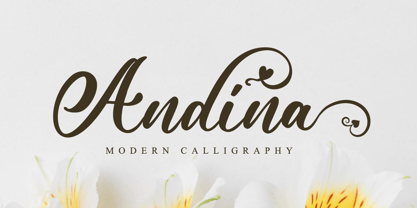 Andina is an exquisite handwritten font, masterfully designed to become a true favorite. It maintains its classy calligraphic influences while feeling contemporary and fresh. This font is PUA encoded which means you can access all of the glyphs and swashes with ease!
 - Andalusia Signature by Letterena Studios,
$9.00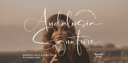 Andalusia Signature is an exquisite handwritten font, masterfully designed to become a true favorite. It maintains its classy calligraphic influences while feeling contemporary and fresh. This font is PUA encoded which means you can access all of the glyphs and swashes with ease!
 - Vallisa by Letterara,
$12.00 Vallisa is a cute and sweet handwritten font with an incredibly friendly feel. This font will turn any creative idea into a true piece of art! This font is PUA encoded which means you can access all of the cute glyphs with ease!
 - FS Silas Sans by Fontsmith,
$80.00 The great enigma There are hidden depths to FS Silas Sans. First impressions are of a functional, multi-purpose typeface with a cool, edgy, angular character. Gaze into its eyes a little longer, though, and you'll detect a more nuanced, colourful personality, with full, open, satisfyingly squarish forms balancing the abruptness of the sharply-angled terminals and ascenders. Authoritative, official and stern on the outside; amiable and welcoming on the inside. You’re so Dane The designers, led by Phil Garnham, were trying to capture something straight-talking, authentic, and a little... Scandinavian. ‘We were thinking about some of the characters in Danish dramas that were on in the early stages of the font’s development, like The Killing and The Bridge,’ says Phil. ‘The police officers, that is, not the psychopathic killers. Smart and a bit cool, but with a warm heart.’ For a good Danish name, we settled on Silas. It was that or Hans-Christian. The finer points Silas Sans rewards close inspection. Study, if you will, its amply squarish forms, the roomy ‘o’ and ‘e’, in particular. Observe the angular ascenders and terminals of, for example, the ‘L’, ‘I’, ‘d’ and ‘i’, inferring the movement and lift of a pen. Consider the cuts to the ‘A’ and ‘v’ that create harmony with adjacent letters. And scrutinise the subtle ink traps set within the ‘A’ and ‘Y’ for reproduction at small sizes. A fine subject, we think you’ll agree, and available in a versatile range of weights to make (with FS Silas Slab) a typographic system with a comprehensive hierarchy.
 - Kilometro Display by Hueso,
$20.00 Kilometro Display is a Font Family inspired by the chrome car emblems of the auto industry. In the early 1950s Car manufacturers started using this sort of joint-lettering (script) to write their brand or model on their cars. The trend quickly made it’s way to other industries like electric appliances and it lasted for a good 30 plus years. Today only a handful of brands still uses this font style for their products. This geometric script re-lives a bold past all the way through 5 styles to a thin future.
 - Pleasant Valley Sundae JNL by Jeff Levine,
$29.00 It seems only fitting that Pleasant Valley Sundae JNL, a typeface re-drawn from hand lettering on a piece of vintage sheet music, should take its name as a pun on another song's title from a different era. "Pleasant Valley Sunday" was a 1967 hit for the Monkees and was written by the legendary songwriting team of Carole King and the late Gerry Goffin; inspired in turn by a street they'd lived on named Pleasant Valley Way, in West Orange, New Jersey. The record made it to #3 on the pop charts.
 - Aetna JY Pro by JY&A,
$49.00 JY Ætna was designed originally by Francesco Griffo in 1495, and appeared in a book by Cardinal Bembo the following year. The typeface was re-created by Jack Yan in 1994, in time for its 500th anniversary. The original x-heights, quaint letters and other niceties have been restored. An italic complement, based on the design by Giovantonio Tagliente, has also been developed. JY Ætna has been one of JY&A Fonts’ more popular families over the years, with some typographers preferring its taller ascenders and descenders for headline work.
 - Retrofit by Vanderfont,
$29.00 The evocative and original Retrofit is based on typefaces of the 1940s and 50s, which extolled the virtues of American products in glossy magazines for the new suburban consumer. Oversized terminal bulbs and occasional slab serifs lend a rhythm and a bouncing baseline provides just the "zing" to spice up that bland typographic treatise. Retrofit's easy familiarity can be seen on children's books, games, food packaging, and other places where a kid friendly note is needed. Retrofit has been adapted by Quickutz for their punched letter cutting tool, and re-named "Maggie".
 - Diamant Handwriting by 38-lineart,
$14.00 Diamant Handwriting is an upright handwritten font, which looks like a thick pen stroke. Form orientation is generally flowing horizontally, this is a reflection of composure in writing, we set the rhythm of each glyph so that the combination of high and low letters is very soft, try it, whatever you type with this font looks very calm. Activate the OpenType feature, because this font is equipped with ligatures (liga), Stylistic(salt), Contextual(calt) and initial alternates. We present all of this so that your writing is automatically setup, we also provide access to all alternates (aalt) features, this allows you to choose the glyph you like manually. We designed this font only for brand identity. Your brand will look different from other brands. You can also use it for short slogans to further amaze views and attract more customers to see you closer. 'Diamant' is another word of diamond that is often used in Europe, we give this name as a representation of the whole font as a symbol of luxury, brilliance and stability and comfort. We do not extend the theory and philosophy of this font, you better try it yourself, and you will be amazed. thank you
 - Colleen Doran by Comicraft,
$29.00 A DISTANT SOIL is a classic bold and beautiful science fiction/fantasy comic book series by creator, writer, artist AND letterer Colleen Doran! A DISTANT SOIL is being remastered and re-released by those awfully nice chaps at Image Comics and Colleen commissioned Comicraft to create the definitive bold and beautiful Colleen Doran font, based on her original pen lettering, so that she might re-letter the series without excessive eye strain or hand cramp.
 - Tripper Pro by Underware,
$50.00 Tripper is a rock-hard display font family. The six styles – from Light to Black – of this robust stencil typeface will assure your text grabs all the attention it can get. Instead of settings large amount of texts, just use this font for a small amount of words. Or even better: just one word. But most importantly: make it really, really, really big. The lightest weight is pretty condensed, and slowly expands when the weight increases. The bridges – essential to a stencil font – have the same width across all styles, so you can safely apply all styles in the same size without the risk of stencils falling apart. Due to the absence of curves throughout the whole family, Tripper is suitable for more limited, industrial applications too. Tripper comes in several flavours. Next to the basic flavour, there is a stencil family which automatically creates borders around every letter, word or line. Then there is Tripper Rough, a textured version with that intelligent random, grungy look. Together with the previously released multi-colour font Tripper Tricolor, the complete family consists of 24 styles. Tripper is equipped with a bunch of OpenType features, like different figure styles, fractions, superiors, etc. But if all the OpenType ding-dong is not enough for you, just try the ornaments. The separate ornament font comes with icons, indicators, manicules, banderoles and patterns.
 - Aleesya Rose by Brenners Template,
$19.00 Aleesya Rose is a Stylish Font Family to bring a touch of elegance to any design. The clear contrast blends into all styles - even thin styles - and the strong individuality by weight delights the designer's imagination. 14 styles including 7 weights and italics are essential for designers to complete more detailed and sophisticated typography. This style has 426 glyphs each, check the glyph window in your app. The upright standing of the vertical stems stably supports the center of gravity of the entire font. And the thin strokes used as finishing touches will convey an elegant personality to the layout. The ligatures are designed to appeal to the reader with their beautiful tenderness, and they are: Ba, Be, Ha, He, LO, Le, Lo, Re, Ro, ck, de, do, ee, ff, fi, oo, rr, th. In particular, we recommend that you choose this font family to achieve the following purposes: Editorial design, Personal branding, Branding business, logo design, portfolio, and any special design.
 - Finador Slab by Julien Fincker,
$24.00 Finador Slab is a soft slab-serif family. It has a strong character and can be used for a lot of cases, especially for editorial, branding, packaging and logos. The Slab version is based on the Finador Sans version. It matches perfectly and can be used easily together. The Finador Slab family includes 8 weights, from thin to heavy + their matching italics. With 900+ glyphs per style it supports over 200+ latin based languages, includes an extended currency symbol set and a lot of Open Type Features like small caps, ligatures, fractions, alternates and many more. The lightest and boldest weights are good for display usage, while the middle weights can be also used for body text. Finador Slab supports almost every of your needs. It meets all the requirements to become your next favorite workhorse family. So just give it a try. The Medium weight is for free.
 - Capraia by CAST,
$45.00 Capraia is a book typeface, with a heavily quirky look when shown at big sizes, and with an irregular but attractive rhythm at text sizes. Capraia Book and Regular are designed specifically for continuous texts: Book meets a current preference of Italian publishers for lighter faces, while the slightly heavier Regular is intended for the wider international market. True to its vocation for publishing, Capraia has a big x-height, medium contrast and wide bracketed serifs. Furthermore, its slightly flattened curves, some unconventional roman letterforms (a, G, Q) and the 'slanted roman' italics, along with design details such as ball terminals, give to the whole family a very contemporary appeal. Originally the design was intended as a tribute to Caslon's Great Primer but at a certain point the designer was enthralled by Baskerville. Capraia is the unpredicted and original result of that intense experience.
 - Milky by Fenotype,
$35.00 Milky is a brisk Brush Script with smooth and bold characters. Milky is both legible and characteristic. It's strong and friendly, perfect for logotypes, packaging and other branding use. In addition to Milky Brush Milky family contains Milky Casuals which is an all caps sign painting style casuals drawn with the same proportions as Milky Brush. On top of that there's Milky Ornaments which contains ending swashes designed to be used with the Brush, and a selection of bold brush strokes with the Milky signature style to complete your designs. Milky Brush is equipped with Contextual Alternates that add variation to the text and help to maintain the smooth flow. Contextual Alternates are automatically on. For extra flair try Stylistic, Titling or Swash Alternates or seek for even more alternates from the glyph palette. Milky Brush is PUA encoded so you can access the alternates in any graphic design software.
 - French Bulldog by Sudtipos,
$49.00 Day after day we are running from here to there, living in a society that does not allow us to slow down for a minute. Having so many things on our minds, we often unnecessarily complicate our problems, and our stress is so great that we forget what happiness is. French Bulldog was made to celebrate the unnoticed precious little moments. A hot coffee in the morning, the sea breeze on your face, the sweet smell of a flower, a nap with your dog, a meeting with friends, the tenderness of a maternal caress, traveling, walking, crying, sharing, feeling, being onesself. French Bulldog creates spontaneity from chaos with different shapes working randomly to form finesse or coarseness, just like a casual hand works a brush and tries to follow the rules with unpredictable results. It is versatile and fresh, friendly and relaxed. Flow in the moment.
 - Sagona by René Bieder,
$39.00 Sagona is a contemporary slab serif building on the clarendon/ionic model dating back to the 19th century. Like its most famous representative Clarendon, Sagona features strong serifs and a variable stroke contrast resulting in a versatile typeface working great in headlines and small text sizes. Where great typefaces like Sentinel, Belizio or FF Hertz are staying close to the industrial and strict appearance, Sagona is focusing on a warm and welcoming approach, emphasizing a subtle elegance especially in the mid weights. The family comes in nine weights with matching true italics. It is equipped with a large set of alternative glyphs, ligatures, old style numbers, initials and finitials, two sets of arrows and many more opentype features making it a perfect choice for professional type setting.
 - Ultramodern Classic SG by Spiece Graphics,
$39.00 If you're getting tired of using Broadway, here’s an exciting alternative in regular and bold weights. Douglas C. McMurtrie, Aaron Borad, and Leslie Sprunger began designing this high-contrast novelty face for the Ludlow Foundry in 1928. It retains the classic style of the Jazz Age with a bit more individuality and spirit than Broadway. This extreme thick and thin design also sports normal descenders instead of the clipped ones found on Broadway. Ultramodern Classic is also available in the OpenType Std format. Some new characters have been added to this OpenType version. Advanced features currently work in Adobe Creative Suite InDesign, Creative Suite Illustrator, and Quark XPress 7. Check for OpenType advanced feature support in other applications as it gradually becomes available with upgrades.
 - Appetite Pro by Serebryakov,
$39.00 Appetite Pro is a total upgrade of the world wide popular display font Appetite (2011). It is based on original lettering and belongs to the upright script like. Appetite Pro consists of 10 weights of the refreshed curves — 5 regular and 5 italic — from Light to Heavy. It’s a multilingual and international font, with a full Western Latin, Cyrillic (Russian, Belarusian, Ukrainian) and basic Greek support. The Appetite Pro font family is specially designed for food identity and packaging design projects. In addition to standard letter cases, Appetite Pro also includes dingbats set. Due to the 10 weights font palette, you can solve a wide variety of professional problems without spending money on extra fonts for titles, subtitles, and main text. Try and buy!
 - Alexander Quill by Canada Type,
$24.95 Alexander Quill was originally designed in the early 1980s to be cut in 14 point for casting into foundry type for the setting and printing of limited edition books at Pie Tree Press, Jim Rimmer's private sanctum. This alphabet exhibits traditional calligraphic tension, which helps its simple, somewhat octagonal forms play well together for an easy read. Its setting expresses a dramatic sense of history or fantasy. Alexander Quill was updated and remastered for the latest technologies in 2012. It comes with plenty of built-in alternates, a glyphset of over 410 characters, and supports the majority of Latin-based languges. 20% of this font's revenues will be donated to the GDC Scholarship Fund, supporting higher typography education in Canada.
 - Glot by Wordshape,
$20.00 Glot is a ten-member flared terminal sans serif family of typefaces based on a mix of proportions of Roman square capitals and hyper-readable sans serifs. Glot comes in five weights with matching true italics: Light, Regular, Medium, Bold and Black. The Glot family has a wide range and is incredibly functional, working well for longer texts as well as display typography. After designing the house typefaces for a handful of the most predominant multi-player online games out there, we decided that it was time to bring the battlefield to the people. Glot comes armed with ample language support (Central, Eastern, and Western European) and OpenType ornamental spiked alternate characters for when one needs a hint of danger.
 - Paris by kapitza,
$99.00 Walking around Paris looking for inspiration for our latest people font, we encountered chic Parisians, yummy food markets, and bakeries on virtually every street corner with delicious baguettes and pastries. We were surprised how many people were cycling, motorcycling and rollerblading along the vast boulevards and side streets of Paris. We spotted classic French cars like the 2CV and Citroën CX and watched the world go by in one of the many sidewalk cafes whilst enjoying a 1664 or a café crème. With our latest people font, Paris, we tried to capture this unique Parisian atmosphere and hope we succeeded. All 64 illustrations are based on photographs taken on location over a period of time. The photographs are then hand traced to create high quality, detailed silhouettes.
 - Makozin by Hashtag Type,
$31.06 Makozin is a humanist typeface with a stylish appearance. Designed with a more fluid approach, makozin has more movement and curvature within stems, an angled stress and visible modulation. Together these features give a strong presence of the hand providing a comfortable read. Makozin's aesthetic dimensions both serve and enhance the design, making it the perfect tool for communicating in magazines; both in their print and online form, with attention grabbing headlines and easy to read body copy that follows. The true italics of this typeface are a real show stealer, they instantly create a sense of atmosphere, style and authority, complementing the uprights perfectly. Full details include 10 weights including italics, manually edited kerning and a range of OpenType features.
 - Face Front by Comicraft,
$49.00 FACE FRONT, True Believers, This is The Issue You’ve Been Waiting For! In response to requests from our Hawkeyed customers, we’re making this Super Team of fonts -- which our fontmeister Assembled for the pages of THE AVENGERS -- available for the first time! A handsome collection of characters that would put a Norse God to shame, FACE FRONT is composed of Earth’s Mightiest regular, italic, bold and bold italic faces -- in UPPER and lower case. And now, these Living Legends can now be yours! Rick Jones not included! Remastered Face Front includes improved spacing and kerning, an upright Bold weight, Central European & Cyrillic characters,Crossbar I Technology™ to place it in exactly the right spots, plus hearts, stars & music notes for Manga lettering.
 - Mangrove by Set Sail Studios,
$18.00 Bring your letters to life with the Mangrove Font Duo! A delightfully playful pairing of Sans and Script fonts. These perfectly balanced typefaces have been carefully designed to work not only as standalone fonts, but also to pair together effortlessly—delivering undeniably eye-catching typography bursting with character. Throw a script letter in the middle of the sans font, try the swooping sans ligatures or it’s uplifting small-caps, the possibilities are numerous. It’ll work in lowercase or uppercase, and with a choice of 3 weights per font, that’s six fonts in total for you to experiment with! Language Support • English, French, Italian, Spanish, Portuguese, German, Swedish, Norwegian, Danish, Dutch, Finnish, Indonesian, Malay, Hungarian, Polish, Croatian, Turkish, Romanian, Czech, Latvian, Lithuanian, Slovak, Slovenian.
 - Glot Round by Wordshape,
$20.00 Glot Round is a ten-member flared terminal sans serif family of typefaces based on a mix of proportions of Roman square capitals and hyper-readable sans serifs with slightly rounded corners. Glot Round comes in five weights with matching true italics: Light, Regular, Medium, Bold and Black. The Glot family has a wide range and is incredibly functional, working well for longer texts as well as display typography. After designing the house typefaces for a handful of the most predominant multi-player online games out there, we decided that it was time to bring the battlefield to the people. Glot Round comes armed with ample language support (Central, Eastern, and Western European) and OpenType ornamental spiked alternate characters for when one needs a hint of danger.
 - Imperial Granum by Greater Albion Typefounders,
$18.00 Imperial Granum is designed primarily as a Roman Title and lettering face, combining formality and dignity with a delightful touch of 'Arts and Crafts' like hand drawn design. The regular form of Imperial Granum (which is inspired by a beautifully hand-lettered early 20th century food advertisement) offers two sizes of capitals, in order to provide true 'small-capitals' lettering. Similarly, the Ornamental form consists exclusively of capitals and is designed to be able to mix and match with the regular form. The miniscule form can, of course, be used in its own right, but is primarily intended to complement the regular and ornamental forms. All three faces are offered in regular and bold weights. Explore some Edwardian Arts and Crafts typographical fun today!
 - Punch Tape JNL by Jeff Levine,
$29.00 Punch Tape JNL emulates the old-style pin-punched paper tapes that were used in everything from ticker tapes to moving electronic signage to early digital typesetting equipment. Pin punch characters were also used in the early days of banking as a secure way of canceling a check so that it was rendered useless if re-submitted. In this version, the "dots" are square rather than round.
 - French Pastry JNL by Jeff Levine,
$29.00 A little ditty from France circa the 1940s called "J'ai Rêvé Dans Tes Bras" (which loosely translated means "I've Dreamed in Your Arms") offered up its title hand lettered in an interesting Art Deco sans. This formed the basis for French Pastry JNL, a tasty typographical tidbit further preserving the wide choice of lettering styles hand-crafted for popular sheet music of past decades.