2,205 search results
(0.018 seconds)
- Better Step by Siwox Studios,
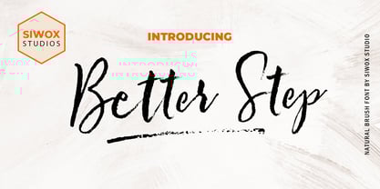
$13.00Better Step is a handmade font with stunning characters. Made with a brush and high-quality water-based ink. Ideal for name tags, handwritten quotes, product packaging, merchandise, social media, greeting cards, etc. To make your designs look even more naturally handwritten, Better Step has 1 extra set of alternate lowercase letters. - Jules Thicket by Rachel White Art,
$14.00 - Shicken Zoop JNL by Jeff Levine,
$29.00Shicken Zoop JNL is based on an old lettering stencil from the early 1950s. The A-Z and a-z keystrokes contain the bulk of the Hebrew alphabet. Additional letters are found on the exclamation point, quote and apostrophe keystrokes. Vowels are positioned on the period, comma, hyphen, colon and semicolon. Please note that this is not a normal Hebrew font; it is in effect a latin font with Hebrew letters appearing in place of latin letters. It will not allow you to copy and paste with other samples of Hebrew text. - Slim Pickens by Dear Alison,
$19.00Have you ever seen lettering that you can connect with but have no clue where you've seen it before? It strikes a chord with certain feelings but you don't know why. Slim Pickens was inspired by the lobby card and poster titling from the 1949 Doris Day film "My Dream is Yours", and keys into the look and feel of vintage handwritten film poster titling. Something about that era in film made it easy to tie visuals with getting swept up in all sorts of emotions, good and bad. A narrow font, full of life and wonderfully hand-drawn, Slim Pickens is an accent font you'll want to have in your font collection for those tight fits, so buy it today and fill in the gaps of your designs with a little nostalgia! - Sewing Patterns by Lauren Ashpole,
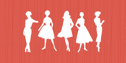
$15.00When I created my first website, I loved using vintage sewing pattern illustrations in my designs. Thinking back on it, I wanted to create a dingbat inspired by those images and Sewing Patterns is the result. The font features ladies-fashions in silhouette form for uppercase and lowercase letters and childrens- styles for the numbers. - PT Sewed by Volcano Type,
$19.00 - Sesquipedalian NF - Unknown license
- Telenovela NF by Nick's Fonts,
$10.00Here's a retooling of the Art Deco classic Novel Gothic, designed by Morris Fuller Benton and Charles H. Becker for American Type Founders in 1929. We've added a little sparkle to this classic with a reflected-highlight treatment, to help create attractive and commanding headlines. Both versions include the complete Latin 1252, Central European 1250 and Turkish 1254 character sets, as well as localization for Moldovan and Romanian. - Holofernes NF by Nick's Fonts,
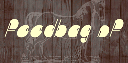
$10.00The raw emotional energy of German Expressionism is evident in this font, based on Judith Type, designed by C. H. Kleukens in 1923. This version takes its name from the Biblical character who lost his head to the original font’s namesake. Both versions of the font include 1252 Latin, 1250 CE (with localization for Romanian and Moldovan). - Feedbag NF by Nick's Fonts,
$10.00 - Blackbarry NF by Nick's Fonts,
$10.00Deutsch Black, designed by Barry Deutsch for VGC in 1966, provided the inspiration for this extrabold exercise in heavy ink coverage. A number of variants, in lowercase slots, were added to offer flexibility to your headline designs. Both versions include the complete Latin 1252, Central European 1250 and Turkish 1254 character sets, as well as localization for Moldovan and Romanian. - Mogzilla NF by Nick's Fonts,
$10.00An uncredited typeface discovered within the pages of Alphabete: Ein Schriftatlas von A bis Z named "Fat Cat" provided the pattern for this exercise in minimalist type design. Best used sparingly for inescapable, if somewhat cryptic, headlines. Both versions of this font include the complete Latin 1252 and CE 1250 character sets, with localization for Romanian and Moldovan. - Anacostia NF by Nick's Fonts,
$10.00The 1923 Barnhart Brothers & Spindler specimen book called this typeface "Cardstyle", and suggested its use at small sizes for business cards. It also work quite well in large sizes when a warm, casual antique feeling is called for. Named for a river that flows through Washington, DC. Both versions of the font include the 1252 Latin and 1250 CE character sets (with localization for Romanian and Moldovan). - Fernburner NF by Nick's Fonts,
$10.00This stunning display face is based on Hans Bohn’s 1929 opus for Gebr. Klingspor, originally named Orplid. One of the treasures discovered in the legendary green vinyl binder that launched Nick’s love of type, it’s a real crowd pleaser. Both versions of this font include the complete Latin 1252, Central European 1250 and Turkish 1254 character sets. - Relampago NF by Nick's Fonts,
$10.00This distinctive titling face is based on Elegant Lichte, designed by Hans Möhring for D. Stempel in 1928, with the helpful addition of a lowercase not found in the original. It functions equally well as either a period piece or a contemporary masterpiece. Both versions include the complete Latin 1252, Central European 1250 and Turkish 1254 character sets, as wellas localization for Moldovan and Romanian. - Spindletop NF by Nick's Fonts,
$10.00One in the series of fonts called Whiz-Bang Wood Type, intended to be set large and tight. Spindletop’s ultra-condensed letterforms allow a lot of information to be packed into little horizontal space. Named for a famous East Texas oil field that made a lot of people rich in the early part of the twentieth century. Both versions of this font include the complete Unicode 1252 Latin and Unicode 1250 Central European character sets. - Falfurrias NF by Nick's Fonts,
$10.00Another in the Whiz-Bang Woodtype series, based on authentic xylographic designs from the late nineteenth century. Named after (surprise!) a small town in Texas. The net effect is a typeface which can add style and warmth to any project. Both versions of this font include the complete Unicode 1252 Latin and Unicode 1250 Central European character sets. - Altamonte NF by Nick's Fonts,
$10.00Logotype lettering from 1896 for the Italian confection company Talmone provided the inspiration for this curvy, cuddly face. Warm up your headlines today with this antique charmer. Both versions include the complete Unicode Latin 1252, Central European 1250 and Turkish 1254 character sets, as well as localization for Lithuanian, Moldovan and Romanian. - Parsnip NF by Nick's Fonts,
$10.00Will Ransom designed the exemplar for this series for Barnhart Brothers & Spindler in the early 1900s. The typeface was originally named "Parsons", after the advertising director of a Chicago department store (evidently a very BIG customer of BB&S). Both versions of this font contain the Unicode 1252 (Latin) and Unicode 1250 (Central European) character sets, with localization for Romanian and Moldovan. - Quinceanera NF by Nick's Fonts,
$10.00Here's a new take on an old dry-transfer standard from the 70s named Barrio. This unicase version features several handy ligatures not found in the original typeface, which will substitute in OpenType-savvy applications when the lowercase combos are typed. This font contains the complete Latin language character set (Unicode 1252) plus support for Central European (Unicode 1250) languages as well. - Mexia NF by Nick's Fonts,
$10.00Another addition to the Whiz Bang Woodtype series, this typeface is a double-wide, extrabold version of the so-called Tuscan style of lettering, popular at the end of the nineteenth century. Named after a small town in Texas, which the locals pronounce "meh-HAY-a." Both versions of this font contain the Unicode 1252 Latin and Unicode 1250 Central European character sets, with localization for Romanian and Moldovan. - Kirschwasser NF by Nick's Fonts,
$10.00An unannotated photocopy tucked inside the leaves of an old lettering book yielded this unusual and exuberant Art Deco face. The caps feature a simple “bubbly” pattern that makes this offering pack a punch, not unlike the German cherry brandy for which it is named. Both versions of the font include 1252 Latin, 1250 CE (with localization for Romanian and Moldovan). - Kandinsky NF by Nick's Fonts,
$10.00While strolling through the Phillips Collection in Washington, DC, I came across a delightful painting by Wassily Kandinsky entitled “Succession”. Many of the forms seemed to me typographic so, of course, a font followed, and this is it: wild, wacky and delightfully different. Both versions of the font include 1252 Latin and 1250 CE (with localization for Romanian and Moldovan) character sets. - Bellagio NF by Nick's Fonts,
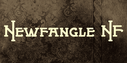
$10.00This family, in normal and bold weights, is based on Advertisers Gothic, designed by Robert Wiebking for Barnhart Brothers & Spindler in 1917. The original might be considered a transitional design between Art Nouveau and Art Deco; this version accentuates the Deco traits, adding a thick-and-thin treatment not found in the original. The large x-height and short descenders allow for compact, commanding headlines with a carefree charm, a.k.a. bell'agio. Both versions of the font include 1252 Latin, 1250 CE (with localization for Romanian and Moldovan). - Newfangle NF by Nick's Fonts,
$10.00 - Kenotaph NF by Nick's Fonts,
$10.00This willowy wonder is based on Morris Fuller Benton’s Stymie Obelisk, one in a series of typefaces he designed for American Type Founders in the 1930s. An obvious choice when real estate is at a premium, its classic forms will add just the right amount of punch to any headline it graces. Both versions include complete Latin 1252, Central European 1250 and Turkish 1524 character sets, with localization for Moldovan, Romanian and Turkish. - Tasneem NF by Nick's Fonts,
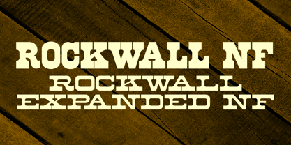
$10.00The pattern for this elegant, if slightly quirky, Art Deco typeface was drawn by Gustav Jensen for the 1931 classic, American Alphabets. Perfect for suggesting the exotic, the font also includes several graphic elements in Jensen’s inimitable style. Both versions of the font include 1252 Latin, 1250 CE (with localization for Romanian and Moldovan). - Rockwall NF by Nick's Fonts,
$10.00Two offerings from the Page specimen book, Aldine and Aldine Extended, provided the patterns for this family of Western-style standards, named for the smallest county in Texas, at least area-wise. Both flavors of this font feature the 1252 Latin, 1250 Central European, 1254 Turkish and 1257 Baltic character sets. - Whitefriars NF by Nick's Fonts,
$10.00Here's an offering from the Blackfriars Type Foundry of London that's perfect for commanding headlines. The letterforms have been carefully kerned for a tight fit to increase the visual color of this nostalgic behemoth. All versions of this font include the Unicode 1250 Central European character set in addition to the standard Unicode 1252 Latin set. - Picaro NF by Nick's Fonts,
$10.00A rather quaint but charming typeface, originally named Harlequin, provide the inspiration for this typeface. Its mild eccentricities will add an inviting warmth to your next project. Both versions of this font contain the Unicode 1252 (Latin) and Unicode 1250 (Central European) character sets, with localization for Romanian and Moldovan. - Daliwood NF by Nick's Fonts,
$10.00This quirky charmer is based on a typeface called "Les Catalanes", designed in 1952 by Enric Crous-Vidal for Fonderie Typographique Française. Appropriately, it is named for the king of quirky Cataláns. - Raconteur NF by Nick's Fonts,
$10.00Lettering in a 1923 ad for Piera Nova, designed by Hernando G. Villa, inspired this delightful Deco offering. Like its namesake, this font is a talented teller of tales, both elegant and entertaining. This font contains the complete Latin language character set (Unicode 1252) plus support for Central European (Unicode 1250) languages as well. - Kingstown NF by Nick's Fonts,
$10.00A simple, elegant semiscript…enough said. All versions of this font include the Unicode 1250 Central European character set in addition to the standard Unicode 1252 Latin set. - Ashkelon NF by Nick's Fonts,
$10.00This heavyweight poster sans is based on the typeface Samson, designed by Robert Hunter Middleton for the Ludlow Type Foundry in 1940. The slanted uprights suggesting brushwork make this face a perfect choice for casually commanding headlines. Both versions include the complete Latin 1252, Central European 1250 and Turkish 1254 character sets, with localization for Lithuanian, Moldovan and Romanian. - Daffadowndilly NF by Nick's Fonts,
$10.00Here’s another offering based on the work of Alf Becker, long-time contributor to Signs of the Times magazine. This only comes from the 1940s, and is a light and bouncy single-stroke face that’s sure to pep up any project it graces. This font contains the complete Latin language character set (Unicode 1252) plus support for Central European (Unicode 1250) languages as well. - Waxahachie NF by Nick's Fonts,
$10.00This unusual take on a typical woodtype typeface is based on a 1950s Stenso lettering template and, appropriately, takes its name from a small town in Texas not far from Dallas, locally noted for its grand Victorian homes. - Refugio NF by Nick's Fonts,
$10.00This family is based on an offering in Barnhart Brothers & Spindler’s Type Specimen Catalog No. 9, issued around 1910, originally named "Grant". It makes a handsome addition to the Whiz-Bang Woodtype series, and is available in both a Rustic and Refined version. Named for a town in Texas, which the locals pronounce "Reh-FURRY-o". Both versions of this font contain complete Unicode 1252 (Latin) and Unicode 1250 (Central European) character sets, with localization for Romanian and Moldovan. - Matamoros NF by Nick's Fonts,
$10.00Another tip of the hat to the halcyon days of woodtype, this cap-small cap typeface takes its name from the bustling Mexican metropolis just across the Rio Grande from Brownsville, Texas. Both versions of the font include 1252 Latin, 1250 CE (with localization for Romanian and Moldovan). - Kaprice NF by Nick's Fonts,
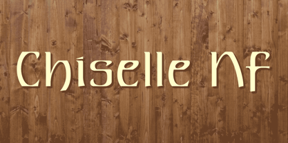
$10.00This unusual sans typeface was inspired by a serif face called Faust, designed by Albert Kapr for the Institut für Buchgestaltung in 1959. Its mix of medieval, Jugenstil and Bauhaus influences makes it an intriguing choice for your next project. Both versions of this font include the Unicode Latin 1252 and 1250 Central European character sets, with localization for Moldovan and Romanian. - Chiselle NF by Nick's Fonts,
$10.00This font is a straight-up revival of Rustikalis, a typeface designed for the VGC Phototypositor in the 1960s. This face combines medieval flair with contemporary design sensibilities into one attractive package. Both flavors of this font feature the 1252 Latin, 1250 Central European, 1254 Turkish and 1257 Baltic character sets.
