10,000 search results
(0.094 seconds)
- Afterword JNL by Jeff Levine,
$29.00 At the end of the 1931 gangster film “The Public Enemy” a hand lettered card offers up an afterword on the demise of Tom Powers (James Cagney’s character in the film) and how a “public enemy” is neither a man nor a character but a problem society must deal with. The text is in an Art-Deco influenced sans serif, and has been digitally recreated as Afterword JNL, which is available in both regular and oblique versions.
 - Mangan by Hoftype,
$49.00 Mangan is a new text face which combines classical rationality with contemporary design. Mangan appears dynamic, elegant, vivid and provides a high standard of functionality. The Mangan family comprises 14 styles and is well suited for ambitious typography. It comes in OpenType format with extended language support. All weights contain small caps, ordinals, ligatures, proportional lining figures, tabular lining figures, proportional old style figures, lining old style figures, matching currency symbols, fraction- and scientific numerals, and arrows.
 - Ongunkan Rhaetian Script by Runic World Tamgacı,
$60.00 Rhaetic or Raetic (/ˈriːtɪk/), also known as Rhaetian, was a Tyrsenian language spoken in the ancient region of Rhaetia in the eastern Alps in pre-Roman and Roman times. It is documented by around 280 texts dated from the 5th up until the 1st century BC, which were found through northern Italy, southern Germany, eastern Switzerland, Slovenia and western Austria, in two variants of the Old Italic scripts. Rhaetic is largely accepted as being closely related to Etruscan.
 - Denso Serif High by DSType,
$40.00 An eye-catching and practical type family that doesn't intend to be retro or evoke any geometrical cliché. Ranging from a low contrasted thin to a vigorous black, Denso is available in both low and high contrast versions. All consistently developed across two styles, Serif and Sans. Marked by the vertical rhythm, enhanced by the enormous x-height, Denso has the typographic qualities that will allow the design to be highly readable, with a strong stylish statement.
 - FF Elementa Rough by FontFont,
$47.99 Lithuanian type designer Mindaugas Strockis created this display FontFont in 2002. The family contains 2 weights: Regular and Bold and is ideally suited for advertising and packaging, film and tv as well as software and gaming. FF Elementa Rough provides advanced typographical support with features such as alternate characters, case-sensitive forms, and stylistic alternates. It comes with tabular lining figures. This FontFont is a member of the FF Elementa super family, which also includes FF Elementa.
 - FF Droids by FontFont,
$41.99 Dutch type designer Donald Beekman created this display FontFont in 1999. The family has 6 weights, ranging from Light to Bold (including italics) and is ideally suited for music and nightlife, poster and billboards as well as software and gaming. FF Droids provides advanced typographical support with features such as ligatures and case-sensitive forms. It comes with proportional lining figures. This FontFont is a member of the FF Droids super family, which also includes FF Droids Sans.
 - Texturic by Zagach Letters,
$15.00 Texturic is a handwritten brush script with natural hand brushed strokes to give your design realistic and natural look. Texturic has a variety of coded features to create unique text designs. Stylistic alternates for all letters and numerals, contextual alternates and swashes, which makes your designs to look more natural. It is perfect for titles, headlines, greeting cards, stationery design, packaging, magazines, posters and more. Multilingual support. Extended Latin character base that covers most European languages.
 - Vienna Workshop by Hanoded,
$15.00 The Vienna Workshop was a production community of visual artists, which operated from 1903 to 1932. The emphasis lay on fine craftsmanship and its motto was: "Better to work 10 days on one product than to manufacture 10 products in one day". The typeface before you was based on some of the artwork produced by Vienna Workshop artists, in particular that of Koloman Moser. Vienna Workshop comes with some unusual glyphs, intriguing ligatures and Babylonian language support.
 - Tangient by Galapagos,
$39.00Designed primarily for display use, Tangient is serviceable down to the larger text sizes. It presents an idiosyncratic profile, with a tight fit, clearly proportionally spaced, yet having the texture of a monospaced design. Its shapes leap out from the page, where well behaved characters would make a more subdued statement. The calligraphy from which Tangient GD was electronically "cut" originally appeared in a series of personal greeting cards prepared by the Zafaranas in celebration of the New Year. - Gothic 13 by Linotype,
$29.99Gothic 13 is a bold condensed sans serif typeface. Originally designed in small sizes, Gothic 13 is very similar to Modern Gothic Condensed, which was a turn-of-the-20th-century modernization of a popular nineteenth century style. Until Linotype integrated it into their technology, it did not exist in sizes larger than 24 point. The design used for digitization was the 18-point. Gothic 13 is ideal for display work, especially where space is at a premium. - Parisette NB by No Bodoni,
$39.00 These four typefaces, Berlinette NB, Lyonette NB, Marseillette NB and Parisette NB, were designed from the same basic shape, a geometric form that avoids strict horizontals and uses more offbeat triangular shapes. Parisette is a fanciful type that is both bouncy and biting. The frivolity and quirk of the narrow width is offset by the razor-sharp, hatchet horizontals, which require protective gloves when type setting. This is a good typeface for enigmatic signs at postmodern student demonstrations.
 - Silo Soft by TypeUnion,
$25.00 Designed and built in London by TypeUnion, Silo soft is a fluid sans serif typeface embodying energetic curves and a clean, functional structure. The Silo Soft Family is made up of 6 weights, which range from a delicate Extra-Light, all the way through to a punchy, loud Extra-bold and each carry a versatility for multiple applications and uses. Silo soft features open type alternate characters, and extensive language support to provide a flexible, substantial user experience.
 - Bloody Charm by PizzaDude.dk,
$20.00 Is it blood, melted ice, water or something slimy? Choose yourself, because Bloody Charm can be used for all purposed that needs something either scary or melting. I've added two versions: Regular and Drips. The Drips versions is (you may have guessed it already!) a bit more drippy than the regular version. Both versions uses contextual alternates, which in this case means that there is 3 different versions of all lowercase letters - and these automatically cycles as you type!
 - Denso Sans High by DSType,
$40.00 An eye-catching and practical type family that doesn't intend to be retro or evoke any geometrical cliché. Ranging from a low contrasted thin to a vigorous black, Denso is available in both low and high contrast versions. All consistently developed across two styles, Serif and Sans. Marked by the vertical rhythm, enhanced by the enormous x-height, Denso has the typographic qualities that will allow the design to be highly readable, with a strong stylish statement.
 - DIN Mittel EF by Elsner+Flake,
$35.00The typeface DIN Mittel, offered by Elsner+Flake, is based on the DIN 1451 used in Germany since 1931. The DIN 1451 which was primarily seen in the areas of technology and traffic had to adhere to the so-called DIN Norms. Variations of the DIN 1451 are also employed in Austria, Eastern Europe, Greece and the Near East. With its new release Elsner+Flake has expanded the DIN Mittel with the characters EuropaPlus and Cyrillic. - FF Droids Sans by FontFont,
$41.99 Dutch type designer Donald Beekman created this display FontFont in 1999. The family has 6 weights, ranging from Light to Bold (including italics) and is ideally suited for music and nightlife, poster and billboards as well as software and gaming. FF Droids Sans provides advanced typographical support with features such as ligatures and case-sensitive forms. It comes with proportional lining figures. This FontFont is a member of the FF Droids super family, which also includes FF Droids.
 - Horndon by ITC,
$29.99Horndon is a decorative revival of late art nouveau style typefaces. The robust, high waist forms of these letters lend a unique, early 20th Century feeling of optimism to text designed with them. The letterforms themselves have adapted a three dimensional appearance: they each sport an individual drop shadow. Horndon is an all caps typeface, which was originally designed in 1984 by Martin Wait for Letraset. A similar art nouveau typeface, Galadriel, is also available from Linotype." - Denso Sans by DSType,
$40.00 An eye-catching and practical type family that doesn't intend to be retro or evoke any geometrical cliché. Ranging from a low contrasted thin to a vigorous black, Denso is available in both low and high contrast versions. All consistently developed across two styles, Serif and Sans. Marked by the vertical rhythm, enhanced by the enormous x-height, Denso has the typographic qualities that will allow the design to be highly readable, with a strong stylish statement.
 - Cedora by Lafontype,
$19.00 Cedora is a humanist sans serif designed with a playful appearance. Cedora comes in 14 styles with 7 weights ranging from thin to black each of which represents multiple languages allowing you to do editorial activities. In the terminal section the size is made a little thinner so that the shape doesn't look so sharp and the x-height and open counter have been taken into account so that it is good enough for a small text size.
 - Almarena Neue by Almarena,
$29.00 Introducing Almarena® Neue Variable, the evolution of Almarena® Typeface, which we created in 2020. Almarena® Neue is a modern sans serif typeface that combines legibility, impact and contrast. This new version of Almarena is variable with 3 axes: Weight - Display - Slant. It is also available as a static version in 9 weights (+ italics) for each style (Classic & Display) with several alternatives. Almarena Neue® supports 94 languages and contains 565 glyphs for each weight.
 - Quoi Chou NF by Nick's Fonts,
$10.00The letterforms of Lucien Bernhard's stylish, if somewhat anorexic, Bernhard Fashion were beefed up and complemented with thick-and-thin stroke variation to create this elegant family, available in normal and bold weights. Additionally, Bernhard's variant forms have replaced several of the letters which commonly appear in other revivals. The Postscript and Truetype versions contain a complete Latin language character set (Unicode 1252); in addition, the Opentype version supports Unicode 1250 (Central European) languages as well. - Overbold by Catharsis Fonts,
$32.00 Overbold is an unapologetic display typeface inspired by an illustration in Eric Gill's Essay on Typography (p.51), in which he demonstrates �how not to make letters�. In particular, he shows that increasing the weight of the downstroke in a serif �A� without structural adjustments yields an absurd, �overbold� result. I found the letter so charming that I decided to blatantly disregard Gill's wisdom and draw an entire overbold typeface. Here is the result. I'm not sorry.
 - Serp and Molot by ParaType,
$30.00 Designed for ParaType in 2003 by Tagir Safayev. The typeface was inspired by some of the Cyrillic letterforms of Sergey Chekhonin (1878-1936). Chekhonin belonged to the World of Art group, which is so closely associated with the flowering of Russian book and theater design at the beginning of the 20th century. For use in advertising and display typography. Serp & Molot has been adjugded Award of Excellence in Type Design of 'bukva:raz!' ATypI International Type Design Competition, 2001.
 - Bulldog Slab by Club Type,
$36.99 Figgins and Caslon may be names familiar to many as Type Founders. Indeed they are, but they are perhaps less well known for the emergence of Sans Serif type styles which have become part of our lives since 1889. The first hundred years of this style is celebrated with this design by Adrian Williams, completed in 1989. It echoes many features of the Gothic, Grotesque and Sans Serif models of the period, based particularly on the 1870 Figgins.
 - Wittingau by Storm Type Foundry,
$39.00 Wittingau is the original German expression for “Třeboň”, which is a beautiful town near my studio in South Bohemia. I love it for its calm and inspiring atmosphere and rich cultural past dating from the 12th century. The present typeface family is released as homage to Třeboň in the style of its greatest glory – Gothic Revival with classicistic decorativeness. Wittingau is excellent for music covers, book and catalogue jackets, invitations and posters. Contains many ornaments for creating decorative wallpapers.
 - Lostgun Plus by Qaratype,
$22.00 Lostgun Plus is a new version of Lostgun typeface, it is a Stunning, classy upper and lowercase typeface that looks incredible in both large and small settings. Best used as a display for headings and logos, Lostgun plus has clean lines and smooth curves that gives any project an extra touch of class. what’s news: – New Stylish Alternate Characters. – No Ligature which give you more control on your typing. – Remove some unnecessary Alternates. – Two styles: Regular and Bold.
 - Tiara by Tanincreate,
$16.00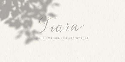 Tiara is a lovely modern calligraphy script typeface with contemporary accents. It is great for wedding invitations, branding, headline, logotype, apparel, packaging, advertising etc. Tiara script comes in uppercase, lowercase, punctuation, symbols & numerals, stylistic set alternate, ligatures, multilingual support . All lowercase letters include beginning and/or ending swashes which gives a realistic hand-lettered style. To use the swashes, a program that supports OpenType features is needed (Adobe Photoshop CS, Adobe Illustrator CC, Adobe Indesign, Corel Draw, ect.)
 - Devil Kalligraphy by Lián Types,
$17.00Devil Kalligraphy was performed by Argentina Lián Types in 2007. The shapes of each caracter have a strong personality. It was based on antique writings. Devil Kalligraphy was inspirated in calligraphy styles. Gothic and Uncial themselves. A mix with lots of personal qualities. Devil Kalligraphy has ligatures which look evil. Ascendents and descendents were designed to look that way too. Kerning was designed taking into account the way calligraphers used (and still use) to write: Pattern looking. - Brans by Ckhans Fonts,
$34.00 Brans family consists of 18 styles (9 weights, 9 Italics), in each of which there are more than 543+ glyphs. In the typeface, each weight includes extended language support, fractions, tabular figures, ligatures, arrows and more. Perfectly suited for graphic design and any display use. Support for 28 languages: Afrikaans Albanian Catalan Croatian Czech Danish Dutch English Estonian Finnish French German Hungarian Icelandic Italian Latvian Lithuanian Maltese Norwegian Polish Portugese Romanian Slovak Slovenian Spanisch Swedish Turkish Zulu
 - JT Alvito by JAM Type Design,
$15.00 The JT Alvito family includes 5 weights with matching italics. It is ideally used as a dipslay typeface but can also be used in body copy. You will find that it works particularly well in advertising, packaging, logo design and branding. JT Alvito provides advanced typographical support with features such as ligatures, fractions, and super- and subscript characters. It holds most glyphs which are required for Western European, Central European, South Eastern European and Vietnamese languages.
 - Bulldog by Club Type,
$36.99Figgins and Caslon may be names familiar to many as Type Founders. Indeed they are, but they are perhaps less well known for the emergence of Sans Serif type styles which have become part of our lives since 1889. The first hundred years of this style is celebrated with this design by Adrian Williams, completed in 1989. It echoes many features of the Gothic, Grotesque and Sans Serif models of the period, based particularly on the 1870 Figgins. - All Smiles by Ingrimayne Type,
$14.95 AllSmiles is a sunny little face in which all the letters smile at you. It can be used in notes and cards of congratulation or in celebrating good-news announcements. In the update of 2011, emoticons were added in the appropriate unicode slots (unicode 1F601 to 1F640 slots). For the sad version, see BringInTheFrowns, and if you only want to proclaim a little joyfulness, you can temper the feelings with a plain version of the typeface, FebDrei.
 - Girona by Narrow Type,
$35.00 Girona is a contrasting sans serif typeface which comes in 5 weights from light to bold. Large inktraps and many playful details create a modern typeface with a distinctive look. Girona offers many discretionary and standard ligatures. With different stylistic sets you can change the feel of your design from more delicate to more bold. It’s a perfect typeface for branding, editorial design, logo design and many others. Girona works best in larger sizes or headlines.
 - Safety by Pelavin Fonts,
$25.00 Safety is influenced by works from the Machine Age which had its greatest period between the two world wars and celebrated the triumphs of the late Industrial Age including mass production, skyscrapers, radio & phonographs, hydroelectric power and streamlined styling in industrial design. It is based on an Art Deco display style lettering known most popularly as Broadway or Manhattan but, having existed in a multitude of incarnations from showcard lettering to neon signs for a century.
 - WT Volkolak by Wraith Types,
$50.00 Volkolak is the ultimate serif-sans-grotesque tribrid, its numerous cuts will give you many options represent a typesetter's dream! Designed as one, it offers a serif, a contrasted sans serif and a grotesque style. The numerous typesetting options offered this way gives it a ton of usability and functionality in many different mediums, editorial design, books, magazines, posters, visual identity, web design... You won't find a project in which you can't use this true workhorse superfamily!
 - Cicero by Présence Typo,
$36.00Cicero was the first typeface designed by Thierry Puyfoulhoux in 94. It is what could be called a semi-serif. Only the serifs which occur naturally when drawing letters with a flat nib pen have been retained. The absence of certain serifs allows for much tighter spacing. The remaining serifs still stabilize the baseline, although less effectively than a "full-serif" typeface. By borrowing features from both the sans and serif styles, Cicero truly stands at their crossroads. - Woodline by Jeff Levine,
$29.00 Most folks might picture wood type lettering as the fancy styles of the 1880s which so perfectly evoked images of the Old West. Occasionally there is an exception to that rule, as an online image of some vintage wood letters with an Art Deco influence inspired a revival as a digital type face. Wood Lined JNL features a bold alphabet with an engraved line throughout the characters, and is available in both regular and oblique versions.
 - Kidcut by Malgorzata Bartosik,
$29.00 Kidcut is a typeface created by cutting glyphs out of paper with scissors. The shapes are irregular, giving the impression of being cut out by a child. The typeface contains upper and lower case letters of the Latin alphabet (basic, Eastern, Western and South Western Europe, Vientamese and Pinyin) and three contextual alternates from each glyph, which is very important when there are three identical letters in one word - then we have the impression of handmade, not repetitive.
 - Fineprint by Monotype,
$29.99The script typeface named Fineprint is based on its designer's own handwriting, or at least as Steve Matteson saw his handwriting on a really good day. Unlike many digitizations of handwriting, Fineprint maintains a consistent harmony and balance across its letters in a line of text. The Fineprint family includes a number of swash and alternate letterforms, which helps pull this quirky personal nature off. Use Fineprint whenever you want to make something appear personal, friendly, or informal! - Setsuko by Pelavin Fonts,
$20.00 Setsuko finds its origins on the ancient Silk Road, a network of trade routes crossing the continent of Asia, named for the Chinese silk trade which began in the Han Dynasty more than two thousand years ago. Originally designed to brand and package products celebrating the charm and mystery of the Ancient East, the characters in Setsuko are intended to express admiration and respect, not stereotyping or parody hoping to leave room for a designer's creativity and personal interpretation.