10,000 search results
(0.038 seconds)
- Barn Owl by astroluxtype,
$20.00 Vintage, country, distressed or just plain worn out. The Texas general store on the side of the highway that has been there since 1954 and they're still selling old fashion bottled soda. A renovation/excavation at a downtown urban construction site reveals the old ad on exterior brick. Barn Owl provides the headline in your project with the ultimate in aged retro visualization. It is a basic minimal font set which includes only uppercase letterforms. It is a headline font best used above 36 points in size. The first of our “Trifonictype” (Tin Sign is the 2nd) there are three components to the font, Barn Owl Outline, Barn Owl Fill and Barn Owl Shadow. These can be used in different combinations for different effects, copy and paste type then indicate a different font each time. Paste in the front or back in application to see effects in combination. Fill and Shadow could be used with irregular letter spacing for various effects. Outline could be used with just Shadow for a another effect. Use your photo manipulation program to overlay and change the transparency of your headline. There are a few extended glyphs and barn(ding)bats in the lowercase letter strokes indicated in a poster sample, these are found only in the Barn Owl Outline. Download PDF manual for complete showing.
 - Altheria by Ardyanatypes,
$23.00 Altheria Font is a script font with an exquisite handwriting style. Designed with meticulous attention to detail, Altheria offers various alternate characters that allow you to create unique, captivating, and embellishing letterforms in your designs. With its diverse character collection, Altheria provides numerous options to add a personal touch to your design works. The ability to choose from different letter variations grants unlimited flexibility and creativity, making it perfect for crafting attractive and distinctive visuals. One of Altheria's main features is its abundance of ligatures, which enhance the font's appeal and aesthetic quality. Ligatures are specially designed character combinations that produce a smoother, more harmonious impression in writing. Thus, Altheria offers not only beautiful letter shapes but also provides exceptional visual balance among interconnected characters. Furthermore, Altheria supports multiple languages, allowing you to utilize this font in various multilingual projects. This makes it an incredibly versatile option for design purposes that aspire to exude a luxurious and elegant impression. Altheria is highly suitable for a wide range of design projects, including but not limited to book covers, fashion magazines, business cards, wedding invitations, and much more. The font imparts a unique luxury and elegant appeal to every applied design. With Altheria, you can create attention-grabbing works that elevate the aesthetic value of each design project you undertake.
 - Temet Nosce by Artisticandunique,
$25.00 Temet Nosce - Serif font family - Multilingual - 6 Styles Temet Nosce Serif font family help you develop your creative projects with its 6 styles and multilingual supports. It was inspired by the famous saying from ancient Greek mythology. The characters that make up its structure were influenced by the carved letters in the old stone inscriptions. According to ancient Greek and Roman authors, there were three maxims prominently inscribed upon the Temple of Apollo at Delphi: "know thyself", "nothing too much" and "give a pledge and trouble is at hand". Their exact location is uncertain; they are variously stated to have been on the wall of the pronaos (forecourt), on a column, on a doorpost, on the temple front, or on the propylaea (gateway). The date of their inscription is also unknown, but they were present at least as early as the 5th century BC. Although the temple was destroyed and rebuilt several times over the years, the maxims appear to have persisted into the Roman era (1st century AD), at which time, according to Pliny the Elder, they were written in letters of gold. This font comes with uppercase, lowercase, punctuation, symbols and numbers, ligatures and multilingual supports. Ideal for books and magazines, editorials, headlines, websites, logos, branding, advertising and more. This font family can meet your needs in all creative projects, modern and classic. With this font you can create your unique designs. Have a good time.
 - Walbaum 2010 Pro by Storm Type Foundry,
$54.00 Upon numerous demands of highly esteemed users of our fonts I decided to supplement the Walbaum type family by display and poster cuts. Because I obviously cannot compete with world’s renowned type foundries which already offer a number of renderings of forenamed typeface, I thought proper to decline a bit from the original Walbaum’s design, strictly speaking, from the apprehension we commonly keep about this typeface. Therefore I didn’t set forth the way of modernizing (shame!), but rather the opposite direction: towards an analysis of the original neo-classical intention. I took the 10-point character, magnified it enormously and cut off progressively all the optically thickened bobbles which raised by small-size correction. I ended up at the size of about 120 points, where it became obvious that any further thinning would lead to an undesired manneristic fragility. Resulting 8-member family Walbaum 120 is naturally usable in variety of sizes, as well as cuts marked “10” you can use, say, from 6 to 30 points. I only hope that mister Justus Erich won’t pull me by the ear when we’ll meet on the other side...
 - Lipa Agate by TypeTogether,
$49.00 Lipa is the name of the Slovenian national tree 'Linden'. The typeface Lipa Agate by Croatian designer Ermin Međedović, is part of a bigger type collection, comprising various type groups into one coherent system which Ermin developed over the past 10 years. Lipa Agate is the first to be released; a sans serif designed and engineered to be used in the smallest text sizes, best under 10pt, and in very bad printing conditions. It is perfect for phone books, classified ads, directories or any other job requiring economy without jeopardising legibility. To achieve this, Lipa Agate employs a range of tools, such as deep ink-traps, narrow proportions and a tall x-height. Contemporary editorial design requires a high amount of flexibility to respond to various design situations in a consistent fashion. Lipa Agate — with its 3 levels of condensation, 4 weights and 2 sets of different x-heights, 'High' and 'Low', which share the same width — fulfils these requirements wonderfully. That's a total of 24 fonts! To make this clean and honest workhorse face complete, its large character set also includes small caps, arrows, info-numerals and much more.
 - VAG Rounded Next by Monotype,
$57.99 VAG Rounded Next brings a classic 1970s typeface up to date, keeping all of its easy going, approachable personality but adding some much-needed versatility and language support. Originally commissioned by Volkswagen, VAG Rounded remained in use by the company until the early 90s and has also been used by Apple, Skype and Myspace. Its enduring appeal lies in its appealingly rounded terminals, and its immediate, informal tone of voice. “When you look at the Volkswagen Beetle it has these curves that are timeless and legendary,” says Steve Matteson, who led the creation of VAG Rounded Next. “I think that's what stands out in this design – that friendly aesthetic, and the simple line and circle.” This new version offers 700 glyphs with pan European language support (including Greek and Cyrllic), as well as 10 weights of upright and italic styles. New display weights Shine and Rough – which create “chocolate popsicle” and “rust” effects – are begging to be used in branding, packaging and editorial projects, while the lighter weights are well suited for text. VAG Rounded Next Variables are font files which are featuring one axis and have a preset instance from Thin to Black.
 - Neue Plak Variable by Monotype,
$344.99A little-known design by Futura designer Paul Renner gets a long overdue update by Linda Hintz and Toshi Omagari, in this reliable and impactful industrial sans serif. Neue Plak offers more weights and widths than the original 1928 design, extending its use for branding, editorial, logos and UIs. The pair based their updated and extended version on the original Plak wood type, uncovering lost details and incorporating them as alternates – including the choice between open or strikethrough counters. Neue Plak's outwardly stubborn personality is counteracted by unexpected details, which make for an unusual juxtaposition of severe and playful. “It felt like we should pay Paul Renner more tribute,” says Hintz, who spent time researching the typeface in Hamburg's Museum der Arbeit. “The forms themselves are partly quirky, partly really fun, but with a German stiffness that makes for a strange mix.” Neue Plak offers 60 weights, including a new text version that pairs well with the display weights, and allows the design to function in print and digital environments, and for a wide range of uses. Neue Plak Text Variables are font files which are featuring one axis and have a preset instance from Thin to Black. - Massif by Monotype,
$57.99 “Designers can’t help but be inspired by the things that surround them,” says Massif’s designer Steve Matteson. An avid mountain climber, Matteson found his inspiration for his text face family in the dramatic granite formations of North America’s Sierra Nevada Mountains. Most of Matteson’s type designs are custom projects designed with an end use or customer in mind. Massif, which had no customer or specific purpose, was probably his most personal typeface to date. “My goal was to embody, in Massif’s two-dimensional letterforms, the angular tension and smooth curvature characteristic of the rugged terrain of Yosemite National Park’s Half Dome, which was formed by eons of glacial and tectonic activity,” Matteson explains. The typeface’s striking design echoes the faults and fissures that define a massif formation, resulting in a rich texture when used for body text and revealing distinctive shapes and proportions at display sizes. The Massif family comes in six weights, from Light to ExtraBold, each with an italic companion. The OpenType Pro suite contains small caps, ligatures and old style figures, and offers a small set of decorative ornaments. Pro fonts also include an extended character set supporting most Central European and many Eastern European languages.
 - News Gothic SB Vietnam by Scangraphic Digital Type Collection,
$26.00 This version of News Gothic contains the Vietnamese character set. Since the release of these fonts most typefaces in the Scangraphic Type Collection appear in two versions. One is designed specifically for headline typesetting (SH: Scangraphic Headline Types) and one specifically for text typesetting (SB Scangraphic Body Types). The most obvious differentiation can be found in the spacing. That of the Body Types is adjusted for readability. That of the Headline Types is decidedly more narrow in order to do justice to the requirements of headline typesetting. The kerning tables, as well, have been individualized for each of these type varieties. In addition to the adjustment of spacing, there are also adjustments in the design. For the Body Types, fine spaces were created which prevented the smear effect on acute angles in small type sizes. For a number of Body Types, hairlines and serifs were thickened or the whole typeface was adjusted to meet the optical requirements for setting type in small sizes. For the German lower-case diacritical marks, all Headline Types complements contain alternative integrated accents which allow the compact setting of lower-case headlines.
 - Maxima Now Pro by Elsner+Flake,
$59.00 The sans serif linear antiqua Maxima which was created in the beginning of the sixties by Prof. Gert Wunderlich for Typoart Dresden, was newly actualized in 2007 after more than 45 years. Many hands and heads were involved in the successful re-design of Maxima Now over a period of two years to assist the designers of the Elsner+Flake Design Studios in Hamburg, and the typeface family is now available. The re-design happened in close cooperation with Wunderlich who has given support to numerous projects in Elsner+Flake’s studio in Hamburg. A great deal of care was given to the necessary preliminary tasks such as the viewing of the original designs and print tests, the analysis of the digital Typoart data which had been in the possession of Elsner+Flake since 1985 and 1989, and a design conceptualization based on detail correlations, as well as the extension of the character complement. It had been Elsner+Flake’s goal to include as many of the existing Maxima cuts into the re-design program as possible. The result is an extended font family with 25 weights in EuropaPlus layout.
 - Bojimtes by Twinletter,
$12.00 Introduce Bomjites font. Calligraphy fonts are made by hand in detail on each letter character so that they can be combined with various kinds of writing design needs. This font is designed to produce lovely and beautiful words and sentences, creating beautiful writing has never been easier. Not limited to that, the bold calligraphy font is designed to keep paying attention to the beauty of each letter, there are alternate options for the letters which are certainly easy for you to access, so you can automatically customize the letters you want to enhance the visual appearance of your design project. This charming font also offers the beauty of abstract typography harmony for a wide variety of design projects, including digital natural handwriting for designs, quote designs, for social media business designs, advertisements, trademarks, food and beverage promotion banners, text, posters, a signature, and all designs require handwriting or whatever design you want. ============================================================================================================ What’s Included : File font Web Fonts Standard glyphs Ligature Works on PC & Mac Simple installations Accessible in Adobe Illustrator, Adobe Photoshop, Adobe InDesign, even work on Microsoft Word. PUA Encoded Characters – Fully accessible without additional design software. Fonts include multilingual support for; Afrikaans, Albanian, Croatian, Czech, Danish, Dutch, English, Estonian, Finnish, French, German, Hungarian, Italian, Norwegian, Polish, Portuguese, Slovak, Slovenian, Spanish, Swedish Thank you for your purchase! Hope you enjoy our font!
 - Batick Rodist by Alcode,
$20.00 Batick Radist collection is a luxury and elegant font pair that will bring a unique style and a trendy look to your designs. Comes with Serif Typeface and Chic handwritten with trending ligatures and special character, this will make Batick Radist Collection usable in all design projects and work perfectly to pair with any other font. With duo styles you can create design such as wedding media, book covers, greeting cards, logos, branding, business cards and certificates, even for any design work that requires a classic, formal or luxurious look. Included multiligual support and special ligatures Try Batick Radist collection, Enjoy the richness of OpenType features and let her fun and elegant excitement make you happy and enhance your creativity! You can use this font very easily.
 - Retro Checkbook JNL by Jeff Levine,
$29.00 By the 1990s, the availability of font creation software opened the door to an explosion of creativity, experimentation and exploration into the world of digital typography by amateur and professional alike. The undisputed king of the freeware fonts was Ray Larabie through his Larabie Fonts website. It seemed at the time that Ray’s output was endless, and he amassed dozens upon dozens of fonts that ranged from the ridiculous to the sublime. In fact, Ray was the driving force of encouragement and a behind-the-scenes “mentor” who helped Jeff Levine Fonts get underway in January of 2006. As Larabie’s focus changed to higher-quality commercial type design with the launch of Typodermic, Inc., many of his “less than perfect” font experiments were withdrawn and shelved. Ray eventually turned those lost (and sometimes questionable) typefaces into a bundled zip archive released into the public domain through Creative Commons. One particular design “Boron” (circa 1996) featured computer-oriented lettering as if etched onto a circuit board. Running with this idea, and with Ray's approval, the electronic elements were stripped away, the characters cleaned up and modified, and the font reworked in Retro Checkbook JNL, which is available in both regular and oblique versions.
 - Silken by Scholtz Fonts,
$19.92 Silken is a stylish and contemporary handwriting font that combines the elegance of fonts such as Zapfino with the immediacy of handwriting fonts such as Affable. There are many handwriting fonts out there, but many of them border on being grungy and irregular. This font combines beauty with individuality and spontaneity. Silken comes in a number of styles, the primary style of which is Silken Scarf. This style has a strength and sophistication that is particularly appropriate for headlines and short passages of text (such as invitations, certificates, greeting cards etc.) Silken Thread is a variant of the font family that is even more delicate and polished than Silken Scarf. The third style, Silken Book, with a greater x-height and less dramatic capitals, is more readable and less extreme than the other two styles. It should be used for longer passages or where readability is of primary importance. Suggestions for use: - wedding stationery - greeting cards - valentines day mediaa - beauty product media - lingerie tags - women's magazine pages - classical music media - award certificates The font is fully professional: carefully letterspaced and kerned. It contains over 235 characters - (upper and lower case characters, punctuation, numerals, symbols and accented characters are present). It includes all the accented characters used in the major European languages.
 - Pinkerton by LetterStock,
$20.00 Pinkerton Introducing Pinkerton font. It was inspired from a cartoon that i saw on television, and it was originally crafted by hand to add natural handmade feeling than i make it clean with pentool. We improvise it a little bit to make a playful feel, this font is bold so and it can look strong if you use it for branding or even title for your poster design with playful decorative style. Opentype features Pinkerton Font is very good looking in playful decorative logotype, labels, t-shirt prints, product packaging, invitations, advertising and others. If you looking for a playful decorative font, than this item is a good choice for you because this font have a strong playful feel. This fonts works with folowing languages: Afrikaans, Albanian, Asu, Basque, Bemba, Bena, Chiga, Cornish, Danish, English, Estonian, Filipino, Finnish, French, Friulian, Galician, German, Gusii, Indonesian, Irish, Italian, Kabuverdianu, Kalenjin, Kinyarwanda, Low German, Luo, Luxembourgish, Luyia, Machame, Makhuwa-Meetto, Makonde, Malagasy, Malay, Manx, Morisyen, North Ndebele, Norwegian Bokmål, Norwegian Nynorsk, Nyankole, Oromo, Portuguese, Romansh, Rombo, Rundi, Rwa, Samburu, Sango, Sangu, Scottish Gaelic, Sena, Shambala, Shona, Soga, Somali, Spanish, Swahili, Swedish, Swiss German, Taita, Teso, Vunjo, Zulu Thank you for using this font. LS
 - DT Paperside by Dragon Tongue Foundry,
$15.00 Paperside: Neither Papyrus nor SSI Countryside. Inspired in some ways by the Papyrus form, but untextured and smoother, with the dimensions and proportions more open, like that of Countryside SSi, with its larger easily readable lowercase body, and more consistent, shorter stems. Paperside has an open scripted feel which is pleasing on the eye and easy to read. Paperside can enhance the first letter of most sentences automatically, and changes other letters to suit their position within words, and the letters they appear beside. Now comes in 5 weights plus italic. For best results, use this ‘smart font’ with Contextual Ligatures turned on. Mulitiple Stylistic Alternatives are included. Inspiration for this font came from two other fonts. Papyrus: was designed by Chris Costello and created in 1982, it is a hand-drawn textured typeface, emulating texts written in biblical times. One of the most used (and misused) fonts of all times. Owned by Letraset, and currently published by the Internation Typeface Corporating (ITC). Countryside SSi: The serif font of an unknown designer, is currently licensed by Southern Software Inc. Feel free to preview some of the Dragon Tongue fonts that are yet to be released, at https://www.dragon-tongue.com/fonts
 - Anordighos by Kotak Kuning Studio,
$15.00 Introducing my new font Anordighos, a casual script font to give your design a more personal touch and makes the font looks being customized. This font is suitable to use for logotypes, product design, labels, watermark, social media posts, apparel, invitations, signboards, sport club, motor/car, special events or anything that need handwriting feeling. What you get: - Anordighos includes capital and lowercase letters, Alternates, and Ligatures - Numbers + punctuation - Foreign language support I highly recommend using a program that supports OpenType features and Glyphs panels such as Adobe Illustrator, Adobe Photoshop CC, Adobe InDesign, or CorelDraw, so you can see and access all Glyph variations. Anordighos is encoded with Unicode PUA, which allows full access to all additional characters without having special design software. Mac users can use Font Book, and Windows users can use Character Map to view and copy one of the extra characters to paste into your favorite text editor / application. We hope you enjoy the font, please feel free to comment if you have any thoughts or feedback. Or simply send a PM or email to kotakkuningstudio@gmail.com. Thanks for purchasing and have fun! Note: The shadow effect is not included in the font, it's only for this presentation purpose.
 - Novera by René Bieder,
$29.00 The Novera family is a sharp geometric sans in ten weights plus matching italics, available in two versions – Modern and Classic. It has a contemporary, approachable and multifunctional yet characteristic design, that comes with an extensive glyphs set of 1000+ glyphs per font, meeting all typographic demands. The Design Vertical terminals, circular shapes and angular apexes – Novera truely breathes geometry! But the concept goes beyond the application of rational geometry. The intension was to create a highly legible family suitable for every day usage inspired by the work of Paul Renner, Eric Gill or Jakob Erbar, combining the geometric with the human and the functional with the unconventional. Although Novera is inspired by the past, its appearance is unmistakingly modern. Modern vs Classic Novera is available in two versions - Modern and Classic - born from the same source file but with different characters set as default. This creates subtle but effective distinctions such as the double-storey a (Novera Modern) which is optimized for legibility in longer text paragraphs, as opposed to the single-storey a (Novera Classic) which allows a purely geometric appearance. Another distinguishing feature are the ascenders on Novera Mondern, which extend above the cap height for an elegant presence, compared to the ascenders on Novera Classic, ending at the cap height, for a compact and helvetica-flavored look. Novera Modern was intended for usage in body copy, whereas Novera Classic was planned for headlines, short paragraphs or logos, but both versions can be used vice versa too, of course. Alternate Characters To maintain neutrality and a modern appearance, the standard character set largely dispenses with idiosyncratic forms. This is in contrast to the alternative forms with the gill-like lowercase letters g and t as well as a traditional shape of S and the German ligature t/z, which traces back to old German spellings. Also inspired by German poster designs from the early 20th century are the elongated i-dots and dieresis-dots that can create eye-catchers in headlines or logos. By the way, both versions, Novera Modern and Classic, can be created via stylistic set 1, 17 and 18. Opentype Features and Symbols The family comes with many opentype features to support modern typesetting. This includes ligatures, different number sets or alternative shapes for texts set in all caps. If you like arrows and other shapes, you will love Novera! The family has a built-in extensive symbols-set including 48 different arrows and various geometric shapes or icons. Weights With its 40 styles and 1000+ glyphs per font, the Novera family covers all thinkable design scenarios from branding to web, app or editorial usage. It blends in perfectly in text heavy paragraphs with its mid-weights like Light, Regular, Medium or Bold or stands out like a monument in headlines and posters with its extreme weights like Thin, ExtraLight, Black or Ultra. Testfonts If you like to test the fonts before buying the full version, please follow the link below. Please note, all test fonts are available for evaluation purposes only and contain a limited character set! A commercial license for the full version must be purchased separately. Please send a mail to contact@renebieder.com for more information. Download the test fonts here: https://www.renebieder.com/test-fonts
 - Chalk Hand Lettering by Fontscafe,
$39.00 If you are into the vintage feel, you will love this one. This is as vintage as it probably gets. There are probably only a handful of places in the world where schools still use blackboards and chalk – they’ve given way to their white board and marker counterparts for decades now. White boards are definitely more practical and less messy when compared to chalk, but then if you are creatively inclined you will agree that a little bit of mess is worth it if you are going to get the effects that you desired! Well, we can give you the effects minus the mess with our chalk hand lettering fonts! As the name suggests, this font gives you that distinctly unique chalk on slate feel, and if you are wondering what’s distinct about it; writing on slate or blackboard was a slow process which required deliberated and concentrated efforts resulting in a handwriting which was usually quite different to a person’s handwriting on paper. Typography of chalk on slate was an everyday event in the classrooms of yesterday, and today we hardly ever get to see one of these if it all. Writing on a black board with chalk was quite an interesting achievement in its own right, if you ended up with anything legible and if your writing remained focused and ‘in-line’! But of course like everything else, his took time to master and when you did get it right, chalk hand lettering was quite an enjoyable experience! For semi-permanent designs, say for example an eventful day at school; students of the day would create beautiful typography on the boards, and add a solidarity to it sometimes by shading one side of the lettering – usual y the right side towards which the lettering leaned. This is the effect our chalk hands lettering shaded variation gives you. You could get this font individually, but we strongly advise you check out the “chalk hand lettering pack” font. It includes the simple “chalk hand lettering” (minus the shading effect) and also a “chalk hand elements” bag of tricks. The elements is a collection of graphic art which resemble shapes and designs that used to be added to chalk art, to beautify the typography. If you enjoyed seeing the effects of our Chalk Hands font, and the shaded variant – you are simply going to go gaga over Chalk Hand Elements! The chalk hand font of course enables you to make typographic art similar to the effect of chalks on slates and black boards. This was quite the art form in the days gone by! The shaded variation added a bit of solidarity and the technique was commonly used to make semi-permanent designs say for example a welcome note when somebody important was to visit. Classic chalk hand designs, especially the semi permanent ones often had little pieces of art to help beautify the creation as a whole. It could simply be symmetrical graphics appearing before and after the title and headings, maybe just an interesting shape to fill in an empty area on the board, and such…our Chalk Hand Elements offers you a ton of such graphics. The two chalk hand variations and the elements are all included in the Chalk Hand Family, and this is strongly recommended if you want to make designs that are truly reminiscent of the days of chalk on slate.
 - Nusaibah by Eyad Al-Samman,
$20.00 “Nusaibah” is the first name of an early convert woman to Islam, and the first female to fight in defense of the Islamic religion. Her full name is Nusaibah bint Kaíab Al-Maziniyyah and she took part in the Battles of Uhud, Hunain, Yamama and the Treaty of Hudaibiyah with Islam’s prophet Muhammad (pbuh). Nusaibah is best known for her brave and heroic feat during the Battle of Uhud - fought on March 19, 625 - when she entered the battle carrying a sword and a shield to protect the prophet Muhammad (pbuh) from the arrows of the enemy, and she accordingly received several wounds while fighting and these wounds were not healed until the following year. The prophet Muhammad (pbuh) mentioned her distinct courage by saying that in whichever direction he turned in the battlefield, he could see her defending and protecting him. "Nusaibah" is a modern, geometric, and headline Arabic display typeface. The main trait of this typeface is the novel symmetrical design of its letters which renders it as one of the modern stylish typefaces used for headlines and titles. This is can be noticed in its letters such as “Theh”, “Jeem”, “Ain”, “Sheen”, and others. Moreover, “Nusaibah” font has a character set which supports Arabic, Persian, Urdu, and Latin letters and numerals with a limited range of specific Arabic and Latin ligatures. This font comes in two weights (i.e., regular and bold) with nearly 643 distinctive glyphs. Due to its geometric and linear design, “Nusaibah” typeface is appropriate for heading and titling in Arabic, Persian, and Urdu magazines, posters, and surfaces of different equipment. It is also elegantly suitable for signs, books’ covers, advertisement light boards, products’ and services’ names, and titles of flyers, pamphlets, novels, and books of children. “Nusaibah” typeface is one of the Arabic typefaces that has a novel and modern-day design which can be used in versatile graphic, typographic, and artistic works in different languages for diverse cultures.
 - P22 Folkwang Pro by IHOF,
$29.95 Folkwang is an unusual roman type with a lowercase that resembles an upright italic. Unusual top serifs are contrasted by almost no foot serifs. Originally released by the Klingspor foundry in 1955, this face originated from Hermann Schardt while he was the director of the Folkwang Werkkunstschule in Essen Germany circa 1949. According to British book designer and printing historian John Dreyfus in the 1955 Penrose Annual: Folkwang “…is a lovingly made piece of work which could have easily have been little more than an act of awe-struck reverence for the calligraphic techniques rediscovered by Edward Johnston and spread abroad in Germany by Anna Simons. Of special interest is the serif treatment of the lower-case letters: at the feet the terminals are mostly left bare, but the ascenders and the cross-strokes of the f and t are given elaborate curving serifs which in the mass create an effect unusual in a page of letters made as movable types, resembling rather more a piece of intaglio engraving. The ligatures ch and ck are original and successful.”
 - Bargain Shopping by Jeff Levine,
$29.00 F.W. Woolworth was once one of the giants of the variety store chains, along with the likes of Kress, S.S. Kresge, McCrory’s, Neisner Brothers, Ben Franklin and others. In 1960, the company brought out a new corporate logo with a type design harking back to the Art Deco style of the 1930s and 1940s. A photo of one of their old store fronts (despite having only eight letters to work with) inspired the digital interpretation of the signage as Bargain Shopping JNL, which is available in both regular and oblique versions.
 - TV Nord by Elsner+Flake,
$39.00The typeface family TV Nord is based on the corporate typeface NDR Sans which was developed by Elsner+Flake for the Norddeutsche Rundfunk (www.ndr.de) between 1999 and 2001. This new design came into being as part of a complete overhaul of the visual image of the NDR. This became necessary because the NDR, founded in 1954, incorporated the stations of the East German states Mecklenburg-Vorpommern (1992) and Brandenburg (1997) after the re-unification of Germany. The Hamburg advertising agency DMCGroup developed a new and unified image for the NDR which is in existence to this day. The typeface TV Nord relates to the design of the Trade Gothic and similar American sans serif typefaces of the early part of the last century. Its development concerns itself as much with good legibility for print, as it does for the reproduction on TV screens, which among others, is achieved through its high x-height. The logotype for the NDR as well was developed from the capitals of the NDR Sans. In 2014, the TV Nord was revised stylistically and expanded to incorporate all European-Latin languages. As part of this effort, further complementary cuts were added. - Ongunkan Bosnia Pyramid by Runic World Tamgacı,
$100.00 The signs of the Bosnian pyramids The pyramid researcher, Semir Osmanagic, began excavations in 2005 in Visoko, Bosnia, 30 km North from Sarajevo. Mr. Senad Hodocic, the curator at the local museum, pointed out at the pyramidal shape of the Visocica Mountain, which grabbed Osmanagic's attention. It is also suspected that the four adjacent hills, covered by plants and greenery, also hide the pyramids. The main sites of the excavations are called the Pyramid of the Sun and the Pyramid of the Moon, and the results achieved so far have already proved that those structures are man-made and artificial. The Pyramid of the Sun is bigger and older than the pyramid in Giza, which was built by Pharaoh Cheops 4600 years ago. Gábor Szakács, who went to the site in June 2006 for the first time, found the symbols on the megalithic blocks inside the tunnel of the Pyramid of the Sun, which correspond to the ancient Hungarian runic writings. Further information about the Bosnian Pyramids is available at the website http://www.piramidasunca.ba/. There are also researchers who do not accept the subject of the Bosnian pyramids. Time will tell the truth.
 - Edita by TypeTogether,
$49.00 Edita is a gentle typeface, humanistic in concept yet with a contemporary feel, where softness and fluidity play a very important role. This can be seen especially in its italics, which are loosely based on handwriting. This book typeface family is intended to be used in books where text is set together with photographs and other graphic elements. However, Edita is a general book typeface, versatile enough to be used in many other contexts, from novels to promotion material. Edita’s large character set, covering most languages which use Latin script, and styles give the designer the possibility to work with a big typographic palette, allowing complex typesetting with several levels of information. This is further enhanced by the two optically corrected weights Edita Small and Small Italic. They have been particularly designed for their use in very small type sizes, such as in captions and notes. They differ in having a slightly bigger x-height, heavier stems, reduced contrast, and carefully drawn ink-traps to ensure legibility at sizes as small as 5 pt. Additionally, their extenders are shorter to save space which allows text to be set with tighter leading.
 - ITC Schuss Hand by ITC,
$29.99Designed by German graphic designer Jochen Schuss. ITC Schuss Hand and ITC Schuss Hand Bold can probably best be described as excellent all around scripts useful for a broad spectrum of advertising purposes as well as for those applications that benefit from a refined handwritten appearance. The characters themselves have a soft, almost “liquid” appearance which is enhanced by the subtle swelling at most of the stroke terminals. The slightly condensed nature of the characters plus a relatively large x-height ensures that both weights are ideal for the advertising arena. An additional feature on ITC Schuss Hand and ITC Schuss Hand Bold are the capital letters which can actually be used on their own in word settings whereas most script capitals are designed just for initialing purposes. The designer has also invested a good deal of careful thought to the way in which a high percentage of the lowercase letter combinations overlap to create an authentic hand-scripted appearance. This, together with the italicized letter forms, will make Schuss Hand and Schuss Hand Bold ideal candidates for those occasions when paper correspondence requires an informal style. So, as is claimed, an excellent all around script style. - Milligan by Greater Albion Typefounders,
$14.50 Milligan is named in honor of the late Spike Milligan, a wonderful comedian who (amongst many other things) wrote and start in the Goon Show. It's a jolly, boisterous display Roman which can bring a sense of liveliness and fun to any project where it's used.
 - TurvyTopsy by Greater Albion Typefounders,
$9.00 TurvyTopsy offers all the fun of delightful hand-drawn irregularity, captured in a typeface. Designing this was a wonderful exercise in ignoring all the rules of precise geometric construction to which we normally work. These irregular forms somehow achieve a delightful character & legibility all of their own.
 - ITC Newtext by ITC,
$40.99ITC Newtext was designed by Ray Baker, who created a well designed and legible typeface and built into it every design refinement which could optimize its usefulness. The expanded shapes are generous and legible and the economical vertical set results in more lines to the page. - Pelin by Koray Özbey,
$9.00 The design of Pelin, which began as an experiment, inspired by the harmony created by the contrast between the soft, flowing movements and sharp movements found in Circassian dances. To capture this harmony, both curved and sharp lines were used along with stems that contrasting angles.
 - Minangrasa by Mevstory Studio,
$25.00 Minangrasa is a blackletter inspired by traditional houses in West Sumatra, Indonesia which are shaped like cow horns. It's bold and fun with a retro twist. Using all caps results in very stylish text, while combining capital letters produces text that is very easy to read.
 - LGF Besitos Square by LGF Fonts,
$18.00 BESITOS is a deconstruction INSPIRED on a sans serif type, in which the weights of the source did not mark the width of the letter but the lines that compose it is made in two variants according to their lines end up at right angles or curves.
 - Cognac by Solotype,
$19.95Many years ago, we bought a bunch of proofs that had apparently come from the defunct Van Loey-Nouri foundry in Belgium. Cognac was an incomplete alphabet among them, which we completed. Just a guess, but 1910 seems like a probable date for this art nouveau design. - Bonlivet by Greater Albion Typefounders,
$12.00 Bonlivet is an all capitals display face, which starts from Roman letter forms and pushes them into wild decorative extravagance. There is a somewhat early 20th century feel to this, but really it’s just a bit of good fun, with a hint of elegance thrown in.
 - Talking Picture JNL by Jeff Levine,
$29.00 In a vintage photograph, promotional signage outside an old theater for the 1929 early sound film “The Doctor’s Secret” had lettering in a wide, bold Art Nouveau slab serif design. This was the model for Talking Picture JNL, which is available in both regular and oblique versions.
 - Uncial by Monotype,
$29.99Victor Hammer created many faces based on uncial handwriting of which American Uncial, released commercially by the Stempel foundry in 1952, is the source for this version. Uncial is an ideal choice for historical or church pieces, provided that the length of the copy is brief. - Hauslan by Álvaro Thomáz Fonts,
$15.00 Hauslan is a simple, minimal and geometric type family inspired by the rationality presented by Bauhaus in 1920 which affected many areas such as architecture and graphic design. Following the concept of basic geometric shapes, Hauslan focuses on readability and versatility, either for small texts or headlines.
 - Majestika Script by Letterhend,
$15.00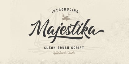 Majestika Script is a beautiful modern calligraphy which is suitable for you who needs a typeface for headline, logotype, apparel, invitation, branding, packaging, advertising etc. This typeface is comes in uppercase, lowercase, punctuations, symbols & numerals, stylistic set alternate, ligatures, etc also support multilingual and already PUA encoded.
 - LGF Besitos Round by LGF Fonts,
$18.00BESITOS is a deconstruction INSPIRED on a sans serif type, in which the weights of the source did not mark the width of the letter but the lines that compose it is made in two variants according to their lines end up at right angles or curves. - Beckson by Valentino Vergan,
$12.00 Beckson is a futuristic unique sans serif typeface, which comes with creative alternative letters. Beckson is designed with minimalist distinctive shapes that make it very eye catching. Beckson is a fantastic typeface for modern and futuristic designs, you can use it for a wide range of projects.