10,000 search results
(0.045 seconds)
- Kiptide by Alcode,
$15.00 Kiptide is a organic handwritted font inspired by natural brush typography. Written in rapid motion using a slightly dry brush pen. This will give you a fresh and elegant design. Kiptide comes with uppercase and lowercase sets, numbers, alternative styles for some lowercase characters are also available which make your text and designs more attractive.
 - Kaylar by Letterhend,
$14.00 Kaylar Script & Serif is a pair of elegant typeface consist of script and serif font. The beauty script and the condensed serif perfectly matched and bring a luxury and classy feel. What makes it even more special is its unique opentype feature which allows you to enable the swash ornament in a very simple way.
 - Warilah by Letterafandi Studio,
$16.00 Warilah is a modern handwritten with characters that dance along the baseline. It can be used for various purposes such as logos, wedding invitations, headings, t-shirts, letterhead, signage, labels, news, posters, badges and so much more. This font is PUA encoded which means you can access all of the glyphs and swashes with ease!
 - Sinister Undertones JNL by Jeff Levine,
$29.00 Hand lettering from the 1958 movie poster for “Vertigo” (designed by Saul Bass) was the inspiration for the digital font Sinister Undertones JNL, which is available in both regular and oblique versions. The quirkiness of this irregular, squared-edge sans – despite its simplicity – perfectly captured the mood and drama of Alfred Hitchcock’s film production.
 - Bunker by Omine Type,
$24.00A versatile stencil type family with lowercase characters and a extensive character set. Bunker has four styles, and all of them are interchangeable, which means that a character occupies the same space (advance-width) in all of the fonts. It also has four styles of figures: tabular-lining, tabular-oldstyle, proportional-lining and proportional-oldstyle. - Farmer's Market PW by Patty Whack Fonts,
$24.00Farmer's Market PW is suitable for display use for titles, as well as paragraphs of text. This font contains tons of characters. Uppercase, lowercase, numerals, foreign characters, fractions, lots of alternates and ligatures as well as punctuation. Farmer's Market PW is available in OpenType and TrueType format which are both included in the same package. - Tithua by Muykyta,
$20.00 Tithua is a modern font with strokes clear and well marked, easy to read and simple design. The curved shape on the slab terminations give a harmonious and pleasant smoothing which removes stiffness and enriches the design. For now comes in five different widths and includes Latin extended-A characters and some OpenType features.
 - Brandon Grotesque Office by HVD Fonts,
$40.00 This special Office version of Brandon Grotesque is especially for all Microsoft Office applications (Word, Excel, Powerpoint …). It contains just the 4 basic styles which are stlye-linked and can be easily accessed by the "I" or "B" button in Office. The fonts are manually hinted so their appearance is also optimized for these applications.
 - Doright Black NF by Nick's Fonts,
$10.00 This typeface takes its design cues from Dudley Upright, a Dan X. Solo find from the sixties. This version is considerably wider than the original, which increases its legibility while retaining its flower-power vibe. Both flavors of this font feature the 1252 Latin, 1250 Central European, 1254 Turkish and 1257 Baltic character sets.
 - Snoogle by Linotype,
$29.00Snoogle is a friendly, round display typeface. Its character set contains 99 ligatures, which may be automatically implemented in OpenType-savvy applications. These give Snoogle the feeling of a script face, as opposed to normal rounded types. Snoogle's text variant is complimented by a Dingbats font, including further design elements as well as pictogram figures. - InkArt Labels by John Moore Type Foundry,
$24.95 Inkart is a font dingbats, shapes for new labels or frames that the user can supplement according to the requirements and purposes. It consists of a set uppercase containing the forms, and a set is lower case which has areas of the same shapes to be colored by layers. Contains retro and modern styles.
 - Seathera by Almarkha Type,
$35.00 Seathera is a beautiful script that feels classy, elegant, and modern. It is perfectly suited for a wide variety of projects! This font is PUA encoded which means you can access all of the magical glyphs and swashes with ease! It also features a wealth of special features including alternate glyphs and ligatures. Thank you
 - Dupliciter by JAF 34,
$9.90 DUPLICITER is an experimental display sans serif font which has two typefaces for comfortable and experimental use. DUPLICITER is a (latest) part of new school in type design that could be called like mind-free and geometric direction in the world. Sans serif, condensed, sharp edges, geometric, experimental, these are the main attributes of DUPLICITER.
 - Florens LP by LetterPerfect,
$39.00 Florens is a flourished, semi-formal script that designer Garrett Boge modeled after his own italic calligraphy, which is a contemporary version of the chancery script of the Italian Renaissance. In addition to the standard character set, a Flourished font provides old-style figures, special dingbats, and swash variants for all upper and lowercase characters.
 - Kingthings Spike Pro by CheapProFonts,
$10.00 You gotta love this extreme take on the "gothic" blackletter traditions! Roger Nelsson edited a few letters, drastically improved the spacing - and then gave it the usual large CheapProFonts character set. Fun! Kevin King says: "Kingthings Spike was made because Buffy has one, I made Willow... Xander is yet to come. Oh and because I hate Engravers Old English! Pugin, eat my shorts! Sorry!" Kingthings Spikeless is a toned down version of Kingthings Spike. Kevin King says: "Kingthings Spikeless was requested by those who actually want to read text... well I call that tedious, but if you must, here it is no flourishes, just my small homage to black-letter." ALL fonts from CheapProFonts have very extensive language support: They contain some unusual diacritic letters (some of which are contained in the Latin Extended-B Unicode block) supporting: Cornish, Filipino (Tagalog), Guarani, Luxembourgian, Malagasy, Romanian, Ulithian and Welsh. They also contain all glyphs in the Latin Extended-A Unicode block (which among others cover the Central European and Baltic areas) supporting: Afrikaans, Belarusian (Lacinka), Bosnian, Catalan, Chichewa, Croatian, Czech, Dutch, Esperanto, Greenlandic, Hungarian, Kashubian, Kurdish (Kurmanji), Latvian, Lithuanian, Maltese, Maori, Polish, Saami (Inari), Saami (North), Serbian (latin), Slovak(ian), Slovene, Sorbian (Lower), Sorbian (Upper), Turkish and Turkmen. And they of course contain all the usual "western" glyphs supporting: Albanian, Basque, Breton, Chamorro, Danish, Estonian, Faroese, Finnish, French, Frisian, Galican, German, Icelandic, Indonesian, Irish (Gaelic), Italian, Northern Sotho, Norwegian, Occitan, Portuguese, Rhaeto-Romance, Sami (Lule), Sami (South), Scots (Gaelic), Spanish, Swedish, Tswana, Walloon and Yapese.
 - Traction by Schriftlabor,
$36.99 Traction was originally conceived and designed by Swiss astronomer Christian Thalmann. Schriftlabor designers Chiara Mattersdorfer and Miriam Surányi expanded, completed and produced the font family. This typeface sports signature serifs, soft edges and a fluid, organic design. Enlarged, the organic letters are reminiscent of the profiles of off-road tyres and hiking boots. In text sizes, it is the humanistic forms that set the tone to ensure fluid legibility. Totalling at 18 styles in nine weights, all fonts come with small capitals and all possible numerical variations.
 - Fresh Milky by Forberas Club,
$16.00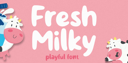 Fresh Milky Font is script font inspired by modern and ligature characters. It is especially designed for luxury, elegant, feminine projects, Fresh Milky Font is perfect for creating modern and chic designs such as logos, packaging, editorials and more. this Fresh Milky Font is only available for personal use. So, if you want to use its full features and license, get the premium version as well!
 - Donut Power by Forberas Club,
$16.00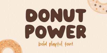 Donut Power Font is script font inspired by modern and ligature characters. It is especially designed for luxury, elegant, feminine projects, Donut Power Font is perfect for creating modern and chic designs such as logos, packaging, editorials and more. this Donut Power Font is only available for personal use. So, if you want to use its full features and license, get the premium version as well!
 - Mighty Yogurt by Forberas Club,
$16.00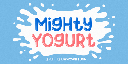 Mighty Yogurt Font is script font inspired by modern and ligature characters. It is especially designed for luxury, elegant, feminine projects, Mighty Yogurt Font is perfect for creating modern and chic designs such as logos, packaging, editorials and more. this Mighty Yogurt Font is only available for personal use. So, if you want to use its full features and license, get the premium version as well!
 - Sheryna Lemu by Forberas Club,
$16.00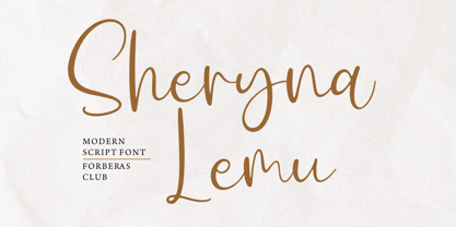 Sheryna Lemu Font is script font inspired by modern and ligature characters. It is especially designed for luxury, elegant, feminine projects, Sheryna Lemu Font is perfect for creating modern and chic designs such as logos, packaging, editorials and more. this Sheryna Lemu Font is only available for personal use. So, if you want to use its full features and license, get the premium version as well!
 - Salty Bread by Forberas Club,
$16.00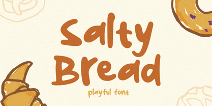 Salty Bread Font is script font inspired by modern and ligature characters. It is especially designed for luxury, elegant, feminine projects, Salty Bread Font is perfect for creating modern and chic designs such as logos, packaging, editorials and more. this Salty Bread Font is only available for personal use. So, if you want to use its full features and license, get the premium version as well!
 - Pinel Pro by URW Type Foundry,
$39.99 The characteristic ‘French face’ was originally made in 1899 under the supervision of Joseph Pinel. Thus, what was originally French 10 pt. Nº 2, got its present name. The Frenchman Joseph Pinel called himself a "typographical engineer", but was at the time employed as a type draughtsman at the Linotype Works in Altrincham. It appears that this and some other faces that he supervised, were, except for use on the Linotype, also meant for manufacturing matrices for the Dyotype. This composing machine was an invention of Pinel. The Dyotype was a rather complicated machine and consisted, like the Monotype, of two separate contraptions, a keyboard which produced a perforated paper ribbon and a casting machine which produced justified lines of movable type. Unlike the Monotype which has a square matrix carrier, the Dyotype had the matrices on a drum (in fact two drums, hence the name of the machine). A Pinel Diotype company was founded in Paris and a machine was built with the help of the printing press manufacturer Jules Derriey. As is often the case, a lack of sufficient capital prevented the commercializing of this ingenious composing machine. Coen Hofmann digitized the font from a batch of very incomplete, damaged and musty drawings, which he dug up in Altrincham. He redrew all characters, bringing up the hairstrokes somewhat in the process. The result is a roman and italic, while the roman font also includes Small Caps
 - DearJoe 6 by JOEBOB graphics,
$29.00 The dearJoe series of fonts had it’s origin somewhere around 1999, the year I created dearJoe 1, which was a first (and half-assed) attempt at converting my own handwriting into a working font. Being able to type in my own handwriting had always been a childhood fantasy, and even though I only partly understood the software, a working font was generated and I decided to put it on the internet for people to use. And that’s what they did: at this moment the dearJoe 1 font has been downloaded millions of times and can be found on just about anything, ranging from Vietnamese riksjas, a Tasmanian gym to a fancy chocolate store on 5th Avenue. The font is not something I am particularly proud of, but it started me of in building what later became the JOEBOB graphics font foundry. Inbetween creating other fonts, the dearJoe series has become a theme I revisit every once in a while, trying to create an update on how my handwriting evolved, along with my abilities in creating fonts that mimic actual handwriting. In the last decade or so I started implementing ligatures and alternate characters, which helped a lot in making something that can almost pass for actual handwriting.
 - Malutzki Initials by Spirit & Bones,
$15.00 In 1980, Peter Malutzki, Heidi Hübner-Prochotta and Manfred Prochotta founded the FlugBlatt-Presse and began producing broadsheets, which they called FlugBlätter and which also gave their press its name. They were mostly woodcuts or linocuts, combined with hand-set typography. When they finished the series in 1984 there were 67 FlugBlätter. During a Frankfurt Book Fair in the 1980s the collector Rob Saunders acquired FlugBlatt No. 37 along with other prints. Later they became part Letterform Archive, a non-profit museum and special collection library in San Francisco, which Rob Saunders founded in 2014. In 2021, Letterform Archive posted the FlugBlatt No. 37 on social media, where type designer Lena Schmidt saw it, immediately fell in love with it, and developed the plan to bring it into the digital world. After contacting Peter Malutzki – who is still working as a book artist today – and in close consultation with him, Schmidt translated the letterforms into a font series, Malutzki Initials. The three fonts can be used for black (single-color) text using the Regular style, or for multicolor text by applying different colors to the Letter Layer and Figure Layer styles.
 - K&T Heidi by K and T,
$70.00 This is a well-built, functional (all caps) typeface, which is very modern in character. The use of diagonal corners in this angular typeface is inspired by the pennant numbers on British Royal Navy warships, which adds an military quality to this typeface. The gaps, which form the Stencil divisions, follow pre-established horizontal and vertical lines, they help to achieve both geometric and proportional harmony. The direction of the gaps is always at a right angle to the stroke.
 - Flowy by Typesketchbook,
$49.00 Flowy is a romantic and delicate type, made up of four sub-families. Brush, Script, and Condensed imitate freehand writing using different tools. In these families, you can choose the original version which embodies freehand styles, the Clean option which offers a clean-cut edge and is more suitable for corporate assignments, or Rust which changes the texture. Meanwhile, two options, Clean and Ink, come with the Sans type. The complete family has 29 individual typefaces that serve your projects every purpose.
 - NewNerdish by Ingrimayne Type,
$9.95 A sans-serif face in which the circular elements have become almost square, NewNerdish resembles a number of typefaces which have become associated with a modernistic, computer look. There is little or no variation in the weight of horizontals, diagonals, and verticals. It comes in two widths each with five weights and each weight has an oblique version, which has the same letter shapes as the upright version. The ShadowedInside style is designed to be used in a layer with the Shadowed style.
 - Al Chevrola by Aluyeah Studio,
$80.00 Al Chevrola is a dynamic modern sans serif. Strong, with curves and an elegant touch. It is a rounded, geometric near-monoline construction sans serif typeface with display details which gives it modern, simple, elegant, chic, cool, and strong vibes. Each style and character looks amazing in large headlines. Al Chevrola works great in branding, logos, magazines, packaging. FEATURES: 4 Weight OpenType support Easy to use (with special combination) Multilingual support (15 languages) PUA Encoded Thanks for checking out Al Chevrola. I really hope you enjoy using it! If you have any questions I'd be more than happy to answer them, just send me a message.
 - Stat Text Pro by Jure Kožuh,
$45.00 www.Stat-Type.com Complementary Type Family Stat Display Pro Stat Text Pro is an information design sans serif type family which was developed as a complementary to Stat Display Pro. Stat Text Pro retains many characteristics of its display counterpart, while giving readability a greater importance. It has simpler letter shape details which enable it to accomplish a constant rhythm whiles being read. Its main intended use is to accompany Stat Display Pro in places where longer passages of text are needed. In this way the visual character of the composition is retained and at the same time readability of text is given attention. As its display counterpart it has a large character set with multiple weights, which are defined by optimal size ratio, wide aperture and balanced counters. It contains nearly 700 glyphs, including diacritics, ligatures, small caps, old–style figures, arrows and more. This enables it to achieve wide language support. It consists of four weights (Light, Regular, Medium, Bold) which are accompanied by their corresponding obliques. Stat Text Pro type family has higher than average x height (72% of cap height) which is accompanied by matching ascender and descender size ratios. The development of the type family was based on research in legibility to achieve highly legible letter shapes, while not diminishing their visual character. A detailed description of Stat Pro type family is available at Stat-Type.com where a DEMO font can be downloaded.
 - Passenger Train JNL by Jeff Levine,
$29.00 A 1940s travel poster for the Florida East Coast Railway (which then carried passengers but is now a freight line) had the railroad’s name hand lettered in a bold Art Deco sans. This inspired Passenger Train JNL, which is available in both regular and oblique versions.
 - VolumeFour by Ryan Corey,
$10.00 VolumeFour is a heavy, geometric sans-serif display face inspired by the custom lettering which adorns Black Sabbath's groundbreaking "Vol 4." Its bold forms and naturally tight spacing evoke the era which spawned such classics as "Snowblind" and "Supernaut", bringing this aesthetic to a contemporary audience.
 - Stiff by Edyta Demurat,
$20.00 We present to you STIFF - a simple, characteristic typeface in a nice, retro style which is angular, geometric and extra narrow. Stiff makes the text look distinctive and unique so it's perfect for titles, subtitles, logotypes or short parts of text which need to be exposed.
 - Bollent by Fype Co,
$16.00 Bollent is a luxurious, elegant and modern typeface which is suitable for wedding, fashion, beauty, packaging, logo, branding content and muc more. Bollent also includes ligatures and alternates which makes it easy for you to create a logo for your personal branding and your business beautifully.
 - Mocha Script by Borges Lettering,
$52.00 Created by veteran Sign Painter, Bruce Bowers and Lettering Artist, Charles Borges de Oliveira. Mocha Script boasts over 243 characters which includes alternates, ligatures and special end characters which allows the Designer to create a magnitude of variations of letters to produce unique hand lettered words. Enjoy!
 - Peach Montain by Nathatype,
$25.00 Peach Mountain is an elegant, modern, multipurpose display serif font needed by designers today. The simple letters’ morphology has relatively similar proportions. Furthermore, its high contrasts and wide spaces are truly legible with which you can apply for any text sizes. In addition, you can make use of this font’s available interesting features to beautify your designs. Features: Stylistic Sets Ligatures Multilingual Supports PUA Encoded Numerals and Punctuations Peach Mountain fits best for various design projects, such as posters, banners, logos, magazine covers, quotes, headings, printed products, invitations, name cards, merchandise, social media, etc. Find out more ways to use this font by taking a look at the font preview. Thanks for purchasing our fonts. Hopefully, you have a great time using our font. Feel free to contact us anytime for further information or when you have trouble with the font. Thanks a lot and happy designing.
 - Quotes and Texts by Pixel Colours,
$24.00 Quotes and Texts is a sweet handwritten uppercase font designed to look clear and chic in small formats like texts, quotes, and social media posts. Includes: Uppercase and lowercase caps characters, numbers and punctuation Supports Language
 - Kerosene by Bhubbiberry Studio,
$20.00 Kerosene a modern-style serif font that create chic logos, quotes, posts, blog posts, book cover, branding projects, magazine imagery, music logo, movie poster, wedding invitations and much more! Kerosene support multilingual languages, numbers,and punctuations.
 - Fleischmann Gotisch PT by preussTYPE,
$29.00 Johann Michael Fleischmann was born June 15th, 1707 in Wöhrd near Nuremberg. After attending Latinschool he started an apprenticeship as punchcutter in the crafts enterprise of Konstantin Hartwig in Nuremberg, which ought to last six years. For his extraordinary talent Fleischmann completed his apprenticeship after four and a half years, which was very unusual. 1727 his years of travel (very common in these days) began, during which he perfected his handcraft by working in different enterprises as journeyman. First location was Frankfurt/Main where he worked for nearly a year at the renowned type foundery of Luther and Egenolff. Passing Mainz he continued to Holland, where he arrived in November 1728 and stayed till he died in 1768. In Amsterdam he worked for several type founderies, among others some weeks for Izaak van der Putte; in The Hague for Hermanus Uytwerf. Between 1729 and 1732 he created several exquisite alphabets for Uytwerf, which were published under his own name (after his move to Holland Fleischmann abandoned the second n in his name), apparently following the stream of the time. After the two years with Uytwerf, Fleischmann returned to Amsterdam, where he established his own buiseness as punchcutter; following an advice of the bookkeeper and printer from Basel Rudolf Wetstein he opened his own type foundery 1732, which he sold in 1735 to Wetstein for financial reasons. In the following Fleischmann created several types and matrices exclusively for Wetstein. In 1743 after the type foundery was sold by Wetstein’s son Hendrik Floris to the upcoming enterprise of Izaak and Johannes Enschedé, Fleischmann worked as independent punchcutter mostly for this house in Haarlem. Recognizing his exceptional skills soon Fleischmann was consigned to cutting the difficult small-sized font types. The corresponding titling alphabets were mostly done by Jaques-Francois Rosart, who also cut the main part of the ornaments and borders used in the font examples of Enschedé. Fleischmann created for Enschedé numerous fonts. The font example published 1768 by Enschedé contains 3 titling alphabets, 16 antiquacuts, 14 italic cuts, 13 textura- and 2 scriptcuts, 2 greek typesets (upper cases and ligatures), 1 arabic, 1 malayan and 7 armenian font systems, 5 sets of musicnotes and the poliphonian musicnotesystem by Fleischmann. In total he brought into being about 100 alphabets - the fruits of fourty years of creative work as a punchcutter. Fleischmann died May 27th, 1768 at the age of 61. For a long time he was thought one of the leading punchcutters in Europe. A tragedy, that his creating fell into the turning of baroque to classicism. The following generations could not take much pleasure in his imaginative fonts, which were more connected to the sensuous baroque than to the bare rationalism of the upcoming industrialisation. Unfortunately therefore his masterpieces did not survive the 19th century and person and work of Fleischmann sank into oblivion. The impressive re-interpretation of the Fleischmann Antiqua and the corresponding italics by Erhard Kaiser from Leipzig, which were done for the Dutch Type Library from 1993 to 1997, snatched Fleischmann away from being forgotten by history. Therefore we want to place strong emphasis on this beautiful font. Fleischman Gotisch The other fonts by Fleischmann are only known to a small circle of connoisseurs and enthusiasts. So far they are not available in adequat quality for modern systems. Same applies the "Fleischman Gotisch", which has been made available cross platform to modern typeset-systems as CFF Open Type font through the presented sample. The Fleischman Gotisch has been proved to be one of the fonts, on which Fleischmann spent a good deal of his best effort; this font simply was near to his heart. Between 1744 and 1762 he created 13 different sizes of this font. All follow the same principles of forms, but their richness of details has been adapted to the particular sizes. In later times the font was modified more or less sensitive by various type founderies; letters were added, changed to current taste or replaced by others; so that nowadays a unique and binding mastercopy of this font is missing. Likewise the name of the font underwent several changes. Fleischmann himself probably never named his font, as he did with none of his fonts. By Enschedé this textura was named Nederduits, later on Nederduitsch. When the font was offered by the german type foundery Flinsch in Frankfurt/Main, the more convenient name of Fleischmann-Gotisch was chosen. In his "Masterbook of the font" and his "Abstract about the Et-character" Jan Tschichold refered to it as "Duyts" again. To honour the genious of Johann Michael Fleischmann we decided to name the writing "Fleischmann Gotisch PT" (unhyphenated). Developing the digital Fleischman Gotisch I decided not to use one of the thirteen sizes as binding mastercopy, but corresponding to the typical ductus of the font to re-create an independent use of forms strongly based on Fleischmann´s language of forms. All ascenders and descenders were standardised. Some characters, identified as added later on, were eliminated (especially the round lower case-R and several versions of longs- respectively f-ligatures) and others were adjusted to the principles of Fleischmann. Where indicated the diverse characters were integrated as alternative. They can be selected in the corresponding menu. All for the correct german black letter necessary longs and other ligatures were generated. Through the according integration into the feature-code about 85% of all ligatures in the type can be generated automatically. Problematic combinations (Fl, Fk, Fh, ll, lh, lk, lb) were created as ligatures and are likewise constructed automatically. A historically interesting letter is the "round r", which was already designated by Fleischmann; it is used after preceding round letters. Likewise interesting is the inventive form of the &-character, which is mentioned by Tschichold in his corresponding abstract. Nevertheless despite all interpretation it was very important to me to maintain the utmost fidelity to the original. With this digital version of a phantastic texturfont of the late baroque I hope to contribute to a blossoming of interest for this genious master of his kind: Johann Michel Fleischmann. OpenType features: - Unicode (ISO 10646-2) - contains 520 glyphes - Basic Latin - Latin-1 Supplement - Latin Extended-A - Latin Extended-B - Central European Glyhps - Ornaments - Fractions - Standard ligatures - Discretionary ligatures - Historical ligatures - Kerning-Table
 - Goldbugs by Nathatype,
$29.00 Hi, Everyone! Want font to make your branding bold? Looking for a fabulous, stylish, modern, and adventure font? We've got what you want. Goldbugs-A Serif Font Goldbugs a timeless serif font. Designed with elegance and modern style. Every letter has a unique and beautiful touch, which will make your design come alive. This font is perfect for quotes, shirt designs, websites, branding, children's designs, svg designs, blogs, logos, invitations and more! Our font always includes Multilingual Support to make your branding reach a global audience. Features: Ligatures Stylistic Set Swashes PUA Encoded Numerals and Punctuation Thank you for downloading premium fonts from Natha Studio
 - The Blacklight Script by HKL Studio,
$19.00 I would like to introduce this cool font, The Blacklight Script, which is a Bold script font with a touch of charming Retro style. This font also looks interesting because I added some alternative features that you can use. stay relevant for a charming modern look. there's nothing wrong if you feel all the experience of using this font in your design, make this font one of the font collections on your computer what will you get: Blacklight scripts Alternative PUA features coded We hope you enjoy this font! feel free to comment if you have any thoughts or feedback. Thank you for buying and happy creating! :)