10,000 search results
(0.013 seconds)
- Frutiger Symbols by Linotype,
$29.00In Adrian Frutiger, the discipline of a mathematically exact mind is joined with an unmistakable artistic sense. His independent work possesses the controllable language of letterforms. Personal and intensive, this work is the manifestation of his expressive will. Frutiger's precise sense of outline reveals itself two- or three-dimensionally in wood, stone, or bronze, on printing plates and in the form of reliefs. However, even his independent work can be understood as objectivized signs; in their symbolism, they are embedded in the fundamental questions of human existance. They might have developed in the spirit of playfulness, but their nature is always conceptual, directed towards a complex, yet harmonic, whole. Following function, form also necessarily follows the content of the language. The entire spiritual world becomes readable through letters. Essentially, Adrian Frutiger attempts to fathom the basic, central truth which defines our lives: change, growth, division - beginning and end. In a virtual synthesis, he seems to close the circle in which the world reflects itself in symbolic forms. Frutiger Stones is for Adrian Frutiger the example of his formal artistic sensibility par excellence. Searching for the fundamental elements in nature, he has discovered the pebble, rounded and polished over innumerable years by gently flowing water. And out of this, he has created his complete system, a ruralistic typeface of letters and symbols. It depicts animals and plants, as well as astrological and mythical signs. Because of its unique aura, Frutiger Stones is particularly well-suited to different purposes - in headlines and prominent pictograms, as symbol faces, illustrations, and more. Frutiger Symbols is a symbol font of plants, animals and stars as well as religious and mythological symbols. Together with Frutiger Stones this typeface builds a complete design system, which offers endless possibilities. It can be used for illustrations or a symbol type with its distinctive pictograms. Frutiger Symbols is available in the weights regular, positive and negative. - Maiers Nr. 8 Pro by Ingo,
$27.00 A handwritten ”font for technicians“ from ca. 1900. Very geometrical, rigid forms borrowed from the typical characteristics of Jugendstil / Art Nouveau. This script is found in an old magazine which was issued sometime in the years shortly before WWI. The original copy, produced by means of a galvanized plate, is just 7 centimeters wide. It served as the model for technical professions in which, at that time, the captions of drawings were still done by hand. ingoFonts has not only digitized this beautiful typeface, we have also extended it to a whole family. In »Maier’s Alte Nr. 8« special attention was given to ensure the ”uneven“ edges, typical of handwritten script, remained effectively noticeable even in the digitized form. As a result, this ”technical“ font retains a handmade touch, while »Maier’s Neue Nr. 8« is the clean version with exact contours. The Art Nouveau forms, which are characteristic for the period of origin around the turn of the century around 1900, look especially pretty. The high degree of abstraction also seems strange in Maier's No. 8, especially when the age of the original is known. It is generally assumed that it was not until the Bauhaus in the late 1920s that such "modern" typefaces were created. Maier's No. 8 is a generation older! So many of today's supposedly "ultramodern" typefaces look quite old in comparison. In addition to the original two weights, Light and Bold, the Maiers Neue Nr. 8 got a regular and a extra-bold weight. Furthermore, the Neue is also available in italics. Although this is only a slanted version, unlike common practice, it is inclined to the left. Maier’s Nr. 8 Pro is suitable for all European languages. It includes ”Latin Extended-A,“ for Central and Eastern Europe incl. Turkish, and even Cyrillic and Greek, too. The font includes several stylistic alternates as well as a number of ligatures.
 - Kingthings Serifique Pro by CheapProFonts,
$10.00 This is what you get when you mix monoline rounded letters with some bracketed serifs and finish it off with a sprinkle of ornamental appendages. The result is very readable, rather original and quite charming. I have fixed some inconsistencies in serif designs across the weights, cleaned up the serif connections - and added a fourth weight. But I have kept all the wonky curves and slightly differing stroke thicknesses, as they are so integral to the charm. Kevin King says: "I guess all type designers at some point think 'Well, I'll just have a go at a standard text face...' There is a long story here somewhere, suffice it to say that I started with the thinnest version - typical. I wanted to make a standard serif text face - until I saw it in print and thought "Yuk! it looks like everything else!" - still does really but with twiddles and pooneys..." If you find the "twiddles & pooneys" too much you can tone them down with the OpenType Stylistic Alternate feature (which will make sure they don't appear on three consecutive letters) or remove them completely with the OpenType Swash feature. ALL fonts from CheapProFonts have very extensive language support: They contain some unusual diacritic letters (some of which are contained in the Latin Extended-B Unicode block) supporting: Cornish, Filipino (Tagalog), Guarani, Luxembourgian, Malagasy, Romanian, Ulithian and Welsh. They also contain all glyphs in the Latin Extended-A Unicode block (which among others cover the Central European and Baltic areas) supporting: Afrikaans, Belarusian (Lacinka), Bosnian, Catalan, Chichewa, Croatian, Czech, Dutch, Esperanto, Greenlandic, Hungarian, Kashubian, Kurdish (Kurmanji), Latvian, Lithuanian, Maltese, Maori, Polish, Saami (Inari), Saami (North), Serbian (latin), Slovak(ian), Slovene, Sorbian (Lower), Sorbian (Upper), Turkish and Turkmen. And they of course contain all the usual "western" glyphs supporting: Albanian, Basque, Breton, Chamorro, Danish, Estonian, Faroese, Finnish, French, Frisian, Galican, German, Icelandic, Indonesian, Irish (Gaelic), Italian, Northern Sotho, Norwegian, Occitan, Portuguese, Rhaeto-Romance, Sami (Lule), Sami (South), Scots (Gaelic), Spanish, Swedish, Tswana, Walloon and Yapese.
 - Comenia Sans by Suitcase Type Foundry,
$75.00Comenia Sans was designed in the framework of a unique typographic project for all types of schools. It is a complementary face for Comenia Serif, released by our friends at Storm Type Foundry. Comenia Sans has a lot in common with its serif sister: the height of both upper and lower case, the length of ascenders and descenders, and the general weight. This makes the two perfect partners which work well even when set side by side in a single line of text. Comenia Sans does, however, lack all serifs, ornamental elements and stroke stress variation. All these elements freshen up the feel of long texts, but for shorter texts use, they are not necessary. Despite that, Comenia Sans retains the soft, friendly character of its big sister, as well as a few tiny details which lend it its unique character without compromising legibility or utility. Open counters give all letters an airy feel and permit enough variation in construction. This is why the face works well even in multiple-page texts. All its letters are easily distinguished from each other, so the reader's eyes are not strained. Diacritics and punctuation harmonize with both upper and lower case. As usually, all diacritical marks fully respect conventional shapes of accents and they are perfectly suitable for Czech, Slovak, Polish and other Central European languages, where a lot of diacritics abounds. Similarly to the renaissance italics which refers to the cursive forms, Comenia Sans introduces novel shapes of some characters drawing from the hand-written heritage. This is most apparent in the single-bellied a, the simplified g, and the stem of f which crosses the baseline and ends with a distinct terminal. In the text, emphasized words are thus distinguished not only by the slant of letters, but also by the shapes of the letters themselves. All twelve styles contain set of small caps, suitable for the names, in the indexes or the headlines in longer texts. Legibility in small sizes under 10 points was at the center of designers' attention, too. This is why the counters of a, e and g are large enough to prevent ink spread in small sizes, both on-screen and in print. After all, the font was specifically optimized for screen use: its sober, simple forms are perfectly fit to be displayed on the computer screen and in other low-resolution devices. When used in the context of architecture, the smoothness of all contours stands out, permitting to enlarge the letters almost without limit. A standard at the Suitcase Type Foundry, each style of Comenia Sans boasts a number of ligatures, an automatic replacement of small caps and caps punctuation, a collection of mathematical symbols, and several types of numerals which make it easy to set academic and other texts in an organised, well-arranged way. For the same purpose, fractions may come in handy, too. Apart from the standard emphasis styles, the family also contains six condensed cuts (each set has the same number of characters), designated for situations where space is limited or the need for striking, poster-like effect arises. Comenia Sans is the ideal choice for the setting of magazines, picture books, and navigation systems alike. Its excellent legibility and soft, fine details will be appreciated both in micro-typography and in poster sizes. Although it was designed as a member of a compact system, it will work equally well on its own or in combination with other high-quality typefaces. - Flirt by Canada Type,
$25.00It's a very happy day when we stumble upon beautiful alphabets that were never digitized. It is even a happier day when the beautiful alphabet finds its way to us through friends and people who like our work. Some two months ago, the forms of this gorgeous font were pointed to us by a friend who saw it in an old Dover Publications specimen book showcasing historical alphabets. It was there under the name Vanessa, with nothing else to go by. We looked and researched for further information but found nothing else. So this gem comes to you like a coal that winked its way out of the ashes because it wanted to shine again. Flirt is very authentic art deco with a noticeable element of artistic pride, swashy delicate majuscules and very aristocratic, fashionable and flirty minuscules. The majuscules can be used as every other capitals usually are, or as initial caps. The minuscules can very nicely stand on their own quite independently from the caps whenever desired. These letters are quite similar to the hand lettering used on of the kind of theater posters, specifically burlesque and opera entertainment, which are now considered very retro-chic and fashionable to see hanging on walls in home or office. The initial specimen we worked from showed a single basic art deco alphabet with numerals which seemed as they belonged to another font. That alphabet became the base Flirt font, the numerals were redrawn to fit much better with the minuscules, and the character set was greatly expanded to include punctuation, accented characters, and many many alternates, especially for the majuscules. Majuscules with a descending right vertical stroke were a common artistic touch in the high days of theater posters, so we thought they would be great additions to the character set. These alternates can be found all over the font. So to maximize the design fun, have a character map or glyphs palette handy when you use Flirt. After the base font was finished, we thought it would be a good idea to give it a bold treatment unlike anything seen out there, and the farthest thing from the mechanical bolds seen everywhere now. This bolding treatment consisted of thickening the lowercase's vertical strokes inwards, but leaving the horizontal stroke weight as is, and thickening only the thicker vertical strokes of the uppercase. The result is quite the visual feat. We encourage you to test both the regular and bold weights and see for yourself. - Bank Sans EF by Elsner+Flake,
$35.00 With its extended complement, this comprehensive redesign of Bank Gothic by Elsner+Flake offers a wide spectrum for usage. After 80 years, the typeface Bank Gothic, designed by Morris Fuller Benton in 1930, is still as desirable for all areas of graphic design as it has ever been. Its usage spans the design of headlines to exterior design. Game manufacturers adopt this spry typeface, so reminiscent of the Bauhaus and its geometric forms, as often as do architects and web designers. The creative path of the Bank Gothic from hot metal type via phototypesetting to digital variations created by desktop designers has by now taken on great breadth. The number of cuts has increased. The original Roman weight has been augmented by Oblique and Italic variants. The original versions came with just a complement of Small Caps. Now, they are, however, enlarged by often quite individualized lower case letters. In order to do justice to the form changes and in order to differentiate between the various versions, the Bank Gothic, since 2007 a US trademark of the Grosse Pointe Group (Trademark FontHaus, USA), is nowadays available under a variety of different names. Some of these variations remain close to the original concept, others strive for greater individualism in their designs. The typeface family which was cut by the American typefoundry ATF (American Type Founders) in the early 1930’s consisted of a normal and a narrow type family, each one in the weights Light, Medium and Bold. In addition to its basic ornamental structure which has its origin in square or rectangular geometric forms, there is another unique feature of the Bank Gothic: the normally round upper case letters such as B, C, G, O, P, Q, R and U are also rectangular. The one exception is the upper case letter D, which remains round, most likely for legibility reasons (there is the danger of mistaking it for the letter O.) Because of the huge success of this type design, which follows the design principles of the more square and the more contemporary adaption of the already existing Copperplate, it was soon adopted by all of the major type and typesetting manufacturers. Thus, the Bank Gothic appeared at Linotype; as Commerce Gothic it was brought out by Ludlow; and as Deluxe Gothic on Intertype typesetters. Among others, it was also available from Monotype and sold under the name Stationer’s Gothic. In 1936, Linotype introduced 6pt and 12pt weights of the condensed version as Card Gothic. Lateron, Linotype came out with Bank Gothic Medium Condensed in larger sizes and a more narrow set width and named it Poster Gothic. With the advent of photoypesetters and CRT technologies, the Bank Gothic experienced an even wider acceptance. The first digital versions, designed according to present computing technologies, was created by Bitstream whose PostScript fonts in Regular and Medium weights have been available through FontShop since 1991. These were followed by digital redesigns by FontHaus, USA, and, in 1996, by Elsner+Flake who were also the first company to add cursive cuts. In 2009, they extended the family to 16 weights in both Roman and Oblique designs. In addition, they created the long-awaited Cyrillic complement. In 2010, Elsner+Flake completed the set with lowercase letters and small caps. Since its redesign the type family has been available from Elsner+Flake under the name Bank Sans®. The character set of the Bank Sans® Caps and the Bank Sans® covers almost all latin-based languages (Europe Plus) as well as the Cyrillic character set MAC OS Cyrillic and MS Windows 1251. Both families are available in Normal, Condensed and Compressed weights in 4 stroke widths each (Light, Regular, Medium and Bold). The basic stroke widths of the different weights have been kept even which allows the mixing of, for instance, normal upper case letters and the more narrow small caps. This gives the family an even wider and more interactive range of use. There are, furthermore, extensive sets of numerals which can be accessed via OpenType-Features. The Bank Sans® type family, as opposed to the Bank Sans® Caps family, contains, instead of the optically reduced upper case letters, newly designed lower case letters and the matching small caps. Bank Sans® fonts are available in the formats OpenType and TrueType.
 - Eureka Springs by Maulana Creative,
$16.00 Eureka Springs is a chic signature style script font. With contrast thin stroke, slanted and fun character with a bit of ligatures. To give you an extra creative work. Eureka Springs font support multilingual more than 100+ language. This font is good for logo design, Social media, Movie Titles, Books Titles, a short text even a long text letter and good for your secondary text font with sans or serif. Make a stunning work with Eureka Springs font. Cheers, MaulanaCreative
 - Maybrown by Akrtype Studio,
$19.00 Maybrown is an elegant script. It is slender, feminine and classy, while still maintaining a friendly feel. Maybrown script is versatile and will work perfectly for any project that needs to feel sleek and chic. Maybrown include ligatures, capital letters and alternate letters. You need a program that supports OpenType features like Adobe Illustrator, Adobe Photoshop CC, Adobe Indesign and Corel Draw. and you can also access alternative flying machines via Font Book (Mac users) or Windows Character Map (Windows users).
 - Breathine by MJB Letters,
$19.00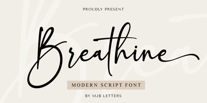 Breathine is a modern script font, with stylish looks that will add a chic elegance to design, perfect for websites, wedding stationery, modern logos, personal branding, social media quotes, and more. Files Included: Works on PC & Mac Simple installations Accessible in Adobe Illustrator, Adobe Photoshop, Adobe InDesign, and even work on Microsoft Word. PUA Encoded Characters – Fully accessible without additional design software. Thank you so much for checking out my shop, and please get in touch if you have any questions!
 - Loffers by Khaiuns,
$10.00 Thanks for checking out Loffers Script! A fabulously fun yet elegant script font with tons of energy, allowing you to create beautiful hand-made typography in an instant. Loffers Script is a beautiful chic script that is suitable for branding, wedding invitations, and other romantic projects In order to use the beautiful swashes, you need a program that supports OpenType features such as Adobe Illustrator CS, Adobe Photoshop CC, Adobe Indesign and Corel Draw. Thanks for use this font ~ Khaiuns
 - Signature Collection by Nicky Laatz,
$20.00 Get ultra chic with the new ‘Signature Collection’ handwritten font - A stylish and super-casual font created to look as close to natural handwriting as possible by including over 100 carefully designed, natural looking opentype ligatures, and a full set of lowercase alternates. Loaded with built in Opentype features, it’s recommended that you use it with your opentype ligatures option turned on in your character settings, then watch as, like magic, this script comes to life as if you are writing it yourself.
 - Brishia Jodie by sizimon,
$25.00 Introducing our product Brishia Jodie! Connecting script, designed to convey elegance and style. It is slender, feminine and friendly. Brishia Jodie is perfect for fashion, e-commerce brands, trend blogs, or any business that wants to appear classy and chic. Brishia Jodie Includes: Uppercase, lowercase, numeral, punctuation & Symbol Stylistic alternates Stylistic Set01 - Stylistic Set02 Ligatures PUA Encoded Characters Fully accessible without additional design software. If you have any question please do not hesitate to contact me : info@sizimon.com. Thank You!
 - Ferments by Haksen,
$14.00 Ferments is a stylish modern and natural handwritten script font with casual chic flair. It is perfect for branding, wedding invites and cards, and maybe for red wine label. Ferments includes full set of Natural uppercase and lowercase letters, numerals, a large range of punctuation and ligatures. In order to use the beautiful swashes, you need a program that supports OpenType features such as Adobe Illustrator CS, Adobe Photoshop CC, Adobe Indesign and Corel Draw. Thanks and have a great day, Haksen Studio
 - Jelly Cloud by Supfonts,
$10.00 JellyCloud / Font with Swashes JellyCloud is a chic script with exquisite accents. It is perfect for branding, wedding invitations and invitation cards and much more. Font includes a full set of gorgeous uppercase and lowercase letters, numbers, a large selection of punctuation marks, ligatures Test it out below to see how it could look for your next project! Includes: Regular Script Latin languages support Uppercase and lowercase Numbers and punctuation Ligatures Check out my blog: https://www.instagram.com/zloillev pinterest.com/dmitriychirkov7 Enjoy
 - Ruth Clair by Typetemp Studio,
$20.00 RuthClair Lovely Script Calligraphy whisk you away for a romantic rendezvous with your love of handwritten scripts. A little bit chic, a little bit classy, RuthClair is a must-have for any script font collection. this Fotn comes with alternatives and ligatures that create stunning logos, quotes, posts, blog posts. branding projects, magazine imagery, wedding invitations, and much more Features : Multilanguange PUA Encoded Web Font Included Contact me with an inbox message If you have any question. Thank you! Happy Creating.
 - Casandra Lie by IbraCreative,
$17.00 Casandra Lie – A Chic Monoline Script Font Casandra Lie, a name like a whispered secret, perfectly embodies the essence of this chic monoline script font. Imagine the delicate stroke of a fine penmanship teacher gliding across paper, leaving behind an effortless trail of ink that dances and twirls with understated elegance. Every letter whispers tales of romance and intrigue, their slender forms adorned with graceful swashes and subtle flourishes that hint at a hidden passion. Think vintage Parisian boudoirs illuminated by candlelight, secret love letters penned under twilight skies, and the airy charm of handwritten invitations to soirees under the stars. Casandra Lie is not merely a font; it’s an invitation to a world of whispered dreams and unspoken promises, etched in ink as delicate as a spider’s web, yet strong enough to capture the beating heart of a story waiting to be told. Casandra Lie is perfect for branding projects, logo, wedding designs, social media posts, advertisements, product packaging, product designs, label, photography, watermark, invitation, stationery, game, fashion and any projects. Fonts include multilingual support for; Afrikaans, Albanian, Czech, Danish, Dutch, English, Estonian, Finnish, French, German, Hungarian, Italian, Latvian, Lithuanian, Norwegian, Polish, Portuguese, Slovak, Slovenian, Spanish, Swedish.
 - Morris by HiH,
$10.00 Morris is a four-font family produced by HiH Retrofonts and based on the work of the very English William Morris. William Morris wanted a gothic type drawn from the 14th century blackletter tradition that he admired both stylistically and philosophically. He drew from several sources. His principal inspiration for his lower case was the 1462 Bible by Peter Schoeffer of Mainz; particularly notable for the first appearance of the ‘ear’ on the g. The upper case was Morris’s amalgam of the Italian cursive closed caps popular throughout the 12th through 15th centuries, a modern example of which is Goudy’s Lombardic Capitals. The gothic that Morris designed was first used by his Kelmscott Press for the publication of the Historyes Of Troye in 1892. It was called “Troy Type” and was cut at 18 points by Edward Prince. It was also used for The Tale of Beowulf. The typeface was re-cut in at 12 points and called “Chaucer Type” for use in The Order of Chivalry and The Works of Geoffrey Chaucer. Morris' objective is designing his gothic was not only to preserve the color and presence of his sources, but to create letters that were more readable to the English eye. ATF copied Troy and called it Satanick. Not only was the ATF version popular in the United States; but, interestingly, sold very well in Germany. There was great interest in that country in finding a middle ground between blackletter and roman styles -- one that was comfortable for a wider readership. The Morris design was considered one of the more successful solutions. Our interpretation, which we call Morris Gothic, substantially follows the Petzendorfer model used by other versions we have seen, with the following exceptions: 1) a larger fillet radius on the upper arm of the H, 2) a more typically broadpen stroke in place of the foxtail on the Q, which I do not like, 3) inclusion of the aforementioned ear on the g and 4) a slightly shorter descender on the y. We have included five ornaments, at positions 0135, 0137, 0167, 0172 and 0177. The German ligatures ‘ch’ & ‘ck’ can be accessed using the left and right brace keys (0123 & 0125). Morris Initials One and Morris Initials Two are two of several different styles of decorative initial letters that Morris designed for use with his type. He drew from a variety of 15th century sources, among which were Peter Schoeffer’s 1462 Mainz Bible and the lily-of-the-valley alphabet by Gunther Zainer of Augsburg. Each of the two initial fonts is paired with the Morris Gothic lower case. Morris Ornaments is a collection of both text ornaments and forms from the surrounding page-border decorations.
 - Dream Script by Lián Types,
$49.00 One of my dreams as a type-designer was making a good looking chancery cursive. Full of life, like some of the best calligraphers around the world do on their artworks. With Julian Waters, John Stevens and Denis Brown (just to name a few of them) (1) chancery, or italic script, was transformed into a new, exciting and very fresh style of calligraphy mainly at the end of 20th Century. Dream Script may be that dream named above made true. I have been practicing chancery in the way I learnt from those calligraphers for many years now. Making a font out of my ink-sketches was a tough work, since they were closer of -being art- than of -being type-. However, this font rescues many aspects of handmade calligraphy: You have to look at it really close to notice it is actually a font, and that was one of my goals. The secret of a good looking chancery is on its subtle details: pen angle is constantly changing, even on the strokes which seem straight. Capitals and swashes have to be done a little faster than lowercase letters. The rhythm has to be even, in spite of its playful look. The fact that makes Dream look alive is that it has many alternates per glyph. This makes each word look unique like it happens in calligraphy: you will find alternates for the beginning/ending of a word/phrase, some for the middle of it, some interchangeable. Also, to accompany the script, you will find Dream Caps, which was inspired in the eternally beautiful trajan capitals. Place them like I did on the posters and you will have great results for sure. The font works great in small, middle and big sizes and can be a great selection for magazines, wedding invitations, perfumes, and posters. Close your eyes, and Dream with me... TECHNICAL Dream Script Pro is the most complete style, it contains all the alternates and ligatures (OT programmed, better if you use Adobe applications) If you plan to use the font for text, be sure to activate the less decorative capitals, which are placed in the “salt” group of alternates. Dream Script Standard has less glyphs than the Pro one, it contains just some ligatures for a better legibility. (OT programmed, better if you use Adobe applications) NOTES (1) Not only are they great artists, but also good people, who are always willing to share with their students all what they know. I would also like to thank Ricardo Rousselot, whose work inspired me this time to make “The Dream Script” exlibris; and to Alisara Tareekes, a very talented friend which international calligraphy conferences gave me: She kindly helped me with some tips to make this font better.
 - HavingWrit - Unknown license

- Half SunBurst-w4-02 - Unknown license

- Deltras by Abbasy Studio,
$17.00 Deltras is handmade modern vintage display typefaces, which is combining the style of classic typography with an modern handlettering style. The font have smooth edges to make vintage printing, so it will bring a handdrawn classic look feels. It easily cooperating together and perfect for creating the traditional style logos, labels, package design, lettering for t-shirts and much others. There are more than 355 glyphs in the font including Stylistic sets, Contextual Alternates etc. OpenType features with Stylistic Alternates, Contextual Alternate in some characters that allows you to mix and match pairs of letters to fit your design.
 - Collette by Scholtz Fonts,
$21.00Collette was named in honor of an art deco font called "Independent" designed in the 1930s by Collette and Dufour. Collette is influenced by the design of the original font, however, there are substantial differences: instead of small caps, a true lower case was created, the upper case character proportions and shapes have been greatly modified, and all missing characters have been created to make a truly modern font which nevertheless has all of the panache of the original. It is best used to create a retro feel and in headings, subheads and in short passages of text. - Bagilean Geliayditan by Gold Type,
$12.00 Bagilean Geliayditan is the new editorial serif with all clean and soft lines, tight curves, and a trendy and elegant look! Bagilean Geliayditan has 16 fonts. which comes with 2 font family styles: - Bagilean Geliayditan: Regular, Italic, Medium, Medium Italic, Condensed, Condensed Italic, Outline and Outline Italic. - Bagilean Geliayditan Elegant: Regular, Italic, Medium, Medium Italic, Condensed, Condensed Italic, Outline and Outline Italic. Bagilean Geliayditan is perfect for your design needs such as to create nostalgic designs but still clean and elegant such as headlines, magazines, logos, packaging, editorials, titles, branding projects, logo designs, packaging, magazine titles, advertisements, short or long texts. Etc......
 - FF Dax Compact by FontFont,
$59.99 German type designer Hans Reichel created this sans FontFont in 2004. The family has 6 weights, ranging from Light to Black and is ideally suited for editorial and publishing and small text. FF Dax Compact provides advanced typographical support with features such as ligatures, alternate characters, case-sensitive forms, fractions, super- and subscript characters, and stylistic alternates. It comes with a complete range of figure set options – oldstyle and lining figures, each in tabular and proportional widths. This FontFont is a member of the FF Dax super family, which also includes FF Dax and FF Daxline.
 - Aromatica by Latinotype,
$39.00 Aromática—designed by Sofia Mohr—is a rounded typeface with a simple and clean look that reminds us of those strokes found in handwriting while providing functionality and readability. Aromática consists of 7 fonts: a monolinear Script, a Sans-serif of 5 weights, ranging from Extra Light to Bold, and a Patterns font, inspired by aromatic herbs and spices, which is the perfect companion to the Script and Sans faces. Aromática was specially designed for branding and packaging, but it may also be used for headlines, publishing and advertising. The family comes with a character set that supports 207 different languages.
 - Awesome Fonta by Meutuwah,
$20.00 Hello Font Lovers... Awesome Fonta is another lovely modern calligraphy typefaces, which is combining the style of classic calligraphy with an modern style. combines from copperplate to contemporary typeface with a dancing baseline, modern and elegant touch. including initial and terminal letters, alternates, and ligatures. Can be used for various purposes.such as headings, logos, wedding invitation, t-shirt, letterhead, signage, lable, news, posters, badges etc. To enable the OpenType Stylistic alternates, you need a program that supports OpenType features such as Adobe Photoshop, Adobe Illustrator, Adobe Indesign, Corel Draw, and More!!! Thank you for your purchase...
 - Milafleur by ParaType,
$25.00 Milafleur presents the second member in the series of pictorial fonts with calligraphic miniatures by Lyudmila Mikhailova. The first font of the series, Milanette, was released one month earlier. Milafleur contains more than 60 pictures -- mostly flowers which define the origin of its name. In contrast to Milanette the pictures in Milafleur are less abstract and thus can be used as small illustrations in greeting texts, postcards, intimate notes, diaries and even in Christmas cards because some of the pictures show strobiles instead of flowers and coniferous branches instead of leaves. Released by ParaType in 2011.
 - Aila by TipoType,
$30.00 Aila is a surprising slab serif built on the structure of a realistic Roman, but with unique organic features that make this typeface an exercise in tension between structure and rhythm. This expressive tension is displayed in heavier styles (Aila Bold and Aila Black), and is strongly evident in the italic forms. Aila's italics offer an interesting re-interpretation of the cursive ductus of classic italic forms, to offer rhythmic and swift variants, which are the ideal counterpoint to the regular set in body text. Each style of the Aila family offers an extended character set specially designed for editorial design projects.
 - Storybook by ArtyType,
$29.00 Storybook is a friendly informal script with rounded features and a generous x-height for enhanced legibility. This distinctive italic typeface comes in three weights and bridges the gap between traditional scripts and contemporary hand-written styling; it adapts to a nostalgic or classic purpose whilst retaining a modern feel at the same time. The design lends itself to subject matters like childrens' books, various literature projects and even speech bubbles in equal measure. The Storybook glyph palette boasts an extended European character set and a well considered series of swash alternates which instantly transform the appearance of any texts when activated.
 - Alegros by Letterara,
$16.00 Alegros is a stylish and elegant serif font. It is suitable for a wide variety of designs due to its neat and clean style. Incredibly versatile, this font fits a vast pool of designs, elevating them to the highest levels. Comes with some alternates and ligatures, so you can combine them to make a perfect typography design. It is ideal for your upcoming projects. Such as luxury logo and branding, classy editorial design, magazines, Packaging, poster, movie, cosmetic brand, fashion promotions, art gallery branding, and more. This font is PUA encoded which means you can access all of the glyphs.
 - Breakfast Noodles by Hanoded,
$15.00 I used to be a tour guide and spent a lot of time in Asia. One thing that I really liked, was having noodles, ANY kind of noodles, for breakfast! Breakfast Noodles is a very uncomplicated headline font: I made it while seriously renovating our ‘new’ home (a fixer upper farm), which means that this particular font was made over a period of almost 3 months… It wasn’t exactly a letter at a time, but close. I will try and make the next font in, say, under two months… Hopefully! In the meantime, enjoy this one!
 - Adsention by IM Studio,
$19.00 Thank you for checking out Adsention! A very playful yet elegant script font with lots of energy, letting you create beautiful handcrafted typography in seconds. With its extra bouncy curves & twists, Madina Script is guaranteed to make your text stand out - perfect for logos, printed quotes, invitations, cards, product packaging, headers and anything else you can imagine. What's really amazing is that Adsention comes with a complete set of lowercase alternatives, which let you create more authentic custom tone text, allowing you to add some really unique and elegant finishing touches to your script text. Thank you very much.
 - Avonick by Valentino Vergan,
$16.00 Avonick is a beautiful condensed font family with an elegant touch. Avonick has a sophisticated and professional look, its clean and elegant letters make it perfect for sleek and professional projects. Avonick comes in four weights, Light, Regular, Semibold and Bold. Each font weight has an oblique version. Avonick has a stylish design which makes it very versatile, the font can cover a wide range of projects such as: branding, mastheads, magazines, logos, banners, wedding invitations, websites, blog posts, pull quotes, editorials, packaging, social media posts, advertisements and much more. We hope you enjoy using the Avonick font family.
 - Harlan by Trial by Cupcakes,
$29.00 Harlan is from another place and time. But not just one specific place or time– with its barely-there, knife's-edge serifs, and its smooth curves and flourishes, Harlan feels both vintage and modern; both feminine and masculine. Inspired by the Baltimore bar "WC Harlan", which in turn was inspired by the old candle-lit bars of France, the tucked-away osterias of Italy, and the antique books and journals one might find in a patron's hand. It's a font you'll reach for when you're looking for something refined and elegant, but not too stylized or stuffy.
 - JesusLovesYouAll by LucasFonts,
$19.00 Almost every type designer feels the need, from time to time, to interrupt his or her serious work on complex text type systems for something more playful. In Luc(as)'s case this has often meant designing more typefaces. In the early 1990s, while working on Thesis, Luc(as) drew several display faces which were based on the shapes of TheSans but were either de(con)structive versions or experimental variations. Jesus Loves You All is a heretic thorny typeface vaguely based on the outlines of TheSans. Jesus Loves You was given a remarkable three-dimensional treatment in Abbott Miller's Dimensional Type project.
 - Wildcat by K-Type,
$20.00 The starting point for Wildcat was the 3×5 squared grid popular for tiled lettering and American sportswear typefaces. However, Wildcat breaks free of the net whenever necessary. This typeface comes across as tough, it has no soft curves, and evokes strength and confidence. Unlike other collegiate-style fonts, Wildcat includes a real lowercase which makes the face particularly usable and adaptable. Wildcat also contains a full complement of Latin Extended-A characters. Three fonts are included in the download; Regular, College and Outline. The College and Outline fonts share identical spacing and kerning, so can be overlapped to create bicolor artwork.
 - Breadcrumbs by Hanoded,
$15.00 Every morning, after the kids have gone to school, I vacuum the floor and remove about half a kilo of breadcrumbs… No, not really have a kilo, but any given bird could probably survive on the leftovers. When it was time to name this font, Breadcrumbs was all I could think of! Breadcrumbs and children seem to go together well, as they are featured in Hansel & Gretel and Hop-o'-My-Thumb. Breadcrumbs font is a happy, sloppy fairytale font, which you can use for your book covers, your party posters and maybe crumbly bread packaging. But that is entirely up to you.
 - Epigraph by Pesic,
$29.00 Epigraph is a font which has role models in the lapidary letter. The glyphs doesn't have serifs, but it has humanistic qualities and the nucleus of a serif. The differences between thick and thin stokes are small, and the font design is unobtrusive and graceful with traditional proportions. Epigraph has satisfactory readibility, it is suitable for the text and brochures headlines, catalogues, books and other typographic demands with historical, archeological and artistic content, as well as other etiquette. Character map contains all Latin glyphs of European languages and Cyrillic. Besides its regular version it has Italic, Bold, BoldItalic and SmallCaps.
 - Sanseki by Hanoded,
$20.00 The term Sanseki (Japanese for Three [Brush] Traces) is used to describe three famous Heian period calligraphers: Yaseki, Gonseki and Saseki. Not that I would ever dream of comparing my messy brush-work with theirs, but the name stuck and I kind of liked it. I used Chinese ink and a high quality brush (which I got in a sale actually) to create this font. All glyphs were hand painted in one go! Sanseki is a very detailed brush font. Upper and lower case letters mingle and there’s even an alternate for every lower case glyph. Comes with an abundance of diacritics.
 - Macho Moustache by CAST,
$45.00 Macho Moustache is closely related to Macho Modular , the parent type with which it shares modular widths and most letterforms. The difference is that Macho Moustache follows the ‘Grotesque' tradition of tight apertures for a, c, e and s as well as some of the numerals. Original design work started together with Macho Modular in 2008. Now the range and communication potential of the Macho family has been developed with five weights. Since the Macho family was designed bearing in mind the idea of Themerson's semantic typography, Macho Moustache features all sets of modular brackets and underlinings.

