8,838 search results
(0.033 seconds)
- Chinta Retro Font by Khoir,
$15.00 Launched Chinta, new serif type modern fonts wrapped in a soft classic touch combined with crooked and crooked alternative fonts, will make it one of the conveniences to explore various types of designs. With a soft touch but does not leave an elegant impression, this font is suitable for using logos, food design, weddings, branding needs, posters, emblems, advertising and much more. so what are you waiting for? FEATURES CHINTA ONE CHINTA TWO So what are you waiting for? immediately purchase this font.
 - B-Movie Retro by Die Typonauten,
$19.00
- Metro Nova by Linotype,
$57.99 Metro Nova comprises seven weights, from ultra thin to extra black in regular proportions, and six weights as condensed designs. Each has an italic counterpart for a total of 26 fonts. The family is available as OpenType® Pro fonts, which provide for the ability to easily insert typographic features such as ligatures, fractions and alternate characters. Pro fonts also offer an extended character set to support most Central European and many Eastern European languages.
 - Paris Metro by Studio K,
$45.00 Nothing is more iconic of Paris than its antique Metro signs, which are the inspiration for this typeface. The signs vary from station to station, some featuring plain block capitals, others the most exquisite Art Nouveau. This example falls somewhere in between. and should inject a strong gallic flavour into any design or publishing project. To recreate the Metro effect in Photoshop, set your text white on red, then go to Layer Style> Inner Shadow. Or with Paris Metro Reverse set your text red on white, then go to Layer Style> Drop Shadow.
 - Retiro Std by Typofonderie,
$59.00 Full of life Hispanic Didot in 2 optical sizes Retiro is a daring interpretation of Spanish typography. Severe, austere and yet, full of life, Retiro is a vernacular version of Castilian and Andalusian in a typical Didot. Named after a lovely park in Madrid, Retiro started life as a a bespoke typeface designed to give a unique voice to the magazine Madriz. In 2006, the founder of Madriz was looking for a Didot for his new magazine. The Didot is the archetypal typeface used in high-end magazines. Retiro is a synthesis of these high contrast styles mixed with an Hispanic mind. Result is then, after 2-3 years of work, a typeface with countless variations to establish typographic shades adapted to different sections and pages of the Madriz. In 2014, it was necessary to further revise the typeface before its launch at Typofonderie. In order to keep its originality, the unique weight was retained, but complemented with optical size variants to set highly contrasted headlines into various sizes, visually balanced. How to use Retiro optical sizes? Each font provided in Retiro family is named according to the scale of body size: 24 pt and 64 pt. Of course, these names are referring to the body sizes used in typographic design. In the “glorious old days,” the letterpress period, it was customary to cut punches directly to the size at which typefaces would be used. The punchcutter had to visually adapt his design to the engraving size. The aim was to optimize the best contrast and general weight, but also to respect both design’s and reader’s needs. In Retiro’s case, intended for large titling sizes, it’s an adaptation of this ancient practice for our contemporary uses. Although each font is named by a typographic point size, do not feel obliged to use this font at this precise size, but why not, in larger or smaller. It’s rather the concept of gradients that must be preserved in layouts, rather than strictly size numbers. It’s up to the designer to select the right font size for his own designs. Granshan Awards 2012 Creative Review Type Annual 2011 Designpreis 2011 Club des directeurs artistiques, 41e palmarès Type Directors Club 2010 Certificate of Type design Excellence
 - Metro Gothic by BA Graphics,
$45.00An up-beat gothic with that trendy retro look. - Metro Sans by Studio Few,
$12.00 The result of a study into the Paris Metro system; Metro Sans is a Grotesk typeface with personality. It bridges the gap between the stern terminals of a Swiss Neo-Grotesk, and the smooth curves of a modern day Geo-Grotesk. The two combine to give a versatile typeface that works well in both body and display weights.
 - Light Metro by Nathatype,
$29.00 Ready to make your branding spark? If you need to create a big, bold logo for your business, work on a poster for an event, or whatever your project may be-then this is the perfect font for you. Light Metro-A Script Font Light Metro is a captive font designed with strong outlines and fat strokes to bring your branding to life and add a touch of vintage, fun, but still stylish. Inspired from pop 1960-1970s. This font features thick and angular letters that easy on the eyes and nice to look while it’s also easy to read. Light Metro becomes more special with extruding version option. Perfect to create amazing headings, logos, menus, social media graphics, and many more. Our font always includes Multilingual Support to make your branding reach a global audience. Features: Ligatures Stylistic Sets Swashes PUA Encoded Numerals and Punctuation Thank you for downloading premium fonts from Natha Studio
 - Metro Office by Linotype,
$50.99The Metro Office family is designed after the model of the original sans serif family – Metro No.1 – produced by W.A. Dwiggins and Mergenthaler Linotype’s design studio during the late 1920s and 1930s. A distinctly new interpretation of the sans serif idea, Metro was a thoroughly “American” sans serif when it was released. However, over the ensuing decades, it became a favorite the world over. Moreover, it is one of the first “humanist” sans serif typefaces designed. While redesigning Metro in 2006, Linotype’s Type Director Akira Kobayashi drew from his own knowledge of humanistic letterforms. The result is a redefined Metro; a typeface that is finally ready for heavy text setting. The original Linotype Metro No.1 never had italic variants. Kobayashi has created oblique variants, extending its use in document setting. A double-storey a and g, as well as a wider w were features of Dwiggins’ original Metro design that were filtered out by Mergenthaler Linotype in the 1930s. Kobayashi remedied this historical slight, retooling Dwiggins’ original forms and optimizing their legibility. Kobayashi has additionally retooled some of Metro’s more troublesome letters, which has black elements that became too dense. By opening up the troublesome joins (like that on the Q), Kobayashi has given his new Metro a more even color in text, improving its legibility while retaining its original spirit. - Metro Capitals by Letterhend,
$19.00 Introducing, Metro Capitals, a fun handwritten typeface. This font is perfectly made for branding, packaging, headline, logos, magazines, books, greeting / wedding cards, packaging, fashion, make up, stationery, novels, labels or any type of advertising purpose. Features : uppercase & lowercase numbers and punctuation multilingual alternates PUA encoded We highly recommend using a program that supports OpenType features and Glyphs panels like many of Adobe apps and Corel Draw, so you can see and access all Glyph variations.
 - Metro Beardy by Figuree Studio,
$16.00 Hello, This is Metro Beardy! Metro Beardy is a retro bold font that comes from hand scratches to get natural writing. With the main style of the hand-lettering display font. Metro Beardy is very suitable for use in various media such as; packaging, logos, labels, posters, shirt designs, wisdom quotes, bulletins, typography, and many other media, especially with retro or vintage looks.
 - Metro Photograph by Nirmana Visual,
$24.00 Metro Photograph, Serif Display Typeface Inspired by Renaissance Design Era. Metro Photograph offers beautiful typographic harmony for a diversity of design projects, including logos & branding, social media posts, advertisements & product designs.
 - Deco Metro by Greater Albion Typefounders,
$20.00 Deco Metro is a 1920s and 30s inspired display family, ideal for posters, banners, book covers and other promotional work. Two weights, regular (with an incised centre line) and bold (without the centre line) are offered. The family has an extensive range of features including discretionary ligatures, old-style numerals, Swash Letter and numeral forms, small capitals, Roman numerals and fractions.
 - HG Heisei Minchotai by RICOH,
$199.00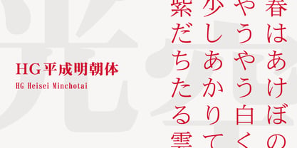 平成明朝体は、ワープロやDTPの普及にともなうフォント需要の高まりに対して供給が遅れていたため、文字フォント開発・普及センターの指揮のもと、製作された、本文用の明朝体です。デザインは、リョービイマジクスが担当。横組み適性を考慮し、視覚的重心が低めになっています。可読性のため、ふところは広めに、また、低解像度出力機での使用を考慮し、直線を多用したシンプルなデザインになっています。
 - Heisei Mincho N by Adobe,
$79.00 - Jensen Old Style by Wooden Type Fonts,
$15.00 Based on the original design of Nicholas Jenson 1470-76, this is a revival of one of the popular wooden type fonts of the 19th century. This font was also created in a slightly different version by William Morris circa 1890. Suitable for text.
 - URW Heisei Mincho by URW Type Foundry,
$99.99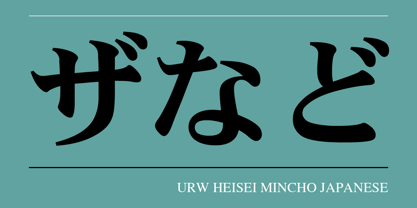
- Heisei Kaku Gothic by Adobe,
$39.00 - URW Heisei Gothic by URW Type Foundry,
$99.99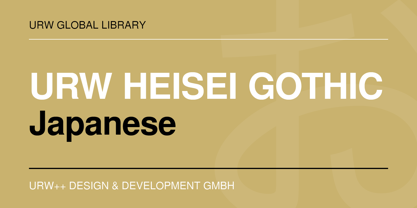
- Heisei Maru Gothic by Adobe,
$39.00 - Narnia BLL - Unknown license

- Chica Mono - Unknown license

- Shifty Chica - Unknown license

- Chico Stencil by Apply Interactive,
$30.00 - Dulce Chico by Good Java Studio,
$18.00 Dulce Chico is the perfect font for all your fun designs. The main font file is equipped with ordinary characters, as well as more than 350 glyphs to support most Latin-based languages. Everything is made with the same brush, and everything is the same size as Letter Kids, so you can be sure they will work well together! It is suitable for you to use in making t-shirt design, quote, label, packaging, logo type, or long writing. Because we have compiled kerning and matrices that are tailored to your needs. Dulce Chico features: - Fully coded PUA for full access to all characters - Multilingual Support
 - Chica Maravilla by Artisan Studio,
$16.00 Chica Maravilla is a work that is purely a result of handwriting, and has a natural characteristic. This is perfect for invitations, signatures, blogs, social media, business cards, product brands. OpenType features can be accessed by using OpenType smart programs such as Adobe Photoshop, Adobe Illustrator, Adobe Indesign, Corel Draw and Microsoft Office.
 - Cchicanos Personal Use - Personal use only

- Makeba Retro Funky Groovy by Beast Designer,
$15.99 Makeba Retro Funky Groovy Font is a fun and funky display font that brings back the spirit of the 70s. Its bold, rounded letters feature groovy curves and playful embellishments that exude a retro vibe. This font is perfect for creating eye-catching titles and headlines for posters, album covers, and other retro-inspired designs. The font’s energetic and upbeat personality is sure to make any project stand out.
 - The Some One Retro by Sipanji21,
$12.00 "The Some One" is a display font with a retro theme, featuring several alternative styles that can help elevate your designs. It is ideal for a wide range of design projects, such as car decals, t-shirt designs, or logos for retro-themed branding. With its unique and stylish appearance, "The Some One" adds a touch of nostalgia and sophistication to your designs. The font's retro feel makes it perfect for designs that require a vintage or classic look, while the alternative styles allow for flexibility and customization. Whether you're creating a bold and eye-catching design or a more subtle and understated one, "The Some One" is the font you need to make your designs truly exceptional.
 - Free Form Retro JNL by Jeff Levine,
$29.00 The titles and credits from the 1960 French film “Le Passage Du Rhin” (English release title: “Tomorrow is My Turn”)” are hand made in a free form bold alphabet resembling both cut paper and quickly sketched lettering. This avant garde style inspired the digital type revival, which is available in both regular and oblique versions.
 - LHF Retro Ricky Doohickies by Letterhead Fonts,
$29.00 LHF Retro Ricky transports you right into the groovy retro past. These 60’s-era Doohickies set includes over 85 panels and dingbats to enhance your designs. Save time recreating vintage logos and designs. Goes perfect with the LHF Retro Ricky Fonts, only available at Letterhead Fonts.
 - Hand Retro Sketch Times by TypoGraphicDesign,
$19.00 CONCEPT/ CHARACTERISTICS A serif typeface with modern and fancy handmade haptics. Take the 3 layers for unique designs and create many different variations. From light and warm outline (take the regular style), about heavy and pithy filling (take the bold style) till fancy and modern 3d shadows (take the 3d style). The combination of all 3 font styles = bulky design freedom. Game with it! Handemade sketched for display size. APPLICATION AREA The vintage but modern, the raw but friendly serif font »Hand Retro Sketch Times« with many language support (for a display font) would look good at headlines. Editorial Design (Magazine or Fanzine) or Webdesign (Headline Webfont for your website), party flyer, movie poster, music poster, music covers or webbanner. And and and… TECHNICAL SPECIFICATIONS Headline Font | Display Font | Serif Layer Font »Hand Retro Sketch Times« OpenType Font with 341 glyphs, alternative letters and ligatures (with accents & €) & 3 styles & 3 layers (regular, bold, 3d)
 - Rospi Clean and Retro by Typoforge Studio,
$20.00 Rospi Clean and Retro Family is two-element font inspired by the weekly "Tygodnik Ilustrowany” from the 1933.
 - KR Wedding Bells - Unknown license

- La Belle Aurore - Personal use only

- Martian Hull Markings - Unknown license

- KR Eight Ball - Unknown license

- KR Christmas Bells - Unknown license

- Bulk Weight JNL by Jeff Levine,
$29.00 Bulk Weight JNL is a stripped down version of Inline Square JNL (based on 1930s sheet music hand lettering) with the inline removed. What is left behind is a thick, bulky, ultra bold lettering style suitable for attention-getting headlines. Bulk Weight JNL is available in both regular and oblique versions.
 - Bill Corporate Medium by OGJ Type Design,
$35.00 Bill Corporate is a geometric typeface with generous capitals. A modern classic, based on Max Bill’s lettering work, its straightforward and uncompromising construction can be both edgy and sublime. With minimalist letterforms, pointy apexes instead of flat ones, and archetypal proportions, this font family doesn’t follow any trends but strives to achieve a timeless formal vocabulary. The skeleton of its letters is based heavily on the famous primary shapes of the Bauhaus: square, circle, and triangle. This makes for quite wide uppercase and much narrower lowercase letters. The contrast between uppercase and lowercase benefits inexperienced users, who will be able to get appealing results quickly. At the same time, it’s a powerful tool for seasoned designers, who can employ either case selectively to set the desired typographic course. Bill Corporate Medium’s 16 styles (including a set of eight lighter-than-light fonts from “Two” to “ExtraLight”) are an excellent choice for editorial design, branding, headlines, and even short to mid-length copy in a wide range of applications and industries. The uppercase letters in particular—with their varied widths and lavish dimensions—are suitable for cosmopolitan and stylish logotypes and wordmarks. Whenever a timeless, staid, and classy look is demanded, choose Bill Corporate.


