10,000 search results
(0.137 seconds)
- Revelio by ArimaType,
$14.00 Revelio is a cool, bold, retro-styled display font. This font is PUA encoded which means you can access all of the beautiful glyphs and swashes with ease! Add it confidently to your favorite creations and let yourself be amazed by the outcome generated.
 - Spooky Place by AEN Creative Studio,
$15.00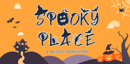 Spooky Place is a cool and quirky halloween display font. This font is PUA encoded which means you can access all of the glyphs and swashes with ease! Add it confidently to your favorite creations and let yourself be amazed by the outcome generated.
 - Begadul by Differentialtype,
$10.00 Begadul is an elegant serif font with a contrasting thickness, very suitable for displays such as titles, greeting cards, magazine covers, and many more. This font will be a great addition to your library, as it will make every design a true piece of art.
 - Hex by Hanoded,
$15.00 Hex is an uneven, spiky font with an evil twist. The glyphs look like they have been scratched onto paper (which is indeed the case), so it will be perfect for your scary halloween postcards or posters. Hex font comes with extensive language support.
 - Psychoscout by Absoluut Designers,
$30.00 Psychoscout is an initial cap font, originally developed for the Psychoscout record by Flat Earth Society (2006). In 2011 the font was updated for commercial use. It's highly recommended for headlines or posters. It can also be used as a stencil for decorating walls etc.
 - Gothic Herbarium by 2D Typo,
$32.00 Ornamental font based on the Gothic Revival ornaments developed by Augustus Pugin (1812-1852). This is a collection of ornamental plants and flowers arranged in a convenient font file that may be always at hand. Decorate your projects with high quality and interesting ornaments!
 - Delabasto by Seniors Studio,
$15.00 Delabasto is contemporary brush font, with the look of a stylish face. were painted on paper and carefully made into a font. can be used for stationery, fashion, logo, merchandise, books, clothing, magazines, cover artwork etc. Delabasto includes several ligatures, alternates and international support.
 - Tropical Sunday by Yoga Letter,
$18.00 "Tropical Sunday" is a brush font that is perfect for summer moments. This font is very simple because it has been specially designed. Equipped with uppercase, lowercase, numerals, punctuation, and multilingual support. Can be used for holiday moments, vacations, social media, stickers, posters, and more.
 - Fat Bubble by IbraCreative,
$23.00 Fat Bubble is a cute, cheerful and modern display font. Thick and friendly, this font will be an ideal choice for a wide range of casual, comic, kids book, and any informal designs. Use Fat Bubble for your creations and explore its endless possibilities.
 - Black Thunder by Letterafandi Studio,
$14.00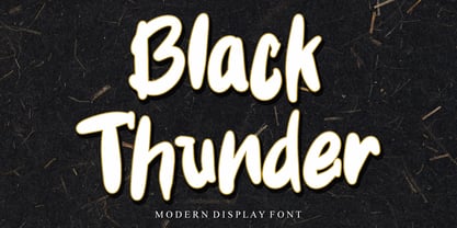 Black Thunder is a Modern and friendly brushed display font. This font is PUA encoded which means you can access all of the glyphs and swashes with ease! Add it confidently to your favorite creations and let yourself be amazed by the outcome generated.
 - Simply Conception by Muksal Creatives,
$10.00 Simply Conception is a unique and modern family of serif fonts. Simply Conception has 18 families Regular and italic font, starting from the small thin to the largest black. This typeface is versatile and can be used successfully in magazines, posters, branding, websites, etc.*
 - Sophi Sophi by Daylight Fonts,
$50.00 This is a modern-day interpretation of the 1930s font. With a wide range of alternates, you can create Art Deco and Bauhaus style typography in one piece. People who see it will be fascinated by the stylish and feminine look of the font.
 - Donaldina by Solotype,
$19.95This came from an early-1900s lettering book. Never was an actual font, but it has a quaint look that should be useful. We hate to see alphabets just fade away, which is why we make fonts like this. We added a few touches. - Trangher by Krafted,
$10.00 If you’re after a font that instantly catches the eye and makes your brand memorable, stylistic fonts are the way to go. Introducing Trangher - A Modern Stylistic Font. Whether you’re working on a magazine cover, a web page, or tackling a full rebranding project, Trangher can take your design to a higher level. Check it out and see the difference that a great font can make! What you’ll get: Multilingual & Ligature Support Full sets of Punctuation and Numerals Compatible with: Adobe Suite Microsoft Office KeyNote Pages Software Requirements: The fonts that you’ll receive in the pack are widely supported by most software. In order to get the full functionality of the selection of standard ligatures (custom created letters) in the script font, any software that can read OpenType fonts will work. We hope you enjoy this font and that it makes your branding sparkle! Feel free to reach out to us if you’d like more information or if you have any concerns.
 - Honest Sky by Nathatype,
$29.00 Show your lovely, unique points of view with this font script. Honest Sky is a script font made from handwriting to show modern, elegant designs to any of your designs. The letters are created in interconnected cursive styles with a lot of curved wipes. The lines’ proportions and thickness are consistent enough. Use Honest Sky for big-sized texts for a legibility reason. Enjoy the available features in this font. Features: Stylistic Sets Ligatures Multilingual Supports PUA Encoded Numerals and Punctuations Honest Sky fits for various design projects, such as posters, banners, logos, magazine covers, quotes, headings, printed products, merchandise, social media, etc. Find out more ways to use this font by taking a look at the font preview. Thanks for purchasing our fonts. Hopefully, you have a great experience using our font. Feel free to contact us for further information when you have a problem using the font. Thank you. Happy designing.
 - Honey Cages by Nathatype,
$29.00 Honey Cages is a lovely display serif font in thick weights to show friendly, expressive, motional, balanced nuances between functionality and creativity. Generally, the letter shapes are round with consistent heights and wide spaces. There are also curved wipes on some of the letters’ edges to add decorative styles. Use Honey Cages for big-sized texts for a legibility reason. This font comes with some lovely features for you to enjoy. Features: Stylistic Sets Ligatures Multilingual Supports PUA Encoded Numerals and Punctuations Honey Cages font fits for various design projects, such as posters, banners, logos, magazine covers, quotes, headings, printed products, merchandise, social media, etc. Find out more ways to use this font by taking a look at the font preview. Thanks for purchasing our fonts. Hopefully, you have a great experience using our font. Feel free to contact us for further information when you have a problem using the font. Thank you. Happy designing.
 - Cutoff Pro by URW Type Foundry,
$49.99 The first plain weight of Cutoff was designed in 2005 to be used in Miele, an independent Italian free magazine. The need was for an elegant, unusual and legible semi-serif with contemporary flavour. I was fascinated by the deconstructivist work of Jeff Keedy (Hard Times Thick), Phil Baines (Can You, You Can) and Otl Aicher (Rotis), so my aim was to get the feeling of a cut transitional typeface; at the same time felt the exigence to work on the whole shape of the glyphs, in order to soften the “90s deconstructivist” effect and obtain a more balanced and readable design. In the last years I further worked on the typeface adding the other styles, extending the character set and refining the letterforms. Finally the precious collaboration with URW++ brought in 2010 to a complete OpenType Pro font family, with multilingual and advanced typographic features. Fulvio Bisca, July 2010
 - Nova Quinta by Mans Greback,
$69.00 Nova Quinta is a breathtaking, enchanting formal script font that weaves an air of magic and sophistication into your designs. With its delightful swirls and exquisite swashes, this font radiates a lovely charm, perfect for adorning wine labels, farm produce packaging, and luxury branding. Imagine your design coming to life with the genuine elegance of Nova Quinta, transforming your work into an enchanting piece of art. The font's irresistible beauty and decorative allure make it a dreamy choice for projects that require a touch of refinement and grace. The Nova Quinta font family includes four mesmerizing styles to suit various design needs: Regular: A gracefully balanced, enchanting style Bold: A more assertive and captivating presence Italic: A whimsical dance of flourishes and movement Bold Italic: The perfect blend of boldness and flair Unleash your creativity with the advanced OpenType functionality of Nova Quinta. This font family ensures top-notch quality and provides you with full control and customizability. It includes stylistic and contextual alternates, ligatures, and other features to make your designs a vibrant, one-of-a-kind masterpiece. Nova Quinta embraces an extensive lingual support, covering all Latin-based languages, from Northern Europe to South Africa, from America to South-East Asia. It contains all the characters and symbols you'll ever need, including all punctuation and numbers.
 - Ombres by Typephases,
$25.00 Very close thematically and in style to the rest of our “whimbats” (the Absurdies, Bizarries, Illustries, Genteta and Whimsies series), the Ombres contain a number of peculiar silhouettes and illustrations of people that range from cute to scary, with everything in between. Ombres offers152 pictures in 3 files. These imaginary characters were produced with different techniques: quick pencil sketches, ink, watercolour, though once digitized and simplified to bring them into the font files there is little apparent difference. The silhouettes, rather than flat shadows are more dimensional in their look, because they have been digitized retaining the original brushwork or pencil strokes of their source drawings. Some of them remind of the venerable tradition of metal stock cuts from vintage type foundries. The digitized results are quite different, but the energetic nature of the subjects has been mantained. Their vectorial file format means you can use them at any size with no loss of quality. Every Ombres dingbat offers ready-made images for a variety of creative projects. They can be used as they come or easily customized in any graphics program. At small sizes they are ideal spot illustrations with a whimsical touch; at large sizes they can bring a whole page, a spread or even a big poster to live.
 - Quayside by Eclectotype,
$40.00 Quayside is a deliciously thick and bulbous baseball script, with a wealth of OpenType features. Features include: Contextual alternates - I would suggest having these on by default; they make letters connect more smoothly (uppercase letters like M and H, which are normally non-connecting for all-caps purposes, connect to lowercase letters. The swash variant of J, and all o and b characters connect to any e character at a lower junction for a smoother join). Contextual alternates also make sure special end-forms of lowercase letters are used at the ends of words. Ligatures - A nice collection of useful ligatures which make the text flow smoother. Swash - Gives you more exuberant capitals. Not recommended for all-caps usage! The swash function also gives a variation of the ampersand and turns # into a nice numero symbol. Oldstyle Figures - lining figures are default but with the flick of a switch in OpenType savvy applications, you get expressive oldstyle figures. Quayside is a versatile typeface. Depending on the mood you're after, it can easily be retro or modern, fun or (fairly) serious. I'm often pleasantly surprised by the wide variety of uses my fonts get put to, and I can't wait to see what you do with this one!
 - Fromage by Adam Ladd,
$25.00 Fromage is a modern and bold high-contrast sans serif that balances visual interest with restraint. Designed with Adam Ladd’s signature personality, Fromage has dramatically angled terminals and elongated stroke endings that lend both an elegant air and a dynamic rhythm, making it an obvious choice for fashion, beauty, or luxury branding. With horizontal rather than the sheared terminals, Fromage Alt offers a more classic and refined look, conveying touches of a traditional serif Didone.
 - Amstir by Craft Supply Co,
$15.00 Amstir is a timeless classic among serif typefaces, perfectly tailored for editorial use. With its elegant lines and refined presence, Amstir brings an air of sophistication to your content. Elevate your editorial projects with the grace and tradition of Amstir's distinguished design. This typeface is ideal for greeting card, packaging, brand identity, poster, or any purpose to make your design project look eye catching and trendy. Feel free to play with this typeface!
 - Song Plugger JNL by Jeff Levine,
$29.00 In the heyday of "Tin Pan Alley", a song plugger was one whose job it was to bring a publisher's song to the attention of performers, show producers and radio station executives; the forerunner of the promotion man who visited disk jockeys with new record releases in the hopes of getting them played on the air. Song Plugger JNL was based on hand lettering spotted on some late-1920s-early 1930s sheet music.
 - Jenriv by Linh Nguyen,
$25.00 Inspired by designs of the early Renaissance, Jenriv brings out a sedate atmosphere and generous inner spaces. Starting with the idea of mixing straightforward strokes and curves, it results in kind masculine figures, but calm and humble. It reminds some archaic air but a simplified one. Jenriv embraces text flows, multiple languages, and various styles with standard OpenType features. It is well adapted to various applications, from medium body text to large headlines, or logotypes.
 - Morison by Fenotype,
$35.00 Morison is an original but versatile serif family. With just about the right amount of personality and character, it can stand out when needed, but works equally well in everyday tasks where legibility is the key. The Morison family consists of separate stylistic ranges for display and text use. Each range comes in eight weights with corresponding italics. The display versions are sophisticated enough for tasks where a certain amount of extra elegance and flair are required, without compromising much on legibility. The text versions, however, are true workhorses, suitable for continuous texts in small sizes. All Morison fonts are equipped with handy Open Type features, such as built-in small capitals and multiple numeral styles.
 - Dry Erase by Zap Studio,
$20.00 This font is my first attempt at typeface design. It is based on my own handwriting and I tried to maintain the natural quality, where the letters are quite loose, some going in different directions, thickness and position. It has Open Type features including contextual alternatives, stylistic sets and ligatures. Trying to maintain natural quality of handwriting each glyph has four styles which randomly appear when you type. For example, when there are double letters, the two letters are slightly different. You may also switch off the random feature and use the four styles on their own. The many alternates are best activated in OpenType-aware programs, such as Word 2010, Illustrator CS4+, InDesign CS4+ and QuarkXpress 7+.
 - Supra Mezzo by Wiescher Design,
$29.00 »Supra Mezzo« – designed by Gert Wiescher in 2012/13 – is an unusual addition to the Supra family, a weight in between the normal and the condensed width. This cut comes in very handy if you need to put lots of text into a relatively small space without loosing readability. The compactness with great legibility makes Supra Mezzo absolutely unique. The light and normal weights and the dominant x-height with its high ascenders make for easy reading of long copy. The heavy and x-light weights are great for elegant headlines. Supra is an OpenType family.
 - Monotype Clearface Gothic by Monotype,
$29.99Clearface Gothic first appeared in 1910, designed by Morris Fuller Benton, the world-famously prolific typeface artist. In addition to Clearface Gothic, Benton also designed classics like Franklin Gothic, Century Expanded, and many other types. Clearface Gothic is a sans serif face with light forms displaying the Zeitgeist of the turn of the 20th century. Distinguishing characteristics are the open forms of the a" and "c," the arched "k," and the upward-tilting horizontal stroke of the "e." The relatively narrow typeface, with its open inner white spaces, is extremely legible even in small point sizes. There is no accompanying italic." - Montix by Linotype,
$49.00Montix is a narrow, constructed type family that developed by the German designer Diana Fischer in 2003. With five weights (light, light italic, regular, regular italic, and bold), Montix is a particularly effective small family, especially when used for headline or display purposes. Montix's letterforms have relatively long ascenders and descenders, which compared with its horizontally compact body gives it its unique style. Words or lines of text set in Montix would look best when some amount of white space is left around them. Because of this, the faces are well suited for logos and corporate identity uses. - FP København Sans by Fontpartners,
$35.00 Copenhagen has been in need of a typeface that unites the city’s many visual expressions. The three designers Morten Rostgaard Olsen, Henrik Birkvig and Ole Søndergaard have designed and developed the typeface FP København. Now available from MyFonts in 44 styles: Serif & sans serif, uprights & italics, small caps, pictos-characters, stencils, sprayed style, OT-features, ligatures, contextual alternates etc. The shapes of the letters are inspired by the city’s culture and the visual environment and design in Denmark in the 20th century. It is relatively low and wide as the city itself and with rounded corners that give it a warm visual mood.
 - Capital by Fenotype,
$19.00 Capital is a multifunctional super family with modernist roots. It is comprised of two distinct subfamilies: Gothic and Serif. Both share the same structure and proportions and come in seven weights – thin, light, regular, bold, extra bold and black, along with corresponding italics. Both Capital families are equipped with a full set of Cyrillic characters, making them a versatile choice for multinational use. All Capital fonts come with the following Open Type features: Small Caps, Old Style Figures, Fractions, Numero-sign & Ligatures. Features specific for Gothic roman versions only are Circle Numerals, Titling alternate for the R character and Arrows. The Gothic italics have a Titling alternates feature where the true italic forms are omitted and replaced with simpler stroke endings. Both Capital gothic and Serif families are true workhorse fonts that can carry out almost any typographic task. Combine them both for the best results – multi-pack available for a no-brainer price.
 - Vogan by Heinzel Std,
$9.00 Vogan Typeface is a versatile font that comes in both regular and outline versions, both of which are in all capital letters. The regular version of the Vogan typeface features solid, bold characters that are perfect for making a statement. The letters are clean and well-defined, making them highly readable and suitable for a variety of design projects. Whether used for headings, logos, headlines, magazines, posters, or other creative applications, the regular version of Vogan Typeface commands attention with its bold and impactful appearance. In contrast, the outline version of Vogan Typeface provides a different aesthetic. The characters in this version are defined by their outer contours, creating a stylish and modern look. The outline font maintains the overall shape of the letters while allowing the background to show through the center, adding a touch of sophistication and creativity to any design. This version is particularly popular for design projects where a contemporary and edgy vibe is desired.
 - Ongunkan South Picene by Runic World Tamgacı,
$50.00 South Picene (also known as Paleo-Sabellic, Mid-Adriatic or Eastern Italic) is an extinct Italic language belonging to the Sabellic subfamily. It is apparently unrelated to the North Picene language, which is not understood and therefore unclassified. South Picene texts were at first relatively inscrutable even though some words were clearly Indo-European. The discovery in 1983 that two of the apparently redundant punctuation marks were in reality simplified letters led to an incremental improvement in their understanding and a first translation in 1985. Difficulties remain. It may represent a third branch of Sabellic, along with Oscan and Umbrian (and their dialects), or the whole Sabellic linguistic area may be best regarded as a linguistic continuum. The paucity of evidence from most of the 'minor dialects' contributes to these difficulties. The corpus of South Picene inscriptions consists of 23 inscriptions on stone or bronze dating from as early as the 6th century BC to as late as the 4th century BC. The dating is estimated according to the features of the letters and in some cases the archaeological context. As the known history of the Picentes does not begin until their subjugation by Rome in the 3rd century, the inscriptions open an earlier window onto their culture as far back as the late Roman Kingdom. Most are stelai or cippi of sandstone or limestone in whole or fragmentary condition sculpted for funerary contexts, but some are monumental statues.
 - Gelato Luxe by Eclectotype,
$60.00 Back in 2011, Gelato Script was the best-selling brush script font on MyFonts, and has remained popular, appearing on everything from designer handbags to primetime TV shows; from food blogs to wedding invitations; from glossy magazines to (not so imaginatively!) ice cream shops. All these years on, and it struck me that there is much that could be improved on; there are certain glyphs that never quite felt right. So I decided to update Gelato Script, and this is the result, Gelato Luxe. What started as a simple update quickly spiralled into a total overhaul. There is not a single glyph in the new version that’s the same. The entire font has been tweaked and tinkered with and redrawn and respaced and rekerned to get it to this point. While I wanted to maintain the feel of Gelato Script, Gelato Luxe represents a massive leap in sophistication, with new alternates for smoother connections, and a totally new OpenType engine, with no fewer than seventeen stylistic sets. Gelato Luxe is a truly versatile script font. You can effortlessly change the feel by playing with the many OpenType features. Make sure contextual alternates and standard ligatures are switched on, and it will work like a charm right out of the box. See also Gelato Fresco for a further updated version, this time with extra weights!
 - Ciclamino by TrueBlue,
$16.00 “Ciclamino” is the Italian name for a small, elegant forest flower with a sweet but strong fragrance. This font is inspired by the peculiars characteristics of this flower, to the elegant shapes of the petals and its intense fragrance but sweet and refined. The result is a font with a particularly incisive but elegant layout suitable for high-impact graphic projects with a modern and decisive flavor but with a note of balanced elegance. There are no limits to the situations in which you can use it to give a touch of originality to your graphic creations but there are some project categories in which it could be a choice of great visual impact and help you express all your creativity. The particular can give excellent results in all those situations that have a flavor of modernity, and innovative technology and express innovation and dynamism and decision. At the same time, its decisive and sinuous lines also adapt to situations with a gothic and fantasy relish and even to tribal graphics. But this is just a minimal list of situations in which it can express its potential, it is a very versatile font and you can find a lot of other situations in which its use can make a difference and help you obtain an original result with a great visual impact.
 - DINfun Pro Removed by CheapProFonts,
$10.00 A collection of DIN Mittelschrift variants where parts of the letters have been removed to create different effects. The Plain font is included if you buy the family pack, and can be mixed in. The DINfun Pro fonts are special versions of the classic DIN 1451 Mittelschrift, far removed from the original typeface's serious and no-nonsense roots. I have made them as companions to the classic, with some some very different expressions, complete with a large multilingual character set. Time to spice up that DIN profile! :) ALL fonts from CheapProFonts have very extensive language support: They contain some unusual diacritic letters (some of which are contained in the Latin Extended-B Unicode block) supporting: Cornish, Filipino (Tagalog), Guarani, Luxembourgian, Malagasy, Romanian, Ulithian and Welsh. They also contain all glyphs in the Latin Extended-A Unicode block (which among others cover the Central European and Baltic areas) supporting: Afrikaans, Belarusian (Lacinka), Bosnian, Catalan, Chichewa, Croatian, Czech, Dutch, Esperanto, Greenlandic, Hungarian, Kashubian, Kurdish (Kurmanji), Latvian, Lithuanian, Maltese, Maori, Polish, Saami (Inari), Saami (North), Serbian (latin), Slovak(ian), Slovene, Sorbian (Lower), Sorbian (Upper), Turkish and Turkmen. And they of course contain all the usual "western" glyphs supporting: Albanian, Basque, Breton, Chamorro, Danish, Estonian, Faroese, Finnish, French, Frisian, Galican, German, Icelandic, Indonesian, Irish (Gaelic), Italian, Northern Sotho, Norwegian, Occitan, Portuguese, Rhaeto-Romance, Sami (Lule), Sami (South), Scots (Gaelic), Spanish, Swedish, Tswana, Walloon and Yapese.
 - Sketchnote by Delve Fonts,
$29.00 The Sketchnote typeface was born of necessity: designer Mike Rhode needed a series of hand-drawn fonts to illustrate and produce his book, “The Sketchnote Handbook.” Because of its origin, this typeface was designed to be practical and convey the human character and quirks of his normal handwriting and hand-drawn lettering. The family is comprised of five fonts: Sketchnote Text in Regular, Bold, and Italic, the somewhat compressed and bold Sketchnote Square for headlines, and the playful Sketchnote Dingbats. Sketchnote Text is a casual script with a slightly bouncy baseline. In order to mimic the differences present in natural handwriting, OpenType features are built-in that automatically switch between multiple versions of each letter or number. In total, over 240 alternates in each of the text fonts are employed, making for a more authentic appearance. The warm texture of Sketchnote is the result of actual ink-spread on paper captured in the scans of written letterforms and was intentionally left intact during the digitization process to preserve that feeling. Rhode created Sketchnote Square as a display type to complement Sketchnote Text. Drawn instead of written, the letters often have neat little happenstance voids within the strokes. Sketchnote Dingbats features a selection of icons, rules, and arrows to provide some functional and fun tidbits, handy for bringing additional life to any design.
 - DINfun Pro Grunge by CheapProFonts,
$10.00 A collection of DIN Mittelschrift variants with some typical grunge style treatments. The Plain font is included if you buy the family pack, and can be mixed in. The DINfun Pro fonts are special versions of the classic DIN 1451 Mittelschrift, far removed from the original typeface's serious and no-nonsense roots. I have made them as companions to the classic, with some some very different expressions, complete with a large multilingual character set. Time to spice up that DIN profile! :) ALL fonts from CheapProFonts have very extensive language support: They contain some unusual diacritic letters (some of which are contained in the Latin Extended-B Unicode block) supporting: Cornish, Filipino (Tagalog), Guarani, Luxembourgian, Malagasy, Romanian, Ulithian and Welsh. They also contain all glyphs in the Latin Extended-A Unicode block (which among others cover the Central European and Baltic areas) supporting: Afrikaans, Belarusian (Lacinka), Bosnian, Catalan, Chichewa, Croatian, Czech, Dutch, Esperanto, Greenlandic, Hungarian, Kashubian, Kurdish (Kurmanji), Latvian, Lithuanian, Maltese, Maori, Polish, Saami (Inari), Saami (North), Serbian (latin), Slovak(ian), Slovene, Sorbian (Lower), Sorbian (Upper), Turkish and Turkmen. And they of course contain all the usual "western" glyphs supporting: Albanian, Basque, Breton, Chamorro, Danish, Estonian, Faroese, Finnish, French, Frisian, Galican, German, Icelandic, Indonesian, Irish (Gaelic), Italian, Northern Sotho, Norwegian, Occitan, Portuguese, Rhaeto-Romance, Sami (Lule), Sami (South), Scots (Gaelic), Spanish, Swedish, Tswana, Walloon and Yapese.
 - Flintlock by CozyFonts,
$25.00 The Flintlock Font Family has a Bold personality. The 'Rough' version of the Flintlock Font has a hand-carved or hand-etched edge, carefully crafted for each of over 300 glyphs. Caps, lower case, all numbers, fractions, accents and European characters that work in over 70 languages. 'Classically Built with a Vintage Flair'. Vintage in the American West Tradition that might have been forged and implemented from the 1860s through the 1930s and consequently fresh again. Flintlock Rough can be envisioned on many things dated from 1860 to present day. The font is available in 3 basic weights as of this release date. There are other versions on the drawing board... Flintlock Rough works extremely well with Posters, Branding, Movie Titles, Invites, Stationary, Signage, Embroidery, Letterpress, Ads, Logos and anything that feels Industrial or Hand-Crafted, eg. Coffee, Breweries, Antiques, Woodcuts, Western Styles, Sports Styles, Holidays, Menus, and more. Flintlock Flat & Flintlock Flat Italic are the siblings to Flintlock Rough without the hand-carved edge but rather clean with slightly rounded corners and edges. Extremely Legible, Bold and best used in all the same application descriptions mentioned above and more, specifically contemporary uses and settings, eg. Sports, Titles, Branding, Headlines, Logos and more. Curiously the Flat & Italic versions of Flintlock work extremely well in 1960s and 1970s settings.
 - Amorie by Kimmy Design,
$12.00 Amorie is a tall and skinny hand drawn font. It comes in various weight and styles, and with an array of opentype options. Built to appear completely hand crafted, different designers could produce completely different results, selecting either Modella (classic and chic), Nova (fun and fancy) or SC (Small Caps and all business.) Each style comes in light, medium and bold and has an accompanying italics version. Opentype for this font includes Contextual Alternatives, which produces three versions of each character, making sure no two identical letters appear next to each other thus giving your design a fully authentic look. There are also stylistic alternatives, which offer different style to a select few characters, including capital letters: A, K, R, Q, Y and lowercase letters: a, e, k, t, y. Lastly, is a large set of swashes, 3 for each letter they accompany. For the most part this includes the whole uppercase alphabet as well as lower case letters with an ascender or descender. Amorie includes a large set of graphic extras, including stylish frames, arrows, line breaks, corners, flourishes and more. The complete package gives you one unbeatable font family. If you do not use Opentype but are using a program that includes a full glyph panel, you will be able to access each of the style variations you want.