9,017 search results
(0.021 seconds)
- Rotato Sans by VIP Graphics,
$8.49 Rotato Sans is a geometric sans-serif typeface that brings a fresh, modern look to any design. This minimalist but distinctive font is defined by its crisp composition and symmetrical elements — designed for optimal legibility at all sizes. Available in three different weights, Rotato leaves an understated impression of elegance & futurism! Currently available in three standard weights (more coming soon): Rotato Sans Bold – Strong and futuristic Rotato Sans Regular – Clean and crisp Rotato Sans Light – Elegant and modern FEATURES Three (3) Font Weights + Italics Numbers & Punctuation Special Characters Rotato Sans is a dynamic font that works great across various applications: from branding & logos to technology & fashion — whether in a giant heading, or paragraphs of body text.
 - Marlowe by FaceType,
$30.00 If you are looking for a unique typeface with a light and pure elegance, Marlowe will be your choice. Marlowe is the rat pack of fonts: Regular is perfect for headlines and subtitles, while the expressive Escapade, Swirl and Cocktail styles are charming display fonts. All four provide an extended set of capitals, small caps and lower case characters. Please take a close look at the elegant alternate letters for A, E, K, M, N, O, Q, R, W and g – there are even three kinds of ampersands to choose from. Altogether Marlowe offers amazing 25 alternates and 74 discretionary ligatures, while Marlowe Swirl has additional 26 automated ligatures. Make sure you use applications supporting all these lavish OpenType features.
 - Titul by ParaType,
$30.00 Titul is a display typeface with strong historical connotations. It is based on a series of stylish lettering for book covers, designed by Russian graphic artist Alexander Leo in the 1920s. The historical reference for him was book design of the 1st half of the 19th century. Type family consists of four ornamented and three basic styles: one solid, one inline and one striped. All seven faces have corresponding oblique styles. Also, there is a beautiful vignette font and a style for constructing ornamental borders. Titul suits best for vintage spirited typography, from the 19th to early 20th century. It is perfect for book covers, theater posters, packaging and greeting cards. Typeface was created by Isabella Chaeva and released by Paratype in 2020.
 - Martin Crantz by Proportional Lime,
$9.99 Martin Crantz (or sometimes Krantz) of the three, including Ulrich Gering and Michael Friburger, that set up a press at the Sorbonne in 1470 was likely the fellow who had the technical know how how to cast the type itself, hence the name of this new face that is based on his work. This font has been expanded to meet the demands of modern day use but it also contains a number of specialized glyphs that allow for the recreation of text in the manner of his day with such characters as the -rum abbreviation and other handy Renaissance oddities. Since this face was designed prior to 1501 there is no italic variant in keeping with the spirit of historical accuracy.
 - Transitore by PintassilgoPrints,
$- Transitore is a lively hand-drawn font with loads of alternates and ligatures which, managed by advanced OpenType features, help create a convincing handcrafted look. The contextual alternates feature automagically substitute glyphs, providing a cool random effect, while the discretionary ligatures feature bring on witty interlocks and curly elements. Turn on both and multiply the possibilities! But wait; there's more! This font also brings a handy set of swashes for adding that extra special touch. And yet, there are three supplementary fonts: Transitore Color A and Transitore Color B work as stackable layers for easily adding colors, while Transitore Splashes generate irresistible splashes of ink. This family is a smart and complete toolbox that offers endless ways to style your text compositions. Enjoy!
 - Holy Grail by Comicraft,
$29.00 GOOD GOD! You have circumnavigated the globe and chosen wisely...The Grail is FOUND! Oh... no, Zoot set light to our beacon, which I've just remembered is Grail-shaped. But wait, look! There! Carved in the wall... a Legend: "Here may be found the last words of Joseph of Aramathia: He who finds the Grail must face three, maybe four, challenges. First, the path of God; Second, the word of God; Third, the breath of God, and fourth is the Font of God. Only a font that is valiant, pure of spirit and includes international characters, both European AND Cyrillic -- may find the Holy Grail... in the Castle of AARRGGGHHH… That's all it says; the guy carving it must have died before he could finish.
 - Senlot Serif by insigne,
$29.00 Senlot Serif is a follow-up to the technical yet elegant sans serif Senlot . In this serif edition, the original’s calligraphic tension shines through, with a moderate amount of contrast. Moreover, you can use Senlot Serif to set large amounts of text or for titling. It has a special calligraphic tension, and lends itself to luxury and design work of high quality. There’s a full set of small capitals and titling capitals and a real italic. Including thin to heavy, there are nine weights and three widths. Also included are a full set of OpenType features, super and subscript, old style numbers, and expanded Latin with support for more than 72 languages. For your next luxury campaign, the new rich text is Senlot Serif.
 - Spire by GroupType,
$19.00 Originally designed by Sol Hess for the Lanston Monotype Foundry in 1938, this revival was designed by Ann Pomeroy in the early 90s. Spire is a condensed serif with a very 1930s retro look. PLEASE NOTE: Each Spire font (Regular, Extra Light and Monoline) include a companion Expert font in the download. The Experts feature several alternate glyphs. The Family includes three Styles and three Expert styles. 6 fonts all together.
 - Natalya by insigne,
$24.99 Natalya is a flashy and rhythmic script. The script has more space between characters than most for better legibility, and the basis point for the ornate swirls is the golden ratio. This makes for an especially harmonious typeface with timeless appeal. The typeface includes three alternates with variations of the ascenders and descenders. All three fonts include OpenType ligatures, oldstyle figures and ending swashes for an even more elaborate appearance.
 - Choco Bold by Ardyanatypes,
$19.00 Chocolate is a lovely and delicious food; many people almost love chocolate. As well as sweet, pleasing to the eye fonts, making all designs look elegant and fun. To introduce it, there is Choco Bold, a typeface designed for sweet and cheerful design needs. Choco Bold has a firm impression that makes it easy to use for all conditions, such as business cards, book covers, branding, food packaging, and much more that Choco Bold can do. Choco Bold also comes with various ligatures and alternatives to give different styles and supports all languages. So feel free to use it.
 - Neue Augenblick by Harmnessless Type,
$40.00 Neue Augenblick is a modern contemporary Germany-esque grotesk. This Font face carries a powerful mechanical and industrial feel, it is inspired by aesthetic personality of beautiful Panzerkampfwagen and Post-war Brutalist Architectural. There are ten weights, ranging from Thin to Black, each with oblique italics and plenty of alternates. Neue Augenblick comes with attention-grabbing ink traps make it feels more contemporary. Various opentype features from stylistic alternates, multilingual extended latin support, ligatures, discretionary ligatures, fractions, arrows, scientific numerals, catchwords set, icons and more. Neue Augenblick is suited for embrace both maximalism or minimalism design works for designers to play with.
 - Schoeffer by Proportional Lime,
$14.95 Peter Schoeffer was a printer who was apprenticed to Gutenburg and after leaving Gutenburg in 1455 he set up shop with Facob Fust. His son, Peter the Younger, moved to Mainz and carried on the trade. This particular font is based on a typeface of Peter the Younger that was cut circa 1509-1520. This font has over 900 characters. While there are only about 80 in the historical exemplar the rest have been developed for modern usage. This font is based on Typ.7:146/148G also known as Gesellschaft für Typenkunde plate no. 258.
 - ChromosomeLight - Unknown license

- ChromosomeHeavy - Unknown license

- Social Gathering JNL by Jeff Levine,
$29.00 Social Gathering JNL is modeled from the Art Deco hand-lettered title of a vintage piece of sheet music entitled "Three of Us".
 - Azote by Thomas Jockin,
$30.00 One line, two lines, three lines. Inspired by the 1968 Mexican Olympics, Azote is a multiline typeface family that adds lines for weight.
 - immoral - Unknown license

- Trappers And Traders by chrismetcalfe,
$25.00There is something fun about western type. And there is something fun about hand drawn type. Put them together and.... Tada. - Terfens Contrast by insigne,
$35.00 Terfens draws influence from chancery scripts, updating it for the twenty-first century. Terfens Contrast is derived from Terfens' DNA and retains its humanist tone. It’s tall x-height gives it a friendly but not informal feel. With Terfen Contrast, calligraphy-inspired letterforms are rendered with a high contrast nib, lending raw vitality and expressivity. This juxtaposition gives the letters a sense of firmness and energy, but also of heavenly, delicate beauty. Terfens is a full-service branding and packaging solution, containing a lot of personality, combining the passion of a broad nib pen with the beauty of a brush. Terfens is a "workhorse typeface" comprising 48 typefaces in three widths and eight weights. There are ligatures and swashes in all weights, as well as support for more than 72 languages. Another powerful typeface to add to your collection of eye-catching fonts. Terfens draws influence from chancery scripts, updating it for the twenty-first century. Terfens Contrast is derived from Terfens' DNA and retains its humanist tone. It’s tall x-height gives it a friendly but not informal feel. With Terfen Contrast, calligraphy-inspired letterforms are rendered with a high contrast nib, lending raw vitality and expressivity. This juxtaposition gives the letters a sense of firmness and energy, but also of heavenly, delicate beauty. Terfens is a full-service branding and packaging solution, containing a lot of personality, combining the passion of a broad nib pen with the beauty of a brush. Terfens is a "workhorse typeface" comprising 48 typefaces in three widths and eight weights. There are ligatures and swashes in all weights, as well as support for more than 72 languages. Another powerful typeface to add to your collection of eye-catching fonts. • Recommended uses: modern branding and logo design, powerful editorial design, exciting packaging, and a wide range of additional jobs. • 54 font styles, including eight weights, eight italics, and three widths. • Each weight has 500+ glyphs. Useful Opentype features include: Access All Alternates, Discretionary Ligatures, Denominators, Fractions, Kerning, Standard Ligatures, Lining Figures, Numerators, Oldstyle Figures, Ordinals, Scientific Inferiors, Subscript and Superscript.
 - Walbaum Antiqua Pro by RMU,
$40.00 Walbaum Antiqua Pro is an RMU redesign of a German font classic, with three different number forms and small caps throughout all font styles.
 - Raskal by PizzaDude.dk,
$20.00Yiehar! Woohee! This is a funky and chunky wild west PizzaDude font! Buy all three versions at once and save a fistful of dollars! - Sketchimpact by Librito.de,
$12.00 The design for the font “sketchimpact” is based upon the typeface Impact. The font family consists of three different versions: solid, outline and lines.
 - ASTYPE Ornaments Wine Grape A by astype,
$28.00 WineGrape uses the following OpenType features to set up to three different color layers: - Small Caps / changing direction - Superscript/Superior (Grapes) - Subscript/Inferior (Leafs)
 - Lyra by Canada Type,
$39.95 Lyra is an Italian Renaissance script that might have developed if metal type had not broken the evolution of broad pen calligraphy. It lies in the area between the humanist bookhand and the chancery cursive, combining the fullness and articulation of the Roman letters with a moderate italic slant and condensation. A steep pen-angle allows use of a broader pen relative to the x-height, giving the letters more contrast with light verticals and heavy curves. Lyra embodies the Renaissance spirit of refining technical advances of the late middle ages with reintroduction of ancient classical principles. Based on the moving penstroke with constantly changing pen-angle, it brings the vitality of handwriting to the ordered legibility of type. Lyra is a formal italic, too slow for copying books. By eliminating the element of speed, digital technology opens up a new level of calligraphy, bringing it into the sphere of typography as would naturally have happened if metalworkers had not controlled the process. If classical Western traditions are respected, digital calligraphy has the potential to recapture the work of the past and restart its stalled evolution. There is of course no substitute for the charm of actual writing, with each letter made for its space; but the tradeoff is for the formal harmony of classical calligraphy as every curve resonates in tune with every other. This three-weight font family marks Philip Bouwsma's much-requested return from a three year hiatus. It also reminds us of his solid vision in regards to how calligraphy, typography and technology can interact to produce digital beauty and vesatility. Each of the three Lyra fonts contains almost three character sets in a single file. Aside from the usual wealth of alternates normally built into Bouwsma's work, Lyra offers two unique features for the user who appreciates the availability of handy solutions to subtle design space issues: At least three (and as many as six) length variations on ascending and descending forms, and 65 snap-on swashes which can be attached to either end of the majuscules or minuscules. The series also offers 24 dividers and ornaments built into each weight, and a stand-alone font containing 90 stars/snowflakes/flowers, symmetric contstructs for building frames or separators, masking, watermarking, or just good old psychedelia.
 - Sunny Sam by Mans Greback,
$39.00 Sunny Sam is a fun handwritten typeface. It was drawn and created by Måns Grebäck during 2019 and 2020. The movements of this happy script font represents optimism and vivacity. Sunny Sam comes in three high-quality styles: Thin, Medium and Bold. The three weights works great as complements to one another. It has an extensive lingual support, covering European Latin scripts. Sunny Sam contains all characters you'll ever need, including all punctuation and numbers.
 - Modulair by Beware of the moose,
$17.99 Modulair is a dot matrix based font with nice typographic features. Various figures, complete punctuation and small caps in three weights makes the Modulair a very usable font for subtile typographic solutions or headlines. Since autumn 2023, the Modular has been expanded with italics in three weights. The first sketches were made in 1979 on my father's Olivetti typewriter. Forty years later I used these sketches as the basis for the Modular.
 - GR Milesons by Garisman Studio,
$23.00 GR Milesons | Artdeco Typeface Milesons is a very interesting font, which has been inspired by Art Deco art. It is formed from very careful lines with stylistic set and ligature features. Milesons has 300+ glyphs consisting of three styles: Milesons One, Milesons Two and Milesons Three. Suitable for any graphic design projects, prints, logos, posters, t-shirts, packaging and applicable for some types of graphic design. Milesons is compatible with any software without any pain.
 - Perfume by Fenotype,
$25.00 Perfume - a luxurious display pack. Perfume is a display combo pack of three styles and eight fonts. Perfume fonts are soft and clean and they have a distinguishable character. Perfume Pen is a monoline script with three weights and large x-height. Perfume Pen is equipped with automatic Contextual Alternates that keep the connections smooth. In addition Perfume Pen has Swash, Stylistic and Titling Alternates, boasting over 500 glyphs in total. Perfume Brush is a bold brush script with two weights. Perfume Brush is also equipped with Contextual Alternates to keep connections smooth and Swasha lternates for more imposing character forms. Perfume Sans is a sturdy all caps Sans with three weights. For the best price purchase the whole pack!
 - Corsica by AVP,
$19.00 Corsica is an all-purpose geometric sans-serif typeface of visually uniform stroke thickness. The design seeks to be reminiscent of classic 20th Century grotesques with a crisp modern appearance and opentype features that are now expected. Coverage includes most Roman languages, Greek and basic Cyrillic. Each font contains a standard set of features including fractions, small capitals etc. The family contains six weights, two widths and three lowercase size options, together with an italic variant for each. The are three standard 4-font families for each size variant and a further three corresponding families for Condensed versions. The versatility provided by this extensive family has many useful applications. In particular, the choice of small, medium and large lowercase letter sizes (SX, MX, LX) allows designers to select an appropriate style for suitable impact and legibility in different situations such as headlines, captions, signage, web menus etc. Although each of the three size options will work equally well in most situations, the middle size (Corsica MX) would generally be the preferred choice for lengthy texts.
 - Ares by Adam Jagosz,
$15.00 Ares is a crisp all-caps display typeface suitable for sci-fi logos and titles. It owes its peculiar futuristic vibe to angular, top-heavy letters that hang from the cap-height instead of sitting on the baseline. The typeface consists of six subfamilies available in 10 weights, as well as as two variable fonts of three axes: Weight [wght], ranging from 1 to 1000, Mid-height [MHGT], ranginf from 0 to 1000, Tracking [TRAK], ranging from 0 to -40. The mid-height axis affects the typeface's waistline, including crossbars, and divides the fonts into three subfamilies: Ares Lo, Ares, and Ares Hi. These three families are solid-stroked, and the other three families are their stencil-stylized counterparts: Ares Broken Hi, Ares Broken, and Ares Broken Lo. The tracking axis is only available in the variable versions, and proportionally affects the kerning, thus helping set the type more tightly without effort. Ares supports a wide range of Latin-based orthographies, including not only European, but also Vietnamese as well as major African languages like Hausa, Fula or Ewe.
 - Rospo Wood by Typoforge Studio,
$30.00 Font Rospo-Wood is two-element font inspired by the weekly "Tygodnik Ilustrowany” from the 1933. Font has three alternative glyphs that are automatically replaced.
 - Gusto by Device,
$39.00Gusto comes in three related variants that go from hot-dog to melted chocolate, a gastronomic combination not to be passed up (or thrown up). - Delightful by Jessie Makes Stuff,
$12.00 Delightful is a whimsical and cheerful handwritten font family of varying weights and widths. This typeface is like if Comic Sans had a cousin who studied abroad one summer and now wears scarves to look more grown up, even though inside she's still the same, sweet marshmallow she always was. The letters were inspired by my handwriting on a good day - slowed down, legible, and intentionally drawn. I even threw in some of my favorite doodles as alt characters because the set wouldn't be complete without them. And the name was inspired purely by how it feels when I see it - and by my word of the year, delight. Delightful is ideal for anyone who wants to include a bit more warmth and a personal touch with their messaging. It's friendly and non-threatening, and will enhance personal projects or professional ones alike - whether you're a designer, an Instagram influencer, or you need to create some flyers for the local Mom 'n Pop Shop. There are two versions of this font. The original style is slightly more rounded and gets chubbier as you increase its boldness, and the stretched style is like a condensed version, except it's been stretched taller rather than squished narrower. I hope you delight in it as much as I do!
 - Janda Happy Day - Personal use only

- Lunanic by Ingrimayne Type,
$9.00 Lunanic is a geometric novelty typeface family with a touch of graffiti. The letters are formed from a circle with a notch or nick taken out, a shape that reminds me of a partial lunar eclipse. Half of the family have the nick on the left and half on the right. The faces are monospaced and so tightly spaced that there is no space between most of the letters so the filled styles cannot be used alone without tweaking. There are several ways to tweak them to make them readable: adjacent letters can be colored differently, the characters spacing can be increased, or an outlined style can be layered on top of the filled letters. The family does not have a true lower case. Most of the characters in the lower-case slots are alternates for those on the upper-case keys and they can be mixed in whatever way the user finds best. The family has twelve members: two orientations with three weights each and each of these six has an outline style to go with it. Lunanic is fun, bizarre, weird, and obviously a decorative display font.
 - Skuul by Typoforge Studio,
$28.00 The inspiration for the designing of the font Skuul was Letraset in 1981. Font Skuul, for each character has three alternative characters with their automatic replacement.
 - VVDS The Dickens Tale by Vintage Voyage Design Supply,
$10.00 The Dickens's Fairytale – it's a new chapter of VVDS products - The collections of fancy display fonts which will include many typefaces that will be perfectly combined not only with each other, but also with other collections of this series. As a result, you will get a large collection of beautiful fonts and graphics that will help you create beautiful designs without having to look for anything else. All these collections are inspired by classic books design of XIX and XX centuries like Franklin's Library Classic Collection and modern publishing houses like Barnes & Nobel Collectible Editions. This collection is the first one and including 12 font files. The Serif presented in two styles - cutted and normal. The cutted style has two weights - Regular and Bold. Also, there are two types of shadows - block and offset. Plus decor for cutted serif. The cherry on top - curly calligraphic Script with Swirl calligraphy elements for decoration. The both of types has many Open Type Features as Oldstyle Figures, Fractions, Stylistic Alternates and ending lowercase letters for script. • OTF & WEB • Multilingual
 - MC Dippie by Maulana Creative,
$18.00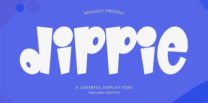 Dippie cheerful display font. Heavy stroke, fun character with a bit of ligatures. To give you an extra creative work. Dippie cheerful display font support multilingual more than 100+ language. This font is good for logo design, Social media, Movie Titles, Books Titles, a short text even a long text letter and good for your secondary text font with script or serif. Make a stunning work with Dippie cheerful display font. Cheers, Maulana Creative
 - MC Coolbass by Maulana Creative,
$22.00 Coolbass cheerful display font. Heavy stroke, fun character with a bit of ligatures. To give you an extra creative work. Coolbass cheerful display font support multilingual more than 100+ language. This font is good for logo design, Social media, Movie Titles, Books Titles, a short text even a long text letter and good for your secondary text font with script or serif. Make a stunning work with Coolbass cheerful display font. Cheers, Maulana Creative
 - Ready For Anything BB by Blambot,
$15.00 Ready for Anything BB is a classic comic book lettering font designed with a Speedball C-6 pen nib, giving it supremely versatile letter-forms to complement any comic book art. As if that weren't enough, it also features contextual alternates that swap through six versions of every letter, three versions of every number, exclamation point, and questions marks. It also automatically corrects errant serif-I, and creates a bouncy baseline for any more than three consecutive letter!


