10,000 search results
(0.061 seconds)
- DS Comedy Cyr - Unknown license

- Independence - Unknown license

- Ionic bond - Unknown license

- Bruce - Unknown license

- Bluestar by Melvastype,
$29.00 Bluestar is a roundhand script with modern touch. It has round terminals and quite low stroke contrast. It has five weights in upright and italic styles. Bluestar has two sets of capital letters; one is more basic and subtle and the other (Stylistic Set 1) is bigger and fancier. Bluestar has also lots of alternates for ascender, descenders, end swashes etc. to give a good amount of possibilities to play with and make some unique designs. It also has few options for tails and underlines.
 - Intervogue by Miller Type Foundry,
$25.99 Released by Intertype in the 1930’s, Vogue was a geometric sans serif rival to Futura and Kabel. Vogue had many unique quirks such as its distinctive G, that striking Q with a vertical tail, and many others. Almost ninety years later there has been no decent digital revival of this wonderful typeface... until now. Intervogue brings this classic to life in the modern age. Seven weights complete with true obliques and an alternate cut give Intervogue the versatility to be a true workhorse.
 - Intervogue Soft by Miller Type Foundry,
$25.99 Released by Intertype in the 1930’s, Vogue, was a geometric sans serif rival to Futura and Kabel. Vogue had many unique quirks like its distinct G, that striking Q with a vertical tail, and many others. Almost ninety years later there has been no decent digital revival of this wonderful typeface... until now. Intervogue Soft brings this classic to life in the modern age. Seven weights complete with true obliques and an alternate cut give Intervogue Soft the versatility to be a true workhorse.
 - Neuron by Corradine Fonts,
$29.95 Neuron puts a chemist's twist on standard block-style print to create a fresher version of the elemental alphabet. Widely spaced letters and a slightly tall x-height have a clean effect for great readability. Squarish shapes are stylized to retain curved tails, achieving a neutral appearance that makes it very versatile. A thick width in ExtraBold, Black and Heavy give stand-out strength for headlines and branding, without affecting legibility. This modern sans-serif family includes 16 variants, and covers Latin, Central European and Cyrillic characters.
 - Rossika by ParaType,
$25.00 Rossika is a four-style typeface designed by Oleg Karpinsky in 2002-2004 for the ParaType company. The general design and some letterforms were borrowed from antique Russian typefaces of XV-XVIII centuries. For example, the upper Cyrillic N has a diagonal stem, a tail of Ц character is attached in the center unlike major contemporary designs. Some characters have alternatives. There are several Latin and Cyrillic ligatures. Rossika is intended for logos, headlines and short text blocks: posters, calendars, post cards, diplomas, certificates and the like.
 - M Young Hei HK by Monotype HK,
$523.99HK series fonts are in Unicode encoding and consists of BIG 5 character set and HKSCS characters. The character glyphs are based on the regular Traditional Chinese writing form and style. It is generally used in Taiwan ROC, Hong Kong and Macau. - M Kai HK by Monotype HK,
$523.99HK series fonts are in Unicode encoding and consists of BIG 5 character set and HKSCS characters. The character glyphs are based on the regular Traditional Chinese writing form and style. It is generally used in Taiwan ROC, Hong Kong and Macau. - M HG Hagoromo T HK by Monotype HK,
$523.99HK series fonts are in Unicode encoding and consists of BIG 5 character set and HKSCS characters. The character glyphs are based on the regular Traditional Chinese writing form and style. It is generally used in Taiwan ROC, Hong Kong and Macau. - Ventana by Hanoded,
$15.00 Ventana (Spanish for window) is an old-fashioned handwritten typeface. It was created using Chinese ink and a bamboo pen. The result is a rather classy, stylish font. Ventana is highly legible and comes with all the diacritics you'd probably ever want.
 - M HG Kyokashotai T HK by Monotype HK,
$523.99HK series fonts are in Unicode encoding and consists of BIG 5 character set and HKSCS characters. The character glyphs are based on the regular Traditional Chinese writing form and style. It is generally used in Taiwan ROC, Hong Kong and Macau. - M Hei HK by Monotype HK,
$523.99HK series fonts are in Unicode encoding and consists of BIG 5 character set and HKSCS characters. The character glyphs are based on the regular Traditional Chinese writing form and style. It is generally used in Taiwan ROC, Hong Kong and Macau. - MSung HK by Monotype HK,
$523.99HK series fonts are in Unicode encoding and consists of BIG 5 character set and HKSCS characters. The character glyphs are based on the regular Traditional Chinese writing form and style. It is generally used in Taiwan ROC, Hong Kong and Macau. - MHeiSung HK by Monotype HK,
$523.99HK series fonts are in Unicode encoding and consists of BIG 5 character set and HKSCS characters. The character glyphs are based on the regular Traditional Chinese writing form and style. It is generally used in Taiwan ROC, Hong Kong and Macau. - M Windy HK by Monotype HK,
$523.99HK series fonts are in Unicode encoding and consists of BIG 5 character set and HKSCS characters. The character glyphs are based on the regular Traditional Chinese writing form and style. It is generally used in Taiwan ROC, Hong Kong and Macau. - M HG Reithic T HK by Monotype HK,
$523.99HK series fonts are in Unicode encoding and consists of BIG 5 character set and HKSCS characters. The character glyphs are based on the regular Traditional Chinese writing form and style. It is generally used in Taiwan ROC, Hong Kong and Macau. - Nouveau Yorke JNL by Jeff Levine,
$29.00 Inspired by the hand-lettered address for the publisher of some 1920s sheet music, Nouveau Yorke JNL is a throwback to a simpler period in time when sheet music and piano rolls were the mainstay of parlor entertainment.
 - Bingbong by Letteralle,
$19.00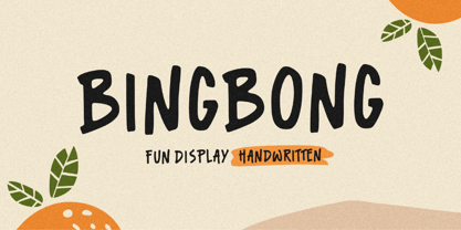 Introducing Bingbong Font! Bingbong is a fun and cheerful allcaps handwritten font display. This font is suitable for handwriting logos, T-shirts, merchandise, quotes, social media posts, advertising, and a lot more! Bingbong comes with an accent language. Thank You!
 - Palatino Nova Paneuropean by Linotype,
$67.99Palatino® Nova is Prof. Hermann Zapf's redesign of his own masterpiece, Palatino. The original Palatino was cut in metal by August Rosenberger at D. Stempel AG typefoundry in Frankfurt, and released in 1950. Palatino was later adapted for mechanical composition on the Linotype machine, and became one of the most-used typefaces of the 20th Century. Palatino was designed for legibility, and has open counters and carefully weighted strokes. The type was named after Giambattista Palatino, a master of calligraphy from the time of Leonardo da Vinci. Palatino is a typeface based on classical Italian Renaissance forms. A modern classic in its own right, Palatino is popular among professional graphic designers and amateurs alike, working well for both text and display typography. Hermann Zapf and Akira Kobayashi redeveloped Palatino for the 21st Century, creating Palatino Nova. Released by Linotype in 2005, the Palatino Nova family is part of Linotype's Platinum Collection. Palatino Nova includes several weights (Light, Regular, Medium, and Bold), each with companion italics. Four styles (Regular, Italic, Bold, and Bold Italic) have Greek and Cyrillic glyphs built into their character sets. The Palatino Nova family also includes revised versions of Aldus (now called Aldus Nova), as well as two titling weights. The first titling weight, Palatino Nova Titling, is based on Hermann Zapf's metal typeface Michelangelo, including Greek glyphs from Phidias Greek. The heavier titling weight, Palatino Nova Imperial, is based on Sistina. The fonts in the Palatino Nova family support all 48 Western, Central, and Eastern European languages. Additional features: ligatures and historical ligatures, Small Caps, ornaments, and a range of numerals (proportional & tabular width lining and Old style Figures, fractions, inferiors, and superiors)." - Univers Next Cyrillic by Linotype,
$49.00 Linotype Univers is a completely reworked version of the original Univers typeface family designed by Adrian Frutiger in 1957. After a long process of painstakingly detailed revision, Frutiger and the design staff at Linotype completed this large joint project in 1997. The result: a brilliant and cohesive font family of 63 weights and styles including the 4 monospaced typewriter weights. All the existing weights were completely redrawn, with careful attention paid to making the proportions more consistent with each other and improving fine details such as curves and thick-to-thin stroke ratios. The family was expanded from 27 to 63 weights, providing a much larger framework to graphic designers for choosing just the right style. The bold and condensed weights were reworked for improved legibility and on-screen application. The stroke weights were revised for consistency within each face as well as in relationship to the other weights. By following Frutiger's original designs, the humanist character of the sans serif Univers now comes through more distinctly. The systemized numbering system has also been updated. With its sturdy, clean forms Univers can facilitate an expression of cool elegance and rational competence. In fact, the strong familial relationships between all the styles and weights make it a serviceable choice for large graphic design projects that require versatility with consistency. Frutiger was successful in staying true to his initial aims; the new Linotype Univers does indeed work in longer texts as well as for display settings. In 2010 the typeface family was extended and renamed into a more logical naming of "Univers Next" to fit better in the Platinum Collection naming.
 - Univers Next Paneuropean by Linotype,
$89.00 Linotype Univers is a completely reworked version of the original Univers Univers typeface family designed by Adrian Frutiger in 1957. After a long process of painstakingly detailed revision, Frutiger and the design staff at Linotype completed this large joint project in 1997. The result: a brilliant and cohesive font family of 63 weights and styles including the 4 monospaced typewriter weights. All the existing weights were completely redrawn, with careful attention paid to making the proportions more consistent with each other and improving fine details such as curves and thick-to-thin stroke ratios. The family was expanded from 27 to 63 weights, providing a much larger framework to graphic designers for choosing just the right style. The bold and condensed weights were reworked for improved legibility and on-screen application. The stroke weights were revised for consistency within each face as well as in relationship to the other weights. By following Frutiger's original designs, the humanist character of the sans serif Univers now comes through more distinctly. T he systemized numbering system has also been updated. With its sturdy, clean forms Univers can facilitate an expression of cool elegance and rational competence. In fact, the strong familial relationships between all the styles and weights make it a serviceable choice for large graphic design projects that require versatility with consistency. Frutiger was successful in staying true to his initial aims; the new Linotype Univers does indeed work in longer texts as well as for display settings. In 2010 the typeface family was extended and renamed into a more logical naming of "Univers Next" to fit better in the Platinum Collection naming.
 - Palatino Nova by Linotype,
$50.99 Palatino® Nova is Prof. Hermann Zapf's redesign of his own masterpiece, Palatino. The original Palatino was cut in metal by August Rosenberger at D. Stempel AG typefoundry in Frankfurt, and released in 1950. Palatino was later adapted for mechanical composition on the Linotype machine, and became one of the most-used typefaces of the 20th Century. Palatino was designed for legibility, and has open counters and carefully weighted strokes. The type was named after Giambattista Palatino, a master of calligraphy from the time of Leonardo da Vinci. Palatino is a typeface based on classical Italian Renaissance forms. A modern classic in its own right, Palatino is popular among professional graphic designers and amateurs alike, working well for both text and display typography. Hermann Zapf and Akira Kobayashi redeveloped Palatino for the 21st Century, creating Palatino Nova. Released by Linotype in 2005, the Palatino Nova family is part of Linotype's Platinum Collection. Palatino Nova includes several weights (Light, Regular, Medium, and Bold), each with companion italics. Four styles (Regular, Italic, Bold, and Bold Italic) have Greek and Cyrillic glyphs built into their character sets. The Palatino Nova family also includes revised versions of Aldus (now called Aldus Nova), as well as two titling weights. The first titling weight, Palatino Nova Titling, is based on Hermann Zapf's metal typeface Michelangelo, including Greek glyphs from Phidias Greek. The heavier titling weight, Palatino Nova Imperial, is based on Sistina. The fonts in the Palatino Nova family support all 48 Western, Central, and Eastern European languages. Additional features: ligatures and historical ligatures, Small Caps, ornaments, and a range of numerals (proportional & tabular width lining and Old style Figures, fractions, inferiors, and superiors)."
 - Matchmaker by Angie Makes,
$30.00 Matchmaker, a modern calligraphy typeface, was inspired by the various works of modern day calligraphers. Its tall, quirky, and juxtaposed letterforms provide a deviation from traditional calligraphy-inspired typefaces. Matchmaker features smart contextual alternates and swashes that add to the front and beginnings of letters (using lowercase letters, enter === before the word then +++ after the word to see the feature in action). Also watch as letters on the end of words magically receive a shortened tail. This font works best in OpenType aware software so that you can take advantage of its many tricks and features. Comes as an .otf (OpenType font) file. Here is a great article on open type aware software: http://www.myfonts.com/info/opentype-support-in-applications/ Chocked full of swashes, alternates, and ordinals, Matchmaker just might be the perfect match for your next project.
 - Seven Moon by Four Lines Std,
$15.00 Introducing Seven Moon: A Retro-Inspired Font with Bold and Cheerful Charm. Seven Moon's cheerful charm shines through every character, evoking a sense of nostalgia and excitement. Its bold strokes and unique shape give it a strong presence, while its playful nature adds a touch of warmth and approachability. This font is designed to command attention and leave a lasting impression. Its distinct style ensures that your message will be conveyed with impact, making it an excellent choice for branding, advertising, social media graphics, and more.
 - Seasonal Drift by Hanoded,
$15.00 Seasonal Drift is a brush font that I made using one of my father in law's Chinese brushes and ink. For some reason this font reminded me of the ocean, like waves and currents and driftwood. Seasonal Drift comes with a healthy dose of language support and some cool discretionary ligatures.
 - Mark - 100% free

- AlphaSports - Unknown license

- Albino - Unknown license

- AlphaElfin - Unknown license

- M XiangHe Hei TC by Monotype,
$187.99 The M XiangHe Hei Traditional Chinese typeface merges traditional brush strokes with modern letterforms to carefully balance traditional calligraphy with humanist design. Named for the smooth movements of a flying crane, the M XiangHe Hei typeface is designed to glide across the page, and features strokes that are partly derived from the Kaishu calligraphic style – an everyday script which dates back hundreds of years. M XiangHe Hei TC features Neue Frutiger for its Latin glyphs, and works harmoniously Neue Frutiger World and Monotype’s CJK typefaces: Tazugane Gothic (Japanese) and Seol Sans (Korean). M XiangHe Hei TC is a great choice for global brands using sans serif Latin typefaces looking to maintain their visual identity, and communicate with a consistent tone of voice with Traditional Chinese. The M XiangHe Hei TC fonts have over 19,000 glyphs, and support the BIG5/HKHCS and CP950 character sets for Traditional Chinese.
 - M XiangHe Hei SC Std by Monotype,
$187.99 The M XiangHe Hei Simplified Chinese typeface merges traditional brush strokes with modern letterforms to carefully balance traditional calligraphy with humanist design. Named for the smooth movements of a flying crane, the M XiangHe Hei typeface is designed to glide across the page, and features strokes that are partly derived from the Kaishu calligraphic style – an everyday script which dates back hundreds of years. M XiangHe Hei SC features Neue Frutiger for its Latin glyphs, and works harmoniously Neue Frutiger World and Monotype’s CJK typefaces: Tazugane Gothic (Japanese) and Seol Sans (Korean). M XiangHe Hei SC is a great choice for global brands using sans serif Latin typefaces looking to maintain their visual identity, and communicate with a consistent tone of voice with Simplified Chinese. The M XiangHe Hei SC Std fonts have over 8,000 glyphs, and support the GB2312 character set for Simplified Chinese.
 - Reinfolk by IKIIKOWRK,
$17.00 Introducing Reinfolk - Decorative Sans, created by ikiiko. Reinfolk is a sans serif typeface with a unique decorative shape. The form is a combination of the sans typeface with the tail character on the slab letter, so that it forms a unique formation and has a distinctive character. Reinfolk is a simple font, with a elegant and calm impression. This typeface is perfect for an elegant logo, branding, layout magazine, home & decor layout, beauty product, packaging product, quotes, or simply as a stylish text overlay to any background image. What's included? Uppercase & Lowercase Number & Punctuation Alternates & Stylistic Multilingual Support Get also a good offer & FREEBIE at our site : www.ikiiko.com Enjoy our font and if you have any questions, you can contact us by email : ikiikowrk@gmail.com
 - Stash by J Foundry,
$30.00 Your Stash of fonts for that custom hand-lettered look. Stash comes in two styles; a clean modern and a worn vintage look, each in five weights. Stash features hundreds of alternates to make every setting look crafted and unique. The fonts are programmed with a smart set of contextual alternates that handle initial and final forms, as well as a few connecting pairs, making each word look polished. Tails and underlines round out the character set. With Stash you can craft solid logotypes with a unique look, set posters and ads, and even run longer lines of copy on packaging. Pick it up for your next craft beer label, chocolate pack, café logo, or good old social media posts!
 - Mellandry by Arterfak Project,
$24.00 Introducing our new product Mellandry, inspired by childhood taste and marker scratch. The uppercase and lowercase letters are designed to stay fit when combined in a word. A playful font with stylistic alternates which is based on custom calligraphy. The added tails and swashes give you options in your design. There are 50+ custom ligatures to make it more looks flexible. Mellandry is suitable for your quotes, design label, clothing design, merchandise, craft design, even comic design as a body text, title, and etc. Font featured: - Uppercase - Lowercase - Number - Symbol - Multilingual characters: ??????????????????????????????????????????????????????????????????????? - Ligatures - Stylistic alternates - Catchwords Thank you for visiting, and I hope you enjoy it! Please do not hesitate to drop me a message if you have any issues or inquiries.
 - Pekoe JNL by Jeff Levine,
$29.00 Jeff Levine Fonts offers its interpretation of Tea Chest, an Art Deco serif stencil font originally designed in 1939 by Robert Harling for the Stephenson-Blake type foundry. Pekoe JNL is available in both regular and oblique versions.
 - Svaxtica by Ilhamtaro,
$15.00 SVAXTICA is a modern font like a maze with a galaxy theme. This font is all caps font. To enable the OpenType Stylistic alternates, you need a program that supports OpenType features such as Adobe Illustrator CS, Adobe Indesign & CorelDraw X6-X7. Cheers!
 - Crimson Skyline by Hanoded,
$15.00 Crimson Skyline is a thin brush font. I used a pencil and Chinese ink to paint the letters. Crimson Skyline comes with double letter ligatures for the lower case letters. And the name? Well, it just has a nice ring to it. That’s all!


