10,000 search results
(0.054 seconds)
- Quickly Freehand by Cititype,
$12.00 Quickly Freehand is a sans serif font in a casual handwriting style, this is an alternative font for when you get bored with the formal atmosphere. Comes with two versions, regular and italic, to complement your design needs. You can use this font for product labels, taglines, children's craft, prints on t-shirts, paper bags, headlines, cheerful quotes and even long text writing. This font can be used in various graphics software, even in Microsoft Word. Supports 27 languages allowing Quickly Freehand to be used in the wider world.
 - Elmore by Haksen,
$10.00 Introducing the warm handwriting "Elmore" Script Font! If you are needing a touch of casual modern calligraphy for your designs, this font was created for you! What's Included: Uppercase and Lowercase Ligatures Number and Punctuation Support Language This font works best in a program that supports OpenType features such as Adobe Indesign, Adobe Illustrator CC and CS, or Adobe Photoshop CC and CS also CorelDraw More Questions? Here are some (potential) answers! Do not to resell this font in any way. Multilingual Support is included for Western European Languages Cheers!
 - Jasmine Sheffield by Haksen,
$13.00 Introducing the elegant Jasmine Sheffield Script Font! If you are needing a touch of casual chic calligraphy for your designs, this font was created for you! What's Included: Uppercase and Lowercase Ligatures Number and Punctuation Support Language This font works best in a program that supports OpenType features such as Adobe Indesign, Adobe Illustrator CC and CS, or Adobe Photoshop CC and CS also CorelDraw More Questions? Here are some (potential) answers! You are not permitted to resell this font in any way. Multilingual Support is included for Western European Languages Cheers!
 - Handestonie by Almarkha Type,
$35.00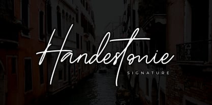 Handestonie – Signature Font and classy style, this font is great for your creative projects such as watermark on photography, and perfect for logos & branding, photography, invitation, watermark, advertisements, product designs, stationery, wedding designs, label, product packaging, special events or anything that need handwriting taste. What’s Included : Standard glyphs Ligatures Alternate glyphs Web Font Works on PC & Mac Simple installations Accessible in the Adobe Illustrator, Adobe Photoshop, Adobe InDesign, even work on Microsoft Word. PUA Encoded Characters – Fully accessible without additional design software. Fonts include multilingual support Cheers! Thank You
 - Murisa Barbara by Murisa Studio,
$10.00 This time we present to you our newest font. Barbara is one of our proud fonts. Barbara is designed with the inspiration of a woman's beauty. Barbara was born with stunning elegance. You can use this font for your daily needs, such as writing a message, quote words, or the name of the recipient of your invitation. You can of course also use this font in your products. Barbara will perfect your product. Elegance, cheerfulness, beauty will be the main attraction for your product. Get it right now.
 - LiebeMenu by LiebeFonts,
$19.90 LiebeMenu is a comprehensive set of hand-drawn restaurant and menu essentials: Restaurant signs and menu labels, dishes with vegetables, meat, fish and cheese, and of course drinks and desserts. Whether you design professional menus for a gourmet restaurant or for your friend’s dinner party, LiebeMenu instantly adds a warm personal touch. Over 110 carefully crafted drawings are included in this single font and can be used in any text or graphics application. If you like this font, you may also like our cooking ingredients font LiebeCook and our decorative restaurant phrases font LiebeMenuLettering.
 - NorB Pen by NorFonts,
$28.00 NorB Pen was inspired from Arial Round font, I use this font for my jazz lead-sheets. It's a handwritten text font emulating a round marker permanent pen. You can use this font with any word processing program for text and display use, print and web projects, apps and ePub, comic books, graphic identities, branding, editorial, advertising, scrapbooking, cards and invitations and any casual lettering purpose… or even just for fun! NorB Pen comes with 8 weights, each with their matching italics and in a Light, Normal, Bold and Heavy version.
 - Sanseki by Hanoded,
$20.00 The term Sanseki (Japanese for Three [Brush] Traces) is used to describe three famous Heian period calligraphers: Yaseki, Gonseki and Saseki. Not that I would ever dream of comparing my messy brush-work with theirs, but the name stuck and I kind of liked it. I used Chinese ink and a high quality brush (which I got in a sale actually) to create this font. All glyphs were hand painted in one go! Sanseki is a very detailed brush font. Upper and lower case letters mingle and there’s even an alternate for every lower case glyph. Comes with an abundance of diacritics.
 - Revolte by Wiescher Design,
$39.50 Whenever I see clippings on TV of demonstrations, protesting against this or that, with people holding up signs, I am surprised about the signs being professionally printed or plotted in Helvetica or Futura condensed. I've even seen signs in Zapfino! That doesn't really cut it, it doesn't look much like a real protest. So I decided to give the protesting world a real good font for the occasion. In German a Revolte is an uprising, I thought that was a good name for the font. Hasta la victoria siempre from your revolutionary type designer Gert Wiescher.
 - Magical Brush by Hanoded,
$15.00 Personally I think a brush font should have the word ‘Brush’ in its name. It’s not that easy finding a name - you need some magic to come up with a good one! Magical Brush is a completely handmade font. I used a small brush (a number 3 to be precise) and Chinese Ink. I wanted just a little ‘erosion’, so I used copier paper rather than my expensive French water color paper (which is quite rough). Magical Brush comes in the normal variant and a chickenpox one. Use it for your posters, your book covers and your Christmas invitations!
 - Kontext Dot by Elster Fonts,
$20.00 Imagine a font that is easier to read the smaller it is – or the further away the text is. There are already many rasterised fonts, I wanted to take it to the extreme and use as few dots as possible. The result is a typeface that lives up to its name. Each individual circle makes no sense on its own; individual letters are only recognisable in the context of all associated circles, individual letters are most likely to be recognised in the context of whole words. Attached to a building wall, text would be readable from a great distance and become increasingly difficult to decipher the closer you get to the building. Placed on the ground or on a large flat roof, text would only be readable from a higher building, an aeroplane or - depending on the size - in Google Earth. Kontext has old style figures, superscript numerals, case-sensitive questiondown and exclamdown and an alternative ampersand, 390 glyphs at all. Use the same value for font size and line spacing to keep the lines in the grid, or change the line spacing in 10% steps. Change the spacing in 100-unit increments to keep the grid. The numbers in the family- and style-names refer to the (ca.) grey value of the respective background and the font itself. Kontext Dot 00-33 has e.g. a white background (0%) and 33% grey value. Kontext Dot 66-33 has a 66% background and 33% grey value. »Positive« styles (first number smaller than the second number) have kerning, »negative« styles (first number bigger than the second number) can have none.
 - Cornhusker by Section Type,
$22.00 Standing tall as an Illinois cornfield in September, Cornhusker Regular is a strapping condensed sans designed by a champion cornhusker. Inspired by 1940s Midwestern signage, it's warm & charming characters are perfectly at home in logos, beverage bottles and food packaging, restaurant menus, travel advertisements, websites, stationery, handmade product packaging and so much more. If you're looking for a hand-crafted typeface with punch (who can fit into tight spaces!) then Cornhusker Regular is the font for you. This inspired revival excels in both retro & modern designs. Cornhusker Regular includes capital letters, small caps, and alternate cuts (with diacritics) of A, E, F, J, X, Y, ᴀ, ᴇ, ғ, ᴊ, x, ʏ, 0, 1, 2, 3, 4, 5, 7 and a sharp German double s in both cap and smallcap. This font is not affiliated with or endorsed by the University of Nebraska. WHAT'S INCLUDED Cornhusker Regular includes an installable digital Opentype Font file in a single weight. This file contains a basic Latin character set with a full set of uppercase and small caps, multilingual diacritics, numbers, international currency figures, punctuation and pagination symbols. The font also includes alternate cuts for select uppercase and smallcap letters (located in stylistic sets). It is compatible with Adobe CS and CC, Microsoft Word and other type editing apps. SUPPORTED LANGUAGES Afrikaans, Alsatian, Basque, Bislama, Breton, Catalan, Chamorro, Danish, Dutch, English, Faroese, Finnish, Flemish, Franco-Provencal, French, Frisian, Friulian, Galician, German, Greenlandic, Icelandic, Indonesian, Irish, Italian, Ladin, Latin, Luxembourgish, Malay, Manx Gaelic, Northern Sotho, Norwegian (Bokmål), Norwegian (Nynorsk), Occitan, Portuguese, Rhaeto-Romance, Romansh, Sami (Inari), Sami (Lule), Sami (Northern), Sami (Skolt), Sami (Southern), Scottish Gaelic, Spanish, Swahili, Swedish, Tagalog, Walloon and Welsh.
 - DIN Next Arabic by Monotype,
$155.99 DIN Next is a typeface family inspired by the classic industrial German engineering designs, DIN 1451 Engschrift and Mittelschrift. Akira Kobayashi began by revising these two faces-who names just mean ""condensed"" and ""regular"" before expanding them into a new family with seven weights (Light to Black). Each weight ships in three varieties: Regular, Italic, and Condensed, bringing the total number of fonts in the DIN Next family to 21. DIN Next is part of Linotype's Platinum Collection. Linotype has been supplying its customers with the two DIN 1451 fonts since 1980. Recently, they have become more popular than ever, with designers regularly asking for additional weights. The abbreviation ""DIN"" stands for ""Deutsches Institut für Normung e.V."", which is the German Institute for Industrial Standardization. In 1936 the German Standard Committee settled upon DIN 1451 as the standard font for the areas of technology, traffic, administration and business. The design was to be used on German street signs and house numbers. The committee wanted a sans serif, thinking it would be more legible, straightforward, and easy to reproduce. They did not intend for the design to be used for advertisements and other artistically oriented purposes. Nevertheless, because DIN 1451 was seen all over Germany on signs for town names and traffic directions, it became familiar enough to make its way onto the palettes of graphic designers and advertising art directors. The digital version of DIN 1451 would go on to be adopted and used by designers in other countries as well, solidifying its worldwide design reputation. There are many subtle differences in DIN Next's letters when compared with DIN 1451 original. These were added by Kobayashi to make the new family even more versatile in 21st-century media. For instance, although DIN 1451's corners are all pointed angles, DIN Next has rounded them all slightly. Even this softening is a nod to part of DIN 1451's past, however. Many of the signs that use DIN 1451 are cut with routers, which cannot make perfect corners; their rounded heads cut rounded corners best. Linotype's DIN 1451 Engschrift and Mittelschrift are certified by the German DIN Institute for use on official signage projects. Since DIN Next is a new design, these applications within Germany are not possible with it. However, DIN Next may be used for any other project, and it may be used for industrial signage in any other country! DIN Next has been tailored especially for graphic designers, but its industrial heritage makes it surprisingly functional in just about any application. The DIN Next family has been extended with seven Arabic weights and five Devanagari weights. The display of the Devanagari fonts on the website does not show all features of the font and therefore not all language features may be displayed correctly.
 - DIN Next Devanagari by Monotype,
$103.99DIN Next is a typeface family inspired by the classic industrial German engineering designs, DIN 1451 Engschrift and Mittelschrift. Akira Kobayashi began by revising these two faces-who names just mean ""condensed"" and ""regular"" before expanding them into a new family with seven weights (Light to Black). Each weight ships in three varieties: Regular, Italic, and Condensed, bringing the total number of fonts in the DIN Next family to 21. DIN Next is part of Linotype's Platinum Collection. Linotype has been supplying its customers with the two DIN 1451 fonts since 1980. Recently, they have become more popular than ever, with designers regularly asking for additional weights. The abbreviation ""DIN"" stands for ""Deutsches Institut für Normung e.V."", which is the German Institute for Industrial Standardization. In 1936 the German Standard Committee settled upon DIN 1451 as the standard font for the areas of technology, traffic, administration and business. The design was to be used on German street signs and house numbers. The committee wanted a sans serif, thinking it would be more legible, straightforward, and easy to reproduce. They did not intend for the design to be used for advertisements and other artistically oriented purposes. Nevertheless, because DIN 1451 was seen all over Germany on signs for town names and traffic directions, it became familiar enough to make its way onto the palettes of graphic designers and advertising art directors. The digital version of DIN 1451 would go on to be adopted and used by designers in other countries as well, solidifying its worldwide design reputation. There are many subtle differences in DIN Next's letters when compared with DIN 1451 original. These were added by Kobayashi to make the new family even more versatile in 21st-century media. For instance, although DIN 1451's corners are all pointed angles, DIN Next has rounded them all slightly. Even this softening is a nod to part of DIN 1451's past, however. Many of the signs that use DIN 1451 are cut with routers, which cannot make perfect corners; their rounded heads cut rounded corners best. Linotype's DIN 1451 Engschrift and Mittelschrift are certified by the German DIN Institute for use on official signage projects. Since DIN Next is a new design, these applications within Germany are not possible with it. However, DIN Next may be used for any other project, and it may be used for industrial signage in any other country! DIN Next has been tailored especially for graphic designers, but its industrial heritage makes it surprisingly functional in just about any application. The DIN Next family has been extended with seven Arabic weights and five Devanagari weights. The display of the Devanagari fonts on the website does not show all features of the font and therefore not all language features may be displayed correctly. - DIN Next Cyrillic by Monotype,
$65.00DIN Next is a typeface family inspired by the classic industrial German engineering designs, DIN 1451 Engschrift and Mittelschrift. Akira Kobayashi began by revising these two faces-who names just mean ""condensed"" and ""regular"" before expanding them into a new family with seven weights (Light to Black). Each weight ships in three varieties: Regular, Italic, and Condensed, bringing the total number of fonts in the DIN Next family to 21. DIN Next is part of Linotype's Platinum Collection. Linotype has been supplying its customers with the two DIN 1451 fonts since 1980. Recently, they have become more popular than ever, with designers regularly asking for additional weights. The abbreviation ""DIN"" stands for ""Deutsches Institut für Normung e.V."", which is the German Institute for Industrial Standardization. In 1936 the German Standard Committee settled upon DIN 1451 as the standard font for the areas of technology, traffic, administration and business. The design was to be used on German street signs and house numbers. The committee wanted a sans serif, thinking it would be more legible, straightforward, and easy to reproduce. They did not intend for the design to be used for advertisements and other artistically oriented purposes. Nevertheless, because DIN 1451 was seen all over Germany on signs for town names and traffic directions, it became familiar enough to make its way onto the palettes of graphic designers and advertising art directors. The digital version of DIN 1451 would go on to be adopted and used by designers in other countries as well, solidifying its worldwide design reputation. There are many subtle differences in DIN Next's letters when compared with DIN 1451 original. These were added by Kobayashi to make the new family even more versatile in 21st-century media. For instance, although DIN 1451's corners are all pointed angles, DIN Next has rounded them all slightly. Even this softening is a nod to part of DIN 1451's past, however. Many of the signs that use DIN 1451 are cut with routers, which cannot make perfect corners; their rounded heads cut rounded corners best. Linotype's DIN 1451 Engschrift and Mittelschrift are certified by the German DIN Institute for use on official signage projects. Since DIN Next is a new design, these applications within Germany are not possible with it. However, DIN Next may be used for any other project, and it may be used for industrial signage in any other country! DIN Next has been tailored especially for graphic designers, but its industrial heritage makes it surprisingly functional in just about any application. The DIN Next family has been extended with seven Arabic weights and five Devanagari weights. The display of the Devanagari fonts on the website does not show all features of the font and therefore not all language features may be displayed correctly. - DIN Next Paneuropean by Monotype,
$92.99DIN Next is a typeface family inspired by the classic industrial German engineering designs, DIN 1451 Engschrift and Mittelschrift. Akira Kobayashi began by revising these two faces-who names just mean ""condensed"" and ""regular"" before expanding them into a new family with seven weights (Light to Black). Each weight ships in three varieties: Regular, Italic, and Condensed, bringing the total number of fonts in the DIN Next family to 21. DIN Next is part of Linotype's Platinum Collection. Linotype has been supplying its customers with the two DIN 1451 fonts since 1980. Recently, they have become more popular than ever, with designers regularly asking for additional weights. The abbreviation ""DIN"" stands for ""Deutsches Institut für Normung e.V."", which is the German Institute for Industrial Standardization. In 1936 the German Standard Committee settled upon DIN 1451 as the standard font for the areas of technology, traffic, administration and business. The design was to be used on German street signs and house numbers. The committee wanted a sans serif, thinking it would be more legible, straightforward, and easy to reproduce. They did not intend for the design to be used for advertisements and other artistically oriented purposes. Nevertheless, because DIN 1451 was seen all over Germany on signs for town names and traffic directions, it became familiar enough to make its way onto the palettes of graphic designers and advertising art directors. The digital version of DIN 1451 would go on to be adopted and used by designers in other countries as well, solidifying its worldwide design reputation. There are many subtle differences in DIN Next's letters when compared with DIN 1451 original. These were added by Kobayashi to make the new family even more versatile in 21st-century media. For instance, although DIN 1451's corners are all pointed angles, DIN Next has rounded them all slightly. Even this softening is a nod to part of DIN 1451's past, however. Many of the signs that use DIN 1451 are cut with routers, which cannot make perfect corners; their rounded heads cut rounded corners best. Linotype's DIN 1451 Engschrift and Mittelschrift are certified by the German DIN Institute for use on official signage projects. Since DIN Next is a new design, these applications within Germany are not possible with it. However, DIN Next may be used for any other project, and it may be used for industrial signage in any other country! DIN Next has been tailored especially for graphic designers, but its industrial heritage makes it surprisingly functional in just about any application. The DIN Next family has been extended with seven Arabic weights and five Devanagari weights. The display of the Devanagari fonts on the website does not show all features of the font and therefore not all language features may be displayed correctly. - Tijuf by Twinletter,
$15.00 Introducing our newest display font, Tijuf, this font designed with a unique and creative shape gives you the ease of use in a variety of your project needs. designed in a fun, cheerful, and unique style. When used in conjunction with other fonts in our collection, it gives you the ability to create unique, captivating, and highly impressive visual displays. of course, your various design projects will be perfect and extraordinary if you use this font because this font is equipped with a font family, both for titles and subtitles and sentence text, start using our fonts for your extraordinary projects.
 - Retail Script by ITC,
$29.00Retail Script was designed by Vince Whitlock in 1987. It is a font with strong, dynamic base forms and very small ascenders and descenders, which makes a closed, solid overall image. The fine white lines which are traced within the figures make the font a bit more cheerful and the shading makes the figures look three dimensional. The energetic Retail Script is best used in headlines in larger point sizes in order to preserve the look of its fine details. - MC Rock Ice by Maulana Creative,
$17.00 Rock Ice Funny Display Typeface Rock Ice funny display typeface. Heavy stroke, fun character with a bit of ligatures. To give you an extra creative work. Rock Ice funny display typeface support multilingual more than 100+ language. This font is good for logo design, Social media, Movie Titles, Books Titles, a short text even a long text letter and good for your secondary text font with script or serif. Make a stunning work with Rock Ice funny display typeface. Cheers, Maulana Creative
 - Smooky by Gassstype,
$23.00Hello Everyone, introduce our new product Smooky is Funny Playful Font. Use it for any project that needs a cheerful and playful look! Perfect for labels, quotes, posters, DIY projects, branding, packaging, greeting cards, websites, photos, photography kids,child,window art, scrapbooking, tags and so much more! Smooky is font with Unique and challenging nuances. very suitable for the title, typography, Poster, magazines, brochures, packaging,Websites and much more for your design needs, making your designs more modern and professional. - School by Monotype,
$39.00The School font family is a popular design based on a grade school alphabet. The School fonts allow teachers to create custom hand-lettered exercise sheets and classroom signage. Five variations are available. The plain style and its corresponding bold will create hand-lettered stand-alone text. The lined style and its corresponding bold superimposes a set of three guidelines on the plain style. A dashed style is also provided in case a teacher prefers the centerline to be dashed instead of solid. - Josef K Patterns by Juliasys,
$9.60 Franz Kafka’s manuscripts have always been a source of inspiration for designer Julia Sysmäläinen. At first she was just interested in literary aspects but later she noticed that content and visual form can not be separated in the work of this ingenious writer. Analyzing Kafka’s handwriting at the Berlin National Library, Julia was inspired to design the typeface FF Mister – by now a well known classic. Over the years, FF Mister K became a handsome typeface family and even produced offspring: the Josef K Patterns. Some of Kafka’s most expressive letterforms were the starting point for these decorative ornaments. How do the Patterns work? Outlines and fillings correspond to the uppercase and the lowercase letters on your keyboard. You can use them separately or layer them on top of each other. If you write a line of “pattern-text” in lowercase and repeat it underneath in uppercase you get a row of fillings followed by a row of outlines. Now you can color them and then set line space = 0 to get a single line of layered colored ornaments. Alternatively, activating OpenType / stylistic set / stylistic alternates will also unite the two lines to a single layered line. Further magic can be done with OpenType / contextual alternates turned on. On the gallery page of this font family is a downloadable Josef K Patterns.pdf with an alphabetical overview of forms. Hundreds of patterns are possible … we’d love to see some of yours and present them here on the website!
 - Sealt by Michael Rafailyk,
$9.00 Sealt Typeface is inspired by the oldest saltworks in Eastern Europe, founded in 1390 in Drohobych. Sealt means salt in Old English, so most letters are rough and sharp like salt crystals and seem to be carved out of the rock. View PDF Specimen: https://michaelrafailyk.com/typeface/specimen/Sealt.pdf Variable font: Sealt VF has weight axis and includes hundreds of weights ranging from Light (300) to Bold (700), so feel free to choose the most accurate weight that you need, using a slider. Localized Forms: 47 character substitutions for Azeri, Bulgarian, Catalan, Dutch, German, Kazakh, Moldavian, Polish, Romanian, Tatar, Turkish. Glyph Composition/Decomposition (Diacritics): Full Latin and based Vietnamese set of diacritics (561 characters). Precomposed. Ordinals: adehnorst. Superscript, Subscript, Numerator, Denominator: 0123456789. Fractions: ¼½¾⅐⅑⅒⅓⅔⅕⅖⅗⅘⅙⅚⅛⅜⅝⅞⅟ (precomposed). Any other fractions (even those typed through a slash) will also be displayed correctly, with the automatic replacement to Numerator + fraction + Denominator. Slashed Zero: All 0 figures, including Lining, Superscript, Subscript, Numerator, Denominator, and Fractions. Contextual Alternates: ΆΈΉΊΌΎΏ. Greek uppercase accented characters lose their tonos accent and retain only dieresis in All Caps mode. Turned on by default. If you need tonos accents in All Caps then turn off Contextual Alternates (calt) feature. Standard Ligatures: OO TT tt fi. Turned on by default. Language count: 480+. Kerning Class pairs: 4295. The promo images used photos of Albin Berlin, Hervé Piglowski, Karolina Grabowska, Scott Webb from Pexels and Dollar Gill from Unsplash.
 - Struffoli by Hanoded,
$15.00 Struffoli are small, marble sized deep fried dough balls from Naples. They are served with a variety of sweet condiments, like honey, sugar and sprinkles. There is nothing deep fried about Struffoli font, nor does it resemble a deep fried dough ball: I just liked the name and at least now I can say what Struffoli are! Struffoli was handmade using a brush and Chinese ink. It does look like a connected script font, but it is not (really): only a few letters connect, making it a more versatile font. Use it for your cookbooks, posters and toy packaging. Rest assured, it comes with a generous serving of diacritics.
 - Southwark by Hanoded,
$15.00 London is one of my favourite cities, so it was about time I named a font after it. Well, technically, I named a font after one of London’s districts. Southwark comes from the Anglo-Saxon word Suthriganaweorc, which means ‘Fort of the men of Surrey’. The font Southwork is a handmade Clarendon. I used a Japanese brush pen to create the outlines. I gave the glyphs texture by filling them in with a brush and Chinese ink. Southwark, therefore, has an uneven look and a brushy texture. It looks good on just about anything, but posters, greeting cards and product packaging come to mind.
 - SIAS Gramma by SIAS,
$29.90 The Gramma font family provides about 240 very basic graphic structures. Compilation of of this set has been inspired not by symblic but by graphical-morphological concerns. Therefore the three fonts (A, B, C) represent the entirety of all possible and simple graphic forms. Glyphs of this kind are likely to be found anywhere: in scripts, in signage, in branding marks – and so on. So, the Gramma font package is applicable to a great variety of usage. Whenever a free choice of elemental graphic motifs is desired – be it ideographical, pictographical or for brand design, this package provides you with nearly any graphic shape imaginable.
 - Lucky Organics by IbraCreative,
$12.00 Lucky Organic is an endearing and charming handwritten bubble font that radiates pure cuteness and playfulness. With its whimsical and rounded letterforms, Lucky Organic captures the essence of joyful innocence. Each letter is nestled within a delightful bubble, creating a captivating and cheerful visual effect. The font's organic curves and friendly design make it an ideal choice for projects that crave a touch of adorable charm, such as children's books, playful logos, and vibrant signage. Lucky Organic effortlessly transforms any text into a lively display of creativity, bringing a smile to faces and a sense of light-hearted wonder to designs.
 - Theater Nouveau JNL by Jeff Levine,
$29.00 Sheet music from the 1911 stage production of the comic opera “The Enchantress” featured the hand lettered names of both the star and composer in a monoline Art Nouveau style. This sans serif type design is now available as Theater Nouveau JNL in both regular and oblique versions.
 - Weekend Plans JNL by Jeff Levine,
$29.00 A piece of vintage British sheet music from 1941 entitled “That Lovely Week-End” featured the song’s name in a bold Art Deco sans serif with rounded edges. This lettering design is now the digital type face Weekend Plans JNL, which is available in both regular and oblique versions.
 - Pacific Island JNL by Jeff Levine,
$29.00 Lettering on the sheet music cover for the title song from the 1957 Marlon Brando movie "Sayonara" was the model for Pacific Island JNL. The design has an Asiatic influence, but also reflects a bit of show card lettering as well. Available in both regular and oblique versions.
 - Morningside Heights JNL by Jeff Levine,
$29.00 Named for a Manhattan neighborhood, Morningside Heights JNL is based on lettering found on a 1920s-era piece of sheet music. Part of the charm of hand lettering from the Art Nouveau era is found in the non-standard line thicknesses, experimental character shapes and varying character widths.
 - Nouveau Stencil JNL by Jeff Levine,
$29.00 The sheet music for the 1917 song "Wake Up Virginia (and Prepare for Your Wedding Day)" features a hand lettered title in a sans serif Art Nouveau design with stencil influences. This was the inspiration for Nouveau Stencil JNL, which is available in both regular and oblique versions.
 - Artistry JNL by Jeff Levine,
$29.00 The 1935 sheet music for Shirley Temple's "That's What I Want for Christmas" [from her 20th Century Fox film "Stowaway"] provided the hand lettered sans which became the model for Artistry JNL. A condensed block design with rounded corners, the typeface is available in both regular and oblique versions.
 - Olde Nouveau JNL by Jeff Levine,
$29.00 Olde Nouveau JNL is an interesting Art Nouveau typeface based on lettering found on some vintage sheet music. It's name is a contradictory pun, since "Nouveau" means new in French, and Olde (spelled in the archaic form) is the total opposite of what the Art Nouveau movement embodied.
 - Showpiece JNL by Jeff Levine,
$29.00 Showpiece JNL was redrawn from the hand lettering for the name and address of a music publisher found on some 1930s-era sheet music. The lettering style has features influenced a bit by both the end of the Art Nouveau period and the beginning of the Art Deco movement.
 - Novelty Nouveau JNL by Jeff Levine,
$29.00 Novelty Nouveau JNL gets its name from its source of inspiration – the cover of a 1919 piece of sheet music for the novelty tune “America Never Took Water (And America Never Will)” This Art Nouveau condensed sans serif type design is available in both regular and oblique versions.
 - Sitting Pretty JNL by Jeff Levine,
$29.00 Sheet music for the 1923 tune "I'm Sitting Pretty (In A Pretty Little City)" had the main part of the title hand lettered in an Art Nouveau condensed Roman type design which became the inspiration for Sitting Pretty JNL. The typeface is available in both regular and oblique versions.
 - Second Guess JNL by Jeff Levine,
$29.00 The cover of the 1934 sheet music for "Your Guess Is Just as Good as Mine" offers up another hand lettered Art Deco sans with a classic period look. The square-ish lettering with rounded corners of Second Guess JNL is available in both regular and oblique versions.
 - Common Area JNL by Jeff Levine,
$29.00 The unusual hybrid of square letter forms mixed with Art Deco-influenced ones in the digital typeface Common Area JNL is brought to you by the hand lettering found on a vintage piece of sheet music for "William Tell". The typeface is available in both regular and oblique versions.
 - Jazzy Roll JNL by Jeff Levine,
$29.00 The 1915 sheet music for the tune "Dancing the Jelly Roll Song" by Nat Vincent and Herman Paley featured the title hand-lettered in a sans serif design strongly influenced by the Art Nouveau movement of the early 20th Century. This formed the basis for Jazzy Roll JNL.