10,000 search results
(0.057 seconds)
- Pico by d[esign],
$8.46 Pico is the pixel font that works small and large—from web buttons to LED boards. The native font size is 16px, however you can work within any size that’s a multiple of 2. Pico is featured in the gorgeous mobile game Space Age: A Game of Cosmic Adventure by Big Bucket! The latest version of Pico (1.300) includes a staggering 454 new characters (from 235 to 689)! This update includes support for south eastern European and all new Cyrillic, Hebrew, Greek and math characters. Latin characters and kerning have also been updated and improved for legibility.
 - FS Lucas by Fontsmith,
$80.00 Pure and not-so-simple Maybe it’s the air of purity, openness and transparency that they transmit, but geometric typefaces are more popular than ever among leading brands. Based on near-perfect circles, triangles and squares, geometric letterforms look uncomplicated, even though making them readable is anything but – something the designers of the first wave of geometric fonts discovered nearly a century ago. Many of the world’s most recognisable brands in technology, retail, travel, food, manufacturing and other industries continue to be drawn to the straightforward, honest character that geometric fonts convey. Fontsmith set out in 2015 to develop a typeface in the same tradition, but optimised for the demands of modern brands – online and offline usage, readability and accessibility. And, of course, with the all-important Fontsmith x-factor built in. FS Lucas is the bold and deceptively simple result. Handle with care The letterforms of FS Lucas are round and generous, along the lines of Trajan Column lettering stripped of its serifs. But beware their thorns. Their designer, Stuart de Rozario, who also crafted the award-winning FS Millbank, wanted a contrast between spiky and soft, giving sharp apexes to the more angular letterforms, such as A, M, N, v, w and z. Among his inspirations were the colourful, geometric compositions of Frank Stella, the 1920s art deco poster designs of AM Cassandre, and the triangular cosmic element symbol, which led him to tackle the capital A first, instead of the usual H. The proportions and angles of the triangular form would set the template for many of the other characters. It was this form, and the light-scattering effects of triangular prisms, that lit the path to a name for the typeface: Lucas is derived from lux, the Latin word for light. Recommended reading Early geometric typefaces were accused of putting mathematical integrity before readability. FS Lucas achieves the trick of appearing geometric, while taking the edge off elements that make reading difficult. Perfectly circlular shapes don’t read well. The way around that is to slightly thicken the vertical strokes, and pull out the curves at the corners to compensate; the O and o of FS Lucas are optical illusions. Pointed apexes aren’t as sharp as they look; the flattened tips are an essential design feature. And distinctive details such as the open terminals of the c, e, f, g, j, r and s, and the x-height bar on the i and j, aid legibility, especially on-screen. These and many other features, the product of sketching the letterforms in the first instance by hand rather than mapping them out mechanically by computer, give FS Lucas the built-in humanity and character that make it a better, easier read all-round. Marks of distinction Unlike some of its more buttoned-up geometric bedfellows, FS Lucas can’t contain its natural personality and quirks: the flick of the foot of the l, for example, and the flattish tail on the g and j. The unusual bar on the J improves character recognition, and the G is circular, without a straight stem. There’s a touch of Fontsmith about the t, too, with the curve across the left cross section in the lighter weights, and the ampersand is one of a kind. There’s a lot to like about Lucas. With its 9 weights, perfect proportions and soft but spiky take on the classic geometric font, it’s a typeface that could light up any brand.
 - FS Lucas Paneureopean by Fontsmith,
$90.00Pure and not-so-simple Maybe it’s the air of purity, openness and transparency that they transmit, but geometric typefaces are more popular than ever among leading brands. Based on near-perfect circles, triangles and squares, geometric letterforms look uncomplicated, even though making them readable is anything but – something the designers of the first wave of geometric fonts discovered nearly a century ago. Many of the world’s most recognisable brands in technology, retail, travel, food, manufacturing and other industries continue to be drawn to the straightforward, honest character that geometric fonts convey. Fontsmith set out in 2015 to develop a typeface in the same tradition, but optimised for the demands of modern brands – online and offline usage, readability and accessibility. And, of course, with the all-important Fontsmith x-factor built in. FS Lucas is the bold and deceptively simple result. Handle with care The letterforms of FS Lucas are round and generous, along the lines of Trajan Column lettering stripped of its serifs. But beware their thorns. Their designer, Stuart de Rozario, who also crafted the award-winning FS Millbank, wanted a contrast between spiky and soft, giving sharp apexes to the more angular letterforms, such as A, M, N, v, w and z. Among his inspirations were the colourful, geometric compositions of Frank Stella, the 1920s art deco poster designs of AM Cassandre, and the triangular cosmic element symbol, which led him to tackle the capital A first, instead of the usual H. The proportions and angles of the triangular form would set the template for many of the other characters. It was this form, and the light-scattering effects of triangular prisms, that lit the path to a name for the typeface: Lucas is derived from lux, the Latin word for light. Recommended reading Early geometric typefaces were accused of putting mathematical integrity before readability. FS Lucas achieves the trick of appearing geometric, while taking the edge off elements that make reading difficult. Perfectly circlular shapes don’t read well. The way around that is to slightly thicken the vertical strokes, and pull out the curves at the corners to compensate; the O and o of FS Lucas are optical illusions. Pointed apexes aren’t as sharp as they look; the flattened tips are an essential design feature. And distinctive details such as the open terminals of the c, e, f, g, j, r and s, and the x-height bar on the i and j, aid legibility, especially on-screen. These and many other features, the product of sketching the letterforms in the first instance by hand rather than mapping them out mechanically by computer, give FS Lucas the built-in humanity and character that make it a better, easier read all-round. Marks of distinction Unlike some of its more buttoned-up geometric bedfellows, FS Lucas can’t contain its natural personality and quirks: the flick of the foot of the l, for example, and the flattish tail on the g and j. The unusual bar on the J improves character recognition, and the G is circular, without a straight stem. There’s a touch of Fontsmith about the t, too, with the curve across the left cross section in the lighter weights, and the ampersand is one of a kind. There’s a lot to like about Lucas. With its 9 weights, perfect proportions and soft but spiky take on the classic geometric font, it’s a typeface that could light up any brand. - Regra by Typodermic,
$11.95 Introducing Regra: the squared, high-tech typeface designed for the contemporary world. With its unique industrial letterforms, Regra is the perfect choice for cutting-edge technological design. The robust, blocky letters convey strength and precision, infusing your message with a sense of power and style. Whether you’re creating a sleek, modern website or designing a high-tech product, Regra is the perfect choice for conveying a sense of one-of-a-kind style and technological accuracy. The three different weights and italics provide plenty of flexibility for all your design needs, ensuring that your message is conveyed with maximum impact. At the heart of Regra is its distinctive letterforms. Each character is carefully crafted to reflect the latest in contemporary design trends, with sharp angles and clean lines that exude a sense of sophistication and elegance. From its squared-off corners to its bold, geometric shapes, Regra is the typeface of choice for designers who want to create something truly unique. So if you’re looking for a typeface that can take your designs to the next level, look no further than Regra. With its stylish letterforms and high-tech design, Regra is the perfect choice for anyone who wants to make a statement with their typography. Try it out today and see the difference it can make in your designs! Most Latin-based European writing systems are supported, including the following languages. Afaan Oromo, Afar, Afrikaans, Albanian, Alsatian, Aromanian, Aymara, Bashkir (Latin), Basque, Belarusian (Latin), Bemba, Bikol, Bosnian, Breton, Cape Verdean, Creole, Catalan, Cebuano, Chamorro, Chavacano, Chichewa, Crimean Tatar (Latin), Croatian, Czech, Danish, Dawan, Dholuo, Dutch, English, Estonian, Faroese, Fijian, Filipino, Finnish, French, Frisian, Friulian, Gagauz (Latin), Galician, Ganda, Genoese, German, Greenlandic, Guadeloupean Creole, Haitian Creole, Hawaiian, Hiligaynon, Hungarian, Icelandic, Ilocano, Indonesian, Irish, Italian, Jamaican, Kaqchikel, Karakalpak (Latin), Kashubian, Kikongo, Kinyarwanda, Kirundi, Kurdish (Latin), Latvian, Lithuanian, Lombard, Low Saxon, Luxembourgish, Maasai, Makhuwa, Malay, Maltese, Māori, Moldovan, Montenegrin, Ndebele, Neapolitan, Norwegian, Novial, Occitan, Ossetian (Latin), Papiamento, Piedmontese, Polish, Portuguese, Quechua, Rarotongan, Romanian, Romansh, Sami, Sango, Saramaccan, Sardinian, Scottish Gaelic, Serbian (Latin), Shona, Sicilian, Silesian, Slovak, Slovenian, Somali, Sorbian, Sotho, Spanish, Swahili, Swazi, Swedish, Tagalog, Tahitian, Tetum, Tongan, Tshiluba, Tsonga, Tswana, Tumbuka, Turkish, Turkmen (Latin), Tuvaluan, Uzbek (Latin), Venetian, Vepsian, Võro, Walloon, Waray-Waray, Wayuu, Welsh, Wolof, Xhosa, Yapese, Zapotec Zulu and Zuni.
 - Carter Sans by ITC,
$40.99 Carter Sans: a wonderfully accomplished humanist sans serif with a beautiful twist Matthew Carter has been involved in designing typefaces since before many of us were in diapers. With dozens of great typefaces to his name, he has finally put his name to one. His newest typeface, Carter Sans™, brings together those decades of wisdom, experience, and technical expertise. The result is a humanist sans with flared strokes and terminals, a feature that has more in common with the chisel rather than the broad nib pen. Subtle detail, elegant curves, and graceful proportions make for an exceptional and distinctive sans serif typeface, that Carter himself describes as a 'humanist stressed sans.' This imbues the letterforms with a dynamism sometimes lacking in humanist sans serifs. Use it to striking effect in all-caps settings, or for extended texts. Carter Sans was recently used to great effect by Michael Bierut and Joe Marianek of Pentagram, in their work for the Art Directors Club.Carter Sans italics are unfussy, with the only remnants of cursiveness in letters like e and f. It sets beautifully with the roman. Award winning type designer Dan Reynolds (Malabar™ et al.) collaborated with Carter to produce a type that looks just magnificent in print; it would also make a fine choice for that letterpress project! Certainly a welcome addition to anyone's type library.
 - Weiss Rundgotisch by Linotype,
$67.99The German designer Emil Rudolf Weiss originally created Weiss Rundgotisch for the Bauer typefoundry in 1937. In their catalog for the typeface, Bauer began with this quote from Leonhard Wagner: The round gothic (rundgotisch) script is the most beautiful kind of script; she is called the mother and the queen of all the rest." While designing Weiss Rundgotisch, Weiss was inspired by Renaissance types cut by the Augsberg printer Erhard Ratdolt. Ratdolt had spent some time in Venice, which is most likely where he became familiar with round gothic letters. This sort of letterform was never as popular in Germany as Fraktur or Gotisch may have been, but round gothic types were used there for centuries to represent arts and craft feelings, as well as old-fashioned handwork. For a blackletter typeface, Weiss Rundgotisch is very similar to normal serif and sans serif designs, especially its uppercase letters, which seem to have some uncial influence in them as well. Therefore, Weiss Rundgotisch is more legible for contemporary readers, making this an excellent choice for anyone looking to set text, logos, or headlines with in blackletter. Weiss Rundgotisch was apparently quite a difficult typeface to design, even for a master designer like Weiss. He began work on the face in 1915; Weiss Rundgotisch's development took over 20 years to complete." - Monthir by Ditatype,
$29.00 It may be a hard challenge to find an attractive, prominent font in a unique way amid the abundant font options available. Due to the significant reason to find the right font to deliver appropriate messages and emotions, we would like to introduce you to the Monthir, the perfect choice to express any of your project designs. Monthir is a capitalized brush font in brush details to produce authentic looking handwriting displays. The font’s bold, firm displays which are the advantages of such a font can create more interesting, prominent designs. Besides, people can feel closer to the brands or designs created through its personal, natural nuances. The letters’ proportions are relatively consistent, yet its dramatic, bold styles are suitably applied for bigger text sizes rather than the text body. Features: Multilingual Supports PUA Encoded Numerals and Punctuations Monthir fits best for various design projects, such as brandings, posters, banners, headings, magazine covers, quotes, invitations, name cards, printed products, merchandise, social media, etc. Find out more ways to use this font by taking a look at the font preview. Thanks for purchasing our fonts. Hopefully, you have a great time using our font. Feel free to contact us anytime for further information or when you have trouble with the font. Thanks a lot and happy designing.
 - IAM BLACK by Top Type,
$10.00 I Am Black is a sophisticated, charming sans serif font with a fashionable touch. Specially designed for luxury, elegant, feminine projects, this font is perfectly suitable for creating modern, chic designs. This font is PUA encoded which means you can access all the glyphs and ligatures with ease!
 - West Avenue by KA Designs,
$12.00 West Avenue is a chic font that combines the look of both a traditional and modern serif. Use opentype features to take full advantage of the sleek alternates and glyphs - making each project luxurious and unique! This font is perfect for logos, branding, packaging, advertisements, social media and more!
 - Baleny by Craft Supply Co,
$15.00 Baleny Elegant Font Duo is a combination of a serif font & beauty handwritten script font based on the expression of real handwriting. Baleny Elegant Font Duo will work perfectly for fashion, e-commerce brands, trend blogs, wedding boutiques or any business that wants to appear upscale and chic.
 - Cherrydorry by Motokiwo,
$15.00 Cherrydorry, a chic and elegant handwritten font with classy ligatures. It also support multilingual characters and absolutely PUA encoded. I recommend this font for logos, business cards, fashion design, beauty design, magazine, or a movie. With natural handwriting and a lovely pen stroke, Cherrydorry will blend into your design.
 - Marquetta by Ditatype,
$29.00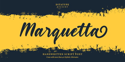 Marquetta is a modern handwritten font. With a classy and natural handwritten style, it brings a classy and chic typeface. Marquetta is best used for weddings, branding, logotype, and quotes. Features: - Beautiful Ligatures - PUA Encoded - Multilingual Support - Numerals and Punctuation Thank you for downloading premium fonts from Dita Type
 - Fellicia by Ditatype,
$29.00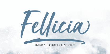 Fellicia is a modern handwritten font. With a classy and natural handwritten style, it brings a classy and chic typeface. Fellicia is best used for weddings, branding, logotype, and quotes. Features: - Beautiful Ligatures - PUA Encoded - Multilingual Support - Numerals and Punctuation Thank you for downloading premium fonts from Dita Type
 - Bettermind Signature by Din Studio,
$29.00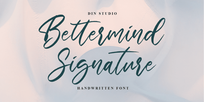 Bettermind Signature is a handwritten font. With a classy and beautiful handwritten style, it brings a classy and chic typeface. Made for any professional projects. Bettermind signature is best used for weddings, branding, logotype, and quotes. Includes: Bettermind Signature(OTF) Features: Stylistics PUA Encoded Multilingual Support Numerals and Punctuation
 - Royal Ambition by Lemonthe,
$13.00 Royal Ambition is a perfect mix modern script and sans serif font. Together or apart, these fonts are ideal for adding a chic and cheery touch to your crafts. It was created to help you designing makes gorgeous logos, posters, wedding invitations, blog posts, social media, and more!
 - Constaller by Namara Creative Studio,
$18.00 Modern calligraphy font with casual-chic flair. Magical pressure makes this font perfect for creating signature logos and watermarks for photography studios or wedding invitations. Constaller includes the full set of uppercase and lowercase letters, multilingual symbols, numerals, punctuation, alternates, swash and ligatures. Thanks and have a wonderful day.
 - Croz by Cititype,
$17.00 Croz Script is a raw and organic script typeface. Its cool appereance is carefully handcrafted to straight away grab the attention of the viewers. the shapes give this font a modern, chic, fun, funky vibe. Suitable if use for logos, posters, craft project, portfolio, headlines, brandings, apparel, etc.
 - Dorothy Script by Bosstypestudio,
$14.00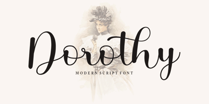 Dorothy Script is a Chic and Lovely Calligraphy font, described by a Love touch with natural handwritten style, perfect for your favorite projects. Fall in love with its incredibly distinct and timeless style and use it to create spectacular designs! What's Include : Multilingual Support Alternatis Ligatures Thank You,
 - The "Cartoonist" font, designed by George Edward Purdy, is a testament to the playful, expressive nature of fonts inspired by the golden age of comics and animation. This typeface stands out due to i...
- Explosion by Suomi,
$25.00 This font is an experiment in building dynamics into a typeface. Explosion has two variants to be put on top of each other for more dimension.
 - Glaciana by Intellecta Design,
$13.90Note: Only the regular style in font family is currently available due the complexity and the resulting memory and performance issues associated with the other styles. - Aberforth by Brittney Murphy Design,
$9.00 Aberforth is clean, mixed-case font family. It's mono-height, so it pairs well with other fonts. Family includes regular, rough, outline, tiles, and italic versions.
 - TXT Small World by Illustration Ink,
$3.00Get that Disney look with this downloadable "Small World" font. It's ideal for journaling and titles for theme park scrapbooking or wording for other creative publications. - Pareson by Balevgraph Studio,
$12.00 Pareson is stylish and beautiful sans serif font. It will look perfect in photography designs, watermarks, social media posts, advertisements, logos, branding, and various other projects.
 - YD Backjae by Yoon Design,
$580.00Yoon Backjae is a sans serif typeface consisting of 2 weights. It supports up to 13 different languages such as English in Latin and other scripts - Rancher JNL by Jeff Levine,
$29.00 Rancher JNL was inspired by classic wood type. This wide, slab serif typeface is reminiscent of wanted posters, broadsides and other printed matter from the 1800s.
 - Hobo by Bitstream,
$29.99Morris Fuller Benton’s 1910 contribution to the Art Nouveau sanserif, designed for ATF, with all descenders eliminated to encourage combinations of this typeface with other shapes. - YD Gogooryo by Yoon Design,
$580.00Yoon Gogooryo is a sans serif typeface consisting of 2 weights. It supports up to 13 different languages such as English in Latin and other scripts - Swirly by Trim Studio,
$12.00 Swirly is a cute handwritten font to share happy, loving, and cheerful vibes and moments in life like Easter, Valentine, Christmas, and for many other occasions.
 - YD Winter by Yoon Design,
$400.00YD Winter is a casual script typeface consisting of 3 weights. It supports up to 13 different languages such as English in Latin and other scripts. - YD Yoonche by Yoon Design,
$400.00YD Yoonche is a geometric sans serif consisting of 4 weights. It supports up to 13 different languages such as English in Latin and other scripts. - Letterpress Helpers JNL by Jeff Levine,
$29.00 Letterpress Helpers JNL continues a series of vintage cartoons, border and corner elements, stock designs, sales helpers and other embellishments re-drawn from vintage source material.
 - Compass St by TipografiaRamis,
$35.00 Compass St – a new addition to the existing Compass TRF Stencil fonts, originally released in 2010. Package consists of two fonts with rather different, both decorative, styles. Typeface is released in OpenType format with extended support for most Latin languages.
 - Matrijs by Hanoded,
$10.00 Matrijs is the Dutch word for mold. It comes from the Latin word for mother or womb and is somewhat similar to the English word Matrix. Matrijs is a handmade Garamond which can be used for a wide range of projects.
 - Moyenage Sans by Storm Type Foundry,
$55.00Moyenage is a modern replica of blackletter. Whereas the calligraphic typeface family can be used in shorter texts and posters, the sans-serif variation is rather experimental project which may find its use on music cover design, occasional lettering and invitations. - SpeedSwash by Greater Albion Typefounders,
$16.00 SpeedSwash is a stylised oblique script-fraktur hybrid. That description could should bizarre - lets face it, it does - but the result is actually rather splendid we think. Lovely for poster work where a sense of life and motion is required.
 - Greatlove by Realtype,
$15.00 Greatlove is a brush script written in natural brushes. Written in quick motion using a rather dry brush pen, looks beautiful and is perfect for designs like, magazines, logos, product packaging, quotes, posters, merchandise, social media greeting cards and more.
 - Antibes by Barmoor Foundry,
$15.00 Antibes is a casual italic face with print caps and cursive lowercase letters. Antibes works well with colorful, freeform illustration and travel-related material like illustrated travel brochures and callouts for maps. All-caps paragraphs are an easy read and letter-spaced all-cap treatments can be used for titling.
 - RBNo3.1 by René Bieder,
$25.00 RBNo3.1 is a sans serif typeface with a technical and geometric appearance. The family includes 9 weights with matching italics. Its large x-height makes it especially legible at small point sizes. RBNo3.1 feels comfortable in technical surroundings with short text passages, in brochures, catalogs, magazines, posters, websites, headlines or logos.
 - Bohemian Cassidy by Letterhanna Studio,
$19.00 Bohemian Cassidy is a lovely handwriting script font. It's perfect for signatures, logo type, weddings, posters, brochure or any display use. Bohemian Cassidy is perfect to get a more charismatic impression or give a unique touch to your projects and branding, greeting cards, wedding, banner, name card, lettering, fonts pairing, etc.