2,809 search results
(0.027 seconds)
- Gibson Girl JF by Jukebox Collection,
$32.99 Based on a hand lettered sample from the early 20th Century, Gibson Girl is a heavy script font with a vintage flair. During the end of the 19th Century, the “Gibson Girl” created by illustrator Charles Gibson, was considered the ideal of feminine beauty and poise in that time period. The term has become associated with the Gilded Age in America. The design of the Gibson Girl font reflects both femininity and self confidence.
 - Strongs Draughtsman by Nick's Fonts,
$10.00One in the series of fonts celebrating the Halcyon Days of Handlettering. Strongs Draughtsman is a monoline font that evokes the sensibilities of the early twentieth century. Based on a font called "architects' pen strokes" as delineated by Lawrence and Charles Strong in their The Art of Show Card Writing from 1922. Both versions of this font contain the Unicode 1252 (Latin) and Unicode 1250 (Central European) character sets, with localization for Romanian and Moldovan. - Copacabana by Alan Meeks,
$45.00 Copacabana is heavily based on one of my favourite typefaces Goudy Old Style Italic. It is sharper and more clearly defined than Goudy yet still retains it old style characteristics. The face is slightly angled so is basically upright whilst still retaining Italic characteristics.
 - Children in Need - Personal use only

- Bolderist by Sign Studio,
$12.00 Bolderist is a bold serif font designed for writing that needs to be read easily and clearly. However, the Bolderist still has an artistic and elegant form. Each curve is integral and has a point at extrema. You will get a smooth shape on each side.
 - Helvetian Times by Elemeno,
$25.00Helvetian Times is an unusual typeface. It clearly thinks it's a standard text font, but the offbeat letter shapes and inconsistent serifs combine to form something that defies conventional categorization. Helvetian Times works well at any size, but generally evokes the impression that something's not quite right. - Gambino by Monotype,
$15.99 Childlike, sure; utterly affable, yes, but ultimately actually very cool. Yup, that’s Gambino. This chalky, super textured, semi connected script is a kooky playground pal and a grown-up technically savvy typeface all rolled into one. Upright yet tumbling, these simple, crayon-like letterforms are a delight.
 - Greene Designs by Woodside Graphics,
$19.95This font consists of 26 design elements derived and adapated from various architectural works of Charles and Henry Greene who created hundreds of designs for houses, furniture and decorative arts in their own unique interpretation of the "Arts & Crafts" style in the early years of the 20th Century, mostly in Pasadena, California. Many of the picture elements are designed to form distinctive borders, and the variety of designs contained in this font encourages their use in many creative ways. - Gabriel Bautista by Comicraft,
$29.00 Comix Gorilla GABRIEL BAUTISTA is the artist of John JG Roshell's CHARLEY LOVES ROBOTS series. His incredible watercolors graced the pages of ELEPHANTMEN #50. In some circles he is known as "Galvo" or "Gabo" and he has brought his brofu color skills to the pages THE SPIRIT, ALL STAR WESTERN and also illustrated JESUS CHRIST, IN THE NAME OF THE GUN. He is also the creator of comic battling site ENTERVOID.COM and indy press PULPOPRESS.COM. He loves his girl, his dog lulu and his font.
 - Sticky Rush by Bogstav,
$16.00 This is my and it's handmade super legible sans font. Very suitable for anything that needs a clearly handmade look, but not overdoing it. I've added several different versions, and they all fit on top of each other - or you can use them just fine as individual fonts.
 - Bungler by Bogstav,
$17.00 This font is a strange mixture of sweet strawberry cake and horrifying terror! :) Meaning that the font can be used for something pretty scary (such as a horror poster) or something quite innocent (like products for children) It resembles fat brushstrokes, but clearly it was drawn with a pen.
 - Kegger by Chank,
$59.00Show you school spirit with this sporty, collegiate font. These big chunky serifs let the world know you speak with authority, and they'll read your message clear as a bell. It's like a traditional college font, but it's got a chanky flair. Good for hockey jerseys and house parties. - schizophrenia Queue - Unknown license

- Behrensmeyer Vigesimals by Dharma Type,
$14.99 This 8-bit pixel font is designed with respect for 80s game designers and the pixel font pioneers in middle 90s. And for the calligrapher H.P. Behrensmeyer & Charles Paxton Zaner. Use at size 20 pixels or multiples of 20 and anti-alias off is recommended. List of our Pixel Font Project. ·Flat10 Antique ·Flat10 Artdeco ·Flat10 Arts&Crafts ·Flat10 fraktur ·Flat10 Holy ·Flat10 Holly ·Flat10 Segments ·Flat10 Stencil ·Flat20 Gothic ·Flat20 Headline ·Flat20 Hippies ·Flat20 Streamer ·Behrensmeyer Vigesimals ·Civilite Vigesimals
 - Artful Dodger by Hanoded,
$15.00 The Artful Dodger is a character in Charles Dickens' Oliver Twist. Dickens wrote his books in the Victorian Era, which also gave birth to a beautiful and extensively used typeface called Clarendon. The typeface was developed by Robert Besley and first published in 1845. Artful Dodger was modeled on the glyphs found in a 1865 book, which was typeset in Clarendon. Artful Dodger has not been 'cleaned', so the glyphs look rough and worn, just like the book I found them in.
 - G&G by Woodside Graphics,
$19.95G&G is the only authorized digitized version of the original handlettering of early 20th Century architects Charles and Henry Greene. This font is both accurate and authentic -- it was adapted directly from the Greenes' original plans for The Gamble House in Pasadena, California, and others. G&G contains both Upper and Lower-case characters, consistent with the Greenes' use of lower-case to explain fine construction details on their plans. G&G is very successful in creating the illusion of hand lettering. - 2030 by Noir Typo,
$26.00 2030 font is inspired by the typography of the early 20th century, the Futura of Paul Reener, Cassandre and Charles Loupot’s works and, on a broader level by modernism and art déco mouvements. Geometric, with classicals proportions, this typefaces is a re-interpretation, in a actual form, of the alphabets from this period. The lines are straight, but the letters are easy to read and nice to watch thanks to optical corrections. Build with 9 weights of 700 glyphs, italics and small caps.
 - Chalk And Cheese NF by Nick's Fonts,
$10.00The name comes from a British expression about two things that couldn't be more different, and it suits this offering to a tee. The uppercase of this typeface is based on 1930s lettering by French poster artist Charles Loupot, and the lowercase is based on 1910s lettering by German plakatmeister Ludwig Hohlwein. Oddly, the two seem to play together well. Both versions of the font include the 1252 Latin and 1250 CE character sets (with localization for Romanian and Moldovan). - Versailles LT by Linotype,
$57.99 The origins of the font Versailles go back to the 19th century in France when, with the introduction of lithography, alphabets could contain freer forms. The basic forms are Modern Face with triangular serifs. The direct influence for Versailles was the writing on the back of the memorial to Charles Garnier, the architect of the Paris Opera. Versailles is a classic font for advertisements, perfect for shorter texts and titles/headlines and it makes an impression of elegance and strength.
 - Future Tense by Borges Lettering,
$30.00 Future Tense is a modern type style that is perfect for logos, film, video games, packaging, signs, and more. Charles Borges de Oliveira & Vassil Kateliev's attention to letter forms insures extreme legibility without sacrificing this modern style. The 160 alternate letters will keep your designs looking fresh and different. A unique feature included in Future Tense is the small caps have their own set of small caps. This allows 3 different looks for each letter. What’s included in Future Tense: 160 alternate letters makes designing eye catching logos rewarding! The alternates are included in the small caps and second small caps as well. Future Tense is a titling face that contains small caps as well as a second set of small caps. Multilingual: support for over 200 languages. Over 2,500 glyphs make up Future Tense. PUA encoded. Take your designs to the next level with Future Tense. Please note: artwork is not included with font purchase. The images above show how Future Tense can be used in a design setting. Future Tense was designed and created by Charles Borges de Oliveira and Vassil Kateliev. This font is dedicated to Warrel Dane.
 - Rondabo by Yoga Letter,
$14.00 "Rondabo" is a cute display font with cute doll headdresses, cherries, a smiling sun, tulips, carrots, and cute bunny ears. This font can be used for spring, Easter, book titles, movie titles, cartoons, magazines, logos, and more. This font is equipped with upper- and lower-case letters, numerals, punctuation, and multilingual support.
 - Harbour by Alias Collection,
$60.00 Harbour is a clash of Latin and Germanic typestyles - two conflicting letterforms, culturally, politically and aesthetically. Latin letterforms have a geometric base, blackletter types are calligraphic. Harbour takes calligraphic forms that derive from writing with quills, but is a typeface that is clearly drawn‚ rather than written‚ to produce graphic, dynamic letterforms.
 - Ceriburn by Typeskets,
$18.00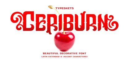 Ceriburn is inspired by the sweetness and richness of cherries. It easily evokes impressions of nature, elegance, and romanticism. You can use this stunning decorative font for logos, packaging, business cards, crafts, books, labels, headlines, invitations, print templates, and a multitude of other design ideas! Letter, Number & Punctuation, Accent Characters, Alternates Features.
 - Petit Four by Hanoded,
$15.00 A "Petit Four" is a small, bite-sized, French pastry. The font before you is a bite-sized Hanoded original. It is hand made, fun to use and comes with a lot of calories. Like its namesake, use Petit Four sparingly and it will be the cherry on top of your design.
 - Alpha Bravo by Wiescher Design,
$39.50 AlphaBravo was born on a napkin. I was just doodling, playing around with letterforms when the ballpoint glided a little bit too far and suddenly I had my first letter with the dash sticking out on the left of the e’s horizontal line. I quickly checked on how many letters I could let a line stick out! Then I wrote a couple of words that way and letters joined in the most unusual places, creating new closed forms. I gave the font a try and quickly discovered, that I had stumbled onto an interesting new typeface. I didn't know how to call it, so I simply used the first two letters of the alphabet, Alpha and Bravo. Looking forward to Charlie and Delta, your very curious, Gert Wiescher.
 - Shinn Kickers JNL by Jeff Levine,
$29.00 Conrad X. 'Cobb' Shinn (Sept. 4, 1887- Jan. 28, 1951) was a Fillmore, Indiana-born post card illustrator who sold a series of successful novelty postcard lines which included (among others) Charlie Chaplin, automobiles and the Dutch culture in the beginning years of the 20th Century. After serving in World War I, Shinn found the market for novelty postcards dwindling, and he also lent his artistic skills to cartoon features and illustrating many children's books [including his own, under the nickname 'Uncle Cobb'] which taught easy step-by-step drawing methods. Some time in the 1920s, he eventually migrated into the field of supplying electrotypes and stereotypes of 'stock cuts' of photos and line art to the printing trade. In the days of letterpress printing, this was the forerunner of paper clip art and its successor, electronic clip art. Purchasing many of his designs from 'journeyman' artists of the time, the diversity of Cobb Shinn's stock cuts library grew with the passing years, reflecting changing times, styles and topics. Some of the illustrators whose signed works were presented in Shinn's 'CUTalogs' [as he called his stock cuts catalogs] include Mary Clemmitt, Louis H. Hippe, E.C. Klinge, Nelson White, Harvey Fuller, Bess Livings, Lois Head, Harvey Peake and Van Tuyl. Upon his passing in 1951, it's not known how long the Indianapolis-based company existed before finally closing its doors. One of the more popular series of cartoons were the line illustrations of men and women affectionately called 'little big head guys' by many modern fans of these cuts because the heads of the characters were drawn somewhat larger than the rest of their bodies. Shinn Kickers JNL is a collection twenty-six of these illustrations, and just like a kick in the shin (as the pun in the name implies), these charming cartoons get your attention.
 - Wankstaberg Battles - Personal use only

- Teenage Girl 2 - Unknown license

- VTC-BadEnglischOne - Personal use only

- Beagle Boyz NF by Nick's Fonts,
$10.00Whoever knew the Red Menace could be such fun? This bold and bouncy face is based on a Cyrillic alphabet presented in the book Schrifti Alphabeti, published in the Soviet Union in 1979. It rollicks and frolicks, and might even fetch your slippers. Special thanks to Charles Barsotti for permission to use The Pup to promote this doggone-good product. The Postscript and Truetype versions contain a complete Latin language character set (Unicode 1252); in addition, the Opentype version supports Unicode 1250 (Central European) languages as well. - Kodiak by Borges Lettering,
$45.00 Kodiak was designed by 40+ year sign painting veteran, Brian Grant, and is loosely based on the works of many great sign painting masters. Brian and Charles Borges de Oliveira teamed up to bring this beautiful sign painters classic to the digital age. Kodiak retains the warmth of a hand lettered font without being stiff and mechanical. Great for period style lettering to modern day logos. With over 160 alternates and 10 ornaments you are bound to find the right look for your next design!
 - LHF Chicago Script by Letterhead Fonts,
$46.00 This Charles Borges' script takes full advantage of the Open Type format with several automatic ligatures that occur as you type for a nicer fit. Plus, the manual stylistic alternates allow you to choose the letters you prefer. Alternates occur automatically as you type in supported programs when you have "Ligatures" or "Stylistic Alternates" turned on. If your program does not support automatic ligatures and substitutions, you may still access the alternates manually using the printable keyguide or using Character Map (Windows) or Font Book (Mac).
 - Cartoon Panel JNL by Jeff Levine,
$29.00 Charles W. "Plot" Plotner was a cartoonist who had developed a template-based cartooning set for kids circa 1952 called "Plot-O". A companion set was called "Plot-O the Clown". "Plot-O" consisted of two plastic templates with pre-cut and numbered cartoon shapes. By following the simple directions and tracing the corresponding parts, any youngster could create basic cartoons of people and finish them off with their own details. The hand-lettered instruction booklet provided the design inspiration for Cartoon Panel JNL.
 - Rhapsody by profonts,
$39.99Rhapsody is clearly showing Unger's love with Blackletters and Gothics. Other than many of the existing Blackletters, Rhapsody is really easy to read. The calligraphic forms of the upper case in connexion with its lower case appear very special, very unique. Rhapsody, having its origins in the 50ies, was redesigned, completed and expanded by Unger for the URW++ FontForum. - The City Burn by Alien,
$40.00 The City Burn, formerly called "The city burn night after night and we spray-paint the walls", was especially designed for Mad Skills Mag issue#3 Urban Flavour. It needed to be street, and urban, so I made a stencil font. It’s used by Fox5 tv for the rant TV show, the website infected.com, Fried chillies TV, and others!
 - Graphite Love by Mvmet,
$16.00 Graphite Love is a chalky handwritten font that you can use it for anything ranging from t-shirts, book designs, packaging, and greeting cards to stickers and posters, or anything that needs a casual touch, it will be your perfect font to pick. Fall in love with its incredibly versatile style, and use it to create lovely designs!
 - Arts District JNL by Jeff Levine,
$29.00 Although the model for Arts District JNL was a set of wood type, the design influence is clearly from the Art Nouveau era. Note the combination of unusual flat and curved sides on many letters. Decorative, yet legible; Arts District JNL works well with any period piece or as a pleasant alternative to traditional headline fonts.
 - Petre Devos NF by Nick's Fonts,
$10.00At first glance, this unusual display face might appear to be a product of the 1960s, with its highly unconventional letterforms and its plastic, fantastic highlight treatment. However, this font is in fact inspired by a ca. 1930 poster for a Belgian beer of the same name. The uncredited Flemish designer was clearly a head of his time (ouch!). - Radiate Sans by Studio Sun,
$20.00 Radiate Sans is a Humanist - Geometric Sans Serif fonts, Simple geometric letters shapes, medium contrast character style, It was designed lately 2018. and published on April 2020. Radiate Sans is a neutral typeface, have stroke modulation (strokes that clearly vary in width along their line) or alternating thick and thin strokes. Radiate Sans intended as a display typeface that could be used for posters and advertisements, as well as for the text of documents that need to be clearly legible at small sizes or from a distance, such as book blurbs, timetables and price lists. The family include 5 font weights, with a bonus 4 Widths in the OpenType version. It supports ISO Adobe 2, Adobe CE, Latin Extended characters, Standard Greek, and Standard Cyrillic. OpenType features include small caps, old style figures, superscript and subscript, ordinals, proportional lining figures, and case forms.
 - Freak by HiH,
$10.00 Freak was originally released by The Great Western Type Foundry in 1889. According to Maurice Annenberg, Great Western became Barnhart Brothers & Spindler when the Barnhart brothers bought out the Toepfer family in 1868.The plant superintendent, Charles Spindler, became Secretary of the new firm. Specimen books as late as 1899 show the name Great Western alongside the BB&S name. At some point, prior to 1925, Freak was renamed “Bamboo” by BB&S. It was delisted when BB&S was absorbed by ATF in 1929. Listed in McGrew under “Bamboo”.


