10,000 search results
(0.028 seconds)
- PostIndexHand2 - Unknown license

- DS Diploma-DBL - Unknown license

- NCS Radhiumz by Namara Creative Studio,
$12.00 NCS Radhiumz is a modern powerful quality sans serif font with great versatility. This extended font can be used for bold editorial statements, graphic heavy prints or just as a simple logo. This new type will definitely make your designs stand out and unique. Included 08 variant to choose : Light Light Italic Regular Italic Bold Bold Italic Bold Rounded Bold Shadow Included uppercase, lowercase, numerals, punctuations, multilingual support, and some alternates & ligatures.
 - Corrente by d[esign],
$17.38 Corrente, named aptly for its “electric” letter shading (“corrente” is Italian for “current” (electrical)) will add a little spark to your works. Corrente’s “Dagger” glyphs are lightning bolts!
 - Throw My Hands Up in the Air - Personal use only

- Covington Cond - Unknown license

- Covington Exp - Unknown license

- Covington SC - Unknown license

- Plasmatica Rev - Unknown license

- Covington Rev - Unknown license

- CREATOR PERSONAL USE - Personal use only

- SMILE PERSONAL USE - Personal use only

- DAMAS PERSONAL USE - Personal use only

- WATCHER PERSONAL USE - Personal use only

- Schism One by Alias,
$55.00 Schism is a modulated sans-serif, originally developed from our Alias Didot typeface, as a serif-less version of the same design. It was expanded to three sub-families, with the thin stroke getting progressively heavier from Schism One to Schism Three. The different versions explore how this change in contrast between thick and thin strokes changes the character of the letterforms. The shape is maintained, but the emphasis shifts from rounded to angular, elegant to incised. Schism One has high contrast, and the same weight of thin stroke from Light to Black. Letter endings are at horizontal or vertical, giving a pinched, constricted shape for characters such as a, c, e and s. The h, m, n and u have a sharp connection between curve and vertical, and are high shouldered, giving a slightly square shape. The r and y have a thick stress at their horizontal endings, which makes them impactful and striking at bolder weights. Though derived from an elegant, classic form, Schism feels austere rather than flowery. It doesn’t have the flourishes of other modulated sans typefaces, its aesthetic more a kind of graphic-tinged utility. While in Schism Two and Three the thin stroke gets progressively heavier, the connections between vertical and curves — in a, b, n etc — remain cut to an incised point throughout. The effect is that Schism looks chiselled and textural across all weights. Forms maintain a clear, defined shape even in Bold and Black, and don’t have the bloated, wide and heavy appearance heavy weights can have. The change in the thickness of the thin stroke in different versions of the same weight of a typeface is called grading. This is often used when the types are to used in problematic print surfaces such as newsprint, or at small sizes — where thin strokes might bleed, and counters fill in and lose clarity, or detail might be lost or be too thin to register. The different gradings are incremental and can be quite subtle. In Schism it is extreme, and used as a design device, giving three connected but separate styles, from Sans-Didot to almost-Grotesk. The name Schism suggests the differences in shape and style in Schism One, Two and Three. Three styles with distinct differences, from the same start point.
 - Schism Three by Alias,
$55.00 Schism is a modulated sans-serif, originally developed from our Alias Didot typeface, as a serif-less version of the same design. It was expanded to three sub-families, with the thin stroke getting progressively heavier from Schism One to Schism Three. The different versions explore how this change in contrast between thick and thin strokes changes the character of the letterforms. The shape is maintained, but the emphasis shifts from rounded to angular, elegant to incised. Schism One has high contrast, and the same weight of thin stroke from Light to Black. Letter endings are at horizontal or vertical, giving a pinched, constricted shape for characters such as a, c, e and s. The h, m, n and u have a sharp connection between curve and vertical, and are high shouldered, giving a slightly square shape. The r and y have a thick stress at their horizontal endings, which makes them impactful and striking at bolder weights. Though derived from an elegant, classic form, Schism feels austere rather than flowery. It doesn’t have the flourishes of other modulated sans typefaces, its aesthetic more a kind of graphic-tinged utility. While in Schism Two and Three the thin stroke gets progressively heavier, the connections between vertical and curves — in a, b, n etc — remain cut to an incised point throughout. The effect is that Schism looks chiselled and textural across all weights. Forms maintain a clear, defined shape even in Bold and Black, and don’t have the bloated, wide and heavy appearance heavy weights can have. The change in the thickness of the thin stroke in different versions of the same weight of a typeface is called grading. This is often used when the types are to used in problematic print surfaces such as newsprint, or at small sizes — where thin strokes might bleed, and counters fill in and lose clarity, or detail might be lost or be too thin to register. The different gradings are incremental and can be quite subtle. In Schism it is extreme, and used as a design device, giving three connected but separate styles, from Sans-Didot to almost-Grotesk. The name Schism suggests the differences in shape and style in Schism One, Two and Three. Three styles with distinct differences, from the same start point.
 - Schism Two by Alias,
$55.00 Schism is a modulated sans-serif, originally developed from our Alias Didot typeface, as a serif-less version of the same design. It was expanded to three sub-families, with the thin stroke getting progressively heavier from Schism One to Schism Three. The different versions explore how this change in contrast between thick and thin strokes changes the character of the letterforms. The shape is maintained, but the emphasis shifts from rounded to angular, elegant to incised. Schism One has high contrast, and the same weight of thin stroke from Light to Black. Letter endings are at horizontal or vertical, giving a pinched, constricted shape for characters such as a, c, e and s. The h, m, n and u have a sharp connection between curve and vertical, and are high shouldered, giving a slightly square shape. The r and y have a thick stress at their horizontal endings, which makes them impactful and striking at bolder weights. Though derived from an elegant, classic form, Schism feels austere rather than flowery. It doesn’t have the flourishes of other modulated sans typefaces, its aesthetic more a kind of graphic-tinged utility. While in Schism Two and Three the thin stroke gets progressively heavier, the connections between vertical and curves — in a, b, n etc — remain cut to an incised point throughout. The effect is that Schism looks chiselled and textural across all weights. Forms maintain a clear, defined shape even in Bold and Black, and don’t have the bloated, wide and heavy appearance heavy weights can have. The change in the thickness of the thin stroke in different versions of the same weight of a typeface is called grading. This is often used when the types are to used in problematic print surfaces such as newsprint, or at small sizes — where thin strokes might bleed, and counters fill in and lose clarity, or detail might be lost or be too thin to register. The different gradings are incremental and can be quite subtle. In Schism it is extreme, and used as a design device, giving three connected but separate styles, from Sans-Didot to almost-Grotesk. The name Schism suggests the differences in shape and style in Schism One, Two and Three. Three styles with distinct differences, from the same start point.
 - Komika Text Kaps - Unknown license

- Potter Alaska by Aldedesign,
$18.00 Potter Alaska is Nice Bold Script Font - A stylish and quirky new bold script. Potter Alaska font was created to look as close to a readable bold script as possible by including a couple ligatures.
 - Presidio by Woodside Graphics,
$19.95Presidio is a stylized version of the hand-lettered calligraphy typical of the Mission era of early California. This lettering was often unique to an individual hand, but the characters shared a common style, and had their roots in the Middle Ages when monks and scholars copied whole books one letter at a time. "Presidio" replicates this style with subtle variations in each character, giving the font its authentic charm. - Savattera by Prioritype,
$18.00 Introducing a new script font with a beautiful, uniquely elegant and very charming look, you can click it and can be used in your projects such as wedding invitations, quotes, creative posts, clothing product packaging, promotions, video preview images, logos and much more to explore. because it has many cool variations. As a picture you can see the preview above. Features: -Uppercase -Lowercase -Numeral -Punctuation -Multilingual -Alternate -Ligature -Swash Thanks.
 - Telenovela NF by Nick's Fonts,
$10.00Here's a retooling of the Art Deco classic Novel Gothic, designed by Morris Fuller Benton and Charles H. Becker for American Type Founders in 1929. We've added a little sparkle to this classic with a reflected-highlight treatment, to help create attractive and commanding headlines. Both versions include the complete Latin 1252, Central European 1250 and Turkish 1254 character sets, as well as localization for Moldovan and Romanian. - Cursivo Saxonio by Intellecta Design,
$21.90 Cursivo Saxonio is a typeface inspired in the famous book The Case of Charles Dexter Ward, by H P Lovecraft. It shows better than I get with my studies the authentic "Insularis" or "Cursivo Saxonio" handlettering of the VIII and XI centuries used by some people in Britain. The text on the accompanying poster reads: “Corwinus necandus est. Cadaver aq(ua) forti dissolvendum, nec aliq(ui)d retinendum. Tace ut potes”
 - Olympian by Linotype,
$29.99 After the Second World War, the Ionic style replaced Modern Face as the favored typeface for newsprint. A couple decades later, it was in turn replaced by the next generation of newspaper fonts, a mix of Old Face, Transitional and Modern Face forms. Olympian itself tends toward the Old Face style but is nevertheless an example of this new generation, a result of a time of change and experimentation.
 - Tea Dance by Studio K,
$45.00 If you think nostalgia isn't what it used to be, this will change your mind. A ritzy new font family from Studio K that will transport you back to the era of afternoon tea dances performed to the strains of the Palm Court Orchestra or the Bath Pump Room Quartet: a celebration of the golden age of dance from Busby Berkeley to Fred Astaire and Ginger Rogers. Enjoy!
 - Corton by Greater Albion Typefounders,
$14.00 Corton was inspired by the traditional lettering on a gravestone in an English village. While that might sound a rather solemn beginning, Corton has wonderfully lively air, with distinctive lively serifs and beautifully swashed downstrokes. Eight faces are offered: regular and titular each in three weights plus regular condensed. Between them they are ideal signage and display faces, merging 'olde-worlde' charm and fun character, but remaining clear and legible.
 - Shangri La NF by Nick's Fonts,
$10.00An unusual handlettered alphabet from the 1922 chapbook Modern Show Card Writing, by Joseph Bertram Jowitt, provided the pattern for this whimsical face. Its letterforms, as well as its name, conjure up visions of faraway places, and is sure to add a unique charm to your next project. This font contains the complete Latin language character set (Unicode 1252) plus support for Central European (Unicode 1250) languages as well. - William Jameson by Letterhanna Studio,
$19.00 William Jameson is a monoline signature handwritten font. Its distinct and well rounded letters make this font a masterpiece. Fall in love with its incredibly versatile style and use it to create spectacular designs! William Jameson is made using opentype technology which makes the connection between letters more fluid, there are 3 types of tails in each letter that will automatically change according to the letters in front of it.
 - Gosthel by Sibelumpagi,
$18.00 Introducing Gosthel, a dry Brush typeface, carefully hand-brushed. Comes with natural and organic flowing brush pen, make the letters look cool and classy. Gosthel has a unique style and charming characteristics from the brush texture. Gosthel is a good choice for many different projects such as logos & branding, invitation, stationery, wedding designs, social media posts, advertisements, product packaging, product designs, label, photography, watermark, special events or anything.
 - Kelsy Fantastic by Great Studio,
$13.00 Kelsy Fantastic is a charming and cute new hand-lettered font duo - perfect for casual type in greeting cards, illustrations, quotes, quaint branding, book covers, children's books, packaging and so much more. Suitable for short and sweet quotes, as well as longer meaningful paragraphs. Designed and kerned with care and love to make using it a breeze. Please don't hesitate to contact me if you have any questions! Happy creating!
 - Chromate by Supfonts,
$18.00 Chromate - a charming family with 3 fonts in retro style of the 80s and 90s! The dense structure will give an incredible retro vibe to your project. There are 3 fonts at your disposal, Regular, Italic and Script. This set covers all your needs and allows you to keep the project in a single style. You no longer need to look for which font is suitable, everything is already here
 - Melgard by Larin Type Co,
$15.00 Melgard this amazing handwritten font is light and elegant, will emphasize your personality in any project and will charm you with its signature. This font includes alternates for Uppercase and Lowercase, make your signature with them. You can use it to create logos, branding, t-shirts, book covers, stationery, marketing, blogs, magazines, cosmetics, signage, and more. This font is easy to use has OpenType features, and supports PUA encoding.
 - Volut by jpFonts,
$19.95 Volut is a very charming display font designed by Christoph Ulherr. The family comes with four design variations as Base, Blocks, Outline and Outline Blocks. It’s touching and kissing characters create an outstanding sex appeal. Volut invites you to play and have fun, just try it. It should only be used in large point sizes beyond 24pt. All fonts include stylistic alternates and special ligatures to guarantee the best typographic quality.
 - Angel Cry by Stefani Letter,
$12.00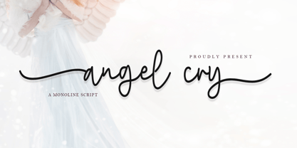 Angel cry is a beautiful monoline script font that will effortlessly add a perfect look to any craft! Your imagination and this font will make a perfect combination. Get inspired by its unique charm and create amazing greeting cards, Weddings, books, logos, stationery, and much more! This font is PUA encoded which means you can access all of the cute glyphs with ease! It also features a wealth of including ligatures.
 - Overbillions by Almarkha Type,
$35.00 Introducing Overbillion - Brush Script is a Authentic brush script that is written casually and quickly. Letters are made with brushes on paper. Then scanned and carefully drawn into vector format. That is why Overbillion has charming, authentic and relaxed characteristic more natural look to your text with a more natural look to your text. You can activate Ligature OpenType panel, Overbillion Perfect for designs,branding projects, Logo design, Quotes product packaging.
 - Kifisia Antigua NF by Nick's Fonts,
$10.00This rough-and-ready display face is based on El Greco Antique, released by the Fundición Richard Gans of Madrid in the 1930s. Distressed but not distressing, rough yet charming, ragged around the edges but curiously refined. Named after a village in Greece which is the ancestral home of the forebears of the Curtii. Both versions of the font include 1252 Latin, 1250 CE (with localization for Romanian and Moldovan). - Rummy Tall by Bunny Dojo,
$23.00 Rummy, the stout, scrappy font inspired by sports branding and 1940s film, has grown up and is ready to take on new responsibilities. The result: Rummy Tall. Still powerful, precise, and packed with personality, Rummy Tall's added height brings with it even more versatile charm. Track Rummy Tall tightly for a sturdy foundation, or give Rummy Tall some breathing room for an unexpected air of nobility. Reach new heights!
 - Packard Patrician NF by Nick's Fonts,
$10.00Here’s a new take on the hand-lettered alphabet Oswald Bruce Cooper used in ads for the Packard Motor Company, later converted into a metal typeface by the Barnhard Brothers & Spindler foundry. This version has smoother outlines and an increased x-height, but retains all of the elegant charm of the original. Both versions of this font include the complete Unicode Latin 1252 and Central European 1250 character sets. - Old Softy NF by Nick's Fonts,
$10.00The pattern for this friendly face was found within the Keystone Type Foundry's 1884 specimen book, under the rather prosaic name of Round Gothic. This version retains all of the original's warmth and charm, while updating it to twenty-first century standards. Both versions of this font include the complete Latin 1252, Central European 1250 and Turkish 1254 character sets, along with localization for Lithuanian, Moldovan, Romanian and Turkish. - Fadella by Stefani Letter,
$12.00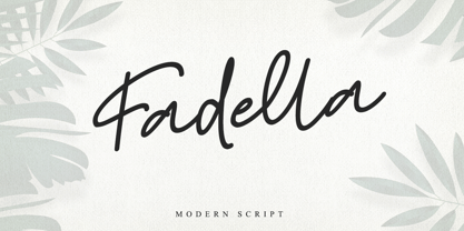 Fadella is a beautiful monoline script font that will effortlessly add a perfect look to any craft! Your imagination and this font will make a perfect combination. Get inspired by its unique charm and create amazing greeting cards, Weddings, books, logos, stationery, and much more! This font is PUA encoded which means you can access all of the cute glyphs with ease! It also features a wealth of including ligatures.


