10,000 search results
(0.161 seconds)
- Nosegrind by Scriptorium,
$24.00Nosegrind is a bit of a departure from our usual more traditional font offerings. It's based on skate-culture graffiti gleaned from various samples of similar style found on walls in Austin and online. The font includes two character sets, one which is plain and one which is enhanced with outlines. In normal usage the characters should nest, with slight overlap from one character to the next as shown in the sample to the right, but the lower case characters in the font are spaced evenly but not pre-nested, leaving the degree of overlap up to the user - nesting is easily adjusted with the tracking option in programs like Photoshop, Quark or InDesign. Ultimately Nosegrind will be added to our Modern Fonts collection, where it ought to fit in nicely. - Delayed Love by Abbastype,
$10.00 Delayed Love is a unique blend of a classic and modern script style. It works well for logos, wedding invitations, posts, t-shirts, letterhead, signage, labels, posters, badges and more. It includes OpenType features with alternative styles, binders and multi-language support. To activate the OpenType Stylistic alternative, you need a program that supports OpenType features such as Adobe Illustrator CS, Adobe Indesign & CorelDraw X6-X7, Microsoft Word 2010 or newer versions. How to access all alternative characters, using Windows Character Map with Photoshop: https://www.youtube.com/watch?v=Go9vacoYmBw How to access all alternative characters using Adobe Illustrator: http://youtu.be/iptSFA7feQ0 There are additional ways to access alternatives / swash, using Character Maps (Windows), Nexus Fonts (Windows), Font Book (Mac) or software programs such as PopChar (for Windows and Mac).
 - WildSong by Scholtz Fonts,
$19.00 WildSong was inspired by the exuberant flight and beautiful song of birds. While most brush scripts take their cue from mid-twentieth century samples, WildSong is a fresh, contemporary alternative. WildSong reflects a dynamic interplay between dark and light, creating a sense of drama while hinting at a calligraphic background. Words suggest a baseline, yet are not bound by it. Letters interweave in a seemingly random dance, sometimes connecting smoothly, then breaking that connection as a calligraphic scribe does intuitively. Exuberant swash alternatives to uppercase letters, as well as ligatures can be accessed through both the type and glyph palettes. The font contains over 235 characters - (upper and lower case characters, punctuation, numerals, symbols and accented characters are present). It has all the accented characters used in the major European languages.
 - African Gold by Scholtz Fonts,
$19.00 The name African Gold is associated with Johannesburg, the "City of Gold"; (the Zulu name for Johannesburg is eGoli). The font was so named for two reasons: the intricate African patterns within the characters of the font suggest the shafts and tunnels of a gold mine, and, as with a gold mine, the richness lies within. African Gold is a display font that is best used at larger sizes, however, it contains a full character set with all accents, special characters, diacritical marks and all the characters are carefully spaced and kerned. The numerals are mono-spaced so that they will line up correctly in columns of figures. The letters of the alphabet are spaced according to their width and are carefully kerned to create an attractive appearance.
 - Pepi/Rudi by Suitcase Type Foundry,
$39.00 The superfamily Pepi and Rudi is based on playful experimentation with basic geometric shapes - the circle, rectangle and triangle - elements that laid the foundations for typographic Modernism. The Pepi and Rudi introduces a number of current elements into a time-proven concept of primitively constructed typefaces. The typeface's somewhat uniform character width establishes a more regular rhythm; the character set is expanded, and legibility is improved thanks to taller lowercase. A wide range of ten styles, from hairline-thin to extra-thick with adequate Italics allow for universal use across the whole scope of graphic design. Carefully designed diacritics, clear punctuation marks, table number characters, ligatures, arrows or alternative lowercase characters are standard; this is sure to please everyone needing to work effectively with a neutral, geometric headline typeface.
 - Pagkaki by Nantia.co,
$8.00 Pagkaki Font is a fun display font, with support for Extended Latin and Greek characters. Of course, with this typeface, you have access to a Greek set of characters. Pagkaki Handcrafted Greek Font is a multilingual font that can transform any project into a bold graphic design statement. Also, this handmade font supports both uppercase and lowercase characters, and it is a powerful, bold handwritten font. Additionally, the font supports all the European languages with the Extended Latin character set. This craft font looks perfect on baby shower invitations, but not too childish. Again, if you are loving crafts this is the scrapbooking font for you! In addition, I have to mention the endless applications of this lettering font in food products, restaurant menus, hotels, and generally in the food and hospitality industries.
 - Daisy Rider by Blythe Green,
$13.00 Daisy Rider is a handcrafted, mixed-case, semi-script font with an authentic feel and lots of extras! It's perfect for: logos, branding, wedding invitations, business cards, greeting cards, posters, magazines, social media, planners, prints, and more. NOTE: Since this is a semi-script font, I programed Daisy Rider with many alternate characters and ligatures that ensure the characters work seamlessly together (unlike what you're seeing with the sample text on My Fonts). See the sample images for reference. Once you download the file, you can access these features through any Open Type program such as Adobe Creative Suite, Microsoft Word, etc. FEATURES: 60 ligatures to help make your type look as handwritten as possible Alternate characters to give a unique touch to each word Multilingual accents + characters
 - FS Sinclair by Fontsmith,
$80.00 ZX Spectrum In 1982, a home computer came on the market that would launch the UK IT industry. The ZX Spectrum sold five million units and spawned thousands of software titles. It was the must-have gadget for every teen. FS Sinclair is inspired by the memory of Sir Clive Sinclair’s greatest creation: the experience of entering its clunky command codes and reading its simple, grid-placed type. Smart, switched-on, great in text and display, FS Sinclair is a modern grid-based font, drawn with the Spectrum in mind and brought to life by well thought-out design. Formula Having completed the font for Channel 4’s brand update, the Fontsmith team defined the formula for its next font: the creative essence of the C4 work but with more structural discipline, more rigid form and a little more seriousness. The new font wouldn’t look self-consciously retro but it would reference the past and, it was hoped, influence the future. Readability Like the ZX Spectrum, it took a while for the new font to do exactly what it was meant to do. Many of the early concepts by Phil Garnham and Jason Smith were too jagged – the result of an awareness of getting too close to existing fonts of the same ilk, such as Wim Crouwel’s Gridnik. Eventually, FS Sinclair evolved into a more readable, functional grid-based type design that answered Phil and Jason’s original, self-set brief. Idiosyncratic There’s a technological, systems feel to FS Sinclair but ultimately, humans are in charge. The lowercase “a”, “n”, “m” and “r” have clean-cut “ears”, and the square-ish design is softened by round joins on the inside of the letterforms. The idiosyncratic design of letters such as “g”, “j”, “k”, “v”, “w” and “y” bring the design up to date. This is a modular font with character, and a range of weights that allow varied application.
 - Glance Sans by Identity Letters,
$29.00 Geometric, stylish, and not quite a stencil face: Glance Sans is the urban alter ego of Glance Slab—a strong-willed sans-serif with no frills but a few unique character traits. Glance Sans follows the design principle of nonjoining parts that made Glance Slab successful. Some strokes may not connect to their stems, creating visible gaps and thus, a dynamic impression of balance and movement. However, Glance Sans has a calmer appearance due to the lack of detached serifs. If Glance Slab’s home territory are large, crowded stadiums and massive sports events, Glance Sans prefers streetball courts, well-used skate parks, and underground clubs. It also adapts to urban work environments from finance to high-tech. Whenever a more toned-down look is called for while retaining the elegance of an athlete, Glance Sans is ready to roll. In the city environment, versatility is key. That’s why Glance Sans sports 7 weights as well as a complete set of italics. These are not just sloped romans but individually drawn letterforms, subtly referencing classic italic construction for more effective emphasis. Among the 600+ glyphs of Glance Sans, you’ll find goodies such as six sets of figures, circled numbers, circled arrows, and all kinds of currency symbols in two stylistic versions. Glance Sans is a great tool for industrial and high-tech branding, for wayfinding systems in contemporary or modernist architecture, for corporate identities in arts, crafts, medicine, culture, and education, and for all kinds of sports-themed design. Both members of the Glance superfamily are easily and effectively combinable; both are able to stand on their own feet. With its powerful italics, you might opt for Glance Sans as your text typeface and use Glance Slab for headlines. Or you set large, clean, display-sized lines in Glance Sans and spice them up with a bit of sportive Glance Slab. It’s up to you to decide how to bring out the best in both of them.
 - Initiate by Stiggy & Sands,
$24.00 A Stylish Technology Sans Serif Initiate began as a digitization of a film typeface from LetterGraphics in the early 70's known as "Kent". The original specimen was only in a Black weight with a tall x-height and included standard Capitals, Lowercase, Numerals and minimal Punctuation. It was a techno style sans-serif, ripe with potential. As a single weight typeface, it yearned for so much more: from family weight development to stylistic variants. We also decided to create a more normalized x-height version as well, leaving the original design as the Display series. Extras we developed for this family are Unicase variants, High & Low hairline position glyphs, as well as other alternate styled characters. The Initiate standard family has 1154 characters per font, while the Display family and Monoline font has 685 characters per font. A comprehensive character map preview is at the end of the poster graphics collection. Opentype features for Initiate Family include: Ligatures Unicase Stylistic Alternate Set Stylistic Set 02 - Limited Alternate Characters (A,K,X,Y,k,u,x,y and variants) Stylistic Set 03 - Lower Hairline Characters (B,C,E,F,G,H,P,R,Æ,a,c,e,r,s and variants) Stylistic Set 04 - M & N alternates Stylistic Set 05 - I alternates Smallcaps Set Smallcaps Lower Hairline Set when Stylistic Set 03 is enabled Limitless Fractions Ordinals Superscript & Subscript Opentype features for Initiate Display Family & Monoline font include: Ligatures Unicase Stylistic Alternate Set Stylistic Set 02 - Limited Alternate Characters (A,K,X,Y,k,u,x,y and variants) Stylistic Set 03 - Lower Hairline Characters (B,C,E,F,G,H,P,R,Æ,a,c,e,r,s and variants) Stylistic Set 04 - M & N alternates Stylistic Set 05 - I alternates Limitless Fractions Ordinals Superscript & Subscript
 - ZWISDOM - 100% free

- Emperor by Solotype,
$19.95Another design inspired by Chinese characters, but with a somewhat less obvious treatment than many. - Restraining Order AOE by Astigmatic,
$19.95A typeface made from vintage typewriter samples and meticulously compiled into a complete character set. - Bank Statement AOE by Astigmatic,
$19.95A typeface made from vintage typewriter samples and meticulously compiled into a complete character set. - Veggie Fruit by Gerald Gallo,
$20.00 VeggieFruit is an assortment of 47 vegetables and fruits all located under the character keys.
 - Joe Hand by MatchaJoeJoe Fonts,
$10.00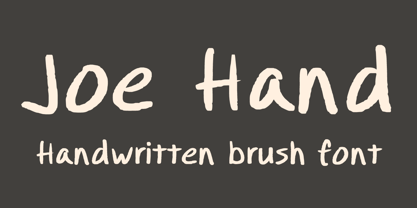 A handwritten brush font containing upper & lowercase characters, numerals and a large range of punctuation.
 - Ricochet Caps by Ben Harman,
$19.00 Ricochet is a masculine, vintage all-caps font with contextual alternates for most common characters.
 - Overdrawn Account AOE by Astigmatic,
$19.95A typeface made from vintage typewriter samples and meticulously compiled into a complete character set. - Office Memorandum AOE by Astigmatic,
$19.95A typeface made from vintage typewriter samples and meticulously compiled into a complete character set. - Squarefill by Michael Browers,
$25.00Squarefill is an all-uppercase grunge typeface featuring Latin, Extended Latin and Cyrillic character sets. - Urgent Telegram AOE by Astigmatic,
$19.95A typeface made from vintage typewriter samples and meticulously compiled into a complete character set. - Military Document AOE by Astigmatic,
$19.95A typeface made from vintage typewriter samples and meticulously compiled into a complete character set. - Sterling Script by Canada Type,
$54.95 Sterling Script was initially meant to a be digitization/reinterpretation of a copperplate script widely used during what effectively became the last decade of metal type: Stephenson Blake's Youthline, from 1952. The years from 1945 to 1960 saw a heightened demand for copperplate faces, due to post-war market optimism, as well as the banking and insurance industries booming like never before, which triggered the need for design elements that express formal elegance and luxury. The name Sterling Script is a tip of our hat to England, the Stephenson Blake foundry's country of origin. It is also a historical hint about copperplate scripts having been used mainly for banking and bonds in the 19th century. Originally we just wanted to resurrect a gorgeous metal type from the ashes of forgotten history. But after the main font was done we saw that the original s really needed an alternate. We made one. But we felt sorry for the original s and didn't want to see it dropped from use altogether, so we saved it by building a set of ligatures that solve the minor connection problem with the s at large sizes. Before the completion of the ligatures, a few different alternates were also drawn, and we were faced by the fact that the single font we set out to do was now a much larger set than we anticipated. While thinking about how to split up our unexpected bundle of large characters, we drew a few more alternates and some swashes. This abundance "problem" reached a certain point where there was no looking back, so we just decided to go all the way with this font. We added many more alternates, swashes, ligatures, and two full sets of each beginning and ending lowercase letter. The result is over 750 characters of sheer elegance. Sterling Script has many features that set it above and beyond other copperplate scripts: - It has 2 beginning and 2 ending alternates for every single lowercase character. The beginning and ending variants on the vowels are also available in accented form in the appropriate cells of the character map. - Sterling Script is the ultimate elegant font choice for luxury design. Very elegant, but not too soft. Its strong and confident shapes convey a message that is real, comforting and assuring. - One of the eventual purposes of expanding Sterling Script this extensively was to create a script that finds the middle ground between formal and informal without compromising either trait, a script where the degree of formality can be gauged, tweaked, cranked up or toned down depending on the layout's needs. Aside from beginnings and endings, there are multiple variations for the majority of the basic characters. This is a formal script on steroids, where twirls and swashes can be set to come out unexpectedly from any place in the word, which is great for reducing the inherent rigidity of words set in copperplate scripts and "humanizing" them whenever needed. This is especially useful for wedding, postcard and invitation design, where not every viewer of the collateral material has something to do with banking or insurance. - With such an extensive character set, a designer can easily set a word or a sentence in 10 or more different ways, and choose the perfect one for the task at hand. This is particularly useful for work where details are of utmost importance, like logos, slogans, or elegant engravings that consist of one to three words. Let those swashes and twirls intertwine for maximum elegance. The Sterling Script complete package consists of 7 fonts: Sterling Script, Alternates, Beginnings, Endings, Swashes, Swash Alternates, and Ligatures. Sterling Script is available in five different purchase options and price ranges. But with such a massive offering of variation, the Sterling Script complete package is definitely the most value-laden set in its class. Once you use Sterling Script, you will never want to go back to other copperplates.
 - KleinsFirstScript - Unknown license

- Epsiolet by PizzaDude.dk,
$20.00Epsiolet is wacky, crunchy and unpredictable! Comes in Open Type with loads of different ligatures! Note: you will need to use OpenType supporting applications to use the autoligatures. - AZ Cupcakes by Otto Maurer,
$23.00 AZ Cupcakes is a special Font for Cupcakes bakery Designs and for all Fans of Cupcakes. It comes in Creamy Design an with many sweet and sugar Graphics.
 - Persimmon by Typadelic,
$19.00 Persimmon is elegant and semi-formal with some very unusual letter shapes. Calligraphic in nature, Persimmon can be used where you want a distinctive and unique lettering style.
 - High Intensity by BA Graphics,
$45.00A solid powerful Bold condensed face great for headlines and sub heads and in some cases even as a text face. High Intensity will definitely get your attention. - Peppercorn by Elemeno,
$25.00Peppercorn seems to have been thickly painted on a rough surface. Comes in regular and a spattered Black version. Based on the font Hubbub, which compliments it well. - Sideron by Fontron,
$35.00Sideron is a first release and has some minor similarities to Broadway in its thick and thin strokes but is much squarer. There is also an Italic version. - Ramaskrig by Bogstav,
$17.00 Interesting script font with lovely crunchy details - comes with multilingual support and contextual alternates with 4 different versions of each letter, and they cycle automatically as you type!
 - FF Care Pack by FontFont,
$41.99 German type designer Johannes Erler created this pi and symbols FontFont in 1992. The font is ideally suited for advertising and packaging. It comes with proportional lining figures.
 - Nd Harquied by Notdef Type,
$25.00 What about some spooky type? Nd Harquied is great for Halloween, Comics, Monsters, or maybe something that you came up with melting cheese! How creative can you be?
 - Dimor by Nine Font,
$20.00 Dimor is a modern display type family with 6 styles. Specially designed for headlines and short sentences. We hope this will contribute to your impressive and distinctive title
 - Uncut Madness by Mirco Zett,
$15.00 Uncut Madness is a another horror genre font, inspired by vintage movie posters, books and vinyl covers. Including some bloody extras... ;) Made for logos, headlines, apparel design etc.
 - Your Flames by Bogstav,
$17.00 A slightly wild brush script suitable for posters! Comes with contextual alternates - meaning the font has 5 different versions of each letter, which automatically cycles as you type!
 - Danu by Phoenix Group,
$12.00 Danu font is a font with a traditional style with a minimalist approach, this font is inspired by Javanese script with curved letters and some dots in it.
 - Kids Activities JNL by Jeff Levine,
$29.00 Kids Activities JNL is based on the hand lettering found on the covers of some 1955 Cub Scouts activity books. It's available in both regular and oblique versions.
 - Snappy by Jörg Schmitt,
$35.00 Snappy is a friendly and curly font. It is influenced by the typical coffee house typefaces in france. It comes along with four weights and one outline font.
 - Macro by Gustav & Brun,
$10.00 Macro is a hand-drawn display font available in a regular and a bold version. Both versions come with double upper cases. Prepare to make a monstrous statement!

